
GENSTAT DISCOVERY EDITION 3
GENSTAT
DISCOVERY
EDITION 3
FOR EVERYDAY USE
Flemish Association for Development
Co-Operation and Technical
Assistance (VVOB)
ILRI-ICRAF Research Methods Group
University of Reading
Statistical Services Centre
ii
GenStat Discovery Edition
for everyday use
Wim Buysse, Roger Stern, Ric Coe and Crispin Matere
iii
Correct citation : Wim Buysse, Roger Stern, Ric Coe and Crispin Matere, 2007. GenStat Discovery
Edition 3 for everyday use. ICRAF Nairobi, Kenya. 117 pp.
This publication is the intellectual property of the University of Reading, the World Agroforestry
Centre (ICRAF) and International Livestock Research Institute (ILRI). While use of the information
it contains is encouraged, the content should not be republished in any way without the permission
of the publishers.
The publishers and the authors make no representation, express or implied, with regard to the
accuracy of the information contained in this book and cannot accept any legal responsibility or
liability for any errors or omissions that may be made.
All terms mentioned in this book that are known to be trademarks or service marks have been
appropriately capitalized. The publishers and the authors cannot attest to the accuracy of this
information. Use of a term in this book should not be regarded as affecting the validity of any
trademark or service mark.
The University of Reading
Whiteknights
PO Box 217
Reading
Berkshire RG6 6AH
United Kingdom
http://www.reading.ac.uk
The World Agroforestry Centre
ILRI-ICRAF Research Methods Group
PO Box 30677
00100 Nairobi
Kenya
http://www.worldagroforestry.org/rmg
International Livestock
Research Institute
ILRI-ICRAF Research
Methods Group
PO Box 30709
00100 Nairobi, Kenya
http://www.ilri.org/rmg
iv
Contents
1
2
3
4
5
6
7
8
GenStat Discovery Edition............................................................................................1
1.1
What is this guide about? ......................................................................................1
1.2
Configuration and developers................................................................................2
1.3
Acknowledgements ...............................................................................................2
1.4
Reference for GenStat Discovery Edition 3 ...........................................................2
GenStat Basics.............................................................................................................3
2.1
Starting GenStat Discovery Edition 3 ....................................................................3
2.2
Data input ..............................................................................................................5
2.2.1
Data input using the Spread Menu .................................................................5
2.2.2
Data input from Excel worksheets ..................................................................9
2.2.3
Advanced data input.....................................................................................12
2.2.4
Leaving GenStat...........................................................................................12
2.3
Some basic data manipulation ............................................................................14
2.3.1
Summary statistics .......................................................................................14
2.3.2
Calculating and formatting columns .............................................................16
2.3.3
Columns containing factors ..........................................................................21
2.3.4
Using the graphics editor..............................................................................23
2.3.5
Saving data from GenStat to Excel ..............................................................26
2.3.6
Importing factors from Excel.........................................................................27
2.3.7
Deleting data ................................................................................................28
2.4
Understanding how GenStat works .....................................................................28
2.4.1
Available variables .......................................................................................28
2.4.2
A first introduction to the GenStat command language ................................30
2.4.3
Server sessions............................................................................................34
Simple statistical ideas ...............................................................................................35
3.1
First some more data manipulation: appending spreadsheets ............................35
3.2
Visual data exploration ........................................................................................38
3.2.1
Boxplots .......................................................................................................38
3.2.2
Median and quartiles ....................................................................................39
3.2.3
The use of boxplots ......................................................................................42
3.3
Hypothesis testing ...............................................................................................44
3.3.1
Testing a hypothesis about the population mean .........................................44
3.3.2
Comparison of samples................................................................................45
3.3.3
Paired t-test ..................................................................................................49
3.3.4
A non-parametric example ...........................................................................51
3.4
A fast and simple regression ...............................................................................53
Review of chapters 2–3 ..............................................................................................56
Challenge 1 ................................................................................................................57
Before starting an Analysis of Variance ......................................................................58
6.1
Factors and data organization .............................................................................58
6.1.1
In a GenStat spreadsheet ............................................................................58
6.1.2
From an Excel spreadsheet .........................................................................63
6.2
Exploratory analysis ............................................................................................65
6.2.1
Melon yields .................................................................................................65
6.2.2
Layers and light regimes ..............................................................................68
6.2.3
Survival of Salmonella typhimurium .............................................................69
6.3
A real example ....................................................................................................72
Challenge 2 ................................................................................................................77
Analysis of variance....................................................................................................78
8.1
Two simple ANOVA’s ..........................................................................................78
8.2
Getting more out of the output.............................................................................80
v
8.3
Defining the treatment structure ..........................................................................84
8.3.1
Factorial treatment structure ........................................................................85
8.3.2
Nested blocking structure .............................................................................92
8.3.3
Checking for outliers.....................................................................................95
8.4
Randomising an Experiment ...............................................................................98
9 Challenge 3 ..............................................................................................................102
10 Further Reading........................................................................................................103
10.1 The Help menu ..................................................................................................103
10.2 PDF user guides................................................................................................105
10.3 GenStat on the Web ..........................................................................................107
10.4 The GenStat user community............................................................................108
10.5 Other free documentation, French and Spanish translations.............................108
vi
1 GenStat Discovery Edition
1.1 What is this guide about?
This guide is intended primarily for scientists who wish to use GenStat for the
analysis of their research data. Most of the examples are taken from the book
‘Statistical Methods in Agriculture and Experimental Biology’ by Mead, Curnow
and Hasted 2 , others come from course material developed by ICRAF and the
University of Reading. Our primary aim is to teach GenStat, rather than statistics.
In some chapter however we review some basic statistics and show how GenStat
Discovery Edition can be used to teach statistics. Nevertheless, minimal
information is given regarding the data and the interpretation of the results.
Chapter 2 of this guide gives a basic introduction to GenStat and can be considered as a
tutorial. It covers data input, some descriptive statistics, calculations and an introduction to
the command language. Chapter 3 introduces the application of simple statistical ideas in
GenStat (t-test and simple regression). Chapter 6 is about data organization and exploration.
Analysis of Variance using GenStat is covered in chapter 8. Examples include a simple
randomised block, factorial treatment structure and a split plot design. The other chapters
contain review questions or “challenges”.
Our main purpose in writing this guide is to provide supporting material for scientists, who are
on a training course in statistics. This guide, particularly chapters 1 - 5, may also be used for
self-study, either within a supervised environment, or for users who have experience of other
statistical packages. This guide is not intended for self-study by beginners to statistical
computing.
We estimate that the whole of the guide could be covered in a one-day session on a training
course for those familiar with other statistical software. This session would introduce the
software and could include a discussion on initial impressions of GenStat at the end of the
session. On training courses for participants with limited computer skills, this guide will take
at least 4 days. Such training course could include other exercises with additional datasets.
Datasets for a course on analysing agroforestry experiments can be found at the website of
the Research Support Unit of the World Agroforestry Centre (ICRAF):
http://www.worldagroforestrycentre.org/RMG
All datasets used in the examples and exercises can be found on the CD-rom. If you read
this manual in a printed version, the files can be downloaded from the websites of the
Research
Support
Unit
of
the
World
Agroforestry
Centre
(http://www.worldagroforestrycentre.org/RMG)..
2
Roger Mead, Robert N. Curnow, Anne M. Hasted, 2003. Statistical Methods in Agriculture and Experimental
Biology. Third Edition. Chapman & Hall/CRC. 472 pages ISBN 1-58488-187-9
1
1.2 Configuration and developers
The minimum recommended configuration under Windows XP is a Pentium PC with 32 Mb
RAM. GenStat Discovery Edition 3 will work on PCs running Windows 95, 98, NT, 2000 and
XP.
GenStat Discovery Edition 3 was developed by VSN International Ltd, in collaboration with
practising statisticians at Rothamsted and other organisations in Britain, Australia and New
Zealand. The address of VSN International Ltd is 5 The Waterhouse, Waterhouse Street,
Hemel Hempstead, HP11ES, UK– http://www.vsn-intl.com/ - E-mail: [email protected]).
GenStat is a registered trademark of the Lawes Agricultural Trust (Rothamsted Experimental
Station).
1.3 Acknowledgements
This manual has been adapted and expanded by the ILRI-ICRAF Research Methods Group
from “Using GenStat Discovery Edition for everyday use”. The latter was prepared by staff
from the SSC, Reading and ICRAF, Nairobi. It was, in turn based on original notes prepared
by Gillian Arnold and Ruth Butler for an MSc. course run by the Department of Agricultural
Sciences of the University of Bristol. We are very grateful to them and many others who
contributed to earlier versions of this guide.
1.4 Reference for GenStat Discovery Edition 3
The correct citation when referring to GenStat Discovery Edition 3 in a publication is:
GenStat Discovery Edfition 3, 2007.. VSN International Ltd., Hemel Hempstead, UK.
2
2 GenStat Basics
The aim of this introductory chapter is to become familiar with the basics of how
GenStat for Windows operates.
In this manual, we sometimes assume a user who already has experience of MS Excel since
most users will have organised their data in a spreadsheet and MS Excel is currently the
most widely used spreadsheet. We show how data entered into Excel can be analysed with
GenStat and also how data from GenStat can be saved as an Excel file. However,
experience with Excel is not necessary for using GenStat.
2.1 Starting GenStat Discovery Edition 3
Once GenStat Discovery Edition 3 is installed and you have obtained the free license key,
you start GenStat Discovery Edition within Windows on a PC by clicking on the GenStat icon
on the desktop or toolbar or by selecting the GenStat executable, from the Programs Menu.
If no GenStat icon is available on the desktop, you can create one yourself 3 .
Fig. 2.1 Some of the GenStat windows after start up, also showing several toolbars.
Title bar
Menu bar
Tool bar
Output window
Input log
3
By default, GenStat Discovery Edition 3 is installed the folder C:\Program Files\GenDisc3. Use Windows
Explorer and go to the subfolder C:\Program Files\GenDisc3\Bin. Right click with the mouse on GenStat.exe
and create a shortcut. This shortcut can now be dragged onto the desktop. You might rename the icon on the
desktop (right click on the icon and click ‘rename’) as GenStat Discovery Edition, to avoid confusion with
previous or newer versions.
3
After starting GenStat, you see a standard Windows interface (Fig. 2.1) with a title bar, menu
bar, tool bar, spreadsheet tool bar, status bar and several windows (Fig. 2.2). The Output
window will contain the output from the operations we perform. The input log keeps a record
of what has been done in an analysis. Many of the menus are standard for Windows
applications. Only Run, Data, Spread, Graphics, Stats and Tools are GenStat-specific.
Below an example is given of the interface after a spreadsheet has been opened.
Fig. 2.2 Some GenStat windows once data have been entered.
4
2.2 Data input
2.2.1
Data input using the Spread Menu
We show two ways of entering data into GenStat. The first is with GenStat. Choose Spread
⇒ New ⇒ Create as in Fig. 2.3.
Fig. 2.3 Spread => New => Create
Fig. 2.4 Give the initial size of the spreadsheet
Choosing Create brings up a box allowing you to specify how many data columns you want,
and how many rows of data there will be. Edit the box to make a GenStat spreadsheet with 2
columns and 14 rows as shown in (Fig. 2.4).
Different types of spreadsheet can be made, but the default (i.e. what GenStat will select in
the absence of any further information) - Vector - is usually the type you will need. Select
the Vector icon and click [OK] or simply click on the Vector icon, and an empty spreadsheet
will appear. You can start to enter data by clicking in a cell in the spreadsheet. Type the
number, and then press the [Enter] key. Enter the following numbers into the first column:
30.7 36.4 35.1 20.6 31.7 31.7 37.1 34.8 25.9 27.3 28
30.6 22.3 14.4
Press the [Enter] key after the last number. The cursor will then move to the top of the next
column. Enter these numbers into the second column:
66
147
126
56
93
99
104
103
32
44
67
56
35
26
Make sure that you press the [Enter] key after typing the final number, otherwise
the content of the last cell will not be sent to the GenStat server.
If you have made any mistakes, these can be easily corrected, using the arrow keys to move
to the cell to amend and entering the correct value.
For each row, the value in the first column is the height of Prunus africana trees in a forest in
Uganda. The data were measured as part of a research project of ICRAF. The value in the
second column gives the diameter of the same tree. So the first tree is 30.7 metres high and
has a diameter at breast height of 66 centimetres.
5
It is considered a good data management practice to give a detailed description
of your data. If you save your spreadsheet leaving the column names C1 and C2,
some time in the future you will not remember anymore what these data were
about. Also none of your colleagues is likely to figure out the meaning of your
data.
Adding a detailed description in GenStat can be done in several ways:
- giving a meaningful column name
- adding extra description to the column
- giving a meaningful name to the spreadsheet.
2.2.1.1 Naming columns
To change the column names from the default C1 and C2 to something more meaningful,
position the cursor as shown in the figure Fig. 2.5 below. It becomes a pencil, rather than a
hand, and clicking on the mouse gives a popup screen where you can type the name for the
column, as shown in Fig. 2.6. Then press [OK].
Fig. 2.5 Step one in renaming a column
Fig. 2.6 Giving the column a new name.
6
Once you have given column C1 the name “Height”, repeat with C2 with the name “DBH” (for
“Diameter at Breast Height). These names now appear on the columns of the spreadsheet.
2.2.1.2 Adding extra description
Another way of changing the column name is to choose Spread => Column =>
Attributes/Format, see Fig. 2.7, or click in a column and press [F9], or right-click in a
column and choose Column attributes (Fig. 2.8).
Fig. 2.7 Spread => Column => Attributes/Format
Fig. 2.8 Right-click for common features
The result in all cases will be a window that gives all kind of information on column attributes
and the way the column is formatted (Fig. 2.9). Since some of the data have one decimal,
we could enter 1 in the Decimals box. You can change the name of the column but you can
especially add extra information in the Description box. The description can be maximum 39
characters long.
Fig. 2.9 Formatting the column attributes
7
This example also shows a general point when using GenStat, namely that there
is usually more than one way to call a dialogue. We often find that the quickest
route is to right-click, but this only gives the most common features.
2.2.1.3 Naming spreadsheets
Use File => Save As to save the file. By default you are prompted to save the file as
sheet1.gsh in the My Documents folder (Fig. 2.10). Will you one year from now still be able to
remember what is the content of sheet1.gsh? Or will you be able to differentiate it from sheet
453.gsh?
It is a good practice to choose something meaningful as a file name, for instance “Prunus
africana height and dbh Mabira Uganda.gsh”. The filename can be anything that is
acceptable to your computer system. The Windows 2000 Help gives for instance:
A file name can contain up to 215 characters, including spaces. However, it is not
recommended that you create file names with 215 characters. Most programs
cannot interpret extremely long file names. File names cannot contain the
following characters: \ / : * ? " < > |
So, use long and descriptive names but don’t exaggerate.
It is recommended to change the working directory (Fig. 2.11). This is the default directory
where GenStat will save spreadsheets and other file types. It is good practice to save your
data files in a folder called, for instance, C:\Data. If you have a D-drive, use Windows
explorer to create a folder on that drive for your data files. You can even create one folder
per project, each containing several subfolders.
Fig. 2.10 Default directory and name
Fig. 2.11 Saving a GenStat spreadsheet with an
informative name in a directory of your choice
Now use Run => Restart Session, to clear everything from the memory. To continue with
the next chapter, minimize GenStat and open MS Excel.
8
2.2.2
Data input from Excel worksheets
You may already have your data in a spreadsheet like MS Excel. Importing data from an MS
Excel spreadsheet into GenStat is very easy.
If you entered your data using another software, you still can browse through this
section since most procedures will be quite similar. If you are not familiar with MS
Excel, you can skip this section.
GenStat can import data from many spreadsheet formats. To know which ones, choose Help
=> Contents and Index and type “spreadsheet” in the Index box, select the “spreadsheet
file formats” entry and click [Display]. The resulting help-file shows information on all
possible file formats as in Error! Reference source not found..
Fig. 2.12 Help=>Contents Index
Fig. 2.13 Importing from different spreadsheets
We assume you are now in Excel. Create a new Excel workbook and enter the data from
Fig. 2.5. In a spreadsheet like Excel you can add extra information in the cells above the
data as in Fig. 2.14:
You can enter a short name for the column.
In the row above, you can enter a long name and mention the measurement units.
One row higher you can add extra information on the experiment.
9
Fig. 2.14 Data and descriptive information
entered into MS Excel.
The extra information is sometimes called “meta-data” and makes it clear what the data are
about. To import the data into GenStat, you define a named range in Excel. In Excel,
highlight the range containing the data and the header row and choose Insert => Name =>
Define (Fig. 2.15). Give the range a name, for instance Prunusdata (Fig. 2.16). Then save
the Excel workbook and give it a meaningful name, for instance “Prunus africana height and
dbh Mabira Uganda.xls”. You can also rename the worksheet. Right-click on the tab “Sheet
1” and rename it as “Prunus africana” (Fig. 2.17). Then save the Excel file again. You have
now finished with Excel, so minimize or close Excel and go back to GenStat.
Fig. 2.15 Defining a named range in Excel
Fig. 2.16 Giving the range a sensible name
Fig. 2.17 Naming an Excel sheet
10
In GenStat, choose File => Open and select the Input file (Fig. 2.18). You can indicate that
the file to import is of the ‘Other Spreadsheet Files’ type.
Fig. 2.18 GenStat's File => Open, choosing
spreadsheet file-types
Fig. 2.19 Choosing to open the range that was
named in Excel, see Fig. 2.16
In the next window, shown in Fig. 2.19, you can select the named range “Prunusadata”. By
clicking [Finish], the data are immediately imported in a GenStat spreadsheet as shown in
Fig. 2.20.
Fig. 2.20 Data imported into a GenStat
spreadsheet
Sometimes people mistakenly import the whole Excel worksheet instead of just the named
range. The result is a GenStat spreadsheet that cannot be used, as shown in the following
example. In GenStat, restart the session by selecting Run ⇒ Restart Session and then
clicking the [Yes] button, to clear all windows, dialogue boxes and the spreadsheet. Choose
again File => Open and select the Input file “Prunus africana height and dbh Mabira
Uganda.xls”. This time however, select the worksheet “Prunus africana” (Fig. 2.21). The
result is a GenStat spreadsheet with 2 columns containing text, as shown in Fig. 2.22. By
default, GenStat reads the contents of the Excel cells on the first row as column headers.
Since the cells on the second row contain text, GenStat assumes that the whole column
contains text and shows a green T next to the column header.
11
Fig. 2.21 Mistakenly importing a whole sheet
from Excel into GenStat
Fig. 2.22 The resulting import includes the
column names as data
An alternative way of importing spreadsheet data into GenStat is to copy a range of cells
from Excel and paste it into GenStat. This is not good practice in data management, but is a
fast and easy way of doing quick provisional analyses
Choose Run => Restart Session to clear all data out of GenStat. Go back into Excel.
Highlight the range containing the data and column headers, right click with the mouse in this
range and click Copy or choose Edit => Copy. Now the data are loaded into the Windows
clipboard. Go back to GenStat and choose Spread => New => from Clipboard (Fig. 2.23)
and the data are entered into a GenStat spreadsheet.
Fig. 2.23 Copying data into GenStat from the clipboard
2.2.3
Advanced data input
If you are going to transfer data repeatedly from the same external file, it is also possible to
create links to that file. More information can be found for instance in ICRAF Research
Support Unit Technical Note 2, available at http://www.worldagroforestrycentre.org/RMG
2.2.4
Leaving GenStat
To end a GenStat session, choose File ⇒ Exit. You will be asked if you want to save any of
the open windows or spreadsheets. Select [No] on all windows asking you if you want to
save the contents of the Input and Output windows and [Yes] when asked if you are sure
12
you want to exit GenStat. More on saving data in different file formats can be found in
chapter 2.3.5.
As well as showing you how to enter data into GenStat, you have seen how easy
it is to transfer data from another package, such as Excel. Using GenStat does
not stop you from using other software that you may be familiar with
(spreadsheets or statistical packages). We will show examples from Excel
spreadsheets at various points in this guide.
13
2.3 Some basic data manipulation
2.3.1
Summary statistics
Restart the session and reopen the file “Prunus africana height and dbh Mabira Uganda.xls”.
The data in the spreadsheet are passed into the GenStat server as soon as you click
anywhere outside the spreadsheet or the spread menu. Try doing this by clicking in the
output window.
Some summary information about the two columns Height and DBH, will appear in the output
window showing minimum, mean and maximum values, number of values and number of
those that are missing.
For further statistical summaries use the Stats menu, as shown in Fig. 2.24. Choose Stats
⇒ Summary Statistics ⇒ Summarise Contents of Variates. Select the variates to be
summarised, as shown in Fig. 2.25, and then click [Run].
Fig. 2.24 GenStat's descriptive
statistics menu
Fig. 2.25 The dialogue to display summary statistics
Select the Output Window. If you cannot see this window, try clicking the
or
buttons
in the toolbar successively until it appears. Some of the results are shown in Fig. 2.26 below.
14
Fig. 2.26 The default summary statistics
There are other statistics available with the dialogue box shown in Fig. 2.25. Find the
dialogue box again. Click on the [Clear] button to clear all currently selected statistics.
Reselect the variables and choose Arithmetic Mean, Standard Deviation and Standard Error
of Mean, and click [Run].
In the box in Fig. 2.25, you could already have selected to display a histogram, boxplot and
stem and leaf diagram. A range of other graphs is possible with the Graphics menu. Let’s
see for instance if there is a relationship between height and diameter. Use Graphics ⇒
Scatter Plot (see Fig. 2.27) and complete the dialogue box as shown in Fig. 2.28. This will
give the scatter plot from (Fig. 2.29).
Fig. 2.27 GenStat's graphics
menu
Fig. 2.28 An x-y plot dialogue
15
Fig. 2.29 Resulting scatterplot in a separate window
Notice that the default background in Genstat Discovery Edition 3 is a yellow tan colour. In
most cases it is better to have the graph displayed on a clear white background. Changing
the background colour and other graph edits are explained in chapter 2.3.4.
2.3.2
Calculating and formatting columns
It is easy to calculate new variates from those already entered in a GenStat session. Choose
Spread => Calculate => Column (Fig. 2.30) and select the calculation you need and the
name of the new variable that you wish to save.
Fig. 2.30 Menu for the GenStat calculator
The next example is not the simplest, but illustrates the ease with which calculations can be
done. Often when measuring trees, you want to calculate the volume. The volume of a
16
quadratic paraboloid is often used as an approximation to the volume of the tree. The
general formula for this is: V= 0.5*g*h with g being the basal area and h the height of the
tree.
First select the spreadsheet again. Do this, either by clicking somewhere in it (if you can see
it), or use the toolbar arrow buttons or the Window menu (Fig. 2.30).
Fig. 2.30 One way of retrieving the spreadsheet
To calculate a new column, choose Spread ⇒ Calculate ⇒ Column as shown in Fig. 2.30.
First we calculate a column with the basal area, given by the formula: 3.1416 * DBH/2 *
DBH/2. Position the cursor in the large box on top of the calculate window before you start
typing. You can either type the names of the variables or double click on them in the list with
the available data. Also type the name of the new column into the bottom box labelled Save
Result In as shown in Fig. 2.31. Also, tick the check box next to Display in Spreadsheet
and click [Run].
Fig. 2.31 The calculate dialogue
Fig. 2.32 The resulting column
There is now a new variate, called basalarea, added to the spreadsheet, as shown in Fig.
2.32, which holds the 14 values of the basalarea for each tree. The name is part shaded (in
yellow on a colour screen) to indicate that the column basalarea is a calculated column. To
illustrate the difference between an ordinary and a calculated column, try to change a value
in the basalarea column. GenStat gives a warning. See Fig. 2.33 below.
17
Fig. 2.33 Warning if you try to change a
value in a calculated column
If you are still in the basalarea column, right click on the mouse, and choose the option called
Column Attributes. You will see the Column Attributes dialogue. This gives details of the
basalarea column, including the calculation you used.
Thus GenStat's spreadsheet is a little like an ordinary spreadsheet in that it
records the calculation, rather than just doing the transformation. If you change a
value in the original column, the derived values do not however change
automatically. You could then use Spread ⇒ Calculate ⇒ Recalculate, to
update the derived values.
We will do this now, because our calculation contains an error. The diameter of the trees was
measured in cm, while usually a basal area is expressed in m2. So we have to divide each
diameter by 200 to get the radius in meters. Meanwhile we can improve the calculation by
using the operator ** for the exponent. And instead of abbreviating Pi as 3.1416, we can use
the GenStat command for the constant pi: CONSTANTS (‘pi’). The complete formula is
shown in Fig. 2.34.
Fig. 2.34 Correcting the calculation
Fig. 2.35 The new calculated column
We have the basalarea, but we still could add some descriptive information. Right-click in the
basalarea column and choose Column Attributes or choose Spread => Column =>
Attributes/Format or press [F9]. Add a description and set the number of decimals to two,
as shown in Fig. 2.36.
18
Fig. 2.367 Description and decimals for the
calculated column
Now we can calculate the volume of each tree. Choose Spread => Calculate => Column
again or choose Window and select Calculate (Fig. 2.37) or click on the window list button
in the toolbar (Fig. 2.38). The same window with the first calculation will open.
Fig. 2.37 Getting the calculate dialogue back
Fig. 2.38 Another way to restore the dialogue
Many dialogue boxes in GenStat do not close when you click [OK]. They only
close if you click on [Cancel]. This is so you can easily repeat an operation, or
get more output from the current analysis without having to go back through the
menus. It is quite easy to get a large number of windows and dialogue boxes
open at once, so it can be quite hard to find the one for which you are looking.
Therefore it is a good idea to close a box by clicking [Cancel] as soon as it is no
longer needed.
19
Calculate the volume and format the column as shown in Fig. 2.40 and Fig. 2.41.
Fig. 2.40 Calculating the volume
Fig. 2.41 Formatting the calculated column
The data values came from 14 numbered trees. It would be useful to have this information
entered too. Click in the first column (Height) of the spreadsheet. Choose Spread ⇒ Insert
⇒ Column before Current Column. This gives a dialogue box called Create a new
column as shown in Fig. 2.39 below.
Fig. 2.39 Spread => Insert => Column before
Current Column
Fig. 2.40 Making a column with a regular
sequence
Type treeno in the name box and click on [OK]. A new column will appear in the
spreadsheet filled with missing values (denoted by *). You could now type in the numbers 1
to 14, but there is a quicker way to fill in regular sequences.
Right click in the Spreadsheet and choose Fill from the popup menu or choose Spread ⇒
Calculate ⇒ Fill. In the Fill dialogue that is shown in Fig. 2.40, make sure that treeno is in
the top box. Clicking [OK] will fill treeno with the numbers 1 to 14. Fill can also be used to
make patterned sequences.
Details of the use of this, or any other dialogue, can be found by clicking the [Help] button in
the dialogue box.
20
2.3.3
Columns containing factors
So far, all the information entered into GenStat has been numerical. It is possible to enter
textual information as well. One structure that accepts this kind of information is a FACTOR.
This is a special column used to indicate groups in the data (there will be more about factors
later in this manual).
The first seven trees of this data set were measured in the middle of the forest, the interior,
while the last seven trees grew at the forest edge. Hence the factor will have two groups or
levels. Here one is labelled Interior and the other Edge.
Click in the first column of the spreadsheet (treeno) and choose Spread ⇒ Insert ⇒
Column after Current Column. Type Position into the Name box, and click to select Factor
under Column Type. The box will change as shown in Fig. 2.41.
Fig. 2.41 Creating a factor column
Specify that the factor has 2 levels and then click on the [Labels] button. The dialogue
shown below appears. Type 'Interior' and press the [Enter] key. The next level (2) will
become selected. Type 'Edge', press [Enter] and then click [OK] to make the changes take
effect.
Click [OK] in the Create a new column dialogue to make the new column which contains
empty cells (see Fig. 2.43).
Fig. 2.42 Giving labels to factor levels
Fig. 2.43 The resulting spreadsheet
Now there are two ways of entering the position: entering ordinals or entering labels. Let’s do
the first 5 trees using the ordinals. Factor values are stored as ordinals; namely as integers
between 1 and the number of levels of the factor. In our example there are two factor levels,
so the ordinals will be 1,1,1,1,1,1,1,2,2,2,2,2,2,2.
21
Right-click in the empty Position column and choose Column Attributes. Indicate that the
factor has to be displayed as ordinals (Fig. 2.44). Now enter 1 for the first 5 trees, see Fig.
2.45.
Fig. 2.44 Displaying a factor as
ordinals
Fig. 2.45 Entering the first level of a factor
Try to enter 3 as Position for tree number 6. GenStat gives a warning that only 1 or 2 is
possible (see Fig. 2.46). Click [OK] and press [Escape].
Right-click again in the Position column and choose Column Attributes to give the dialogue
shown in Fig. 2.44. This time however, indicate that the factor has to be displayed as labels.
We had entered the factor labels already, so after clicking [OK], the position of the first five
trees is shown as Interior. Now you can continue entering the values. You can enter ‘Interior’,
‘interior’ or even just the first letter ‘i’ and GenStat will show the correct factor label ‘Interior’.
Enter ‘e’ for trees 8 until 14 as shown in Fig. 2.47.
Fig. 2.46 Attempt to enter an illegal value
in a factor column
Fig. 2.47 Entry of data into a factor column using
the labels
As long as you type the correct first letter of the Factor label, GenStat will display
the correct label. If you type the wrong letter, GenStat will give you a message
and ask you to retype your entry. Double clicking gives a pop-up menu that lists
the allowable levels; see Fig. 2.48.
22
Fig. 2.48 Popup menu to indicate the allowed
factor labels
2.3.4
Using the graphics editor
The Position column can be used to label a graph. Choose Graphics ⇒ 2D => Single XY.
Fill in the boxes as shown below, and click [Finish]. If you first click [Next] in Fig. 2.49, you
can add titles to the graph and the axes.
Fig. 2.49 Graphics => Point Plot => Single
XY
Fig 2.50 Colours in graphs for different levels
In the screen plot, the points from the two groups will be coloured differently, but both will be
plotted as X.
Again in Fig 2.50 you have the default tan background and rather long labels in the key. In
Genstat Discovery Edition 3 it is easy to change legends, titles and axes after a graph has
been plotted. Choose Edit⇒ Edit Graph from the menu bar in the default graph window
(Fig 2.50) which takes you to the Genstat Graphics Editor shown in Fig. 2.51 On the menu
bar choose Tools⇒ Graph Options and click on the tab for the graph edits you require. (Fig.
2.52 ). In this example the Layout page has been selected and the “Background Colour” box
23
check box has been ticked. Clicking on the down arrow (circled in yellow) produces a palette
of background colours to choose from. Here we have chosen white. Clicking on the white
colour square will close the colour palette. Now click on [OK] on the bottom of the dialogue
box. Similarly, other edits can be made using the options in this dialogue. After changing the
background colour and editing the key titles the graph appears as in Fig. 2.53
Fig. 2.51 Genstat Graphics Editor
Fig. 2.52 Graph options dialogue with
Layout tab selected
Fig. 2.53 Edited Graph
In the Discovery Edition 3, graphs can be saved in a number of different formats by choosing
File => Save as: These formats include:
•
•
•
*.gmf – GenStat Meta File. This is the default GenStat graphics format. You can
reopen a GenStat Meta File in GenStat and send it to other GenStat users. You will
not be able to insert a gmf file as a picture in MS Word.
*.eps –Encapsulated Postscript. A standard file format for importing and exporting
Postscript language files. This format can be inserted into MS Word documents
*.emf – Enhanced Meta File. This is another graphics file format for the Windows
platform, the successor of wmf (Windows Meta File) format. In the Meta file format,
24
•
graphics can be stored both as bitmap (pixels) or as vector format (commands like
“draw line”). Emf is only supported on Windows 95 and higher. Not all software
supports emf, but MS Word 97 or later can import it.
*.jpg – Joint Photographic Experts Group Image File. A compressed bitmap graphic
image. This gives you a small file size but you sacrifice some quality. This format
should not be used to archive original images as you cannot return to the original
level of quality. This format can be inserted into MS Word documents
•
*.tif – Widely supported and commonly used format in commercial printing. This
format can be easily inserted into a MS Word document. This format can also be
used for archiving.
•
*.png – Portable Network Graphics.
A recent graphics format with similar
characteristics to *.tif. It has good compression efficiency and is suitable for
archiving. This format can also be inserted in MS Word documents
•
*.bmp – Bitmap File. In this file format, graphics are stored as pixels. It can only be
used on the Windows platform. File compression is not supported so bmp files are
usually large.
If you want to create a temporary graph that you will only use in GenStat, choose the *.gmf
format. If you want to include a picture in a Word document, choose the *.emf format. For
other purposes, use the bmp format. In the graphics editor you can change the pixel size
(Options => Change Bitmap Size).
Fig. 2.54 Saving a graph as bitmap file
You leave the GenStat Graphics Window by choosing File ⇒ Exit from the menu bar.
Earlier, you used Stats ⇒ Summary Statistics ⇒ Summarise Contents of Variates to give
some summaries of the data. Now, with the data in two groups, it is useful to give the
summaries for each group individually. The dialogue used in Fig. 2.25 can be used for this,
but a more general alternative is Stats ⇒ Summary Statistics ⇒ Summaries of Groups
(Tabulation) to give the dialogue shown in Fig. 2.55.
25
Fig. 2.55 The tabulation dialogue
Fig. 2.56 Summary statistics for each factor level
Complete the dialogue as shown and press [Run]. The results as shown in Fig. 2.56 appear
in the Output Window.
Save the spreadsheet before continuing
2.3.5
Saving data from GenStat to Excel
In chapter 2.2.1.3 on page 8 we saw how to save a spreadsheet. By default, a Window
appears asking to save the data as a GenStat spreadsheet (*.gsh). This is particularly
useful if backward compatibility with older GenStat versions is wanted. But a wide range of
other file formats is also available.
In chapter 2.2.2 it was shown how data could be imported from an Excel worksheet. We had
imported the file “Prunus africana height and dbh Mabira Uganda.xls” from Excel. We will
reopen this file and calculate the basal area again. Since we did all calculations in the
GenStat spreadsheet “Prunus africana height and dbh Mabira Uganda.ghs”, the Excel
spreadsheet only contains 2 colums Height and DBH. So, first choose Run => Restart
Session, indicating [Yes] to clear all data from the GenStat memory, open the Excel file and
calculate the basal area. Refer to chapter 2.3.2 if necessary.
This time we want to save the spreadsheet as an Excel file. Choose File => Save.
26
Fig. 2.57 Save spreadsheet as Excel file
Fig. 2.58 Warnings
In the resulting dialogue, shown in Fig. 2.57, you select “Excel File [*.xls]” beside the “Save
as type” list box. At this point you can give the file a new name and click [Save ].
Alternatively, you can overwrite the old file or save the data as a new worksheet in the old
file. If you leave the old file name in the file name list box (Fig. 2.57) and click [Save ], you
will get the first warning shown in Fig. 2.58 asking if you wish to replace the current file. Click
on [Yes] and you will see the second warning giving the options to “Overwrite” or to “Add”. If
you click on [Overwrite] all existing worksheets in the workbook “Prunus africana height and
dbh Mabira Uganda.xls” will be deleted and the data will be saved in a worksheet called
GenStat Data. By clicking [Add], the existing worksheets will be kept and a new worksheet
GenStat Data will be added to the Excel file, Fig. 2.59 . If you repeat this, new worksheets
will be added: GenStat Data, GenStat Datb, GenStat Datc, …
Fig. 2.59 Add worksheet to existing file
2.3.6
Importing factors from Excel
If you import data from Excel that contain factors, they are treated slightly differently. In our
example, Interior was the first factor level or ordinal and Edge was the second. If you import
a column containing the factors “Interior” and “Edge” from Excel, Edge would have an ordinal
of 1 and Interior an ordinal of 2. The reason is that Excel reads factors from Excel in
alphabetical order.
27
2.3.7
Deleting data
Before proceeding we delete the column, called treeno to show the difference between
deleting a whole column and deleting its contents.
First we select the column. Click in the name field; click in the column and press
[Alt]+[Ctrl]+C; or choose Spread ⇒ Select ⇒ Current Column. Clicking again will deselect
the column. Once selected, you might think that the [Delete] key should delete the column.
If you press the [Delete] key, only the data disappear, the column remains! Use Edit ⇒
Undo Del Cells or press [Ctrl] + Z to get the data back (Fig. 2.60).
To delete the whole column, with the cursor in the column choose Spread ⇒ Delete ⇒
Current Column. You still can recover the column choosing Edit ⇒ Undo Del Col or by
pressing [Ctrl] + Z (Fig. 2.61). You can also select one, or more, rows and delete them in
the same way.
Fig. 2.60 Undoing the deletion of cells
Fig. 2.61 Undoing the deletion of columns
2.4 Understanding how GenStat works
2.4.1
Available variables
Close the spreadsheet with the Prunus africana data. You can do this by choosing File =>
Close, by pressing [Ctrl]+[F4] or by clicking on the button with a diagonal cross in the top
right hand corner of the spreadsheet. Once closed, do you think the data are still in GenStat?
28
Fig. 2.62 Closing a GenStat spreadsheet
The answer is yes. Because the GenStat you see is a Windows interface that sends
commands to a program running in the background: the GenStat Server. When these
commands are processed, the message in the GenStat status bar shows what is happening
and the GenStat icon in the Windows Taskbar changes from green (Fig. 2.63) to red (Fig.
2.64). However, when working on small datasets it goes so fast that you will not be able to
see it.
Fig. 2.63 The taskbar with the GenStat server Fig. 2.64 The GenStat server icon changes to
ready
red when the server is busy
So, even if you don’t see anything, there can be still all kinds of data somewhere in the
GenStat server. You can check which variables are currently available to the GenStat server
using Data ⇒ Display or pressing the [F5] key and clicking for instance on “All Data”.
Fig. 2.65 List of all the variables in the GenStat server
This lists the names of the structures and their types as shown in Fig. 2.65. All
structures used so far are variates (Height, DBH, basalarea, volume, treeno) and
factors (Position), but later on you will use other types of columns too. This is
also a useful dialogue box from which you can delete columns when they are no
longer needed.
29
Click [Close] to close the Display dialogue box. See chapter 2.4.3 for information on how to
clean the GenStat Server of data.
2.4.2 A first introduction to the GenStat command
language
So, GenStat is basically a standard Windows application running on top of the GenStat
server. GenStat existed long before Windows was created and in the old days you had to
know the "language". You simply typed commands, which you submitted to GenStat.
The menus in the GenStat Discovery Edition 3 are based on an underlying command
language, ‘GenStat – Seventh Edition, see Fig. 2.66. You can use GenStat by typing
commands in the Input Window as we show now. At the same time, we show how GenStat is
used as a calculator.
Fig. 2.66 Details about GenStat
Restart GenStat. Use File ⇒ New ⇒ Text Window as shown in Fig. 2.67. This gives you an
Input Window. In this window, type Print 3+4 as shown in Fig. 2.68.
Fig. 2.67 Opening a text window
Fig. 2.68 Typing a GenStat command
30
Now select the Run menu (Fig. 2.69). You can choose either Submit Line (if the cursor is
still on the line you typed) or Submit Window. Choose one of these.
Fig. 2.69 Submitting commands to
GenStat
Fig. 2.70 The results are in the output window
You have now submitted your "program" of commands to the GenStat server. The results are
put in the Output Window.
You can go to the output window in various ways, e.g. by using the Windows menu. There
you see that GenStat normally "echoes" the command and shows you that 3+4=7.
The Windows version of GenStat gives you a variety of ways of submitting calculations to the
GenStat server. An alternative to the above is to use the Data menu: Data ⇒ Calculations
as shown in Fig. 2.71.
Fig. 2.71 Data => Calculations
Fig. 2.72 Using the calculate dialogue
Then type 3 + 4 as the function, click on Print in Output and then on [Run]. If you look in the
Output window, you see that 3 + 4 still equals 7 (Fig. 2.73).
31
Fig. 2.73 And yes: 3 + 4 still is 7
Fig. 2.74 The input log
The Input Log Window is also useful. It keeps a record of all the commands you have
submitted, see Fig. 2.74. Access it for instance by choosing Window ⇒ Input Log. You
see that the use of the Calculation menu has resulted in GenStat preparing the commands
PRINT 3+4 for you and has submitted them to the GenStat server.
So, that is how GenStat works. You prepare commands, which are submitted to the GenStat
server. The Windows version has simply given you a variety of ways of helping you prepare
the commands for GenStat. GenStat obeys the commands and puts the results in the
Output Window. It keeps a record in the Input Window.
If the commands produce graphs, then GenStat puts the graphs in a Graphics Window. If
you make a mistake in the command, it prints an error message in the Fault Window (and in
the Output Window).
The example above (3 + 4 = 7) indicates that GenStat may be used as a simple calculator.
This is worth a little practice. It is useful to have a scientific calculator. Also it is sometimes
useful to transform data. For example, if you want to calculate the difference between 4.35
and 2.37 expressed as a percentage of 4.35, open the calculator with Data ⇒ Calculations,
check that Print in Output, is still ticked and
type the following calculation in the top box:
100 * (4.35 -2.37) / 4.35
Click [Run]. This will give the following in the output window:
(100*(4.35-2.37))/ 4.35
45.52
i.e. the difference is 45.52% of 4.35.
It is important that the brackets () are included where appropriate to make sure that the
calculation has only one meaning.
Try more calculations to see how this works, using both an Input window and the Data ⇒
Calculations dialogue box.
The symbols +, -, *, / are used for the operations of addition, subtraction, multiplication and
division respectively and ** is used for powers. There are also various mathematical
functions available. One is for calculating the square root of a number. The function is
32
SQRT(), where the number whose square root is required is given in the parenthesis, for
example SQRT(12.37). The following table gives an overview of how to perform some
calculations by using the Input Window. More information can be found in the GenStat Help
file under ‘List of functions for expressions’.
Some basic calculations using the Input Window
Symbol
Operation
Example
Result
+
addition
PRINT 3+4
7.000
-
subtraction
PRINT 3-4
- 1.000
*
product
PRINT 3*4
12.00
/
division
PRINT 3/4
0.7500
**
exponentiation
PRINT 3**4
81.00
Function
Operation
Example
Result
SQRT(x)
Square root
PRINT SQRT(4)
2.00
EXP(x)
Exponential function
PRINT EXP(1)
2.718
LOG(x)
natural logarithm of PRINT LOG(2.718)
x, for x > 0
0.9999
LOG10(x)
logarithm to base 10 PRINT LOG10(10)
of x, for x > 0.
1.000
ROUND(x)
rounds the values of PRINT
x to the nearest ROUND(1.234)
integer.
1.000
Other examples
Result
PRINT (1/2)
0.5000
PRINT (100*(4.35 -2.37))/4.35
45.52
PRINT CONSTANTS(‘pi’)
3.142
PRINT CONSTANTS(‘e’)
2.718
By default, GenStat will show three decimals in the Output Window when using the PRINT
command, or PRINT directive in the GenStat terminology. To increase this you have to add
a parameter to this directive.
PRINT CONSTANTS (‘pi’); DECIMALS = 10
Will give you 3.1415926536 in the Output Window.
Most of the time however, you will perform calculations in a spreadsheet as was seen in
chapter 2.3.2 above. Once you become experienced in using GenStat, you could
33
alternatively do calculations only in the GenStat server, using the Data ⇒ Calculations
menu, rather than the Spread ⇒ Calculate ⇒ Column route that you used earlier. The
result is the same to the GenStat Server, but you would not automatically see the calculated
column in a spreadsheet.
2.4.3
Server sessions
After trying several of the above calculations, the Input and Output Windows look a mess. All
the data can be cleared out of the GenStat server with Data ⇒ Clear All Data or Run ⇒
Restart Session. Less drastically, you can clear the output window by clicking the ‘Clear
Output’ button (
) in the toolbar.
Input as well as Output Windows can be saved (make the window active by clicking in it and
click File => Save As). You can save the Input Window, or the Input Log Window, as a text
file or as a ‘GenStat file” (*.gen). In this way, you can load the commands in the Input
Window again for another, similar, analysis. The Output Window can be saved as a text file
or as an ‘Output file’ (*.out). This is useful to save the results of an analysis for comparison
with other results or for reporting. Saving a selection of input and output files of critical
analyses also contributes in establishing an audit trail.
34
3 Simple statistical ideas
The main purpose of chapter 2 was to introduce GenStat Discovery Edition.
Chapter 2 can be considered as a tutorial. In this and the following chapters we
still show how the GenStat Discovery Edition operates but we also review some
basic statistics and show how GenStat can be used to teach statistics. Most of
the examples are taken from Mead, Curnow and Hasted 4 . For more information
on the statistical aspect of the examples, see the relevant section in that book or
refer to any other statistics introductory text.
3.1 More data manipulation: appending
spreadsheets
In the analysis so far, we have just considered descriptive statistics. Thus we have
summarised the data numerically and drawn graphs. In the next chapters we introduce ideas
of simple statistical inference. However, first we introduce some more data manipulation.
We take an example from Mead, Curnow and Hasted, pages 36 and 42. This
compares 6 observations from a new variety of wheat that have following yields
(tons/ha):
new:
2.5 2.1 2.4 2.0 2.6 2.3
with 10 observations from the standard variety as follows:
standard:
2.2 1.9 1.8 2.1 2.1 1.7 2.3 2.0 1.7 2.2
Since these columns are of different lengths, they are entered into two separate
spreadsheets. For the first set, use Spread ⇒ New ⇒ Create as shown earlier in chapter
2.2.1 (page 5). Set it to have 1 column of 6 rows, enter the data and give the column the
name new.
Save the spreadsheet, giving it a meaningful name as was seen in chapter 2.2.1.3 on page
8, for instance “Wheat variety new.gsh”. Then use Spread ⇒ New ⇒ Create again.
Change the number of rows to 10 and enter the second set of data into this other
spreadsheet, naming the column as standard. Save the spreadsheet, giving it another
name, for instance “Wheat variety standard.gsh” (see Fig. 3.2).
4
Roger Mead, Robert N. Curnow, Anne M. Hasted, 2003. Statistical Methods in Agriculture and Experimental
Biology. Third Edition. Chapman & Hall/CRC. 472 pages ISBN 1-58488-187-9
35
Fig. 3.1 Spreadsheets for wheat yields
Fig. 3.2 Naming the spreadsheets
Data often need reorganising before analysis and here this step is illustrated by
joining the data together from the two sets.
What we wish to do is to append the data from the two columns and add a further
column that specifies from which set each observation has come.
If the spreadsheets are no longer in GenStat then they will have to be opened. They were
saved earlier with the names ‘Wheat variety new.gsh’ and ‘Wheat variety standard.gsh’ (Fig.
3.1).
Fig. 3.3 The spreadsheet 'Wheat variety
standard.gsh' is the active window.
Fig. 3.4 The append dialogue box.
Click in the spreadsheet Wheat variety standard.gsh, so it is the active window (Fig. 3.3).
Use Spread ⇒ Manipulate ⇒ Append and complete the dialogue as shown in Fig. 3.4, i.e.
append Wheat variety new.gsh to the data in Wheat variety standard.gsh. We also specify
that a factor column with the name variety will be used to distinguish between the two sets of
data, and that the second level of the factor will get the name ‘new’. Press [OK].
36
Fig. 3.5 The resulting spreadsheet after the
append operation.
Fig. 3.6 The final spreadsheet after some
renaming.
The resulting spreadsheet is as shown in Fig. 3.5 above. This latter form of the data is more
common and is used in most of the remainder of this guide.
Now it is just a matter of cleaning up to get the spreadsheet as in Fig. 3.6
Change the label of the first factor level from Original to standard. (See Chap 2.2.1.2
Rename the column with the variables from standard to yield. (See chapter 2.2.1.1)
Save the spreadsheet as ‘wheat yield.gsh’. (See chapter 2.2.1.3)
So, you have the data in the GenStat server shown in Fig. 3.7 and Fig. 3.8.
Fig. 3.7 The visible spreadsheets
Fig. 3.8 The available data in the
GenStat server
37
3.2 Visual data exploration
3.2.1
Boxplots
One way to present the data is to use a boxplot. It is always useful to explore data before
carrying out any statistical test. This way you know what to expect and can discover
anomalies. Use Graphics => Boxplot. When the data are organized in two separate
spreadsheets (like “Wheat variety new.gsh” and “Wheat variety standard.gsh”), complete the
dialogue as shown in Fig. 3.9 and click [Finish]. When the data are organised as a single
variate with groups in one spreadsheet (in “wheat yield.gsh”), complete the dialogue as
shown in Fig. 3.10. This gives the graphs in Fig. 3.11.
Fig. 3.9 Graphics => Boxplot when the data
are in several variates
Fig. 3.10 Graphics => Boxplot when the data
are organised as one variate with several
groups
Fig. 3.11 The resulting boxplots
You will note that the background of the graph in Fig. 3.11 is white and not the default yellowtan colour. The instructions for editing this and other graph attributes is found in chapter 2.3.4
38
So, our visual impression is that the yield of the new variety is generally higher than the yield
of the standard variety although there is some overlap. A formal statistical test has to confirm
this, but first we go a bit deeper into boxplots.
3.2.2
Median and quartiles
A boxplot is the graphical representation of a 5-number summary of a dataset:
minimum, Q1, median, Q3, maximum.
The middle value of data arranged in ascending order is called the median. When there is an
even number of observations, the median is the average of the two middle values. Half the
observations are smaller and half of the observations are larger than the median.
~
x=x
( n +1) / 2
~
x = (x
( n / 2)
(n = odd)
+ x( n / 2+1) ) / 2 (n=even)
The median of the yield of the standard variety is (2.0 + 2.1)/2 = 2.05.
yield
1.7
1.7
1.8
1.9
2.0
2.1
2.1
2.2
2.2
2.3
rank
1
2
3
4
5
6
7
8
9
10
The value of the median is not influenced by extreme values nor does it change when the
data are skew or bimodal.
Quartiles divide the data into quarters:
1st quartile = Q1 = 25 % of the observations are smaller, 75 % are bigger
2nd quartile = Q2 = median
3rd quartile = Q3 = 75 % of the observations are smaller, 25 % are bigger
Calculation of the quartiles 5 :
Q1 = median of the group of observations below the median. Q1 of the standard wheat
yield = 1.8
Q3 = median of the group of observations above the median. Q3 of the standard wheat
yield = 2.2
The difference between Q3 and Q1 is the interquartile range (IQR). It is a measure of the
spread of the data. It is not sensitive for extreme values. The IQR of the standard wheat yield
= 0.4.
Median and quartile are special cases of percentiles. Generally, the pth percentile is a value
whereby p % of the observations are lower than this value and (100 – p) % are higher. In
th
GenStat 8 Edition, percentiles are called quantiles.
There are several routes in GenStat of calculating median, quartiles and quantiles. One
possibility is through the Stats => Summary Statistics => Summarize Contents of
Variates menu. Fig. 3.12 shows the dialogue boxes when the 5-number summary is made
5
If the whole data set has an odd number of observations note that there are two ways of calculating the
quartiles. GenStat excludes the median from the calculations of Q1 and Q3 while some other authors include the
median in both calculations.
39
for two variates while Fig. 3.13 shows this for one variate with groups. The results can be
found in the Output Window.
Fig. 3.12 Calculating the 5-number summary
for data from two variates
Fig. 3.13 Calculating the 5-number summary
for data from one variate with two groups
For variates containing groups, also Stats => Summary Statistics => Summaries of
Groups (Tabulation) can be chosen. Here you need to enter the quantile percentage points
yourself. In the Quantile Percentage Point box of Fig. 3.14, enter the quantile percentage
points for lower quartile, median and upper quartile (25, 50, 75). Clicking [Run] will give the
results in the Output Window. After clicking on [Run] the [Save] command button in Fig.
3.14 is no longer greyed out and using this [Save] option will give you the possibility to save
the summary statistics in several tables (Fig. 3.15). The resulting tables are given in Fig.
3.16.
Fig. 3.14 Stats => Summary Statistics =>
Summaries of Groups (Tabulation)
Fig. 3.15 Saving the summary statistics in
several tables
40
Fig. 3.16 The resulting tables with minima, maxima, lower quartile, median and upper quartile
per factor level
Finally, it is also possible to use commands as was introduced in chapter 2.4.2 (page 30).
For instance, submitting the following line:
QUANTILE standard,new
will return the 5-number summary of the variates new and standard in the Output Window
(Fig. 3.17).
Fig. 3.17 The output of the QUANTILE
procedure
QUANTILE standard,new
0.0000
0.2500
0.5000
0.7500
1.0000
quantil
1.700
1.800
2.050
2.200
2.300
0.0000
0.2500
0.5000
0.7500
1.0000
quantil
2.000
2.100
2.350
2.500
2.600
41
3.2.3
Ä
The use of boxplots
Comparing groups
Boxplots are a useful tool to compare groups of data. In Fig. 3.11 for instance, it looked as
if the yield of the new variety is higher than the yield of the standard variety. There is
however some overlap and remember the scale we are working with (minimum value is 1.7
tons/ha, maximum value is 2.5). A formal statistical test has to confirm the difference, but if
this test shows completely different results to the graph, we know something is wrong.
Ä
Outliers
Another use of boxplots is to show outliers. Go back to the spreadsheet and insert a value
of 2.9 instead of 2.0 for the 8th value in the Standard group. Don’t forget to press [Enter]
after changing the value or the GenStat server will not be updated. The general shape of the
graph is the same, but the odd value is indicated as deserving close scrutiny. There are now
two ways to display the boxplot. Instead of using Graphics ⇒ Boxplot and immediately
clicking [Finish], click [Next]. You can choose now between two types: Box and Whisker
and Schematic. The advantage of a schematic boxplot is that you can easily discover
outliers.
Fig. 3.18 Box and Whisker plot
Fig. 3.19 Schematic boxplot with outlier
marked
In a Box and Whisker boxplot, the ends of the whiskers mark the minimum and maximum
values of the data set; in a schematic boxplot they mark the ‘upper and lower inner fence’.
The upper inner fence is defined as the maximum data value that is still smaller than the
upper quartile plus 1.5 times the interquartile range; or the maximum value if this is less than
upper quartile plus 1.5 times the IQR. The lower inner fence is defined similarly. Extreme
values outside 1.5 and 3 times the interquartile range are by default marked as green
crosses. More extreme values (more than 3 times the above mentioned range) are marked
as red crosses.
Ä
Shape of distribution
A boxplot gives an idea about the shape of the distribution, although you can also get this
information from other plots (histograms and QQ-plot). Fig. 3.20 shows a boxplot from data
of a normal distribution symmetric around 0.
42
One observation can be considered as an outlier. Fig. 3.21 shows a histogram of the same
data.
Fig. 3.20 Boxplot for normally distributed data
(one outlier)
Fig. 3.21 The corresponding histogram for
normally distributed data (one outlier)
In Fig. 3.22 we show an example based on a real world dataset of a skew distribution with a
long tail of high outliers. 50 % of the observations have a value between 0 and 8 but the
largest value is 106.
Fig. 3.22 Boxplot for skew data
Fig. 3.23 The corresponding histogram for
skew data
Before continuing, set the value of the standard wheat variety you changed back to 2.0.
43
3.3 Hypothesis testing
Some of the examples we use are taken from “Confidence and Significance: Key Concepts
of Inferential Statistics” from the Statistical Services Centre of The University of Reading,
published in 2006. It can be downloaded from
http://www.reading.ac.uk/ssc/publications/guides/topinf.html. This booklet also contains more
information on the statistical concepts.
3.3.1
Testing a hypothesis about the population mean
The first example comes from this booklet. A researcher facilitates an on-farm trial to study
the effect of using Tephrosia vogelii as a green manure for soil fertility restoration. She
claims the use of the manure will increase pigeon pea yields measured as pod weight. In the
trial pigeon peas are grown with and without the Tephrosia in two plots on each of eight
smallholders’ fields and the values recorded are the differences in pod weights between plots
(kg/plot):
3.0
3.6
5.4
-0.4
-0.8
4.2
4.8
3.2
Our null hypothesis is that there is no difference in pod weights. We test this against the
alternative hypothesis that there is a difference.
H
0
: μ = 0 kg
plot
H
1
: μ ≠ 0 kg
plot
We first enter the differences in pod weight in a new spreadsheet and save it as
podweight.ghs shown in Fig. 3.24 and we carry out some summary statistics. To carry out a
t-test we need the mean and the standard error as given in Fig. 3.25.
Fig. 3.24 The spreadsheet with
differences in podweight
Fig. 3.25 Some summary statistics in the Output
Window
15
DESCRIBE [SELECTION=mean,sem] podweight
Summary statistics for podweight
Mean = 2.875
Standard error of mean = 0.810
The general formula for this one sample t-test is:
t = (estimate – hypothesised value)/ standard error of the estimate
In the example this becomes:
44
t = (2.875 – 0)/0.81 = 3.55 and we have to compare this with the t-distribution of 7 degrees
of freedom.
In GenStat, choose Stats => Statistical Tests =>One and two sample T-Test and fill in the
dialogue window as in Fig. 3.26
Fig. 3.26 The t-test dialogue
box
Fig. 3.27 The results of a t-test in the output window
***** One-sample T-test *****
Variate: podweight.
*** Summary ***
Sample
podweight
Size
Mean
Variance
8
2.875
5.245
Standard
deviation
2.290
Standard error
of mean
0.8097
95% confidence interval for mean: (0.9603, 4.790)
*** Test of null hypothesis that mean of podweight is equal to 0 ***
Test statistic t = 3.55 on 7 d.f.
Probability = 0.009
The results of the T-Test can be seen in the Output Window (Fig. 3.27). The p-value is 0.009,
so if the null hypothesis is true (no differences in mean pod weight), then we have less than a
1 % chance to get the sample we have. This is not impossible. It is however so unlikely that
we declare the result to be statistically significant and we reject the null hypothesis.
In the Output Window, we also find the 95 % confidence interval of the mean. This range is
highly likely (95 % chance) to contain the true population mean. So, based on our sample, it
is very likely that the average difference in pod weight between pigeon peas grown with
Tephrosia and those not grown with Tephrosia is somewhere between 0.96 kg/plot and 4.79
kg/plot. The general formula for this 95 % confidence interval of the mean is
()
x ± t d . f . × s.e. x
3.3.2
Comparison of samples
We will use the example of the wheat yield again. Choose Run => Restart Session to clear
all data from the GenStat server. Open the spreadsheet in the file ‘Wheat yield.gsh’.
In the boxplot in Fig. 3.11, it looked as if the yield of the new wheat variety is higher than that
of the standard variety. We have reasons to believe this is true because the new variety was
designed to produce higher yields. Our hypothesis is that the mean yield of the new variety is
higher than the yield of the standard wheat variety. We will now do a formal statistical test. In
this case, we will use ‘t’ test of two independent samples.
We rephrase our hypothesis as a null hypothesis and an alternative hypothesis:
H :μ
0
s tan dard
−μ
new
H :μ
s tan dard
−μ
pooled
1
=0
≠0
45
For this t-test, the general formula is:
t = (estimated mean of first sample – estimated mean of second sample)/(standard error of
difference of the means )
The calculations necessary to perform the test depend on two assumptions:
both samples come from normally distributed populations
both populations have the same variance
Because of this last assumption, we can combine the two sample variances to give a better
estimate of the variance in the two populations. This pooled variance is calculated as:
s
2
pooled
( n1 − 1) s12 + ( n2 − 1) s22
=
( n1 + n2 − 2)
The standard error of the differences of means is then:
s.e.d . =
s 2pooled
n1
+
s 2pooled
n2
It is possible to get the necessary summary statistics (Fig. 3.28) and calculate the pooled
variance (Fig. 3.29) of 0.0502143. This can then in turn be used to calculate a t-value of 2.59253 (not shown). This t-value has to be compared with the t-distribution with 14 degrees
of freedom (n1 + n2 – 2 = 6 + 10 – 2) that can be found in most statistical textbooks.
Fig. 3.28 The necessary summary statistics
Fig. 3.29 Calculating the pooled variance
This was the hard way that could be of use when teaching statistics but it is of course easier
to let the software do all the work. Choose Stats => Statistical Test => One and two
sample T-Test, select in the Test box the Two-sample (unpaired) test and make sure you
indicate the data consist of one set with groups as in Fig. 3.30. If you prefer to work with both
“Wheat variety new.gsh” and “Wheat variety standard.gsh”, proceed as in Fig. 3.31.
46
Fig. 3.30 Comparing two samples when there
is one variate with two groups
Fig. 3.31 Comparing two samples when there
are two variates
The results of the test are given in the Output Window.
Two-sample t-test
Variate:
Group
yield
Variety
factor:
Test for equality of sample variances
Test statistic F = 1.15 on 5 and 9 d.f.
Probability
(under
null
hypothesis
of
equal
variances)
=
0.80
Summary
Sample
standard
new
Size
10
6
Mean
2.000
2.317
Difference of means:
Standard error of difference:
Variance
0.04667
0.05367
Standard
deviation
0.2160
0.2317
Standard error
of mean
0.06831
0.09458
-0.317
0.115
95% confidence interval for difference in means: (-0.5623, -0.07108)
Test of null hypothesis that mean of yield with Variety = standard is
equal to mean with Variety = new
Test
statistic
t
=
-2.77
on
14
d.f.
Probability = 0.015
47
If the null hypothesis is true (both population means are equal), then we only have a chance
of about 1.5 % to find the samples we found (p-value is 0.015). So we can reject the null
hypothesis and decide that there is a statistically significant difference between the two
sample means.
What else do we find in the Output Window? First we find some summary statistics, next we
see the results of an F-test, then the t-test and finally the 95 % confidence interval for the
difference in means.
By default, GenStat gives an F-test for equality of sample variances, because this was one of
the assumptions we used to perform the t-test of two independent samples. However, this Ftest only performs well if the distributions of the populations are close to the normal
distribution.
The general formula for the 95% confidence interval of differences in means is given by:
x1 − x 2 ± t n1 + n2 −2 × s.e.d .
So, based on our samples, it is likely that the standard wheat variety will produce on average
somewhere between 0.05 to 0.55 tonnes/ha less than the new wheat variety.
If necessary, some of the results in the Output Window (for instance this F-test) can be
suppressed by changing the options of the t-test. After choosing Stats=>Statistical Tests=>
One and two sample T-Test, click on the [Options] button (Fig. 3.32).
Fig. 3.32 Comparing two samples when there is
one variate with two groups
48
3.3.3
Paired t-test
In the above example, we compared two independent groups. In this example we will
perform the test on paired data. The example comes from Confidence and Significance: Key
Concepts of Inferential Statistics (Statistical Services Centre, University of Reading, 2006)
page 17 (data on page 14). The x and y values represent the tensile strength of rubber
samples collected from two plantations (x and y) on 10 occasions. The aim was to see
whether the two plantations differed in the quality of their rubber samples.
Occasion
1
2
3
4
5
6
7
8
9
10
X
174
191
186
199
190
172
182
184
200
177
Y
171
189
183
198
187
172
179
183
199
176
Performing a paired test means that the plantation to plantation variability is removed from
the analysis, so we compare the differences in tensile strength at each occasion.
In GenStat, choose Run => Restart Session and create a new spreadsheet where you
enter the above-mentioned data. To show two ways of doing the test, first calculate the
difference in strength between the X and Y plantation on each occasion in a new variable
called “Difference”. Save the file as ‘tensile strength paired data.gsh’ (Fig. 3.33).
Fig. 3.33 tensile strength paired data.gsh
The first way of doing the test is to select a two-sample (paired test) and compare X with Y
(Fig. 3.34). Or you can select a one-sample test and compare the differences with a mean of
zero (Fig. 3.35).
49
Fig. 3.34 Paired two sample t-test
Fig. 3.35 The one-sample approach for a
paired t-test
Fig. 3.36 Output of a paired two sample t-test
Fig. 3.37 Output of the one-sample approach
for a paired t-test
***** Two-sample T-test (paired) *****
Calculated using one-sample t-test with
hypothesis that the mean of X
- Y is equal to 0
the
null
***** One-sample T-test *****
Variate: Difference.
***** One-sample T-test *****
Variate: Y[1].
*** Summary ***
*** Summary ***
Sample
Standard
Sample
Standard
deviation
X- Y
1.135
Size
Standard error
of mean
10
0.3590
Mean
1.800
Variance
1.289
deviation
Difference
1.135
Size
Standard error
of mean
10
0.3590
Mean
1.800
Variance
1.289
95% confidence interval for mean: (0.9879, 2.612)
95% confidence interval for mean: (0.9879, 2.612)
*** Test of null hypothesis that mean of Difference
is equal to 0 ***
*** Test of null hypothesis that mean of X- Y is
equal to 0 ***
Test statistic t = 5.01 on 9 d.f.
Test statistic t = 5.01 on 9 d.f.
Probability < 0.001
Probability < 0.001
The Output Window gives exactly the same results in both cases (Fig. 3.36 and Fig. 3.37).
No wonder, because by choosing a paired t-test we indicated we want to ignore the
plantation to plantation variability. So in both cases we tested whether the mean of the pairwise differences is equal to zero.
The t-statistic was calculated using the mean difference and the standard error of the
estimate as seen in chapter 3.3.1:
t = (1.8) / 1.289
10
= 5.013
By comparing matched pairs we improved the precision of the analysis. If we had chosen to
perform a t-test of two independent samples, the small but systematic differences between
the pairs would not have been detected. We would have calculated a pooled variance from
the rather large variances of X and Y. This would have lead to a non-significant t-value of
0.41 (Fig. 3.38) and we would have mistakenly concluded that there are no differences in
tensile strengths between the two plantations.
50
Fig. 3.38 Using the wrong approach leads to wrong results although nothing is technically
wrong with the calculations.
***** Two-sample T-test *****
Variates: X, Y.
*** Test for equality of sample variances ***
Test statistic F = 1.02 on 9 and 9 d.f.
Probability (under null hypothesis of equal variances) = 0.98
*** Summary ***
Sample
X
Y
Size
Mean
Variance
10
10
185.5
183.7
93.83
95.34
Standard error for difference of means
Standard
deviation
9.687
9.764
Standard error
of mean
3.063
3.088
4.349
95% confidence interval for difference in means: (-7.338, 10.94)
*** Test of null hypothesis that mean of X is equal to mean of Y ***
Test statistic t = 0.41 on 18 d.f.
Probability = 0.684
This paired structure can be compared to the concept of blocking in experiments and
stratification in surveys.
3.3.4
A non-parametric example
All t-tests and generally much statistical analysis are based on the assumption that data
come from a normal distribution. Sometimes this is not the case, for instance:
the distribution is very skew because one or some measurements are much larger
that the usual range and are not a measurement error.
measurements are not on the ratio scale but on the ordinal scale. For instance
different farmers may assign scores between 1 and 10 about preferences of using
different tree species on their farm. Some farmers will avoid extreme scores, others
will use them.
In such cases we may choose to use non-parametric methods.
Let’s imagine that the differences in tensile strength (Fig. 3.33) consist of such data. A
possible approach now is to use the sign test. Under a null-hypothesis of no difference
between the two samples, about half of the differences would be positive and about half
would be negative, so the median would be zero. In the example, 9 differences are positive,
one difference is zero and zero differences are negative. We do not go into details about the
calculations but show how to perform the test in GenStat. Choose Stats => Statistical Tests
=> One-sample non-parametric tests. The variate to be tested is “Difference” and by
default, GenStat tests against a median value of zero (Fig. 3.39).
51
Fig. 3.39 Sign test
***** One-sample Sign Test *****
Variate
Difference
Size
9
Median
1.500
Test if median equals 0
Test statistic:
Effective sample size:
Two-sided probability level:
9
9
0.004
In this example it is very obvious that the null-hypothesis of no difference is rejected
(p=0.004).
52
3.4
Simple regression
We will now introduce some key elements of data analysis using GenStat, by
means of simple regression. This example is taken from page 193 of Mead,
Curnow and Hasted. In this chapter we only show how to perform a linear
regression in GenStat and what kind of options are available.
Start a new GenStat session (see chapter 2.4.3), create a spreadsheet with 2 columns (conc
and uptake) and 17 rows and enter the data from Fig. 3.40. Add extra description to the two
columns: conc are various CO2 concentrations passed over wheat leaves at a temperature of
35 °C and uptake is the amount of CO2 that is taken up by those leaves. Format the uptake
column so it shows two decimals. Save the spreadsheet as ‘CO2 uptake wheat leaves.gsh’.
See chapter 2.2 if you need some help with this.
Fig. 3.40 Simple regression data
Fig. 3.41 The same data in a GenStat spreadsheet
75
100
100
100
120
130
130
160
160
160
190
200
200
200
200
240
Uptake
(cm3/dm2/hour)
uptake
0.00
0.65
0.50
0.40
1.00
0.95
1.30
1.80
1.80
2.10
2.80
2.50
2.90
2.45
3.05
4.30
250
4.50
CO2 concentration
conc
Before starting a formal analysis we first look at the data in an exploratory way. Check the
summary statistics for each of the two columns (see chapter 2.3.1) and draw a graph. Draw a
point plot as in Fig. 3.42 to see if there is a linear relationship.
53
Fig. 3.42 A point plot of the regression data
Choose Stats ⇒ Summary Statistics ⇒ Correlations and complete the dialogue as shown
in Fig. 3.43 to give the correlation between uptake and conc.
Fig. 3.43 Correlations dialogue
Fig. 3.44 Results in output window
So, we see a linear pattern and a high positive correlation between the CO2 concentration
and the CO2 uptake. We can therefore fit a straight-line model to the data. Choose Stats ⇒
Regression Analysis ⇒ Linear Models. Choose Simple Linear Regression or General
Linear Regression in the regression box and click [OK]. Once you have done this, the results
of the regression can be seen in the Output Window and the buttons on the linear regression
menu that were dimmed in Fig. 3.45 have become active.
54
Fig. 3.45 Linear regression dialogue
At the bottom of the Output Window we can see the estimate of parameters in the fitted
equation:
uptake = -2.043 + 0.02494 * conc
Click on [Further Output] in the dialogue in Fig. 3.45, next on [Fitted Model] and finally give
the explanatory variable, see Fig. 3.46 to produce a graph with the original observations and
the fitted regression line.
Fig. 3.46 Further output from the regression
model
Fig. 3.47 The resulting graph
Note: that the graph is edited.
This example shows it is easy to “do statistics” once you have become familiar with the use
of dialogues in GenStat.
55
4 Review of chapters 2–3
Here we review some of the tasks you have undertaken in the previous chapters. Could
you?
Task
Hint
Open a set of data you entered earlier in Excel, for example See page 9
the file “Prunus africana height and dbh Mabira Uganda.xls”?
Enter a new set of data that has 3 columns and 6 rows?
See page 5
Import a named range from an Excel worksheet.
See page 11
Derive a new column containing the square of the values in an See page 16
existing column?
Append a GenStat spreadsheet to another?
See page 35
Carry out a two-sample unpaired t-test?
See page 45
Find the names and lengths of all the columns of data.
See chapter 2.4.1 on
page 29
Explain why a boxplot is often a useful summary of a set of See page 42, look in a
data and also to compare different sets?
statistics book, or ask
someone.
Give a line plot?
Look at the second
option in the menu
shown in Fig. 2.26 on
page 15
Carry out a simple linear regression?
See page 53
Summarise a column of data?
See page 14 and page
26
Explain how GenStat “works”?
See chapter 2.4 on
page 29
Explain what a factor column means?
See page 20
Leave GenStat? (If not, then keep practising!)
56
5 Challenge 1
The file called “Fallow species trial.xls” contains data from a field experiment in
which soil nitrate was measured at the start of the season in plots that had been
under various fallows (coded in TRT). Maize yield was measured in each plot at
the end of the season, as well as the level of Striga (a parasitic weed) infestation.
Find the average grain yield for each type of fallow. Produce a graph that shows
the relationship between maize yield and preseason soil nitrate for each type of
fallow. Check whether there is an obvious relationship between maize yield and
Striga, and whether the plot looks clearer if square root (Striga) is considered.
57
6 Before starting an Analysis of
Variance
GenStat has comprehensive facilities for the analysis of designed experiments.
In this chapter we look first at the way the data are set-up for this type of
analysis. This extends the discussion of factors that was introduced in chapter 2.
We then consider examples of a completely randomised, randomised block and
split plot experiment. The important concept of factorial treatment structure is
also described.
6.1 Factors and data organization
6.1.1
In a GenStat spreadsheet
In a textbook or course on statistics, a dataset containing measurements on the yield of 4
melon varieties may be given as in Fig. 6.1 (see Mead, Curnow and Hasted, 2003. p. 58):
Fig. 6.1 Common data layout in textbooks
Variety
Yields
A
B
C
D
25.12
40.25
18.30
28.55
17.25
35.25
22.60
28.05
26.42
31.98
25.90
33.20
16.08
36.52
15.05
31.68
22.15
43.32
11.42
30.32
15.92
37.10
23.68
27.58
This tabular layout is not, however, best suited, or indeed, acceptable to most statistical
packages. Instead, as shown in Fig. 6.2, the measurements are entered in columns of
length equal to the total number of units. Together with these data, other columns are
entered that describe the experimental treatment, etc. These are the factors that were
introduced earlier (chapter 2.3.3 page 20). Common examples are the unit number, the
block from which the unit comes, or the fertiliser amount applied to the plot. In most
experiments, there is more than one measurement. The way of entering data with each
measurement in a single column is also well suited to such situations. An example is shown
in Fig. 6.2.
58
Fig. 6.2 Data layout for use with statistical packages
Notice that in the example the name of the columns ‘Variety’ and ‘dbclass’ are in
italics. In a GenStat spreadsheet, a name in italics preceded by an exclamation
mark (!) indicates that the column is a factor.
We will now create some spreadsheets that will be used in chapter 8.
6.1.1.1 Melon yields.
Create a spreadsheet with 2 columns and 24 rows. The first column, called Variety, is a
factor with 4 levels (“A”, “B”, “C” and “D”). The second column Yield is a variate. Format Yield
to show 2 decimals.
Normally data are entered in the randomised order that corresponds to the
recording in the field book and a column is included that gives the plot number.
Here however we have entered the data in the order shown in the textbook.2
All this was shown in chapter 2.3.3. In that chapter we also saw the difference between
entering ordinals or labels. We show now some alternative ways of creating a spreadsheet,
some are more suitable when entering ordinals, others when entering labels. Skip the rest of
this section if you’re happy to know only one way of entering data into GenStat.
Ä
Fill
This is the easiest option when entering data as ordinals. In the example we could fill a
column containing a variate: 6 times 1, 6 times 2, 6 times 3 and 6 times 4. Choose Spread
=> Calculate => Fill and indicate you want 6 repeats (Fig. 6.3). In the preview window you
are able to see how the figures will appear in the column. Next choose Spread => Column
=> Convert, convert the column into a factor type and with the Spread => Factor => Edit
labels option you can change the 4 figures into 4 letters (Fig. 6.4). Press the [Enter] key
after typing each label.
59
Fig. 6.3 Indicating the number of repeats
Fig. 6.4 Changing the Factor labels
If you already have a factor, and you want to give it labels or to modify the
existing labels, click anywhere in the column, choose Spread ⇒ Factor ⇒ Edit
Labels.
Ä
List fill.
This option is slightly more difficult. Consider it as a good practice for when you want to learn
the GenStat command language. Otherwise, the Fill option is easier. Spread => Calculate
=> List Fill brings you to a small dialogue screen where you can enter a formula (Fig. 6.5)
1…24 is called a progression; a list of numbers ascending with equal
increments or descending with equal decrements. 1…24 returns 1, 2, 3, 4, 5
up to 24. A second number separated from the first by a comma gives the
increment or decrement. 1,2…24 would return 1, 3, 5, 7 and so on (24 would
not be included).
Pre-multipliers cause each number in a progression or list between brackets to
be repeated. 6(1…4) would return 1, 1, 1, 1, 1, 1, 2, 2, 2, 2, 2, 2, 3, 3, 3, 3, 3,
3, 4, 4, 4, 4, 4, 4
Post-multipliers cause the list to be repeated. (1…4)6 would return 1, 2, 3, 4, 1,
2, 3, 4, 1, 2, 3, 4, 1, 2, 3, 4, 1, 2, 3, 4, 1, 2, 3, 4
Fig. 6.5 The List Fill dialogue screen
If you choose this method to fill “Variety” now convert the column to a factor afterwards and
change the labels. Save the spreadsheet as “Melon yield.gsh”
60
Ä
Converting text columns.
This option is very useful when importing for instance survey data from other software
packages. On a text column you can right-click and choose Convert to Factor. The result is
a factor column in GenStat containing labels.
6.1.1.2 Layers and light regimes.
Use any of the methods mentioned in chapter 2.3.3 and chapter 6.1.1.1 to create a
spreadsheet with data of an experiment on the effect of lighting on the egg production of
pullets (Mead, Curnow and Hasted page 69). The figures are the number of eggs laid by a
pen of six pullets in the period between 1 December 1950 and 22 February 1951.
Blocks
1
2
3
4
Treatments
Treatment
Totals
O
330
288
295
313
1226
E
372
340
343
341
1396
F
359
337
373
302
1371
Block totals
1061
965
1011
956
3993
If you use the List fill option, note that the formula to enter the blocks will be (1…4) 3 while
the formula for the treatments will be 4(1…3). The difference when using Spread =>
Calculate => Fill is shown in Fig. 6.6 and Fig. 6.7.
Fig. 6.6 The Fill dialogue screen when
entering the blocks
Fig. 6.7 The Fill dialogue screen when
entering the treatments
The resulting GenStat spreadsheet should look as in Fig. 6.8. The following information can
be added to the treatment column using column attributes or using Spread => Factor =>
Edit labels after converting the column to a factor.
-
Treatment O: control (natural daylight only)
Treatment E: extended day (total day length 14 hours)
Treatment F: flash lightning (natural day plus twice 20 second flashes per night)
61
Fig. 6.8 The resulting spreadsheet
Enter the “Eggs” data and save the file as “Egg production.gsh”.
62
6.1.2
From an Excel spreadsheet
6.1.2.1 Survival of Salmonella typhimurium.
The layout of the data where each factor or measurement is entered in a single column, as
introduced in chapter 6.1.1, is the most suitable layout for working with any statistical
package. However, if you have many factors or measurements, it can be difficult to
understand the contents of a column. One way of documenting the data in GenStat is to give
an extra description as was seen in chapter 2.2.1
A more convenient way of adding a description to factors and measurements and also
adding meta-documentation about the dataset can be done using Excel, as shown in the
example below. Fig. 6.9 shows the textbook layout, while Fig. 6.10 shows the layout as
entered in the Excel file “Salmonella typhirum survival.xls”. The data are from Mead, Curnow
and Hasted, 2003 page 113.
Fig. 6.9 Text book layout of data
Fig. 6.10 Meta-documentation layout of data
in MS Excel
As mentioned in chapter 2.2.2, you can define a name in Excel for the range containing only
the data plus the header row, and import the named range into GenStat. Part of the GenStat
spreadsheet after importing the Excel named range is shown in Fig. 6.11.
63
Fig. 6.11 Part of an imported Excel
spreadsheet
Some tricks for easily importing a named range from Excel into GenStat.
An exclamation mark (!) following the column header in Excel (for example
“Sorbic!”) automatically converts the column to be a factor column in GenStat. In
the resulting GenStat spreadsheet, the name of the column will be in italics and
will be preceded by an exclamation mark.
A dollar sign ($) following the column header automatically converts the data in
the column to text. In the resulting GenStat spreadsheet, a green letter T will
precede the name of the column.
A colon (:) followed by a figure behind the column header formats the variate
automatically to a certain number of decimals. For instance when importing the
column Density:2 from Excel into GenStat, that variate will be formatted with two
decimals.
Column headers (called identifiers in GenStat) can consist of up to 32 letters or
digits, but they must start with a letter and they are case sensitive. Spaces
between several words are converted to an underscore. However, avoid using
long names or special characters (@, #, /, …) since this can create problems
when exporting to other software packages.
A description of the column can be added in the row above the column name.
If any values are missing, an asterisk (*) could be entered. Blank Excel cells are
automatically converted into an asterisk, when importing into GenStat. However
both blank cells and asterisks can create confusion when exporting to other
software packages. Make sure you distinguish blank cells from cells containing
the value zero.
64
6.2 Exploratory analysis
Before proceeding to Analysis of Variance it is important to look (critically) at the
data, both for error checking and to see if we can discover patterns in the data.
We will do this now for the 3 spreadsheets we have created.
6.2.1
Melon yields
In chapter 2.3.1 we saw already how to create summary statistics. As always there are still
other ways. Clear the GenStat memory (Run => Restart Session), open the file “Melon
yield.gsh” and choose Stats =>Summary Statistics => Summaries of Groups
(Tabulation). Complete the dialogue as shown in Fig. 6.12.
Fig. 6.12 The tabulation dialogue window
Fig. 6.13 The resulting table in the Output
Window
The results appear in the output window (Fig. 6.13). You may now want to copy these
summary statistics in a report. The following options will save you time.
Highlight the table in the Output Window and choose Edit => Copy Special => RTF Table.
Two dialogue boxes will appear. The first asks you after how many spaces you want to split
the columns (Fig. 6.14); the second allows you to change the appearance of the final Word
table (Fig. 6.15). Modify the options to suit the style of your report and click [OK].
65
Fig. 6.14 Splitting columns after one or two
spaces
Fig. 6.15 Options for a RTF table
The table below is what you get when you choose Edit => Paste Cells in Word. The
resulting table looks as follows:
Mean
Variety
A
B
C
D
Minimum
Maximum
Median
20.49
37.40
19.49
29.90
15.92
31.98
11.42
27.58
26.42
43.32
25.90
33.20
19.70
36.81
20.45
29.44
Notice that the headings of the columns are not correct. You could have edited the table in
the Output Window of GenStat before copying it. Or you can modify the layout of the table in
Word. The example below gives the same table with some columns deleted, some changes
in the layout and some extra information added.
Melon Variety
A
B
C
D
Average yield (kg)
20.49
37.40
19.49
29.90
Data from Mead, Curnow and Hasted,
2003. p. 58
Alternatively, you could first save your summary statistics in a GenStat spreadsheet. First
click on the [Save] button in the Summary by Groups dialogue window. Check the summary
statistics you want and give them a name. In the example we want the means and will call
this “Average yield”. Don’t forget to indicate you want to show the resulting table in a
spreadsheet (Fig. 6.16). After clicking [Save] a new table containing the summary statistics
will appear (Fig. 6.17). You can format the means to have 2 decimals (see chapter 2.3.2).
66
Fig. 6.16 Saving the table
Fig. 6.17 The resulting GenStat table
With the table of means selected, you can now choose again Edit => Copy Special => RTF
Table. The next dialogue window is the same as in Fig. 6.15 and allows you to change the
appearance of the final Word table. Again, you can paste the cells in Word and modify the
layout of the table.
A
20.49
B
37.40
C
19.49
D
29.90
From the resulting table we clearly see that the average yield of variety B is higher than the
others. Variety A and C have a low average yield, probably not much different. We cannot
see if these differences are caused by a few observations or if the averages give a picture of
the average situation. For this a boxplot is useful. Refer to chapter 3.2.1 (page 38) to create
a similar boxplot to the one in Fig. 6.18.
Fig. 6.18 Boxplot of the yields of the melon varieties
67
The exploratory analysis gives us an idea of which melon varieties have a higher yield and
which ones produce a similar yield. Whether these are real differences will be shown later
during the formal statistical analysis.
6.2.2
Layers and light regimes
Follow the steps described in the previous section with the file “Egg production.gsh”, to give
the results shown in Fig. 6.19 and Fig. 6.20.
Fig. 6.19 GenStat table with average
egg production per treatment
Fig. 6.20 The resulting boxplot
The “Margin” in Fig. 6.19 which can be renamed as “Grand Mean”, is given by selecting the
Set Margin box in the Summary by Groups dialogue window (Fig. 6.21) before you click on
the [Save] button.
Fig. 6.21 Setting the margin
68
6.2.3
Survival of Salmonella typhimurium
Open “Salmonella typhirum survival.xls” and perform some exploratory analysis. In some
cases, a scatter plot (also called a point plot) is more useful than boxplots to draw
conclusions. One question here is whether there is a change in Salmonella density with
increasing water activity for the different levels of sorbic acid.
Use Graphics ⇒ 2D Scatter Plot and complete the dialogue as shown in Fig. 6.22.
Fig. 6.22 The scatter plot dialogue window
Fig. 6.23 The resulting graph
Fig. 6.23 shows a clear pattern of increasing Salmonella density with increasing water
activity. The default plot may not have exactly the features you want. It is possible to change
legends, titles and axes after a graph has been plotted. Choose Edit => Edit Graph which
takes you to the Genstat Graphics Editor as explained in chapter 2.3.3 , page 20.
In order to investigate the general effect of different sorbic acid levels it may be useful to plot
the average density for each combination of water activity and sorbic acid level. Choose
Stats => Summary Statistics => Summaries of Groups (Tabulation) and calculate the
means of Salmonella Density by Water acidity and Sorbic acid level (Fig. 6.24). First click on
[Run] and then on the [Save] button to save the means in a table (Fig. 6.25). This table
(Fig. 6.26) will show, as columns, the levels of the factor that is put at the bottom in the
Groups box (Fig. 6.24). The other factors will be shown as rows.
69
Fig. 6.24 First step while creating a table of
average Density by Water activity and Sorbic
acid level
Fig. 6.25 Finishing the table
The resulting spreadsheet is a table shown in Fig. 6.26. This is another GenStat data
structure. It is not possible to plot a graph of the data in a table, but we can convert the table
to the normal type of spreadsheet (the “Vector” type). Click in the table shown in Fig. 6.26
and choose Spread => Manipulate => Convert, indicate you want the sheet type “Vector”
and click [OK] (see Fig. 6.27). Also, format the columns to show 2 decimals.
Fig. 6.26 A GenStat table
Fig. 6.27 Converting the table to a vector
sheet type
If you now check the available data in the GenStat server (see Fig. 6.28 as was shown in
chapter 2.4.1), you see you have created three new variates and one new factor, each of
them with 6 values. GenStat converted the column headers from the table into those variates
and factors but at the same time changed their name (Water_1, %0_ppm, %100_ppm,
%200_ppm). We will not go into details about this naming. You can now create a point plot.
Since the y-values of such a plot are in 3 different variates, we choose a Multiple Y Scatter
Plot in Fig. 6.29.
70
Fig. 6.28 New data structures in the available
data
Fig. 6.29 Creating a Multiple Y Scatter Plot
The resulting scatter-plot of the group averages gives us a clear picture of the trend in the
data set, and we can distinguish the different levels of Sorbic acid in the legend.
Fig. 6.30 The resulting scatter-plot with a clear legend
We conclude that the Salmonella density increases with increasing Water activity. The
density also diminishes with increasing Sorbic acid. The question remains if these
differences are significant. This is found out with a formal statistical analysis.
71
6.3 A real example
Textbook examples are usually too small to demonstrate the importance of data
exploration. A “real” example is therefore used as a further illustration of
exploratory methods. This was an experiment in Kenya with 16 farmers in one
district and 12 in a second district. Each farmer had 3 plots, two of which had
tree mulch applied; the third was a control. The main variable of interest was the
grain yield. The primary objective of this experiment was to investigate whether
the “good results” with the Tithonia and Lantana mulch in on-station experiments
was repeated on farmer’s fields.
Import the named range “data” from the Excel file “Onfarm tithonia and lantana mulches.xls”.
One topic of interest was whether all farmers from the West district benefited from the mulch
in the experiment.
There is a spreadsheet menu ‘Restrict’ that is very useful when exploring data. Choose
Spread => Restrict/Filter. There are several possibilities and we choose to restrict by
selecting a factor level (Fig. 6.31). In this case we want to select only the farmers of the West
district and West is one of the two levels of the factor location. So we restrict the data to
include only the level ‘West’ of the factor ‘location’ as in Fig. 6.32.
Fig. 6.31 Restricting to a factor level
Fig. 6.32 Selecting only the location ‘West’
The result of this restriction is that all data from the Central district are still there but they are
not used in the calculations. The status bar (Fig. 6.33) shows for instance that only 36 of the
84 rows are not restricted.
Fig. 6.33 The status bar
shows the number of nonrestricted rows.
72
When you click on the ‘restrict switch’ (Fig. 6.34); a cross above the scroll bar of the
spreadsheet, the restricted rows will be displayed in red as shown in Fig. 6.35.
Fig. 6.34 The restrict switch
Fig. 6.35 Restricted rows are shown in red
To see if farmers in the West district who applied mulch obtained a higher maize yield, we
could construct a line plot. Choose Graphics =>2D Line plot and construct a plot of maize
yield (the variate grain) versus farmer grouped per type of mulch (variate treat) (Fig. 6.36).
On clicking [Next] type the graph title “Maize yield in West district” and name the X and Y
axes “farmer number” and “maize yield (ton/ha)” respectively. Then click on [Finish] button
and the resulting graph is shown in Fig. 6.37.
Fig. 6.36 Constructing a line plot
Fig. 6.37 The resulting line plot
Usually however, you create graphs for exploring data. In such a case you don’t want to
waste too much time editing and adding titles. Instead of clicking [Next ] as above, you have
clicked on [Finish] as in Fig. 6.38. Once satisfied with the graph, you can now go ahead and
do the editing of the background and the titles as in Fig. 6.39 Refer to chapter 2.3.4 on page
23 for further details on editing graphs.
73
Fig. 6.38 The resulting spreadsheet after a
second restriction.
Fig. 6.39 Editing the graph
The resulting graph (Fig. 6.37) gives much more information than the previous GenStat
editions. It has one problem in that the data along the X-axis are organised with increasing
farmer number. It would be more informative to order them according to increasing average
maize yield. You could consider the grain column as a stack of maize yield data when there
is no mulch, when Lantana mulch is applied and when Tithonia mulch is applied. With the
Unstuck menu command we can split the stack of data on grain column in three smaller
stacks; in this case into one stack per type of mulch applied.
Choose Spread => Manipulate => Unstack (Fig. 6.40). We split the stack of grain (put grain
in the Unstack Columns box) according to treatment (treat in the Unstacking Factor box)
and we want to keep some other factors in the new spreadsheet, like location and farmer, to
be able to identify the data values (put them in the ID Factors box). The result should look as
in Fig. 6.41.
Fig. 6.40 The Unstack Columns dialogue box
Fig. 6.41 The resulting spreadsheet with
unstacked columns
Rename the columns grain_1, grain_2 and grain_3 according to the treatment (see chapter
2.2.1.1) and calculate the average grain yield in a new column (see chapter 2.3.2). With Edit
=> Bookmark => By value, you can now mark the minimum and maximum value of each
variate (Fig. 6.42). When you right-click in the column with the average grain yield, a menu
appears that allows you to sort the averages in ascending order (Fig. 6.43).
74
Fig. 6.42 Marking the extremes
Fig. 6.43 Sorting on the average
If you followed all steps above, you should get a spreadsheet that looks as in (Fig. 6.44)
Fig. 6.44 The sorted spreadsheet
Follow the steps mentioned above (but think about what we did in chapter 6.2.3 when
choosing the type of plot). After having sorted the data according to average maize yield in
ascending order, you also have to create a temporary farmer number or reorder the existing
farmer number. Experiment a bit with the graph editor (try edit the values of the X-axis) and
you should get a similar graph as the one in Fig. 6.45.
75
Fig. 6.45 The final graph with maize yield ordered along the
ascending average maize yield
Now back to the data exploration. Try to answer following questions, using either the table or
the graph shown above:
How many of the 12 farmers had a higher yield from the Tithonia mulch
compared to the control?
And the Lantana mulch compared to the control?
In the original spreadsheet, use Spread ⇒ Restrict/Filter ⇒ To Groups (Factor levels)
again and select only the Central district. Click to [Replace with New], otherwise you will
have no data left! Use Graphics ⇒2D Line Plot again to plot just the Central district data.
This gives the equivalent plot for the Central district. Try to answer the same questions as
above but for the Central district. From the two graphs do you feel that the farmers in the two
districts benefit equally from the mulch?
Remember that when you wish to use all the data, you must first use Spread ⇒
Restrict/Filter ⇒ Remove All. All calculations under the Stats menu will only be
performed on the restricted data set. Bookmarks however will be set on all data.
76
7 Challenge 2
In the graph in Fig. 6.45 on page 76, the data along the X-axis are ordered according to
increasing average maize yield. You became familiar with stacking and unstacking data in
GenStat. There is also a second way of arriving at the graph in Fig. 6.45. Try to find it.
(Hint, use a tabulation first and set the margin.)
77
8 Analysis of variance
8.1 Two simple ANOVA’s
Start a new GenStat session and open the file “Melon yield.gsh” (chapter 6.1.1.1 , page 59).
The design of this experiment is a completely randomised design. From the exploratory
analysis in chapter 6.2.1 we suspect there will be differences between the yields of different
melon varieties. We confirm this with a formal statistical analysis. To perform an analysis of
variance, choose Stats ⇒ Analysis of Variance. In the Analysis of Variance menu, choose
One-and two-way … ; then, under “Design” click the button next to One-way, see Fig. 8.1.
Fill in the variate and the treatment and click [Run].
Fig. 8.1 The ANOVA dialogue window
The resulting ANOVA table can be found in the Output Window.
Analysis of variance
Variate: Yield
Source of variation
Variety
Residual
Total
d.f.
3
20
23
s.s.
1291.48
367.65
1659.13
m.s.
430.49
18.38
v.r.
23.42
F pr.
<.001
We conclude that there is, at least, one significant difference in yield between the different
melon varieties.
If you prefer to use the command language (see chapter 2.4.2), look in the Input Window to
see which commands have been used.
"One-way design"
BLOCKS "No blocking"
TREATMENTS Variety
COVARIATE "No Covariate"
ANOVA [PRINT=aovtable,information,means; FPROB=yes; PSE=diff] Yield
78
Restart the session and open “Egg production.gsh” (chapter 6.1.1.2 , page 60). This time
there is not only a factor describing the treatments, but a second factor – Block – describing
the layout (design) of the experiment.
To analyse data from such an experiment choose Stats ⇒ Analysis of Variance, then again
select One-and two-way Analysis of Variance and again click the button next to One-way,
from the list in the Design box. Now choose “Eggs” for the Y-variate and “Treatment” for the
treatments. By checking the box next to “blocks”, see Fig. 8.2., you will be given the
opportunity to enter “Block” in this textbox. This allows information about the layout of the
experiment to be passed to GenStat.
Fig. 8.2 The dialogue window for a one-way ANOVA in
randomized blocks
The results are shown in the Output Window. We conclude there are differences in egg
production for the different treatments.
Analysis of variance
Variate: Eggs
Source of variation
d.f.
s.s.
m.s.
v.r.
Block stratum
3
2330.3
776.8
2.01
Block.*Units* stratum
Treatment
Residual
2
6
4212.5
2321.5
2106.2
386.9
5.44
11
8864.2
Total
F pr.
0.045
79
8.2 Getting more out of the output
The conclusion that there are significant differences between the treatments is just the
starting point in the analysis. We now use the other information in the Output Window to
assess what differences they are.
We expect that the treatments will increase the egg production. That is why we did the
experiment. This increase can be calculated from the tables of means that can be found in
the Output Window. Treatment F (flash lights) increases the number of eggs per 6 chickens
by 36.3 (342.8 – 306.5) in the almost three month period (or by 36.3/6 = 6.05 eggs per
chicken). Extended daylight increases the production by 42.5 eggs (i.e. 349 – 306.5); or 7.1
eggs per chicken.
Tables of means
Variate: Eggs
Grand mean 332.8
Treatment
O
306.5
E
349.0
F
342.8
The standard error of the differences of the means is also provided in the Output Window.
Standard errors of differences of means
Table
rep.
d.f.
s.e.d.
Treatment
4
6
13.91
The standard error times a t-value based on 6 degrees of freedom (the residual degrees of
freedom from the ANOVA – also shown with the s.e.d.) is called the LSD (least significant
difference). This can also be found in the Output Window by requesting it in the One-Waytwo-way ANOVA dialogue window (Fig. 8.2), by clicking on the [Options] button to get the
dialogue window (Fig. 8.3).
Fig. 8.3 Changing the options in the output of an ANOVA
80
Least significant differences of means (5% level)
Table
rep.
d.f.
l.s.d.
Treatment
4
6
34.03
Our output gives 34.03 as the value of the least significant difference at the 5% level of
significance. The differences in means between the control and the flash treatment, and
between the control and the extended treatment were 36.3 and 42.5 respectively. So,
because each of these differences are larger than 34.03 we are fairly sure that either of the
two treatments will increase the egg production compared to the control. Now, which of the
two treatments is the “better” option? The difference of 6.2 eggs per pen (or about 1 egg per
chicken) between the extended and flash treatments is way below 34.03. Any difference
between E and F is too small for this experiment to detect.
We have been using the standard output to compare the treatments. In this case, there were
only a few treatments and the comparisons were done to answer the research questions:
“Does extra light improve the egg production and which method is the better?” We answered
these questions and added a measure of precision.
One common way to ensure that the analysis corresponds to well-defined objectives is to
use contrasts. We illustrate their use with this same example. Now, however, we will have to
use the General Anova Dialogue box so choose Stats ⇒ Analysis of Variance, and then
choose General…. In the resulting dialogue show in Fig. 8.4 you could choose One-way
Anova (In Randomized Blocks) in the drop down list next to “Design” but the default
General Analysis of Variance will work just as well.
Fig. 8.4 The [Contrasts] button in the
ANOVA dialogue window
Fig. 8.5 Specifying the contrast
Click on the [Contrasts] button in the Analysis of Variance dialogue window (Fig. 8.4). A
sub-dialogue window opens, where we specify the contrasts. We want to compare some
treatments, so the Contrast Factor in the example is Treatment and the type of contrast is
Comparisons (Fig. 8.5). We want to make 2 comparisons: one comparing the light
treatments to the control and the second comparing the extended and the flashing
treatments. So the number of contrasts is 2. When you click [OK] you will get a matrix as
shown in Fig. 8.6. The default name of the matrix is Cont, but you could have changed this
in the ANOVA Contrasts dialogue window. This matrix has two rows, because we specified
that we wanted to make 2 comparisons. It has 3 columns, because the treatment factor has 3
levels.
81
Fig. 8.6 Renaming the contrast
Fig. 8.7 Filling in the linear combination
By default the rows are labelled as “Contrast 1” and “Contrast 2” but you can change this by
simply clicking in the cell. We are interested in 2 comparisons; “O vs E and F” and “E vs F”,
see Fig. 8.7.
Now we have to define coefficients for each level of the factor we want to compare. To
compare Extended daylight and Flashlights, subtract one effect from the other, as shown in
the second row of Fig. 8.7. To compare the control (O) with the other two, you subtract the
effect of O from the mean of the effects of the two treatments; see the first row of Fig. 8.7.
GenStat will now use these coefficients to split up the treatment sum of squares.
Technically, you have filled the matrix so that the sum of the coefficients is zero for each
comparison, i.e. for each row in Fig. 8.7, this is the case for each comparison: (-1) + 0.5 +
0.5 = 0 and –1 + 1 = 0. Also the sum of the pairwise products of the coefficients is zero: (1)*0+0.5*(-1)+0.5*1 =0. This is the definition of orthogonal contrasts. Orthogonal contrasts
can be interpreted separately because they are estimated independently, though useful
contrasts do not have to be orthogonal.
Fig. 8.8 The contrasts are incorporated in the
treatment structure
When the matrix is ready, click somewhere outside the matrix to send the data to the
GenStat server and to return to the main dialogue. You will see (Fig. 8.8) that the treatment
structure in the Analysis of Variance dialogue window has changed. Click on [Run] and the
resulting Treatment sum of squares in the ANOVA table in the Output Window has been split
up. The Treatment effects explain about half (4212.5) of the total variation (8864.2). Almost
all of those Treatment effects are explained by the difference between the control and the
two lighting regimes (4134.4 of 4212.5), while the difference between extended daylight and
flashing explains almost nothing (78.1 of 4212.5). So the significant difference between
treatments we saw before is due to the difference between O on the one hand and E and F
on the other hand (p-value of 0.017). There is no evidence for a difference between E and F.
82
Analysis of variance
Variate: Eggs
Source of variation
d.f.
s.s.
m.s.
v.r.
Block stratum
3
2330.3
776.8
2.01
Block.*Units* stratum
Treatment
O vs E and F
E vs F
Residual
2
1
1
6
4212.5
4134.4
78.1
2321.5
2106.2
4134.4
78.1
386.9
5.44
10.69
0.20
11
8864.2
Total
F pr.
0.045
0.017
0.669
No multiple comparison tests?
If you have been using other statistical packages to analyse experimental data,
then you may have been using multiple comparison tests (Newman-Keuls,
Tukey, Duncan, etc.) to compare treatments, rather than the contrasts that we
described above.
To learn more about when multiple comparison test are not appropriate read the
section on multiple comparisons in the Genstat Help. If you want to understand
why we feel multiple comparison tests are not worthwhile read the SSC Reading
guides.
Earlier versions of GenStat did not include multiple comparison tests. The
developers of GenStat do not feel that these add to the proper analysis of
experimental data. They have now introduced these tests, so users could see for
themselves that these tests are not of value!
They are now on the Options button of the ANOVA dialogue as shown in Fig. 8.3.
If the Multiple comparisons button is not visible, use the Options ⇒ Options
menu, to activate multiple comparisons in the dialogue.
83
8.3 Defining the treatment structure
We have analysed two designs so far: a completely randomised design (or a one-way
ANOVA without blocking) and a one-way ANOVA in randomised blocks. In each case there
has been one single factor identifying the individual treatments. In the general ANOVA
dialogue window, when you click on the arrow next to the design-box, you can see a whole
range of other designs that can be analysed.
Designs in General ANOVA menu:
General Analysis of Variance
One-way ANOVA (no Blocking)
One-way ANOVA (in Randomized Blocks)
Two-way ANOVA (no Blocking)
Two-way ANOVA (in Randomized Blocks)
General Treatment Structure (no Blocking)
General Treatment Structure (in Randomized Blocks)
Unbalanced Treatment Structure
Completely Randomized Design
Split-Plot Design
Split-split Plot Design
Split-Plot (or criss-cross) Design
Latin Square
Graeco-Latin Square
Lattice Design
For a simple one or two-way experiment you can use the One-way and Two-way Analysis
of Variance dialogue box (Fig. 8.1). However, we suggest you use General Analysis of
Variance dialogue (Fig. 8.4) with the General Analysis of Variance design option routinely.
84
Once you understand a few basics you will be able to specify the correct analysis for more
complex designs.
The treatment and layout (blocking) structure are entered using a formula in
which following operators are used:
+ addition
e.g. A+B+C main effects of A, B, and C
. interaction
e.g. A.B interaction of A and B
* cross-product
A*B is equivalent to A+B+A.B
/ nesting
A/B is equivalent to A+A.B
We explore this for two examples of a factorial treatment structure, one in a randomised
block layout, and the other in split plots.
8.3.1
Factorial treatment structure
Factorial experiments are studies during which direct effects of more than one experimental
treatment are examined simultaneously, while at the same time cross-effects or interactions
of those treatments are examined. The advantages of factorial experiments are summarised
as:
•
•
If there are no interactions, you benefit from “hidden replication”
If there are interactions, the trial can investigate them
Let’s start with a theoretical example. An experiment is set up to examine the influence of
variety, the application of an insecticide and the application of a fungicide on the yield of
maize. Let’s investigate some possible approaches.
Treatment Description
A
Variety 1, no insecticide, no fungicide
B
Variety 2, no insecticide, no fungicide
C
Variety 1, insecticide, no fungicide
D
Variety 2, no insecticide, fungicide
If the experiment were set up as in the table above, there would be some problems caused
by the way the experiment was designed. When comparing treatments using a one–way
ANOVA, only the differences between treatment A and B will be caused by the variety effect.
85
The differences between C and D could be due to variety, insecticide or fungicide and the
effect of variety is measured only for no insecticide or fungicide.
An alternative design with 8 treatments is
Treatment
Description
A
Variety 1, no insecticide, no fungicide
B
Variety 2, no insecticide, no fungicide
C
Variety 1, insecticide, no fungicide
D
Variety 2, insecticide, no fungicide
E
Variety 1, insecticide, fungicide
F
Variety 2, insecticide, fungicide
G
Variety 1, no insecticide, fungicide
H
Variety 2, no insecticide, fungicide
If the experiment were set up as in this table, you could analyse it using a one-way ANOVA.
as seen above. The effect of the variety could be found by examining the difference between
treatments A and C and E and G versus B and D and F and H.
This ANOVA is completely valid, but the results are meaningful only if you are willing to
accept that the effect of each factor is the same at all levels of the other factors: changes in
maize yield due to the use of a different variety are the same if an insecticide is applied or
not and if a fungicide is applied or not AND changes in maize yield due to the use of an
insecticide are the same for both varieties and if a fungicide is applied or not AND changes
in maize yield due to the use of a fungicide are the same for both varieties and if an
insecticide is applied or not. So, this ANOVA is valid under the assumption of the treatment
effects being additive (we used the word “and” quite often in the previous sentence). There
is however no way that we can prove that this assumption is true and if the assumption is not
true, the results are only valid for each specific set of levels that were compared. For
instance the Variety effect would only be valid if no insecticide and no fungicide are applied.
Although there are situations where it makes no sense to look at interactions, most of the
time it does and a factorial treatment structure will give much more information for this type of
analysis.
The design of the theoretical example should be rewritten as a design with 3 factors in which
all the levels of each factor are combined with each other. This factorial treatment structure
would look as follows.
(Treatment number)
1
2
3
4
5
6
7
8
Variety
V1
V2
V1
V2
V1
V2
V1
V2
Insecticide
No
No
Yes
Yes
No
No
Yes
Yes
Fungicide
No
No
No
No
Yes
Yes
Yes
Yes
86
Now we can find the main effects of each factor, that is, the average change over different
levels of the other factors, by examining following differences:
Main effect of Variety = treatments 1, 3, 5, 7 versus 2, 4, 6, 8
Main effect of Insecticide = treatments 1, 2, 5, 6 versus 3, 4, 7, 8
Main effect of Fungicide = treatments 1, 2, 3, 4 versus 5, 6, 7, 8
We can also investigate interactions. Does using an insecticide have, for instance, the same
effect on both varieties? In this example, this would be examined by examining treatments 1
and 5 versus 2 and 6 (the effect of variety when no insecticide is applied) and by examining
treatments 3 and 7 versus 4 and 8 (the effect of variety when an insecticide is applied). Then
our question is answered by examining whether; difference 1 (1and 5 vs 2 and 6) compared
to difference 2 ( 3 and 7 vs 4 and 8) are similar (no interaction) or are different (interaction).
GenStat doesn’t have a special option to analyse three-way ANOVA’s. Instead, we use the
General Analysis of Variance design. In the Treatment structure box, we type a formula
using the operators mentioned in the introduction above. For the example this would be (Fig.
8.9):
Variety*Insecticide*Fungicide
This can be rewritten as:
Variety+Insecticide+Fungicide+Variety.Insecticide+Variety.Fungicide+
Insecticide.Fungicide+Variety.Insecticide.Fungicide
So, a combination of the main effect of each factor, the first order interactions and the
second order interactions.
Fig. 8.9 An example of a factorial treatment structure
We now analyse the dataset “Salmonella typhirum survival.xls” that was considered in
chapter 6. Open this file. We want to analyse the variate Density, the design is factorial with
two factors Water and Sorbic and the experimental units are grouped in randomised blocks.
Complete the Analysis of Variance dialogue window as shown in Fig. 8.10 and indicate in
the ANOVA Options window that you also want the LSDs to appear in the Output Window.
87
Fig. 8.10 Factorial treatment structure
Fig. 8.11 Indicating you want the LSDs
The Output includes the ANOVA table, with sums of squares for each factor and also for the
interaction.
There are three tables of means in the output, corresponding to each of the terms in the
treatment formula, one each for the main effects of Sorbic and Water, and one for the full
treatment set (interaction table).
The tables of standard errors of differences of means and LSDs each have three columns to
match the three tables of means. For example in the ‘Least significant differences’ table the
value of 0.1362 given under ‘Sorbic’ is the LSD for comparing Sorbic means – these are
means of 18 (= 3 blocks x 6 levels of Water) data values (‘rep’) and the LSD (and equivalent
SED) is based on 34 d.f. (The Residual d.f.).
Analysis of variance
Variate: Density
Source of variation
d.f.
s.s.
m.s.
v.r.
2
0.01385
0.00692
0.17
Block.*Units* stratum
Water
Sorbic
Water.Sorbic
Residual
5
2
10
34
81.56910
2.75936
1.31626
1.37389
16.31382
1.37968
0.13163
0.04041
403.72
34.14
3.26
Total
53
87.03245
Block stratum
F pr.
<.001
<.001
0.005
Message: the following units have large residuals.
Block 3 *units* 9
Block 3 *units* 10
0.405
-0.425
s.e. 0.160
s.e. 0.160
Tables of means
Variate: Density
Grand mean 5.501
Water
0.78
4.194
0.82
4.387
0.86
4.790
0.9
5.532
0.94
6.418
0.98
7.684
88
Sorbic
0 ppm
5.802
100 ppm
5.444
200 ppm
5.257
Water
0.78
0.82
0.86
0.9
0.94
0.98
Sorbic
0 ppm
4.283
4.560
5.140
5.997
6.533
8.297
100 ppm
4.233
4.300
4.697
5.357
6.407
7.673
200 ppm
4.067
4.300
4.533
5.243
6.313
7.083
Standard errors of differences of means
Table
rep.
d.f.
s.e.d.
Water
Sorbic
9
34
0.0948
18
34
0.0670
Water
Sorbic
3
34
0.1641
Least significant differences of means (5% level)
Table
rep.
d.f.
l.s.d.
Water
Sorbic
9
34
0.1926
18
34
0.1362
Water
Sorbic
3
34
0.3336
The GenStat commands that were produced to execute the analysis can be seen in the input
log (Window ⇒ 2. Input log).
"General Analysis of Variance."
BLOCK Block
TREATMENTS Water*Sorbic
COVARIATE "No Covariate"
ANOVA [PRINT=aovtable,information,means; FACT=32; FPROB=yes; PSE=diff,lsd;
LSDLEVEL=5]\
Density
When interpreting the results from a factorial analysis of variance with an interaction, it is
often useful to give a pictorial representation of the 2-way table of means. One method of
doing this within GenStat is to select the [Further Output] button in the Analysis of
Variance dialogue box, this gives you the ANOVA Further Output dialogue window seen in
Fig. 8.12. Click on the button Means Plots... in the Graphics grouping as shown. This
produces the ANOVA Means Plots dialogue (Fig. 8.13 )
This plot allows the table of means to be plotted against one of the factors. If an
analysis of variance has been carried out, with two treatment factors in a factorial
combination, then one of the factors is chosen as the Factor for X-axis. The
means will be plotted against this factor. The other factor defines the Groups.
The means for each level of the Groups factor will be distinguished with different
colours and/or symbols. By default, just the means are plotted, but if Lines is
selected under Method instead, then the means will be connected by lines.
89
In this example choose water to be the factor whose levels are on the x-axis, and sorbic to
be the groups factor, as shown in Fig. 8.13 . Select Lines as the Method of plotting. The
resulting graph is shown in Fig. 8.14 .
Fig. 8.12 The ANOVA Further Output
Dialogue
Fig. 8.13 Selecting the factor for the X-axis
and the factor for the groups
Fig. 8.14 The resulting graph with an SED bar
The graph includes an SED bar, which is centred about the grand mean.
90
It is sometimes more helpful to give the LSD bar. As yet, this cannot be done
directly with the menu, but this can be achieved by modifying the command the
menu produces. The modified line can then be executed in a new input window
with Run ⇒ Line. LSDs was selected under [Options] of the Analysis of
Variance dialogue box, so the appropriate LSD value has already been
calculated and printed (0.334).
The use of the dialogues above has sent the single line AGRAPH [method=lines]
Water;Sorbic to the GenStat server. Once you become more experienced, a much quicker
alternative way is to type the command directly. This is best done in a new Input window.
Open the new Input window with File ⇒ New which opens the New dialogue box. Choose
text window and copy or type the line AGRAPH [method=lines] Water;Sorbic into the new
Input window. Now you add “; bar=0.334 “ to the end of this line (as below),
AGRAPH [method=lines] Water;Sorbic;bar=0.334
Leave the cursor in the line and choose Run ⇒ Submit Line, to give a graph with the LSD
bar as shown in Fig. 8.15
The command is automatically added to those in the Input log (see page 89). You can submit
everything to the GenStat server, GenStat will carry out the ANOVA and plot the graph
again.
Fig. 8.15 The same graph but with an LSD bar
Refer to chapter 6.3 for adding textboxes to the graph. Use Run ⇒ Restart Session to
clear the data.
91
8.3.2
Nested blocking structure
In some factorial experiments, it is necessary for practical reasons to use larger experimental
units for some factors than for others. This is called a Split Plot design. For a Split Plot
experiment with the main plots laid out in a Randomised Block design, a factor is needed for
blocks (block), another for main plots within blocks (mainplot – to which levels of treatment
factor1 are applied) and another for subplots within main plots (subplot – to which levels of
treatment factor2 are applied). In general, there can be more than one factor at either level.
The general formula describing the layout and the factorial treatments of a split-plot design
are :
Layout : block/mainplot/subplot
Treatment factors : factor1*factor2
The operator “/” is the nesting operator. For instance the formula
A/B
would expand to A+A.B The latter term can be thought of as “B within A”.
Enter this in the General Analysis of Variance dialogue box or alternatively, select Split-plot
from the list of possible designs. The three layout factors then have to be entered in the
Blocks, Whole Plots, and Sub-plots boxes.
Both dialogues generates the following GenStat commands:
BLOCK block/mainplot/subplot
TREATMENTS factor1*factor2
The BLOCK statement can be translated as ‘subplots nested within mainplots which are
nested within blocks’. GenStat is excellent for analysing designs with this greater level of
complexity, as all the information required is given by the formulae entered into the boxes
defining the layout (Blocks, Whole Plots etc) and, separately, the Treatment Structure (or
with the equivalent BLOCK and TREATMENTS statements). The output is comprehensive
as all the standard errors of differences are calculated, even for multi-way treatment tables,
along with the degrees of freedom required for each.
Example: from Mead, Curnow and Hasted, pages 151-155 (Example 7.4). Six varieties of
lettuce are grown in frames and the frames are removed on several dates. There are 4
blocks (1, 2, 3, 4), each with 3 main plots for the 3 different uncovering dates (x, y, z). Within
each main plot there are 6 subplots for the 6 varieties (A, B, C, D, E, F). The data (yield of
lettuce) were originally given in systematic order. For the purposes of illustrating the factors
required in GenStat, these data are presented below as from a possible experiment.
92
Block 1
111
1
1
1
Block 2
x
F
9.9
211
2
1
1
Block 3
Y
E
11.1
311
3
1
1
Block 4
x
F
4.8
411
4
1
1
z
D
11.3
112
2
E
16.2
222
2
D
11.3
312
2
D
10.3
412
2
A
6.3
113
3
C
9.2
223
3
F
14.3
313
3
C
11.4
413
3
F
12.2
114
4
A
11.8
224
4
A
8.8
314
4
B
11.8
414
4
B
8.8
115
5
D
15.6
225
5
B
12.9
315
5
A
9.7
415
5
C
2.6
116
6
B
8.3
226
6
C
15.7
316
6
E
14.0
416
5
E
14.1
121
D
12.6
221
F
11.6
321
B
11.2
421
F
9.8
122
1
2
2
C
3.3
222
2
B
8.4
322
2
D
11.0
422
2
B
8.5
123
3
A
7.0
223
3
A
9.1
323
3
F
15.9
423
3
C
7.2
124
4
E
12.6
224
4
E
12.3
324
4
C
7.6
424
4
D
14.7
125
5
B
5.7
225
5
C
6.9
325
5
E
10.8
425
5
A
6.4
126
z
6
6
2
3
1
X
D
15.4
326
C
10.6
331
y
6
3
3
1
z
A
12.5
426
E
14.4
431
4
2
1
x
6
4
3
1
y
E
11.5
E
8.5
3
A
7.5
333
3
C
1.0
433
3
C
9.4
134
4
C
12.1
234
4
F
10.8
334
4
D
14.2
434
4
A
9.4
135
5
F
12.5
235
5
D
10.8
335
5
F
10.4
435
5
B
7.8
136
6
A
9.7
236
6
E
11.2
336
6
B
6.1
436
6
D
10.7
In the plan above, the first four entries (columns) in each plot are the unit, block, mainplot
and subplot numbers (blocking factors). These layout factors are systematically ordered
within the design. They are followed by the labels for the treatment factors for date and
variety, together with the yields that are to be analysed.
Enter the data into a spreadsheet (e.g. column by column from the plan above), with three
factors (block, mainplot, and subplot), which define the layout of the experiment (these will be
in a systematic order). Two factors are created to indicate the treatment factors date and
variety. The spreadsheet is shown in Fig. 8.16. Save the data, giving the file the name
“Lettuce uncovered.gsh”
Fig. 8.16 The spreadsheet with the lettuce
data
Fig. 8.17 Factorial treatment structure and nested
blocking structure
93
Yield
233
Variety
5.4
Date
B
Sub-plot
3
Main Plot
7.5
133
Block
F
Variety
2
Date
432
Sub-plot
7.1
Block
A
Main Plot
2
Date
332
Main Plot
8.4
Block
B
Unit
2
Date
232
Sub-plot
13.2
Block
D
Main Plot
2
Unit
132
Unit
226
231
1
Yield
10.2
16.5
2
Unit
F
E
3
Yield
y
Z
Variety
1
1
Sub-plot
3
2
Yield
1
2
Variety
131
1
In the Analysis of Variance dialogue box, choose the General Analysis of Variance and
complete as in Fig. 8.17. Notice in the output on the next page that the two SEDs required
for the variety by date table of means are printed in the right-hand column of the Standard
errors table. The second (under the section headed ‘Except when comparing means with the
same level(s) of’) is for comparing two means with the same date (1.59). The first SED for
the variety by date table (1.65) is to compare two means for different dates. The relevant d.f.
are printed immediately below each SED. Use Run ⇒ Restart Session to clear the data.
Analysis of variance
Variate: Lettuce
Source of variation
Block stratum
d.f.
3
s.s.
29.343
m.s.
9.781
v.r.
1.35
F pr.
2
6
38.003
43.566
19.002
7.261
2.62
1.44
0.152
Block.Mainplot.Subplot stratum
Variety
5
Variety.Date
10
Residual
45
Total
71
260.508
163.698
227.277
762.395
52.102
16.370
5.051
10.32
3.24
<.001
0.003
-4.4
s.e. 1.8
Block.Mainplot stratum
Date
Residual
Message: the following units have large residuals.
Block 1 Mainplot 3 Subplot 1
Block 1 Mainplot 3 Subplot 3
4.3
s.e. 1.8
Tables of means
Variate: Lettuce
Grand mean 10.3
Variety
A
8.8
B
8.6
C
8.1
Date
x
10.4
y
11.1
z
9.3
Variety
A
B
C
D
E
F
Date
x
8.8
9.2
9.6
12.8
13.2
8.8
y
10.1
9.3
11.2
11.5
11.7
12.6
D
12.6
E
12.8
F
10.8
z
7.4
7.2
3.4
13.4
13.3
11.1
Standard errors of differences of means
Table
Variety
Date
rep.
s.e.d.
12
0.92
24
0.78
Variety
Date
4
1.65
d.f.
45
6
46.05
Except when comparing means with the same level(s) of
Date
1.59
d.f.
45
94
8.3.3
Checking for outliers
The nesting approach can also be used to increase the information shown in the Output
Window. Start a new session and open the “Egg production.gsh” file again. Each unit is a
pen of 6 chickens. We can consider each unit as a level of a factor “Pen”. So, insert a column
containing this factor before the column “Block” as in Fig. 8.18. Now we will add a mistake
to the dataset to be sure it will contain an outlier. Change the number of eggs laid by Pen 3
(Block 3, Treatment O) from 295 to 195.
Fig. 8.18 Adding a unique identifier for each
unit
Analysis of variance
Variate: Eggsnumber of eggs per pen
Source of variation
d.f.
s.s.
m.s.
v.r.
Block stratum
3
3980.
1327.
0.76
Block.*Units* stratum
Treatment
Residual
2
6
11129.
10472.
5565.
1745.
3.19
11
25581.
Total
F pr.
0.114
Message: the following units have large residuals.
Block 3 *units* 1
-66.
s.e. 30.
When you carry out the ANOVA, you will get a warning that one observation has large
standardized residuals. But you have to start counting to find this observation; in this case it
is the first unit of block 3 (Fig. 8.19). Now, this is not very convenient when you analyse
95
large and complex datasets. Furthermore, the message will be different when the order of
data changes.
Fig. 8.19 Counting to find the observation
with a large standardized residual
For instance, the same ANOVA on the same dataset but this time ordered according to the
descending number of eggs would result in following warning.
Analysis of variance
Variate: Eggsnumber of eggs per pen
Source of variation
d.f.
s.s.
m.s.
v.r.
Block stratum
3
3980.
1327.
0.76
Block.*Units* stratum
Treatment
Residual
2
6
11129.
10472.
5565.
1745.
3.19
11
25581.
Total
F pr.
0.114
Message: the following units have large residuals.
Block 3 *units* 3
-66.
s.e. 30.
However, the unit number, in this case the pen number, could be considered as a layout
factor that is nested within the blocks. So we could also carry out an ANOVA as in Fig. 8.20
96
Fig. 8.20 Putting the units in the block structure
"General Analysis of Variance."
BLOCK Block/Pen
TREATMENTS Treatment
COVARIATE "No Covariate"
ANOVA
[PRINT=aovtable,information,means;
FACT=32; FPROB=yes; PSE=diff] Eggs
The resulting error message will now give very direct information regardless of how the data
were ordered, in this example that the observation with the large residual is observation Pen
3 from Block 3.
Analysis of variance
Variate: Eggsnumber of eggs per pen
Source of variation
d.f.
s.s.
m.s.
v.r.
Block stratum
3
3980.
1327.
0.76
Block.Pen stratum
Treatment
Residual
2
6
11129.
10472.
5565.
1745.
3.19
11
25581.
Total
F pr.
0.114
Message: the following units have large residuals.
Block 3 Pen 3
-66.
s.e. 30.
97
8.4 Randomising an Experiment
GenStat includes the facilities for the randomisation of a wide range of designs. For those
that are used in this guide the procedure is to use Stats ⇒ Design ⇒ Generate a Standard
Design.
Here we first show how to design a randomised block experiment of the same size as
analysed earlier, namely with 4 blocks and 3 treatments. Select One-way Design (in
Randomized blocks). Complete the dialogue as shown in Fig. 8.21, by inserting the
information for the blocks and treatments. All the rest can remain as the defaults, so click on
[OK]. The results are as shown in the spreadsheet in Fig. 8.22.
Fig. 8.21 The dialogue window for generating
Fig. 8.22 The resulting spreadsheet
a standard design
Note that GenStat has added a column to give the plot number, as well as one,
called Plot, which gives the plot number within each block. The order of the
values in your treatment column will probably not be the same as above, but you
could get the identical randomisation if you use the same number for the Seed,
as is shown in the dialogue box above. This ‘Randomization Seed’ is an initial
value GenStat needs for a subroutine that generates a random numbers.
The design information has been copied into a spreadsheet. This can now be
saved as a GenStat spreadsheet, if you intend later to enter the experimental
data directly into GenStat. Alternatively it can be saved in a standard
spreadsheet format, such as an Excel file, if you will use that for the design of
data collection forms and then for the data entry.
The next example is an experiment with a factorial treatment structure. Use Run ⇒ Restart
Session to clear the data and then Stats ⇒ Design ⇒ Generate a Standard Design. As
an example we take a Randomised Block design with 5 blocks of 12 treatment combinations
98
comprising the factorial set for two factors, one with 3 levels (fact1) and the other with 4
levels (fact2).
Complete the menu as shown in Fig. 8.23. It gives the plan in a spreadsheet (Fig. 8.24)
and also the dummy ANOVA table in the output window, as shown below.
Fig. 8.23 Generating a two-way design in
randomised blocks
Fig. 8.24 The resulting spreadsheet
Analysis of variance
Source of variation
Block stratum
d.f.
4
Block.Plot stratum
fact1
fact2
fact1.fact2
Residual
2
3
6
44
Total
59
The final example shows the completion of the same dialogue for a split plot design, with the
same structure as was analysed earlier in this guide. Note when completing the dialogue
you can click the Options button to get the dialogue box show in Fig. 8.26. Here tick the
checkbox for “Trial ANOVA with random data”. This illustrates the form that the results will be
presented in. (Fig 8.27 )
99
Fig. 8.25 Generating a split-plot design and
getting options dialogue
Fig. 8.26 Options dialogue showing trial
ANOVA checkbox
Fig 8.27 Generating a split-plot design
Analysis of variance
Variate: _Rand_
Source of variation
d.f.
s.s.
m.s.
v.r.
F pr.
Block stratum
3
215.770
71.923
13.15
Block.Mainplot stratum
Date
Residual
2
6
0.865
32.807
0.433
5.468
0.08
5.47
0.925
Block.Mainplot.Subplot stratum
Variety
Date.Variety
Residual
5
10
45
1.981
5.563
45.000
0.396
0.556
1.000
0.40
0.56
0.849
0.840
Total
71
301.987
Tables of means
Variate: _Rand_
Grand mean 13.28
Date
1
13.43
2
13.20
3
13.21
Variety
1
12.95
2
13.36
3
13.29
4
13.42
5
13.21
6
13.44
Date
1
2
3
Variety
1
13.58
12.88
12.39
2
13.27
13.43
13.37
3
13.11
12.86
13.92
4
13.47
13.55
13.25
5
13.43
13.16
13.04
6
13.74
13.32
13.26
Standard errors of means
Table
Date
Variety
rep.
24
12
e.s.e.
0.477
0.289
d.f.
6
45
Except when comparing means with the same level(s) of
Date
d.f.
Date
Variety
4
0.660
19.78
0.500
45
100
Least significant differences of means (5% level)
Table
Date
Variety
Date
Variety
4
1.950
19.78
rep.
24
12
l.s.d.
1.652
0.822
d.f.
6
45
Except when comparing means with the same level(s) of
Date
d.f.
1.424
45
Stratum standard errors and coefficients of variation
Variate: _Rand_
Stratum
Block
Block.Mainplot
Block.Mainplot.Subplot
d.f.
3
6
45
s.e.
1.999
0.955
1.000
cv%
15.1
7.2
7.5
101
9 Challenge 3
The design of the experiment in Challenge 1 (page 57) was a randomised block
design, with the blocks specified in column REP. Use the analysis of variance to
find the standard error of the difference between Sesbania (code SES) and
natural fallows (code NAT) in (a) mean maize yield (b) soil nitrate.
102
10 Further Reading
10.1
The Help menu
We showed in chapter 2.2.2 (page 9) how to find more information on a subject using the
GenStat Help. In the example, we saw how to learn more about the different spreadsheet
formats that can be imported into GenStat. The GenStat help looks and works rather similar
to many other Windows programs, but if in doubt on how to use it, get help from the GenStat
help dialogue. Choose Help => Contents and Index. Select the tab [Search] in the dialogue
box as in Fig. 10.1. Type in your question words, “how to use help” and click on the button
[List Topics]. This produces a number of possible topics on which you can obtain
information (Fig. 10.2). Scroll down to read all the possible topics, choose the topic closest
to your needs, in this case “Getting Help”, and click on the [Display] button. The information
will be displayed in the right hand dialogue window.
Fig. 10.1 Searching GenStat Help
Fig. 10.2 Selecting and Displaying a topic in
GenStat Help
Choosing Help=> Tutorials from the main menu bar opens a window giving options for
various tutorials. Most of the tutorials cover similar subjects to those in this guide but using a
video format that actively shows you the steps in the procedures explained. Select the
tutorial you want and click on the [Start] button (Fig. 10.3) to begin the tutorial.
103
Fig. 10.3 Selecting a GenStat Tutorial
The first tutorial screen shows you how to use the viewer control buttons (Fig. 10.4 ). By
default the tutorial will continue to the next window to begin the tutorial with the viewer control
buttons displayed at the top of the screen (Fig. 10.5). These buttons allow you to control the
video including pausing the action and repeating the action when you need to spend more
time on a particular step
Fig. 10.4 First Tutorial Screen explaining viewer controls
The tutorial runs continuously. To control the tutorial, press the right mouse button to activite
a menu of control selections as shown in Fig. 10.5
104
Fig. 10.5 Control options for the tutorial
You control the tutorial video by selecting the different options depending on what you want
to do (Fig. 10.5).
Pause the video by selecting Play/Pause options or clicking space bar. You can continue by
repeating your action a second time (it works like toggle key)
Also, after pausing the video you can step forward at your own pace by selecting Forward
option or clicking Page down key. Step backwards by selecting rewind or clicking Page Up
key.
Go to the end of the tutorial by selecting the End option or clicking the End key.
You can leave the tutorial at any time by selecting the Exit option or clicking the X in the
upper right hand corner, in the usually way, to close the tutorial window.
10.2
PDF user guides
And there is more! After installing GenStat Discovery Edition 3, you have on your computer
almost 3,000 pages of user guides in pdf format. Pdf format stands for portable data format
and is a file format that can be read with Adobe Acrobat Reader. This software is free and is
likely to be on your machine. If not, you can get the latest version at www.adobe.com
The manuals are easily accessed directly from the help menu as shown below in fig. 10.6a
and fig. 10.6b [Help =>GenStat Guides and Help=> Reference Manual] submenus
respectively.
105
Fig. 10.6a The menu containing .pdf guides
(GenStat Guides)
Fig. 10.6b The menu containing .pdf guides
(Reference Manual)
The following table gives an overview of the different pdf user guides available.
IntroGuide.pdf
Introduction: Under GenStat Guides
Newfeatures.pdf
New Features: Under Reference
Manual
SyntaxGuide.pdf
Syntax and Data Mangement:
Roger Payne, Darren Murray, Simon Harding,
David Baird, Duncan Soutar & Peter Lane. 2003.
GenStat® for Windows (7th Edition) Introduction.
VSN International, Oxford, UK. 342 pp. ISBN-1904375-08-1
Roger Payne (Ed.) 2003. New features in
GenStat® Release 7.1. VSN International,
Oxford, UK. 64 pp. ISBN 1-904375-14-6
Roger Payne (Ed.). 2003. The Guide to
GenStat® Release 7.1 Part 1: Syntax and Data
Management. VSN International, Oxford, UK. 510
pp. ISBN ISBN 1-904375-09-X
Under GenStat Guides
StatsGuide.pdf
Statistics: Under GenStat Guides
Refman1.pdf
Summary: Under Reference Manual
Refman2.pdf
Directives: Under Reference Manual
Roger Payne (Ed.). 2003. The Guide to
GenStat® Release 7.1 Part 2: Statistics VSN
International, Oxford, UK. 924 pp. ISBN 1904375-10-3
Roger Payne et al. 2003. GenStat® Release 7.1
Reference Manual Part 1: Summary. VSN
International, Oxford, UK. 278 pp. ISBN 1904375-11-1
Roger Payne et al. 2003. GenStat® Release 7.1
Reference Manual Part 2: Directives. VSN
International, Oxford, UK. 442 pp. ISBN 1904375-12-X
106
Refman3.pdf
Procedure Library: Under Reference
Manual
Roger Payne and P.W. Lane (Eds.) 2003.
GenStat® Release 7.1 Reference Manual Part 3:
Procedure Library PL15 VSN International,
Oxford, UK. 516 pp. ISBN 1-904375-13-8
Fig. 10.7 The folder containing additional information
10.3
GenStat on the Web
Clicking on Help => GenStat on the Web takes you to the VSN GenStat Website at
http://www.genstat.co.uk/. From this main page, double click on GenStat discovery edition 3
and you will go to a page with information on GenStat discovery edition 3 (Website:
http://www.genstat.co.uk/products/discovery/). Here you can make any of the following six
choices depending on your needs; Download, Register, Terms and conditions, Support
resources, Upgrade and Contact us.
Links to free training resources is found at http://www.genstat.co.uk/resources/training/. The
index
page
also
links
you
to
the
GenStat
users
page
http://www.vsni.co.uk/products/genstat/user/ where you can, among other things, join the
GenStat Discussion group list. The GenStat discussion list is a lively electronic discussion list
where GenStat enthusiasts share experiences and opinions on a wide range of GenStat and
statistical matters.
107
10.4
The GenStat user community
There is an informal community of GenStat users who are active through a mailing list. You
can read the rules of the list browse the archives and join the list at
http://www.bioss.sari.ac.uk/genstat/
10.5
Other free documentation, French and
Spanish translations
The introductory guide to GenStat 5th Edition has been translated into French and Spanish.
Although they reference a much older version some parts may still be useful. These guides
are in the “Doc “ folder of GenDisc3 program files. Go to C:\Program Files\GenDisc3\Doc (if
“Program Files” folder is not on drive C you will need to go to the drive containing the folder
called “Program Files”) and open the folder called “Doc”. Click on either IntroFrench5ed.pdf
or IntroSpanish5ed.pdf as needed.
This guide is an adaptation to GenStat 8 of the manual, GenStat Discovery Version for
everyday use. This original manual can be downloaded for free from
http://www.worldagroforestry.org/RMG. The Discovery Version of GenStat is based on
GenStat 7th Edition and more information about this version can be found at
http://www.ruforum.org/.
The original manual, GenStat Discovery Version for everyday use, was translated in French.
You can download “Discovery_pour_usage_quotidian.zip” for free from
http://www.worldagroforestry.org/RMG
ICRAF, the World Agroforestry Centre, has prepared a set of notes on the analysis of
experimental data. These include analyses using GenStat, plus a set of sample data files.
The materials are available from the website of ICRAF’s Research Support Unit:
http://www.worldagroforestry.org/RMG (under Data Analysis). On the same website, under
Resources, you find several technical notes. Some of them contain additional information on
GenStat.
The
Statistical
Services
Centre
(SSC)
of
the
University
of
Reading
(http://www.rdg.ac.uk/ssc/) , has produced a series of “good-practice” guides. They are
available on the SSC website: http://www.rdg.ac.uk/ssc/publications/guides.html. They
include a guide to help MSTAT users who would like to start using GenStat.
Also, SSC has produced resources and other information for GenStat Users and these are
available at http://www.rdg.ac.uk/ssc/software/genstat/genstat.html
The Biometry Unit Consultancy Services (BUCS) of the University of Nairobi, in collaboration
with statisticians from Malawi and Zimbabwe, has produced a guide on their strategy for
statistical software in their respective faculties of agriculture. They recommend use of
GenStat for teaching postgraduate students and in their research work. For undergraduates
they advocate the use of SSC-Stat (an add-in for Excel) and Instat+ (a simple statistics
package). Up-to-date versions of these packages may be downloaded from the SSC website
given above.
108
109


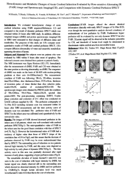


© Copyright 2026