ABC
docz
Explore
Log in
Create new account
Download
Report
business and industrial
Landing Pages How to Turn Traffic into Money
How to Adjust Marketo Landing Page Lengths
Come, Thou Fount [E] E E/G#
499 Come, Thou Fount of Every Blessing A G
4 536 Awake, My Soul, and with the Sun A
4 236 Creator Spirit, by Whose Aid G
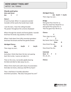
How Great Thou Art Hymn Sheet with Chords
How to prepare and deliver a presentation Roberto Cipolla Department of Engineering
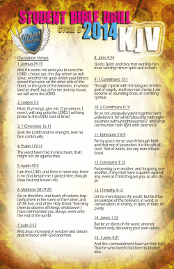
Student Bible Drill Cycle 6 2014 KJV Study Guide
Document 48066
HOW GREAT THOU ART Chords and Lyrics:
Document 131707
Learn How to Create gURL Campaigns, Landing Pages and Web-to-Lead Forms
© Copyright 2026
About abcdocz
DMCA / GDPR
Report

![Come, Thou Fount [E] E E/G#](http://cdn1.abcdocz.com/store/data/000132973_1-98b97f355f2485cfa1dce7ecc295b0f3-250x500.png)