
How to get personas to conform A Master’s thesis by Anders Ryman
A Master’s thesis How to get personas to conform – A case study of design method compatibility by Anders Ryman LIU-KOGVET-D--02/12--SE The Cognitive Science Program – Interaction Design Department of Computer and Information Science Linköping University, Sweden in collaboration with EssNet AB in Stockholm, Sweden 1 2 SAMMANFATTNING Denna magisteruppsats bygger på ett designfall och avser utforska möjligheten att kombinera tre olika metoder i designprocessen: kontextuell undersökning (contextual inquiry) under förstudiefasen, skapandet av personas för att vägleda själva designen och kooperativ utvärdering (cooperative evaluation) för att testa prototypen. Metoderna användes inom ett designprojekt utställt av EssNet AB i Stockholm, ett internationellt företag i spelbranschen, åt vilka en prototyp för ett pekskärmsgränssnitt togs fram. Den kontextuella undersökningen bestod av besök hos fyra olika spelombud, där arbetssituationen och den nuvarande användningen av datasystem för spelregistrering studerades. Resultaten från undersökningen utgjorde grund för skapandet av två personas, en primär och en sekundär. Dessa personas vägledde sedan designen av både Lo-Fi- och HiFi-prototyperna. Designidéerna i Lo-Fi-prototypen utvärderades i flera diskussionssessioner och Hi-Fi-prototypen testades slutligen av sex deltagare genom kooperativ utvärdering. Slutsatserna som dragits från studien är att man, trots att de tre metoderna är kompatibla, ändå måste göra ett s k kreativt språng från de data som insamlats i den kontextuella undersökningen till skapandet av personas. Det är också av stor vikt att deltagarna i den kooperativa utvärderingen till viss del liknar de personas som använts för att kunna försäkra sig om dessas validitet. 3 4 ABSTRACT This master’s thesis is built around a design case and aims to explore the possibility of combining three methods in the design process: contextual inquiry in the pre-study phase, the creation of personas to guide the design, and cooperative evaluation to test the prototype. The methods were used in a design project proposed by EssNet AB in Stockholm, an international company in the gaming business, for whom a prototype for their touchscreen interface was developed. The contextual inquiry consisted in visits to four different vendors, where the work situation and the current use of computer systems for game registration were studied. The results from the inquiry lay ground for the creation of two personas, one primary and one secondary. These personas then guided the design of both Lo-Fi and Hi-Fi prototypes. The design ideas of the Lo-Fi design phase were evaluated in several discussion sessions and the Hi-Fi prototype was finally tested by six participants, using the cooperative evaluation method. The conclusion drawn from the study is that although the three methods are indeed compatible, there is still a creative leap to make between the data gathered in the contextual inquiry and the creation of the personas. It is also of importance that the participants in the cooperative evaluation match the personas to some degree in order to confirm the personas’ validity. 5 6 ACKNOWLEDGEMENTS A number of people made this study possible by contributing in different ways, both professionally and personally: Mattias Arvola, University of Linköping – for supporting me with guidance on theoretical and practical issues as well as on focus and delimitations of the study. Håkan Markör, EssNet AB – for being my support and guide at EssNet, providing me with the necessities required for this study and making me feel welcome at the office. Friends and family – for just existing. You know who you are. Respect. Stockholm 2000 Anders Ryman 7 8 TABLE OF CONTENTS 1. INTRODUCTION................................................................................................... 11 1.1 1.2 1.3 1.4 2. AIMS OF THE STUDY AND RESEARCH QUESTION ................................................. 11 RESEARCH SETTING ........................................................................................... 11 DELIMITATIONS ................................................................................................. 12 THESIS OVERVIEW .............................................................................................. 12 THEORETICAL BACKGROUND AND TECHNOLOGICAL FRAME........ 13 2.1 TOUCHSCREENS ................................................................................................. 13 2.1.1 General description .................................................................................. 13 2.1.2 Different technical solutions ..................................................................... 14 2.1.3 Studies on touchscreen interfaces............................................................. 14 2.1.4 Applications .............................................................................................. 17 2.1.5 Touchscreen used in this study ................................................................. 17 2.2 USABILITY AND QUALITY IN USE ........................................................................ 17 2.3 METHODOLOGY ................................................................................................. 18 2.3.1 Interpretative case studies ........................................................................ 19 2.4 METHODS FOR INQUIRY AND DESIGN ................................................................. 21 2.4.1 Contextual inquiry .................................................................................... 21 2.4.2 Cooperative evaluation............................................................................. 22 2.4.3 Heuristic Evaluation ................................................................................. 23 2.5 PERSONAS .......................................................................................................... 24 2.5.1 Creating personas..................................................................................... 24 2.5.2 Primary and secondary personas ............................................................. 25 2.5.3 Designing for personas ............................................................................. 25 3. THE DESIGN PROCESS – PRESTUDY............................................................. 26 3.1 CONTEXTUAL INQUIRY ...................................................................................... 26 3.2 CREATING PERSONAS ......................................................................................... 27 3.3 HEURISTIC EVALUATION.................................................................................... 27 3.4 RESULTS ............................................................................................................ 27 3.4.1 Contextual Inquiry .................................................................................... 28 3.4.2 Personas.................................................................................................... 29 3.4.3 Heuristic Evaluation ................................................................................. 30 4. THE DESIGN PROCESS – LO-FI ....................................................................... 32 4.1 LO-FI ................................................................................................................. 32 4.2 PROTOTYPE TESTING .......................................................................................... 33 4.2.1 Design discussion sessions ....................................................................... 34 4.3 RESULTS ............................................................................................................ 35 5. THE DESIGN PROCESS – HI-FI ........................................................................ 38 5.1 5.2 HI-FI .................................................................................................................. 38 COOPERATIVE EVALUATION ............................................................................... 39 9 5.3 6. RESULTS ............................................................................................................ 40 DISCUSSION & CONCLUSIONS ....................................................................... 46 6.1 THE DESIGN PROCESS – PRESTUDY ..................................................................... 46 6.1.1 Contextual inquiry .................................................................................... 46 6.1.2 Heuristic evaluation.................................................................................. 47 6.2 THE DESIGN PROCESS – LO-FI ............................................................................ 47 6.2.1 Design discussions .................................................................................... 48 6.3 THE DESIGN PROCESS – HI-FI ............................................................................. 48 6.3.1 Cooperative evaluation............................................................................. 48 6.4 GENERAL DISCUSSION ........................................................................................ 49 6.5 VALIDITY OF THE STUDY .................................................................................... 50 6.6 FUTURE STUDIES ................................................................................................ 52 7. REFERENCES........................................................................................................ 54 10 How to get personas to conform – a case study of design method compatibility 1. INTRODUCTION Throughout the years, the advocates of the need of usability work as a natural part of the system development cycle have always insisted that the users are the most important party. Regardless of what methods they have developed, they have emphasized that you should collaborate with the intended user and put their wishes and needs in the front seat and design to make them satisfied. That’s why I found the idea of personas so fascinating. To some extent, Cooper’s (1999) persona method takes the user “out of the loop” for most of the design phase. This almost obstinate conflict with the common opinion of the user as the center around which the whole design circles, made the idea feel fresh and interesting. In his book “The inmates are running the asylum”, Cooper doesn’t speak that much about the work before and after the persona-centered design phase, only that interviews preceded the design phase and led up to the personas. He says nothing about the work after the design phase. This omission of facts raised a number of questions about how the method works in combination with other, more “user-friendly” methods. The choice of methods to combine with the persona method was made to create a quite clear contrast between the methods. Contextual inquiry (Beyer & Holtzblatt 1993) is definitely not “user-hostile”; the researcher or, as in this case, the designer totally submits himself to the intended user, in the user’s own territory, and take on the role of the apprentice, with the user as his master. Also the evaluation method used in this study, Cooperative evaluation, is to some extent designed to put the user in charge, with thinkaloud protocols and open questions. 1.1 Aims of the study and Research question The aims of this study is primarily to examine how the persona method works in a real design project, and also to see whether contextual inquiry can be used as a prestudy method to gather information about the users, leading to the creation of the personas. Since Cooper doesn’t give any information about what should precede and what should succeed the persona-centered design phase, this study can serve to give other designers suggestions and recommendations on what to think of, beware of, and avoid when using the persona method. The research question for this thesis is the following: How does the Persona method work as a design support and how, if at all, can the Persona method be combined with a prestudy including Contextual inquiry and an evaluation phase including Cooperative evaluation? 1.2 Research setting The best way to test the combination of methods and to seek an answer to the research question is of course to run a design project in real life, so to speak; with a real application from a real company, and with a real target group of users. For this study, this was made possible by EssNet AB in Stockholm, who were in the middle of designing a new product for their customers. This does also mean that their needs had to be considered and met, as well as the needs of my own for making the study interesting and giving for others. 11 How to get personas to conform – a case study of design method compatibility EssNet AB provides a wide range of lottery and gaming products for the gaming industry, including training, implementation, operation, design of new games, support, maintenance and consulting. They provide a complete solution for the customer, from the databases at the bottom to the terminal and user interface at the top. For the latest of their products, the E6 solution, a touchscreen terminal is used, and with that a design for the interface was requested. EssNet AB is a multinational company with offices in Stockholm, Hamburg, Estoril, Budapest, and Riga. Their customers are located all around the world, including Germany, Australia, Israel, Netherlands, and Argentina. 1.3 Delimitations In every research project, in order to be able to focus on certain aspects of a problem, one must delimit the research scope in some way. To approach a problem with the intention of covering all aspects of it is simply not possible. For this thesis, as often, time is the biggest reason for the limited research scope. In this part, the two major delimitations made are presented: ergonomics, and prestudy and prototype evaluation participants. The effect of these delimitations will be discussed in the final chapter. This design case is restricted to what the user sees on the screen and how he or she interacts with the application presented there. It does not take the ergonomic issues with touchscreen applications into account as much as would be preferable when examining the work situation for this context. Although important, the ergonomic issues does not really change the constraints for the designer, more than the risk of arm fatigue issues, which is included in the thesis. Since EssNet AB doesn’t have their customers in Sweden, it was impossible to conduct the Contextual inquiry with the “really real” users. Instead, the prestudy was performed with Swedish informants using a system from an other company. For the prototype testing, the participants wasn’t in the gaming industry, and they weren’t picked exclusively to match the personas created. This was due to the limited time, and the reluctance from the participants in the Contextual inquiry to participate in further studies. 1.4 Thesis overview Since this thesis covers the process of designing a user interface for the EssNet AB E6 coupon reader touchscreen, it will not follow a standardized style (e.g. APA). Instead, in order to make it easy for the reader to follow the line of work, the results will be presented in chronological order. This thesis is a 20 points master’s thesis at the Cognitive Science program at Linköping university, Sweden. The primary target group includes student at the program, researchers in the usability field, people working professionally with usability. The target group assumedly has similar background knowledge as the writer in the field of usability and design. The thesis is also written to give interesting views on design and usability to the company which gave the design assignment, EssNet AB. 12 How to get personas to conform – a case study of design method compatibility 2. THEORETICAL BACKGROUND AND TECHNOLOGICAL FRAME In this chapter, a theoretical foundation is laid to the thesis. It covers the touchscreen technology, along with studies made on touchscreens, a summary of the usability and quality-in-use concepts, a description of the qualitative methods used in the study, and finally a description of the main concept studied: personas. 2.1 Touchscreens In this first section of the theoretical background, the touchscreen technology will be presented. It includes a general description of the technology, an overview of different technical solutions, an assortment of studies made on touchscreens, examples of touchscreen applications, and finally a description of the touchscreen used in this study. 2.1.1 General description A touchscreen is basically a device that produces an input signal when a touch or movement of the finger on the display is registered (Greenstein & Arnaut 1988). The idea of touching the screen for input instead of using other devices (e.g. a mouse) has both advantages and disadvantages. The most important of the advantages is that the technique is easy to learn and easy to operate. The pointing gesture is natural and basically no training is needed to become quite skilled at target selection. Since the input device is also the output device, there is direct eyehand coordination and a clear and direct relationship between the user’s input and the displayed output. Further, all valid input are, and must be, shown on the screen. The user is hereby relieved of the memorization of commands (ibid.). Shneiderman (1990, 1991) adds to list of advantages that the touchscreen eliminates the extra workspace required with a mouse or some other pointing device. He also emphasizes that touching the touchscreen requires little thinking and is a form of direct manipulation that is easy to learn. It is also the fastest pointing device. As for the disadvantages, Greenstein & Arnaut (1988) puts forth some ergonomic issues. First, the user of the touchscreen loses his mobility since he has to be within an arm’s reach of the display in order to touch it. The continuously lifting and lowering of the arm can cause fatigue. Further, aside from the ergonomic issues, the user may obscure the screen with his finger or arm while touching it, and regardless of the touchscreen resolution, the target selection resolution is limited by the size of the finger. This, however, is not an unsolvable problem. By altering the input registration method in the software, the user can perform as precise operations with a touchscreen as with a mouse. This technique, called “lift-off strategy” will be further discussed in the “Studies on touchscreen interfaces” section below. Shneiderman (1990, 1991) also adds that reduction in image brightness can occur and that touchscreen are more expensive than other devices. 13 How to get personas to conform – a case study of design method compatibility 2.1.2 Different technical solutions1 In order to register the user’s touches on the screen, there are two fundamental principles; either an overlay is contacted or beams projected across the screen are interrupted. Conductive, capacitive, and cross-wire touchscreens fall into the overlay category. The conductive touchscreen has two conductive layers, each containing a grid of electrodes in both the X and Y directions. When the user applies pressure on the layers by touching the screen, the two layers make contact and a circuit is completed. The second solution, the capacitive touchscreen, uses a conductive film on the back of a glass overlay. When the user touches the screen, the body’s capacitance causes an electric signal to be generated at the location of the touch. The third and less common solution, the cross-wire touchscreen, uses a grid of wires placed both horizontal and vertical in transparent sheet over the display. A voltage is applied to either the horizontal or the vertical wires and when touched, two of the wires make contact, producing a signal. Solutions that use projected beams across the screen include acoustic and infrared touchscreens. In an acoustic touchscreen, a glass plate is placed over the screen with transducers along the edges. The transducers generate ultrasonic waves on the glass and when the user touches the glass, the waveform is interrupted and the location of the touch is registered by the transducers. Since the transducers work as both emitters and detectors, there is a short delay between the touch and the registration. Finally, the infrared touchscreen uses pairs of light emitting diodes and light detectors along the edges of the screen. When the user touches the screen, two light beams are interrupted, allowing the location to be registered. The conductive touchscreen tend to have the highest touch resolution, which make them suitable for high detail applications. The conductive layers are made of plastics though, which may be scratched quite easily. This is also a problem with the acoustic touchscreen’s glass plate. Dirt and scratches can, besides obscuring the screen, falsely activate the screen. This is an important issue to consider when the touchscreen is supposed to be placed in a public (and hence dirty) environment. As for damage resistance, the capacitive and infrared touchscreens tends to be the best. Another problem with touchscreens is that since the touch surface is slightly above the target, especially when an overlay is used. This can cause the user to miss the target. The problem (called parallax) is most prominent with infrared touchscreens used with curved CRT displays, especially at the edges of the screen. 2.1.3 Studies on touchscreen interfaces The studies presented in this section are far from covering all the work that has been done on exploring the possibilities and constraints of touchscreens. Here, only a selection of studies judged to be relevant to the specific design case of this thesis. For instance, studies made on the possibility of panning windows or dragging objects around on the screen are completely left out. The studies included and the results of them were revisited and considered throughout the process as a support in designing the prototypes. 1 Whole section referred from Greenstein & Arnaut (1988). 14 How to get personas to conform – a case study of design method compatibility Up until around 1992, a number of studies on touchscreens was done, most prominent were the studies by Shneiderman, Plaisant, and Sears. After 1992, these people dropped the touchscreen research, since several successful systems had found their way into museums or cash machines (Plaisant 1999). The majority of the studies performed are comparing the touchscreen with other input devices, measuring speed, error rates, and other performance issues. For the interface design in this study, the question was not “to touch or not to touch?”, why the studies concerning touchscreen performance are left out. Instead, some important research on touchscreen design issues will be presented. The studies reviewed are concerned with touchscreen strategies (Potter et al. 1988), monitor positioning (Sears 1991), and button or keyboard size (Sears & Shneiderman 1989, Sears 1991, Sears et al. 1992). TOUCHSCREEN INPUT STRATEGIES The first touchscreen design issue concerns different touchscreen input strategies. Potter et al. (1988) conducted a study comparing the speed, accuracy, and user satisfaction of three different touchscreen strategies. When touchscreens first arrived on the scene, the input technique was something called “land-on”. This means that the screen registers the initial touching for selection. If there is a selectable item under the initial touch then it is selected, otherwise nothing happens. Until the finger is lifted off the screen, all further contact is ignored. This obviously forces the user to be precise in his touching of the screen, and the result is a high error rate. The land-on strategy was the first of the three strategies tested. The second strategy is called “first-contact”. This strategy works basically the same as landon, but instead of just registering the initial touch regardless of whether the area is selectable or not, it takes advantage of the continuous stream of touch data available in technologies such as the capacitive touchscreen. The user can touch the screen and then adjust the finger onto a selectable area. The first selectable area the user makes contact with gets selected. The third strategy is the “take-off” strategy. In addition to the use of the continuous stream of touch data, the user is provided with a cursor, placed slightly above the finger. The cursor appears when initial contact is made and the user can drag the cursor around the screen for as long as he wants. As long as there is contact with the screen, no selection will be made. First when the finger is lifted off the screen, the current position is registered and the selection, if the position is in a selectable area, a selection is made. The results showed that although the first-contact strategy was significantly faster than the take-off strategy, the error rate for the take-off strategy was significantly lower than both the land-on and first-contact strategies. As for the user satisfaction, the take-off strategy was judged significantly higher than the land-on strategy but not the first-contact. The subjects used the possibility to drag the cursor in the take-off strategy differently. Some subjects waited until they had found the target on the screen and then placed their finger onto or close to the target and then made small adjustments, as would they with the first-contact strategy. Other subjects immediately placed their finger on the screen and dragged the cursor around, using their finger as a search aid. The authors concluded that although there were applications that wouldn’t benefit that much from a take-off strategy, this one is to prefer, especially when the number of items increases and their size decreases. 15 How to get personas to conform – a case study of design method compatibility MONITOR POSITION A study evaluating possible monitor positions (among other things) was conducted by Sears (1991). Three positions: 30, 45, and 75 degrees from horizontal was tested. The users’ preferences and feelings of fatigue were identified. All ten subjects used all three screen angles and were asked to touch seventy small targets twice. No time or accuracy demands were put on the subjects. The purpose was just to have the subjects perform an extended task. The results showed that when the touchscreen was mounted at 75 degrees, it received the lowest preference ranking and was considered the most fatiguing. No other significant differences were found, although the 30 degree mounting received more positive reactions and higher rankings on average than the 45 degree mounting. The conclusion drawn from this study was that the standard monitor position is sub-optimal when using a touchscreen. It results in more fatigue and is (possibly therefore) not as preferred. TARGET SIZE To make a touchscreen application smooth and enjoyable to use, it is of great importance that the user’s touches are registered and interpreted correctly. Here, three studies examining how the size of the targets affects the performance are presented. Although science has improved the touchscreen sensitivity since the early nineties, the recommendations made are of some interest. The first study, conducted by Sears & Shneiderman (1989), compared three target selection strategies: mouse, touchscreen, and touchscreen with a stabilization (software that filters and smoothes raw data from the hardware). The subjects’ task was to select rectangular targets 1, 4, 16, and 32 pixels per side (0.4x0.6, 1.7x2.2, 6.9x9.0, and 13.8x17.9 mm respectively). The results showed no difference in performance or preference between the stabilized touchscreen and the mouse for the 4, 16, and 32 pixel targets. The touchscreen was also faster than the mouse. This implies that it is fully possible to have targets as small as 4 pixels in touchscreen applications. Of course, this is quite small, and for other reasons than accuracy (such as visibility), a larger target is to prefer. The authors also proposes that the designer should make the area around the target selectable as well as the actual target, for better accuracy. The second study (Sears 1991), was conducted in order to determine the minimum key size for touchscreen applications by measuring the distance between the touch location desired and the location actually touched. This was the second phase of a three-phase study (the first phase, concerning monitor position, is referred to above). Fourteen subjects were asked to touch seventy small (1.65 mm square) targets as accurate as possible. The distance between the center of the targets and the actual touch position was recorded. The results showed that there was a bias down- and leftwards. By shifting the touchable region for the target by the appropriate biases (different for different parts of the screen, for instance greater bias at the top of the screen than at the bottom), the researchers found that a target size of 2.27 cm per side is possible. This would still maintain the error rate at less than 1%. The third and final study (Sears et al. 1992) examined how typing speed was affected by the size of the keyboard on the screen. Four keyboard sizes, with keys measuring 2.27, 1.14, 0.76, and 0.57 cm per side, were used. The subjects were asked to type a number of strings 16 How to get personas to conform – a case study of design method compatibility and the time for completion, error rate and preference were measured. The subjects were divided into novices and experienced. The results showed that the keyboard with 2.27 cm keys was significantly faster than the other sizes for both novices and experienced. For the error rate, two categories of errors were used: corrected and uncorrected. For novice subjects, the keyboard size had an effect on the corrected errors but not on uncorrected errors. For the experienced subjects, no effects were found for corrected errors and the lack of uncorrected errors in this group prevented a statistical comparison. As for the subject preference, the large keyboard (2.27 cm) was judged the easiest to type on, while the medium keyboard (1.14 cm) was rated the nicest in appearance. The large and medium sized keyboards were rated equally highest for overall performance. The researchers concluded from this that although both performance and preference increased as the keyboard became larger, even the extra small keyboard could be used for limited data entry in applications with severely limited screen space. 2.1.4 Applications As stated before, the touchscreen’s prime advantages are simplicity, speed, and durability (Shneiderman 1990). This makes this technology attractive in both public areas such as information kiosks, ticket booking machines, and banking terminals, high workload situations such as air traffic control, car driving, or, as is the case in this study, for vendors in the gaming business. Other environments where the touchscreen’s directness can come in handy are in the household with home automation, learning environments, and in applications with limited data entry, where most of the information can be fit onto the screen. 2.1.5 Touchscreen used in this study In this study, a 12” Sanyo LMU-TK12ATC capacitive touchscreen was used. The resolution was 800x600 pixels with 16.19 million colors and the MicroTouch software was used for the touch registration. The capacitive touchscreen is suitable for the intended application use environment: a (more or less) public area with high use frequency by several different operators. 2.2 Usability and quality in use A central concept in human-computer interaction is that of usability. Several definitions has been given throughout the years, with most of them focusing on user performance with the system. For instance, Nielsen (1993A) lists five attributes of usability: learnability, efficiency, memorability, errors, and satisfaction. As for learnability, the system should be easy to learn in order to let the user get some work done with it quickly. The system should enable a high level of productivity, once the user has learned it. This is efficiency. As for memorability, the system should be easy to remember how to use the system, so that the occasional user easily get into it after being away from it for some time, without having to learn everything over again. The system should have a low error rate, and recovery from errors made should be easy. No catastrophic error should occur. Finally, satisfaction simply means that the user 17 How to get personas to conform – a case study of design method compatibility likes working with the system. With his definition, Nielsen says that the usability of a system is an issue of whether the user can handle the functionality of the system, hence if the system doesn’t offer relevant functionality to the user but is easy to use, it still has good usability. A similar definition of usability is found in Preece (1994, p.722): “a measure of the ease with which a system can be learned or used, its safety, effectiveness and efficiency, and the attitude of its users towards it.”. The focus is on performance here too. Löwgren (1993) proposes a slightly broader definition of the term usability. He states that usability is a result of relevance, efficiency, attitude, and learnability – REAL. The three latter are similar to Nielsen’s’ attributes, but the first one, relevance, takes the focus off performance and measures how well a system serves the users’ needs. To further change the focus from the artifacts themselves to the use of the artifacts, the idea of quality-in-use was developed. In the ISO/IEC 14598-1 standard (Software product evaluation – General guide (from Bevan 1997)), quality-in-use is defined: “quality in use: the extent to which a product used by specified users meets their needs to achieve specified goals with effectiveness, productivity and satisfaction in a specified context of use.”. Ehn & Löwgren (1997) changes the focus further with their three quality perspectives for measuring quality-in-use: structural qualities, functional or ethical qualities, and formal or aesthetical qualities (p. 309): “The structure of a system is its material or medial aspects […] The functional aspects of a system concern its actual, contextual purpose and use. […] the form of a system expresses the experience of using the system.” Löwgren & Stolterman (1998), modifies this model, using four quality perspectives: structural, functional, ethical, and aesthetical. The structural quality denotes the construction of an IT artifact, the functional quality denotes how the system works for specified users in a specified use context, the ethical quality denotes the wider effects of the use or misuse of the system, and the aesthetical quality denotes the aesthetical experience of the system. The qualities are not separable, but should be used as different views of the whole system, e.g. the structure of a system shouldn’t only be considered from a structural quality perspective, but from all four quality perspectives. Since the system in this study is aimed to help users in their everyday work situation, focus is mainly on performance. Still, the four perspectives included in the Löwgren & Stolterman model are crucial and applicable. In addition, the personas created makes the perspectives somewhat easier to use. You have a clearer target group defined and this makes the focus more clear. Of course, this presupposes that the personas are valid. The fact that there is no new functionality in the new system, the important thing to look into is what impact the new interaction technique, touchscreen, has on the work situation. This is where the pre-study plays an important part. 2.3 Methodology This thesis is built around a design case, which aims to illustrate the possibilities and constraints of combining a set of methods. Conclusions of my own were drawn and are presented in the thesis, but in addition to these, other designers will also have a detailed picture to analyze from their perspective and draw conclusions from. Hopefully, it will also raise new questions concerning methodology issues, and encourage further studies in this field to be made. 18 How to get personas to conform – a case study of design method compatibility The first step in the process is to get a good picture of the target group, and their work situation. One way of doing this is to go out in the field and observe. In this study, the contextual inquiry method was used. The key elements of contextual inquiry will be presented in the next section. First though, in this section, seven principles for conducting and evaluating interpretative studies, as proposed by Klein & Myers (1999) will be covered 2.3.1 Interpretative case studies In order to provide an aid for assessing the quality of interpretive field research in information systems, and also to guide researchers in this field, Klein and Myers (1999) has put together a set of principles by which researchers can conduct studies and evaluate the outcome. The set consists of seven principles which are all interdependent of each other. In this section, the principles are presented, along with the authors suggestions on using them and finally an overview of how the use of the principles were intended for this study. THE PRINCIPLES 1. The fundamental principle of the hermeneutic circle The first principle is foundational to all interpretive work of hermeneutic nature and the other principles has their origin in this principle. The fundamental principle of the hermeneutic circle suggests that all human understanding is achieved by iteration between considering the meaning of the parts and the whole that they form. The complex whole can be understood by understanding the parts and their interrelationships, and reverse too. 2. The principle of contextualization The principle of contextualization suggests that is necessary that the researcher critically reflects the social and historical background of the research setting. In an interpretivist’s opinion, no organization is static and the relationships between people, organizations and technology are changing all the time. By putting the subject matter into context, the reader is given a possibility to understand how the current situation has emerged. Every object studied is treated as a unique historical occurrence. This does not mean, however, that no generalization of the situation is possible, more about this under principle 4. By conducting a field study, the researcher weaves himself into the history (or future rather) of the organization. This should be considered and reflected upon in the study. 3. The principle of interaction between the researcher(s) and the subjects The principle of interaction requires that the researcher reflects on how the subjects’ behavior is affected by the researcher. By interacting with the participants in a field study, they inevitably change their behavior in some way, since the natural setting doesn’t include a researcher. They can be seen as interpreters and analysts, just like the researcher. They are interpreters as they change their horizons according to the information given by the researcher, i.e. what the study is about, and analysts as their actions are changed by their new horizons. 4. The principle of abstraction and generalization Theory plays a crucial role in interpretive research. By relating the details found in the study to very abstract categories, the unique instances can be related to an idea or concept and 19 How to get personas to conform – a case study of design method compatibility then applied to different situations. Theory provides these categories, and serve as a guide to how to view the world. Klein and Myers emphasizes that researcher must carefully relate the theoretical abstractions and generalizations to the details of the field study as experienced by the researcher in order to give a clear view of how the theoretical insights were arrived at. 5. The principle of dialogical reasoning A person enters each situation with a set of preconceptions which guide their way of looking at and acting in the situation. For the researcher these preconceptions, grounded in theory, guide the original research design. These preconceptions can turn out be wrong though. The principle of dialogical reasoning requires that the researcher is sensitive about any contradictions between his theoretical background and the actual findings of the study, i.e. revising his preconceptions. 6. The principle of multiple interpretations Since field studies are relatively open in their nature, the researcher is bound to receive a number of different interpretations from his participants. The principle of multiple interpretations requires the researcher to not only take the different interpretations into consideration, but also search for the reasons behind them, in order to refine his understanding. This refinement is similar to the evaluation of the researcher’s preconceptions, except that the confrontation is not between the researcher’s preconceptions and the data, but between the different interpretations of the participants. The outcome could be the same though – a revision of the preconceptions. If no conflicting interpretations can be found, the study should reflect over this fact, and try to explain how this situation has emerged. 7. The principle of suspicion The last of the principles, the principle of suspicion requires that the researcher is sensitive to the possible biases that can have been distorting the participants’ narratives and thereby leading the research somewhat astray from the true situation. The researcher should not just collect data from the participants but also see beyond the words and actions of the participants. This can include power structures, vested interests and limited resources, all of which constrain and/or directs a person’s actions. The authors further points out that these principles should not be used as a checklist. Rather, the researcher should use his experience and judgment to decide which principles are applicable to the specific study. All the principle are quite closely linked though, and shouldn’t be used or not used arbitrarily. As an example of the principles’ interdependence, when a researcher decides on what context or contexts should be explored and studied (principle 2), this decision is depending upon how the researcher interferes with the context by interacting with the participants (principle 3), what theory the researcher uses for abstraction and generalization (principle 4), the researcher’s own intellectual history (principle 5), the possibility of different interpretations of the world by the participants (principle 6), and the risk of the researcher being misled by some underling structures which must be critically questioned (principle 7). The intended audience of the study should guide the researcher to what to document and report of. The advantage with a set of principles like the one above is, as with all formalizations of or guidelines for work, that it (hopefully) increases the quality of the outcome, as it allows the researcher to focus on what he or she really wants to achieve. 20 How to get personas to conform – a case study of design method compatibility As you will see in the next section, the definition of contextual inquiry covers most of these principles, so by following the steps included in the method definition, the quality of the outcome is likely to be good. 2.4 Methods for inquiry and design In this section, the different qualitative methods used in this study are described. The qualitative methods covered are contextual inquiry, cooperative evaluation, and heuristic evaluation. 2.4.1 Contextual inquiry Monk et al. (1993) divides the typical system development into three deliverables: requirements, specification, and implementation. In the requirements phase, you gather information about what is it to achieve; who are the users and what are their work situation, what functionality should be included and so on. The specification phase deals with system architecture, human-computer dialogue, detailed functionality etcetera. The final phase, the implementation phase is where the system is actually built, according to the specification. Contextual inquiry, as described by Beyer and Holtzblatt (1998), is one way of getting to know the users and their work situation, and is naturally performed during the requirements phase. The idea is simple: go where the customer works, observe the customer as he or she works, and talk to the customer about the work. The foundation upon which contextual inquiry is built is the master/apprentice model, which has been used in craftsmanship through history. A master teaches the novice the craft by doing the work and talking about it while working. Although the model isn’t that common anymore, it can still be easily adopted by people. Beyer and Holtzblatt claims that this is the common way of learning new things in everyday life; you watch someone who is good at particular task or action. The original model aims to teach the apprentice how to do the work himself. This is not the point with contextual inquiry though. Instead, the apprentice here is learning about the work in order to support with technology. Beyer and Holtzblatt lifts forward four principles to guide the modification of the model to suit the designer’s needs and situation. These principles are the following: context, partnership, interpretation, and focus. The context principle tells the designer to go to the workplace of the user and there see how the work unfolds. By doing this, instead of a traditional, out-of-context interview, the designer is able to get an ongoing experience instead of a summary experience. Being in the relevant context also provides concrete data instead of abstract data. Out-of-context, the user will leave out details about the work that could be crucial in order to understand the work situation. This principle is closely connected to the second principle of Klein and Myers’: the principle of contextualization. The partnership principle, which is comparable to the Klein and Myers third principle: the principle of interaction, tells the designer to try to create an equal relationship with the user. In the master/apprentice model, the power is to a large extent on the master’s side. The master tells the apprentice whatever is important to know, and no more. In a traditional interview situation, the roles are reversed. The interviewer asks questions about what he or 21 How to get personas to conform – a case study of design method compatibility she wants to know, and nothing else. In contextual inquiry, ideally, there is an alternating between watching and probing. The user do his or her work with the designer observing, looking for structure and patterns in the work, and trying to find the reasons behind the user’s actions. When something is unclear to the interviewer, he or she interrupts the work and discusses what just happened with the user. It is crucial to the success of the contextual inquiry that the power doesn’t tilt over to one or the other parties, creating an interviewer/interviewee, expert/novice (with the designer as expert), or guest/host relationship. The interpretation principle tells the designer to be careful with his or her interpretation of the work structure. It is the interpretation of the facts that leads to design ideas later on, not the facts themselves. By constantly being attentive to how the user reacts to the designer’s interpretations during the contextual inquiry, the designer can ensure that his or her interpretations are true, from the user’s view. This springs from having the right relationship with the user. This principle is linked to the sixth principle of Klein and Myers’: the principle of multiple interpretations. It is also related to the seventh principle: the principle of suspicion. Finally, the focus principle tells the designer to consider what is important to learn in the contextual inquiry. With a clear focus, the designer can keep the conversation on the important topics and lead the user back on track without taking control completely. With a clear focus, it is easier to decide what data is important to further elaborate on, and thereby, the designer gets more out of the interview. A clear focus helps the researcher to comply with the first of the Klein and Myers’ principles: the principle of the hermeneutic circle. The designer should not be reluctant to change his or her assumptions about the work situation though. Beyer and Holtzblatt emphasize that the attitude should be to challenge your assumptions, not validating them, just as is proposed in the fifth principle of Klein and Myers’: the principle of dialogical reasoning. A typical contextual inquiry lasts about two or three hours, starting with a conventional interview, where the user is given information about the technique and purpose of the study, and the user gives the interviewer an overview of the work situation and opinions on the tools used. Then there is a transition phase, where the relationship changes from an interviewer/interviewee relationship to a master/apprentice (with modifications) relationship. The rules of this new relationship are explained, the user will do his or her work while the designer watches, and the designer will interrupt and ask questions whenever something comes up, and the user is encouraged to talk about what he or she is doing. After this transition, the contextual interview proper, as Beyer and Holtzblatt call it, starts. The user and designer carry on as described above; the user is working while the designer is observing, asking questions, suggesting interpretations of behavior. This is the most important part of the contextual inquiry, the essence of it. At the end of the interview, the designer should summarize his or her data and interpretations, and present it to the user, who will have a chance to correct and elaborate on the designer’s understanding. 2.4.2 Cooperative evaluation Cooperative evaluation, as described by Monk et al. (1993), is a technique for identifying problem with the requirements or the specification. The cooperative evaluation takes place during the specification phase and lets the intended users give their view on a more or less 22 How to get personas to conform – a case study of design method compatibility functional prototype. It is important that the evaluation is done before the implementation phase, where changes to the system and money- and time-consuming. The characteristics of cooperative evaluation are the following: Representative users work through representative tasks given by the designer or test leader. The users work with a prototype or simulation. The users are encouraged to think aloud and ask questions while working with the tasks. The designer similarly asks the user questions. The user is allowed to make mistakes; the users’ questions and thoughts allows the designer to elicit information about potential usability problems. The designer is attentive to unexpected behavior and comments from the user and these are viewed as symptoms of potential usability problems. The advantages with this technique are that is cheap and easy to perform. By restraining the user’s actions to the tasks, the prototype can be quite simple, but since the user interacts freely with it and continuously makes comments and tells the designer what he or she thinks, a great amount of potential usability problems can be detected. It is also easy to separate the trivial difficulties from the important ones, by discussing the problem with the user directly. 2.4.3 Heuristic Evaluation Heuristic evaluation is a cheap and fast technique for identifying usability problems early in the system development. The term was coined by Nielsen and Molich (1990), and basically means that the evaluator looks at the interface, trying to come up with an opinion of what is good and bad about it. To guide this opinion-building, the evaluator has a number of heuristics on what to look at and what to look for. The authors propose nine basic usability principles well suited for heuristic evaluation. The principles are the following: Simple and natural dialogue Speak the user’s language Minimize user memory load Be consistent Provide feedback Provide clearly marked exits Provide shortcuts Good error messages Prevent errors Of course, these are just to guide the evaluator; all problems identified may not fall into one of these categories and different principles could be more or less important in the system at hand. Further, the heuristic evaluation shouldn’t be the only evaluation of the system, since 23 How to get personas to conform – a case study of design method compatibility important aspects of usability is left out. For instance, no user is involved in the heuristic evaluation, and if the user’s needs or preferences are different from the designer’s or evaluator’s, severe usability problems may go by undetected. On the other hand, the authors point out the advantages of the technique as being cheap and intuitive. It is easy to motivate people to do it, it doesn’t require advance planning, and it can be used early in the development process. These characteristics makes it a good technique to use several times during the development, as a complement to more context-close evaluations which include the intended users. 2.5 Personas In user-centered system design, the classical usability goal is for the product to follow the heuristics defined by Nielsen (1992), or to be “easy to learn”, or “easy to use”. Easy for whom? Since it’s a user-centered design, the obvious answer to this question is “the user”. However, in many design cases, “the user” is a very vague approximation. The truth is that the intended users of a product often differ so much from each other that “the user” becomes an average of all different potential users, leaving the designer with a broad variety of needs, which are often in conflict with each other. Satisfying one need by extending the product with some feature gives all the other users functionality they don’t need nor want. As an alternative, Cooper (1999) proposes the idea of design for personas. The central point of this method is to extract a number of user archetypes, called personas, from studies of the current situation. After this, the users are out of the loop and the designer, or design team, designs the system exclusively for these personas, with only their needs to consider and satisfy. Cooper claims that it’s far better to make 50% of the population love your product than to make the whole population 50% happy. Ever better, he says, is to make 10% of the population ecstatic over the product. This designing for a single user is the effective way to satisfy a broad population. 2.5.1 Creating personas Based on the preceding study of the intended users and their situation, a number of personas are created. This is a creative and divergent activity. The cast of personas should cover most of the different kinds of potential users. All personas are named and given a full spectrum of characteristics, both personal and professional. Some characteristics can seem irrelevant for the design of the actual system, but serves to make the persona more alive. The more precise the description of the persona is, the less likely the designer is to fall back into a “user” perspective. If it is a design team that’s working on a product, it’s important that every member of the team gets to “know” the personas well. The personas should almost become an extra member of the team. The description of the personas are written down in the style of a short story, and are made available at all time during the design process. It’s important to make a clear distinction between the buyer and the user of the product, for instance if a company invests in a new time-reporting system, there’s probably an IT manager in charge of the investment, choosing between a number of similar products from different sellers. It’s not the IT manager, though, who is the typical user of the system. What the manager finds appealing may not be what the real users want or need. The same goes for companies hiring consultants for some work, e.g. Internet marketing or e-business. The 24 How to get personas to conform – a case study of design method compatibility people who are buying the product are definitely not the end users of it. The personas should reflect the user, not the buyer. 2.5.2 Primary and secondary personas After creating the cast of personas, it is time to converge the quite large and sprawling collection into a more handy group. One or more primary personas are picked, and their stories are further elaborated. Some of the early personas are discarded, or only kept as an example of someone you’re not designing for. The primary persona is someone whose needs must be satisfied by the design. If more than one primary persona is identified, Cooper urges for more than one interface to be designed. Each of the primary personas should have an own, tailor-made interface. The rest of the cast, the personas who hasn’t been promoted to be primary personas, remain in the background as secondary personas. These are not given as much thought in the design process as the primary personas, but consideration to their needs is taken as long as they don’t interfere with the needs of the primary personas. 2.5.3 Designing for personas In order to be able to design for the persona, it is critical that the designer tries to think and interact with the system, as his persona would do. Empathy is the keyword here. It is not enough just to think about what the persona needs, the designer has to step into the clothes of the persona and actually be the persona. During the whole design process, the created personas should be present, and the designer should at every design decision ask himself if the solution is in the best interest of the personas and if it is the most suitable solution for them. Further, Cooper (ibid.) pushes for a goal-directed design, rather than a task-directed design. While tasks usually change as technology changes over time, the goals of a user normally remains the same. A good example is the traveler whose goals are speed, comfort, and safety. The nineteenth century traveler makes the journey in the new, high-tech Conestoga wagon, and brings along his Winchester rifle for safety. The modern traveler can take a Boeing 777 for speed and comfort, and leaves his rifle at home for safety. The goals are the same, while the tasks are diametrically different. An even better example that can easily be transferred to computer system design is when the goal is to lie down in the hammock reading a paper, but first the lawn has to be mowed. The task is mowing, the goal is resting. If someone else can be persuaded to mow the lawn, the goal can be reached without having to do the mowing. Transferred to system design, if the computer can do some of the tasks for the user, his or her goals can be achieved effortless, or automatically. These tasks that can be performed by the computer would probably not have been noticed in a task-directed design, where these tasks would have been identified and to a greater extent would have been made possible for the user to perform. 25 How to get personas to conform – a case study of design method compatibility 3. THE DESIGN PROCESS – PRESTUDY In this, and in the following two chapters, the complete design process of this study is described. This chapter describes the prestudy, which included a contextual inquiry of the intended users’ work place and work situation, a heuristic evaluation of an existing prototype, and the creation of the personas used as design support. 3.1 Contextual Inquiry In order to get a good picture of how touchscreens are used and perceived as an artifact today, a contextual inquiry was conducted. The field study was aimed to examine touchscreens used in the gaming context only. Therefore, no other contexts (such as ticket booking) were studied. The procedures of the contextual inquiry are presented here. PARTICIPANTS The contextual inquiry was conducted in cooperation with four different vendors in Stockholm. All four were contracted by two Swedish gaming companies, of which one uses touchscreens. A number of vendors declined a visit for different reasons. Both time, space, and the fact that EssNet was seen as a competing company to whom the current system shouldn’t be shown. All in all, 13 of 17 vendors turned down a visit. PROCEDURE Each visit to the vendors lasted for approximately half a day. In order to make the participants comfortable with an external observer behind the counter, an introduction to what the study aimed at and to what was going to happen during the visit was given. After that, the participants were asked to tell something about themselves and their establishment – how much of their business was concerned with gaming and about their impression of touchscreens as a helping artifact in their work. The vendors were then left to carry out their usual work. The participants were encouraged to think aloud and make comments about their actions whilst carrying them out. The comments should be both descriptive and impressional. The whole visit was carried out in an informal manner, with observation and questioning done alternatingly. When a problem occurred, the vendor was asked to explain what the problem was, how he solved it, and how his impression of the problem was, i.e. whose fault was it, the vendor’s or the system’s, how did the system help to correct the error, and so forth. The observer/interviewer took to some extent the role of an apprentice, with the vendors as experts and teachers. No specific questions were framed prior to the session, though general issues were intended to be covered. These issues were the following: The vendors’ impression of touchscreens in general The vendors’ impression of the system in general 26 How to get personas to conform – a case study of design method compatibility The vendors’ impression of touchscreens in comparison to their impression of keyboard-based terminals Specific opinions on the systems’ ability to help the user in their work Notes were taken during the whole session and shown to the participants afterwards in order to make sure that the observations were valid and that a common understanding of the situation had been reached. 3.2 Creating personas Based on the findings in the contextual inquiry, two personas were created – one primary and one secondary. The creation of personas took about a day to complete and emphasis was laid on the personas’ experience with computer based systems in general and gaming systems in particular. Also, to make the personas come alive and to make it easier to step into the roles, additional information about them, such as personal background, motivation and interests, was made up. A brief description of the personas is presented in the results section of this chapter, with the full document located in appendix A. 3.3 Heuristic Evaluation A prototype of the system existed prior to the making of the prototypes of this thesis, including a Quick Tip and Game Edit for Lotto, a series of login screens, and some additional menus (e.g. ticket sales). A single person heuristic evaluation of this prototype was conducted in order to be able to avoid the mistakes of that prototype and also to save time by taking the good parts of that design and transfer them to the new. The heuristic evaluation was performed with a number of heuristics, all illuminating different aspects of interaction and usability. The heuristics used in this evaluation was the following: prevent errors, provide good error messages, provide shortcuts, provide clearly marked exits, provide feedback, be consistent, minimize user memory load, speak the users’ language, and use simple and natural dialogue. These heuristics were originally proposed by Nielsen (1992). As Nielsen (1993B) further suggests, the flow of the interface from screen to screen and the interaction in-between was also evaluated. All heuristics were applied with the created personas in mind. An overview of the usability problems noted and some comments about the most critical problems identified can be found the results section of this chapter. 3.4 Results In this section, the results or findings from the studies done in the prestudy phase are presented, starting with the contextual inquiry, then the personas created, and finally the results of the heuristic evaluation. 27 How to get personas to conform – a case study of design method compatibility 3.4.1 Contextual Inquiry During the four sessions in the field a number of aspects of the gaming industry and the vendors were examined. As listed in the procedure section, these aspects were: The vendors’ impression of touchscreens in general The vendors’ impression of the system in general The vendors’ impression of touchscreens in comparison to their impression of keyboard-based terminals Specific opinions on the systems’ ability to help the user in their work Generally, the vendors had included the touchscreen as a natural part of the daily work and had some difficulties talking abstractly about the system. Instead, the findings were achieved mainly by observing the vendors at work and by specific comments from the vendors. The vendors found the touchscreen a convenient means to fulfill their daily work. None of the vendors could see any major problems with the technology, at least not as far as performing the most common tasks, such as registering a customer’s bets or ordering tickets. The usual answer to the question “what’s your impression of the touchscreen as an aid in your work?” was “it’s practical and easy to use”, and none of the vendors could see any flaws with the system. The problem one vendor had encountered concerned the hardware, which sometimes caused problems when starting up or creating logs of the transactions for the current day. The observations didn’t find any major problems either with the touchscreen as an artifact. The flow of work was very smooth and although the touchscreen sometimes didn’t register a push, this didn’t interfere with or disturb the current task performed. None of the vendors complained about this, even when confronted with the problem. The system the vendors in this study used was the current system for horseracing betting, ticket booking, and purchasing. In the common case, a customer gives the vendor one or more coupons, which is inserted into a scanner and registered. When an error occurs, the customer or vendor can correct the coupon and scan it again. It is a quite stripped design with big buttons on the screen for the different areas of interest. It’s possible to register a game manually or purchase a pre-booked ticket, identified by a booking code. It uses quite a lot of abbreviations which the vendor is forced to learn by heart. The abbreviations are also available from a booklet kept near the machines. For the manual ticket booking, the vendor is forced to use another booklet with this month’s events. No information is included in the system and the vendor has to take the event code from the booklet, fill in a coupon, and run it through the scanner. This was something the vendors found quite irritating when questioned about it. Especially if no tickets were available at the requested time. In this case, the vendor had to fill in another coupon and run it through the scanner. No other options were made available by the system. At one time during the sessions, a vendor had to fill in a total of five coupon before finding available tickets. The interesting about this problem is that no vendor complained about it until confronted by the observer. The vendor simply accepted this way of booking tickets, as if they thought it was due to software limitations that they were forced to fill in the coupons. When asked to compare the touchscreen with key-based terminals, which are currently used for some of the available games, the vendors generally thought that the touchscreen offered more flexibility and was easier to use. “With the bigger screen and easier interface, there is 28 How to get personas to conform – a case study of design method compatibility really not a contest” was one comment. The observations gave another, and more complex picture of the two different input channels. The use of both the touchscreen and the keybased terminal was highly automated for all the vendors, leaving them with no problems. In fact, the key-based terminal was used more rapidly and with fewer errors than the touchscreen. No measurement of speed was made though, and this advantage for the keybased terminal can be explained by the fact that the touchscreen had been installed more recently than the key-based terminal. A more likely explanation though, is that the touchscreen with it’s bigger screen offers more possibilities, hence more room for errors, than does the key-based terminal. As for the fourth and final aspect, the vendor’s opinions on how the system helped them in their work, emphasis was laid on how the system gave information and help when a problem occurred. The vendors, again, were quite positive and thought the system was helpful, at least they thought the system did what was possible. The observations though noticed that the help the system provided mainly included a brief error message and usually asking the vendor to perform the current task again. With some of the vendors, the technology advances were also discussed, comparing their work situation now, with all the technology involved, with the classical way of betting, where the customer filled in their coupons, gave it to the vendor who then forwarded the coupons to the central office. The vendors were mostly pleased about this improvement, which gave them more time to do other things. 3.4.2 Personas In this section, a brief description of the personas created is presented. First, the primary persona Samuel Goldstein, followed by the secondary persona Bo Karnerud. The full descriptions of the personas can be found in appendix A. PRIMARY PERSONA The primary persona is Samuel Goldstein, a 21-year old youngster working in a shopping kiosk with a variety of goods and services. He’s having responsibility over the gaming service in the store. His feelings about the job is not to warm. In his mind, it’s only a way to get money until he moves on to higher education. He is self-taught on computers and enjoys maintaining his Iron Maiden web site. He has never read a manual in his life and work out things on the screen by trial-and-error. SECONDARY PERSONA The secondary persona is Bo Karnerud, or Bosse as he is called by almost everyone. He is 58 years old and works in a small tobacco and gambling shop in south Stockholm. Most of his life has been centered around this store, which he overtook from his father when he got too old to maintain it himself. Bosse lives in an apartment above the store. He spends a lot of time on analyzing the matches and horseraces that is playable the current week, working out systems for his customers to join. In his shop, gambling is more than just filling in a coupon, it’s a pleasant vacation from the rest of the world. You get coffee and a nice, informed chat with Bosse. He has really good social skills, and a talent for persuasion. Often, you leave the shop with more bets than planned. Bosse isn’t that good with computers. He likes the 29 How to get personas to conform – a case study of design method compatibility systems installed in his shop, since they give more time for other activities, but he finds them quite hard to learn and operate. QUALITIES-IN-USE FOR THE PERSONAS From the created personas’ perspective, a number of qualities-in-use can be identified. These qualities should mirror what the personas would find critical for accepting a system. A quality important to both Samuel and Bosse is the quality of simplicity. In order to use the system, one should not be forced to read a thick manual. The interface should be intuitive to the extent that it should be possible to just walk up and use the system right away, with no or minimal previous training. This is not to say that you should be able to use the system without knowledge about the gaming process; the different games and the rules of those. Making a system that eliminates all needs of support for the user is quite an utopia though, but when confronted with a problem, as before, neither Samuel or Bosse wants to start calling the providers of the system or browsing through a manual. The help should be provided for on-screen. Further, the system shouldn’t slow their work down. After all, it is supposed to be a tool for carrying out the different tasks of registering bets faster than the old way of sending in coupons to a central registration central. The qualities above apply to both personas, although Samuel and Bosse have different perspectives that lead to the same qualities. Other qualities that only apply to one of the personas could be identified, e.g. Samuel is interested in web presentations and could care about the visual appearance of the system. This is not a critical quality though, as he is really not that interested in his job. As for Bosse, the visual appearance doesn’t matter at all, since he is only interested in the raised efficiency of his work the system could offer. 3.4.3 Heuristic Evaluation In this section, an overview of the most critical usability problems detected are presented. The problems identified were filed under the appropriate heuristics and are presented in the same way. Because of the existing prototype’s relative simplicity, problem were not found for all the heuristics, and those without any issues assigned to them are left out in this results section. PROVIDE GOOD ERROR MESSAGES When an error occurs, e.g. when a coupon is filled in wrong, a big square with the error message appears on the screen, covering most of the rest of the screen. The message is not particularly polite to the user, and more or less blames the user for the error. This could be done in a more subtle manner, without having to risk the user’s face. It is also question to whether the error message is necessary at all. The option provided is to either dismiss the coupon totally or to go to the game edit for the particular game. Instead, the system could provide the user with the game edit directly, if possible. 30 How to get personas to conform – a case study of design method compatibility PROVIDE CLEARLY MARKED EXITS The exits, or Cancel buttons, are big and clearly marked, but unfortunately there is no indication on whether it is possible or not to push them. Instead, the button should either be removed or shaded to show that they are not pushable. PROVIDE FEEDBACK In the Game Edit screen, there is no update on the coupon’s correctness. There is only initial feedback on what is wrong with it, and the user is left to remember how many marks he should add or remove. In the log-on screen series, there is no feedback when a number key is pushed. This number keys are in the shape of 3D buttons, and should also be graphically “pushed in” when pushed. USE SIMPLE AND NATURAL DIALOGUE Throughout the system, there are buttons for Ok and Cancel. Although simple and consistent, this could confuse the user, who won’t have any other way of knowing to what they’re saying Ok to but the surrounding screen. Instead, more context based phrases could be used, e.g. “Register game”, in order to help the user. FLOW OF THE INTERFACE The system has a shallow structure. There are almost no long action sequences, except for the previously mentioned error message sequence. Only one more place where there is question about the number of screens the user has to go through was noted, the log-on screen series. Here, the user first has to perform a terminal log-on, and then a user log-on. The two screens could easily be combined into one. OTHER ISSUES Some minor issues were also noted. The scroll buttons for the customer game list are much too small according to the recommendations (Sears 1991). The same goes for the 49 numbers buttons in the Lotto Game Edit. The logout button at the bottom right of the screen is in a position where you can easily expect an Ok button. This can lead to unwanted log-outs. 31 How to get personas to conform – a case study of design method compatibility 4. THE DESIGN PROCESS – LO-FI In this chapter, the Lo-Fi design phase is covered, including the creation of the Lo-Fi design and the procedure and results of the design discussion sessions. 4.1 Lo-Fi Based on the results from the contextual inquiry and the heuristic evaluation, and with the created persona in mind, a first draft of part of the design was sketched on paper. As the work situation can be quite stressful at times, an important goal was to support efficiency. Three means of achieving this is 1. to have a shallow structure, 2. to keep the dialogue and interface simple, and 3. to use static field positions and size. At the beginning of the sketching process, most effort was put into identifying the different basic parts that should be included and shown on the screen. When these parts were identified, more attention was given to the details of these parts, which were designed individually and independent of each other. To each of the different parts, a number of alternative solutions were suggested. These solutions were then evaluated, with pros and cons noted. This design/reflection iteration helped to get a better picture of the system, and was also a good documenting method in order to be able to argue for a solution later on in the design process. The pros and cons were noted both in the persona’s perspective as well as according to a common usability perspective. The following aspects of the system were considered in the Lo-Fi sketching: What parts to be included and shown on the screen (basic parts) Where to position the different parts Customer field o What to be included o How to present the customer game list o How to scroll the customer game list o Appearance of the customer field buttons o Appropriate phrases for the different function buttons Game field o What to be included o How the present the different games available o Lotto 7/49 Quick Tip o Lotto 7/49 Game Edit Status/info field o What to be indicated 32 How to get personas to conform – a case study of design method compatibility o When to change the text (integrated with alternatives for other issues) Excerpts from Lo-Fi prototype sketches 4.2 Prototype testing The initial intention was to have a discussion around different design alternatives with a group of participants, followed by a convergence of the solutions, resulting in one or two complete Lo-Fi prototypes for the same group to test. Due to limited time before sending the sketches to the graphical designer, only the first discussion sessions were held. The procedures of these discussion sessions are presented here, along with the results from them. 33 How to get personas to conform – a case study of design method compatibility 4.2.1 Design discussion sessions PARTICIPANTS The Lo-Fi prototype testing was conducted with a total of five participants. None of the participants had experience from the gaming industry or from touchscreens. Three of the participants had academic backgrounds in cognitive science and usability while the other two had no or little experience in usability work. On one of the sessions, two participants worked together, while the remaining three sessions were held individually. There were two major reasons, or causes, why the participants that participated didn’t have any experience from the gaming industry. First of all, the time available for the testing was too short in order to be able to find real-life vendors to participate. Several vendors declined a visit in the contextual inquiry, and those who agreed to participate there made it quite clear that their time schedule was all booked up. Second, the primary persona created was a novice, which qualifies most of the population. To find participants in your own social network is far easier than to persuade strangers to take their time. In order not to have an all biased test group, the participants’ backgrounds was considered and the participants were, to some extent, handpicked based on that consideration. PROCEDURE Four test sessions were conducted, ranging in time from 45 minutes to 2 hours. During these sessions, different design alternatives were presented and the participants were asked to give comments on the different solutions and they were also encouraged to think of and propose further possible solutions. As a way to further help the participants come up with different ideas, screenshots of the existing prototype were also shown. In the sessions, consideration was given both to the whole appearance of the system and to details of different interaction techniques. The design alternatives included: basic structure of the system, ways of displaying the current customer’s games played, scrolling functionality, ways of displaying the status/info field, game edit for the Lotto game, and navigation through the system. The following issues concerning the different parts of the system was discussed and elaborated on: Where to put the status/info field What should be displayed on the screen How to present the customer game list How to scroll the customer game list Appropriate phrases for Cancel and Ok How to present the available games in the game area How should error messages be displayed 34 How to get personas to conform – a case study of design method compatibility Appropriate names for the function buttons in the customer area How to indicate what type of error has occurred Other issues that emerged during the discussion was appearance and use of symbols (such as a cross for cancel and a check for ok), the need for a separate main menu, headings et cetera. In the Lo-Fi prototype, neither the game edit nor the manual entry for the Oddset game were included. The reason for this exclusion was the limited time available before the sketches were sent to the graphical designer. 4.3 Results The discussion sessions resulted in a number of answers to the questions proposed, as well as several new ways of looking at the different design issues. In this results section, the proposed questions will be revisited here one by one, with the participants’ opinions of them, followed by the additional issues that came up during the discussions. Have in mind that these questions concerns only the game part of the system. WHERE TO PUT THE STATUS/INFO FIELD? The participants had very different opinions on this question. The majority thought that it should be located in the lower part of the screen, directly below the game field. This would give more space for the customer field. An objection to this was that the status/info field wouldn’t draw as much attention to itself as if it was located at the top of the screen. All participants agreed that the status/info field should be visible at all time and updated continuously as the user performed different actions. The status/info field shouldn’t only display answers or comments to the user’s actions, but also guide the user to some extent. WHAT SHOULD BE DISPLAYED ON THE SCREEN? This issue consisted mainly in whether the main menu items (e.g. tickets, administration) should be visible at all time or not. The participants’ opinions were fairly similar to this issue and they thought that the space saved on having a separate main menu screen was more valuable than the quicker access to other parts of the system gained by having permanent links. HOW TO PRESENT THE CUSTOMER GAME LIST? The participants agreed that the customer game list should follow the receipt metaphor, with the text and subtotal clearly separated. The different posts in the list should also be separated for easier distinction, with shading of every two posts preferred to lines or dotted lines. The participants’ questioned the need of extensive information text for each post, suggesting that abbreviations could be used or that key information could be emphasized with the use of bold text. A majority of the participants thought that the total amount should be separated from the list and that an indication of how many games had been played should be included. 35 How to get personas to conform – a case study of design method compatibility HOW TO SCROLL THE CUSTOMER GAME LIST? A majority of the participants preferred the list to be scrolled one item at a time, as opposed to scrolling the list a whole page at a time. As for the scroll button, the participants agreed on having slightly bigger buttons than in the existing prototype, and to separate them, placing one above the customer game list and the other one below, both centered. APPROPRIATE PHRASES FOR CANCEL AND OK? The participants were divided on this issue. Some of the participants favored icons instead of buttons while other participants felt the other way around. Something a majority of the participants agreed on was that the user could easily be mislead by the frequent use of Cancel and Ok buttons, often with several similar buttons on the screen at the same time. A way of getting around this problem could be to use both icons and text buttons, or to use more action specific phrases on the screen (e.g. “process game”, “register game”, and so on instead of just “Ok”). A problem with this solution is of course the space that such longer phrases demand. HOW TO PRESENT THE AVAILABLE GAMES IN THE GAME AREA? Again, the participants were divided in two camps on this issue. Some of the participants pushed for the trademark symbols connected to each of the possible games, which would help the user to distinguish between them in a stressful situation, while other participants preferred buttons marked with the different game names. This solution would benefit from the touchscreen’s look and feel possibilities. It would be easier to see where to push with a three-dimensional button. A third variation, to use the trademark symbols with additional text adjacent to them, was also considered a possibility. HOW SHOULD ERROR MESSAGES BE DISPLAYED? In the existing prototype, a big error message window appeared, hiding most of the rest of the screen, when an error (e.g. scanner or coupon error) occurred. This was not appreciated at all by the participants. The system was conceived as unfriendly and the big error message could lead to even more stress for the user. Instead, the participants preferred to go directly to the game edit and have error messages appear in the status/info field. APPROPRIATE NAMES FOR THE FUNCTION BUTTONS IN THE CUSTOMER AREA? This issue was similar to the Cancel/Ok problem earlier and the participants had the same opinion on this one, i.e. to either change Cancel and Ok to more context specific phrases, e.g. Cancel customer and Remove customer. Again, space limitation is a problem with this solution. HOW TO DISPLAY WHAT TYPE OF ERROR HAS OCCURRED? This issue was related to the game edit for Lotto – how should the system tell the user when a Lotto game was valid for registration after correcting a invalidly filled in coupon? The participants agreed that most of the information should be displayed in the status/info field, 36 How to get personas to conform – a case study of design method compatibility with additional information (e.g. where on the coupon the error was located) in a heading for the game edit area. OTHER ISSUES A number of issues and ideas emerged from the discussion, of which the following were the most important: The different areas should have informative headings in order to ease the orientation on the screen and to further help the user make the right decisions. As mentioned earlier, a separate main menu was preferred. This would give more space to the information needed when registering games. Other suggestions on how to keep the main menu, e.g. to have it as a hidden menu, which would appear when pressing a certain button (like the Start menu in Windows), or to replace the customer area with the main menu after ending a customer. 37 How to get personas to conform – a case study of design method compatibility 5. THE DESIGN PROCESS – HI-FI This third and final design process chapter describes the making and evaluation of the Hi-Fi prototype of the system. 5.1 Hi-Fi The Hi-Fi prototype was implemented in the multimedia program Macromedia Director 7, with a considerable amount of programming in the built-in high level language Lingo. The graphics for the prototype was created by an Hungarian graphical designer, based on the sketches made in the Lo-Fi phase. Some additional graphics was created in Adobe Photoshop 5. The features included in the prototype were chosen to give a clear picture on how the basic structure would work under different premises. These features were fully functional, whereas the features excluded didn’t not have any functionality. Below is a list of the features included and a brief description. Quick Tip2 Menu - Quick Tip Lotto - 2 The same as for Game Edit Lotto Status/Info field - When a Lotto coupon is filled in the wrong way or if the scanner has a problem with reading part of the coupon, the vendor can manually correct the coupon scanned. This can also be used if the customer wants to edit a previously saved game. Game Edit Oddset - The customer picks the results he or she wants to play and how much money will be betted. The vendor then creates a game manually. Game Edit Lotto - The system picks numbers at random. The customer only chooses the number of panels played and for how many weeks the game will last. Manual entry oddest - Menu of the different Quick Tip games available A field a the right bottom of the screen where system messages and important information can be shown. This is visible at all times. Customer area A Quick Tip game is a game where the results is chosen at random by the system. 38 How to get personas to conform – a case study of design method compatibility - An area to the left of the screen reserved for customer related information. Here, the different games played, the total amount of games played, and a subtotal is shown. This is visible at all times. Excluded from this Hi-Fi prototype was a login screen series, a main menu, additional help text, and the two remaining games keno and Toto. The reason for this was either that it didn’t need evaluation due to their simplicity (login and main menu), or because it didn’t actually was intended to exist (the Keno and Toto logotypes were included on the Quick Tip Menu screen in order to give an example of how real logotypes would help vendors to find the right game easier). 5.2 Cooperative evaluation The Hi-Fi prototype was tested using a scenario-based cooperative evaluation method. The procedures of the testing sessions are, along with the results from them, are presented here. PARTICIPANTS A total of six participants participated in the Hi-Fi prototype testing. Four of the participants had a background in cognitive science and usability, while the remaining two participants had only little experience in usability work. None of the participants had any experience of the gaming industry. Four of the participants also participated in the Lo-Fi testing and were hence somewhat familiar with the system being tested. In order to avoid the risk of the results of these sessions being influenced by the Lo-Fi evaluation, for the remaining two participants, this was their first contact with the system. As with the Lo-Fi prototype testing participants, not enough time was available in order to get real-life vendors to participate in the evaluation. Again also, the primary persona was not an expert. PROCEDURE All the test sessions were held at the EssNet office, with one participant at the time. The sessions took about an hour per participant. In order to conduct the test, a touchscreen was mounted at a table with the computer with the software next to it. In these sessions, no coupon scanner or printer was used, since that wasn’t necessary to examine the system’s quality or the participants’ performance. The participants were sitting down. First, the participants were welcomed and asked to try the prototype freely to get a feel for both the system and the touchscreen. When the participants felt they had gained a picture of how the system was working, a scenario with a number of tasks was played out. The participants were asked to take on the role of a vendor, while the test leader would play a customer wanting to place some bets, both manually and by coupon. The entire list of tasks can be found in appendix B. 39 How to get personas to conform – a case study of design method compatibility During the whole session, both during the training and the scenario, the participants were asked to try to share with the test leader as much as possible what they were thinking while executing the different actions needed. These comments were to include both opinions about the system’s performance, structure and appearance. The participants were also encouraged to propose ideas on alternative design solutions and improvements that might be better for the task performed at the time. All comments made by the participants were written down by the test leader, along with the occasional problems the participants encountered while executing the different tasks in the scenario. 5.3 Results The Hi-Fi evaluation sessions resulted in a number of issues concerning the system’s performance and usability. Generally, the scenario that the participants worked their way through caused no major problems. None of the participants were stuck on any part of the scenario for any longer period of time, and they needed only a few attempts to get a good picture of how the system was structured and used. However, some minor problems occurred during the sessions, and the participants also had comments, both positive and negative, about how particular actions were carried out and also how a different solution could improve the prototype. These comments are presented in this section, along with the problems that occurred during the session (i.e. problems that the participants didn’t comment on, but were noted by the session leader). The comments are filed under three different categories – General comments, Feedback issues, and Variation and Additions. Since the participants weren’t “real” users, none of them had any experience of the gaming industry, most of the problems noted is concerned with the actual user interface. It can’t be much said about how the system would work in its intended use context. In order to gather such information, the system must be tested with vendors, preferably out in the field. NOTED PROBLEMS The most prominent problem, that occurred with all of the participants, was adjusting their pushes to the sensitivity of the touchscreen. It often happened that the screen registered a double-push instead of a single-push. This, however, does not relates to the prototype itself, but should be considered as an important issue when designing for a touchscreen. To avoid the user entering a new, unwanted part of system just because the touchscreen registers a double-click, an effort can be made on trying not to put pushable areas or buttons on the same place on two subsequent pages. Another way of avoiding the problem is of course to adjust the touchscreen’s sensitivity, but then again, you don’t want the user to have to hit the screen instead of pushing. The most important, system related, problem was by far that the participants didn’t seem to read the status/info messages that changed depending on where in the system they were (See figure 1). This led to different problems, such as that the participants were left stranded on some part with, in their opinion, no help or feedback from the system. When suggested to the participants that the information they needed was located in the status/info field, they often replied that they had stopped reading that almost from the beginning. This is a major problem. How can you get the user to actually pay attention to such a field? Several participants asked for the system to show more clearly when the status/info field was 40 How to get personas to conform – a case study of design method compatibility updated or changed. This can be accomplished by for instance flashing the field when changes occur, or to clear the field shortly in between messages. In the Lo-Fi prototype evaluation, one participant wanted to have the status/info field a the top of the Figure 1: Status/Info field screen, where it would draw more attention to itself. This would probably result in more attention, but at the same time, you don’t want the user to be distracted from her work with blinking text or fields, especially not if the information drawing attention to itself isn’t needed. The answer is probably more complex than that. If the user doesn’t need the majority of the information displayed, it will be easy to ignore the information she really needs. An alternative is to strip the status/info field of helping text that can be considered unneeded after a training period, but who and how assesses what information is superfluous, the designer or the user? Should the system have a status/info field at all? Further iterations where other solutions of helping or guiding the user (e.g. pop-up windows or information more closely linked to the task at hand) could prove more efficient are necessary. In this study, only one Hi-Fi iteration was possible. Some minor problems occurred when the participants didn’t know which items on the screen was pushable. The light that indicates whether the system is ready for new input (see figure 2) was several times conceived as a button. The same problem occurred with the Quick Tip icon in the Quick Tip Lotto (see figure 3). As far as the light is concerned, this must be blamed on the participants’ inexperience in the system and the quite brief information of the different parts of it given prior to the training and scenario walk-through. A change in the graphical appearance of the “system ready” indicator could further distinguish it from a button. The Quick Tip icon problem on the other hand, can not be explained by any inexperience. It should have not been where it was, or at least not have the same appearance as other, pushable buttons in the system. Figure 3: Quick Tip Lotto icon Figure 2: "System ready" indicator Other pushing problems were noted in the customer game list, where participants tried to push the whole row when they wanted to edit a game (see figure 4), and in the manual entry for Oddset, where participants pushed the match instead of the odds, as if they wanted to mark the match for betting. Some of the participants also had problems knowing if the scroll buttons below the customer game list were active or not (see figure 6). All of these problems must be explained by lack of training on the system, and the participants experiencing these problems soon found out the right action and admitted that the existing way to operate the system on these points was the most obvious and logical way. Finally, some participants got 41 How to get personas to conform – a case study of design method compatibility confused by the different Ok buttons in the system, e.g. pushing the Ok button for ending a customer instead of the Ok button for registering a game. These problems were avoided after a more thorough explanation of the different areas on the screen (i.e. game area, customer area, etc.), but one should consider the choice of phrases for the different buttons, as was noted in the Lo-Fi evaluation. The more mistakes you can avoid, the better. Figure 4: Customer list Figure 5: Active vs. inactive scroll buttons Figure 6: Game field buttons GENERAL COMMENTS A number of comments of general nature, both positive and negative, were made by the participants during the evaluation sessions. These comments are presented here. Overall, the participants found the prototype’s navigation and structure easy to learn and to understand. The structure is fairly flat, with few levels which decreases the risk of getting lost deep down with only one way back. At all time, the user is only one step away from the main screen of the Quick Tip part of the system. Emphasis was laid during the design phase to avoid long sequences of input with several different screens. Instead, most of the information and input choices was concentrated on the same screen. This could cause a problem when a particular game demands a large number of parameters to be set, but the number of screens should probably never have to exceed two. Further, the participants thought that the actions needed to complete the different tasks were intuitive and well designed. Comments were also given to the graphical appearance of the system. Generally, the participants liked the graphics and thought it fit in nicely with the context of gaming. An example of the positive comments concerns the way the different rows in the customer game list and in the Oddset manual entry. The rows are distinguished between by shadowing every other row. This doesn’t draw unwanted attention to itself but clearly serves it’s purpose, i.e. separating the different posts for easier scanning and reading (see figure 4 earlier). Another set of comments, also concerned with the graphics of the system, was less positive on the design of the buttons, especially those in the game field (see figure 6). Since the system is supposed to be run on a touchscreen, one participant thought the look and feel of 42 How to get personas to conform – a case study of design method compatibility these buttons didn’t actually inspire to be pushed. These buttons are basically embossed circles with embossed numbers inside. This felt quite hard and pointed. The opinion was well stated in the comment “it hurts to push the buttons”. A rounder and softer design was asked for in order to encourage pushing. Finally, some comments about the interaction structure was made. These were of minor importance and more of questions and thoughts about how the input could be done differently. An example of this is whether the user should return to the game menu after a completed Quick Tip or manual entry. As a variation, the Quick Tip screen could remain after a registration, enabling the user to make another entry of the same kind as the previous without having to choose the particular game again from the menu. This was more of a thought than a suggestion and the participant who proposed it didn’t see any great advantage by it, just one push less; a push you lose if the next game isn’t of the same kind. FEEDBACK A number of comments concerned the feedback from the system to the user, both positive feedback when an action was performed successfully, and negative feedback when a problem occurred or the user did something wrong. As mentioned before, the most important problem, noted both by the test leader and by the participants, was that the information in the status/info field wasn’t actually read or taken into account. This is quite critical. On several occasions, the participants were watching the screen, trying to figure out what to do or what had gone wrong. Almost every time, the answer was to find in the status/info field. Alternative designs was revised earlier, e.g. change position of the status/info field, flash when information changed, or leave the field empty shortly between messages. All these variations could increase the user’s willingness to read the messages, but to find out which variation, or combination of variations, is the best demands further test with different designs. On the general feedback account, a couple of comments can be put. The first concerns the feedback on where the user is in the system, e.g. Quick Tip Lotto, Game Edit Lotto, which panel is being corrected at the moment, and so forth. This is not satisfying in the current prototype, but can easily be added without changing anything else in the prototype. There is plenty of room above the game area that could be used for this type of information. Or, even better, since most of the action takes place in the game area, this can be enlarged upwards, to fit in a heading for each screen. The other comment was concerning feedback when ending a customer, i.e. registering and printing a coupon. The participant wished for some on-screen feedback that the registration was successful. In the tested prototype, no feedback is given whatsoever, the customer game list is emptied and all totals are zeroed, just as what is done when a customer is cancelled. Some indication, preferably in the status/info field would confirm that the data is sent and received successfully. Notice though that the user, in a real context, also gets a receipt printed out, which also would serve as feedback on ending a customer. A set of comments were made about the feedback in the customer game list. Most important, there is no feedback on which game the user is actually editing. This can easily be solved by either putting a heading above the game area or to mark the row in the customer game list with some other color, or, preferably, with both heading and color change. Some participants also asked for more information in the customer list about the different games 43 How to get personas to conform – a case study of design method compatibility played. This would make it easier to choose the right game for editing. A further improvement could be to show the details of a game in the game area when marked in the customer game list. The last collection of comments was made about the game area and the Game Edit for Lotto and manual entry and game edit for Oddset (which was the same screen). In the Game Edit for Lotto, one comment was made about the coloring of the marked numbers. Instead of green, as in the tested prototype, one participant proposed red as a better color, claiming that green is the color for a correct entry, while red would more clearly indicate that something was wrong. An objection to this suggestion is that when this screen appears, either too few numbers or too many numbers are marked. All numbers marked are not wrong, though. In the case of too few marks, not one of the numbers marked are wrong, and with too many marks, only a few of them are wrong. But which of them? This, only the customer playing the game knows, or rather has to decide when prompted by the vendor. An alternative would be to change to a neutral color instead of green. This would, at least, avoid the semantic problem of the green. For the manual entry and Game Edit for Oddset, a couple of comments on additions was made. First, a display of how many matches that were playable, and also how many matches had been played so far would make it easier, relieving the user from having to remember these numbers, especially when there is a great number of matches playable, i.e. a great number of pages to step through. In the tested prototype, only a ring around the odds marked that the game was betted on. This is of course only visible when the user is on the page of the played match. Second, an indication on the total odds of the combined game was asked for. This, of course, would give the vendor an opportunity to continually update the customer on the odds. Yet, this addition, with the already quite packed game area in the Oddset game, would probably demand a separation into two screens, or to enlarge the game area. VARIATIONS AND ADDITIONS In this section, a number of comments and suggestions on variations and additions are presented. First, on editing a registered game in the customer game list, a majority of the participants thought it would be better to be able to push the whole row instead of just the numbered edit button to the left. Since this is the only thing the user can do with the different posts in the list, this seems to be a well justified change in interaction. Another suggestion on the design of the customer game list was to move the scroll buttons from underneath the list to the right side of the list. This was suggested by several participants and would create a closer connection between the scroll buttons and the list. In the Lo-Fi prototype the buttons were separated and placed above and below the list. This was also liked the most by the participants in the Lo-Fi sessions, but after further reflections, this solution was found to be less satisfying, since the user thereby would hide the list when pushing the upper scroll button. Second, some comments were made about the game area. Some participants questioned the need of displaying the customer game list during game entry. By expanding the game area, hiding the customer game list, more space would be designated to the game played, making it possible to fit all the information needed in one screen. Further, some participants thought a use of two separate screens for Quick Tip Lotto. This would give more space if there was to be more stake alternatives than in the tested prototype. Third, a question that was asked concerning how several error in the Game Edit Lotto was handled. 44 How to get personas to conform – a case study of design method compatibility This was not included in the prototype (in the scenario, only one panel was wrong). Suggestions on how this could be solved included a Next button instead of Ok until all errors was corrected. Fourth, in the Oddset game, a suggestion for fast access buttons was proposed when having a large amount of playable games. Instead of stepping through the different pages, these fast access buttons would enable the user to jump to the right page immediately. Of course, a problem is to know which page is the right one. This would demand either for the vendor to know the matches by heart or to have an additional list available next to the screen. Finally, some remarks were made about the phrases used, especially in the game edit start screen, where the user encounters two Cancel buttons, one for canceling the game, and one for canceling the edit push. Instead of the phrase Cancel game, the phrase Remove game would be more appropriate, thereby avoiding confusion. 45 How to get personas to conform – a case study of design method compatibility 6. DISCUSSION & CONCLUSIONS This study included a design case with two objectives: to create a design proposal for the user interface for the EssNet AB E6 coupon reader touchscreen, and to examine how the technique of using personas to guide the design works in combination with other methods. The first phase included literature research and a prestudy including a contextual inquiry of vendor workplaces, a heuristic evaluation of an existing prototype for the interface, and the creation of the personas needed later on. Following this phase was the Lo-Fi design phase, which included a Lo-Fi divergence phase, discussion sessions with a total of five persons around the alternative design solutions, and a summary of the participants opinions on the design, laying ground for the Hi-Fi prototype. The final phase in the design process was the Hi-Fi design phase, where an semi-functional Hi-Fi prototype was created with the design tool Macromedia Director 7.0. This prototype was then tested on six persons using the technique cooperative evaluation. This discussion chapter is structured like this: first an examination of the design process and its different parts with comments on what was done and how, what could have been done differently, and what consequences or problems the deviations from the methods caused. This is basically a validity discussion. Following this is an attempt to answer the research question of this study, with a discussion on personas as technique and how the combination of the different methods turned out. As this thesis is mainly concerned with examining the persona method, this discussion will be placed in the “general discussion” part, outside the design process discussion. Finally, the chapter is completed with some suggestions on what future studies could be done, and how this thesis can be used as a starting point in those studies. 6.1 The design process – prestudy This section includes a discussion around the design process’ first phase, the prestudy with contextual inquiry and cooperative evaluation. 6.1.1 Contextual inquiry There is always a risk with intruding on someone personal, or in this case professional, space. In contextual inquiry, the researcher comes very close to the participants everyday life and work situation. There is a risk of the participants becoming suspicious to this stranger suddenly standing next to them, looking at all the things that they do. I feel this was the case occasionally in one of the visits. The vendor acted defensively and wasn’t that keen on collaborating anymore. This could be a result of an badly established relationship between the researcher and the participant. When two persons don’t quite get on the right foot with each other, a difficult situation emerges and it’s hard to change the relationship on the spot. This was not the case with all the vendors though. Most of the participants were very friendly once the correct relationship was established. When scheduling the visits, the attitude was different. Most vendors were reluctant to the idea of letting an outsider in behind the counter. As stated before, 13 of 17 vendors contacted declined a visit. Some of them declined it out of space limitation reasons, others because they didn’t feel like being 46 How to get personas to conform – a case study of design method compatibility studied, further others because EssNet AB is a competitor to the company serving the Swedish vendors with hard- and software. Another issue concerning the contextual inquiry is that of the focus used in the study. During the visits, the focus was on a few quite general issues: the vendors’ impression of touchscreens in general, the vendors’ impression of the system in general, the vendors’ impression of touchscreens in comparison to their impression of keyboard-based terminals, and specific opinions on the systems’ ability to help the user in their work. To as large extent as possible, no thought was on the creation of personas. Of course, since the planned design process included personas to follow the contextual inquiry, it was impossible not to start creating personas or outcasts to personas during the visits. This doesn’t have to be a bad thing though; just as Beyer & Holtzblatt (1993) says it’s impossible not to start designing on the spot, the same is true for personas. A big difference is that with design solutions made during the contextual inquiry, these can be proposed to the participants and instantly evaluated. This is not the case with personas. It is hardly good for the relationship to reveal that the particular participant is going to lend a number of attributes to a imaginary person later on in the process. This would most definitely hurt the relationship, as the participant probably would become self-conscious of his or her actions and behavior. The most important issue though, is the one concerning the fact that the contextual inquiry was conducted with Swedish vendors, who aren’t really the target group of this product. The cultural aspects lost by this shortcoming in the study, may just be the difference between a good and useful system and a not so good and not so useful system (I won’t admit to that the contextual inquiry didn’t serve some purpose). 6.1.2 Heuristic evaluation The sufficient number of evaluators in a heuristic evaluation is 5-10 (Nielsen & Molich 1990). This was not the case in this study. Only one person performed the heuristic evaluation. How this affected the validity of the evaluation is hard to say, but there were probably some potential usability problem left undiscovered in the existing prototype. However, since the objective of this evaluation primarily was to reveal major problems with the old prototype and since the study included further evaluations later on in the process, this shouldn’t harm the outcome that much. This is otherwise a big risk with heuristic evaluation if it is the only evaluation technique used in the process. With no users involved, it is easily the case that the system is evaluated from a designer’s viewpoint with his or her values, which can be rather different from the intended users’. 6.2 The design process – Lo-Fi As mentioned before, limited time was the reason that the Lo-Fi design phase became quite brief, with only one divergence phase and one set of discussion sessions about the different alternatives. No complete Lo-Fi prototype could be created, which can have let potential usability problem slip through to the Hi-Fi prototype phase. 47 How to get personas to conform – a case study of design method compatibility 6.2.1 Design discussions The vendors participating in the contextual inquiry all declined further involvement in the design process. Therefore, the remaining evaluations of the design was done with help from “regular” people, not with real vendors. This is of course a big issue when trying to evaluate how the system would work in reality. And the problems starts already here, in the Lo-Fi design phase. If the evaluators aren’t sharing the same values as the real intended users, the remaining design process could suffer, and there will be no way to know until the real users try the design out. The validity of study also suffer somewhat due to the omission of real users. In addition to putting the prototype to the test, correctly cast real users (matching the personas) would help confirming the personas’ validity (or deny it). In this phase of the process, time only permitted that the design of the different parts of the system was evaluated, individually. With no prototype of the system as a whole, there was no way of finding out how the flow of the interface was perceived or if the parts together possibly caused new problem that had to be solved. Just as with the previous issue, this could result in a false belief that the design implemented in the Hi-Fi prototype was the best. 6.3 The design process – Hi-Fi For the Hi-Fi design, the graphics was made by a graphical designer, who hadn’t been part of the process until now. There were also several different wishes stated before sending him the paper sketches. First, there was my usability and user centered design and secondly wishes of EssNet AB. These were, as far as the graphics were concerned, that it should be “cool graphics”. This wasn’t a wish from my side, and certainly not from my secondary persona, Bosse Karnerud. The graphics that came back was, fortunately, not too spaced out, but rather clean and simple. Aesthetically attractive? Judge for yourself. It could definitely serve it’s purpose, and made the Hi-Fi prototyping phase easy and not that time-consuming. 6.3.1 Cooperative evaluation The way in which the cooperative evaluation was conducted raised several issues concerning validity. Although resulting in a great number of comments on the design and suggestions on possible changes, the evaluation could have been improved on four major points. First, the test sessions took place out of context, in a calm, stress-free environment. This was due to limited time and the fact that all vendors in the contextual inquiry declined further involvement in the process. Also, it was a prototype testing, with no real functionality underneath the interface, why the tasks performed had to be scripted to fit into the actions possible to perform in the prototype. Second, the participants, just as in the Lo-Fi design evaluation was “regular” people, without experience in the gaming or vending business. This causes the same problems here as in the Lo-Fi design evaluation. The lack of experience could be responsible for the errors made, and the wrong values could be responsible for the comments and suggestions given. A test group with more experience from the gaming industry could have eliminated some errors and could have made it easier to focus on the quality of simplicity. Third, closely to the second point, the participants were not handpicked to mirror the personas created. This problem was luckily not as big as it could had been though, since the participants were, to some extent, commensurable with the primary persona, Samuel Goldstein (although without experience and knowledge from the gaming 48 How to get personas to conform – a case study of design method compatibility industry). Fourth, the system that the prototype was developed for is aimed for vendors outside of Sweden. With only Swedish participants in the evaluation, some cultural aspects might be overseen. This was an issue already in the prestudy phase. As for the technique itself, cooperative evaluation, it must be said that it brought forward a large amount of interesting and giving critique of the prototype. The open atmosphere of the evaluation method, with the participants feeling free to comment, praise, or howl at the system makes the technique both giving and easy to perform. Just as in contextual inquiry, the most important thing is to create a good relationship to the participants in order to make them feel free to say whatever pops into their heads. 6.4 General discussion To recap the introduction, the research question of this study was this: How does the Persona method work as a design support and how, if at all, can the Persona method be combined with a prestudy including Contextual inquiry and an evaluation phase including Cooperative evaluation? The short answer to this question must be “It works quite good and yes, you can combine the three methods”. Let’s elaborate on this. As for the persona method, a number of issues have come up during and after the design process. First of all, in Cooper’s description of the method, he describes the method with a number of examples from real life design work. In all examples, there is a design team which uses the method. This is certainly an important part of the method. When working in a design team, you and your colleagues are inevitably forced to constantly discuss different issues with each other. When designing alone, you have nobody to neither inspire nor constrain you and your design. It is easy to forget about the personas in a creative moment and start designing for some abstract user or, in the worst case scenario, yourself. It is only the evaluation sessions that give the lone designer input from the outside world. The same problem occurs earlier in the process, when creating the personas. In a team, you can discuss the personas thoroughly and elaborate on them until you find the right ones. A critical point in the design process occurs when it’s time to take the data and interpretations from the contextual inquiry and use these to create the personas. Here, the research question about whether contextual inquiry and personas can be combined really is put up to test. Assuming the two methods works by themselves, the pressure is on the data and interpretations from the contextual inquiry. Does the method provide enough contextbased building bricks to build a sufficiently good persona house? This cannot be answered right away though. There is no way of knowing at this point that you have created a relevant persona gallery, or that you have chosen the right personas as primary or secondary. This requires a fine-tuned judgment by the designer or design team. As mentioned before, a design team is preferable in this situation. By creating or choosing the wrong personas could make the whole design outcome a failure. Usually, what comes out from a series of contextual inquiries is a design vision with a number of important goals that the design should fulfill, based on the interpreted data (Beyer & Holtzblatt 1993). In this case, no explicit vision or goals was created. Instead, the creative leap from data to design took the path through the creation of personas. The lack of an explicit vision can cause a unwanted detour from the path laid out by the contextual inquiry data. But this is a risk with design 49 How to get personas to conform – a case study of design method compatibility visions and usability goals too. Again, the designer’s ability to make the right decision is crucial. The confirmation of course comes in the following evaluations. This leads us from the contextual inquiry/persona breakpoint to the design/evaluation breakpoint. As mentioned before, cooperative evaluation provided good feedback on the design. It is probably of less importance which evaluation method you choose to get feedback on the design, as long as it involves users, and preferably “real” users. Ideally, the design in this study should be evaluated by professional vendors in order to confirm the previous phases in the process. The cooperative evaluation can just as well be performed incontext, which would definitely put the design to the test. As for the notion of quality-in-use, a slight modification, or addition rather, of the model is necessary when working with personas. Instead of just saying that you look at the system from the four perspectives: structural, functional, ethical, and aesthetical, you have to incorporate the personas in the picture. The “user” is substituted with the personas created and the system should be viewed through the personas’ eyes, from the different perspectives. This makes the assessment of the system more focused, since there will be no comments like “this functionality could prove useful for some the users, but possibly not all of them”. Instead, you will have straight answers: “no, Samuel doesn’t need that”. I think this is where the persona method really helps the design process; its communicative advantages helps the design team stay focused. 6.5 Validity of the study In this section, the study will be evaluated from a validity perspective, using the seven principles of Klein & Myers (1999) as a framework. This evaluation will cover all the phases in the study but since the principle set concerns interpretative case studies, the focus will be on the contextual inquiry. THE FUNDAMENTAL PRINCIPLE OF THE HERMENEUTIC CIRCLE The contextual inquiry was performed with focus on four aspects of the work situation and the touchscreen technology’s place in it: The vendors’ impression of touchscreens in general The vendors’ impression of the system in general The vendors’ impression of touchscreens in comparison to their impression of keyboard-based terminals Specific opinions on the systems’ ability to help the user in their work This helped me keep the visits effective and focused. It made it easier to know when to dig into details of the work and when not to. It made it easier to sort out what information was important to further elaborate on. As for the later parts of the study, too much focus was probably laid on details of the prototype created and tested, and not enough on the big picture, in which the system eventually would be implemented. A next step of the process, after testing the prototype out of context, would of course be to conduct tests with “real” users, vendors, in their own work environment. This would serve to find out how good (or not so good) the prototype is. 50 How to get personas to conform – a case study of design method compatibility THE PRINCIPLE OF CONTEXTUALIZATION The main idea of contextual inquiry is to go out in the field, in real life, and study the subject matter in context. By using the method, this demands of this principle is met automatically. This was done in this study, and the contextual inquiry was conducted in a valid context. For even greater validity, the field study could have been done in the countries where the company has it’s market. This was impossible, out of both time and cost limit reasons. Again, if the process hadn’t stopped with the Hi-Fi prototype, more contextualization could have been done in a next stage. It could even have been done directly in the Hi-Fi evaluation phase to increase validity. To summarize: the study followed the principle of contextualization well in the former stages, but lacked severely in the latter. THE PRINCIPLE OF INTERACTION By creating a good relationship with the participant, the researcher in the contextual inquiry can get a good picture of the real work situation. In this study, the power in the relationship sometimes was somewhat on the researcher’s side. Due to reasons mentioned before, the participants were a bit suspicious about the study, from an competition viewpoint. They were sometimes reluctant to take initiative to talk and show how they worked. The validity threats that the imbalance imposes on the study were noticed and considered throughout the process. In spite of this occasional power imbalance, the contextual inquiry provided the researcher with enough data to carry on into the next stages of the process. As for the design phase, the idea with personas is to eliminate users from the actual design work. Therefore, of course, there wasn’t much interaction during this phase. In the evaluations, the interaction wasn’t with real users, which was stated already in the previous section, principle of contextualization. As for the interaction between the researcher and the participants in the evaluation sessions, the mark must be quite good. The spirit of the sessions were, as intended, relaxed and informal in order to create an open atmosphere where the participants would feel free to say anything they can think of, both positive and negative. THE PRINCIPLE OF ABSTRACTION AND GENERALIZATION When using the data from the contextual inquiry to create the personas, almost all abstraction and generalization was done in the head of the researcher. This could surely be criticized. The creative lap could probably have been supported by a more explicit structuring of the data. At the time though, the personas really emerged continuously throughout the vendor visits, and after the last one, the picture was quite clear on how to proceed in creating the personas. Later on in the process, the abstraction and generalization principle didn’t really come into play as the study ended after the first Hi-Fi prototype evaluation. The next step would be to take the results from this evaluation and decide what would have to be changed in the prototype, and that could perhaps be called some form of abstraction and generalization. Some of this was done between the Lo-Fi prototype evaluation and the creation of the Hi-Fi prototype. 51 How to get personas to conform – a case study of design method compatibility THE PRINCIPLE OF DIALOGICAL REASONING The contextual inquiry was performed with the intention of being open to new insights in the work situation. The preconceptions of it turned out to be quite correct though. Still, there was no problem of adjusting them slightly as the picture of the work situation became clearer. This was probably an effect of the relationship created between the researcher and the informants. Had the preconceptions turned out to be wrong, it wouldn’t have been a problem revising them accordingly with the help of the participants. For the later stages, again, much focus was laid on details in the prototypes, although the next step would be to re-enter the field and gather insight of how the real users judged the prototype. THE PRINCIPLE OF MULTIPLE INTERPRETATIONS At the end of each session, the notes taken during the contextual inquiry was shown to the participants, ensuring that they were accurate and relevant. As for the interpretation of the data, no action was taken to confirm it with the participants more than by discussions during the session as a issue was covered. After leaving the vendor, it was up to the researcher alone to make further interpretations. Another, and possibly better approach could have been to revisit the vendor one more time to discuss the interpretations made. This is quite an important critique to the study, since the interpretations laid the foundation for the personas later on. As mentioned in the previous section, the principle of dialogical reasoning, the later stages didn’t include any input from the real users. The researcher bore this in mind during the evaluation sessions though, and therefore the focus in these sessions were on general usability issues. These issues can to some extent be generalized and are valid even if the participants weren’t real users. THE PRINCIPLE OF SUSPICION Again, the fact that the vendors used systems provided by a competing company could have biased the data, inhibiting the participants in telling the researcher their view on the current system. Possibly, the vendors gave a more positive picture of the system than it deserved. This, we don’t know. Real users, real users, real users. In the evaluation sessions, the participants were not the real users, not even strangers to the researcher. This could of course create biases in their comments and opinions about the prototype. This possible problem, again, was identified and therefore the prototype evaluation sessions focused on usability in general, not the system’s potential in the real world. 6.6 Future studies To further study the persona method, it would be interesting to study a design process using personas in a design team. As mentioned in the previous section, the personas was sometimes hard to keep in focus when working alone. I’m sure that a design team could benefit more from personas than the lone designer. 52 How to get personas to conform – a case study of design method compatibility It would also be interesting to let separate teams perform the pre-study phase and the design phase. This would put the personas and their goals to the test. It is quite easy to go blind when you don’t get any external feedback on the outcome of the creative leap. Another interesting issue to study or elaborate on is the creative leap from contextual inquiry data to the creation of personas. In this study, this was done with good confidence that the outcome would be acceptable, but it would be good challenge to try to provide guidelines and recommendations on what to think of and what pitfalls to avoid when doing this creative leap. This study only covers one combination of methods. Future studies could combine other methods with the persona method and evaluate the outcome of those. 53 How to get personas to conform – a case study of design method compatibility 7. REFERENCES Bevan, N. (1997). Quality and usability: A new framework. In van Veenendaal, E. & McMullan, J. (eds.). Achieving software product quality. Tutein Nolthenius, The Netherlands. Beyer, H. & Holtzblatt, K. (1998). Contextual Design : Defining Customer-Centered Systems. Morgan Kaufmann Publishers, Inc. San Francisco, CA. Cooper, A. (1999). The Inmates Are Running the Asylum. SAMS. Indianapolis, Ind. Ehn, P. & Löwgren, J. (1997). Design for Quality-in-use: Human-Computer Interaction Meets Information Systems Development. In Helander, M., Landauer, T. K. & Prabhu, P. (eds.). Handbook of Human-Computer Interaction. pp. 299-313. Elsevier Science B.V. Amsterdam, The Netherlands. Greenstein, J. S. & Arnaut, L. Y. (1988). Input Devices. In Helander, M. (ed.) Handbook of Human-Computer Interaction. pp. 495-519. North-Holland. Amsterdam, The Netherlands. Klein, H. K. & Myers, M. D. (1999). A Set of Principles for Conducting and Evaluating Interpretive Field Studies in Information Systems. In MIS Quarterly. 23(1). March 1999. pp. 67-93. Löwgren, J. (1993). Human-computer interaction. What every system developer should know. Studentlitteratur. Lund. Löwgren, J. & Stolterman, E. (1998). Design av informationsteknik – materialet utan egenskaper. Studentlitteratur. Lund. Monk, A., Wright, P., Haber, J. & Davenport, L. (1993). Improving your Human-Computer Interface. Prentice Hall. New York, NY. Nielsen, J. & Molich, R. (1990). Heuristic Evaluation of user interfaces. In Proceedings of the ACM CHI’90 conference. Seattle, WA. 1990. pp. 249-256. Nielsen, J. (1992). Finding usability problems through heuristic evaluation. In Bauersfield, P., Bennett, J., & Lynch, G. (eds.) Human Factors in Computing Systems CHI´92 Conference Proceedings. pp. 373-380. ACM Press. New York, NY. Nielsen, J. (1993A). Usability Engineering. Academic Press, Inc. San Diego, CA. Nielsen, J. (1993B). Usability evaluation and inspection methods. In Ashlund, S., Mullet, K., Henderson, A., Hollnagel, E., and White, T. (eds.) Bridges between Worlds, INTERCHI’93 Tutorial Notes 22. AddisonWesley. Reading, MA. Plaisant, C. (1999). High-Precision Touchscreens. Museum Kiosks, Home Automation and Touchscreen Keyboards. URL: http://www.cs.umd.edu/hcil/touchscreens/ (acc. 000203). Potter, R. L., Weldon, L. J. & Shneiderman, B. (1988). Improving the Accuracy of Touch Screens: An Experimental Evaluation of Three Strategies. In Proceedings of the Conference on Human Factors in Computing Systems, CHI ’88. Washington, D.C. pp. 27-32. Preece, J., Rogers, Y., Sharp, H., Benyon, D., Holland, S. & Carey, T. (1994). Human-Computer Interaction. Addison Wesley Longman Limited, Harlow, UK. Sears, A. & Shneiderman, B. (1991). High Precision Touchscreens: Design Strategies and Comparisons with a Mouse. In International Journal of Man-Machine Studies. 34(4) 1991. pp. 593-613. 54 How to get personas to conform – a case study of design method compatibility Sears, A. (1991). Improving Touchscreen Keyboards: Design issues and a comparison with other devices. Human-Computer Interaction Laboratory, Center for Automation Research, Department of Computer Science. University of Maryland, Institute for Systems Research. March 11, 1991. CS-TR-2536. Sears, A., Revis, D., Swatski, J., Crittenden, R. & Shneiderman, B. (1992). Investigating Touchscreen Typing: The effect of keyboard size on typing speed. In Behavior & Information Technology. 12(1). January-February 1993. pp. 17-22. Shneiderman, B. (1990). Future Directions for Human-Computer Interaction. In International Journal of HumanComputer Interaction. 2(1). 1990. pp. 73-90. Shneiderman, B. (1991). Touchscreens now offer compelling uses. In IEEE Software. 8(2). March 1991). pp. 9394, 107. 55 APPENDIX A Personas PRIMARY PERSONA Samuel Goldstein is 21 years old and lives in a Stockholm suburb. He’s about 1.85, has long, black-colored hair and likes to listen to heavy metal. Two years ago, he graduated from the gymnasium, with moderate grades. He studied the construction profile of the three-year technical program. He has just finished his duty in the army. Currently, he’s working here and there, while trying to better his grades in order to move on to higher studies. His last job was in a fast-food hamburger restaurant, and now he’s working in a quite large kiosk, located in a shopping mall. The kiosk sells all kinds of things – newspapers, magazines, candy, beverages, tobacco, and they also have a small range of groceries. Just a couple of weeks before Samuel began working there, they installed the new gaming system, with cashiers and computers and touchscreens. The manager was really excited. Unfortunately, neither he nor the other staff had either time or knowledge to operate the system, handling the gaming part of the establishment. That’s what Samuel got employed to do. He said that he was good with computers, and they bought it. He doesn’t really like working there. He figures it’s just a way to get money until he can get into the university. He’s looking forward to not having to get up at six every morning, work all day, and get home at eight in the evening, with a pounding headache and sore legs. In his, now somewhat limited, spare-time he enjoys listening to music – his favorite bands at the moment is Sepultura and Soulfly, and he’s wondering what Iron Maiden’s new album will be like, with the original line-up and all. He has set up a unofficial Iron Maiden site on the net, where you can read interviews from different magazines, look at pictures of the band, and write in a guestbook. But what Samuel is most proud of is his own Iron Maiden time-line, where you can follow the band’s progress and line-up changes during the years. He wished that the school could’ve offered better education on computers, especially html and java. Basically, he’s self-taught on computers, getting different programs from friends and learning them mostly by trial-and-error. He’s made a promise to himself to never read a manual in his life. SECONDARY PERSONA Bo Karnerud, or Bosse as he is called by anyone who’s known him for more than five minutes, is 58 years old. He lives in a one room apartment on Ringvägen in south Stockholm. He’s lived there for the last 15 years. He has just bought a digital receiver in order to get all the sport channels. It also included a neat interface with a lot of options, though Bosse only used it one time. After about 10 minutes, he gave up. He couldn’t make the system do what he wanted and he hasn’t touched it again. Bosse lives on the second floor. On the ground floor, there is a small tobacco and gambling store, run by Bosse. Bosse inherited the store from his father Dag who retired at the age of 74. Dag still spends a considerable amount of time in the store, socializing with his old customers and new ones too. The large social network tied to the store is mainly Dag’s work, but it’s clear that Bosse has the same social skills as his father. It very rare that a customer leaves Karnerud’s for another vendor. In a normal day in the tobacco store, Bosse spends almost a much time on the telephone as behind the counter. His customers can call in different bets, take part in systems composed by Bosse, and so on. Bosse composes three to four systems every night, and often persuades his customers to throw in an extra twenty on some system. When a customer comes into the store and wants to gamble, it’s not just filling in a coupon a giving it along with money to the vendor. In the Karnerud store, gambling is a half-day event. Bosse always has a pot of coffee on and sits down with every customer and discusses today’s odds, sure shots and dark horses. There’s no way you can exit the store without a strong feeling of winning this time. In the old days, Dag and Bosse had to send the customer’s coupons to the central office for registration. Nowadays, the whole procedure is computerized and the only thing Bosse has to do is to push the right buttons and that’s it. Bosse is quite pleased with this technical evolution. It gives him more time with his customers, and also more time after closing hours to work on his systems. On the other hand, the progress in the computer business is a little fast for Bosse. He hasn’t really got around to learn all the finesses of the system. He thinks it’s a bit complicated, but doesn’t like to complain either. So he blames himself when something goes wrong. If he’s lucky, his son Jonas is in the store when a problem occurs. Jonas is much more than Bosse a technical freak, who easily gets around the problems Bosse is encountering, solving them in no time. Often though, Jonas is not around, and Bosse is left alone with the problem. Sometimes he even asks his customers for help. No major damage has been done so far, but Bosse would really like to talk to the guys making these systems. APPENDIX B Tasks in the cooperative evaluation Note: These tasks weren’t presented to the participants in this way. In the cooperative evaluation session, the test leader and participant played the roles of customer and vendor, respectively. In some of the tasks, problems with the coupons were simulated in order to test the error handling parts of the system. 1. Task: Receive and scan coupon Problems: None 2. Task: Receive and scan coupon Problems: Scan error Solution: Rescan coupon 3. Task: Receive and scan coupon Problems: Coupon error (two marks too many) Solution: Remove two marks in Game Edit Lotto 4. Task: Remove the first coupon 5. Task: Receive and scan coupon Problems: Coupon error (one mark missing in an Oddset triple play coupon) Solution: Add one mark in Game Edit Oddset 6. Task: Add a QuickTip Lotto (12 panels, 5 weeks) Solution: QuickTip Lotto 7. Task: Add an Oddset triple play (match1, 1, match 2, X, match 3, 2) Solution: QuickTip Oddset 8. Task: Change last QuickTip Lotto to 10 weeks Solution: Customer Area - Edit 9. Task: Change last Oddset game to four games (add a 1 in match 8) Solution: Customer Area - Edit 10. Task: Receive money 11. Task: End customer APPENDIX C Hi-Fi prototype excerpt Avdelning, Instutition Division, department Datum Date Kognitionsvetenskapliga programmet 00-11-15 Språk Language Rapporttyp Report category Engelska D-uppsats ISRN: LIU-KOGVET-D--02/12—SE Titel Title How to get personas to conform – A case study of design method compability Författare Author Anders Ryman Sammanfattning Abstract This master’s thesis is built around a design case and aims to explore the possibility of combining three methods in the design process: contextual inquiry in the pre-study phase, the creation of personas to guide the design, and cooperative evaluation to test the prototype. The methods were used in a design project proposed by EssNet AB in Stockholm, an international company in the gaming business, for whom a prototype for their touchscreen interface was developed. The contextual inquiry consisted in visits to four different vendors, where the work situation and the current use of computer systems for game registration were studied. The results from the inquiry lay ground for the creation of two personas, one primary and one secondary. These personas then guided the design of both Lo-Fi and Hi-Fi prototypes. The design ideas of the Lo-Fi design phase were evaluated in several discussion sessions and the Hi-Fi prototype was finally tested by six participants, using the cooperative evaluation method. The conclusion drawn from the study is that although the three methods are indeed compatible, there is still a creative leap to make between the data gathered in the contextual inquiry and the creation of the personas. It is also of importance that the participants in the cooperative evaluation match the personas to some degree in order to confirm the personas’ validity. Nyckelord Keywords Usability, method compatibility, personas, contextual inquiry, cooperative evaluation, touchscreen, interaction design, cognitive science


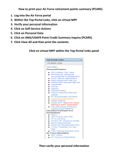


© Copyright 2026