
THE COPYWRITING SOURCEBOOK ANDY MASLEN
ANDY MASLEN
THE
COPYWRITING
SOURCEBOOK
HOW TO WRITE BETTER COPY,
FASTER — FOR EVERYTHING FROM
ADS TO WEBSITES
THE
COPYWRITING
SOURCEBOOK
ANDY MASLEN
THE
COPYWRITING
SOURCEBOOK
HOW TO WRITE BETTER COPY,
FASTER — FOR EVERYTHING FROM
ADS TO WEBSITES
Copyright © 2010 Andy Maslen
First published in 2010 by Marshall Cavendish Business
An imprint of Marshall Cavendish International
PO Box 65829
London EC1P 1NY
United Kingdom
and
1 New Industrial Road
Singapore 536196
[email protected]
www.marshallcavendish.com/genref
Marshall Cavendish is a trademark of Times Publishing Limited
Other Marshall Cavendish offices: Marshall Cavendish International (Asia) Private Limited,
1 New Industrial Road, Singapore 536196 • Marshall Cavendish Corporation. 99 White
Plains Road, Tarrytown NY 10591–9001, USA • Marshall Cavendish International (Thailand)
Co Ltd. 253 Asoke, 12th Floor, Sukhumvit 21 Road, Klongtoey Nua, Wattana, Bangkok
10110, Thailand • Marshall Cavendish (Malaysia) Sdn Bhd, Times Subang, Lot 46, Subang
Hi-Tech Industrial Park, Batu Tiga, 40000 Shah Alam, Selangor Darul Ehsan, Malaysia
The right of Andy Maslen to be identified as the author of this work has been asserted by
him in accordance with the Copyright, Designs and Patents Act 1988.
All rights reserved
No part of this publication may be reproduced, stored in a retrieval system or transmitted,
in any form or by any means, electronic, mechanical, photocopying, recording or otherwise,
without the prior permission of the copyright owner. Requests for permission should be
addressed to the publisher.
The author and publisher have used their best efforts in preparing this book and disclaim
liability arising directly and indirectly from the use and application of this book. All
reasonable efforts have been made to obtain necessary copyright permissions. Any
omissions or errors are unintentional and will, if brought to the attention of the publisher,
be corrected in future printings.
A CIP record for this book is available from the British Library
ISBN 978-0-462-09974-3
Designed by www.stazikerjones.co.uk
Index prepared by Indexing Specialists (UK) Ltd
Printed and bound in Singapore by Times Printers Pte Ltd
Contents
Introduction
1
1. Headline
5
2. Sales letter
13
3. Case study
29
4. Press release
43
5. Product brochure
57
6. Press ad
73
7. Presentation
91
8. E-zine
103
9. Corporate brochure
119
10. Email
137
11. Adword
155
12. Article
167
13. Web page
181
14. Endpiece
197
Glossary
201
Acknowledgements
Many people have inspired, helped and encouraged me to write
this book and this is my chance to repay them. First, as always,
my clients, a great group of people to write for and without
whose commissions I wouldn’t have gained much copywriting
experience at all.
In particular, I’d like to thank those individuals who graciously
allowed me to quote from, and in some cases reproduce, their
marketing campaigns: Paul Joyce, Marketing Director, William
Reed Business Media; Santa Marku, Head of Product
Marketing, BSI; Paul Lewis, Head of Public Relations, RSPB;
Nigel Jagger, Chairman, Cert Octavian plc; Kevin Harrington,
Director, Sodexo; John Harrison, Streetwise Publications; James
Phillips, Managing Director, Lewis Direct Mail; Sally Bibb,
Director, talentsmoothie; James Evelegh, Editor, InPublishing;
Clair Darke, Marketing Manager, FAST Ltd; James Kelly,
Managing Director, Lorien Resourcing and Peter Clay,
co-founder, crocus.co.uk
Martin Liu, Pom Somkabcharti and the team at Marshall
Cavendish have, once again, offered invaluable advice in the most
generous spirit. Ross Speirs, my friend and creative partner, is
another source of advice on all matters design-related, and much
else besides. Jane Kingsmill, Richard Harrison and Jane Bainbridge
are all friends, and writers: they’ve shared their thoughts on email
and web writing and the correct approach for articles.
Jo Maslen is my wife and Commercial Director of Sunfish.
Over the last 12 years, we’ve bounced around hundreds if not
thousands of ideas on the best way to write copy for different
pieces. And, finally, my sons, Rory and Jacob, who always
provide a dazzlingly different perspective on the world and
remind me that there’s more to life than writing headlines.
Thank you all.
For my parents, the first to show me the power of words to move
hearts and minds
INTRODUCTION
Introduction
The Copywriting Sourcebook
I remember my first ever copywriting job. It was 1986 and I had to
write a sales letter. All I remember was my panic at having to fill
two sides of A4 with selling copy… before lunchtime.
What I would have given for some simple guidelines on what to
include, how to structure it and what style to adopt. I guess that
memory was behind my idea for The Copywriting Sourcebook.
You don’t need to read the whole book – or not in one go
anyway – just turn to the chapter that deals with the marketing
piece you’re writing now.
Over the next couple of hundred pages or so, I give you step-bystep advice and templates for 12 of the most common copywriting
tasks, plus a separate chapter focusing on headlines. I’ve drawn on
my experience writing copy both in corporate marketing roles and,
since 1996, as an independent copywriter working for hundreds of
different clients all over the world.
You get explicit, practical, step-by-step guidelines that help you
write better copy, faster, for a wide range of formats, both online
and offline. I help you answer the big questions we all face as
copywriters:
– How do I write copy that works in any format?
– How do I adapt copy from print to digital communications?
– What is the best way to set out any type of sales or
marketing piece?
– How can I save time when writing copy under pressure?
And what of the Internet? I have argued in the past that good
copy works wherever you put it. That’s true at the conceptual
level, but there are differences between the web and print and
I explore them in the chapters on emails, e-zines, AdWords and
web pages.
2
Seven ways this book helps you
1. Helps you achieve sales, marketing and commercial goals.
2. Gives you easy-to-follow advice on the right way
to write copy.
3. Provides real-world examples of different copywriting styles
and tones of voice.
4. Allows you to write better copy, faster.
5. Takes the stress out of planning and writing any type of
marketing or sales copy.
6. Shows you proven shortcuts for beginnings, middles
and ends.
7. Explains how a professional copywriter goes about his work.
3
CHAPTER 1
HEADLINE
FINALLY, THE
SIMPLE WAY TO
WRITE GREAT
HEADLINES
Chapter 1
The Copywriting Sourcebook
Headlines are so important I think they deserve a chapter to
themselves. And they’re everywhere: subject lines, envelope
messages, banner ads, landing pages, book titles, training course
titles. Although most copywriters will tell you they find writing
headlines the hardest part of any job, sometimes they just seem to
arrive out of the ether. One of my own favourites in this category
is from a subscriptions renewal letter I wrote for Top Gear
magazine. The headline reads:
People who think dolphins are cleverer than McLaren engineers
want to ruin your fun
The letter was signed by Jeremy Clarkson, the lead presenter
for the Top Gear TV programme, who also has a monthly column
in the magazine. It captures his trademark tone of voice and style
and does, I think, contain a clear appeal to the reader’s self-interest.
Namely, not having their enjoyment of cars spoiled by do-gooders.
How long did it take me to write? There are three answers. One,
about 15 seconds, the time it took me to type it out. Two, about
five minutes, daydreaming about fast cars. Or three, 35 years,
which was the time I’d spent watching Top Gear on the television
and internalising the brand values of the show (and, latterly, the
spin-off magazine).
However, that was a rarity. Most of the time, I’m like all the
rest, sweating over headlines, finally coming up with a good one,
then paralysed by fear that as I send it off to a client, maybe one
of the rejects would have outperformed it. In the end you just have
to step up to the plate and swing. It might work, it might not, but
you can’t second-guess your list.
So let me ask you a question. What do you think is the purpose
of the headline? Here are a few possible answers:
a) to demonstrate to the reader how clever I am
b) to indulge my taste for wordplay and ‘humour’
c) to stop the reader from turning the page
d) to make the reader want to read the body copy
6
Headline
e) to encapsulate my sales pitch in 10-16 words or fewer
f) to fit in with the picture I have chosen
g) to allow me to use the same tired old cliché as our competitors
h) to raise brand awareness
Though they would never admit it, many copywriters – both
in-house and agency/freelance – are clearly motivated by a combination of a), b), f), g) and h). This type of writer frequently,
though not always, works in an above-the-line role, where
measuring results from specific executions or campaigns is
difficult if not impossible. (But grinning broadly as they drive by
a 96-sheet poster with their headline on it is effortless if not
mandatory.) Writers working below-the-line, where everything is
measurable (and testable) tend to opt for a combination of c), d)
and e). (Though not always.)
Your headline is
your first and biggest
weapon in the battle
for eyeballs.
Winning the battle for eyeballs
If you need to make money from your marketing campaigns, your
headline is your first and biggest weapon in the battle for eyeballs.
Get it right and you have a (temporarily) captive audience and the
possibility of winning orders. Get it wrong and you have a funny
picture for your office wall.
So where do we start? You can roughly divide headlines into
three categories:
1. Those promising news.
2. Those arousing curiosity.
3. Those offering a benefit.
When Ogilvy & Mather tested headlines, they found that
benefits out-pulled news, which out-pulled curiosity. A
combination of all three was the most responsive of all. This is
bad news for writers who favour headlines like this:
Have you discovered Acme toner cartridges yet?
7
Chapter 1
The Copywriting Sourcebook
(Reader: ‘No.’ Turns page.)
But excellent news for writers who like lines like this:
Fighter pilots: how this everyday vegetable can help you see
better at night
(Unfortunately, I’ll never use that one, but you get the idea!)
This should be simple then. After all, you know your product
inside out, don’t you? You know what it does for your customers.
You know what makes it special and different. All you have to do
is get all that across in a dozen or so words. Oh yes. That. That’s
what makes writing good headlines so infernally hard.
In case of emergency, break glass
If you find yourself staring into space for more than ten minutes,
it’s time for emergency action. You’re busy. You have too many
other things to do to be just sitting there. Here’s a way to get
something down on paper. It might not be your final line but it
will free the wheels and let you get on with the rest of your copy.
Step one: Complete this sentence: My product helps my
customers because it…
E.g. My product helps my customers because it saves them
money when they buy their next new car.
Step two: Cut everything up to and including ‘it’.
E.g. Saves them money when they buy their next new car.
Step three: change ‘them’ and ‘they’ to ‘you’ (and tweak the rest
as necessary)
E.g. Save money when you buy your next new car.
Step four: Add ‘NOW: an easy way to’ at the beginning.
E.g. NOW: an easy way to save money when you buy your next
new car.
8
Headline
Not bad. Could be better of course. But this only takes a few
minutes. And it will be better, much better, than 90% of the
headlines you see around you every day.
Practical help
There are no fixed rules on the best format for headlines. But I’ve
always found that ‘How to’ headlines work well a lot of the time.
Openings like these:
How to save £35 a week on your family’s food bill
How to impress even the most sceptical ballroom dancing judge
How to win friends and influence people (oops – sorry, not one
of mine!)
If you want to add a sense of newsiness, the simplest trick is to
add NOW: at the beginning of any headline. And remember,
FREE almost always works well in a headline. Don’t be shy in
business-to-business (b2b) contexts either. Everyone likes getting
free stuff.
Try to keep your headlines as short as you can. Under 16 words
is good. Ten is better. (But there are also plenty of examples of
control-pulverising headlines longer than either of those numbers.)
Remember, you’re not trying to write the whole pitch, just enough
to get your reader interested. And if you feel drawn to words like
‘communication’, ‘effective’ or ‘significantly’, try ‘talking’,
‘better’ or ‘much’ instead.
As a general rule, headlines should be on a single line, two at a
pinch. If you really feel the need to keep going, use a subhead
instead. Like this:
9
Chapter 1
The Copywriting Sourcebook
How to make the perfect sponge cake every time
Order a trial pack of Wonder Mix today and save 99p
You could even add a lead-in that refers to your target,
like this:
Attention all homemakers…
How to make the perfect sponge cake every time
Order a trial pack of Wonder Mix today and save 99p
Design and layout
Headlines look better set in a larger point size than your body
copy. But don’t go mad. As a general rule for most print and
online communications, your headline will tend to shout if it’s
more than twice the point size of your body copy. (Of course, you
may want it to shout.) And don’t use ALL CAPS: it makes it harder
to read quickly and forces your reader to decode it letter by letter. I
think simple sentence case looks best; initial caps force the reader’s
eye to jump up and down as each new word starts (though there’s
evidence that initial caps also work well).
Finally, never use full stops at the end of your headlines. They say
‘stop’ and you don’t want your reader to stop, you want them to keep
reading. The absence of a full stop implies that the sentence hasn’t
finished yet and they will keep reading till they find one. Look at a
newspaper and see if you can find a headline with a full stop.
A few ideas to keep you going
For new products (or things you want to appear new),
start with...
Introducing...
Announcing...
Finally...
10
Headline
At last...
New...
Now...
It’s here...
After 10 years...
Use a journalistic headline
The secrets of fine wine collecting revealed
237 ways to cut your tax bill this year
Looks good, smells better: is this the ultimate aftershave?
Use storytelling or editorial techniques
They laughed when I sat down at the piano, but when I started to
play (a classic)
He started life on the wrong side of the tracks, now he’s running
the company
Why Susie had to turn down an offer of marriage
Compare value with price
Want a CEO lifestyle on a part-time salary?
Break the price down into manageable chunks
The car you’ve always dreamt of, for just £129 a month
Feature the discount
Save £100 when you subscribe to Copywriter Magazine by
Direct Debit
Provide practical information
The seven steps to a perfect lawn
Do you want to improve your copywriting?
Do you make these mistakes in English? (Another classic)
A simple but delicious chocolate cake recipe
How to drop a dress size in two weeks (without giving up chips)
11
Chapter 1
The Copywriting Sourcebook
Style your headline as a quotation or testimonial
‘I’d never won anything. Then I joined QuizFriends. Now I drive
a new BMW’
‘You can make money on the stock market without StockPix. I
just wouldn’t want to try’
‘If you’re looking for a reliable food mixer, it has to be the
FoodStar 500’
Ask your reader a question
Have you ever wished you could retire early?
Are you ready for a snap customs inspection that could cost your
company its life?
What would you do with a million pounds?
Can health and safety be improved in your business?
How much do you know about gardening? Take this simple test
Come in half-way through a sentence
Because there’s more to driving than miles per gallon.
Some of the above ideas are my own; others I have adapted
from other copywriters, including the excellent John Caples’
book, Tested Advertising Methods. If you don’t already own a
copy, buy one. You won’t be disappointed.
Summary
Headlines are too important to waste on lame puns or bogus
‘Ooh! That’s intriguing’ teasers. This goes double online, when
people are even more impatient. If you do nothing else with your
next headline, spell out your main benefit. And remember, if your
reader can say ‘so what?’, it’s not a benefit.
12
CHAPTER 2
SALES LETTER
DEAR READER,
COPYWRITERS
LIKE US KNOW
SOMETHING MOST
FOLK DON’T
Chapter 2
The Copywriting Sourcebook
Introduction
Often called, erroneously, a cover letter, the sales letter is probably
the most powerful piece of copywriting ever to have been invented.
By its very nature personal (if written properly) it takes your sales
pitch directly to each and every one of your prospects. It doesn’t
have to fight for their attention amid a magazine or newspaper full
of more interesting editorial. And you have virtually unlimited
space in which to make your case.
It can venture forth unaccompanied by a brochure or flyer and
just do its job alone. You can illustrate it with product shots or
other relevant images, or go for a plain-looking letter that
replicates the look and feel of business correspondence. Or you
can make it the star of an all-singing, all-dancing direct mail pack
including full colour brochure, order form, reply envelope, sheet
of technical data… whatever you like and are willing to pay for.
In essence, though, a sales letter must look like a letter. In other
words, it should be personally addressed, it should be personally
signed, and it should be designed with the minimum of graphic
incursion into the text. It should also use a reasonably ordinary
typeface – this is not the place to go looking for wacky fonts. And
it should address the reader directly throughout, as if it were
written just to them.
And a sales letter should sell. Now maybe the sell in question is
‘win sales leads we can follow up later’. Maybe it’s a straight ‘win new
orders’. Either way, once you have your goal in mind, the letter must
pursue that goal relentlessly. No deviation, no wavering off course.
Strengths
Sales letters are great for conveying large amounts of information.
Perfect for convincing someone to buy from you. They’ll want a
lot of detail before parting with their cash or bank details, so
having the option to go to two, four, six… twelve or thirty-two
pages gives you the freedom you need to make every possible sales
14
Sales Letter
point, overcome every possible objection, offer independent testimony or evidence that what you say is true and so on. The style you
are able to write in allows you to be conversational, which engages
the reader more deeply in your message, and means they will read
on, past paragraph breaks, page breaks, even separate sheets.
The greatest strength of the sales letter is that it is – or should
be – personal. Even in an age when for most people, email or
social networking have replaced paper-based correspondence,
letters have the power to stop someone in their tracks and make
them read. The Dear Mr Smith at the beginning and the Yours
sincerely, Jane Moore at the bottom mean it is a personal
communication, despite the fact each reader is one of a group of
hundreds, thousands or millions.
The greatest strength
of the sales letter is
that it is – or should
be – personal.
Weaknesses
The greatest weakness of the sales letter is the popular name most
recipients give it: ‘junk mail’. Although the direct marketing
industry (of which I am a part) strives magnificently to popularise
the phrase direct mail, this is purely a term of art within the
business. Punters might refer to ‘mailshots’ as an alternative, but
not in any particularly approving way.
In other words, most recipients of sales letters tend to view
them with suspicion if not outright hostility. They suspect, rightly
in many cases, that the envelope contains irrelevant promises
couched in spammy language.
This puts additional pressure on you as the copywriter to
imbue your sales letter with throat-grabbingly immediate
relevance to your reader. Your English, while faultless, must also
be invisible to your reader; we don’t want them noticing our style,
just ordering our products.
15
Chapter 2
The Copywriting Sourcebook
What can you use it for?
You can use sales letters to communicate with all sorts of groups:
members, subscribers, prospects, customers, former customers,
customers about to become ex-customers, exhibition visitors,
enquirers, website visitors… whomever you have a name and
address for. You can use them to…
• Generate enquiries
• Get requests for a white paper or free report
• Push people to your website to get a download
• Send out trial issues of a magazine
• Generate requests for free samples
• Generate requests for a free product or service trial
• Sell additional products or services to existing customers
• Sell upgraded memberships
• Ask for help finding new members – ‘member-get-member’
• Ask for awards nominees
• Ask for speakers at a conference or seminar
• Ask for feedback on a soft launch of a new website
What goes wrong?
Boring or clichéd openings
How many direct mail letters have you opened where the writer
begins by telling you how they feel? You know the sort of thing…
Dear Mr Smith,
I am delighted to tell you…
Or,
It gives me great pleasure to inform you…
Like we care!
16
Sales Letter
Do not fall into the trap of starting an unsolicited sales letter,
which many if not most of the recipients will categorise as ‘junk
mail’, with a statement, however brief, of your feelings. The reader
must be forgiven for saying, ‘I don’t know your company, I don’t
know your products, I don’t know you … and you’re telling me about
your feelings. Now what was it you wanted to talk to me about?’
Nor should you open with a lecture. This style is much loved by
copywriters working for any sort of knowledge-based business,
such as business or professional information publishing (where I
started my career).
The typical letter opens something like this:
Dear Ms Jones,
In recent years, the world market for homemade quilts has
expanded dramatically. No longer the preserve of New England
homemakers, quilting has become a worldwide industry worth,
conservatively, over $300 million.
Huh? Why are you telling me this? Why should I care?
If it turns out that, because of all this hoohah about quilting,
the reader of your sales letter could make a fortune investing in
quilting technology then good grief, start with that!
And, saving the worst till last, the ultimate cliché with which
not to start your sales letter is,
‘As a valued client’.
This is at once unoriginal and insulting to your reader, neither
approach being likely to secure you further sales. It communicates
several (bad) things: that there are clients you don’t value; that you
are so bored writing to your clients that you resort to clichés; and,
given that the next word is invariably ‘I’, you are unable to write
grammatical English.
17
Chapter 2
If a letter is a personal
communication then
it follows you should
use a personal tone
of voice.
The Copywriting Sourcebook
Poor use of data
If you have enough data to address a letter to the reader personally,
that is, Mr A Maslen, MD, Sunfish Ltd…, make sure you
personalise the opening, Dear Mr Maslen.
I have been banking with a certain global bank ever since I
started Sunfish in 1996. Yet they still persist in sending me ‘customer
service’ letters that begin, Dear Customer. How difficult can it be to
insert a field in the document Dear <salutation> <last name>?
Overlong paragraphs
When confronted with a sales letter, most people begin by
assessing it in purely visual terms. They don’t read it, they look at
it. And they are doing it to form a quick judgement: is this going
to be easy to read? If it looks difficult or boring, they won’t
bother. Why should they – it’s only junk mail as far as they’re
concerned. The single biggest thing you can do to ensure they come
to the right conclusion – the conclusion you want them to come to
– is by breaking up your text into short paragraphs.
In a letter I would suggest staying under five lines. A one-word,
one-line or one-sentence paragraph is fine, regardless of what you
or I were taught at school. (I often hear this line of reasoning used
by marketeers and copywriters when I suggest doing something
that breaks the supposed rules of English. I borrow a line from my
father, a lifelong educator, who said, ‘But you’re not at school!’)
Impersonal tone of voice
If a letter is a personal communication then it follows you should
use a personal tone of voice. That means warm, conversational,
friendly, in plain English and, well, personal. Start off by addressing
your reader as ‘you’ and don’t let up. Never use the phrase, ‘some
of you’ or address your reader by reference to the group to which
they belong, ‘this pressure-sensitive diving watch is suitable for
divers of all skill levels’.
Once you do, you lose your reader, who senses, rightly, that you
aren’t really interested in them, just in their money. Cynics would
argue that you are only interested in their money. But you won’t get
18
Sales Letter
to see it unless you can effect a pretty solid impersonation of
someone who finds them the most interesting creature on the planet.
No benefits
I see a lot of sales letters that manage to fill up a couple of sides
of A4 without ever giving the reader a reason to buy. Lots of facts
about the product, lots of features, but no benefits. You may think
it’s blindingly obvious why someone should buy your gizmo. But
does your reader? Does every reader?
So first answer the question, What’s in it for me?’. That should
ensure you’re talking benefits. Then check that your copy actually
is talking benefits by asking the question, ‘So what?’. If you feel
silly asking ‘so what?’ then you have a genuine benefit. Let’s take
an example. If you were writing a sales letter for the Acme
Stairgate Company, your so-called benefits copy might sound like
any of the following:
Our baby gates are manufactured from NASA-grade chrome-moly
alloy. So what?
This space-age metal is 300% stronger than steel. So what?
Even if a child falls directly against it, the gate holds fast,
protecting your little one. Er, OK, how much?
Too glitzy
Letters should look like letters. In the old days that was a)
obvious and b) difficult to deviate from. The technology simply
wasn’t there to do anything more than lay out the text in a
typewriter face and stick your logo at the top. Now the world is
your oyster. Photos, screen grabs, a fiesta of fancy typefaces,
textured backgrounds… you think of it, your designer can do it.
But it’s all wrong (or most of it is).
Even though for most people, the only letters these days they
receive ARE direct mail, you should still aim to make your letters
resemble correspondence. If you do use graphics (and create what
19
Chapter 2
The Copywriting Sourcebook
I would call an illustrated letter), restrict images in quantity and
placement so they don’t interfere with the run of text. Avoid the
fancier design techniques – you can incorporate them into your
brochure if you really feel they’ll help shift merchandise.
Bad typography
Where shall we start? Not with a wholesale description of all the
forms bad typography can take. Instead, a little checklist of things
to avoid:
• Copy set in too small a point size. Make it easy for your reader
to read your copy without reaching for their specs. If you’re
writing for younger people this is less of a concern, but it still
needs to be inviting, which ultra-small type ain’t.
• Copy set in a design-y typeface. The best typeface to set direct
mail letters in is Courier (or Courier New). After that, Times.
After that, any reasonably straight-looking serif typeface.
Why? Because they are readable, and in tests have been shown
to generate more money. Please avoid making aesthetic judgements about typefaces in promotional literature. Whether it
conforms to your personal taste – or brand guidelines – is less
important than whether it works.
• Scrunched up leading. Resist the temptation to fit all the copy
onto one side of the paper by squishing the leading. Ideally, you
want 2–3pt leading, that is, 11pt type on a 13 or 14pt body.
• Multiple typefaces. Two at most please. Maybe a sans
serif face for the headlines and a serif for the body copy. One
is fine.
No cross-heads
Even in the shortest letter, cross-heads (those headings that run
between paragraphs of body copy), help the reader navigate your
copy and provide an instant visual cue that says, ‘Hey, this is going
to be easy to read’.
You can use them to tell the story in outline, although Joe
Sugarman, a highly successful US-based mail order copywriter,
20
Sales Letter
tested nonsense cross-heads and found even these out-pulled ads
with none at all.
No teasers to keep people reading
People will read long copy (however you define ‘long’). But they
need a little help and encouragement. Saying ‘But that’s not all…’
at the end of a paragraph is a simple (if obvious) trick.
Too short
How short is too short? Simple. Your copy is too short if you have
left anything out that might have persuaded your reader to buy
from you. It doesn’t matter how many words you write in a letter,
as long as they are relevant to your reader.
No signature
Letters should come from individuals. So ensure yours does and
looks like it does. Including a signature – which you can arrange
by simply signing a piece of white paper with a black pen then
scanning it and saving as a graphic file for your Mac or PC – is
the simplest way I know of to achieve this aim.
Signed by a ‘team’.
Argh! Please don’t end your sales letter, ‘Yours sincerely, The
Customer Service team’. Or any other team for that matter.
No PS
People read the PS. In fact they read it pretty well immediately after
opening the envelope. It sits under the signatory’s name, which is
one reason. Another is it sits in a little clean area of its own where
it’s easy to spot. Third is some lingering folk-memory that PSs were
added in at the last minute with some interesting news.
21
Chapter 2
The Copywriting Sourcebook
What you must include
My feeling is that you should include everything in your sales letter.
And by everything I mean every single point you can think of that
will help your reader make the decision to buy from you. Here are
a few things you should include in a sales letter:
A description of the features of your product or service –
translated into benefits. In other words, what your product does for
the reader. And make sure you include all the reasons why someone
might buy from you. You don’t know which one will tip the scales
in your favour, so it pays to be as comprehensive as possible.
A testimonial or two – or three – from existing customers, that
tell the story from a different angle. Make sure your testimonials
are genuine and resist the temptation to tidy them up. As long as
they are in reasonably correct English, leave them alone.
Copy that raises and resolves any potential objections your
prospect might have to buying from you. If your business is new,
or the product is, maybe you include endorsements from wellestablished names in your industry. If it's a high-priced product,
you could compare the price to something else the reader is likely
to possess, or divide it by 365 and talk about the cost per day. Or
compare it to the likely returns that accrue to the reader once
they’ve bought it. If it fits with your industry, product category or
business policies, you might think about offering a money-back
guarantee. These are used widely in subscriptions marketing
within the magazine publishing industry and have been shown to
increase response.
A strong call to action that restates the main benefit or
benefits, and recaps any offer you are making.
What you can leave out
In my case, I can generally leave out the entire opening paragraph
in my first draft. Clients never see these because I delete them in
the editing process. It’s my way of getting started and dispensing
22
Sales Letter
with writer’s block, or, more prosaically, not knowing which way
to begin out of the dozens I can think of.
If your sales letters begin with sweeping generalisations about
your prospect’s industry, you can leave this out. People either
know it or don’t expect to read about it in a sales letter – or both.
Either way, it’s not as attention-grabbing as many copywriters
seem to think.
You can also leave out all but the most cursory descriptions of
your company’s history and development. People generally don’t
care. Yes, they want to be sure they are dealing with a reputable
organisation, but there are other ways of convincing them than a
blow-by-blow account of your company’s foundation and growth.
Institutional membership logos, awards or satisfaction guarantees
will do it for you.
I would also suggest that you leave out, or rather don’t
introduce in the first place, secondary offers or calls to action. In
other words, if you start out with a sales pitch for a pack of craft
materials, don’t end by offering craft workshops. People are easily
confused and won’t know whether to order the craft materials or
book the workshop. They’ll probably end up deferring the decision
altogether. On the other hand, selling packs of craft materials then
writing again to offer seminar places is an excellent idea.
You can also leave
out all but the most
cursory descriptions
of your company’s
history and development. People generally
don’t care.
How to structure it
The main thing you have to do with the structure of a sales letter
is get to the point, fast. In this, sales letters aren’t so very different
from many other channels or marketing media such as emails,
web pages or press ads. Here’s a suggested approach:
Headline: offering a benefit of some kind, leading with your offer
(if you have one), inducing the reader to read by arousing their
curiosity – or, best of all, a combination of all three.
Sub-head: following on from the headline and taking a
slightly different tack. So if your headline focuses on an appeal to
23
Chapter 2
The Copywriting Sourcebook
the reader’s self-interest (always a good idea), your subhead might
lead with the offer.
Salutation: Dear Ms Jones is best (or Dear Carol if you are very
sure of your ground and have the data to back it up). Dear
Showjumper is OK. Dear Client or Dear Customer will also do at
a pinch, though these days, if you haven’t got personal data for
your customers, Hello?! Does the word database mean anything
to you? I’d advise against Dear Sir/Madam – a surprisingly large
number of companies still use this – unless you are hell-bent on
sounding like the Fifties never went away.
First paragraph: here is where it all happens. Or doesn’t. We’ve
already looked at how not to do it. So here’s what I
recommend instead. You lead with your main benefit. If you are
selling chef’s knives that never need sharpening, something like
this should work:
Dear Mr Brown,
As a keen amateur cook you want the same quality blades you’d
find in a top restaurant. But without the high prices. Thanks to
a new technology developed in Japan, home to the world’s most
skilful bladesmiths, this Holy Grail can be yours.
Or you can open with a question. Or three. Asking questions is
an excellent method of engaging your reader. If they get as far as
your opening paragraph, and it asks them a question, I’d bet the
farm they’ll start thinking of the answer.
Or you can begin with a story. One of the most famous and
best-performing direct mail letters of all time, for the Wall Street
Journal opened like this: ‘On a sunny spring afternoon’.
Incidentally, this letter dispensed with a headline and remained
unchanged for about 30 years.
However you start, make sure it’s not just an exercise in fine
writing. You need to get to the point – and the point should be the
benefit to your reader. Anything else will quickly become boring.
Remember, this is direct mail you’re writing here. They didn’t ask
24
Sales Letter
you to write to them. They weren’t expecting you to. And they
really don’t care whether you do or don’t.
Main body: having got to the point and introduced your main
benefit, you need to expand on it, prove it and then introduce
more benefits. Then you need to introduce more evidence that
what you say is true. This leads us on to…
Testimonials: toward the middle or end of your letter you can
introduce testimonials. They seem to work best in oddnumbered groups, so go for one or three. Here’s how I
introduce them:
Do I sound enthusiastic about the Acme Tulip Bulb Trowel? Of
course I do! But then, I’m the guy who invented it. So to give you
a more unbiased view, here are a few of our customers talking…
Going over the page: if your letter spans more than one page (and
there’s absolutely no reason on Earth why it shouldn’t) consider
very carefully how you’re going to get your reader to turn over.
Here are a couple of ideas. You can ask them to, politely, by saying, Over please. (Or please turn over, I’m not going to get too
bossy
here).
Or
you
can
do
something
cleverer, and split your final sentence across the page break. Or
you can tease them along a little by saying something like, Five
more reasons to try us, overleaf.
The call to action: your close is just that. You have to close the
sale. So do it by asking for the order; better yet, command them
to order. Say something like:
Order by 31st January and we’ll rush you your free guide to
growing competition onions.
The PS: as I said earlier, people tend to read the PS, even if they
don’t read much else. So use it for a little bit of stealth selling.
Recap your main benefit. Restate your call to action. Repeat your
offer. Just don’t do what an early client of mine once insisted on
25
Chapter 2
The Copywriting Sourcebook
and say ‘PS Please note, price does not include postage and packing, which is charged at £5.95 per book’. I should have been firmer
with him but I was new to the game and gave in.
Notes on style and tone of voice
You want to sound
conversational, warm
and most definitely
human.
Most of the channels I discuss in this book call for a pretty
similar tone of voice. You want to sound conversational, warm
and most definitely human. For sales letters I would say the
friendlier the better, without descending into fake mateyness.
Keep your style simple and unaffected, use plain English and only
use long words when they carry a specific technical meaning or
you really can’t find a shorter alternative.
Using images
As I’ve said already, keep images to a minimum in sales letters.
The emphasis should be on the copy, particularly since the format
is supposed to be emulating ‘proper’ correspondence. You can use
images very creatively in letters, but always be sure that they are
adding to the power of the copy and not simply decorating. And
be restrained – after all, if you wanted to produce something
really colourful and eye-catching, you should be thinking about a
brochure or flyer.
Letterhead v special paper
One last thing to consider is what you’re going to print your letter
on. If it’s a small quantity, you may feel tempted to use your
standard corporate letterhead. It’s OK, but probably designed to
reflect all the business needs of your organisation, so it will have
lots of space given over to company registration number, directors
and all your contact details including your corporate web address.
26
Sales Letter
Far better to have your designer create either a new direct
mail-friendly letterhead where the extraneous material is shoved
out of the way to make room for your copy or create something
brand new specifically for this mailing.
27
Chapter 2
Figure 1 New subscriber
acquisition letter for
The Grocer magazine
This direct mail letter follows
many of the classic rules, from
text emphasis to handwritten
copy. But it doesn’t have a headline. The client was happy – the
campaign exceeded the targets
for new subscriber acquisitions.
28
The Copywriting Sourcebook
CHAPTER 3
CASE STUDY
HOW I HELPED
BUSINESSES
EXPLAIN WHAT
THEY DO: A
SUNFISH CASE
STUDY
Chapter 3
The Copywriting Sourcebook
Introduction
Case studies are an
excellent way of
showing potential
clients just how good
you are at whatever
it is you do.
A case study is simply a story about how you solved some
problem for one of your clients or customers. It can be copy-only
or you can include images and graphics.
Case studies have their origins in business schools, where they
are used to teach the future masters of the universe about real
world business problems and, hopefully, how to solve them. Given
how many monumental cock-ups are committed by teams of
management consultants, it seems the jury’s out on whether this
teaching method’s any good. However…
Case studies are an excellent way of showing potential clients
just how good you are at whatever it is you do. They tell stories,
which is a good thing, and they tell the truth, which is an even
better thing. By writing a case study you are almost forced to see
the world from your client’s perspective. You can’t get away with
writing reams of copy that simply describes your product or
service and its features. Instead, you have to explain, and show,
how users of your product benefit. Since this is what any potential
client is interested in anyway, it seems like a fine place to start.
There’s no set length for a case study either. It all depends on
the complexity of the problem – or challenge – that you are
talking about. A case study can be ultra-short:
Bill Evans was a disaster at the dating game until, with our
help, he mastered the art of conversation. Thanks to our selfstudy DVDs and website Bill is now happily married with three
beautiful children. ‘I couldn’t have done it without Talk
Yourself Married,’ says Bill.
Or it can run for several hundred, or thousand, words. Just be
sure you are always making relevant points and further convincing
your reader of the wisdom of doing business with you.
30
Case Study
Strengths
The case study’s main strength is that it appears to be less about
sales and more about education, or information. Its purpose is to
sell, but not directly. It serves to warm up your prospect, to
overcome their objections and to answer some of their initial
questions about what you do and whether it’s any good. Done
properly it includes viewpoints other than that of the writer so it
provides impartial testimony.
People are less sceptical when they read a case study. It is serious,
authoritative and packed with facts. When you write a case study, the
bulk of the work is in the research and planning stages. Actually
drafting the copy shouldn’t take very much time at all, because you
are really concentrating on an almost journalistic approach – telling
it like it is – or was, without the need to dress it up.
Weaknesses
Because you generally need a fair amount of space to write a good
case study the implication is that your prospect will need a fair
amount of time to read it. Time, as we know, is in diminishing
supply these days – always has been, really. So plonking a 2,000word case study in front of a busy potential client might be more
off-putting than enticing.
The key, as with any longer copy, is to ensure it’s relevant to
your reader. Design can play a strong role too in breaking up your
copy and presenting it in an attractive, highly navigable format
that leads the reader gently through the whole thing.
And because it’s only what you would call sales support, it is
never going to make the sale on its own, unlike an ad, sales letter
or email. So it will have to be accompanied by other materials,
maybe as part of a sales kit or bigger mailing.
31
Chapter 3
The Copywriting Sourcebook
What you can use it for
Case studies are particularly suited to more sophisticated
products and especially services. If you are selling bird feeders,
bicycles or bananas, you probably won’t need a case study. If, on
the other hand, you are writing copy to promote any of the
following, we’re in business:
• Marketing agency
• Management consultancy
• IT provider
• Law firm
• Property development services
• Media or advertising
• PR consultant
• Executive coaching
• Facilities management
• Contract publishing
• Industrial plant manufacture
• Scientific services for industry
• Management training
What you are trying to do is prove to your prospect that all the
things you say about yourself in your marketing campaign (of
which the case study is itself a part) are true. That, yes, were they
to take you up on your offer, they too would benefit in all the ways
the subject of your case study did.
What goes wrong
Insufficient research
The secret of a really good case study is research. Imagine you are
a journalist writing an article on the same subject. You wouldn’t
just sit down and make it up (well you might but you’re not that
sort of journalist). You’d do your background reading, you’d inter32
Case Study
view the key people involved and you’d find out everything you
needed to about the process or product being demonstrated in the
case study. The result would be a very good article – or case study.
Without enough research you are forced back into
generalities. You can only talk about your client ‘making
significant savings’ rather than ‘making savings of £75,000 a year
on recruitment and training.’ Or ‘after several months of work’
rather than ‘after a two and a half month process involving focus
groups, concept development and advertising pre-testing’.
What’s worse, your reader can spot your fluffy evasions a mile
off. You headed this piece of copywriting with the words ‘case
study’ and that raises certain expectations – quite high expectations – in your reader’s mind. The devil is in the detail they say,
and without enough research you won’t be able to describe what
happened – tell the story, in other words – in enough detail to
make it believable.
Too short
A parallel concern to the problem of poor research is that your
case study is too short. I said in the introduction to this section
that case studies can be ultra short – but at that point they are
really more like turbocharged testimonials. In truth, your reader,
if they decide to read your case study at all, wants some meat they
can get their teeth into. Want an arbitrary word count? I’d say no
fewer than 300. That’s only around half a page of A4 and shouldn’t
be unduly taxing if you’ve done your research.
Too long
Remember, this is not a doctoral thesis or academic case study, it’s a
piece of marketing communications. That means you want something
your reader can read through and digest in one sitting, and I don’t mean
a 17-course banquet type of sitting either. Something more like a quick
lunch. If you are printing your case study, you should have something
that will fill, comfortably, a four-page A4 brochure without resorting to
tiny type or no pictures to squeeze it all in.
33
Chapter 3
A case study gives
you a chance to let
your clients do the
selling for you.
The Copywriting Sourcebook
No client viewpoint
What brings a case study alive is the client’s perspective. Leave it
out and all you have is an extended boast dressed up in worthier
clothes than a pure sales pitch. Just as with a testimonial on its
own, a case study gives you a chance to let your clients do the
selling for you. They should be providing unbiased opinions of
your service that let others know just how good you are.
No coherent storyline
Any good story needs a beginning, a middle and an end. It should
also have believable characters and a narrative that explains how
the hero overcame a challenge. This classic story structure and
ingredients list is why case studies work so well. So make sure you
follow the rules of storytelling.
Dotting around, using too many parallel narrative devices such as
bullet points, callouts, panels and flowcharts will confuse rather
than engage your reader. It’s best to start with a simple statement of
the problem facing your client and work forwards from there.
No images
Think of a case study as akin to a children’s illustrated story
rather than a novel. In other words, you need pictures. Even if the
picture in question is just a photo of your client looking happy
with a quote from them underneath. Without any graphics at all,
you are relying on your reader’s willingness to sit down and read
pure copy. They might do that with a sales letter, where the
personal tone of voice is more engaging, but case studies are
necessarily less conversational in tone and for that reason, more of
a struggle. A few well chosen images lift the case study and
provide some visual relief from the text.
No call to action
Although a case study is not a direct sales piece, you’d be a fool to
spend all that time and money producing one without making it
work a little harder for its corn. So it’s a mistake to leave out a call
to action. Just including your contact details isn’t enough. Instead,
34
Case Study
you need a soft call to action that invites your prospect to contact
you for more information, a free trial, a consultation, more background research from the case study or even another case study.
What you must include
As you’ve probably figured out by now, you have to include as much
detail as possible. The best and most persuasive sort of detail is hard
figures that quantify any benefits the client derived by using your
company, product or service. I’d also suggest the following:
• A profile of the client. This should include a brief mention of
their organisation name, the client contact’s name and job title,
their industry and any other details that flesh them out for your
reader. We hope that the reader will identify with the client in the
case study, so give them enough material to make the connection.
• A timeline of some sort, so the reader can see how the project
or process worked over time and as a sequence.
• A detailed description of the problem or challenge facing the
client and that led them to come to you for help.
• Background on your organisation and what particular skills,
experience, products, technologies or processes you could call
on to help your client.
• Details of what exactly you did.
• How the project turned out. Obviously this is going to be a
positive outcome, but you can paint a picture so the reader
sees how your input led to the outcome.
• Glowing remarks from the client, either couched as picture captions, pull quotes or interview-style quotations in the body copy,
What you can leave out
You can leave out anything that will be too technical for the
average reader of the case study to understand. Also, despite my
35
Chapter 3
The Copywriting Sourcebook
pleading for detail, be selective. Your aim is to provide just enough
detail for the story to be believable. You are not writing a manual
that will enable your reader to replicate your results on their own.
I‘d also suggest omitting long slabs of copy describing your
organisation. The way you tend to use case studies means the
reader will already have found you and accessed information
about your organisation. The stage they are at when they request,
download or read a case study is beyond the ground-level research
of finding out who you are and reading the About Us page on
your website.
And avoid the temptation to include any obviously salesy copy.
This is not the place to start listing benefits or ‘10 reasons to work
with us’. Keep it clean and neutral in tone for maximum effect.
How to structure it
Headline: your main headline is like the title of your story. It
doesn’t necessarily need to promise a benefit like an ad headline
or sales letter, though it can. What you do need to is encapsulate
the challenge. You might write something like this:
Creating a more effective public consultation system for
Northminster City Council
Sub- or super-head: under or over your main headline you need
to make it clear to the reader that what they are reading is a case
study. This is one of the rare occasions where you do actually want
to merely label a piece of marketing collateral. So, you have a
short line that reads:
A Sunfish Ltd case study
Introductory paragraph: here’s where you fall back on the old
journalistic technique of answering the questions who, what,
where, when and why? In your opening paragraph, give your read36
Case Study
er the whole story in outline. Not the detail, just the bare bones.
You’re going to expand on them later. It’s what magazine editors
call a standfirst: the shortest paragraph that sits between the headline and the body of the article and draws the reader into the text.
First section: describe the challenge or problem the client was
facing. It’s best to couch it in terms that suggests there was some
benefit that was just out of reach if only they could surmount the
obstacle in the way. This sets you up to go on to describe how you
arrived on the scene and put things right.
This is also the place where you can introduce the main character:
your client. They realised what was needed was outside help and
you can reveal how they realised that outside help was you or your
organisation. Perhaps they’d read about your work with another
business in their industry. Maybe they did some web research.
However you do it, show your reader how you came to be selected.
The more due diligence the client did before picking you to help
them, the wiser a choice it seems for your reader to skip that stage
and come directly to you.
Second section: having explained the set-up and the route the
client took to finding you, you can outline the benefits they could
expect to enjoy from working with you. Are you fast? Do you have
more experience in this area than anyone else? Have you won
awards? Do your clients typically go on to experience industryleading levels of staff retention or profitability or engineering
success? Whatever the outcome, you can point to it here.
Third section: now you need to explain exactly what happened.
Describe the process, but try to keep it interesting. That means
introducing more people, telling your reader what happened in
engaging language, using dates, describing any (minor) setbacks
and how you overcame them. Think about your favourite writers
of fiction and how they keep you reading. Cliff-hangers,
unexpected developments, changes of pace: these are all devices
you can import into your copywriting. You can even introduce
dialogue by quoting the main players on both sides in turn. This
allows you to vary the style and register of your copy and gives
your reader a break from the narrative.
37
Chapter 3
The Copywriting Sourcebook
Fourth section: you've described the process and the story is
nearing completion. Tell your reader what happened in the end.
When everything that needed to be done was done, did the client
get the desired benefits you outlined in section two? How much
exactly? Where exactly? In which parts of the business or market?
Provide figures if you can or some other way of putting a value on
your contribution. Another quote from the satisfied client would
work well here.
Fifth section: it’s not over till it’s over, and you can suggest that
there’s still more to come. Perhaps you are continuing to work
with the client in other areas of the business. Or the project
expanded to include new activities. This sows an important seed
in your reader’s mind that working with you is about long-term
relationships, which will be more profitable for you. A simple
heading that works here is ‘Next steps’.
Final section: this is where you make your play for their
business. The call to action in other words. Remember to keep it
friendly and non-salesy. Provide all your contact details and, if
possible, create some sort of incentive to encourage the reader to
contact you. A further case study, a no-obligation business healthcheck or a free 30-minute consultation could all work, if you are
prepared to resource them.
You could also include brief details of your organisation
especially if you can pull out the aspects of your service that
match the likely needs of the reader.
Notes on style and tone of voice
For a case study, you should adopt a fairly serious style and tone of
voice. You want to come across as professional, experienced,
knowledgeable and authoritative rather than warm and fuzzy. This
is all about positioning yourself as the experts – the go-to guys –
rather than as the reader’s new best friend. (That will come later.)
You demonstrate that you care about your customers by
fleshing out the case study with details of your commitment to
38
Case Study
solving their problems, rather than by snuggling up to the reader.
Aim for a style you’d expect to see in a broadsheet newspaper or,
perhaps, The Economist. Just remember that this particular
magazine will cheerfully call a spade a spade and not a horticultural
cavity excavation facilitator.
You write case studies in the past tense. This is, after all, a story
of something that’s already happened. A sentence to introduce the
problem might read like this:
When Jarndyce & Jarndyce discovered their client records
system couldn’t cope with legal requirements in the Far East, they
knew they had to address the problem fast. Their newly launched
Hong Kong practice was on the brink of winning five major corporate deals that would flounder if they fell foul of the regulators.
And to avoid your case study sounding too much like an
academic paper or sludgy corporate record, write in the active
voice as far as you can. Like this:
Harry Mills, head of chambers in Hong Kong, decided to
contact Sunfish because he’d read of our success with another
law firm in Singapore.
Rather than this:
Sunfish was contacted by Harry Mills, head of chambers in
Hong Kong, after it had been discovered that another law firm
in Singapore had been helped by us.
Using images
One thing to remember here – try to avoid library images. Case
studies are records of what actually happened so you should have
at least one photograph that illustrates the story. The moment
people see a stock shot the not-so-subtle subtext is, this is not true.
39
Chapter 3
Figure 2 Case study on a
partnership between the
British Standards Institution
and the Federation Against
Software Theft (FAST)
40
The Copywriting Sourcebook
If you are quoting personnel from your client, get their
mugshots. Or arrange for them to have one taken. Even a shot of
their premises is better than nothing. Caption all your images and,
if they are photos of your client’s team, use a quote as the caption.
You may want to illustrate the process with a flowchart,
timeline or other graphic. That’s fine as long as they don’t
interfere with the flow of copy or dominate it to the extent that
it’s easier just to look at the pictures. Alone they won’t tell the
story in sufficient depth to convince the reader to hire you.
Case Study
When you’re writing a case study,
you can structure it like an article,
with a headline, standfirst, cross
heads, quotes and photographs.
Remember to include a call to
action and focus on how you
solved the client’s problem.
41
CHAPTER 4
PRESS
RELEASE
‘BORING PRESS
RELEASES GET
THROWN IN
BIN’ SAYS
COPYWRITER
Chapter 4
The Copywriting Sourcebook
Introduction
PR really is free
advertising.
PR really is free advertising. Without the taint of commercialism.
But you do have to work a little harder. Journalists are under no
obligation to print what you send them, unlike their more accommodating colleagues in the advertising department. So give them
something usable, write it well, and sprinkle a few quotes around.
A press (or media or news) release is a standardised way of
announcing some news to the media. There is fairly broad
agreement on format, style and structure between the media outlets on the receiving end and the PR companies and companies
doing their own PR on the other. We’ll cover all that in this chapter.
You have to remember that precisely because it is a press
release, and not an ad or sales piece, you must avoid selling. This
might sound odd coming from a copywriter but believe me, the
fastest route into the journalist’s Deleted Items folder is to come
over all super-smashing-great.
You have to imagine that you are the journalist writing the article.
You wouldn’t hock your professional ethics to a company you’d
never heard of, regurgitating a thinly-disguised sales pitch as a
news article. Instead you'd want to write something that would be
of genuine interest to your readers. If, in passing, you mentioned
the name and specialism of the company behind the story, well,
that’s because leaving it out would mean not telling the full story.
The key to a good press release lies in the subject matter – and
how you present it. Remember that journalists are looking for
something that they think will interest their readers. They want
something that will fit the overall style and tone of their
paper/magazine/programme/website.
Strengths
From an operational standpoint, the best thing about press releases
is that they cost relatively little. If you’re writing them in-house you
spend about as much time, maybe a little less, as you would on an
44
Press Release
ad or sales letter. If you are commissioning an external
copywriter, you’d similarly pay around about the same amount as
for a short ad or web page. If you have a PR agency, well, you may
never discover how much you’re paying, but then you wouldn’t be
reading this unless you were planning to change.
From a marketing standpoint, if you get your press release into
the media you have independent endorsement of your company
and its products and services. It’s not an ad, so the reader isn’t
suspicious. And because it’s editorial there’s a much higher chance
they’ll read it. You can also then use the cutting itself in publicity
campaigns (subject to getting copyright clearance of course) and
place it in your reception area in a folder titled ‘XYZ Company,
Media Coverage’.
You should also get some measurable results, over and above
any notional ‘awareness’. When I was running an in-house PR
operation, we used to ask every caller, ‘what prompted you to call
us today?’ and fill in the answer on our call log. When I consolidated the results I discovered that 16% of inbound calls were
prompted by media coverage. We never made the final step and
tracked sales back to media coverage but it’s a fair bet there would
have been hundreds of thousands of pounds’ worth of business
directly attributable to our original press releases.
Weaknesses
The great weakness of press releases is the mirror image of their
great strength: because you’re placing yourself in the hands of a
journalist, you can’t control what happens. You can spend time,
effort and money planning, writing and distributing thousands of
the damn things only to find you get no coverage. If your soft news
happens to coincide with a war – or even a celebrity staggering
drunk out of a club – there’s a chance your story will get spiked.
However, if you go about it in the right way, you will get coverage:
just don’t regard it as a straight-line graph between number of
releases issued and amount of column inches.
45
Chapter 4
The Copywriting Sourcebook
A further weakness of press releases is that because they are
supposed to be objective – news, in fact – you can’t blow your own
trumpet. You must be discreet. But that’s like accusing rowing boats
of being slower than speedboats, or elephants of lacking agility.
What you can use it for
A press release is, in essence, an announcement. An announcement of news, in fact. But the definition of news gets a bit blurry.
Here are a few ideas for news stories you could promote to the
media with a press release (in no particular order):
• New product
• New service
• Research or survey results
• A new hire, especially a senior position
• New premises
• An event you are holding
• Charity involvement
• Environmental developments
• Community projects
• Sports or other sponsorship
• Opening a new office (locally, regionally, nationally or internationally)
• Books or articles published by staff members
• Speeches given by staff members
• Advice on hobbies (for business-to-consumer ‘b2c’ companies)
• Advice on business best practice (for business-to-business
‘b2b’ companies)
46
Press Release
What goes wrong
No relevance to the target media’s audience
A journalist will only use your press release if it meets the
following condition:
It must be relevant to their audience.
Local news stories about how you rescued a dilapidated watermill
and turned it into B1 industrial space will not interest the editors of
national newspapers or international business magazines.
Stories about how you successfully applied for and were awarded ISO 9001 status are unlikely to make it into the pages of
Practical Woodworker. In other words, think about your reader.
You don’t have to create a separate press release for every single
media outlet on your list, but it makes sense to figure out who will
be interested in your story then either target them specifically or
create a few versions with a different flavour or hook for the broad
sections of the media that you are contacting.
Bad subject line
Although you can send out press releases by post or even fax, most
these days will go out by email. Either directly from your company
or via a distribution service. That means you’ll need a subject line.
And the tip here is don’t start your subject line: PRESS RELEASE.
Journalists are used to getting press releases in their inbox so they
don’t need telling. It’s a bit like writing JUNK MAIL on the outer
envelope of your mailshot.
Bad headline
Assuming the hard-pressed hack opens your email, the first thing
they’ll read is your headline. As long as you remember you are
trying to gain their attention you should be fine. But avoid
headlines like this:
47
Chapter 4
The Copywriting Sourcebook
The XYZ Corporation is delighted to announce that it has
relaunched its website
Like we care!
Slow start
Maybe your headline is a cracker and it’s stopped the journalist in
their tracks. So they go on to the opening paragraph. This is where
you dive straight in and tell the story in outline. Not where you
light your pipe, lean back in your armchair and begin, ‘Well, my
boy, let me tell you how your grandfather started this wonderful
business back when the old King was on the throne’.
Beyond your company name, and maybe the briefest of explanations of your line of business, leave your corporate profile until the
end. If there’s something newsworthy in your release (and if there
isn’t, why are you sending one out?) get it out there immediately.
Boring/no news
What journalists want is a story. A news story. If you don’t have
any news, they won’t use your press release. In fact (and worse)
they will mentally add a sticker on your card in their Rolodex, little
black book, or Outlook addresses folder, saying ‘timewaster’.
You may be very excited about launching your best-selling
product in a new colour or pack size, but that doesn’t make it news.
The deal is, you get free advertising in return for doing some work
on creating a news story that will save the journalist some time.
And remember, it has to be interesting to their readers, as well as
to them personally. So think about the ultimate reader as well as
the journalist, whom you can think of as a professional filter.
Naked sales pitch
Journalists aren’t stupid (though according to some of my
journalist friends, they are lazy). If you send an ad reformatted as
a press release they will delete it as fast as they are able. Clues
abound in press releases like this, usually in the form of overblown
language where a new product is always ‘revolutionary’ or
48
Press Release
‘unique’ and a new technology always ‘groundbreaking’ or, still,
‘cutting edge’. Any claim made without supporting evidence will
be similarly treated. ‘Hugely popular’ hair regrowth products
better have some statistics to back up their best mate status
among the nation’s balding men.
Bad use of English
You are writing for a primary audience of writers. So be especially
careful not to commit any errors of grammar, punctuation,
spelling or style. Journalists have a never-ending stream of press
releases to pick through and will cheerfully discard any that flag
the author’s lack of attention to detail.
I’d include, in this section, using jargon. Unless there’s a specifically technical meaning to a word that means it is the only one
that will do, avoid all industry or business jargon. You will not
impress journalists by talking about any of the following:
You are writing for
a primary audience
of writers. So be
especially careful not
to commit any errors
of grammar, punctuation, spelling or style.
• Low-hanging fruit
• Getting our (or anyone else’s) ducks in a row
• Singing from the same hymn-sheet
• Strategic anything
• Going forward
• Communications modalities
• Paradigms (especially if in the process of being shifted)
What you must include
Before you put pen to paper (quaint expression, I know, but I like
it), write a plan. What is the big story? Is there a secondary story?
How and why will this be of interest to your target audience?
Seems obvious, but local papers like a local angle, national papers
like a broader angle that appeals to everyone, and specialist media
like something that is more focused.
The classic PR method is to answer ‘Who? What? Where?
When? Why? And How?’ in your opening paragraph. This is
49
Chapter 4
The Copywriting Sourcebook
certainly a great way to begin but remember also to inject at least
a small spark – something that will catch the journalist’s imagination
and/or curiosity.
Apart from the story itself, there are a few elements that are
mandatory for every press release:
The words Press release
Release or embargo date
Either Ends at the end of the story, or (more common in the
US) three centred #s, like this:
###
A line offering contact details for the person who can provide
further information.
A brief profile of your organisation, which you can introduce
with the words, ‘Notes for editors’
Details of any photo opportunity.
What you can leave out
Starting from the premise that a press release is a news story you
write that you hope the journalist will use, you should leave out
anything that is irrelevant to the story. So, great swathes of boilerplate outlining the history and development of your organisation.
Cut. Puff, hype and other varieties of over-inflated sales claims.
Cut. Flowery adjectives, waffle and repetition. Cut!
If you feel the need to see all this stuff in print (or on screen)
you know you have an alternative – pay for it.
How to structure it
First, at the top of the page, write Press release. Or News release.
This is one of a number of standards that you have to adhere to.
It tells the journalist at a glance what they’re looking at and how,
ideally, they should respond to it.
50
Press Release
Then the date. There are two formats here:
30 November 2009
For immediate release
Embargoed until:
00:01 30 November 2009
The first format means journalists can use the release as soon
as they get it. The second means they have to wait until the date
and time specified. Generally, you would only use embargoes if
there’s some other timed event or announcement that the release
must not pre-empt. Having said that, you can stretch the point a
little. When writing press releases for the research company I used
to work for, we’d always embargo press releases until some nominal
publication date to create a sense of topicality even if the report in
question had already been sent to clients.
Then your headline. Newspapers and magazines have highly
paid people writing the headlines that will actually appear in
print. Your headline has an audience of one: the journalist. Its job
is to grab their attention (just like an ad headline) and get them to
open your press release – because you can use your headline as the
subject line if you’re distributing via email. Unlike ad headlines,
the press release headline should encapsulate the story rather than
promise benefits or appeal to the reader’s self interest. (In a sense
the whole point of press releases is that they appeal to the journalist’s
desire to get their work done quicker and with less effort.)
Try to come up with a headline that will arrest the journo’s
instinct to lob your carefully crafted missive into the trash
(whether literally or virtually). News is good, but ask yourself
whether the news you want to get talked about is news from their
point of view. Your new product might have the sales team and
half the Board dancing naked in the streets with joy unconfined,
but will it have that effect on a bunch of cynical hacks? Here are
a few things I have found to work well:
51
Chapter 4
The Copywriting Sourcebook
• Giving main survey findings, e.g. ‘Teens say no to careers
in business’
• Promising a list, e.g. ‘Sunfish points the finger at top seven
copywriting sins’
• Using a cliché, e.g. ‘Sunfish names and shames brand pirates’
• Using sex, e.g. ‘Lie back and think of England, says
new report’
• Using gender, e.g. ‘Women now better copywriters than men,
says Sunfish’
• Using geography, e.g. ‘No good copywriters outside London,
says report’
• Using wordplay, e.g. ‘Black day for white goods, says research firm’
• Using statistics, e.g. ‘One in four copywriters now vegetarian,
says Sunfish’
• Being controversial, e.g. ‘Copywriting ‘irrelevant to selling’
claims guru’
If you are working with local media, you may find you have an
easier ride, and a headline that simply tells the story works equally
well. In which case, keep it short and to the point and aim for the
style you see in your local paper.
XYZ Company opens new office in Anytown
Is better than
The directors and staff of XYZ Company are delighted with
their new offices in Anytown
You can also use a sub-head where you flesh out the story in
more detail. You are drawing the journalist further into your story
without forcing them to read the body copy.
First paragraph. This is critical. As I said earlier, you have to
give the news story, quickly, and explain who’s doing what, why,
where, when and how. Avoid hype or gushy prose in favour of
a straight journalistic (there’s that word again) telling of the
facts. This is all you want – or should want. You can dress it up
52
Press Release
however you like on your website or in your advertising, but for
the press release stick to what you can prove.
Second paragraph. Introduce supporting evidence and go into
more detail on the main story. Just remember to keep focused on
what the reader wants to read, not what you want to say. You may
have all sorts of ‘messages’ you are keen to get across to potential
customers but journalists are not interested in helping you sell
more widgets.
Third paragraph. Time for a quote. Quotes are an excellent way
to enliven press releases. Journalists like to be able to give the
impression that they have researched a story before writing it.
Provide them with a few quotes and you make their lives easier: a
service for which they will thank you. Here’s the classic format:
‘Writing press releases opened my eyes to a whole new sphere
of linguistic contortions,’ said Andy Maslen, Managing
Director of Sunfish. ‘Knowing what journalists wanted made
it far easier to get started, too,’ he added.
Some people like to put their quotes in the present tense (says,
continues). This is fine – really more a matter of taste than
anything else. Just be consistent. Quotes can come from
customers, business partners, affiliates, sales agents, members of
staff, your CEO, it doesn’t really matter as long as they are
relevant to the story. If the quote comes from outside your company,
make sure you have the person’s permission to quote them in your
press release (as a courtesy if nothing else).
Fourth/final paragraph. Conclude with a few sentences that
explain the link back to your company and its particular skills/experience. Don’t go overboard here, keep it factual and to the point.
You end with ‘Ends’ or three ###s .
Notes for editors and contact details. Give the contact details
(landline, mobile, email, postal address) for the person who will
field any media enquiries. And a brief profile of your company.
53
Chapter 4
The Copywriting Sourcebook
You can stick in a slightly self-glorifying line or two here.
Sometimes journalists are short of space and will cut and paste
this information at the end of the story. If they do, you can
cheerfully refer to your company as ‘the leading provider of
widget solutions’: Widgets Monthly’ in other publicity materials.
Notes on style and tone of voice
You should write press releases in the third person. Like this:
XYZ Company today announces it will manufacture all its
products using carbon-neutral technology.
Not in the first person like this:
AT XYZ Company, we are pleased to announce…
Your style should be
concise, short and free
of flowery language,
hype and jargon.
Your style should be concise, short and free of flowery
language, hype and jargon as already noted. Keep sentence length
down – 10-16 words on average is great. Remember, you don’t
want the journalist running out of enthusiasm for reading because
if they do, it’ll never see the light of day.
Use the active voice. Like this:
XYZ Company is now giving its customers the option of a
carry-away service on its grand pianos.
Not the passive, like this:
Customers of XYZ Company are now being given the option
of a carry-away service on its grand pianos.
The tone of voice should be dispassionate, neutral: in a word,
journalistic. Avoid breathless phrases like, ‘In an exciting new development…’ or ‘Known for its revolutionary new technologies…’
54
Press Release
In terms of length, the shorter the better. If you can say what
you have to say in one page or screen rather than two, do it. You
get no points for padding. If your release is interesting but the
journalist wants more, they have your contact details to get in
touch. Having said that, I used to send out six or seven-page press
releases and get them picked up by the Financial Times and other
equally stringent media outlets. The easy answer to the ‘how long’
question is, ‘As long as it needs to be. But no longer.’ Like every
other form of copywriting.
Using images
You can attach images to a press release. In the old days, that
meant enclosing glossy prints with the details sticky-taped to the
back. Nowadays you’re more likely to be attaching hi-res JPEG
files to an email. Or you could include a couple of lines in the
release itself about a photo-opportunity where journalists can
come along to take their own pictures.
The rule is, provide something interesting, relevant, distinctive
and preferably not a cliché – so no grinning executives in front of
new premises then.
Three points to bear in mind:
a) The image must be of sufficient quality. For digital that
means high-resolution – your digital camera is fine; your
mobile phone isn’t.
b) Copyright – you must own it or have a licence to use it.
c) Caption – always supply one so the journalist knows what
the photo is showing.
55
Chapter 4
The Copywriting Sourcebook
Figure 3 Press release for the
Royal Society for the Protection of
Birds’ 30th Big Garden Birdwatch
to be straight narrative, getting
the quote right is the key way to
achieve this. Plain, conversational
English is the order of the day.
‘We wanted to convey the passion
and personality of the RSPB and
the people who work for it. Given
that most press release copy has
56
‘It was given full-page treatments in
the Times, Independent and Guardian
and was also well featured in the
Telegraph, Sun and Mirror. The Today
programme covered it live in a prime
07.40 slot and on news bulletins. It
was on Radio 2 and 3 and the
Guardian podcast.’
Paul Lewis, Head of Public
Relations, RSPB
CHAPTER 5
PRODUCT
BROCHURE
INTRODUCING
THE NEW WAY
TO WRITE
PROMOTIONAL
COPY
Chapter 5
The Copywriting Sourcebook
Introduction
Brochure, leaflet, flyer, cut sheet, sales piece: whatever you call it,
I’m talking about the sheet of paper (or, increasingly, the PDF)
that gives your prospective customer the information they need to
buy what you’re selling. ‘I thought that was the sales letter!’
someone yells from the back. ‘Or the ad!’ calls another. It can be.
Though these often focus more on the benefits rather than the
features. The definitions can get a bit hazy. If you have a 32-page
saddle-stitched (stapled) sales letter complete with illustrations
and an order form, who’s to say that’s not a brochure?
Different industries have different terms for the brochures they
create. One woman’s brochure is another woman’s leaflet. There’s
no technical definition of what makes a brochure different to a
leaflet. I’d only venture to say a leaflet is skimpier, in terms of both
weight of paper and amount, and often format. A four-page A5
piece, printed on 115 gsm stock, I would call a leaflet. A 12-page A4
piece, printed on 250 gsm stock, I would call a brochure.
Here’s what I think makes a brochure a brochure, and not some
other kind of marketing piece.
It’s impersonal. Or, immediate correction, it used to be. But now,
with the advances in digital printing and data integration, you can
have personalised brochures. At any rate, the copy feels less personal.
It’s often very ‘designer’-looking. Photography, graphics, print
rather than typewriter typefaces, lots of white space, typography
and layout, format, gloss paper, spot varnish and all sorts of other
graphic design or printing techniques.
It has a lower proportion of copy to images. In a letter, 75:25
copy to images might feel like the maximum; in a brochure it
could easily be 10:90.
Overall, from a copywriter’s perspective, the main difference is
that brochures tend, for the same amount of paper, to have less
copy than letters. You aren’t trying to pack it in to make the sale:
you know that there’s a sales person (either flesh and blood or in
letter form) to close the deal. That means, if you’re a freelance,
58
Product Brochure
you may charge less than you would for a letter of the same
format: it depends if you charge by the word or not.
Strengths
Because they are brochures, readers expect them to be a bit flash
and not to speak to them directly. This gives you some leeway in
how you present the information you want to convey. They are great
for presenting product details in a way that a stand-alone letter can
struggle with. If you want a panel with a list of 20 bullet points
listing technical features of your carbon-fibre fishing rod go ahead!
You also have unlimited space (or as much space as you’re
prepared to pay for) to show product photographs. The higher
quality stock (paper) you use for brochures is better for printing
photos on and everything looks, well, shinier.
By talking to your printer, you can create something genuinely
lovely to touch. The sense of touch is probably the least well
understood in terms of marketing communications effectiveness.
Maybe because most agencies and clients only truly get excited by
TV advertising, or press at a pinch. If you’re selling high-end
goods then something smooth, silky and stiff [steady on – Ed.]
starts selling before your customer has read a word.
Brochures can be kept (or at least filed) when sales letters, ads
and other ephemera have been consigned to the recycling box, to
emerge again when your customer is in the mood to make that
buying decision.
Because of their neutral tone of voice and production values,
brochures can do duty in a variety of contexts. You can mail them,
sure. But you can also give them out to people at exhibitions, sit
them in a literature dispenser in your reception area or include
them in a press kit, all uses that would sit a little oddly with a sales
letter, for example.
59
Chapter 5
The Copywriting Sourcebook
Weaknesses
Because of the way many brochures are written and designed,
they look pretty but are far less engaging than letters or good
direct response advertising. So although you can use them in the
contexts I listed above, it’s not clear how much good they do.
You’re unlikely to get orders flooding in just because you scatter
brochures around an exhibition hall like confetti. You really need
that extra impetus that comes from a well-trained and enthusiastic
sales person.
They are also expensive. If you’re selling yachts then yes,
I think you need a brochure. If you’re selling magazine
subscriptions, you may want a brochure to show off those
double- or triple-page spreads of Hollywood’s finest but I’m not
sure you need one. A publishing client of mine has tested omitting
brochures from her mailpacks and found no difference in
response. Given the additional cost of including one, she now
doesn’t bother, and has improved her return on investment (ROI)
in the process.
The fact that you can go on adding content to brochures means
that many organisations end up saying everything, rather than the
right thing. It’s the printed equivalent of the sales person who
never notices those buying signals because they’re too busy
talking, and keeps selling when they should be closing. The reader
is overwhelmed with information, when what they’re really
looking for is reasons to buy.
What can you use it for?
Contextually speaking, you can use brochures to:
• Add information to a mailshot without padding the letter.
• Give sales people something to hand out to prospects (they
often feel more motivated to get out there when you provide
this sort of collateral).
60
Product Brochure
• Warm up exhibition visitors.
• Inform journalists about your organisation and its products
or services.
• Provide visitors to your premises with something to read
while they’re waiting.
• Lend weight to tenders you’re submitting.
And, in their lighter, more toned guise of leaflets, you can use
them as loose inserts in magazines or newspapers as part of a
direct marketing campaign.
In terms of marketing applications, you can use them for:
• Generating sales leads.
• Winning orders.
• Driving free trials of your product.
• Improving people’s perceptions of your organisation.
• Gaining new members or supporters.
What goes wrong
Over-written
Freed from the apparent need to connect with the reader, many copywriters, when writing brochures, tend to kick back a bit. ‘Ah!’ they
moan softly. ‘At last … I can write. Really write!’ The knuckles crack,
the framed portrait of Raymond Chandler or Jane Austen seems to
smile encouragingly down on them, and they’re off. Into a field of
prose so purple it’s positively imperial. No sector is immune, but, once
again, the car industry leads the field, particular for performance or
luxury cars. (Though eco-cars are fast (slow?) becoming the third
member of this over-written group.) You know the sort of thing…
Combining grace, a refined design aesthetic and a hunkereddown stance that bespeaks hidden depths of power, the
Lexfinides Arcturion X920 boasts breathtaking performance
and the largest cup-holders in its class.
61
Chapter 5
The Copywriting Sourcebook
Does anyone buy this? (The copy I mean, not the cars.) It looks
increasingly out of touch in the age of the chat room and user
forum, where manufacturers can, if they choose, discover what
their customers are writing about their products.
Over-designed
If writers get all hot and bothered when a brochure comes up for
discussion, wait till you see what happens to designers. All that
space. All that freedom. All that budget! I’ve only met a couple of
designers who enjoy laying out sales letters. Not enough to do,
you see (or is there? See Chapter 2). But I’ve never met a designer
who didn’t enjoy doing brochures. There’s something about the
format that brings out designers’ ‘creativity’. Unfortunately, this
can result in a piece that, while aesthetically pleasing, reduces the
copy to the status of one of the ‘wooden lords’ in a Shakespeare
history play. You know, the ones loitering at the back of the stage
saying, ‘My liege, what news from the Low Countries?’
Perhaps because few designers are taught typography any
more, they tend to regard copy as an intrusion or, worse, an
irrelevance, like the guest at a party who nobody else knows. So
your words, so carefully crafted, get shoved against a wall, or
tucked into the space between the kitchen and the downstairs
toilet. In a sense this is really under-design, not over-design. White
type reversed out of a black or coloured ground is terrible for
anything that has to be read in daylight, yet it’s a favourite of
brochure designers. Tiny type doesn’t work anywhere, ditto.
Not enough detail
If you’re selling something expensive, like a motorbike, your
prospect needs to feel that the emotional decision they’ve already
made is buttressed by unassailable logic. In reality, they want to
hack off down the Pacific Highway (or at least the North
Circular) with the soundtrack to Easy Rider throbbing insistently
inside their helmet. But they can’t. Not until the head has followed
the heart. It’s because we are – or, rather, want to be – rational
creatures. Shoes, gadgets, luxury foods: for many people with the
62
Product Brochure
money to afford them, the desire isn’t enough. The internal
finance director needs to be convinced that it’s a wise purchase.
And it’s the detail that does it.
If you focus only on the emotional benefits of buying, you leave
this huge gap unplugged. But if you include tables of data about
dimensions (yes, it will fit in the garage, which will lower
insurance premiums); fuel efficiency (well I know it’s bigger than
my last bike but it actually costs less to run); and performance (it’s
not that I want to go 170 mph, it’s the mid range acceleration that
will help me get out of trouble in a hurry that’s important), your
prospect can satisfy themselves that they have performed all the
due diligence they need to go ahead and buy it.
Impenetrable copy
Because the brochure is often the place where you describe your
product rather than sell it, there’s a temptation to go into exhaustive
technical detail on how it was designed and built and the
technologies that allow it to do its work. The question is, do your
readers care? Yes they want enough detail to allow them to
rationalise their decision, but the key word in that condition is
‘enough’. It doesn’t happen all the time, but when a product’s
designers, developers or engineers have a hand in writing the copy
for the brochure, you can almost guarantee that it will be
over-written. Too technical, too wordy, too much information.
Unless you’re selling to engineers, in which case it’s probably
impossible to give them too much information.
Too much narrative copy
It’s fine to open a brochure with a couple of narrative paragraphs (ie paragraphs like this one, in ‘normal’ sentences), but
people are more likely to skim these and any others written in a
similar style. You can help them by breaking paragraphs into
shorter-than-normal blocks. Remember that although four or
five-line paragraphs look OK on screen, they become daunting
grey blocks when set in the narrow columns of a brochure.
63
Chapter 5
The Copywriting Sourcebook
What you must include
Given that brochures
favour facts over
feelings, you must
include all the relevant facts about your
product (or service).
Given that brochures favour facts over feelings, you must include
all the relevant facts about your product (or service). Remember
that facts aren’t necessarily the same as features. It might be a fact
that an A-list movie star drives one of your cars. But they won’t be
sitting in it when Joe Average buys one at his local dealership. In
essence, you need to give your reader all the relevant information
they need to be confident in buying from you. That could include
any or all of the following:
Product
• Physical dimensions
• Weight
• Materials
• Colour
• Performance data
• Benefits
• Options
• Cost
• Packaging
• Delivery method
• Environmental impact
• How it’s made
• How it’s tested
• Who else uses it
• What they say about it
• What happens if it goes wrong (not that it’s going to but it’s
good to know)
• Photographs, illustrations, diagrams
Service
• Who provides the service
• Their qualifications
• What the service consists of
• Who it’s aimed at
64
Product Brochure
• Benefits
• The process for tailoring or specifying it
• What makes your service special
• Photographs, illustrations, diagrams
I mentioned digital print earlier. Now you can create personalised
brochures that are specific to individual customers. An example: I
wrote some copy for an American company’s website a while ago.
One of their services was managing the production of tailored
brochures for car manufacturers. The manufacturer’s sales staff
would meet punters at a car show, collect their details including
things like their ideal colour for a car, their hobbies, whether they
had a family and so on. Let’s say the customer prefers red, plays
golf, has two children and is planning to buy them a dog. The
sales representative then uploads this personal data to their print
facility via the web. Two days later, the customer would receive a
full colour brochure in the post featuring a red estate car on a golf
course, with kids in the back seats and a Labrador sitting dutifully
at its master’s feet. Cool.
Copy gets personalised too, from a bank of paragraphs
relevant to the distinct customer segments defined by the client.
Your job is easy. You just have to plan your copy according to a
grid of possibilities, rather than writing a single narrative aimed
at a single, typical punter.
What you can leave out
You can leave out stuff that pleases you but won’t make the
punter more ready to buy from you. I’d say that would include the
following:
Background copy that ‘sets the scene’ by, for example, describing
the history of the printing press before trying to sell a
multi-function desktop printer/copier/scanner.
Copy you’ve always wanted to write but never quite found the
right vehicle for. Such as ‘nature’ copy, where you research some
65
Chapter 5
The Copywriting Sourcebook
animal (it’s always an animal, never a plant), force a connection
with your product, then give it the full beans on a couple of
hundred words of colourful creative writing that wouldn’t be out
of place in a wildlife magazine.
Your aspirations. Nobody cares whether you hope this will
prove to be the most reliable widget since Fred T Barker first
carved a crude widget from polymerised chicken dung in his shed.
It either is, or it isn’t.
Your emotions. Nor does anybody care what you feel about
your product. Yes, I’m sure that after remortgaging your house,
getting all your relations to buy £500 of shares each in your new
company and working 70 hours a week for three years, you are
delighted (not to say mightily relieved) that your product has
finally come to market. But why should your prospects care? The
big question is, will it solve their problems?
How to structure it
You may feel that long letters aren’t right for your product,
market or customers, and stick to one page, so the brochure is
where you should tell the whole story, including all the features.
So how do you persuade your potential customer to take their
time and read it all? Here are a few practical ideas.
Use bullet points and lists
People love reading lists. They look less daunting and come with
built-in white space, which gives your copy room to breathe. Use
bullet points when the order of your list items isn’t important, a
numbered list when it is (perhaps a set of operating instructions,
or ‘how to order’).
If you’re using bullets, stick to one type – all circles or all
dashes, squares, whatever. And please don’t punctuate them as if
they were a long narrative sentence, ie with semi-colons and a
final full stop. The bullet points themselves do the job of splitting
the items and the semi-colons just add clutter.
66
Product Brochure
Have a Q&A section
I love these. They look so impartial, as if you’re merely providing
an information service. But, of course, you wrote the questions, so
they lead into further selling copy in the guise of simple answers.
You need to adopt a different tone of voice for these: wide-eyed but
not overtly stupid for the Qs, authoritative and friendly for the As.
Use testimonials
I’ve written about these before, but they are so useful they deserve
another airing. Whether you draft them or you let your customers
do the hard work, make sure that the testimonials make a series of
relevant points about your product. Try to be specific, rather than
the ‘...I find Sunfish very useful in my work...’ style. If your product
saves people time, or makes them feel special, explain how.
Selling to a decision-making group
It often happens, perhaps it always happens, that you are never
really selling to just one person. In business-to-consumer (b2c)
copywriting, your punter is almost certain to discuss their
purchase with a spouse, a friend or a relation. Or with other
members of their favoured user group or chatroom. In businessto-business (b2b) copywriting, there may be formal arrangements
for purchasing: you will often be faced with persuading the user
(the ultimate consumer of your product), the specifier (who lays
down the rules for purchasing it) and the authoriser (who holds
the purse-strings and has final approval over the buying decision –
which is really only a recommendation).
The question I’m often asked in training courses is, how do you
speak to each person in the group in language that’s relevant to
them? And it’s a good one. Unless you’re going to mail them all
separately with tailored versions of the brochure (not impossible,
but not cheap either), you have to find a way to talk to each of
them separately. Here’s how I do it:
The bulk of the copy talks about the product rather than to the
reader (I know, I know, it’s not what I said before, but go with me).
67
Chapter 5
The Copywriting Sourcebook
The tone is still conversational, so it feels personal, but the
benefits are generic. Then you have a section that looks like this:
Who should buy iWidget?
Accountants – who want greater control over widget costs
Engineers – who need to design custom widgets to tighter
tolerances
Marketeers – who want to add value to clients’ businesses
Investors – who need to track widget makers’ shares in real time
Designers – who want to test new colours with web-based
focus groups
This simple device (the list, not the iWidget) allows you to do
two things: hook people in by saying, ‘look this is for you’ and
show each group WHY they should be interested.
In terms of the broad structure of the brochure, it’s pretty
much the same as a press ad:
Headline
Introductory paragraph that introduces the product and delivers
the knockout sales point (also known as the main benefit).
Second paragraph that expands on the benefit and maybe
introduces proof. Or that raises and knocks flat the main
objection (if it’s serious enough).
Then one or more of the items from the ‘What you must
include’ section above, laid out according to a coherent visual
hierarchy and typographic scheme that draws your reader through
the brochure to the order form/call to action.
The order form/call to action. If it’s a form, have somebody
who wasn’t involved in writing or designing the brochure fill it in.
Was it easy? Did they understand what they were ordering and
how to go about it? Did anything confuse or irritate them? It’s all
valuable feedback and best done at the proof stage, not when you
have 10,000 sitting in a mailing house somewhere. And please,
don’t put the words ‘Order form’ at the top. This is a little bug68
Product Brochure
bear of mine. It’s obviously an order form. Why waste space
stating the obvious? Instead I recommend ‘Order now’. Or ‘Order
within 14 days and get a FREE book’.
Notes on style and tone of voice
Although I always try to write copy in a personal, conversational
style, when I’m writing brochures it does veer away from the
ultra-personal style I’d use for an email or sales letter. You become
a bit cooler, a bit more down to earth, a bit more neutral. The
product is the hero. It can help to imagine you’re a journalist
writing a feature article about the product. How would they write
the copy? They wouldn’t gush, they wouldn’t get frenziedly
excited about its revolutionary new water filtration technology.
They’d be dispassionate, analytical, calm.
This style will work. I go back to the ‘over-written’ section
above in ‘What goes wrong’. Nobody buys this over-hyped style of
copywriting any more. They’re all too cynical, too heard-it-allbefore, too web-savvy. So take the time and trouble to do your
research and you’ll find the hook, the angle you need to genuinely
excite your reader.
When you’re thinking about tone of voice, think first about
who you’re talking to. Engineers will not be impressed or engaged
by a wildly enthusiastic tone – they tend to be cautious people,
wary of unsubstantiated claims, keen to verify what they’re told
through controlled, repeatable experiment. So you need to be
controlled, measured and relatively formal in tone. Surfers, on the
other hand, may respond to a freer, more informal tone, but
really, really watch your language. Any private argot, like surf
slang, can mutate almost overnight: those trying to ingratiate
themselves into the group by using the latest buzzwords can end
up looking merely desperate. Gnarly, dude!
Nobody buys this
over-hyped style
of copywriting any
more.
69
Chapter 5
The Copywriting Sourcebook
Using images
As with all the other
chapters in this book,
I recommend you
commission or use
original photography.
Your brochure is where you show the punter what you expect them
to buy. This is no place for abstract arty images or the usual sad
roster of good-looking executives and drops of water crowning
upward from a mirror-like surface. Use sample pages/packshots/
product shots with call-outs (you know, those little bits of text
with arrows pointing to the relevant page) instead. Or use images
that dramatise the benefits of the product. If you’re flogging highpowered motorbikes to middle-aged men, they’re buying a bike,
but they’re paying to be transported to a world where they are free
(of mortgage worries, career worries, family worries, ageing
worries). So show the bike by all means, but show it being leaned
into a bend on a sweeping road without any other traffic,
preferably somewhere dramatic like the Nevada desert.
If you’re promoting a publication of any kind, use sample
pages. Add a drop-shadow if you want to create a more threedimensional feel and always use call-outs. People tend to look at
picture captions (of which these are a special type) so they’re an
ideal place to put some stealth sales copy.
You should also use call-outs or captions with any kind of
product shot or illustration. They needn’t be merely descriptive
either. You can reinforce your benefits copy in a call-out by not
just labelling the image but explaining why that particular feature
is good for the purchaser. You could say something like this:
Titanium sprockets. Up to 55% lighter than conventional steel,
these patented sprockets transform more of your muscle power
into forward motion.
As with all the other chapters in this book, I recommend you
commission or use original photography. Photographers aren’t
wildly expensive and good ones will be able to take a subject you
find samey through overexposure and find a new angle (literally)
that makes it look fresh and exciting.
70
Product Brochure
Figure 4 Brochure promoting
Sodexo’s SayShopping Pass as a
Christmas staff incentive
Copy broken up into manageable
chunks, integrated with the design
concept, and, because it was a
Christmas promotion, a few slightly
corny lines.
(See over for the call to action.)
71
Chapter 5
Underneath all the colour was
a strong sales message that led
the reader through to the call
to action.
72
The Copywriting Sourcebook
CHAPTER 6
PRESS AD
NOW, THE SIMPLE
COPYWRITING
TECHNIQUE THAT
STOPS PEOPLE
TURNING THE PAGE
Chapter 6
The Copywriting Sourcebook
Introduction
This chapter is about press advertising, which doesn’t on the face
of it seem to need a definition as such. I should make clear that
my experience is principally in direct response advertising – that
is, advertising designed expressly to make a sale. So-called brand
advertising has a vaguer goal, but there’s no reason why it
shouldn’t have to perform to the same stringent criteria as its less
glamorous cousin.
If you’re going to write a press ad, you have one very important
decision to make before you do anything else. Answer this question.
What is the ad for?
And please, if your
answer is ‘to raise
awareness,’ put your
pen down and cancel
that space order.
What is the ad for?
And please, if your answer is ‘to raise awareness,’ put your pen
down and cancel that space order. Why? Simply this. Where do
you intend to raise awareness from? And where to? Because if you
don’t know, how on earth are you going to measure the impact of
your ad? And if you can’t measure it, how will you know whether
your money was well spent?
Now, of course, I know that the theory is you just advertise like
hell and rely on the cumulative effect of all those repetitions to bring
in sales at some point. (Because let’s remember, that is the ultimate
point of advertising.) But the people you’ll most often find peddling
that line come from two groups you could hardly call disinterested.
One, advertising agencies, who make fat commissions (still) on
media spend and handsome creative fees on bombastic campaigns
that just have to have double pages in the Financial Times. Two, ad
sales executives. See above re. commission.
Strengths
The main strength or advantage of a press ad is that it’s carried
right into your prospect’s home – or office – within something
they care about: their daily newspaper or a magazine. This Trojan
Horse effect overcomes one of the big hurdles facing every type of
74
Press ad
copywriting – getting past your prospect’s inertia/spam filter/
hostility. So, you get a free ride into the citadel. There are pitfalls,
of course, and we’ll come onto those shortly, but you can be reasonably certain that your prospect will at the very least see your ad.
Depending on your budget, you also have a great deal of space
to play with. A full-page in a broadsheet newspaper let alone a
double-page spread (DPS) is an almost unimaginably large piece
of real estate for a copywriter. Perhaps that’s why so many seem
to crack up under the strain and write 20 words of copy and leave
the rest to the art director to fill in with a photo of a banana and
then leave the rest blank.
You also have the option of full colour, and in glossy magazines
really high quality reproduction for photos and the possibility
of linking your ad to loose or bound-in inserts, tip-ons and
various other creative solutions dreamt up by the magazine’s
advertising department.
Weaknesses
The main weakness of press advertising is the flipside of its
strength. Yes, it gets carried into your prospect’s home or
workplace, but most people don’t buy newspapers and magazines
in order to read ads. So the Trojan Horse rolls to a stop inside the
city walls, the hatch opens and out pour the Greeks. Only to find
there’s nobody there.
Most ads signal their irrelevance to the reader by using a set of
advertising conventions that almost scream, ‘you didn’t pay for
this and it’s nothing to do with the editorial’. Think about your
own reading behaviour when you’re settling down with your
favourite magazine. You probably flip through once, scanning for
interesting articles or pictures. Each time you come to a page of
advertising you turn the page, probably without even reading the
headline. Because you know it’s an ad.
The other weakness of press advertising is its crippling expense.
Or to be more precise, the cripplingly precarious relationship
75
Chapter 6
The Copywriting Sourcebook
between what you spend on it and what you can measurably
conclude you made from it. A phrase attributed to Lord
Leverhulme, the founder of Lever Brothers, ultimately to become
Unilever, went, ‘Half the money I spend on advertising is wasted,
and the problem is I do not know which half’. The problem for
today’s advertisers is more serious even than that, I think. They
may well be wasting all of their advertising budget, since they never
track, record or measure the response they get.
A final weakness of press advertising, and this is not a piece of
special pleading, is that much if not most of it is produced by
advertising agencies. Many of them tend to think in terms of
brand awareness or ‘impact’, rather than cold, hard cash, and that
leads them to produce advertising that pleases the client on
aesthetic grounds, yet leaves the reader unmoved. Perhaps because
there is very rarely much meat to get your teeth into to help you
decide whether to buy the product being advertised. I have been
told on several occasions by marketeers on my training courses
that as the exercise involves writing copy for a press ad, ‘It’s got to
be really short’. Hmmm.
What can you use it for
OK. Let’s start again. You’re running an ad because you want to
achieve measurable business results. Here are 21 objectives you
might have for your ad. You want people to…
1. Join your professional association
2. Subscribe to your newsletter or e-zine
3. Stay at your hotel
4. Request a free trial of your product
5. Register for your website
6. Order your market intelligence service
7. Try your new magazine
8. Sign up to your satellite TV channel
9. Give you their wine collection to look after
76
Press ad
10. Come along to an event
11. Visit your health club
12. Get their car serviced at your garage
13. Insure their art collection with you
14. Become a member of your social networking site
15. Buy your book
16. Hire you as their consultant
17. Call you to book a coaching session
18. Reserve a place at your conference
19. Advertise in your newspaper
20. Invest in your business
21. Send their children to your nursery
Fantastic. All measurable. And all totally suitable for press
advertising.
What goes wrong
Too ‘ad-y’
Most press ads fall down because they look – and sound – ‘ad-y’.
They look like other ads, which is bad because it lets the reader see
at a glance that they’re not part of the magazine they paid for.
Worse still, they fail to devote enough space to the selling message,
relying instead on overly arty layouts where abstract or non-related
pictures dominate the layout, with the copy reduced to a bit-part.
Not enough copy
If all you want to do is raise awareness of your product, service or
company, then a few words will surely do it. Writing ‘XYZ Company
and its products are crap’ will certainly achieve your objectives, and
in just seven words. But if you want to part someone from their
money then you’ll generally find it pays to write a little more.
Enough, in fact, to answer all their questions, both positive, ‘What’s
in it for me?’ and negative, ‘What if it all goes wrong?’
77
Chapter 6
The Copywriting Sourcebook
Too much white space
White space plays a vital role in advertising. It can, if used correctly,
draw the eye to key parts of the copy or graphics, or provide
breathing space for the copy. But this is a far cry from the acres of
expensive media space left blank merely to satisfy the art director’s
artistic pretensions. A simple test: if the copy is so small you can’t
read it easily, there’s too much white space. (Assuming you haven’t
filled every square centimetre already.)
Pictures leading the copy
I once ran a copywriting seminar for some companies in the
construction industry. To make it relevant to their business I pulled a
few ads from the main trade journal. The one I remember most
clearly had, for its illustration, a teacup, above which loomed a
menacing black cloud, with rain lashing down and a bolt of lightning
zig-zagging into the tea. The headline? Ready? All together now…
A Storm in a Teacup
Give the reader a
reason to buy from you.
Regretfully, but not altogether surprisingly, I can’t remember what
the ad was promoting. This sort of lame-brained advertising
breaks the cardinal rule: that the image should agree with the
proposition, not the headline. In fact it’s worse, because you can’t
help feeling that the headline – a honker of a cliché to begin with
– was only chosen because the hapless copywriter was already
envisioning the accompanying photo.
No obvious reason to take the desired action
A lot of press ads forget one of the most basic copywriting rules:
give the reader a reason to buy from you. In simple terms that
means talking about benefits. Or you can think of it as making an
appeal to the reader’s self-interest. That might mean guilt, or
greed, or fear, or lust, or laziness or the desire to save money,
provide for your family or get a better job.
78
Press ad
No call to action
When you’re in sales, it pays – literally – to ask for the order. So why
do so many press ads slip up on this fundamental point? I suspect
there’s a certain breed of advertising copywriter who finds the
whole idea of selling – in fact commerce in general – a little distasteful.
They can knock out their brand-building ads while working on that
screenplay or novel, where their heart really lies, and for which their
degree in English literature or film studies prepared them. At any
rate, short of the ads for baked beans or loo paper, where even the
doziest consumer can work out they’re supposed to go to their local
supermarket or convenience store to pick up a pack, you should
include an explicit call to action, with phone number, website,
email address and number to text.
Me-too ideas
There’s a raft of ideas you will see over and over in press ads. A
short, non-exclusive collection would include bemused or
puzzled-looking businessman; Dalmatian dog but with unusually
shaped or coloured spots; all the copy reversed out of black, or
worse, a photograph: girls in their underwear; Formula 1 racing
cars… and so on.
Maybe sitting down and thinking hard about how their product would benefit the prospect is too much for these writers. So
they fall back on the vast ragbag of easily visible ideas (lame or
otherwise) and choose one of those to copy. Trouble is, they
didn’t work for the first people to try them, so what’s the point?
What you must include
When you write a press ad, try to include all the things you’d
include in a sales letter or an HTML email (assuming that these
aren’t brief spurts of hype). A checklist might look like this:
• How what you’re selling makes your prospect’s life easier.
In detail.
79
Chapter 6
The Copywriting Sourcebook
• Answers to any objections the typical prospect might have. Is it
more expensive than other, similar products? Explain why.
• Evidence that what you’re saying is true. Statistics, endorsement
or case studies work here.
• Reassurance – customer testimonials or third-party endorsements work well.
• A picture. Either the thing you’re selling, or something that
dramatises its main benefit.
• A call to action, as discussed above, with full details of how to
order or take the desired action.
The point about press ads is that, apart from the fact of the
medium itself and any production constraints, it’s not much different, as copy, from any other sort of sales piece. The same
people are reading it – those interested in what you’re selling; and
they’re reading it for the same reasons – because you appear to
have something that meets a need they have. So writing in a
different style to a sales letter or web page, or including completely
different content, is a curious decision.
What you can leave out
Cut anything that leaves your reader unmoved. So, long-winded
descriptions of your company and its mission or values… detailed
descriptions of what your product is, rather than what it does…
beautiful but irrelevant passages describing, for example, the way
the eye works, how an octopus swims or the history of evolution
… superlatives and hype-words including but not limited to
exciting, fantastic, unique, revolutionary, amazing, groundbreaking, incredible.
80
Press ad
How to structure it
A line at the very top that calls to your target reader.
If are writing an ad aimed at homemakers, for a new type of flour
perhaps, you could simply say:
Attention busy home cooks…
That will ensure all busy home cooks pause long enough to
read the next line, which is…
The headline
I’ve covered headlines in greater detail in Chapter 1, but to recap
a few basic points…
• ‘Teaser’ headlines only work if they also promise a benefit.
People are too busy for puzzles. If they want to solve puzzles,
they buy puzzle magazines or do Sudoku.
• In general, headlines need to be brief. Let’s stick to 10-16
words. Use a subhead if you really must say more up top.
• Remember, headlines are there to stop your reader from
turning the page, outline your promise in short, and encourage
them to read on.
For our flour, the headline could say:
How to make light-as-air sponge cakes… every time
A sub-head
You can use a sub-head to draw the reader in still further or introduce a new element such as a special offer or premium:
Professional bakers swear by Wonderlight flour. Try it for
yourself with this free 100g trial pack
Body copy
The body copy is where you make your case. And your sale. The
structure of the copy in a press ad mirrors that for a sales letter. You
81
Chapter 6
The Copywriting Sourcebook
start with the main appeal, expand on it, prove it, introduce reassurance, make them want it and finally ask for the order.
Your first sentence is
there only to make
the reader read the
second sentence.
The opening
Joseph Sugarman, the US mail order copywriter, contends that
your first sentence is there only to make the reader read the
second sentence. And that the second sentence must make the
reader read the third. The third, the fourth, and so on. His rule is
that your first sentence must be short and simple. There’s no
challenge to the reader’s intellect or powers of concentration. The
message of the first sentence isn’t, ‘buy this product’ – it’s ‘read
this ad’. And because Joe makes his opening sentences so easy to
read, the reader does just that. By the end of the ad, they do buy
the product, which is the message of the whole ad.
So, for our Wonderlight ad, the first sentence could read, ‘It’s
heavy.’ Home cooks know that feeling as they pull a cake from the
oven, or cut into it. It begins to make the case for both reading on
and the Wonderlight flour. The second and third sentences might
expand on the first like this: ‘We’ve all had that sinking feeling.
Why didn’t it rise like it did last time?’ Then we could lead the
reader gently, towards the pitch. ‘Was it the creaming? The
temperature? The flour?’ If they are still with you at this point,
they have read past six sentence-ends: two full stops and four
question marks. That means you have trained them remarkably
quickly to read your copy.
Objection handling
In the body of your ad copy you must cover all the reasons why
they should buy from you: the benefits of your product. And all
the reasons why they might not buy from you: their objections. If
an objection is so important that it stands between you and a sale,
you need to raise it straight away, and then resolve it. You know
what to say because when you planned your copy, you would have
made a list of all the objections and how you were going to
counter them.
Now, shall we talk about copy length for a moment?
82
Press ad
Long copy
Surprisingly, to lay people at least, ten-word ads rarely out-pull
100-word ads on the same brief. And 100-word ads rarely out-pull
1,000-word ads. ‘I can’t believe people would read that much
copy,’ they say. But they do. Testing reveals the truth. You can bury
an offer for a premium of some kind deep in the body copy and
you will get redemptions. Here’s why it works.
The only people who are going to buy from you are the people
who are already interested in what you have to sell. Keen gardeners
are interested in defeating slugs. Petrolheads are interested in fast
cars. Quality control managers are interested in methods of
minimising defects. CEOs are interested in maximising shareholder value (let’s not forget why – they have huge stock options). So
if you offer them an ad headed:
The new scientifically proven method of keeping your
flowerbeds slug free
Your chance to sit behind the wheel of an Aston Martin
Take production line defects below 0.01%
Put a smile on the face of your shareholders
… they will want to know more. Much more. As much as you
can tell them. Why only give them half or a quarter of the story?
You wouldn’t in a sales letter so why do it in an ad? ‘Because ads
have to be short,’ is the deafening response. ‘Ads aren’t supposed
to sell, they’re just there to raise awareness.’ And, finally, ‘Ads have
to be ads.’ There is a way out of this circle of shameful reasoning
and that’s simply to start a rigorous programme of testing. Write
two ads, one short and one long, run them as an A/B test and just
count the orders. You might, just, find that short outperforms
long, in which case you can stop wasting time bashing out 2,000word ads and go for lunch. But it’s far more likely that you’ll
discover something all the great mail order companies, fundraisers
and magazine publishers have known for years (and, to be fair, not
kept to themselves), which is that long copy works better.
So, write everything you can think of that will make your sale.
83
Chapter 6
The Copywriting Sourcebook
Benefits will always catch your reader’s interest. And stop your
ears against the honeyed words of those who whisper of ‘more
impact with a bigger image’, or the ‘dramatic use of white space’.
I pulled out two ads from my Museum of Pride (it’s a small museum,
housed on the head of a pin; unlike my Museum of Shame, which
occupies a large barn on the outskirts of Salisbury) and counted
the words (easier than counting the neighbouring angels).
The first, for Bill Fryer Direct – a direct marketing agency – had
330 words of body copy. The second, for Google, had 357. Go
figure. Incidentally, both had headlines beginning, ‘How…’.
Reassurance
As you work through your body copy, you should include a
testimonial or two, or three. They break up the text and allow you
to introduce some independent witnesses who’ll vouch for the
effectiveness of your product. Perhaps you or your company or
your product has won an award for customer service or innovation
or product excellence. If you have, mention it and reproduce the
award logo. Or favourable press coverage. Anything, really, that
sends a message to your prospect that you are a reputable company
with a product to match. If you offer a money-back guarantee, you
should definitely mention this. Mark it off under a separate
heading, or put it in a panel. Get your designer to create a certificate border or seal to add credibility. Ultimately, the credibility
comes from your copy, though. Something like this:
I am so sure that Wonderlight will give you perfect sponge cakes
every time, I want to give you this PERSONAL guarantee. If you
decide, after baking with Wonderlight, that it doesn’t live up to
my promise, simply return the packet top (you can keep the flour)
and I will refund the entire purchase price. No questions asked.
Call to action
Some people like to start writing ads by writing the call to action.
It’s straightforward and gets your wheels turning. Tell them what
you want them to do. It will get you into the right frame of mind
84
Press ad
for the rest of the ad. And this is no time for pussyfooting around.
Use the imperative mood. Instruct your reader to do the thing you
want them to.
Give them a deadline. Give them an incentive. Give them a
simple way to respond. And if you’re using a coupon, aim for as
few cuts as possible to get it out of the publication it appears in.
Nobody has time for paper sculpture these days so centred
octagonal order forms are out.
Provide phone, email, web and postal response channels. Let
people choose. But be aware that when it comes to the order itself,
simplicity is best. The more choices they have to make, the lower
the response. That goes for product choice and payment methods.
Though it is orthodoxy in some quarters to offer cheque, credit
card, Direct Debit or invoice methods, research has shown that
this depresses response. A straight ‘bill me’ option for payment
will maximise response, though you will then have to write a
billing series (multiple letters chasing payment) to get the money
in. You will also have to write off a certain proportion of your
orders as bad debts.
Notes on style and tone of voice
I have identified three broad styles of advertising copywriting style.
Style 1 – ads trying to sell stuff to consumers. These vary in the
specifics of their style – a luxury watch is a consumer product as
much as a tin of beans is, but they use different tones of voice. But
they are all understandable and attempt to engage the reader on
their own level.
Style 2 – ads trying to sell stuff to business people. The socalled business-to-business (b2b) school of copywriting tends to
be dull, worthy, inflated with woolly jargon and ‘strategic’ phrasemaking that can only leave the reader cold. Luckily these firms
also have salespeople and account managers who can actually
shift inventory.
85
Chapter 6
The Copywriting Sourcebook
Style 3 – corporate advertising. God help us, but this is the
most impenetrable, self-aggrandising, painful school of
copywriting ever devised. The best place to find great examples of
the style is within the pages of the Financial Times, The
Economist or any of the other high-end business publications.
If you are paying – handsomely – for advertising space, wouldn’t
it make sense to try to connect with the people likely to be
reading the publication where your ad will appear? That means
using down to earth language that doesn’t require a dual-core
processor to understand. I imagine many writers of styles 2 and 3
above don’t, won’t or can’t master this simple approach because
they have never paused in their labours long enough to imagine
what it might be like to be on the receiving end of their own copy.
Having hung around with all sorts of people over the years, from
crane drivers to chief executives, I can confidently assert that
nobody talks like that!
On the assumption that your sales letters are written in a plain
English, engaging style where you try to establish rapport with
your reader and offer simple solutions to their problems, use that
approach for your ads too. And forget about how many readers
the publication has. When your reader reads your copy, they are
not part of a crowd, hanging adoringly on your words like cult
members: they are alone.
Using images
I have some pretty fixed views – prejudices, really – about fatuous
advertising imagery. (You may not agree with me, of course.)
Here’s what I think works.
• Pictures of your product.
• Pictures of your customers using your product.
• Pictures of people who are like your reader. (So that’s no more
bikini-girls for the building trade, then.)
86
Press ad
• Pictures that show how the reader’s fortunes will improve if they
buy from you.
• Pictures that dramatise the benefits of your product.
And here’s what I think doesn’t work.
Cheetahs, dolphins, sharks, chessmen, handshakes, clocks,
businessmen, groups of models balanced for age, gender,
ethnicity and so forth, punks, storms in teacups, cute animals,
smiling telephone operators… well, you get the picture.
If you do decide to include an image, make sure it agrees with
the proposition. In other words, if you promise people they will
save money fast, show them an image that means saving money.
Not, because you like the idea of a headline reading, ‘Faster than
a speeding bullet’ a picture of a man in a Superman outfit.
I have lost count of the number of ads for solicitors, accountants and other professional firms based on the idea of service,
where the headline reads, variously:
We bend over backwards to help you
We go the extra mile
We’re your number one fan
illustrated by, in turn:
Man bending over backwards
Man running past milepost
Man holding cheerleader pom-poms
Come on guys! We can do better than this.
87
Chapter 6
Figure 5 Press ad for Cert
Octavian’s wine storage business,
Octavian Cellars.
‘The idea of the advert was to get
prospects to think ‘where is my
wine?’ as storage is mostly
arranged by their merchant, who
does not necessarily store in the
best place. As far as the advert
itself, the photograph was the
starting point and in my view it
does double duty – keeps attention
and reinforces confidence due to
the quality of the image.
The headline was designed to
generate curiosity, and questions
make people think about the
subject.’
Nigel Jagger, Chairman, Cert
Octavian plc
88
The Copywriting Sourcebook
Press ad
89
Chapter 6
Figure 6 Press ad for Streetwise
Publications’ ‘The Driver’s
Survival Handbook’.
‘Marketeers tend to get bored
with their ads quicker than their
customers. I'm more than happy
to leave an ad to run while it’s still
making money. This is partly laziness (writing copy is always
painful) but mainly the realisation
that there’s no point in fixing
what isn’t broken.
Having said that, we’ve tested a
number of alternatives over the
years (there may be something
better) but they’ve never beaten
the control. The only things we’ve
changed are the testimonials and
the picture.’
John Harrison, Streetwise
Publications
90
The Copywriting Sourcebook
CHAPTER 7
PRESENTATION
AS YOU CAN SEE ON
THIS SLIDE…
Chapter 7
The Copywriting Sourcebook
Introduction
I use it. You use it. I’ve been to a christening where the priest used
it. (Truly, I have.) But do we really need it? And if we do, are we
using it correctly? Here are some of the reasons why a lot of
people use Microsoft® Office PowerPoint (and its competitors):
a) It’s a substitute for original thought.
b) It’s a crutch for the nervous.
c) It’s a great way to pass an afternoon.
d) It’s there.
e) It looks slick.
f) It appears to save time.
The best presentation I ever saw was devoid of P. (Let’s just call it
P from now on – it saves time.) The speaker – an entertaining and
knowledgeable Irishman called Barry Mahon – simply stood in front
of the audience and spoke, without notes. With nothing else to look
at or be distracted by, every member of the audience focused on
Barry – and on what he was saying. I suspect this was his intention.
If you are going to use P, here are a few thoughts on making it
work for you (and, more importantly, your audience), rather than
the other way around. First, take a clean piece of white paper and
a pencil. Now…
1. State your business goal. In other words, what are you trying
to achieve? Is it an order? Senior management buy-in?
Behaviour change in employees?
2. Identify and research your audience. Who are they? What do
you know about them? Most important of all, how much do
they know about the thing you’ll be talking about? This will
help you pitch your presentation at the right level.
3. Specify your objectives. What do you want your audience to
know, feel and commit at the end of your presentation? Make
them SMART objectives: Specific, Measurable, Achievable,
Relevant and Timed.
92
Presentation
4. Interrogate your product, service or idea. Make sure you fully
understand it – especially from your audience’s perspective.
5. Brainstorm ideas. Go for quantity not quality at this stage.
You can filter them later.
6. Structure your presentation.
Now, if you must, launch P.
P use is now so widespread that in certain management consultancies, everything is written using it, even proposals. People like its
apparent flexibility and pre-built presentations. It is a useful
communications tool – if it’s used properly. It’s just that so many
people don’t. You can tell I’m not a huge fan, but here goes…
Strengths
First, a confession: I have used presentation software for almost
every single presentation I have ever given. Though I am trying to
wean myself off it, using fewer and fewer slides with each go.
There’s something terrifying about the thought of every member of
your audience looking at you the whole time. What if your nose
itches (or worse)? What if you forget your next point? And so on.
P does help you speak without notes. Though from my
experience on both ends of presentations, virtually all speakers
have notes as well.
More to the point, it allows you to present multimedia content.
Very occasionally you’ll see a presentation where the presenter has
used P to deliver moving pictures, audio, animation (and not just
slide transitions) and photographs or illustrations. Another presentation I’m glad I saw was given by a guy called Max McKeown. Max
used P creatively – he didn’t have his speech on screen, but he did
show us TV ads, graphs and all sorts of thought-provoking images.
P also provides the basis for leave-behinds such as workbooks
and sales folders. You just press a button and it spits all the slides
out into your word processor.
93
Chapter 7
The Copywriting Sourcebook
And it can be very helpful if you use it for training courses. You
can ensure everyone is thinking about the same point as you talk
around the subject.
Weaknesses
The main weakness of
Powerpoint is that it
has become, through
its ubiquity, a cliché of
business life.
94
I’ll try to stay calm. The main weakness of P is that it has become,
through its ubiquity, a cliché of business life (and many other lives
besides). Your heart sinks as you enter a meeting room dominated
by a drop-down screen: you can already feel your will to live
slipping away as the presenter gets onto their hind legs and clicks
for the first of what will undoubtedly be 250 slides of increasingly
unreadable text and baffling flowcharts. Oops, I said I’d try to
stay calm.
P becomes an aim in itself. For many presenters, the bulk of the
work is done simply in writing the presentation. Little or no
thought goes into the desired response from the audience; or,
more to the point, how sitting through the presentation will affect
the likelihood of their doing it at all.
And because you write a P presentation on a computer screen
but then deliver it on a much larger one (usually), there’s often a
mismatch between the ease of reading for the writer and the
audience. We’ve all sat through presentations where the presenter
has essentially typed a speech into P and then proceeded to read it
out from the screen.
This leads to a further weakness, in that the presenter, having
committed themselves to so much verbiage on screen, feels unable
to tear themselves away from it, and delivers most of the presentation facing backwards.
Presentation
What can you use it for
In theory, you can use P to help present anything. A short and
definitely non-exhaustive list would include the following:
• training courses
• sales proposals
• research findings
• lessons or lectures
• product demonstrations
• sales briefings
• design proposals
• religious services
What goes wrong
Too many words/points
Perhaps because they want to order their thoughts, or give
themselves something to read from on-screen, many people cram
everything they want to say onto the slide. The resulting splatter
of bullet points is too much for anyone to take in quickly and your
audience will spend the whole time reading off the screen instead
of listening to you.
Too much animation
I’m talking about slide builds and transitions here, rather than you
showing old cartoons. How much is too much? It’s all too much!
I once sat through a half-hour presentation where the presenter
had clearly spent ten times that long inserting every single slide
transition and text-build effect from the P tool box into his presentation. If you stopped concentrating and just watched, it was
quite fun, hypnotic really, as each new bullet point and slide
faded, slid, pixellated, spiralled, bounced and zoomed into view. I
can’t remember anything he said, mind you.
Just because it’s there doesn’t mean you have to use it. Children
95
Chapter 7
The Copywriting Sourcebook
might find it all very jolly, but unless you’re presenting to children,
and jollity is your main aim, I’d avoid it all.
Unreadable text
This is a problem for many communications channels, not just
presentations. Poorly thought-out colour combinations, e.g.
yellow on white or red on green (I’ve seen both), tiny type (see
point 1 above) and dense paragraphs of copy: all surface on P
slides and all make your audience’s job impossible. But give
people text on screen and they will persist in trying to read it. The
resulting drain on their core processors will leave them with little
or no memory left for whatever you’re saying.
Over-complex charts and graphics
Designing P slides at your PC or Mac means you’re viewing it
from about 30-50 cm away from the screen. That allows you to
create quite detailed, fiddly charts and graphics. However, project
them onto a screen 5-30 metres away and, again, you’ve just
thrown your audience a curveball.
What you must include
Writing a presentation is no different from writing a sales letter,
press ad or email. You have to have a plan and at the top of your
plan you need to have a goal. What are you trying to communicate? What response are you trying to get from your audience?
That plan will drive your content. But do try to vary the way you
communicate your ideas and messages. Use pictures as well as
words. Use music, or video files.
In conceptual terms, you must include, or make, all the points
that you need to for your audience to accept your proposal. If
you’re selling, that will include the features of the product or service, but much more importantly, the benefits these confer on the
reader. You’ll also want to include some sort of proof that your
product does what you say it does, That could be statistics from
96
Presentation
your user base or customers. It could be case studies or testimonials.
But remember at all times, that you are writing for the screen, so
keep it brief. Ultra-brief. If you have some great testimonials,
rather than type them all up and project them on screen, you
could have a slide with a smiling face and a single line reading:
‘Happy customers’ then tell your audience you are going to read
out a couple of testimonials.
If you are presenting research findings, of course you will want
to show the headline figures or concepts you tested. But avoid the
temptation to put every last multivariate analysis table up there.
Instead, use the slides to cue in your next point and then tell your
audience about the detailed findings.
Most people screw up presentations not because they are poor
writers but because they are poor presenters. The paralysing anxiety many people experience when told they have to give a presentation is what drives them to overpopulate the slides. But there is
an alternative (and as this isn’t a book about presentation skills
I’ll leave off a general discussion about what you need to do to be
a more confident presenter). You use the notes field below the slide.
This is where you type up your speaker’s notes, not on the slide
itself. Then when you print your slides out for yourself, you get a
neat set of bullet points nobody can see except you. Or use
Presenter View. These are what you use to stay on track and
confident you’re not going to miss anything out.
And avoid the temptation to use your slides as handouts unless
they really work as handouts. Instead, prepare handouts separately,
maybe using a word processing program. You can include a copy
of your slides for reference but there’s no golden rule laid down
anywhere that says you must. It all goes back to your plan. You
should think of P as three discrete applications:
Most people screw
up presentations not
because they are
poor writers but
because they are
poor presenters.
1 The on-screen presentation – designed to keep your
audience focused and on track but essentially primed to listen.
2 The speaker notes – designed to keep you on track.
3 The leave behind – designed to remind your audience of your
main points and encourage them to take the desired action.
97
Chapter 7
The Copywriting Sourcebook
What you can leave out
I guess, by now, you know what I think you should leave out of a
presentation. Like many of the other channels and formats
discussed in this book, the high-concept answer is ‘anything that
doesn’t move your audience closer to your objective’. The more
practical answer is ‘anything that distracts your audience from
what you are saying and trying to get them to internalise, believe
or remember’. That would include unnecessary animation,
excessive text on-screen and tedious background descriptions of
your company and its ‘customer-facing solutions’.
How to structure it
To a large degree, the structure of your presentation depends on
what you are trying to achieve and the style and purpose of your
presentation. A sales presentation will have a different structure to
an academic presentation. Or will it? Can we arrive at a generic
structure that works in most cases? How about this.
You open with a brief statement of why you’re there in front of
your audience.
You move on to outline the problem or challenge or point of
your presentation and, in outline, your answer. Do you have a
better way of cleaning municipal drains? A new technology for
creating presentations online? An answer to urban violence? A
new proposal for teaching maths to 11-year-olds?
You go on to explain why your answer is better than any other.
Why your hypothesis is more believable. Why your product is
worth investing in. Why your research is worth taking
further. That means detail.
You provide some objective proof or endorsement, in the form
of statistics, testimonials, endorsements, citations, awards or
press coverage.
You close with some kind of call to action. Don’t just leave them
98
Presentation
dangling with a limp, ‘well that’s about it, really’. Ask for feedback,
an order, the chance to provide a quotation or proposal.
However you structure your presentation in terms of slide
order, here’s the one huge point you must always remember...
Your audience isn’t interested in you and they’re certainly not
interested in sitting through a boring presentation for an hour
and a half.
No. They’re interested in themselves. In how to solve the problem that’s bugging them. A bit like with proposals and bid documents, they don’t want to sit through a long screed about you,
your company and your wonderful products. They want to hear
how you are going to fix things for them. So when you’re writing
a presentation, bear this simple fact in mind. The best sales letters
and emails always start by appealing to the reader’s self-interest.
In building rapport with the reader. In involving them in what
you’re saying. The same goes for presentations. The first thing I
do when I am delivering a copywriting workshop is not to start
flashing slides in front of people. I ask them to tell me about themselves and their burning issues about copywriting. Instant buy-in.
Notes on style and tone of voice
When using P itself, here are a few guidelines that I try to follow.
You might find them helpful too.
• Follow the six-by-six rule for text slides. This means a
maximum of six bullet points and six words per bullet.
• Try to emulate the style you find in newspaper
headlines. Not grammatically complete sentences but packed
with meaning.
• Avoid emotional language and anything that gives your text
‘personality’. That’s what you’re there for.
• Ensure you use a point size that will be legible from the back
99
Chapter 7
Used well, and
creatively, Powerpoint
can help you convince
or inform people. But
it should come last
in the writing
process, not first.
The Copywriting Sourcebook
of the room in which you’ll be presenting.
• Decide from the outset whether you are going to add full
stops to your bullet points. If you do, use them consistently all
the way through your presentation. If you don’t, ditto.
• Avoid that ghastly and prissy use of semi-colons at the end of
bullet points, except the penultimate one, where you often see
a semi-colon followed by ‘and’, leading to the final bullet,
which does end in a full stop.
• Avoid two-line slide titles or bullets: they are very demanding
on your audience.
• Obvious this, but proofread your presentation, including
running spell-check.
Used well, and creatively, P can help you convince or inform
people. But it should come last in the writing process, not first. I
suspect that 99% of all presentations delivered this year would be
at least as effective without it, with the speaker instead using 5 x 7
index cards to speak to and engaging the audience with some emotion, eye contact and good old-fashioned salesmanship.
Using images
Great! Yes, use images. And make them moving images if you can.
Be aware that the perfect little 72 dpi postage-stamp image you
grabbed off the web may look awful once it’s blown up to a metre
across. On which subject, just because an image is on the web
doesn’t mean you have the right to use it. It may be subject to
copyright. (You often find images have so-called watermarks
across them if they are from commercial image libraries.) There
are some very good and very cheap royalty-free image libraries on
the web nowadays, where you can buy high-quality images for a
few pounds. Three I have used are Shutterstock, iStockphoto and
Fotolia.
If you do decide to use images, the same general rules apply to
this format as to all the others. Make sure your image is there to
100
Presentation
communicate, not merely decorate. Make sure it isn’t a cliché (no
more businessmen shaking hands please). Make sure it is relevant
and understandable to your audience.
Figure 7 Presentation slide from
Write for Results, the business
writing training company
co-founded by the author
Try to follow the six by six rule for
presentations – no more than six
bullet points and six words per
point. (This fails.)
Remember, the slides are there to
help your audience, not you.
101
CHAPTER 8
E-ZINE
HI FRED, IT’S A
BUSY MONTH HERE
AT ACME
CORPORATION
Chapter 8
The Copywriting Sourcebook
Introduction
Publishing an e-zine is a relatively cheap way of staying in touch
with a big group of people who might either be customers or turn
into them. It’s an excellent way to enhance your reputation and
keep your name in front of people. But there’s a lot of ’em about.
So yours needs to deliver standout content, and be easy, even
entertaining, to read.
An e-zine exemplifies the ‘give to get’ marketing strategy so
beloved of the current generation of marketing consultants. In the
old days you paid for vast swathes of expensive media then filled
it with self-aggrandising advertising messages (the argument
goes). Customers were somehow tricked or bullied into buying
from you under this relentless onslaught of hype. Now, in the
internet age, there’s a new ‘paradigm’ in town. Instead of promoting, we educate. Instead of pushing messages we pull customers to
our sites. Instead of pitching we offer information.
It’s hard to think of a business that doesn’t want to build better
relationships with its customers – whether in the business-toconsumer (b2c) or business-to-business (b2b) space – and from purely
personal experience, I’ve not come across a more effective tool
(barring lunch) for doing that than the e-zine. Let’s venture on a
definition of the term. An e-zine is a free, regular newsletter, delivered
via email, to a group of people who have asked you to send it to them.
Each of those six elements of the definition bears some analysis.
1. It’s free: which, counter-intuitively, means it has to deliver
more value than if it was paid for. Why? Well, because it was so
easy to get it’s just as easy to get rid of. Once people have paid
for something, they’ll spend a while convincing themselves that
it’s worth something. To do otherwise would be to admit they
made a mistake with money, which people are loath to do.
2. It’s regular: without a predictable pattern and reasonably
frequent delivery (say no less often then monthly) the recipients
fail to connect with it and fail to recognise it as part of their
relationship with you and/or your organisation.
104
E-zine
3. It’s a newsletter: not a sales letter (though you will be doing
some selling, both overt and covert). That means it should
deliver news. Not necessarily topical, up-to-the-minute news –
there’s the web for that. Not even corporate news – much
beloved of old-school corporate newsletter editors/writers,
where every ‘exciting’ purchase of a Verbmeister 2750 lexical
composition engine was given front-page treatment. No, I
mean news as in something your reader hasn’t heard before and
that they will find useful for their job, hobby or life in general.
It should also have the feel of a letter as opposed to an ad,
brochure or press release.
4. It’s delivered via email, in plain text or HTML, so you have
the chance to link to your, or other, websites and use the full
possibilities of the web.
5. It’s sent to a group of people, which might tempt you to
address them collectively (don’t do it).
6. And they have asked you to send it to them, that is, they’ve opted
in. Which means you have their permission to contact them, and
something more important and very fragile: their trust.
It should also have
the feel of a letter
as opposed to an ad,
brochure or press
release.
Great, I hear you say. So we just migrate our current newsletter
to the web then. Er, no. Here’s why. Old-school company
newsletters are usually stuffed with photos of people receiving
awards or grinning uneasily at a computer screen pretending to
work. Typical articles focus on the company’s acquisition of a
new photocopier. Or perhaps an office move. Often, the bulk is
taken up by thinly disguised plugs for new products. And who
reads these slick epistles? I’ll tell you. Nobody, that’s who. Er, OK,
some people do…
…the marketing manager. Those members of the Board who
don’t have enough to do that day. The proofreader (assuming they
use one, which, to judge from the average issue, most don’t). Here’s
who you won’t find reading them. Customers. And do you know
why they don’t read them? Because they’re boring.
105
Chapter 8
The Copywriting Sourcebook
Strengths
So why go to the (undoubted) time and trouble of publishing an
e-zine? It’s simple. Your subscribers are your best prospects. You
have their permission to contact them regularly (could be weekly,
or even daily). They will know, trust and respect you as a source
of unbiased information on a subject that interests them.
In my line of work, as in most others, customers buy when they
need my services, rather than when I want them to. That’s why
using direct mail, paradoxically given it’s an area I specialise in,
isn’t so successful for me. My e-zine gives me a way to contact
them 12 times a year and remind them that I exist.
Whatever your line of business, you have a product or service
that people want. Now, they pay for that, which is only fair. But
why not give them something for nothing? Information. Let’s look
at what your e-zine could be about. If you sell information, you’re
home and dry. Just repurpose a few snippets of editorial and you
have a readymade e-zine. Sell garden equipment? Your e-zine could
give people tips on gardening. If you are a conference organiser,
give them highlights from recent events you’ve run.
Get your e-zine right and it acts as a source of highly qualified
sales leads, orders, new clients, publicity and profits. If you are
marketing a knowledge-based business like a small consultancy,
you can use your e-zine to establish your reputation as an expert
in your chosen field, whether that’s business coaching or web
design. In a product-based business, perhaps where you have
aggressive competitors willing to trade on price, you can create
some space between you and them by adding value for your
customers with your e-zine.
It’s not free to create, write, market and distribute an e-zine, but
compared to the costs of media advertising or direct mail, it’s a
no-brainer. The simplest proof I can give you of this is that I use
one and so do thousands of small businesses who would never
dream of stumping up the tens of thousands of pounds (minimum) it would cost them to reach an international audience.
Written properly, and with effective policies for subscribing
106
E-zine
and, just as importantly, unsubscribing, you have a relationshipbuilding tool that becomes self-sustaining, as subscribers forward
it to their friends and colleagues.
Weaknesses
The e-zine’s strength is also its weakness. Because it’s emailed, it’s
subject to the vagaries of your subscribers’ schedules, attention
spans and willingness on any given day to open and read yet more
words. Then there are spam filters, of which more in a moment.
Think of your own inbox for a moment. You probably subscribe to
at least one regular e-zine, maybe from a media site, a blog or a
guru of one stripe of another. You know that they’re interesting,
but you also know they’re not urgent. They aren’t from your
spouse, your boss or your best friend, so you can afford to leave
them unread until you have time. Which may be never.
And because it’s a soft communication, with little or no overt
selling content, your e-zine won’t make you a fortune. It has to
work as part of a concerted marketing strategy that includes other
channels more directly geared to sales.
What can you use it for?
You should think of your e-zine as one of the tools (perhaps your
main tool) that you use to maintain relationships with your customers. Although the selling should be subtle, you can do it, in
fact you should do it. You can use your e-zine to give:
• practical advice on using your product
• tips on doing the thing you do professionally (they may come
to you for help)
• news of events where they can meet or learn from you
• pointers to interesting, relevant websites or blogs
• updates of new products or promotions
107
Chapter 8
The Copywriting Sourcebook
• checklists and questionnaires
• book reviews
…and to ask your subscribers to:
• Forward it to a friend
• Visit your website for more information about the
topics covered
• Book places on training courses or seminars
• Come to a roadshow or product demonstration
• Check out pages on Amazon, eBay, YouTube, MySpace,
Facebook, Twitter and the rest
What goes wrong
Boring
If your subscribers have signed up for your e-zine My Imaginary
Ailments, then your weekly run-down of strange little spots
between your knuckles and a vague sense of unease whenever you
eat raisins will have them enthralled and emailing you with their
own hypochondriacal moments. But if they signed up to Power
Presenting the same catalogue of anxieties will have them
unsubscribing in droves. So, what’s boring depends on who’s
reading and what you promised them in the first place.
Even if you stick to the subject at hand, you’d better be able to
write well and, if possible, entertainingly about it. Nobody likes
being lectured, especially in an email, so simply unburdening yourself
of all you know about bonsai, bike maintenance or balloon animal
making without considering your reader will cost you subscribers.
Badly written
It may be emailed, but it’s more, much more, than ‘just an email’.
You need to give your e-zine just as much attention as you do any
other form of copywriting. If it’s riddled with spelling mistakes,
clunky with bad grammar, hobbled by poor punctuation or just
108
E-zine
plain ugly, you’ll turn off your readers. It must be pleasurable to
read, not merely informative. Remember, people are taking time out
of their busy lives to read your e-zine, so make it enjoyable for them.
Impersonal
Relationships are built retail not wholesale. So if your e-zine feels
and sounds like it’s preaching to a crowd instead of chatting to
one person, your subscribers won’t feel the sense of connection
they need to go on opening and reading your missives, week after
week, month after month. Easiest way to do this (the bad thing, I
mean)? Start your issue ‘As some of you know…’
I’d suggest devoting
no more than 25%
of your e-zine to
promotion.
Overtly selling
You promised your subscribers practical advice or useful information, or news reviews, or a list of the funniest YouTube clips each
week or…whatever. You didn’t promise them, and they would
never have opted in to receive, an unending stream of hysterical
sales pitches. So don’t treat your list as a captive audience. They’re
anything but captive, as your opt-out list will show you every time
you go hard-sell on them. I’d suggest devoting no more than 25%
of your e-zine to promotion, and even then, keep the copy a few
ticks down on the salesometer.
Too short
You make a commitment when you start publishing an e-zine. Part
of that commitment is to start acting like a publisher and delivering content your readers want. And you have to deliver it in
sufficient quantity. Too much bite-sized information and you run
the risk that there’s not enough of ‘you’ in it to cement the bond
you hope to form with your subscribers. Want an arbitrary figure?
OK, your e-zine should be at least three screens’ worth of material
excluding all the opt-in/opt-out stuff.
109
Chapter 8
The Copywriting Sourcebook
Too long
Conversely, if your e-zine is too long, people will start feeling reading it’s a chore. And nobody likes doing chores, right? The aim is to
strike a balance. If your main article copy is more than 700 words
you’d better be pretty sure you’re telling an irresistible story.
What you must include
You should definitely include useful information in your e-zine. In
a moment I’ll give you some ideas for what you could write about.
You should also include some low-level sales messages. Maybe a
few house ads promoting your products or services. Or offering
downloads such as white papers and checklists from your website.
I’d also strive to develop a personal feel to your e-zine, which
means including enough information about yourself to make your
subscribers feel they have a relationship with either you personally, your organisation or your brand. It’s my view that, for all that
companies and their advertising agencies talk about the primacy
of brands and the relationships customers have with the brand,
most people tend to prefer relationships with other people.
Your e-zine is personal to you and your organisation. That will
determine the precise content. But here’s a checklist of all the
important housekeeping stuff as well as some ideas for articles:
Housekeeping
At the top…
• A branding device: either a logo or a masthead – to give your
e-zine an identity
• The e-zine’s name – try to be a little more creative than
calling it XYZ Company News. If you sell fishing tackle, you
could call it, ‘Reel ’Em In!’
• A slogan or strapline that tells subscribers what it’s about. So
our fishing tackle e-zine could say, ‘Helping you catch prizewinning fish’.
• Details of the e-zine itself and the issue:
110
E-zine
• Photo and name of the ‘publisher’ – that’s you.
• Publication date, e.g. March 2009.
• Volume and issue number e.g. Volume 10, number 3 for the
March edition of an e-zine in its tenth year.
• How often you publish.
• ISSN (that’s international standard serial number). I applied
for mine from the British Library. Not compulsory but adds a
touch of authority to your e-zine.
• Succinct information on how to manage your subscription (a
euphemism for unsubscribing) and how to subscribe (because
the reader may have had it forwarded to them).
• You could also include a brief table of contents if you have
more than one article or item in your e-zine.
At the bottom…
• Your privacy policy. It doesn’t have to be long, but it does have
to be clear. Something to the effect that you don’t pass on,
swap or rent out subscriber email addresses.
• A copyright notice – because for everything you write you automatically own the copyright, like this © Andy Maslen, 2009.
• A street address for the publisher. If you are home-based,
I strongly advise you to get a PO box. That way you can
protect your own privacy.
• Your phone number, email address and web address/es.
• Explicit instructions on how to unsubscribe.
Ideas for articles
You may find that writing about the subject you love comes naturally
and you can generate ideas for a dozen articles at a time, or whenever you need one. For the times when you need a little inspiration, here
are five thematic ideas that I’ve always found work for me
Practical advice
The ‘How to’ article is a sure-fire winner because your subscribers
will always want to gain insider knowledge. It’s also good because
the headline practically writes itself. It’s going to start with the
111
Chapter 8
The Copywriting Sourcebook
words, ‘How to…’. So you could have…
• How to invest like a hedge fund manager
• How to run your car on water
• How to triple your income overnight
• How to write better e-zine articles
• How to jump higher
• How to make your household budget go further
You get the picture, I’m sure.
Top tips
Done as a list this is pretty easy article to write. You pick your
topic then come up with a headline that says something like…
15 insider secrets of effective houseboat building
Ten ways management in 2010 will be different
23 routes to copywriting success
Case study
Take a recent client assignment that went well and write it up.
Keep it briefer than a full-blown case study (which you can find
out how to write in Chapter 3).
Fireside chat
Why not interview a colleague, client or contact who has particular expertise or a great story to tell. People love reading interviews
and it lends itself to the concise form of an e-zine. Just be sure to
follow the simple Q&A approach you see in magazines.
Research
If you or your company has done some research, you can take a few
snippets or headline findings and condense them into an e-zine article.
Or spend some time on the net and dig up examples of credible or
even controversial research you can comment on. Remember to keep
it relevant to your e-zine and, more importantly, your subscribers.
112
E-zine
What you can leave out
The high-level answer to the question, ‘What should I leave out of
my e-zine?’ is twofold:
• Stuff that bores your subscribers.
• Stuff that triggers spam filters.
The second is slightly more complex. We should probably say,
‘stuff that triggers automated spam filters or is sufficiently annoying
and/or offensive that your subscribers label it as spam.’
I’d say omit all of the following:
• Extended corporate profiles (nobody cares).
• Detailed product descriptions (unless your e-zine is explicitly
cast as a product catalogue – in which case it’s not really an
e-zine at all).
• Ads for products and services you haven’t thoroughly vetted
(because your subscribers trust you and your recommendations
and will not take kindly to you shilling for snake-oil salesmen).
How to structure it
Structure your e-zine in five zones and you won’t go far wrong.
Here’s how I do it.
Zone1: Masthead and publication details
This is where you establish your brand and define the look and
feel of your e-zine. Are you going to be fun, entertaining, brash,
sophisticated, professional, easygoing, chatty, formal (please no),
authoritative, playful? You and your designer can create that
image through the name of your e-zine and the logo or graphics
you use.
113
Chapter 8
The Copywriting Sourcebook
Zone 2: A note from the publisher
This is where you really establish the personality of your e-zine. If
you are self-employed or any kind of one-man or woman band
then it’s your chance to inject your own personality into the e-zine.
That, after all, is what your clients are ultimately buying. You can
write a short letter using a personalised opening – Dear Jo – and
a friendly sign off with a signature graphic. Don’t get too personal:
your subscribers don’t (or shouldn’t) want to know what you had
for breakfast or the colour and size of that embarrassing
little whatsit on your doodah. Just enough to show them you are
more than a wizard car detailer, knitting pattern designer,
investment guru or model aircraft engineer.
Zone 3: The main article/s
Here’s your chance to shine. This is what your subscribers bought
into. A weekly or monthly dose of your wisdom on the subject
you’re an expert on. You must deliver here or you will go nowhere.
Do your research, be opinionated, give them facts, advise them: in
short, write interesting stuff they can’t get from anyone else.
Zone 4: Ads
Whether they’re selling your stuff or stuff for affiliates or contacts
in your network, there’s nothing wrong with including a few discreet ads in your e-zine. Find a way to mark them off so readers
know what they are (and can choose to ignore them if they want).
Using hypertext in the main article or the letter from the publisher
is an excellent way to link to more detailed promotional copy on
your website.
Zone 5: Housekeeping information
State your privacy policy at the bottom, where it can be clearly
seen but where it doesn’t interfere with the main body of your
e-zine. Explain how to unsubscribe and give a clear link. Don’t
make people reply with Unsubscribe in the subject line – just give
them a one-click link to an automated unsubscribe page.
114
E-zine
Notes on style and tone of voice
The main style point to remember when you’re writing an e-zine
is that because it’s coming into your subscribers’ inboxes, they’re
going to lump it in with all email. That means it’s contributing to
their overall stress levels as yet another email to be dealt with.
And, yes, I know they opted in, but they may have done that on a
day and at a time when they were feeling laid back. Or maybe they
just wanted the freebie you used to entice them to sign up.
So, keep your writing tight, keep it conversational and keep it
(reasonably) brief. A little tip I have found useful is to give them a
word count at the top and indicate roughly how long it will take
to read that particular issue.
Remember, also, that the e-zine truly comes into its own as a
publicity vehicle for solo professionals (though it can work extremely
well for companies too). So try to give your e-zine a personal flavour
and make it feel like it’s your authentic voice. Avoid business-speak
or jargon – unless that’s what your subscribers are looking for.
Keep your writing
tight, keep it conversational and keep it
(reasonably) brief.
My five top tips for e-zine copy
1. Keep your tone of voice informal but authoritative
Nobody wants a lecture. And they don’t want advertising puff,
either. You have to know your stuff and you need to communicate it as if you mean it.
2. Keep your style tight and use plain English
Remember your medium is email. People feel busier than normal
when they are reading their emails. So make it easy to understand. Use simple words and short sentences. Break up your
e-zine into short paragraphs and use section-heads to help your
reader navigate quickly to the stuff that interests them.
115
Chapter 8
The Copywriting Sourcebook
3. Think hard about your subject line
Once again, it’s all that stands between your e-zine and the trash.
Namecheck your e-zine and try to give a flavour of the content,
too. And, for email clients like Outlook that allow readers to see
the email before opening it, your first six or seven lines are crucial
since they act as a sneak preview of your content.
4. Make sure you give practical information
Ultimately, this is a resource for your readers. They want something they can use in their work or personal lives. So provide
tips, tools and techniques. How to beat greenfly on competition
roses. How to win the war for talent. How to stay wellinformed about the web.
5. Remember to sell
Make sure you don’t get so wrapped up in the journalism that
you forget to sell. It doesn’t have to be a hard sell. This is in any
case counterproductive. Instead, remind people that you have
products for sale that will help them even further to enjoy or
benefit from this particular aspect of their lives.
Using images
Images can work well in e-zines. But remember that not everyone
can see them in their email clients. Make sure your e-zine works
without them, so don’t have articles that don’t make sense without
the images. It’s probably best to use them sparingly as the masthead and maybe as navigation devices or ways of breaking up the
e-zine into more manageable chunks. A photo of the publisher –
you – is an instant way to literally establish a face for the e-zine and
to give it a personality. It also humanises it, placing it above most
of the soulless blast emails amongst which it sits in the inbox.
116
E-zine
Figure 8 The opening screen
from the author’s monthly e-zine
Maslen on Marketing
Every month, as well as the
main article, I open with a more
personal update about what I’ve
been doing – putting the ‘news’ in
newsletter. This is where I give the
e-zine some personality. It’s also
where I insert most of the links.
By putting all the important stuff
including a list of contents up top, I
let subscribers check it out in their
reading pane before opening.
117
CHAPTER 9
CORPORATE
BROCHURE
IN 1847, OUR
FOUNDER, JOSIAH
SNODGRASS…ZZZZ
Chapter 9
The Copywriting Sourcebook
Introduction
Hear that ringing sound? It’s the sales rep from your printer hammering the sales bell off its bracket. You’ve just given them the job
of printing your corporate brochure. With all the colour photos,
waxed end-paper, spot varnish and die cutting, corporate
brochures have kept many a firm of printers in the black. But what
is it about corporate brochures that makes them both hideously
expensive to produce and virtually unreadable?
I suspect the culprit is our old friend hubris. In ancient Greece,
hubris was the worst crime imaginable – desecrating your enemy’s
corpse to inflict humiliation and boost your own image.
Nowadays it’s come to mean any act or behaviour stemming from
overbearing pride or arrogance. Now, it may be a stretch to get
from classical Athens to the average 24-page A4 glossy piece of
corporate puff. But the fact remains, most corporate brochures
say more about the company’s opinion of itself than anything
else. And guess what. That opinion is usually – or at least if you
believe what you’re reading – extremely proud. And, therefore,
extremely BORING.
Don’t get me wrong, your business may have discovered a drug
that cures cancer. You may have a team of people so accomplished
at what they do that they are sought out as advisers to governments.
Your products may contribute to the wellbeing of whole societies,
relieving gun crime, voter apathy or racial prejudice. It’s just that the
dreaded corporate brochure seems to exist in a special world, where
everyone involved in its creation has forgotten a simple truth.
People aren’t interested in what you think of yourself.
People are interested in themselves. It’s why the best direct mail
letters speak directly to the reader – about their hopes and
fears…their motivations and reservations… their deepest desires
and secret feelings.
And guess how many people actually read them? Corporate
brochures, I mean. Well, some, I suppose, if we’re being charita120
Corporate brochure
ble. But how many then go on to behave differently towards the
company that issued them? I’d say none. Why is this? It turns out
that wading through page after page of the usual hubristic business-speak leaves your average punter looking for some drying
paint to watch as light relief. But it doesn’t have to be like this.
Corporate brochures can serve an important purpose other
than demonstrating a company’s overweening pride in its own
achievements. To do so they must focus on the reader, just like a
good direct mail letter. Given where most end up, it’s humbling to
think how much money gets spent creating matt-laminated, artdirected, foil-blocked, full-colour bin liners.
Strengths
Clearly, any business with the resources to produce a corporate
brochure is not on its uppers. (Though they may be shortly after
paying the print bill.) So they’re a great way of signalling to
clients, employees and creditors that you are a force to be reckoned with – financially strong and with a story to tell. Your sales
team will love giving them out and feel they have an edge. So
they’re more motivated, which is definitely a good thing.
In the absence of newspapers, trade magazines or a TV in your
reception area, visitors will idly flick through them and may pick
up a few salient points about how doing business with you is good
for them. That’s good too. They are also tangible. Websites have
displaced corporate brochures as the principal repository of
corporate self-promotion, yet they lack the permanence and
touchability of brochures.
Done right, the corporate brochure is your best shot at giving
someone a broad view of what you’re all about. Your values, the
sort of business you are to work with (and for) your strengths, your
complete product range, and the views of your clients, maybe with
some engaging stories about how you’ve helped them. The crucial
phrase is, ‘done right’. Which is what this chapter is all about.
They must focus on
the reader, just like
a good direct mail
letter.
121
Chapter 9
The Copywriting Sourcebook
Weaknesses
Here’s what I think happens when a company embarks on a corporate brochure. First comes the rationale. This varies, but could be:
• ‘We’ve had a great year – let’s tell everyone about how great
we are.’
• ‘Our parent company has forgotten we exist.’
• ‘I saw a brochure our competitors put out with their CEO on
page 1.’
• ‘Investors are losing confidence in us.’
• ‘If we don’t use up our corporate marketing budget, we won’t
get it next year.’
• ‘Our sales guys say they need a corporate brochure.’
Next, a protracted series of meetings involving lots of board
directors who should be busy running the company, where they
toss around concepts like ‘key messages’ and photo shoot
locations. Finally, a team of writers, photographers, designers and
printers (let’s not forget the printers – they’d be feeding their
families on scraps for half the year if it weren’t for corporate
brochures) is assembled, briefed and set to work.
Roughly six months later (it takes this long because the CEO,
having ignored the detailed running of the communications
department for much of the year, suddenly discovers a long-held
affinity for editing and art direction), the brochure is unveiled to
much tarantara and champagne (the vintage and quality of which
determined largely by whatever’s left after the brochure has been
printed). Clients receive them in the post. Exhibition visitors have
them thrust hotly into their unwilling hands. Investors and
journalists get them in goody bags at swanky receptions. And then
what? Usually, they get stuck on a shelf or pushed to the back of
a drawer along with all the others. That was certainly my
experience as both recipient and donor of corporate brochures.
The problem is nobody really knows what they’re supposed to
do with a corporate brochure. Not the marketing department who
122
Corporate brochure
created it, not the sales team who asked for it, and unfortunately,
but not surprisingly, not the client who’s given it.
What can you use it for
This is a tricky one. I could give you a facetious answer about loft
insulation and righting wobbly office furniture but then you’d feel
short-changed. So, you can use corporate brochures for the
following:
• Repositioning your business if you've just acquired it or
embarked on a new corporate strategy.
• Gaining investor confidence (and therefore funding).
• Reassuring potential customers that you are big enough to be
an effective supplier or partner.
• Showing existing customers the full range of things you could
do for them.
• Giving potential employees the corporate story (though you
may want a special employee-focused version).
• Impressing journalists who attend press launches.
• Influencing policymakers (politicians, civil servants, legislators, regulators).
Not a bad list of fairly serious objectives for a few sheets of
paper, I think you’ll agree.
What goes wrong
Ah yes, what goes wrong. Here’s a short but non-exhaustive list:
‘Corporate’ copywriting
Even companies who send out perfectly good direct mail or
e-shots – personalised and personal, written in plain English and
as punchy as a boxer on steroids – can come over all unnecessary
123
Chapter 9
The Copywriting Sourcebook
when it comes to writing the corporate brochure. The rules
become never say in one word what you can say in five. Never use
a short word when a longer one is available. And never make any
bleeding sense if you can possibly avoid it. I suspect it has something to do with the involvement of that rarely seen but influential
body of people – the Board. (I sometimes wonder whether the
Board are just ‘the bored’, which would explain why they are so
ready to get involved in corporate brochures.)
‘Oh no, that won’t do,’ they intone, when the copywriter offers
a lucid sentence in plain English, perhaps explaining that the
company manufactures drill bits for mining equipment. ‘We think
it would sound better if you talked about ‘best-of-breed, geomorphological intervention solutions’.’
Ostentation
The very first corporate brochure I was ever involved in producing
was hideously expensive. About £10 a pop, if memory serves. This
was in the late 1980s. Why? Well, we could start with the illustrator we hired to paint a dozen or so pictures. Then there was the
cover paper, woven from chinchilla hair, or antique Persian rug offcuts, or lily stamens. Finally, the non-standard size – a good idea in
some ways, but it meant we had to send them in Tyvek envelopes –
an additional cost. We managed to avoid foil blocking, spot
varnish and all the other showy devices that cause printers to start
browsing the Mercedes website, but only just.
Library shots
It’s funny how often organisations who gladly inform the reader
of their 20,000 employees worldwide feel that none of them are
valuable enough to be photographed for the corporate brochure.
Instead we are treated to the usual suspects: the pretty girls, hunky
boys and silver-haired though clearly still up for an hour of squash
at 7.00 am male executives. People point at laptops and smile enigmatically, shake hands, sit around in conference rooms being
creative (you can tell they’re being creative because there are
coffee mugs on the table and they’re wearing T-shirts and jumpers
124
Corporate brochure
instead of suits).
Or maybe there’s a stack of smooth flat pebbles… or an
Emperor Penguin… or a watch spring. Why? Who knows.
Committee effects
The corporate brochure is the ultimate committee-driven creative
project. It’s too important for one person to be in charge. Usually
the communications manager is given the responsibility for
producing it, but to call her ‘in charge’ is to completely misunderstand the brief. She is there to assemble a team that will include
any or all of the following: copywriter, designer, photographer,
illustrator and printer; and to liaise with all the departmental or
regional barons who will need to be consulted about the content.
And to show drafts/proofs to those who will, eventually, sign it
off. On projects I have worked on, this latter group has included,
variously, regional managing directors, regional presidents,
divisional managing directors, marketing directors, brand
directors and global CEOs.
The result is often a brochure that, rather than following the
unified ‘vision’ so proudly advertised within its pages, is, instead,
the version hated by the fewest members of the committee.
No purpose
The corporate brochure is beautiful. It is sleek. It is impressive.
The recipients have no idea why you have given it to them. Too
often, in all the brouhaha surrounding their production, one
crucial question is overlooked (or never asked): ‘What do we hope
to gain by doing this?’. ‘Or, to be more precise, ‘What do we want
people to do once they have finished reading this brochure?’.
Every other marketing expenditure is supposed to have some sort
of measurable ROI, except this one. But why? In print terms it’s
one of the most expensive items on the budget.
A mild desire (and request) to have people call to discuss
becoming a customer would be an entirely suitable and not-outof-keeping goal for any corporate brochure.
125
Chapter 9
The Copywriting Sourcebook
What you must include
When you’re writing
a corporate brochure,
remember you need
to have a commercial
goal. Producing
something merely
eye-catching isn't
enough.
When you’re writing a corporate brochure, start with a plan. At the
top of your plan you have a line that explains why you’re producing
it. It will have some sort of commercial rationale. You must include
all the facts, stories and information you need to achieve that goal.
For example, if one of the purposes of the brochure is to convince
investors to take part in an initial public offering (IPO), make sure
you explain how solid the company’s future is and provide evidence
for the claims you’re making for future profitability.
On the other hand, if you want to convince people you are not
a rapacious monster, exploiting your staff and the world generally
for profit, a nice section on corporate social responsibility (CSR)
might go down well.
Think about the following:
• A letter from your president, CEO or chairman.
• Photos of staff (not just senior people, have a few forklift
drivers or retail assistants as well).
• Testimonials from customers (preferably with their photos too).
• Case studies.
• Discussion of how you help your clients meet the typical
challenges facing them.
• A profile of your organisation.
• High level product information.
• Press cuttings.
• Details of your good works (see CSR above).
• Contact details.
What you can leave out
Can you sense a smile of self-satisfaction stealing across your
CEO’s face as she reads the first proofs? Leave out the stuff
making her smile. It’s not for her. Or you. Or the communications
director. It’s for the reader: employee, customer, journalist,
126
Corporate brochure
investor. You don’t, really, even want to make them smile. What
you want is for them to know, feel and commit to the things you
want them to. Although corporate brochures often look like art,
they aren’t art, and their creators shouldn’t be concerned with the
same reactions as artists. So, leave out these:
Empty adjectives
I’ve listed a few of these in Chapter 12 (and in other writing on
copywriting). Adjectives are there to add information, not
emphasis, so those to look out for include major, significant, revolutionary, ground-breaking, best-of-breed and, of course, exciting.
Fad words
‘Our people are united in their passionate drive for excellence.’ Or
is that, ‘Our people are driven by a united passion for excellence.’
Or ‘Our excellent people are passionately driven to excel.’ This sort
of phrasemaking is spawned by the business world’s ever-present
hunger for new ways of disguising some fairly ordinary sentiments.
A brief tour round the workplaces of many of these passion-driven organisations would reveal the truth: a workforce ground down
by long hours, stress and lack of direction. And customers know
this: every time they pick up the phone or make face-to-face contact,
they can tell what unites a company’s employees. If it doesn’t fit with
the copy in the corporate brochure, they don’t say, ‘Oh well, must
have been an off-day,’ they say, ‘Huh! More corporate hype.’
If your employees are passionate about their work, a) it will
show and b) you can get them to tell their own stories (with a
little help from your copywriter).
Over-detailed product information
I have seen this happen where members of the committee who will
approve the brochure have product or service-line responsibility.
And, to be fair to them, you can’t expect the head of product
marketing not to fight for as much product information to be
included as possible. But a corporate brochure is not the place to
give – much less read – page after page of bullet points and long
127
Chapter 9
The Copywriting Sourcebook
copy extolling the features, advantages and benefits of your entire
product range.
The entire history of your organisation
Are your customers interested in the history of your business since
its foundation above a fish and chip shop in East London in 1932?
If they are, great! You can give them a timeline, a commentary, an
essay on changing social conditions and economic development
from the early Thirties to the present day. But…
If you suspect that the only people who really care about your
rise from humble beginnings to global supremacy are your Board,
your founder or your owner, you must argue for a trimmed down
version. Keep the timeline if you must, keep a few milestones, but
focus on the present. Your customers are dealing with you now.
As much ‘we’ as possible
I know it’s difficult. After all, this is about you. But your reader just
isn’t that interested: they’d much rather read about themselves, or
at least how you are going to solve their problems. So try swapping
as many ‘we’s as you can for ‘you’. You’ll end up with copy that’s
far more readable and far more likely to engage your reader.
How to structure it
Begin by thinking about your reader. Once they have finished
reading your brochure, what would you like them to know, feel
and commit to? Do you want them to feel excited about doing
business with you? Reassured that their money is in safe hands?
Do you want them to pick up the phone and arrange a sales
meeting? Send you a cheque for fifty thousand dollars? Apply for
a job? Drop that investigation under Sarbanes-Oxley? It’s all
possible. But only if you begin with your reader, not yourself.
So be creative with the format. A bit creative might mean a square
brochure. Very creative might mean ditching the brochure altogether
and producing some completely new format. A food package. Or a
128
Corporate brochure
toy box. A toolkit. Or an artist’s easel. I wrote a corporate brochure
for one client that was destined to end up as a board game, complete
with box, playing surface, card decks and rules.
But we’re getting ahead of ourselves. Before you start ordering
brass nuts and bolts instead of staples, or sheets of gold leaf, we
need to plan our copy. As with all the pieces discussed in this
book, there’s no hard and fast rule about what goes where in a
corporate brochure, but here’s a suggested format that should get
you going, one I’ve used successfully for a number of clients. It’s
something akin to a website site plan. Even if you end up rearranging the individual sections, these are the big themes I think
every corporate brochure should cover:
Introduction – could be in the form of a letter from your top
bod, or maybe a quirky one from a less senior employee or a
technical specialist like an engineer or a nurse. In it, I’d set the
scene for the rest of the brochure partly by explaining what you
hope the reader will get out of reading and partly by alluding to
the overall social, environmental, economic, business or political
climate you’re operating in.
Who we are – this is the About Us page. It could include
sub-sections that talk about your business philosophy, your
people, your mission, vision or values, your history and development. You could give statistics and data that show your size in
financial and human terms, your growth over a particular period
and your assets, especially if they’re interesting ones, like the
number of patents you hold, your R&D investment or the square
miles of forests you manage sustainably (you probably need to if
you’re printing a corporate brochure).
What we do – provide an overview of your products and
services. Remember to keep this section tight, top-level and
focused on the characteristics that unify them, such as the way you
only develop a new product if you believe it can make a real difference to clients’ profitability, or their carbon-neutral footprint.
What makes us special – whether you operate in a commodity
market or not – and the Internet makes all of us commodity
129
Chapter 9
The Copywriting Sourcebook
suppliers to a degree – you have to work hard to show your reader
how you differ from your competitors. Do you have an in-house
training academy? Have you invented a web-based technology that
makes your way of doing things faster, better and cheaper? Are all
your employees psychic? Find out, and write it down.
Customer stories – switch viewpoints to that of your reader
and tell stories from customers. Case studies in other words. Use
pictures if you can to bring the stories to life and give the reader a
break from all that copy. Remember to structure your case studies
in a logical and coherent sequence – see Chapter 3 for how to do
it. Try to cross-reference the case studies to your special skills so
they reinforce the previous section.
Call to action – yes, your corporate brochure needs a call to
action. Why not, after spending all that money, get some measurable ROI? Tell them how to get in touch and even incentivise them
in some way. You could offer a white paper, free consultation or
audit of some kind.
Notes on style and tone of voice
OK, first of all? Try to stay down to earth. Most corporate
brochures go hurtling into the sky tethered to a huge gasbag filled
with hot air. They usually sound like a cross between a lawyer out
of a Charles Dickens novel and a futuristic technocrat. In
sentences like this one:
Indeed it can be said that XYZ Corporation has delivered
consistently superior service through the delivery of clientcentric best practice solutions and proprietary web-based
synergy applications.
There’s no reason why your corporate brochure should sound like
a pompous old fart. Instead, why not reach out to your reader with
the same style you (or your direct marketing department) would
employ in a mailshot. After all, it’s the same people reading it.
130
Corporate brochure
That means using plain English. And that means…
• Short words rather than longer synonyms.
• Short sentences – aim for around 16 words on average.
• A preference for Anglo Saxon over Latin- and Greek-derived
words (let instead of permit, stop instead of terminate and
before instead of prior to).
• No jargon – so ‘solutions’ is banned.
In terms of tone of voice, aim for a conversational tone. OK, it
can be slightly more formal than a mailshot or press ad if you really
feel you need to come across all serious and authoritative. But
remember that most people, even senior executive types, are bored
rigid by this stiff, self-congratulatory copywriting.
Using images
Remember that for many people, photographs of your directors
or office block are of limited interest, however beautifully they’re
lit, however artfully they’re composed. So, for that matter, are
abstract or high-art concepts, unrelated pictures of wildlife and
the whole panoply of stock images – especially those involving
models in business attire or hard hats whom you pretend work for
your company.
I was once commissioned by a firm of large-format printers to
produce a corporate brochure for them. The concept was called
The Print Buyer’s Guide. It consisted of two slip-cased A5 ring
binders, one with loose-leaf sheets giving information on everything from litho printing to the dimensions for bus-side advertising,
the other a selection of the different stocks they could print on.
The image our photographer shot for the front cover was
inspired: a close-up of four huge tins of ink: cyan, magenta, yellow
and black. They weren’t pristine – each one had drips and runs from
the rim to the base. But they perfectly captured the business of
printing in a way I had never seen before – and haven’t since.
131
Chapter 9
The Copywriting Sourcebook
Original photography like this has many advantages over stock
shots. You own the copyright – or you do if you make sure the
photographer assigns it to you. At the very least, you have an
exclusive licence to use it, so you won’t open your morning paper
and find another company using the same image currently gracing
the front cover of your brochure. You can use it to tell a story that’s
personal to your organisation. If you feature your own employees,
you get some free motivation from your staff, who will be pleasantly
surprised to be chosen – and rewarded – in this way.
You could consider taking photographs of your customers –
there’s no better way I can think of to prove your are a customercentric organisation than to depict them in your corporate
brochure. Again, as with your staff, most clients will be flattered
to be asked.
As an aside, while I was writing this section an executive search
firm (posh recruitment agency) emailed me a PDF corporate
brochure. Here, in sequence are the images they use to illustrate it:
a shiny office block, the insides of a clock, a computer keyboard,
a compass, two men grinning inanely while shaking hands, a page
of stock prices with a clear glass marble resting on it, a page of
stock prices without a clear glass marble resting on it, three separate
photographs of people speaking into mobile phones, an hourglass, an attractive man and an attractive woman gazing at some
paper, another keyboard and three-interlocking jigsaw pieces.
Court adjourned for sentencing and psychiatric reports.
A word on design
Perhaps because most organisations tend to consult a designer
rather than a copywriter when they’re thinking about producing a
corporate brochure, most are design-led. Copy tends to be slotted
in afterwards – sometimes it would seem almost an afterthought
– made to fit whatever slice of real estate the designers have left
among the white space, Amazonian tree frogs and Leonardo-DaVinci-a-like diagrams.
132
Corporate brochure
I have a wonderful example in my Black Museum, where every
alternate page has the copy white reversed out of pale grey.
Leaving aside the somewhat, shall we say, challenging point
size, this typographical mannerism renders the copy virtually
unreadable. Hey ho – the pictures look nice.
Instead of this approach, here is my recommendation:
Either start with the copy and then ask your designer to make it
attractive and readable or ask your designer to arrange for you to
meet the copywriter they intend to use at the start of the project.
Make sure everyone understands what the communications goals
of the brochure are and that having people be able to read the
copy is crucial to achieving them. If the designer then comes back
with grey type on a dark blue ground, ask them how easy this will
be to read compared to black on white or dark grey on cream.
133
Chapter 9
The Copywriting Sourcebook
Figure 9 Corporate brochure for
Lewis Direct Mail, a business-tobusiness direct mail company
For this corporate brochure, we
majored on benefits copy – just
like a direct mail letter. We used
simple techniques like dark type
on a white background so people
could read it, and original
photography of the employees
doing what they do best.
134
Corporate brochure
The point of the brochure was to
emphasise the deep-level benefit
of working with Lewis Direct Mail
– that for busy multi-tasking marketing managers, this is a firm that
allows you to relax, knowing they
are covering all the bases. As a
former client-turned copywriter, I
knew this was true.
135
CHAPTER 10
EMAIL
PLEASE DON’T
DELETE ME
Chapter 10
The Copywriting Sourcebook
Introduction
This chapter is about promotional emails, which, for the most
part, means HTML. This is a huge and ultra-fast evolving subject.
That means two things for you and me. One, I don’t have the
space to go into all the details of email marketing, from clickthrough rate optimization to best day of the week to mail metrics
so I’m going to stick to email copywriting. That is the premise of
this book, after all. Two, by the time it’s published, much of what
I write about the best way to use email may have been superseded.
Again, by sticking to the principles of copywriting for email, I
hope to avoid that fate as much as I can.This is still a field in its
infancy and shows no sign of settling into a predictable pattern.
The best advice I can give you is to find out what works for you
and your business and stick to that, whilst, of course, testing
rigorously and continuously.
For the inside scoop on what’s working and what’s not, try
MarketingSherpa www.marketingsherpa.com or MailerMailer
www.mailermailer.com.
A short word on personal emails
Although I could, I’m not going to go into a long piece about how
to write business emails. That’s one-to-one emails between you
and your colleagues and contacts. Oh, OK then, just quickly. A
few thoughts…
1 Always be polite. Good manners cost nothing, as they say.
You can type Dear Fred in about a second if you practice. It
takes about as long to type Best regards, Andy, or a fraction of
that if you set up a little macro.
2 Check your spelling. But if you’re really so super-busy and
important that you feel you don’t have to, at the very least,
check you have spelled your recipient’s name right. They’ll
forgive almost anything else but not that. See 1 above.
3 Get to the point, but be friendly too. You can give bad news
or demand better payment terms without coming over as Attila
the Hun.
138
Email
4 If you’re asking for action, give them a deadline. You’d be
surprised how many people will respond if you tell them when
you need their answer by.
5 Think hard about the impact your words will have on your
reader. A ‘funny’ remark or word can sound offhand, sarcastic
or rude at the other end. See 1 above.
Selling on screen
So, back to the true subject of this section, which is sales emails. Or,
if you prefer, promotional emails. We’re writing to sell. That might
mean getting leads or orders, but we’re looking for a change in
behaviour that’s going to benefit us and our business commercially.
Here are a few of the challenges we face when writing emails.
First of all, your recipient can get rid of this intrusion into her
working day without lifting a finger. Oh, OK, she does have to lift
a finger, but only by four millimetres, before placing it back down
on the mouse button to trash your promo. All she needs to do is
check out your From field and subject line before deciding that,
yep, this is junk mail. (Let’s just hope she doesn’t consider it the
s-word and permanently block emails from you.) If she uses a
preview pane, boy have you got a hurdle to jump. As she pages
down through her emails, she can see a big chunk of yours
without opening it.
Does it look interesting or boring? Relevant or time-wasting?
How long have you got to persuade her? Current estimates say less
than a second. Once your email is opened, it has to perform as
well as the best sales letter and then some. We all know how
flighty readers of promotional emails are – that’s because we’re
those people too. A poor opening, an over-long sentence, lack of
navigation or scannable elements will all encourage your reader to
say goodbye.
139
Chapter 10
The Copywriting Sourcebook
Strengths
As with e-zines, one of the chief strengths of email as a promotional channel is that it’s comparatively cheap… to send. You
don’t have to pay for printing, or envelopes or enclosing or
stamps. You do have to pay for copy and design, deployment and
tracking though. Or do it in house, which is hardly cost-free. But,
yes, hit for hit, email is cheaper than snail mail.
You can also hit a huge number of people at more or less the
same time and you have far greater control of the timing of delivery than you do with the post. If you want, you can send multiple
messages to the same person on the same day. Try doing that the
traditional way.
You can, if you want to, include animation or links to movie clips,
web pages and blogs. And you have unlimited space. This depends
on your subscribing to the school of thought that emails don’t have
to be short, but if you do, then you have a lot of space to play with.
Weaknesses
There are one or two. Let’s start with the most obvious one. Spam
filters. These fall into two categories: automated and human.
Automated spam filters are designed to detect spam and trash it
without the recipient having to do anything. But what is spam?
Any promotional email? Or only those promising body part
enlargement, instant riches or herbal health supplements? The
general rule seems to be that if you aren’t a spammer and you
don’t write or behave like one, you won’t get into trouble. There
are various free and paid-for resources on the web you can use to
check your email copy before you send it.
The human spam filter is a little different. This is just the feeling you get when you’ve been sent a promotion that you feel is so
irrelevant to you and your needs that you mark it as spam in the
hope the next one won’t reach you. This is more about targeting
than copy, so be aware that however genuine you and your product
140
Email
are, if you are mailing men with a promotion for designer maternity
wear, you’ll get nowhere fast. (But then, that was always true.)
If you’re in business-to-business (b2b) markets, you’ll know
that business people also feel busy and stressed when checking
their emails. The nightmare scenario is coming back from a twoweek break to find several thousand emails in your inbox. People
have always felt busy, even in the days when everything was direct
mail, but the phenomenal success of email has led to a whole
industry of inbox-management training courses, advice sheets
and internal drives to cut email traffic (I was even involved in
writing copy for such a campaign for a large UK manufacturer).
So there’s a feeling that email is, of itself, a problem. Clearly, your
promotional copy is going to have to sparkle to get past all that
inertia and negative emotion.
It’s also harder to read onscreen, though as screen resolutions
improve and a generation of screen-based readers reaches maturity,
I foresee this becoming less of a problem. But for now, it pays to
ensure your designer sets the copy in a sufficiently large point size
for people to read without eye strain. (Again, this was also true in
the old days of print.)
What can you use it for
You can use email for exactly the same range of goals as you can
sales letters. To recap:
• Generate enquiries.
• Push people to your website to get a download.
• Get requests for a white paper or free report.
• Generate requests for free samples or trial issues.
• Generate requests for a free product or service trial.
• Sell additional products or services to existing customers.
• Sell upgraded memberships.
• Ask for help finding new members – ‘member-get-member’.
• Ask for awards nominees.
141
Chapter 10
The Copywriting Sourcebook
• Ask for speakers at a conference or seminar.
• Ask for feedback on a soft launch of a new website.
Give your reader an
instant reason to
keep reading.
In my experience, response rates are much higher for opted-in
lists, which is not really surprising. Because it’s a digital channel,
email is particularly well suited to campaigns where you want to
integrate the sales message with a website, either because you are
asking for sign-ups or registrations, or because you want to demo
a new technology or give people a download.
I have heard it said that you can’t sell directly with an email. That
they’re best used for lead generation. This might be true for the
people who have told me this, though they usually utter it as a
universal truth. But I have one very good client who sold £1,000,000
worth of business reports from a single campaign using copy he
wrote himself and delivered via email. As an attachment.
What goes wrong
Weak opening
Give your reader an instant reason to keep reading. What is the
huge wow-factor difference your product can make to your
reader's life? Give them that. Straight away. Emails that start off
slow, with references to the state of play in the reader’s industry,
will almost certainly fail to engage. Why? Duh! Because they
already know that.
Let’s suppose you’re selling an athletics training programme
based on new scientific research. Your email could start like this…
Dear Fred,
Want to know the secret training breakthrough the US
Olympic team is keeping to itself?
142
Email
Not enough calls to action
Don’t save your call to action to the end like a traditional direct
mail letter. Bung one in immediately. At the top. Above the fold.
And use a mixture of graphic and text links. Not everyone has
their email client or browser set to download images. Put text
links as captions next to or underneath buttons. US email consultancy Silverpop found that the ideal number of links to maximise
click rates was 6-10.
Stiff style
An email is no place for using ‘purchase’ instead of ‘buy’. And your
language needs to be less formal because people are used to the
informality of email as a communications medium. Plain English, in
other words. Even if you’re selling subscriptions to a software
product aimed at radiographers, you can write copy like this:
Of course you want to be sure RadiographerWare 3.0 will do
all I promise. That’s only natural. So here’s what I suggest. Try
it, free, for a month. Then decide.
Overlong paragraphs
That means virtually all of them. Most people, me included, are used
to drafting sales copy in a word processor with page margins set for
A4 (US letter). Which is fine if you’re printing it out as a sales letter.
But for emails, where you should in any case be constraining line
length to 12-16 words, what looks like a fairly short paragraph in
Word becomes a thick, lardy slab. Where you do break them?
Wherever it feels OK to do so. But do it as soon as you can.
Like this.
One-line, one sentence, even, is fine for a paragraph.
Remember, your prime aim with paragraphing in copywriting is
to train your reader to keep on reading.
143
Chapter 10
The Copywriting Sourcebook
Impersonal tone of voice
In direct mail letters, some copywriters feel it’s OK to talk about
‘subscribers’, ‘our customers’ or ‘executives’. (They’re wrong.)
But in an email, which someone might be reading on their
Blackberry or mobile phone, you must use a personal style to
hook them. Simplest trick I know? Call them ‘you’.
Poor subject line
It all happens with the subject line, which we tend to read vertically down our inbox, not horizontally along the line. So place
your keywords toward the beginning, preferably in the first two
words. The recipient’s first name is good, if you have it. This
works for e-zines too. Long headlines in print DM work fine, if
they’re good ones. But for email, you want them as short as
possible. Shorten individual words – ‘business’ becomes ‘biz’;
strip out padding words like ‘the’ and ‘that’.
Long sentences
This is a problem for all sorts of copy, not just digital. But for
emails, forcing your reader to plough through long sentences will
result in them giving up. It’s just too hard. So aim for around ten
words per sentence on average. Fewer if you can make it work. But
always bear in mind the reader and their expectations. I wrote an
email for a business intelligence company with an average
sentence length of 10.4.
What you must include
You have to include everything you need to get your reader to take
the desired action. If you’re emailing pro skateboarders with a
download of a new skateboard game and the chance to win a free
trip to the Xtreme Games, maybe 20 words will do it.
144
Email
Dude! It’s here. And it’s awesome.
Reece Dunwoody’s ProSkate 5.
Check it out. Download the first level now free.
Reece
If, on the other hand, you’re contacting finance directors about
a new approach to corporation tax that will require them to
attend a seminar and ultimately spend £50,000, you may find you
need to include a little more information.
In this, nothing has really changed from the old-school direct
mail letter-writing guidelines. Say everything you have to say, then
stop. But if anything, you have to be even more rigorous at the editing stage in pruning every last word that gets in the way of a clean
transmission of your sales message. I recently went through a 277word email and took out almost 10%. No major words, just filler.
In talking to various people to prepare this section, many
recommended including more than one call to action, sprinkled
through the text. This is sound advice I’m happy to repeat. If your
reader is only skimming and scanning, then restricting yourself to
a single hyperlink or button is unnecessarily tight. Put them
wherever the reader is going to look, in the hope that at least one
will catch their eye.
In terms of content, the rule is the same for sales letters. Lots
of benefits; answers to any objections (there may be none, as in
the skateboard example above); some form of reassurance like a
testimonial or endorsement; and just enough detail about your
product to get them to do whatever you want them to.
145
Chapter 10
The Copywriting Sourcebook
What you can leave out
Much of what I say in the chapter on sales letters applies here too.
It’s common sense that you don’t need to tell people stuff that is
irrelevant to the subject or required action. If we call this section
What you must leave out, then we’re into the area that probably
causes emailers more sleepless nights than anything else: spam.
You can download lists of words or phrases that
trigger spam filters. I Googled this one in seconds:
http://www.wilsonweb.com/wmt8/spamfilter_phrases.htm.
But a careful reading of the accompanying text reveals that
these are words you should consider carefully before using, not
avoid altogether.
The current version of the widely used SpamAssassin software,
which is incorporated into lots of different email checking
programs, has 746 separate tests for spam. These rules include:
Subject says ‘replica’
Body talks about meds and %
Body includes phrase: lower your monthly payments
You can see them all for yourself at
http://spamassassin.apache.org/tests_3_2_x.html.
Interestingly, none specifically forbids the use of the word
‘free’. Yes, combined with certain other words it can trigger a
spam point, but it’s not as clear cut as some would have you
believe. The best advice is to behave like an ethical mailer, which
you are, I hope, then test your email using any of the freely or
commercially available spam check applications.
Leaving spam to one side, you have to focus like a laser on
getting your point across in as few words as possible. The key
phrase there is ‘as possible’. You may need no more than 20 words.
You may need 100. Or 2,000. Just make sure each one is vital, and
that to leave it out would diminish the power of your email.
146
Email
How to structure it
First a quote from a client on the subject of long copy:
‘You personally brain-washed me into long copy, and I have
never found shorter copy perform better, even in email!’
Note that she says ‘perform better’ – there’s no reference to
what she ‘likes’.
Second, is your email designed to look like a personal communication, or more of an online flyer?
If it’s the first, you’ll want to go for a single-column HTML
template or the plainest of HTML designs to replicate the look
and feel of plain text. I’ve seen both used very effectively. If it’s the
second, you have more scope, design-wise, but I think these are
less successful, mostly because they are instantly recognizable as
both promotional in content and impersonal in style. Neither very
strong reasons to open or read. Yet people keep using them, so
they’ve found something that works for them.
From field
If you have a well known brand name, either use that in the From
field, or stick it after a comma and your name. Like this:
From
Andy Maslen, Sunfish
Subject line
We’ve more or less covered this already, but to reiterate the ‘rules’
for good subject lines:
1. Make sure you use keywords that your reader would use
themselves if they were, for example, searching the web for
articles on the same subject. This search engine optimisation
(SEO) route is a good one because it makes you see the world
from your reader’s perspective.
147
Chapter 10
The Copywriting Sourcebook
2. Use those keywords at the very start of your subject line.
Research shows that email clients like Outlook and Gmail
truncate subject lines at 35 to 40 characters. So leaving your
keywords to the end, or inserting them in the middle could be
fatal to your open rate.
3. Keep your subject line short, say under 40 characters. Or
don’t, because as in every field of human endeavour, there are
two sides to this debate. Some testing has revealed higher open
rates for subject lines in the 70-80 character range, although
this might be working better for e-zines, where there’s a
stronger relationship between sender and recipient.
4. Make sure that you are signalling something of benefit to the
reader. This one makes me laugh. Why? Because although I’m
sure the directors of the new breed of e-marketing best practice
consultancies have read their advertising history books, it’s
always presented as brand new wisdom. ‘After extensive testing, we concluded that the subject lines that yielded the highest
open and click-through rates promised the reader some kind of
benefit at the start.’ Er, OK, this is what’s known in the trade
as the science of the bleedin’ obvious. I think we already knew
that benefits worked for ad headlines and sales letters so why
the breathless announcement? It is true. But it was always true.
5. Test using your recipient’s name. You could collect first name
or first name and surname, and you could test using both.
Headline
Your recipient may be looking at your email in the preview pane,
using it as a quick tool to decide whether to read the whole message, ie open it. If your prospect has their reading pane switched
on, they’ll see the top of your message without opening the email.
So use a headline, make your offer prominent, have a call to action
or all three.
What do we know about headlines that work in emails? Pretty
much the same as we know about headlines anywhere else. They
should appeal directly to the reader’s self-interest ie they should
promise a benefit of some kind. They should be personal, urgent,
148
Email
practical, irresistible, specific and, please, related to the promise,
not the picture (if you have one).
You can use your headline as a hyperlink to a landing page too.
Why wait till the end of the message before asking for the order?
They may just do it straight away.
Salutation
It’s an old-fashioned word for a chapter on writing email copy. It
just means
Dear Andy
Or
Dear Mr Maslen
Leave it out and you fail the first test of personal writing. If you
haven’t collected the data – though that leads to the question, is
your list opted-in? – you could say:
Dear Classic Car Owner
Or
Dear Saver,
(Dear Friend, the spammer’s favourite, is best avoided.)
First paragraph
One thing to consider when you’re writing your opening sentence,
which may be your entire opening paragraph…
Do. Not. Waffle.
Get straight to the point. Even if it feels more abrupt than you
would be in a sales letter. The context is different and you need to
149
Chapter 10
The Copywriting Sourcebook
reflect that in the way you write. If you have a new piece of software for chartered accountants that will save them and their practice thousands of pounds a year, that’s what you should start with.
Second and subsequent paragraphs
Now build on your opening paragraph. Explain, briefly, why they
should do what you’re asking them to. You can explain the
benefits in more detail. You can provide credentials. You can offer
a testimonial or two. But be succinct. Edit ruthlessly.
And if your copy is longer than a half-dozen lines, consider
using multiple calls to action. You can vary the way you write
them, but make sure each one is a hyperlink if you’re looking to
close the sale online. If you want them to email you or call you,
the same basic rule applies.
Sign-off
Here’s how you sign off an email:
Kind regards,
Andy Maslen
Managing Director
Not:
Kind regards,
Sunfish
Or, worse:
Kind regards,
The Sunfish Team
150
Email
Legal stuff
Right at the bottom, you have all the small print where you tell
them why they are receiving this email and what to do if they want
to stop receiving emails from you.
Notes on style and tone of voice
Keep it personal, keep it friendly, and keep it as informal as you
dare. You might be writing to senior executives or justices of the
peace, but you can still afford to use a lower register than you
might in a business letter. It’s just the way email is.
Long strings of adjectives might work in print (I’m not sure
they do) but they tend to deaden any power your copy has in
digital media. It slows comprehension down and flattens your
tone. Sounds very boastful and unengaging too. So instead of
writing, ‘Our research is insightful, comprehensive, detailed and
up-to-date and will help you make better IT purchasing decisions,
faster,’ you could just say, ‘Our research helps you buy the right IT
for your business. Faster’.
In the past I have railed against ‘click here’, arguing that the
presence of hypertext itself signals click here. But the digital
world never stands still and I have some evidence now that asking
your reader to click on the link improves click-through rates. It’s
worth testing.
Back in the day, we were told we had five seconds to grab our
prospect’s attention with a sales letter. Now, with emails, it’s
probably a tenth of that. Waffling was always a high-risk strategy;
it’s unsustainable now. You can get into detail, but you have to
work the detail harder. Chop it up and use short, tight language.
If there’s so much to say you feel uncomfortable including it all in
an email, go to a landing page to finish the pitch.
Keep it personal,
keep it friendly, and
keep it as informal as
you dare.
151
Chapter 10
The Copywriting Sourcebook
Using images
Be mindful that not all the people on your list will be able to see
images in emails. So make sure they’re not essential to understanding your copy. Make sure, also, that they are relevant. Images
that show the product are good. If it’s a personal email, your own
ugly mug might be just the job. Stay away from the panoply of
library images that everyone’s seen a million times before. Just
now, emailers seem to be fond of brightly coloured fruit for some
reason – I’m seeing a lot of limes and lemons. Funky-looking people pulling faces are another stock-in-trade. But all they do is say,
‘no original thinking here’. Avoid.
Figure 10 HTML blast email for
The Grocer magazine.
Compare this to the sales letter
from the same campaign in
Chapter 2. Much of the same copy
and branding but repurposed for
the online medium.
Online, sans serif typefaces are
easier to read – the opposite of
print.
152
Email
Figure 11 HTML blast email for
consultancy talentsmoothie
A different approach but still lots
of reasons to buy and an early call
to action.
153
CHAPTER 11
ADWORD
MAGNETIC ADWORDS
COPY? TOP WEB
COPYWRITER
SHOWS YOU HOW
TO MAX OUT
YOUR ADWORD
CONVERSIONS
WWW.SUNFISH.CO.UK
Chapter 11
The Copywriting Sourcebook
Introduction
If you’re not sure,
AdWords are those
four-line text items
you get down the
right-hand side of
the page when Google
gives you your search
results.
If you’re not sure, AdWords are those four-line text items you get
down the right-hand side of the page when Google gives you your
search results (and above the search results). You’ll hear people
talking about ‘natural’ search and ‘paid’ search. The former refers
to the results you get when Google searches for websites containing text (keywords) that matches your search term: gym ball, HR
consultants or Cornish surf holidays. The latter are the hits
returned when Google searches all the AdWords that the owners
of those websites have written and paid for.
AdWords are like any other form of copywriting: they’re there to
grab your attention and persuade you to take an action. The difference between AdWords and traditional advertising is twofold:
a) the action is always the same, for every advertiser: click
on the ad
b) you only pay if the reader of your ad takes the desired action
As with direct response advertising, AdWords would have made
Lord Leverhulme, who, famously, didn’t know which half of his
advertising budget he was wasting, much happier. For one thing,
the only money he would have been spending at all would have
been for actions caused by his ads. And for another, he could have
then gone on to track those ads that led to sales, ie the conversion
rate. And it’s this ratio – the proportion of clickers who turn into
buyers – that is the ultimate test of an AdWord’s effectiveness.
Because, just as the point of a press ad isn’t to get as many people
as possible to read it, the point of an AdWord isn’t to have as many
people as possible click it. It might feel like it is, at least, at the
beginning. But once you start counting the cost of the clicks that
don’t convert – the so-called abandonment rate – the penny drops
(out of your pocket and into Google’s).
As with the section on emails, I am going to limit myself
principally to a discussion of AdWord copywriting. An entire
industry has grown up around the art and science of AdWords,
156
AdWord
from how much to bid for keywords to the right way to schedule
them. If you want to get into that and buy the DVDs, you may get
an edge. But, as with all advertising, you gotta have the copy first.
Strengths
AdWords are great because they allow you to compete on fairly
level terms with everybody else and because you only pay for what
you get – at least as far as delivering visitors to your site. It’s a
mistake to think of them as cheap though. If you write a brilliant
ad in terms of attracting eyeballs, you may be getting hundreds or
thousands of clickthroughs every day of the week. But if you’re not
converting them, you’re paying a fortune…. for nothing.
On some AdWords campaigns I ran to drive subscriptions to
my e-zine, the click-through rates (CTR) ranged from 0.02% to
1.41%. The conversion rate ranged from 2.38% to 25%. A few
moments on Google itself searching for ‘typical AdWords
conversion rates’ yielded stats of anywhere between 3% and 5%
as an average conversion rate.
You have to decide what constitutes a reasonable amount to pay
for each sale – in that respect it’s no different from any other
marketing expenditure. You set your budget, measure your sales and
calculate the return on investment (ROI). As long as you’re happy,
you keep going, refining your ad to try to up the conversion rate.
The real strength of AdWords isn’t their cost – it’s their measurability. You can test – and measure – everything, from time of
day the ads are served (shown) to the price you bid for the keywords linked to your ads. And, of course, endless variations of
headline, copy and landing page.
157
Chapter 11
The Copywriting Sourcebook
Weaknesses
Shall we start with the obvious? AdWords are really, really short.
We’ll come on to just how short in the section on structuring your
copy. That means you have to be very precise in your copy and
objectives. Is that really a weakness? Maybe it’s a strength. The
more complex your proposition, the more you’re going to struggle
to sell it through AdWords. Though given what you’re trying to do
is drive people to your website/landing page, where the real selling
gets done, it should be possible to write an ad that will do that
whether you’re selling paperclips or jet engines, office cleaning or
management consultancy.
Like any form of advertising, AdWords demand that you track
how you’re doing. They do it more than, let’s say, press advertising
(the non-direct variety, that is), because it’s quite possible to run
unprofitable press ads for years. (It’s not sensible, but it is
possible.) But the nature of AdWords advertising means you are
going to be worrying away at your CTR and conversion rates
because they make it so simple. And every time you pay that bill
at the end of the month, you’re going to see exactly how much
money you've spent for exactly what return. Kind of focuses your
mind. Sorry, that’s also not really a weakness.
OK, one last go. The real weakness of AdWords is that they are
not a one-stage sell unlike, say, direct response advertising. They
can’t be. There’s no call to action, no order form, no number to
call. The reader has to make a second step. And the abandonment
rate can be pretty steep, as the figures above show. Driving people
(traffic) to your website is not the goal of AdWords any more than
driving awareness is of press advertising.
158
AdWord
What can you use it for
A shorter section would be called ‘What can’t you use it for?’. You
can use AdWords for pretty much anything. Selling products,
generating sales leads, registering visitors to your website, offering
downloads: they can all work. I spent a few, weird, minutes
Googling the following random searches and found they all had
AdWords attached:
1. Architects
2. Beach houses
3. Compost
4. Diving equipment
5. Electroplating chemicals
6. Food additives
7. Greenhouse gases
8. High-output turbocharger
9. Ink cartridges
10. Juicer
11. Knight costume
12. Lugnuts
13. Massage therapy
14. New age music
15. Optometrists
16. Plastic surgery
17. Quiz ideas
18. Rolling road
19. Strategy consultant
20. Tree surgeon
21. Underwear
22. Victorian antiques
23. Water birth
24. X-ray machine
25. Youth theatre
26. Zoo keeper
159
Chapter 11
The Copywriting Sourcebook
The key is to have a very definite action you want from your visitor
once they get to your site. Don’t just send them to your home page.
Have what’s called a landing page – a specific page created just for
your AdWord campaign where the action requested or flagged up
in the ad is taken by the visitor. If you promise a free report on
home hair colouring, send them to a page where that’s what they
get if they give you their name and email address, not a general
page about all your home salon treatments and products.
What goes wrong
There are only two things that really go wrong with AdWord campaigns. Problem one: you don’t get any clicks at all. So although it
hasn’t cost you any cash, (though it might have cost you plenty of
time), you’re not making any money either. Problem two: you’re
getting loads of clicks and no, or too few, conversions. Now it has
cost you plenty of cash and you’re still not making enough money.
With the first problem, assuming you have chosen the right
keywords and bid the right amount of money – Google is very
good at helping you with this, perhaps not entirely selflessly – the
problem comes down to the wording of your AdWord. It’s simply
not grabbing attention, despite its position on the page, or else it
is grabbing attention but the next couple of lines fail to excite the
reader into taking any further action.
With the second problem, you can clearly write an enticing ad
but you’re losing all your customers before they buy/register or do
whatever it is you want them to. So the problem is down to your
landing page. Is there a mismatch between what your ad promises
and what the landing page delivers? The thread binding your visitor to you is gossamer thin, so even a superficial difference
between ad and landing page, like promising a free report then
offering a free monthly e-zine, could be enough to put them off.
Maybe your form or shopping basket looks dodgy or incomplete
in some way. Perhaps you need to have a more prominent privacy
policy. Maybe your prices are too high.
160
AdWord
In terms of copy, Google imposes very tight rules on what you
can and can’t say, and especially on how long you have to say it. It’s
not secret or mysterious, in fact you can’t even save your ad until it
complies with Google’s rules. But it does mean you have to master
this ultra-tight copywriting style. If you only have 25 characters for
a headline, words like ‘the’ and ‘that’ begin to look like real
luxuries. We’ll come onto style and structure in a moment.
What you must include
Google works on the principle of relevance. If people are searching
for organic seed compost, Google wants to return websites and
AdWords that deal specifically with organic seed compost. Not
organic seeds or seed compost or compost generally, but ‘organic
seed compost’. That means you need to not only bid for the most
specific and relevant keywords you can think of (and once again,
Google will help you), you also have to include them in your copy.
You also need to figure out, then meet, your target reader’s
expectations. Imagine them sitting at their desk, or on their sofa,
searching the Internet for the thing you can provide. What need
are they trying to meet? What problem are they trying to solve?
What itch are they trying to scratch? And then, this question…
Don’t think of the
solution (your view
of the world), think
of the problem
(your reader’s view
of the world).
What are they going to type in?
Someone suffering from painful joints in their fingers might
type in ‘joint pain’ or ‘hand joint pain’ or ‘pain relief hands’. They
might put ‘carpal tunnel syndrome’ because they think that’s what
they’ve got, even if they haven’t. You might be selling heated
gloves that do, genuinely, provide pain relief for arthritic finger
joints. But it’s unlikely your reader is going to be typing ‘heated
gloves’ because they don’t know they exist. So, don’t think of the
solution (your view of the world), think of the problem (your
reader’s view of the world).
Lesson two, get the facts in. Make it crystal clear what you’re
161
Chapter 11
The Copywriting Sourcebook
selling. It’s back to those keywords again. If you’re selling scuba
equipment, talk about that. If you’re selling face masks and
snorkels, that’s even better. There's so little space, you are freed
from trying to create word pictures or any of the other more
involved copywriting techniques you can employ in longer copy
forms like sales letters and press ads. All you have space for is the
product, the need it meets and maybe an offer of some kind.
And try to offer a benefit too. This is really copywriting 101.
You have to think in terms of the benefits of what you’re offering.
Someone who’s short of cash and is looking for a way to cut their
debts is more likely to respond to an ad promising ‘freedom from
debt’ or ‘no more money worries’ than one talking about ‘debt
consolidation’ or ‘debt refinancing’. This is old ground and I
don’t propose to go over it again here in detail, but you must
include some appeal to your reader’s self-interest. Because space is
at such a premium in an AdWord, that appeal and the language
you couch it in is going to be pretty basic.
What you can leave out
Given the severe restrictions on space, you have to follow William
Strunk Jr.’s dictum and ‘omit needless words’. Generally
speaking, needless words can be identified because when you take
them out your message remains unchanged. (Actually, your
message is stronger without them.) In AdWords copywriting, it’s
all the little joining words that help ‘normal’ copy flow, but which
you simply can’t afford here.
Imagine you were trying to stop someone getting on a train just
by yelling something at them. You’re competing with tannoy
announcements, whistles and the general hubbub of a railway station. That’s the level you need to be thinking at for AdWords copy.
In the old days, people would send telegrams to each other when
they couldn’t wait for the normal post. You paid for every single word
so the style became terse. That’s good practice for AdWords.
162
AdWord
Here are a few specifics of what to leave out:
Long words – sounds obvious, but when your longest line is
only 35 characters including spaces, words like ‘significant’ are
pointless when ‘big’ or ‘huge’ are available.
Jargon – what’s obvious to you might be nonsense to your
reader. Avoid ‘ROI’ in favour of ‘profit’ even if the meaning
isn’t 100% the same, unless you’re certain everyone you want to
click knows the jargon in question.
Excessive punctuation – Google isn’t mad keen on spammy-looking ads so those triple exclamation marks are out, I’m afraid.
Superlatives – don’t bother calling your product ‘exciting’,
‘fantastic’ or ‘unique’. If it is any of those things, the name or
description will prove it. If it isn’t, you won’t convince your
reader just by sticking the words in your ad.
How to structure it
There’s only one way to structure your AdWord and that’s the way
Google tells you to. That makes my job fairly simple. Here’s a
screenshot from Google that shows you what they want.
163
Chapter 11
The Copywriting Sourcebook
Let’s try an exercise. Suppose you are selling your services as a sports
injury therapist and personal trainer. Here are a few headlines that
might work in print (don’t forget the spaces count as characters too):
Andy Maslen offers sports injury therapy, massage and
personal training
Get yourself into shape this Spring
Strains, sprains and pains: let me treat you
Beer belly? Get rid of it with your own personal
training programme
Win the Dads’ race this year
They all might work in print, but none of them will in an
AdWord. They’re all too long.
Here are a few that might work…
Sports injury therapy [21 characters]
Personal trainer [16 characters]
Sports massage [14 characters]
Your sports injury cured [24 characters]
Sports therapy training [23 characters]
Not exactly what you’d call creative are they? But they are
exactly the sort of lines or keywords that your target customer is
typing into Google.
Your next two lines are where you expand on your promise. But
there’s so little space that you have to stick to your core message.
If you offer a local service, you can qualify that with the town or
city name where you operate. Or you can go into more detail
about the product or service you provide. So, returning to our
sports injury therapist, you could write:
Sports injury therapy
Andy Maslen: massage, ultrasound
Qualified sports therapist W London
www.andymaslen.com
164
AdWord
If you’re using AdWords to build a list, perhaps for your e-zine,
then you have a two-stage sell, where stage one is getting people to
sign up, before you pitch products and services to them in the
e-zine itself. This is a great technique when you want to keep your
brand in front of your target customers without making cold calls
or paying repeatedly to advertise to them. I do it for Sunfish, my
copywriting agency, and so do thousands if not millions of
consultants and experts in everything from Reiki healing to
property investment.
What you do here is forget about all the terrific benefits of your
service and just focus on the e-zine, white paper or free teleclass
you’re promoting. Like this:
Free investment tips
Top investor shares techniques
that made me $10 million in 1 year
www.andymaslen.com
The style you need
is ultra-short,
ultra-concise,
ultra-specific.
Notes on style and tone of voice
I think you’re pretty much there with style and tone of voice. The
style you need is ultra-short, ultra-concise, ultra-specific. I think it
helps with tone of voice if you can inject even a little bit of a
personal note: anything to lift your ad out of the herd.
You can tell mini stories, as in our ad above. Or you can go for
a more factual approach, as for our sports injury therapist. Best of
all, you can create ad variations, as Google calls them, where you
create and test dozens of different ads all on the same subject and all
pointing to the same landing page, then just run them against each
other and see which does best.
Google will let you use & instead of ‘and’. You can also get
creative with regular punctuation to replace whole words or
phrases. Here are a few substitutions you could make:
165
Chapter 11
The Copywriting Sourcebook
words
offers a service including
which means that
and (in a list)
plus
when you
I can help you to
Using images
You can’t.
166
punctuation
:
>
,
+
capital letter on next word
CHAPTER 12
ARTICLE
COPYWRITER
ANDY MASLEN
GIVES HIS TIPS
FOR SUCCESSFUL
ARTICLE WRITING
Chapter 12
The Copywriting Sourcebook
Introduction
If you get asked to write an article, well done! It’s one of the best
ways to promote yourself and your business. Readers respect and
trust what they read in magazines, websites and newspapers far
more than adverts, mailshots and websites (the corporate ones,
anyway). Maybe you suggested (pitched) an article idea to a magazine editor and they said yes. Perhaps, because of your reputation
in your field, an editor approached you. Or did your PR agency
swing it? It doesn’t matter really, as long as you can deliver. But for
many marketeers, copywriters and entrepreneurs, the more
journalistic style required for articles is unfamiliar ground.
Happily for you, though, the research is fairly undemanding
(the research into the appropriate style, I mean). All you need to
do is settle down with a few back issues of the journal in question
and … read them. In fact, research is the key to a good article. The
ideal situation is to have a surfeit of facts, so that you are free to
pick and choose what you include.
As you’re reading this chapter in a book about copywriting,
rather than journalism, I’m going to assume your main interest in
articles is for their value as a PR tool. That means you’re unlikely
to be worrying too much about whether you get paid to write it.
Which is just as well, because, generally, editors feel that the free
PR you get is ample reward for your efforts. You may get a fee, but
it won’t be much, maybe a couple of hundred pounds or a free ad
in exchange. I would always grab any article offer with both hands
and see it as a delayed return on investment.
Strengths
The huge strength of an article is its perceived neutrality, or
independence. You benefit from the implied endorsement of the
magazine, or website or newspaper. In return, you have to be
neutral. More of that in a moment. Within the PR industry, the
standard valuation of editorial is three times the cost of the
168
Article
equivalent amount of advertising. It’s called ‘advertising
equivalent value’. So if you’re asked to write a one-page article
(the brief will specify a word-count but let’s assume it’ll fit on one
page), it’s worth 3x, where x is the rate-card price for a full-page
ad in the same magazine.
It’s also an opportunity to change down a gear from the sales
copy you’re more used to writing. You can relax a bit and write to
interest people, rather than purely to persuade them. Obviously,
your ultimate aim is to do just that, but this is more about brand
promotion or reputation management than hardcore selling.
You can also multiply the value of your article by requesting
reprints and including them in sales kits, placing a framed copy in
your reception area (if you have a reception) and by reproducing
excerpts in your corporate brochure. And remember to let your
clients know you’ve done it and where they can read your piece.
Weaknesses
In return for the glow of independent endorsement of your views,
you have to surrender virtually all control over the timing and ultimate shape of your article. It may well come out when the editor
said it would, in pretty much the same form as you wrote it. But it
might not. Editors have no compunction about holding a story
over until another issue if something more interesting/relevant/
newsworthy comes along. If space is short in that particular issue,
or they feel you’re going on too long, they’ll cut it, sometimes drastically. You can’t be too precious about your article. It happens to
real journalists all the time and you just learn to live with it. If it
gets really hacked about, the editor probably didn’t like it. Be
grateful it got used at all and swallow your pride.
The style and approach editors require means your article will
not work well as an ad for your business. Or not directly anyway.
You will emerge as a credible industry voice and you will usually
get some sort of signpost at the end of the article pointing to your
website, your email address or your phone number, maybe even a
169
Chapter 12
The main use of an
article is to enhance
The Copywriting Sourcebook
one-line profile of your organisation. If you want to blow your
own trumpet, it’s simple: buy an ad, or that bastard child of
advertising and journalism, the advertorial. For me, though,
there’s something a little dispiriting about those wannabe articles
with the fateful word ADVERTORIAL or ADVERTISEMENT
looming over the headline. They might as well put a sign up
saying, ‘skip this, it’s an ad in disguise’. On the other hand, as
discussed elsewhere in this book, I love the idea of an ad that
follows editorial conventions. And sometimes, if you haven’t
explicitly booked an advertorial, the ad department are happy to
run it without the ADVERTISEMENT tag. But back to articles…
your reputation and
gain positive PR for
What can you use it for?
your business.
The main use of an article is to enhance your reputation and gain
positive PR for your business. It’s a platform you can use to
expound your opinions, expertise or experience to the people you
hope will buy from you. Who are your audience? Existing
customers, who will feel gratified they’re doing business with
someone important enough to write articles in ‘their’ magazine
or newspaper. Potential customers, who now have an independent
endorsement of your business. Even ex-customers, who may feel
they misjudged you and could try you again. Not to mention,
employees, suppliers, your bank, your auditors and all the other
stakeholders in your business who will notch up their opinion
of you.
In practical terms, you can say that readers will be more likely
to do the following after reading your article:
• Enquire about your products or services.
• Visit your website or landing page.
• Try your service or product.
• Add you to a pitch list.
• Invite you to tender for a project.
• Hire you to do some work for them.
170
Article
Broadly speaking, though it’s not particularly easy to measure,
people are more likely to view you favourably and, by extension,
your other more directly commercial communications such as
emails, mailshots and advertising.
What goes wrong
Not relevant to reader
Whether or not you’re being paid to write the article, your prime
duty is not to your PR agency, your shareholders or even the editor of the publication or site you’re writing for. It’s to your reader. This goes for all the copywriting tasks in this book (with the
possible exception of e-zines) but it goes double for articles. Why?
Because this is the only communications channel where your
reader has chosen to read your copy in the expectation of
learning something, or being entertained. People do kind of
choose to read emails or sales letters, but their mindset is
completely different. They know they’re being sold to and in
many cases are reading virtually against their will.
The simple solution is to read a few back issues of the publication
you’re writing for. If it’s a website, read other posted articles. This
will help you write in the right style if you've been commissioned to
write an article, and to pitch your ideas to the right media outlet if
you’re doing it speculatively. A magazine that already has a
copywriter as a monthly columnist is unlikely to want another one.
A marketing and advertising magazine is unlikely to take an article
on procurement or IT. Unless it’s marketing IT.
Corporate puff
‘Wow! I’ve got 1,500 words to pitch my company to potential customers’ is a fairly typical reaction of many first-timers on being
commissioned to write an article. Er, no. You’ve got 1,500 words
to meet the brief supplied to you by the editor. It will talk about
the content of the article and the aims (see 1, above), and it will
stipulate that you must not use your article as a platform for cor171
Chapter 12
The Copywriting Sourcebook
porate horn blowing. Editors are hyper-vigilant about protecting
the editorial integrity of their publications – and after all, that’s
why you want to be in there in the first place. So please resist the
temptation to talk about your ‘unique customer-facing solutions’
and ‘best-of-breed product portfolio’. It’ll only get cut and you’ll
damage, perhaps fatally, your relationship with the editor you
worked so hard to cultivate.
Too short
The brief will include a word limit: 400, 1,600, 3,000, whatever.
Stick to it. If you underwrite they will come back to you asking for
the rest of it. Now you have to interpolate new material after
you’ve stopped thinking about it, and you’ve put the editor to
extra trouble. Not good.
Too long
And try not to go over, either. An acceptable amount would be
10% of what’s called overmatter. For a 500-word piece you can
afford to write 550, for a 2,000-word piece, nobody will get peevish if you supply 2,200. You may feel, having done your research
and written it up, that you can’t honestly do it justice in less than
2,500 words. In which case, tell the editor when you send in your
copy. Explain your reasons, and offer to cut it, if they want you to.
Don’t know the house style
Most media have their own house style rules. Find out what they
are and stick to them. It could be something as simple as whether
they prefer single or double quotes for quotations. Whether they
prefer the present tense for features and the past tense for analysis.
Their attitude to addressing the reader directly (‘you’). Or
whether it’s acceptable for the writer to use ‘I’. The larger titles
will have sub-editors, the smaller ones will rely on the editor to
tidy it up. But why put them to the bother? Follow their rules and
you become one less thing they have to worry about. You might be
commissioned to write more, just because your copy needs so
little work to make it fit for the page.
172
Article
Wrong style for the medium
Print journalism generally has a more relaxed style than online.
You can use longer sentences, and take a bit more time expanding
on your ideas. It’s not the style I advocate in this book for sales
letters, e-zines and ads and you may be unused to having this
degree of liberty. Again, read the publication you’re writing for:
all the information you need is there in front of you. For articles
destined for the web, you can adopt the more direct, punchy style
you already use in sales copywriting. The message is different, but
the style is the same. Short sentences. Short words. Bullet points.
Quick bites of information that are easy to take in.
Wrong timeframe
If you’re writing for a daily or weekly title, you need to be topical;
there must be a news hook. For a monthly or quarterly title,
topical references date too quickly to be of much use. Talking
about things that happened ‘this week’ won’t make much sense if
the article appears six months after you wrote it.
Badly written
A bit vague and ragbaggy, this one. But bear in mind that the first
person who reads your article is a journalist (editor, writer,
whatever you want to call them). Words are their stock in trade
and they don’t take kindly to people who misuse the language. So
check your spelling, punctuation and grammar. Or have someone
you trust check it for you.
Missed deadlines
Three words if you’re writing for a print publication or an e-zine.
Don’t. Do. This.
Press days are sacred and if you miss the deadline bad things
happen. For a start, the editor now has a hole they have to fill. For
a finish, you will royally piss them off and they will find someone
else to write the next article they need from a specialist in your field.
173
Chapter 12
The Copywriting Sourcebook
You have more leeway if you’re writing for a website but it’s still
good practice, if not elementary good manners, to deliver on time.
What you must include
Usually, the editor will have given you a written brief for the article.
That means you know what they’re expecting you to include in
your article. Or you will have suggested a topic and maybe an
outline of an article to an editor and they’ve accepted it. Either
way, you have a fairly clear idea of what to include. Sometimes
there will be an overall point they want you to make, that vending
machine pizzas are substandard compared to those made in
traditional pizzerias, for example. Then it’s up to you to find
evidence to make the case. If you discover, as you start your
research, that the idea doesn’t stand up – perhaps the Pizzamatic
turns out perfectly wonderful pizzas, go back to your editor ASAP
and explain. They’ll rather you do this than slave away trying to
write an impossible article and may be happy if you suggest an
alternative approach, why auto pizzas are making pizzerias look
over their shoulders, for example.
Generally, an article should include information from more
than one source. In this sense, it differs from a white paper, which
can be all about your business, despite the similarity in writing
style. So do your research. If you’re a designer writing an article
about the design of banks, you should interview a handful of
banks and a handful of designers. Unless you’ve specifically been
asked for an opinion or comment piece (which is great, because
you can finally unleash that rant you’ve had building up inside you
for years), you should stick to facts. Give your opinions, by all
means, but provide evidence for your point of view. ‘Banks are
designed by intellectual pygmies who care more for awards than
customers’ is less likely to convince, or interest, your reader than
‘many bankers will admit privately, if not in public, that the
design of their branches is off the pace compared to supermarkets
and even post offices’.
174
Article
Quotes always work well in articles. If you’ve interviewed
someone and told them you’re writing an article for XYZ
magazine or website then you’ve the right to quote them.
Generally you’re talking to contacts or colleagues so they should
be happy to be quoted – after all, they’re going to see their name
in print too. Make sure you follow house style for the way you
attribute and use quotes.
Try to include statistics or other hard evidence to back up your
assertions. If I were writing an article about the merits of long copy,
I would want to provide client quotes, test results or case studies of
A/B copy tests to prove my point. You may be asked to provide
bullet points or you may just feel they’ll help. These, and quotes or
case studies often work well in panel or side-bars: you can indicate
to the editor that this is how you think they should be used, but
don’t be surprised if they decide not to follow your advice.
This might sound obvious, but if you’ve been commissioned to
write a comment or opinion piece, remember to include some
opinions, the more forthrightly expressed the better. Avoid lamesounding openings like ‘It could be argued that…’, ‘There are
those who believe that…’ and ‘Whilst opinions vary, a common
thread seems to be that…’. Go for the jugular: ‘If you want to
write five-word web pages, be my guest. Your designers will be
ecstatic; you just won’t sell anything’. The dream result for the
editor is letters or emails violently disagreeing with your views. It
means people have read it (always nice) and engaged with it.
You’ll probably get asked to write more.
Quotes always work
well in articles.
What you can leave out
When you’re editing your first draft, look for passages that seem
to be doing any of the following:
• Hyping your company or its products or services.
• Showing off your knowledge rather than drawing on it to
make a point.
175
Chapter 12
The Copywriting Sourcebook
• Going into too much detail on a technical point.
• Going off the point.
• Talking about stuff you care about but your reader doesn’t.
And watch for any of the following:
Empty adjectives: editors will cut all your ‘exciting’s, ‘revolutionary’s and ‘amazing’s. Journalists don’t sound breathless
about the subjects they’re covering, and neither should you.
Redundant language: don’t bother talking about ‘important
developments’, ‘close scrutiny’ or ‘orange in colour’. They’ll just
get cut to ‘developments’, ‘scrutiny’ and ‘orange’.
Management speak and business clichés. Your colleagues may love
talking about kicking it to the kerb, doing the heavy lifting or
slapping the puck, but editors generally despise this type of thing.
Jargon. Unless the jargon in question is universally understood
by the magazine’s readership, avoid it in favour of plain English.
Marketing and advertising people don’t even recognise ‘abovethe-line’ as jargon, so you’re free to use it in an article for a
marketing magazine or website. ROI is fine for general business
and financial titles. But be aware that not everyone reading these
titles will have much experience, so always spell out more
obscure terms first before abbreviating them. The standard
form is to talk about return on investment (ROI) the first time
you use the phrase, and ROI thereafter.
How to structure it
There are much more detailed books and articles than this one on
how to structure features, which I guess you will be writing most
often. There are dozens of formal theories about different ways to
write journalistically. In general, though, you should aim to intro176
Article
duce the main point of your article in the first paragraph, if not
the first sentence. So, follow the old presentation rule of three: tell
them what you’re going to tell them; tell them; tell them what
you’ve told them.
A good tip from the pros is that your introductory paragraph
should be what you’d say to a mate down the pub. If you can’t
explain it in simple language, you need to go back and do some more
thinking. Once you’ve introduced your point or theme, you can
expand on it, introduce secondary points that reinforce it, provide
evidence, give other people’s opinions – as quotes – and, finally,
round it all up, maybe with a final quote or pertinent point.
The finished article, once it’s printed or uploaded, will most
likely follow a scheme like this:
Follow the old
presentation rule of
three: tell them what
you’re going to tell
them; tell them; tell
them what you’ve
told them.
Headline to catch the reader’s eye (it may have been used as is,
or slightly altered, as a cover line and in the table of contents).
E.g. I’m not spam, really!
Then a standfirst. This is the short paragraph of maybe a
sentence or two that sits between the headline and the body
copy. Its job is to entice the reader still further and to
summarise the theme or point of the article.
E.g. Writing powerful email copy needs a more delicate touch
in today’s web-savvy world, says Andy Maslen. Here he gives
seven tips for slipping under your reader’s radar.
Next, and critically, your opening paragraph. You can pose the
problem you’re going to deal with, or cite some recent research,
tell a story or jump straight in with whatever you want to talk
about. Just make sure you leave your reader wanting more. Most
people will quickly skim the opening paragraph of an article
before deciding whether to carry on. (A bit like sales letters and
emails really.)
177
Chapter 12
The Copywriting Sourcebook
As you get into the article you can relax, on the assumption
that your reader is willing to go with you as long as you keep
things relevant to them and their needs or interests. It’s a good
idea to introduce a different viewpoint quite soon after you start
unless you’re writing an opinion piece. That could be a quote from
someone you’ve interviewed, some statistics or a survey finding.
Once you’ve introduced your main point, provided evidence for
your point of view, expanded on your theme and maybe introduced a second or even third point, you close. You could use a
final quote or statistic or summarise your main point.
Finally, be sure to include a short profile and your contact
details. The editor might cut it but they’re unlikely to, especially
if you haven’t been paid.
Notes on style and tone of voice
We’ve already talked about the need to follow house style. That is
the over-riding guide to how you should write. You don’t want to
submerge your personality totally; after all, you were asked to
write the article in the first place because of who you are and what
you know. But nor should you ignore the flavour and tone of the
magazine or website overall.
In general, when writing articles you have more leeway than you
do in more overt sales communications. You can use humour or wit
in a freer way than you would in a sales letter (if you would at all) and
you might want, or be asked, to be entertaining or even provocative.
A personal, conversational tone will often be entirely appropriate
for the title you’re writing for, where ‘you’ and ‘I’ are fine. Just check
with the editor and, once again, review the tone and style used in
published articles. Let’s be even more specific: in published articles in
the same section of the magazine, e-zine or site that yours will appear
in. Features tend to be more relaxed than news pieces, which should
be essentially free of tone or obvious stylistic devices like alliteration,
groups of three ideas or sentence fragments (sentence-alikes without
verbs); comment pieces are more outspoken than either.
178
Article
There are some commonly accepted rules for good English
style that you’ll find in various places, online and offline. Look at
the published style guides – The Economist, The Times (of
London), The Guardian, The New York Times, The Wall Street
Journal all have them; read manuals and books on writing generally (like The Elements of Style, also known as Strunk & White,
and The Chicago Manual of Style) and on copywriting specifically.
Get to know them and you’ll be a better and more confident
writer generally, and more popular with editors.
Using images
The editor may ask you to supply ideas for images, or the images
themselves. Most small-circulation magazines and e-zines won’t
have the resources to employ picture researchers and will love you
for providing high quality images to accompany your article. A
few things to bear in mind:
High-quality for print means at least 300 dpi at, say, 10 cm. For
digital publications, 72 dpi is fine, as that’s screen resolution.
Make sure any images you supply are either copyright-free or
come with the appropriate permissions. If you’ve taken photographs, you own the copyright in them automatically. But if you’re
taking pictures of people, make sure you have a signed modelrelease if they are members of the public, or some other form of
written permission. Staff photos are pretty safe and many
companies have a PR page on their website where you can freely
download ‘media-approved’ images.
Pictures need to tell a story. Samey library shots of businessmen
shaking hands will not impress anyone.
And remember to provide captions for any images you
do supply. They’re another chance to make a point, and people
expect them.
179
Chapter 12
The Copywriting Sourcebook
Figure 12 Article by the author,
published in InPublishing
magazine.
Headline, standfirst, cross-heads,
illustration, body copy.
Compare the structure of this article
to the case study in Chapter 3.
180
This is a magazine that gives its
readers lots of useful advice, so I
made sure there was plenty of it
in this article on subscriptions
renewals copywriting.
Because it’s very much written
from an expert’s perspective, I
inject as much opinion (supported
of course) as I can manage. It’s not
a textbook!
CHAPTER 13
WEB PAGE
WELCOME TO
OUR WEBSITE
(DON’T EVER
WRITE THIS)
Chapter 13
The Copywriting Sourcebook
Introduction
The three main types of web page you’re likely to be writing copy
for are e-commerce/shopping sites, landing pages and full corporate
sites. In this chapter I’m going to concentrate on the third of these.
I don’t just mean ‘brochureware’ as it’s disparagingly called, where
the site is essentially static. Your site could be a corporate site but
with a call to action at the heart of it – whether that’s to try your
service, order products, request a demo or free trial, or register for
your e-zine. Or a hybrid, where there’s a mixture of company
information, user areas and buying pages.
So why not focus on the other two?
You need to be able to
write concisely about
your products, pulling
out the key features
and benefits in as few
words as possible.
Writing copy for e-commerce pages is, essentially, catalogue
copywriting. You need to be able to write concisely about your
products, pulling out the key features and benefits in as few words
as possible. And at every stage in the buying process, from adding
items to the shopping basket to completing the online form, to confirming payment details and finally the order itself, you need to
keep watch for ‘What if?’ questions that might be popping into your
customer’s head. Decide how you’re going to answer them and do
it succinctly and reassuringly so they don’t abandon their purchase.
Writing copy for landing pages is not so very different from
sales letter copywriting. You’re making a direct and very personal
appeal to the visitor who’s come to you via an AdWord campaign
or other link. Often these pages even look like letters – sometimes
very old-school letters, complete with underlining, handwritten
notes, highlighting and the rest of the direct mail copywriter’s bag
of tricks. For advice on this style of copywriting, turn to Chapter
2 on the sales letter.
What are you trying to achieve … and how?
As with larger print projects, such as corporate brochures, it’s
important that you are involved as early as possible in the process.
A typical – maybe simplified – project team will include the client,
182
Web page
the web designer and the copywriter. You may be both the client
and the copywriter. In any case, the important thing is to decide
from the outset on a few key points:
What are you trying to achieve? Back in the old days – say the
mid-nineties – most companies were trying to achieve… a
website. The collective sigh of relief as the thing went live were
audible from the marketing department to the room where the
servers were housed. But it turns out, online marketing is the same
as offline marketing. You spend some money and you want
something back. You measure return on investment (ROI) and you
test alternative approaches until you get an acceptable figure. So,
is this purely to tell prospective customers about your organisation? Offer information and advice? Sign up subscribers? Sell
merchandise? Build a social network? Everything that comes next
depends on this decision. So it’s worth spending some time to
ensure everyone agrees on the purpose of the site.
What information does the client want to include in the website
and how is this information going to be structured? This will
determine the site-map and the number of levels of information
visitors have to click through to get to the deepest level. It also
helps to avoid duplication of pages. I worked on a website where
the designers had multiple pages with the same title. The question
was, were they separate pages with separate content or just links
to the same page?
How are you going to convey your main messages?
Paradoxically, it doesn’t all have to be copy. In brochures you have
photos and diagrams. On the web you can add audio, video, animation, interactive quizzes, user forums and blogs. You’ll rarely
see a site with no words (and if you did, you wouldn’t need this
book to help build it), but as a writer writing for the web, you
need to be alive to the possibilities offered by the medium.
Sometimes your job as a copywriter begins to morph into an
information design consultant. You are still concerned with
communicating messages and eliciting reactions, but now you’re
recommending appropriate tactics to achieve that, beyond the
183
Chapter 13
The Copywriting Sourcebook
written word. When I’m writing web copy, I see my job as to
interpret the client’s business needs and ensure the site delivers.
Designers can make the site look nice and work properly, but it’s
still the words that will, ultimately, inform, influence, persuade
and sell.
Strengths
One of the main strengths of the web as a communications medium is that it’s increasingly the place people start looking when
they want information. Consumers and business people are supercomfortable using the web to research and evaluate organisations
and their products and services. It’s my view that, as the web
becomes ever more dominant as an information and sales channel,
the old distinction between offline and online copywriting will
disappear. When there is no print any more nobody will talk
about web copywriting: it will just be called ‘copywriting’. As it
was for most of the Twentieth Century. And then we’re back to
old-fashioned ideas about building rapport with our reader,
establishing their motivations, offering solutions to their problems
and so on.
The web offers infinite flexibility: if you can dream it up,
someone can program it. Your words can appear however you want
them to (though as we’ll see, this can also be a problem). You can
also change copy as your product range, corporate vision or
marketing goals change – in real time if you really want.
And it’s relatively cheap to launch a site and leave it where
everyone can find it, compared to the cost of ink, paper and
postage to push your messages out to hundreds of thousands – or
millions – of potential customers. But…
184
Web page
Weaknesses
Perhaps the biggest weakness of websites is that although you
and/or your client will endlessly visit it, there’s no guarantee
anyone else will. Among all the hype of pull- rather than pushmarketing, somebody forgot to mention that if you build it, they
might not come. Now you have to invest, heavily, in promoting it.
That could mean spending on AdWords campaigns and creating a
whole visitor attraction strategy involving social networking sites,
blogs and e-zines. You will certainly want to push the site address
through all the other communications channels you use. And
you’ll want to ensure your site is optimised for search engines (of
which more in a moment).
From all the talk about making websites ‘sticky’ – in other
words, encouraging visitors to read more, visit more pages and
return more often – you can see the big disadvantage of websites.
They are so easy to leave. You just don’t feel so connected to a
screen full of pixels as you do to a physical, tangible object you
hold in your hands. Fewer of your senses are involved, and that is
automatically less engaging.
Nor can visitors see everything at one glance. Yes, you have
sitemaps, and for more complex sites they can be really useful. But,
in all honesty, how many times have you sat looking at a sitemap
and said ‘Oh yes, that’s much easier to figure out now’? The onus
is on your designer – and you as the copywriter – to make the site
as clear as possible to navigate. Navigation needs to be intuitive
and orientated towards the reader’s needs not the company’s.
What can you use it for?
What can’t you use it for? At the top level, you can – and should –
use your website to reinforce and complement all the other
communications channels you use, online and offline. You can use
a website for just about anything you can dream up as a personal
or organisational goal. Off the top of my head, and going as fast
185
Chapter 13
The Copywriting Sourcebook
as I can, here’s a list:
• Promote your business.
• Sell your products and services.
• Get people to apply for a job with you.
• Make investors want to buy your shares.
• Push your political views.
• Attack ‘unfair’ regulation in your industry.
• Sign up new clients.
• Get people to register to join your service.
• Find out more about your customers.
• Get people to sell their stuff through your site.
• Gain new subscribers to your service.
• Deliver your service itself.
• Show how your products work.
• Give examples of successful projects you've undertaken.
• Act as a forum for users to exchange information.
• Build a network of like-minded professionals.
• Create a marketplace.
• Get journalists to write positive stories about you.
• Create a community of people with similar hobbies,
interests or ideas.
Pant pant … time to stop.
What goes wrong
Offline copy cut and pasted onto your website
This is the single biggest sin of web copywriting. Or it is unless
your offline copywriting is as a good as the best online
copywriting. Which in turn should be as good as the best offline
copywriting. Confused? OK, let’s start again.
Most critics of offline (print) copywriting write from a web
perspective. Their beef is that offline copy is dull, or ‘send only’
and doesn’t engage the reader. That’s certainly true for bad offline
186
Web page
copy. But then there’s plenty of web copy that stinks too.
The best offline copy (let’s choose subscriptions direct mail as
a pretty good example) talks to the reader not at them. It uses
everyday language that people can understand without reaching
for a dictionary. And it’s personal – it sounds like a conversation
happening between two equals.
Insincere/impersonal tone of voice
Phrases like ‘We at XYZ Corporation…’ are pompous and turn
visitors off instantly. You can almost hear the self-satisfied tone of
voice and see the thumbs hooked into the waistcoat pockets.
Baggy sentences
Online it’s a good idea to stick to the shortest sentences you can
manage. I’d say for business-to-consumer (b2c) copywriting, 1012 words per sentence on average is fine. For business-to-business
(b2b) copywriting you might get away with a slightly longer
sentence: you’re not talking to the general population so you can
assume your reader is more literate and better educated. But
they’re also busy and distracted. So aim for around 16 words per
sentence. Shorter would be better.
Too many hyperlinks
Yes it’s tempting to hyperlink every word or phrase on a page that
could conceivably link to another. That was the original intention
behind hypertext and you see it a lot on academic sites and
Wikipedia. But within a commercial site you are trying to keep
your reader with you as you unfold your story. You don’t want
them to control the direction of travel. I know this flies in the face
of the spirit of the Internet but we’re trying to sell here, people!
Over-optimised copy
If you pack your copy so tightly with keywords that there’s little
room for anything else, you might attract more visitors (but see
below for what can go wrong) but when they arrive on your page,
they’ll be instantly turned off by the weird, compulsive repetition
187
Chapter 13
The Copywriting Sourcebook
of their search term.
If readers of print marketing materials are flighty birds then
they’re positively jittery online, ready at a moment’s notice to slip
away to another site, or to check their emails, or Twitter, or their
favourite blog. These mistakes will only hasten their departure.
What you must include
What you must include on a web page depends really on what sort
of page it is and what you’re trying to achieve. Let’s say you have
an e-commerce page with product descriptions. You need to
include enough information about the features and the benefits to
make your visitor want to buy it. That means important little
details like the price, the dimensions and how they’ll get hold of
it. You might want to include testimonials right there, next to the
product panel to reassure your prospective buyer it’s as good as
you say it is. And a tight call to action, as text or a button. An ‘add
to shopping cart’ button is always a good one – it’s become a
standard for the web.
If you’re writing a landing page where you’re asking someone
to stump up a larger amount of cash, maybe for a training course,
webinar or online training programme, you’d better include as
much, or more, as you would in a long sales letter. All the benefits, with stories that bring them to life. Copy that addresses and
resolves your visitor’s objections to going along with your suggestion. Testimonials from satisfied (ecstatic would be better)
customers. Pictures of the product with captions that aren’t just
informative – ‘Jack Dobbs, World Professional Snake-charmer
2009’ – but persuasive as well – ‘Sign up for Charmed! and get
weekly tips on snake charming from Jack Dobbs, World
Professional Snake-charmer 2009 – all for just 99p a week.’ And
plenty of calls to action, both within the text and as buttons,
banners and any other graphic devices you can think of.
If you’re writing a corporate site, then each page must include all
the relevant information to make the visitor want to progress
188
Web page
through the site and do the thing you want them to. That could be
case studies, more testimonials, stories from your current employees,
details of how your products work, what makes them special, your
history and qualifications to offer the service you do and so on.
Headlines
I’ve read very earnest white papers from web design agencies
where the reader is exhorted to write a headline for every page of
their site. And that the headline should engage the reader and
offer a benefit of some kind. Way to go, braniac!
It’s not that it’s bad advice. It’s just that it’s not very new. Or
not to any copywriter who’s ever written an ad or a sales letter.
There a lot of debate about web page headlines as to whether
they should stand alone or should reflect back to the visitor the
link they used to get there. If you click on a button called ‘About
Us’ and arrive at a page headed ‘Company Profile’ there’s a
momentary pause while you figure out whether the two phrases
are synonymous. As we know, a moment is long enough to click
away from the site altogether.
My opinion? If you haven’t been too creative with your page
heads, it’s better to go with a line that adds meaning to the microtext of a button label. You can have it both ways with a headline
like this, for an Our Services link:
Our Services: online copywriting that converts more visitors
Keywords
Search engine optimisation (SEO): how long have you got? This is
a subject too huge to cover exhaustively in a chapter within a book
like this. There are workbooks, e-books, real books, e-zines,
blogs, white papers, discussion forums … all devoted to the endlessly fascinating and critical subject of SEO.
Essentially, you’re trying to create a page that is more relevant
to the target visitor than any other page on the web. So when
search engines spider your page they give it the number one spot
in their natural search results whenever a punter enters a particu189
Chapter 13
The Copywriting Sourcebook
lar search term. At its simplest, you first have to identify the
keywords and phrases that people are typing into Google and the
rest when they are looking for the products and services that you
provide. Then weave them, skilfully, into your copy so that your
keyword density (the ratio of keywords to all the others) is high
enough to register with the spiders.
An example of how not to do it would be:
Our boutique hotel in Kingston is one of the finest boutique
hotels in Kingston. If you’re looking for a boutique hotel in
Kingston this Kingston boutique hotel is the boutique hotel in
Kingston for you.
A better version would be gentler:
If you’re looking for a boutique hotel in Kingston, try The
Manse. It’s a boutique hotel with a difference. All the intimacy
you’d expect, but with the luxuries of a much larger hotel.
I’d say, optimise for your visitor first and search engines second.
In other words consider your visitor’s reaction to your copy as
being the most important factor. You can always find ways to get
more traffic to your site, but if the copy you’re using turns them
off, or away, you’re wasting your money.
What you can leave out
Like every other form of copywriting, web pages suffer from the
inclusion of the following:
• Jargon – ‘We are replatforming our service offering to better
serve your needs’.
• Windy phrasing – ‘Our aim at this time is to research and
disseminate best practice in our core competencies’.
• Long words where shorter words are available – ‘we despatch
190
Web page
[send] your goods the same day’.
• Clichés – ‘we work hard and play hard’.
• Hype – ‘this exciting new greenhouse’.
If it doesn’t sound
like your best sales
person talking
In general, if it doesn’t sound like your best sales person
talking naturally with a customer, leave it out. Even though it’s the
same person reading your offline brochure as your web page, they
are far less tolerant of crappy corporate waffle on the web. It just
doesn’t feel right when it’s jostling for attention with Facebook,
Twitter and all the blogs, user forums and other co-operative sites
and spaces.
naturally with a
customer, leave
it out.
How to structure it
If you're creating a site from scratch and structuring the whole thing,
the specific pages you include will depend to a large degree on who
you are, what you’re trying to achieve and the type of site you’re
creating. But each main type of site where copy is a mainstay –
e-commerce, landing page and corporate – has a fairly similar
underlying structure that includes some or all of the following:
e-commerce
Product pages
Checkout and payment pages
Discussion boards
Corporate background
Terms and conditions
Privacy policy
Landing page
(Similar to a print sales letter.)
Headline
Sub-head
Salutation
Opening paragraph where you grab them with your main benefit
191
Chapter 13
The Copywriting Sourcebook
Proof that what you claim is true
Main body: more benefits and more evidence
Testimonials
The call to action
The PS
Corporate site
Home
About us
Our services/products
Our team
Client area
For investors
Testimonials/case studies
Press
Careers
Corporate social responsibility
Privacy policy
Contact us
Sitemap
Remember that visitors to the site may not be coming in to the
home page and then proceeding in an orderly fashion through
each successive page on the sitemap. If they’re coming via a search
engine, who knows which page they’ll land on. That means you
can’t assume prior knowledge on any given page. It doesn’t mean
you have to repeat the whole company profile on every page, just
that you and the designer have to provide enough context, which
could simply be a consistent colour palette and the logo in the
same place.
Within individual pages of a corporate site, it’s worth bearing
in mind that although people are much more used to scrolling
than they were in the early days of the web, you have to be a very
skilful copywriter to keep them reading past the first screen. For
this reason, I’d suggest a quick start on every page. Get to the
point in as few words as possible then stick a full stop in. Then
192
Web page
expand on it. Then maybe use a few bullet points to tell the story in
outline and point to further pages via hypertext. Then a couple
more short paragraphs to round it off. Think like a journalist. Tell
them all the essential information straight away: who, what, where,
when and why (and how). That way if they get bored or click away,
they take away your most important messages.
If the design has a two or three column grid, you can fit more
information onto the page but you also have to work harder
because now there are conflicting messages and places to start reading. Make sure the designer delivers nice big signposts to the reader so they can figure out where they’re supposed to look first/next.
Notes on style and tone of voice
If you’ve ever read anything you liked about direct mail or direct
response advertising, that’s the style to go for. Short concise
sentences. Short simple words. Everyday language that people can
relate to and that you might hear them using themselves. An
emphasis on the reader rather than the writer, which you can
achieve by talking to them, using the words ‘you’ and ‘your’ more
often than ‘I’ or ‘we’.
Try to use the active voice rather than the passive voice.
Sentences written in the active voice have the subject then the verb
then the object. Or, and far easier to remember: when the actor
comes before the action it’s the active voice. This gives your website a more vigorous, dynamic feel that simultaneously engages
your reader, takes them less time and effort to understand, and
uses fewer words.
Aim for a plain English style that uses Anglo Saxon words like
‘begin’ rather than ‘commence’, ‘cut’ rather than ‘reduce’ and
‘pay’ rather than ‘remuneration’. Avoid fancy language like ‘vis-àvis’, ‘de facto’, ‘je ne sais quoi’ and ‘ad hoc’. You’re impressing
nobody and confusing quite a few.
Open each page with a conversational sentence or two that
sounds like you talking directly to the visitor. For that reason, I
193
Chapter 13
The Copywriting Sourcebook
avoid the naff phrase ‘Welcome to our website’. You see it everywhere but that’s no excuse: you see ‘as a valued client’ everywhere
and that’s no good either. When you meet a client I bet you say
‘Hi’, ‘Hello’, or ‘Chris!’ not ‘Welcome to our offices’. Nor would
you start a sales letter with the phrase ‘Welcome to our sales
letter’. If you really want to welcome people to your website, why
not get a picture of a welcome mat and use the line, ‘Hey! Great
to see you. Come on in’.
The tone you employ is going to depend on the sort of
organisation you are and the sort of emotional reaction you want
to elicit from your visitor. Going by many misjudged websites,
that reaction would be ‘Why are you talking like a trendy vicar?’
or ‘I thought this was a customer-friendly organisation, not the
headquarters of the Daleks’. I’d suggest that, at the top level, you
aim for a warm, friendly, conversational tone of voice. You know,
like you use to real people. You can afford to drop down in register a couple of ticks because the web is a less formal place than the
offline world and people are happy to accept it. That doesn’t mean
using street slang (or what you might fondly imagine to be street
slang) or texting language – just a chattier voice than you’d use in
a business letter or printed brochure. Test the tone of voice of
your web copy by simply reading it aloud. How does it sound?
You’ll hear it as faithfully as your visitor will.
Using images
On the web it’s really the same as for print communications. Real
people are always more engaging than models. Real situations and
products are more convincing than library shots. But…
Why stop at images? This is the web we’re talking about. Get
your multimedia head on and start producing video, audio,
animation and the rest. Talk to your designer at the outset of the
project to figure out which points will be better made by words
and which by other forms of content. Every bit of content will
need a caption, call to action or instruction of some kind, so they
194
Web page
create more copy. But maybe a two-minute video from a customer
will say more than you can in 2,000 words.
The test you use on images for websites is the same as for any
other medium: why are we using this image? What purpose does
it fulfil? How does using it move our visitor close to you goal? If
we take it out altogether, is the page weaker or stronger?
Figure 13 web page from
crocus.co.uk a gardening site
This page makes shopping at
Crocus look easy and safe – a
prime aim for any e-commerce
site. The paragraphs are short and
broken up by dotted rules, making
it even easier to read. And the
tone of voice is friendly without
being frivolous.
195
Chapter 13
The Copywriting Sourcebook
Figure 14 ‘Work for us’ page from
Lorien Resourcing, a specialist
recruitment company
Web copy doesn’t always have to
be formal, narrative paragraphs.
196
This little bit of interactive fun
on the Lorien Resourcing site is
designed to engage the reader
and get potential employees to
pre-screen themselves.
CHAPTER 14
ENDPIECE
Chapter 14
The Copywriting Sourcebook
Well, there you have it. Not everything I could think of – there’s
nothing in here on writing for TV or radio, or speeches or bid
documents. They’re either outside my own experience or not
strictly marketing or publicity tasks. But if your words appear on
paper or screen, I hope you find the guidelines in this book helpful.
There’s a lot of crossover too. Postcards are either like very
short letters or very long AdWords. Posters are giant headlines.
(Unless they’re for underground trains or stations where people
spend ages looking at them – so you can write a little more.) What
works in a sales letter almost certainly works in a sales email or
landing page: strip away the delivery channel – the post or the
Internet – and you’re left with a direct, person-to-person appeal.
Articles and white papers share many characteristics, principally
their more journalistic writing style, though there are differences.
E-zines and old-school newsletters have much in common, as do
AdWords and banner/button ads.
I’ve tried not to repeat myself either. In the sections called
‘Using images’, I’ve aimed for constructive advice throughout,
rather than just harping on about the clichéd use of library shots
– even though this is without a doubt one of the least interesting
things you can do with images.
Where I’ve been able, I’ve given actual examples of the pieces
discussed, from press releases to ads. Another easy way to discover
how to write and lay out marketing pieces is to start collecting
examples. I have box files in my office groaning with mailshots,
case studies, ads and the rest. And remember to keep your eyes
open for anything you see over and over again. That means it’s
working for the company producing it. (Or they are too stupid to
notice that their tried and tested mailshot is a dog. Unlikely.)
To close, I thought I’d return to a theme I wrote about in Write
To Sell, my first book on copywriting: planning. One of my aims
in writing this book was to save you time when you’re up against
a deadline and you have to write something new. The best way I’ve
ever found to save time on a copywriting job is to plan it first.
Start with your goals. Then figure out everything you can about
your reader. Then decide on the best way to connect their needs to
198
Endpiece
your goals. Don’t worry about being ‘creative’ – save that for your
spare time. As David Ogilvy of Ogilvy & Mather once said,
‘What you say is more important than how you say it’.
Andy Maslen, Salisbury, 2009.
About the author
Andy Maslen graduated in Psychology and Anthropology from
Durham University, in England. He then started work, as a sales
representative for a DIY products importer. He also worked as a
cook in an Italian restaurant.
In 1986, he began his marketing career, promoting business
reports, journals and directories through direct mail. After ten years
working in the corporate sector, including a six-year stint as a marketing director, he set up Sunfish, his copywriting agency, in 1996.
Today, he is one of the UK’s leading independent copywriters,
helping organisations of all sizes build sales and profits through
the written word.
Andy is a Fellow of the Institute of Direct Marketing. He
writes and speaks regularly on copywriting and co-founded Write
for Results, a business writing training company, and Thriving
Consultants, a sales and marketing network for self-employed
professionals. He also publishes Maslen on Marketing – a free
monthly e-zine.
Find out more at www.andymaslen.com.
199
GLOSSARY
Glossary
abandonment rate – the proportion of website visitors who click
a link but then don’t follow the order or other desired action
through to completion
above-the-line – broadly, brand advertising and other non-measurable forms of promotion such as PR and sponsorship
active voice – a form of sentence construction where the subject
precedes the verb, e.g. The writer finished the sentence
ad variation – slightly tweaked version of the same Google
AdWord, used to test the effectiveness of different keywords or copy
advertorial – advertisement written and designed to look like
editorial, often headed by the word ADVERTISEMENT or
ADVERTISEMENT PROMOTION
authoriser – the individual involved in a buying decision who has
the power to OK the purchase
banner ad – web advertisement running across the top of a web
page or HTML email, wider than it is deep
below-the-line – broadly, measurable marketing activities such as
direct mail, direct response advertising and all forms of web-based
advertising
body copy – the bulk of the copy in a promotion that sits, usually,
below the headline
business-to-business (b2b) – any product or service sold by one
company to another, eg management consultancy, office
stationery, copywriting
202
Glossary
business-to-consumer (b2c) – any product or service sold by a
company to consumers, eg cosmetics, lawnmowers, life insurance
button ad – web advertisement on a web page or HTML email,
square in format
call-out – a specialised form of caption, often used with product
images, where the descriptive or selling text is joined to the image
by a thin line, or rule
call to action – any piece of copy that asks the reader to take a
specific action, often to place an order
click-through rate (CTR) – the proportion of people who see a
hyperlink (in an email, online ad or web page) and click it
conversion rate – any ratio measuring the proportion of leads that
convert to sales but on the web specifically, the proportion of
people who click a hyperlink and go on to complete the required
action, e.g. placing an order or signing up for a newsletter
corporate social responsibility (CSR) – a broad, catch-all term for
a range of activities undertaken by companies, that don’t lead
directly to profit, e.g. environmental, educational, community,
diversity or charitable projects
cross-head – a heading that breaks up body copy, in sales pieces or
editorial
direct mail – personalised marketing letters, brochures and flyers
delivered to consumers and businesses through the post including
a mechanism for the recipient to reply directly to the sender e.g. a
coupon, web page or number to text
203
direct response advertising – advertising including a mechanism
for the recipient to reply directly to the sender, e.g. a coupon, web
page or number to text
embargo – a deadline stated on a press release before which a
journalist may not publish its contents
endorsement – praise or recommendation from a respected or
well-known figure, though not necessarily one who is a customer
e-zine – a newsletter delivered via email
first person – the style of writing where the writer uses ‘I’ (first
person singular) or ‘we’ (first person plural)
HTML email – an email incorporating graphics, animation and
other design features resembling a web page
hyperlink – any piece of multimedia (text, graphic, etc.) that links
to a web page or starts an online action
hypertext – copy in an email or web page, often underlined or in
a contrasting colour, that links to another web page or part of one
initial caps – the typographic technique where every word in a
sentence or line has the first letter capitalised
keyword – a word likely to be used by people searching for a
product, service or company online; used as the basis of pay-perclick advertising such as Google AdWords and in search engine
optimisation (SEO)
landing page – a web page linked to a digital promotion such as
an email, banner ad or AdWord, or printed marketing materials;
often focused on getting the visitor to take a specific action such
as signing up for an e-zine
204
Glossary
leading – the spacing between lines of type, from the original hot
metal typesetting systems when thin strips of lead would be
inserted between lines of type to space them out. Tight leading
means the lines are scrunched up; loose or relaxed leading means
they are further apart
leave-behind – a piece of marketing material, such as a brochure,
left with a client by a sales person
library shot – a photograph stored as part of a commercially
available collection (usually online) that you can pay to use in a
marketing campaign (as can others)
model-release – a form signed by anyone appearing in a photograph that signals their consent for the image to be reproduced
commercially
natural search – when web users type keywords or search terms
into a search engine and look at the results generated by web
pages rather than paid-for web advertising
objection handling – the part of the sales process where the sales
person listens to and hopefully resolves the prospect’s reservations
or doubts about the product or service being sold
opted-in – an email list where each person on it has confirmed
that they want to be on it
overmatter – copy that doesn’t fit the space allocated to it, either
in marketing or editorial environments
paid search – when web users type keywords or search terms into
a search engine and look at the results generated by paid-for web
advertising rather than web pages
205
passive voice – a form of sentence construction where the subject
follows the verb, e.g. The website was designed by the agency
point size – the distance from the top of the lower case ‘h’ to the
bottom of the lower case ‘g’ in any given typeface (the standardised conversion is 72 points to the inch)
privacy policy – a statement on a web page that explains what
data the site owner holds
pull quote – a quote from an article repeated in larger type and set
in a side column or a space where the main article flows around it
return on investment (ROI) – broadly, what you get back from your
marketing (or any other) spend, so, the ratio of revenue to cost
salutation – the start of a personal communication, e.g. Dear Fred
search engine optimisation (SEO) – the process of designing and
writing a website that gets high rankings on a search engine when
a user types in relevant keywords
second person – the style of writing where the writer uses ‘you’
sentence case – the “normal” way of writing a sentence, with the
first word having a capital letter
sentence fragment – a sentence without a verb, e.g. Sentences must
contain verbs. Or must they?
sitemap – a plan of a website used either purely as a planning aid
at the design and copywriting stage or as a page on the finished
site as a navigation aid for visitors
skyscraper - web advertisement running down the side of a web
page or HTML email, deeper than it’s wide
206
Glossary
specifier – the individual involved in a buying decision who sets
out the requirements for any given purchase
standfirst – the short paragraph or line of copy between the headline and the body of a magazine or newspaper article
strapline – an advertising slogan, usually attached to a logo,
company or brand name
subhead – additional headline running under the main headline,
often to add a point about an offer or free gift
superhead – a short introductory line that sits above the main
headline
third person – the style of writing where the writer uses ‘he’, ‘she’,
‘they’ or ‘it’
tip-on – any piece of card, paper or gift that is glued onto a
magazine page
typeface – a particular design of letters, numbers and punctuation
marks, such as Courier or Times New Roman, often used
interchangeably with ‘font’
white paper – article produced by an organisation to highlight its
skills, experience or new thinking, usually offered as a download
from a website. Differs from an article for publication in having a
single source and being a plug for the author’s company
207
abandonment rates,
AdWords 156, 158
About Us page 129, 189
above-the-line writers 7
active voice 39, 54, 193
ad variations, Google 165
adjective use 127, 151, 176
advertising 73–90
AdWords comparison 156, 158
articles as 169–70
customer relations 110
e-zines 113, 114
equivalent value 169
press release as 44, 48
see also sales...
advertorials 170
AdWords 155–66, 182, 198
contents 161–3
problems 160–1
purposes 159–60
strengths 157
structure 163–5
weaknesses 158
agencies (advertising) 74, 76
animations 93, 95–6
articles 167–80, 198
contents 174–6
e-zines 111–13, 114
length 172
problems 171–4
purposes 170–1
strengths 168–9
structure 176–7
weaknesses 169–70
audience focus
208
AdWords 161
articles 170–1
corporate brochures 126–8
email 140–1
presentations 92, 94, 99
press ads 81, 86
press releases 47, 49, 51
web pages 193
see also client...; customer...
authorisers, definition 67
automated spam filters 140
awareness-raising 74, 76, 77
b2b see business-to-business
b2c see business-to-consumer
background copy 65
see also company histories/
profiles
below-the-line writers 7
benefits copy
AdWords 162
brochures 63–5, 68, 70
case studies 35, 37–8
corporate brochures 134–5
emails 148
headlines 7–8, 12
presentations 96, 99
press ads 78, 79–80, 82, 84
sales letters 19, 22–3, 25
web pages 188–9, 196
Board of directors effect 122, 124
body copy
press ads 81–4
typography 10, 20
boring copy 16–17, 48, 108, 113
brand advertising 74, 76, 110
British Standards Institution 40–1
brochures 57–71
content 64–6
corporate brochures 119–35
problems 61–3
purposes 59
strengths 59
structure 63, 66–9
weaknesses 60
bullet points
articles 175
brochures 59, 66
presentations 95, 97, 99–101
web pages 193
business goals 92, 198–9
business schools 30
business-to-business (b2b)
contexts 9, 67, 85, 141, 187
business-to-consumer (b2c)
contexts 67, 85, 187
see also customer...
buttons, websites 188–9
call-outs 70
calls to action
brochures 68–9, 71
case studies 34–5, 38, 41
corporate brochures 130
emails 143, 145, 148–50, 153
presentations 98–9
press ads 79–80, 84–5
sales letters 23, 25
web pages 182, 188
capital letter use 10
Index
Caples, John 12
captions (images) 40, 55, 70, 179
case studies 29–41
articles 175
contents 35–6
corporate brochures 130
design 31
e-zines 112
length 30, 33
problems 32–5
purposes 32
strengths 31
structure 36–8, 41
weaknesses 31
charts, presentations 96
Clarkson, Jeremy 6
clichés 16–17, 78, 176, 191
‘click here’ text, emails 151
click-through rates (CTR) 157–8,
160
client profiles 35, 37
client’s perspective 30, 34
see also audience focus;
customer...
colour combinations,
presentations 96
comment pieces 174, 175, 178
see also opinion pieces
committee effects 125, 127
commodity suppliers 129–30
see also product information
communications manager role 125
company histories/profiles
case studies 35–6
corporate brochures 128
press ads 84
press releases 48, 50, 53–4
sales letters 23
web pages 192
contact details 38, 50, 53, 111
conversational style 15, 18, 26, 193–4
see also personal approach
conversion rates, AdWords 156–8, 160
copyright issues 100, 111, 132, 178–9
corporate advertising 86
corporate brochures 119–35
contents 126–8
problems 123–5
purposes 121, 123, 125–6
strengths 121
structure 128–30
weaknesses 122–3
‘corporate’ copywriting 123–4, 171–2
corporate profiles see company
histories/profiles
corporate social responsibility
(CSR) 126
corporate websites 182–96
costs
AdWords 156–8, 160
brochures 60
corporate brochures 124–5
email 140
press ads 75–6
press releases 44–5
web pages 184
coupons 85
creativity 62, 128–9, 199
Crocus website 195
cross-heads 20–1
CSR see corporate social
responsibility
CTR (click-through rates) 157–8, 160
curiosity-arousing headlines 7–8
customer photographs 132
customer relations 104–10, 170, 198–9
see also audience focus; client...
customer segmentation 65
customer stories see case studies
data use, sales letters 18
date formats 51
deadlines
articles 173–4
emails 139
decision-making groups 67–8
see also Board of directors
effect; committee effects;
project teams
design issues
brochures 58, 62
case studies 31
corporate brochures 132–3
headlines 10
web pages 183–4, 193
detailed information 33–6, 52,
62–3, 98, 127–8, 151
dialogue 37
digital images 55
digital print brochures 65
direct mail 15
see also sales letters
direct response advertising 74,
156, 158
discounted prices 11
209
due diligence, clients 36–7
e-commerce web pages 182, 188,
191, 195
editorial matters 11, 145, 169–72,
174–5
email 137–53, 198
contents 144–6
e-zines 104–17
press releases 47, 51
problems 142–4
purposes 141–2
strengths 140
structure 143, 147–51
weaknesses 140–1
embargoes, press releases 51
emotional copy 62–3, 66
endorsements 22, 98, 145, 168–70
see also testimonials
e-zines 103–17, 198, 199
AdWords 165
articles 178
content 110–13
definition 104–5
length 109–10
problems 108–10
purposes 107–8
strengths 106–7
structure 113–15
subject line length 148
weaknesses 107
factual copy 64, 161–2, 165, 174
see also information provision
fad words 127
210
feature articles 176, 178
see also articles
Federation Against Software
Theft 40–1
fiction-writers’ devices 37
first person style 54
flowcharts 40
‘FREE’ headlines 9, 196
freelance rates 58–9
‘From’ field, emails 147
full-stop use 10, 100
sales letters 23–4
web pages 189, 196
house styles 172, 175, 178
housekeeping information
110–11, 114–15
see also contact details
‘How to’ phrases 9–10, 111–12
HTML emails 138, 147, 152–3
see also email
hubris 120–1
human spam filters 140–1
hype 80, 104, 127, 191
hyperlinks 149–50, 187
hypertext 114, 151, 187
generalisations 23, 33
goals see business goals
Google 156, 160–1, 163, 165
Gorkana website 196
illustrated letters 20
grammar 39, 49, 53, 108–9, 173
images 198
see also style
articles 178–9
graphics 19–20, 40, 58, 96, 114, 188
brochures 58, 59, 70–1
see also images
case studies 34, 39–41
Grocer magazine 28, 152
corporate brochures 124–5, 131–3
e-zines 116
handouts, presentations 97
emails 143, 152
headlines 5–12, 198
presentations 93, 96, 100–1
AdWords 164
press ads 75, 77, 80, 86–90
articles 177
press releases 55
brochures 68–9
sales letters 19–20, 26
case studies 36
web pages 194–6
categories 7–8
impenetrable copy 63, 86
emails 144, 148–9
in-house writers 44–5
layout/design 10
information provision 106
length 9
see also detailed information;
press ads 78, 81, 84, 88
housekeeping information;
press releases 47–8, 51–2
product information
purpose 6–7
initial caps use 10
Index
international standard serial
numbers (ISSNs) 111
Internet see web pages/websites
interviews 112
see also quotations
introductory matter see openings
ISSNs (international standard
serial numbers) 111
jargon 49, 131, 163, 176, 190
journalistic approach
articles 168, 173, 176–7
brochures 69
case studies 31
headlines 11
press releases 44–5, 47–8, 51–4
web pages 193
‘junk’ mail 15, 17–18, 47, 139
keywords
AdWords 156–7, 162
email subject line 147–8
web pages 187, 189–90
landing pages 158, 160, 182, 188,
191–2, 198
lead-ins 10, 20
see also openings
leaflets 58, 61
see also brochures
leave-behinds, presentations 93, 97
legal information 151
letterhead paper format 26–7
letters 14, 105, 182
see also sales letters
Leverhulme, Lord 76, 156
Lewis Direct Mail 134–5
library shots 39, 124–5, 152, 179, 198
lists 66, 68, 112
local press releases 52
long copy 21, 83–4, 147
long words 26, 163, 190–1
magazines 74–5, 171, 176, 179, 180
see also press...
main benefit, definition 68
marketing campaigns
brochures 61
case studies 32–3
corporate brochures 125
e-zines 104, 107
email 138
press releases 45
Maslen, Andy, CV 199
Maslen on Marketing e-zine 117, 199
mastheads, e-zines 110, 113–14
‘me-too’ ideas 79
measurable results 7, 45, 74, 76–7, 157
media coverage 45, 52
see also press...
model-released images 179
money-back guarantees 22, 84
multimedia
presentations 93
web pages 194–5
narrative paragraphs, definition 63
‘natural’ searches 156
‘nature’ copy 65–6
navigating websites 185
‘needless’ words, definition 162
neutrality, articles 168
new products, headlines 10–11
news
articles 173, 178
e-zines 104–17
headlines promising 7–8
press releases 44, 45–6, 48, 50–2
newspapers 74–5
see also press...
‘NOW’ headlines 8, 9
objection handling 80, 82
objective proof see testimonials
offers 23–4, 26, 162
online/offline copywriting 183–4,
186–7
see also web pages/websites
openings
articles 175, 177
case studies 36–7
corporate brochures 129
emails 142, 149–50
press ads 82
press releases 48, 49–50
sales letters 16–17, 22–3
see also lead-ins
opinion pieces 174, 175, 180
see also comment pieces
opted-in email lists 109, 142, 149
optimising web copy 147, 187–8,
189–90
order forms 68–9, 85
ostentatious copy 124
over-optimised copy 187–8
over-written brochures 61–2, 63, 69
211
overmatter 172
‘paid’ searches 156
paper formats, sales letters 26–7
paragraph structure
articles 176–7
brochures 63, 68
case studies 36–7
e-zines 115
emails 143, 149–50
press releases 52–3
sales letters 18, 24–5
web pages 195
passive voice 54
past tense use 39
payment method information 85
personal approach
AdWords 165
articles 178
brochures 65, 68, 69
e-zines 109–10, 114–17
presentations 99
sales emails 144, 147, 149, 151
sales letters 14–15, 18–19, 21, 26
web pages 187, 193–4
personal emails 138–9
photographs
articles 178–9
brochures 59, 70
case studies 39–40
corporate brochures 124–5, 131–2
e-zines 116
press ads 75, 88–90
press releases 55
see also images
212
plain English
corporate brochures 131
e-zines 115
emails 143
press ads 86
sales letters 18, 26
web pages 193
plain text emails 147
planning copy 126, 198–9
point size
headlines 10
presentations 99–100
sales letters 20
see also typography
PowerPoint presentations 92–101
PR (public relations) 44–5, 49, 168–9
practical advice
e-zines 107, 111–12, 116
headlines 9–11
present tense use 53
presentation rule of three 177
presentations 91–101
content 96–8
problems 95–6
purposes 95
strengths 93–4
structure 98–9
weaknesses 94
press ads 73–90
AdWords comparison 158
content 79–80
length 77, 83–4
problems 77–9
purposes 74, 76–7
strengths 74–5
structure 81–5
weaknesses 75–6
press releases 43–56
contents 49–50
length 55
problems 47–9
purposes 46
strengths 44–5
structure 50–4
weaknesses 45–6
price information 11, 22
The Print Buyer’s Guide 131
privacy policies 111
product information
AdWords 164–5
brochures 59, 62–4, 70
corporate brochures 127–8, 129
e-zines 106, 110, 113
presentations 93, 96–7
press ads 84–5
web pages 184, 188, 190
see also benefits copy;
price information
project teams, web pages 182–3
promotions see sales...
proposition–image relationship 87
PSs 21, 25–6
public relations (PR) 44–5, 49, 168–9
publication details, e-zines 113–14
punctuation
AdWords 163, 165–6
articles 173
bullet points 66
e-zines 108–9
presentations 100
Index
press releases 49
purposes 16
strengths 14–15
Q&A sections 67, 112
structure 18, 23–6
question phrases 12, 24
weaknesses 15
quotations 12, 37–40, 53, 175, 177 sales personnel 58, 60, 74
sales pitch
readers see audience focus
brochures 67–8
reassurance see endorsements;
e-zines 107–8, 109–10, 116
testimonials
presentations 96–8
redundant language 176
press ads 79–80
relevance
press release as 48–9
AdWords 161
sales support materials 31, 36
articles 171
salutations 18, 24, 149
brochures 64
screen-based email readers 141
case studies 31
search engine optimisation (SEO)
email images 152
147, 189
press releases 47, 50
search engines 147, 156, 185,
research 32–3, 97, 112–13, 168, 189–90, 192
171, 174
secondary offers 23
return on investment (ROI) 60,
self-interest appeals 99, 120, 128
157, 176
see also benefits copy
Royal Society for the Protection
selling see sales...
of Birds 56
semi-colon use 100
sentence case, headlines 10
sales emails 138–53, 198
sentence fragments 178
sales letters 13–28, 120–1, 130–1, sentence length
182, 198
articles 173
article comparison 178
corporate brochures 131
brochure comparison 58
e-zines 115
case study comparison 34
emails 144
contents 22–3, 79–80
press ads 82
email comparison 141–2,
press releases 54
145–6, 152
web pages 187
length 21
SEO see search engine optimisation
problems 16–21
service information
213
AdWords 164–5
brochures 64–5
corporate brochures 129
e-zines 106, 110, 113
presentations 93
web pages 184, 190
see also product information
signatures/sign-offs 21, 150
sitemaps, websites 183, 185, 192
slides
notes field 97
six-by-six rule 99, 101
transitions 93, 95–6
see also presentations
slogans 110
SMART objectives 92–3
see also measurable results
Sodexo’s SayShopping Pass 71
spam filters 107, 113, 140–1, 146
speaker notes, presentations 97
specifiers, definition 67
spelling importance 49, 108–9,
138, 173
standfirsts 37, 177
storytelling 11, 24, 30, 34, 36
straplines 110
street slang 194
Streetwise Publications 90
style
AdWords 165–6
articles 172–3, 175, 177–8
brochures 69
case studies 38–9
corporate brochures 130–1
e-zines 115–16
213
emails 143, 151
presentations 99–100
press ads 85–6
press releases 49, 54–5
sales letters 15, 18, 26
web pages 193–4
subheads 9–10, 23–4, 36, 52, 81
subject line
e-zines 116
emails 144, 147–8
press releases 47, 51
subscriptions
acquisitions/renewals 22, 28,
180
e-zine policies 106–7, 111,
114–15
Sugarman, Joseph 82
Sunfish Ltd 18, 165, 199
superheads 36
superlatives 80, 163
Talentsmoothie consultancy 153
targeting audiences 47, 49, 81,
140–1, 161
see also audience focus
‘team’ signatures 21
teasers 21, 25, 81
tense use 39, 53
Tested Advertising Methods
(Caples) 12
testimonials
brochures 67
headlines 12
presentations 97–8
press ads 80, 84
214
sales letters 22, 25
web pages 188
testing press ads 83
text see typography
third person style 54
Thriving Consultants 199
timeframes, articles 173
timelines 35, 40, 128
tone of voice
AdWords 165–6
articles 177–8
brochures 59, 69
case studies 38–9
corporate brochures 130–1
e-zines 115–16
emails 144, 151
presentations 99–100
press ads 85–6
press releases 54–5
sales letters 18–19, 26
web pages 187, 193–5
Top Gear magazine 6
‘Top tips’ articles 112
touch, sense of 59
trust 105, 106
typeface choice 20, 152
typography
brochures 62
corporate brochures 133
emails 152
headlines 10
presentations 96, 99–100
sales letters 20
users, definition 67
‘valued’ client cliché 17
watermarked images 100
‘we’ phrases 128
web pages/websites 121, 181–96, 198
AdWords 158, 160
articles 171, 173, 174, 176
contents 188–91
email integration 142
image libraries 100
problems 186–8
purposes 185–6
strengths 184
structure 129, 183, 191–3, 195
weaknesses 185
‘Welcome to’ phrases 194
white papers 174, 189, 198
white space 78
word count
articles 172
emails 146
word substitutions, AdWords
165–6
Write for Results 101, 199
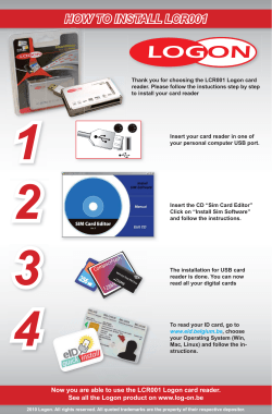


© Copyright 2026