
Document 27202
(VERSION 11.00, April 2014) A UNICODE FONT FOR LINGUISTICS AND ANCIENT LANGUAGES: OLD ITALIC (Etruscan, Oscan, Umbrian, Picene, Messapic) CLASSICAL & MEDIEVAL LATIN, ANCIENT GREEK, COPTIC, GOTHIC, LINEAR B, PHOENICIAN, ARAMAIC, HEBREW, SANSKRIT, RUNIC, OGHAM, ANATOLIAN SCRIPTS (Lydian, Lycian, Carian, Phrygian and Sidetic), IBERIC, CELTIBERIC, OLD & MIDDLE ENGLISH, CYPRIOT, PHAISTOS DISC, CUNEIFORM SCRIPTS (Ugaritic and Old Persian), AVESTAN, PAHLAVI, PARTIAN, BRAHMI, KHAROSTHI, GLAGOLITIC, OLD CHURCH SLAVONIC and MEDIEVAL NORDIC (Old Norse and Old Icelandic). (It also includes characters for LATIN-based European languages, CYRILLIC-based languages, DEVANAGARI, BENGALI, HIRAGANA, KATAKANA, BOPOMOFO and I.P.A.) USER'S MANUAL ALPHABETUM homepage: http://guindo.pntic.mec.es/jmag0042/alphabet.html Juan-José Marcos Professor of Classics. Plasencia. Spain [email protected] 5 April 2014 TABLE OF CONTENTS Chapter 1. 2. 3. 4. 5. 6. 7. 8. 9. 10. 11. 12. 13. 14. 15. 16. 17. 18. 19. 20. 21. 22. 23. 24. 25. 26. 27. 28. 29. 30. 31. 32. 33. 34. 35. 36. 37. 38. 39. 40. 41. 42. 43. 44. 45. 46. 47. 48. 49. 50. 51. 52. 53. 54. 55. 56. 57. 58. Page Introduction Font installation Encoding system Software requirements Unicode coverage in ALPHABETUM Precomposed characters and combining diacriticals Private Use Area Classical Latin Ancient (polytonic) Greek Old & Middle English I.P.A. International Phonetic Alphabet Publishing characters Miscellaneous characters Esperanto Latin-based European languages Cyrillic-based languages Hebrew Devanagari (Sanskrit) Bengali Hiragana and Katakana Bopomofo Gothic Ogham Runic Old Nordic Old Italic (Etruscan, Oscan, Umbrian, Picene etc) Iberic and Celtiberic Ugaritic Old Persian Phoenician Linear B Aegean numbers Cypriot Coptic Kharosthi Ancient Greek numbers. Acrophonic numerals Papyrological numbers Modern New Testament editorial symbols Ancient Greek textual symbols Ancient Greek musical notation Glagolitic Old Cyrillic (Old Church Slavonic) Avestan Brāhmī Anatolian scripts Imperial Aramaic Inscriptional Parthian Inscriptional Pahlavi Phaistos disc Supplementary Multilingual Planes (Plane 1) Input methods for entering Unicode characters Quality of the font Trial version of Alphabetum Registration and price of the font By paying the registration fee you will get ... License and limitations Author's request. Suggestions and queries. Acknowledgements ALPHABETUM Unicode font (v. 11.00 April 2014) 2 3 3 4 5 5 6 7 8 12 16 17 17 17 18 19 21 22 23 24 25 26 27 28 29 30 32 37 40 40 41 43 46 47 49 51 53 54 55 55 56 57 60 69 75 80 87 89 91 93 94 95 96 98 98 99 99 100 100 User's manual. Juan-José Marcos. Plasencia. Spain PRELIMINARY ADVICE : 1. It would be worth spending a few minutes reading the information given below. 2. It would be a good idea to print this document too (100 pages). Note that the print quality will be better than the on-screen display. 3. ALPHA-Test.OTF is an evaluation version, so note that some functions are disabled in this demo font and many characters, (around 600) e.g. the letters “x”, "q", omega, eta and alpha+subscript-iota, vowels “a” and “u”+breve, a few metrical symbols etc, bear a "DEMO" watermark under them. However, the demo version has identical ammount of signs than ALPHABETUM Unicode. If you wish to acquire the full version of the font, please read chapters 54 and 55. 1. INTRODUCTION The ALPHABETUM multilingual Unicode font for word-processors and web-browsers has been designed by Juan-José Marcos, born in Salamanca, Spain, in 1963, with a degree in Classical Philology and Linguistics (PhD), University of Salamanca (1981-1986) and professor of classical languages. This font is the result of a personal interest dating back many years during the problems faced by classicists who needed special characters to type ancient languages. ALPHABETUM font has been specifically designed to type classical and medieval LATIN, ancient GREEK, COPTIC, CYPRIOT, ARAMAIC, HEBREW, SANSKRIT, BRAHMI, GOTHIC, RUNIC, OGHAM, OLD CHURCH SLAVONIC, OLD ITALIC (Etruscan, Oscan, Umbrian, Picene, Faliscan, Messapic etc), IBERIAN, CELTIBERIAN, OLD NORDIC, OGHAM, OLD PERSIAN, AVESTAN, GLAGOLITIC, LINEAR B, UGARITIC, ANATOLIAN SCRIPTS (Lydian, Lycian, Carian, Sidetic etc), PHOENICIAN, KHAROSTHI and OLD & MIDDLE ENGLISH, but this font also includes support for most of the Latin-based European languages (Esperanto, English, Spanish, French, German, Dutch, Italian, Polish, Romanian, Hungarian, Turkish, Danish, Norwegian, Swedish, Finnish, Icelandic, Estonian, Latvian, Lithuanian, Croatian, Slovak, Czech, Welsh, Gaelic, Catalan and Portuguese), Modern Greek, most of the Cyrillic-based languages (Russian, Byelorussian, Bulgarian, Macedonian, Moldavian, Ukrainian, Azerbaijani/Azeri, Abkhaz, Kazakh etc), most of the Devanagari-based languages (Hindi, Nepali, Marathi, Bihari etc) and most of the Bengali-based languages (Bangla, Assamese, Manipuri etc). 2. FONT INSTALLATION As explained below, Unicode is an encoding, not a type of font. A “Unicode” font can be any of a number of types: TrueType, OpenType, Type1, PostScript, CID, LaTex etc. For Windows and Macintosh users, the easiest fonts to use are TrueType and OpenType. ALPHABETUM is a TrueType/OpenType font (TTF/OTF) and it is intalled on your computer like any other fonts of the same type. Steps to install a font in Windows: 1. Click on the Start button in the taskbar, then choose Settings and click on Control Panel. 2. Once the Control Panel window is opened, double-click on the Fonts icon. 3. Select the File menu, and then click Install New Font. The Add Fonts dialog box will appear. 4. In the dialog box Add Fonts select the drive and navigate to the folder where you saved the font file and which contains the font you want to add. 5. When the name of the font you wish to install appears in the list of fonts, select (highlight) it, then click OK to add the font. 6. Close the font dialog when it is finished. Start your word processor and you should see the name of the new font in the list of available fonts. In Mac OSX simply copy and paste the ttf file into your Library/Fonts folder. ALPHABETUM Unicode font (v. 11.00 April 2014) 3 User's manual. Juan-José Marcos. Plasencia. Spain 3. ENCODING SYSTEM As mentioned before, ALPHABETUM is based on the Unicode Standard encoding system. Unicode is a universal standard for character encoding, developed and published by the Unicode Consortium which permits thousands of separate characters to be referenced consistently. Unicode provides the most internationally recognized and standardized way to include more than 256 characters in a font. (Remember that a normal or standard font on a PC or a Mac contains only 256 characters. The first 128 - ASCII code - contains letters, numbers and punctuation marks that we see on the keyboard, plus a few others that are used internally by the computer. Characters with accent marks, non-English characters and additional symbols are found in the block 128-255.) This possibility of including more than 256 characters in a font is clearly beneficial to those who: a) Mix languages in their documents -- Unicode font users do not have to switch to a different font when they need to write in another script. b) Need to use a wide variety of characters and diacritics. c) Wish to exchange documents with other users without running into incompatible arrangements of characters. Ancient Greek is an obvious beneficiary. ALPHABETUM supports the characters defined in version 5.0 of the Unicode Standard and a few new Greek characters included in version 5.1 such as the capital lunate sigma, the san, the sho etc. For further information about the Unicode standard encoding, please visit the following web pages: UNICODE CONSORTIUM home page. http://www.unicode.org/ PATRICK ROURKE's excellent page on Unicode Polytonic Greek on the Web. http://www.stoa.org/unicode/ ALAN WOOD'S list of Unicode resources. Its detailed information is indispensable. http://www.alanwood.net/unicode/ DAVID J. PERRY: Word processing in Classical Languages, an excellent document, full of information about Unicode and why it is useful to scholars. http://scholarsfonts.net/wordprcw.zip Other interesting links on typography: YANNIS HARALAMBOUS: “From Unicode to Typography, a Case Study: the Greek script”: http://genepi.louis-jean.com/omega/boston99.pdf An excellent article full of information about Greek typesetting practices. It is in pdf format (3 Mb), so you will need the free Adobe Acrobat Reader program on your computer to read this document. ADAM TWARDOCH: Polish diacritics. How to? About Polish alphabet and its diacritics (ogonek, kreska and kropka). http://studweb.euv-frankfurt-o.de/twardoch/f/en/typo/ogonek http://www.truetype.demon.co.uk/ TRUE TYPE TYPOGRAPHY MICROSOFT TYPOGRAPHY http://www.microsoft.com/typography/ ALPHABETUM Unicode font (v. 11.00 April 2014) 4 User's manual. Juan-José Marcos. Plasencia. Spain 4. SOFTWARE REQUIREMENTS Only a Windows version of ALPHABETUM is currently available; however this font should be usable on a Macintosh running OSX. This is not a problem, since MacOSX recognizes PC Unicode fonts without complaint. (Note that you will need to restart the computer to fully install the font.) For Unix/Linux systems: I have had reports of people using ALPHABETUM successfully under these systems; however, I have only tested myself the font under Debian. In any case, you need to configure your Xfree server to recognize and to use TrueType fonts in Unix/Linux. You also need a word processor which supports a Unicode font. Mac users. On MacOSX you can use Pages, Papyrus, AbiWord, SUE, Pepper, NeoOffice, Mellel, Nisus Writer or even TextEdit, which comes with the Mac, for rendering the Unicode. At last, Microsoft Word 2004 is Unicode compatible. See Alan Wood's site for further details. Pc users. Recent versions of MS Word (from MS Word 97 up to MS Word 2013) support Unicode (not MS Word 95 and earlier versions). Word Perfect for Windows does not support Unicode. All recent web browsers (Internet Explorer, Chrome, Mozilla, Firefox and Opera on Windows; OmniWeb, Chimera, Safari and Mozilla on Macintosh) do support Unicode. Unix/Linux users. StarOffice, OpenOffice and KWord support Unicode. However, the Unicode editor Yudit (only plain text) is the best in contemporary Unicode support under Unix/Linux system. 5. UNICODE COVERAGE IN ALPHABETUM The current version of the Unicode standard, i.e. Unicode 6.3 (September 2013), defines more than 110,000 characters and the number of characters will be increased further in the near future. The Unicode standard is divided up into ranges or blocks, each range supporting a script/writing system or set of diacriticals or symbols. Naturally, the ALPHABETUM font does not contain all Unicode characters; it was never the intention of the Unicode Consortium that all fonts come with all the characters. ALPHABETUM currently contains over 6,650 glyphs. Among others, ALPHABETUM includes most characters of importance to classicists. The following ranges of Unicode are included in ALPHABETUM (full coverage unless otherwise noted): • • • • • • • • • • • • • • • Basic Latin ● Latin-1 Supplement ● Latin Extended A ● Latin Extended B ● Latin Extended C-D Latin Extended Additional (selected characters) ● Devanagari ● Katakana ● Runic ● Brāhmī Greek & Coptic ● Greek Extended ● Phoenician ● IPA extensions ● Old Italic ● Glagolitic Linear B ● Aegean numbers ● Cypriot ● Aramaic ● Kharosthi ● Iberic ● Celtiberic ● Gothic Hebrew ● Phoenician ● Cyrillic ● Alphabetic Presentation forms (only a few missing characters) Ugaritic ● Old Persian ● Brahmi ● Ogham ● Bengali ● Hiragana ● Inscriptional Pahlavi General punctuation (selected characters) ● Combining Diacritical Marks ● Spacing Modifier letters Superscripts and Subscripts (selected characters) ● Letterlike Symbols (selected characters) Number forms (selected characters) ● Arrows (selected characters) ● Greek musical notation Miscellaneous Symbols (selected characters. Among them full set of planetary and zodiacal symbols) Mathematical Operators (selected characters) ● Geometric Shapes (selected characters) Miscellaneous Technical (selected characters) ● Ancient Greek Acrophonic Numerals CJK Symbols and Punctuation (selected characters used in academic publishing) Private Use Area (additional characters for GREEK – letters with underdot, epsilon with circumflex, capital upsilon+smooth, signs for poetry schemes etc, LATIN – epigraphy, signs for poetry schemes, medieval abbreviations, vowels with brevia or macra and stress mark, vowels with underdot etc, OLD & MIDDLE English – “Saxon” typeface variants, vowels with brevia and macra in combination with stress mark, signs for metrics etc, SANSKRIT – half letters. Many additional characters from different areas of Unicode. ALPHABETUM Unicode font (v. 11.00 April 2014) 5 User's manual. Juan-José Marcos. Plasencia. Spain 6. THE ISSUE OF PRECOMPOSED CHARACTERS AND COMBINING DIACRITICALS. - NORMALIZATION FORM C vs NORMALIZATION FORM D A text (in Ancient Greek for instance) in Unicode can be typed using either precomposed characters (Normalization Form C), in which all the diacritics occur as part of the same glyph as the character they modify, or using combining diacriticals (Normalization Form D), in which the diacritical combinations are on a separate glyph from the character they modify and are displayed in the same space as the character they modify. For example, Greek small letter alpha with smooth (lenis) breathing and (oxia) acute is the precomposed character U-1F04, but the combined characters U-0313 + U-0301 + U-03B1. The two Unicode strings are by definition entirely equivalent. However if you use the combining diacriticals, by default the multiple diacritics of polytonic Greek stack on top of each other, whereas an acute or grave appears next to the breathing mark, so it is safer for now to use the precomposed characters, where available, rather than combining diacritics, to guarantee optimal display. In fact, the World Wide Web Consortium recommends the use of Normalization Form C for World Wide Web documents. Normalization D is what should be used if you ever want to process the text, the conversion between the two is automatic, as long as the proper conventions are followed. However, note that a number of useful precomposed combinations are not yet included in Unicode and there is a very little chance of being added. The decision of not allowing additional precomposed combinations after version 3.0 of Unicode was made because of the increasing reliance on Unicode by web applications and other software that change decomposed into precomposed forms in order to display text properly; such applications will have to be constantly updated if additional precomposed combinations continue to be added. Nevertheless, proposals for additional characters to the standard block can be submitted to the Unicode Consortium and while waiting for them to be approved, these additional precomposed characters can be located in Private Use Area, a special block of Unicode. See the following chapter. If you try to use the combining diacritics in a Unicode font (whatever TTF font you use), you will find that the diacritics usually do not line up properly over or under the base character. You must adjust them manually if your software supports this action. In the future the combining diacriticals may well become more useful when OpenType fonts become widely supported. Nevertheless, ALPHABETUM works with both precomposed characters and combining diacriticals. Despite the difficulty of using the combining diacriticals, I have included all of them in ALPHABETUM (112 combining diacriticals needed to type I.P.A., ancient Greek, Latin and major European languages) for various reasons: a)- They are currently being experimented on. b)- Perseus Project employs them for its display option. c)- The diacritical combining is, for the moment, the only way to put many diacritics used in phonetic transcriptions. The same is applicable to letters with underdot in Greek. However, you can find in the ALPHABETUM Private Use Area the underdot precomposed Greek characters which have not been defined by Unicode yet. ALPHABETUM Unicode font (v. 11.00 April 2014) 6 User's manual. Juan-José Marcos. Plasencia. Spain 7. PRIVATE USE AREA (PUA) A PROBLEM: THE MISSING CHARACTERS As mentioned above, Unicode provides precomposed characters for most characters of interest to classicists; however, a number of useful precomposed combinations are not included. The most important missing characters are: Greek letters with underdot, capital upsilon with smooth breathing, epsilon with circumflex accent, uppercase omega with circumflex accent, a few Latin letters with underdot, symbol for sestertius and denarius, Roman numerals with lines above, vowels and diphthongs with macron or breve in combination with stress mark, signs for metrics, medieval Latin abbreviations etc. THE SOLUTION: PRIVATE USE AREA (PUA) If there are no codepoints already assigned to some characters in Unicode Standard, the font designers can place them in a block of Unicode called Private Use Area (PUA) Unicode reserves this block for characters which will never have codepoints assigned to them by the Unicode Standard. Therefore, this area is available to users for their own needs. THE WEAK POINT: INCOMPATIBILITY There is only one disadvantage with PUA: incompatibility. As far as I know, unfortunately there are no two Unicode fonts that are compatible in their Private Use Area. It is of the utmost importance that font designers come to a consensus about how to utilize the PUA. Failure to do so will result in many unnecessary incompatibilities to the easy exchange of information. One has only need to look at the large number of Greek fonts with many different and incompatible encoding systems (SGreek, GreekKeys, WinGreek, LaserGreek, etc) to see why this is not a desirable situation. The same is true for Old Cyrillic fonts (Irmologion, Kliment, Lazov etc). For this reason, I have coordinated ALPHABETUM private codepoints (where available, as far as possible) with TITUS Cyberbit Basic (U+EA00-U+EB9B / U+ E900-U+E9FF) and with JUNICODE (U+F109 - U+F191) – two excellent Unicode fonts and widely available,–, so it will be easy to convert one into the other by using your word-processor's Search and Replace function. This means that if you receive a text written in TITUS or JUNICODE, you can change the font to ALPHABETUM and the text would, in essence, be the same. Note that if you get crossed rectangles for any characters, it is because they are not present in ALPHABETUM. ALPHABETUM Unicode font has all the characters mentioned above, plus many others in its PUA. ALPHABETUM also contains exclusive characters (metrical symbols, Old Italic variants, Iberic, Celtiberic, Phoenician, Avestan, Brahmi, Old Nordic signs, Glagolitic ligatures, missing Cyrillic signs etc). These unique characters are not present in Titus or Junicode. Here is the PUA scheme in the ALPHABETUM Unicode font: E000-EFFF → Brahmi (EC00-ED2F) The rest signs are coordinated with the TITUS Cyberbit font. F100-F24F → Old Norse and Old English. F280-F2CF → Glagolitic ligatures and glyph variants. F300-F3FF → Old Cyrillic with "ancient look". F400-F5FF → Old Italic (Etruscan, Oscan, Umbrian, Messapic, Picene etc). F600-F6FF → Iberian and Celtiberian. F700-F76F → Metrical signs. F770-F78F → Gothic script. F790-F79F → Additional signs for Hebrew. F7A0-F7DF → Additional signs for Latin and Greek. F7F0-F8EF → Ugaritic. F810-F819 → Ogham glyph variants. F81A-F84F → Old Persian cuneiform. F850-F89F → Avestan. ALPHABETUM Unicode font (v. 11.00 April 2014) 7 User's manual. Juan-José Marcos. Plasencia. Spain 8. CLASSICAL LATIN INTRODUCTION Printing a text in Classical Latin requires no special characters; a standard font has sufficient resources; however, beginner's textbooks require, at a minimum, vowels with macrons, breves and stress marks (sometimes in combination with a breve or macron). These same signs are also used for metrics and others such as the sign for elision, synizesis etc, (see below). Medieval Latin and Epigraphical texts need specialized characters: ligatures, abbreviations etc. ALPHABETUM provides the most common metrical signs and a small selection of epigraphical and medieval characters. All these signs are discussed separately in the following chapters. Finally, modern editors place dots under letters to indicate doubtful readings and employ a lot of signs such as angle brackets, daggers to mark corrupt passages, etc. Most characters mentioned above (except the dagger) are not found in standard fonts. Unicode provides precomposed forms for most characters (but not quite all). The main difficulty with Unicode, as far as Latinists are concerned, is that a number of useful precomposed combinations are not included, the most important are: Y / y plus breve, C/c. F/f. G/g. J/j. Q/q. X/x with underdot and vowels with macra or brevia plus stress. ALPHABETUM includes all of them, many in the Private Use Area. VOWELS WITH MACRONS AND BREVES. VOWELS WITH STRESS ALPHABETUM contains all vowels (uppercase and lowercase) with breve (Y/y, V/v in the PUA), all vowels with macron (V/v in the Private Use Area), all vowels with breve in combination with stress mark and all vowels with macron in combination with stress mark (in the Private Use Area). Unicode includes only in two instances the combination of macron plus acute accent (E/e and O/o) and only one of acute plus breve (A/a). I have included all these combinations because Latin teachers need them and they are not present in Unicode 6.3 SAMPLES : Ā Ă Á Ắ Ē Ĕ É Ḗ Ī Ĭ Í rum Ō Ŏ Ó Ṓ Ū Ŭ Ú Ȳ Ý cque Ǣ Ǽ ā ă á ắ tnes ē ĕ é ḗ ī ĭ í ō ū ȳ ǣ ŏ ŭ ó ú ý ǽ ṓ amṓrem princpium obdiens Cǽsar In divisiōne orbis terra plerīque in parte tertia Afrīcam posuēre, pauci tantummodo Asiam et Eurōpam esse, sed Africam in Eurōpa. Ea finis habet a occidente fretum nostri maris et Oceăni ab ortu solis declīvem latitudĭnem, quem locum Catabathmon incolae appellant. TYPING WITH MACRONS AND BREVES The David J. Perry Latin keyboard for Unicode is designed specifically for the needs of classicists. It is an easy way to enter the vowels with macrons and breves, ligatures Æ æ Œ œ, letters with overdot and underdot, Tironian “and”, versicle & response signs, and many others used in classical Latin. You can download this keyboard from: http://scholarsfonts.net/kbdsonly.exe You must have Tavultesoft Keyman installed in your PC computer to use this Latin keyboard. This program is available from: http://www.tavultesoft.com/keyman/ ALPHABETUM Unicode font (v. 11.00 April 2014) 8 User's manual. Juan-José Marcos. Plasencia. Spain EPIGRAPHY Epigraphical texts needs specialized characters that are not found in conventional fonts, the most common characters are the I-longa, the turned F, the open O, Roman numerals with lines over them, the apex, the interpunct - a dot to separate words -, abbreviations and various ligatures. ALPHABETUM contains those characters mentioned above (several in the Private Use Area) and a large string of others required for transcribing Latin inscriptions such as parentheses for filled-out abbreviations, the underdot for uncertain characters, the angle brackets for letters accidentally omitted, double brackets for letters deliberately erased, inter alia. SAMPLES : - INSCRIPTION HC•SITA•EST•MONTEIA•SATURNINA•QUAE•VXIT•ANN• - NASAL VOWELS ã ẽ ĩ õ ũ cẽsor cõsul virũ - ROMAN NUMERALS WITH LINES ABOVE AND ROMAN COIN SYMBOLS denarius quinarius 𐆗 sestertius dupondius 𐆙 as 𐆚 MEDIEVAL LATIN Medieval Latin texts require specialized characters such as ligatures, abbreviations (a large number of them are found in medieval texts) and others: Æ æ Œ œ Ę ę ⁊ ꝁ ⅌ Ꝓ ꝓ ꝯ ꝫ ꝝ ꝰ ∻ ſt st ꝛ (many in PUA). There are also symbols used in liturgical texts such as the versicle and response signs: ℣ ℟ I have coordinated the Private Use Area codepoints (PUA) with JUNICODE font. Therefore there is full compatibility between both fonts, but note that ALPHABETUM contains much more signs. SAMPLES: Solenti nempe auoreſ numerorū ita eiꝰ celtudinem dignitatē eccłę filiiſ demonſtrare. Qui numerꝰ ut Aureliuſ Auguſtinuſ ait ꝓpterea ⅌feuſ dicitur qua partibꝫ ſuiſ cõplet. Transcription in classical Latin: (Solenti nempe auctores numerorum ita eius celsitudinem dignitatem ecclesiae filiis demonstrare. Qui numerus ut Aurelius Augustinus ait propterea praefectus dicitur qua partibus suis complet.) NOTICE: If you wish to mimic more accurately in your electronic documents the Latin handwriting as it appears in manuscripts, please visit the page entitled “Paleographic fonts” which I have recently created; there you will find information about the different Latin handwriting models and a set of 16 fonts (Capitalis Rustica Latina, Capitalis Elegans, Uncialis Latina, Insularis Minuscula, Carolina Latina, Gothica Textura Quadrata and Humanistica Latina) which try to reproduce properly the characteristics of their corresponding script styles (Capital Rustic, Uncial, Insular, Caroline, Gothic and Humanistic). URL http://guindo.pntic.mec.es/jmag0042/palefont.html ALPHABETUM Unicode font (v. 11.00 April 2014) 9 User's manual. Juan-José Marcos. Plasencia. Spain METRICS Additional characters are required when dealing with metrics. The most important signs used in metrics are the macron and breve (for more information, see above the chapter titled Vowels with macrons and breves), the sign for anceps, the sign for caesura (indicated by a double line), the sign for synizesis (indicated with a tie) and the sign for elision (indicated with an undertie). The metric symbols mentioned above suffice for printing texts aimed at intermediate students as well as for classical Latin, since Latin metrics are somewhat less complex than Greek. The advanced study of Greek metrics requires a large number of special symbols. In Anglo-Saxon poetry, which is likewise organized around stressed and unstressed syllables, stressed syllables are indicated by an acute accent and unstressed syllables by the anceps sign. Also should be mentioned that, at a very advanced level, not all scholars use symbols in the same way, which complicates the issue further. Πηληϊάδεω θεοί antehāc deinde deesse conticuere‿omnes intentique‿ora tenebant There are two ways to do the scansion of poetry verses with a word-processor: a) By typing all the scansion marks on a separate line above the line of text ἐξ οὗ δὴ τὰ πρῶτα διαστήτην ἐρίσαντε (Homer. Iliad I.6) Donec eris felix, multos numerabis amicos b) By typing the vowels with macrons or breves directly. tēmpŏră sī fŭĕrīnt nūbĭlă sōlŭs ĕrs (Ovid. Tristium Liber I, IX v.5-6 ) πλλᾱς δ’ ῑφθῑµους ψῡχᾱς ῎Ăῐδῑ πρῐᾱψν (Homer. Iliad I.3) The first method allows that the caesura can be indicated more easily and it also allows typing the marking of vowels that are long by nature, if desired, in addition to the metrically long and short syllable. If you are using the first method, you will also need to adjust the spacing between metrical characters so that they will line up as far as they can over the vowels below. Due to this difficulty and in order to facilitate a fine appearance of the scansion, I have included in ALPHABETUM a few space characters with different advance widths such as: figure space, thin space and hair space etc. See below the chapter titled Using metrical signs. The second method provides a better appearance if the metrical citation is located within a regular run of text. Both methods, however, are in use in scholarly texts. Such metrical characters are hard to find in computer fonts and no standard exists for their placement and use. To my knowledge, only Anaxiphorminx font contains symbols for metrics. ALPHABETUM provides (in Private Use Area) all the above signs quoted in the two strings, the first has the metrical symbols positioned below the baseline to facilitate the scansion according to method “a” mentioned above, and the second includes the same metrical symbols positioned above the baseline, because the metrical signs are also sometimes printed separately, without accompanying text, for example in explanations of metrical schemes. ALPHABETUM Unicode font (v. 11.00 April 2014) 10 User's manual. Juan-José Marcos. Plasencia. Spain Note that ALPHABETUM also contains duplicates of a few metrical symbols (U+F164 - U+F16C); this is only for compatibility with Junicode. Please do not use them in the regular scansion of verses. A set of nine metrical symbols proposed by the TLG have been approved by Unicode and included in version 4.1 of the standard (March 2005) codepoints 23D1-23D9. METRICAL SIGNS AND MARKS FOR ICTUS INCLUDED IN ALPHABETUM caesura ⏓⏒⏕⏔ ⏖ colon division mark long-short two shorts joined tie anceps stress poem end indicator undertie long ⏑ short ⏗ triseme ⏘ tetraseme anceps long and short ictus ⏙ pentaseme EXAMPLES: ⏑ ⏑ ⏑ ⏑ ⏓ Sapphic verse ⏕⏕⏕⏕⏑⏑ ⏕⏕⏑⏑⏑⏑ Hexameter Pentameter USING METRICAL SIGNS ALPHABETUM is a specialized font for classical metrics which contains around 30 different metrical signs. Nevertheless, these metrical symbols cannot be accessed directly from the keyboard. Naturally you can use the Symbol/Insert command to enter characters; however this is a hard, tedious, and laborious task. This is fine for rarely used characters but too slow for things that you use all the time. In order to facilitate the insertion of metrical signs, I have created two templates (MetricLat and MetricGrk) to use under Word which provides an easy and suitable way to access to metrical signs and vowels with macron and breve directly by using shortcut keys. ALPHABETUM also provides many space characters that allow you to control exactly how metrical signs are placed over the vowels below in order to get metrical characters well lined up. You may be able to get the results you want by using the space characters. For this reason I have also included in MetricLat and MetricGrk shortcut keys for the most useful space characters such as six-per-em-space (341 points of advance width) and hair space (205 points of advance width). Note that the normal advance width when you press the space bar is 550 points in ALPHABETUM font. Registered users interested in metrics can acquire these templates of Word on request, free of any additional charge. I also provide a document in pdf format with information on how to install the templates and the list of keystroke combinations (shortcut keys) required to get metrical characters on your PC. Registered users can modify the template acording to their tastes or even add more shortcut keys if desired. ALPHABETUM Unicode font (v. 11.00 April 2014) 11 User's manual. Juan-José Marcos. Plasencia. Spain 9. ANCIENT (POLYTONIC) GREEK INTRODUCTION If you are new to the world of Greek fonts, you may find it helpful to read the following sections, to get a better idea of how and why fonts differ. Anyone who starts to study Greek with the help of a computer is first of all confronted with the technical problem of the Greek fonts. TYPING IN GREEK: THE BASICS You will need... • A Greek font. Without one of these Greek fonts you will not be able to see any Greek on your computer • A keyboard utility. Most (but not all) Greek fonts for the PC need some kind of program to facilitate the addition of accents and breathings, or in some cases to get any Greek on the screen at all. ENCODING SYSTEMS There are a lot of encoding systems to type in Ancient Greek: WinGreek, GreekKeys, SGreek, SILGreek, Mounce/TekniaGreek, BetaCode, Unicode etc. The WinGreek and the SGreek Greek fonts, for example, belong to different encoding systems this is another way of saying that the characters in each font are ordered differently. For example: = with the WinGreek Grammata font, pressing the letter 'c' on the keyboard makes the Greek letter 'chi' appear on the screen. = with the SGreek font, pressing 'c' on the keyboard gives the Greek letter 'xi'. This means that if you were given a text written in the WinGreek Milan font (based on the WinGreek encoding system), you could change the font to Grammata, Greek Old Face, Greek, Korinthus, Angaros, Grecs du Roi, or any other font based on the WinGreek encoding system, and the text would in essence be the same – the letter shapes would just look slightly different. However, if you were to change the font to SGreek, which is based on a different encoding system, the text would become meaningless gibberish. This has two important consequences: 1. Most utilities to type Greek are designed for a particular encoding system: thus Son of WinGreek works with fonts based on the WinGreek system, but no others. The same goes for Antioch, which works with fonts based on the Unicode system, but no others. So your choice of font limits your choice of utility, and vice versa. 2. The issue of encoding systems comes most clearly to the fore when exchanging documents containing Greek text with colleagues: if you both have the same font on your computers, then obviously there are no problems. If you are both using fonts based on the same encoding system (for example, one uses Grammata and the other Greek Old Face), then it is easy to convert one to the other. However, if you are using fonts based on different encoding systems (such as Grammata and SGreek), there is no easy way to convert one to the other and the Greek text will be unintelligible. The arrival of Unicode fonts should help in time to bring some order to the current chaotic situation. ALPHABETUM Unicode font (v. 11.00 April 2014) 12 User's manual. Juan-José Marcos. Plasencia. Spain KEYBOARD UTILITIES WITH UNICODE SUPPORT There is no easy way to access Greek characters directly in a Unicode font. Unlike normal fonts, which contain about 256 characters, Unicode fonts can contain thousands of characters - potentially a character set for each one of the world's languages. This means that they operate slightly differently to normal fonts: for example, the Unicode Greek fonts tend to contain a Roman font as well as a Greek font, and indeed, the Greek cannot be accessed directly from the keyboard at all. Pressing 'b' on the keyboard will produce a 'b' on the screen, not the Greek letter beta, so some kind of utility (or laborious use of the Insert / Symbol command) is required to produce a Greek letter of any kind. Windows 98 and Windows Me do not provide Unicode support to type polytonic Greek in Word. If you have Windows 2000, XP, Vista or 7, you can use the polytonic Greek keyboard that comes on the Windows CD to type your Greek in Word, Notepad, Outlook Express, InDesign and several other applications as well. This keyboard is based on the old Greek typewriter layout. Nevertheless, in my opinion, this Greek keyboard is sometimes counter-intuitive; therefore some users may not want to use it. There are very good alternatives available, however. At the time of this writing, the most important utilities for inputting polytonic Greek are the following: WINDOWS: - RALPH HANCOCK'S Antioch.An excellent program (keyboard and also format convertor US $50). http://www.users.dircon.co.uk/~hancock/antioch.htm - STEFAN HAGEL'S Multikey. Also an excellent program (keyboard and format convertor. Free). http://www.oeaw.ac.at/kal/multikey/ - ALEXEJ KRYUKOV'S Thessalonica. Keyboard and format convertor. Free (GNU license). http://www.thessalonica.org.ru/en/index.html - JESÚS QUÍLEZ Sibylla. Keyboard and format convertor. Free. User's interface Spanish & English. It operates at system level. http://recursos.cnice.mec.es/latingriego/Palladium/5_aps/esplap17.htm - (MATZENTA) or MAGENTA SOFTWARE Accentuator (Polytonistis) for Unicode. US $65). http://www.magenta.gr/ - MANUEL A. LOPEZ'S Classical Greek Unicode keyboard. Another free utility. http://members.aol.com/AtticGreek/ - DAVID J. PERRY'S Greek Polytonic Unicode keyboard. Another free utility. http://scholarsfonts.net/kbdsonly.exe These last two keyboard utilities use Tavultesoft Keyman controller, version 5.0 or newest. http://www.tavultesoft.com/keyman/ MAC: - DONALD MASTRONARDE'S GreekKeys Unicode keyboard for MacOSX. It has the support of the American Philological Association: http://socrates.berkeley.edu/~pinax/greekkeys/AboutGKU.html - NICK NICHOLAS' GkUnicode Keyboard for MacOSX. Free. It constitutes a variant of the GreekKeys keyboard, with all the Unicode 3.2 Greek characters accessible. http://www.opoudjis.net/Play/GkUnicode.html - LUCIUS HARTMANN Alkaios keyboard. for MacOSX. Free. http://www.lucius-hartmann.ch/diverse/greekfonts/docs/alkaios_keyboard.zip LINUX: - THESSALONICA. Alexej Kryukov. Free (GNU license). Keyboard and format convertor. http://www.thessalonica.org.ru/en/index.html Currently supports 3 encodings for polytonic Greek: Unicode, WinGreek and WinLanguage (= Unitype or ParatypePG). ALPHABETUM Unicode font (v. 11.00 April 2014) 13 User's manual. Juan-José Marcos. Plasencia. Spain ALPHABETUM GREEK FONT ALPHABETUM's Greek design is mutatis mutandis mainly based on the typeface of the Goeschen editions, published in Leipzig. (Note that the original typeface is in italics, though.) This design is representative of the German Greek typefaces used in the late 18th and early 19th century. ALPHABETUM contains all regular polytonic precomposed characters of ancient Greek, archaic letters: ϝ ͱ ϛ ϡ ϟ ϙ and alternative forms for a few letters: ϐ β κ ϰ φ ϕ ρ ϱ Y ϒ θ ϑ, lunate sigma ϲ Ϲ , lunate epsilon ϶ ϵ , san Ϻ ϻ , Bactrian letter sho Ϸ ϸ, “and” ligature ϗ Ϗ, capital upsilon with smooth breathing for poetry in the Aeolic dialect (in PUA), precomposed underdot combinations Ẹ Ẓ Ḥ etc (in PUA), epsilon with circumflex accent , , , uppercase omega with circumflex accent (in PUA) used when transcribing inscriptions but not found in classical literary texts, vowels with macrons and breves ᾰ ῐ ῠ ᾱ ῑ ῡ (most of them in PUA) and other unusual combinations such as , recently supported by Antioch 2.0 (in PUA, coordinated with Vusillus font by Ralph Hancock). SAMPLES : The following Greek text has been typed using precomposed characters with ALPHABETUM : Mῆνιν ἄειδε θεὰ Πηληϊάδεω Ἀχιλῆος (1) οὐλοµένην, ἣ µυρί’ Ἀχαιοῖς ἄλγε’ ἔθηκε, πολλὰς δ’ ἰφθίµους ψυχὰς Ἄϊδι προΐαψεν ἡρώων, αὐτοὺς δὲ ἑλώρια τεῦχε κύνεσσιν (5) οἰωνοῖσί τε πᾶσι, ∆ιὸς δ’ ἐτελείετο βουλή, ἐξ οὗ δὴ τὰ πρῶτα διαστήτην ἐρίσαντε Ἀτρεΐδης τε ἄναξ ἀνδρῶν καὶ δῖος Ἀχιλλεύς. Tίς τάρ σφωε θεῶν ἔριδι ξυνέηκε µάχεσθαι; Λητοῦς καὶ ∆ιὸς υἱός· ὃ γὰρ βασιλῆϊ χολωθεὶς - Homer Iliad 1-9 The following Greek text has been typed using diacritical combining with ALPHABETUM: Θουκυδίδης Α ̓ θηναι̂ος ξυνέγραψε τὸν πόλεµον τω̂ν Πελοποννησίων καὶ Α ̓ θηναίων, ὡς ἐπολέµησαν πρὸς ἀλλήλους, ἀρξάµενος εὐθὺς καθισταµένου καὶ ἐλπίσας µέγαν τε ἔσεσθαι καὶ ἀξιολογώτατον τω̂ν προγεγενηµένων, τεκµαιρόµενος ὅτι ἀκµάζοντές τε ᾐ̂σαν ἐς αὐτὸν ἀµφότεροι παρασκευῃ̂ τῃ̂ πάσῃ . . . - Thucydides Peloponnesian War. ALPHABETUM Unicode font (v. 11.00 April 2014) 14 User's manual. Juan-José Marcos. Plasencia. Spain Epichoric Greek alphabets. ALPHABETUM font also contains the signs required to represent the epichoric Greek alphabets as the following table shows below. Please note that most of these signs are allocated in the PUA block. Phonetic value North Semitic Greek 9th6th cent. B.C. a b g d ĕ u (y) z ē th i k l m n x o p s q r s t ph kh ps ō 𐤀 𐤁 𐤂 𐤃 𐤄 𐤅 𐤆 𐤇 𐤈 𐤉 𐤊 𐤋 𐤌 𐤍 𐤎 𐤏 𐤐 𐤑 𐤒 𐤔 𐤕 𝈕 ALPHABETUM Unicode font (v. 11.00 April 2014) Ionic Attic Western branch Φ Φ Eastern branch Φ 15 Classical Α Β Γ ∆ Ε Υ Ζ Η Θ Ι Κ Λ Μ Ν Ξ Ο Π Ρ Σ Τ Φ Χ Ψ Ω User's manual. Juan-José Marcos. Plasencia. Spain 10. OLD & MIDDLE ENGLISH Writing Old and Middle English have some special needs that are not in standard fonts. Only a few letters such as eth, thorn, yogh and wynn are part of the standard character set. Old and Middle English need special characters such as thaet, vowels with macrons, breves, signs for metrics and other ones. Unicode provides many characters, but not all. ALPHABETUM contains most of them. In Private Use Area I have included the characters that are not found in Unicode 6.2 ALPHABETUM also includes “Saxon” typeface variants (in PUA). I have coordinated private codepoints (PUA) with JUNICODE font. Therefore there is a complete compatibility between the fonts. • SAMPLES: LETTERS: Thorn, wynn, yogh, eth, etc. Þ þ Ƿ ƿ Ȝ ȝ Ð ð ſ, abbreviations “thaet” , “and” ⁊ , vowels with breves, macrons and stress , ū, . . . (many in the Private Use Area). ALPHABETUM also includes “Saxon” typeface: ꝺ ꝼ ᵹ ꞃ ꞅ ꞇ (in the Private Use Area). Text with “Saxon” typeface: Ƿe æꞇhꞃẏnon mıꝺ uꞃum aꞃun þa ẏðan þæꞅ ꝺeopan ƿælıꞅ; ƿe ᵹeſaƿon eac þa munꞇaꞅ ẏmbe þæꞃe ſealꞇan ſæ ſꞇꞃanꝺe, anꝺ ƿe mıꝺ aðeneꝺum hꞃæᵹle anꝺ ᵹeꞅunꝺꝼullum ƿınꝺum þæꞃ ᵹeƿıceꝺon on þam ᵹemæꞃum þæꞃe ꝼæᵹeꞃeꞅꞇan þeoꝺe. Þa ẏðan ᵹeꞇacnıað þıꞅne ꝺeopan cꞃæꝼꞇ, anꝺ . . . The same text with modern letter-forms: Wē æthrynon mid ūrum ārun þā ȳðan þǣs dēopan wǣlis; wē gesāwon ēac þā muntas ȳmbe þǣre sealtan sǣ strande, and wē mid āðēnedum hrægle and gesundfullum windum þǣr gewīcedon on þām gemǣrum þǣre fægerestan þeode. Þa ȳðan getacniað þisne deopan crǣft, and . . . Ðǣm eafera wæs æfter cenned geong in geardum, þone god sende folce tō frōfre. fyrenðearfe ongeat þæt hīe ǣr drugon aldorlēase lange hwīle. – Beowulf. Prologue 12-16 a • TYPING OLD & MIDDLE ENGLISH: I have created a template (OldEngl.dot) to use under Word which provides an easy and convenient way to access directly Old English characters (including Saxon typefaces variants) present in ALPHABETUM by using shortcut keys. Registered users interested in Old English script can acquire this Word template on request, free of any additional charge. I also provide a document in pdf format with information on how to install OldEngl.dot and the list of keystroke combinations (shortcut keys) required to get Old English characters on your PC. Registered users can modify the template or even add more shortcut keys if desired. ALPHABETUM Unicode font (v. 11.00 April 2014) 16 User's manual. Juan-José Marcos. Plasencia. Spain 11. I.P.A. INTERNATIONAL PHONETIC ALPHABET Many pages on the Internet use the International Phonetic Alphabet, or IPA, to describe the sounds of many languages and Unicode is the preferred method of representing the IPA. ALPHABETUM includes characters needed for phonetic transcriptions: (full set of IPA extensions – Unicode range 0250-02AF –, full set of phonetic modifiers and tone letters – Unicode range 02B0-02FF –, and 112 combining diacritical marks, most of them concerning phonetics). So you can do phonetic transcriptions of most common and major languages such as English, French, German, Spanish and so forth. Unicode provides us with IPA characters but entering them is not easy. Lukas Pietsch has created a keyboard to run under Tavultesoft Keyman 5.0 that allows typing IPA. This keyboard is free available at http://people.freenet.de/LukasPietsch/Keyman/Keyboards.html SAMPLES: ɒ ɓ ɔ ɕ ɖ ɗ ǝ ɞ ʉ ɻ ȿ ʄ ʔ ʝ ʠ ʬ ˥ ˦ ˧ ˨ ˩ ˪ ˫ e̘ e̝ n̩ tʸ u̟ d̺ e̯ = British English father /ˈfɑːðǝ/ phonetician /ˌfǝʊnǝˈtɪʃǝn/ dog /dɒɡ/ bird /bɜːd/ teacher /ˈtiːʧǝ/ paw /pɔː/ jam /ʤæm/ cup /kʌp/ theatre /ˈθiːǝtǝ/ meeting /ˈmiːtɪŋ/ good /ɡʊd/ = American English better /ˈbet̬ɚ/ going-over /ˈɡoʊɪŋˈoʊvɚ/ deserter /dɪˈzɝːt̬ɚ/ = French sorte /sɔrt/ palmeraie /palmǝrɛ/ pâleur /pɑlœːr/ chirurgie /ʃiryrʒi/ cuisinière /kɥɩzinjɛːr/ majeur /maʒœːr/ = Spanish uña /ˈuɲa/ águila /ˈaɣila/ leche /ˈleʧe/ cinco /ˈθiŋko/ almohada /almoˈaða/ 12. PUBLISHING CHARACTERS ALPHABETUM contains most common publishing characters and a few CJK symbols that may be useful to those who are preparing text editions to publish. – ― ( ) [ ] ¬ • ⁁ † ‡ ⁋ ¶ § « » < > ⊂ ⊃ “ ” 〈 〉 ⟪ ⟫ ⌜ ⌝ ⌞ ⌟ ⌈ ⌉ ⌊ ⌋ ⁅ ⁆ 『 』 〖 〗 ⟦ ⟧ ® © ™ 13. MISCELLANEOUS CHARACTERS ALPHABETUM also contains many additional characters (selected characters), from different areas of Unicode such as Mathematical Operators, Geometric Shapes, Miscellaneous Technical, Arrows, Dingbats and the full set of planetary and zodiac symbols etc. SAMPLES: ∂∆ΠΣ√∞∫□▭◊◌●⌘⌥←↑→↓↔↕↗↘☎✉☯☹☺ ☼☼☽☾☿♀♁♂♃♄♅♆♇♈♉♊♋♌♍♎♏♐♑♒♓ ☩✠ ★ ✡☉�ℌℭ⁂ ∴ ∵ ⋮ ≠ ≤ ≥ ☠ ☤ ☧ fffiflffiffl ALPHABETUM Unicode font (v. 11.00 April 2014) 17 User's manual. Juan-José Marcos. Plasencia. Spain 14. ESPERANTO Up until now, the most important standard for Esperantists has been ISO 8859-3 (Latin 3), because the accented letters of Esperanto are placed in this standard, therefore Esperantists often use Latin 3 in their documents and homepages. This is a problem for Russian, Greek and Hebrew Esperantists (among others) who want to create homepages, because these languages and Esperanto cannot be represented in the same document using the standard Latin 3. The solution to the problem is Unicode which defines codes for all major languages. A keyboard utility that allows to type Esperanto in Unicode is available from Gyula Zsigri site at http://zsigri.tripod.com/fontboard/espero.html It is very easy to use, simply type an ”x” after ”c, g, h, j, s, u” letters to accent them. (Note that you also need the free Tavultesoft Keyman controller version 5.0 or later) ALPHABETUM allows users to type Esperanto in Unicode because this font contains the 12 special letters of its alphabet: ĉ Ĉ ĝ Ĝ ĥ Ĥ ĵ Ĵ ŝ Ŝ ŭ Ŭ SAMPLES: Se vi havas TTT-ejon kun multaj paĝoj en Esperanto, vi konas la problemon. La supersignajn Esperantajn literojn oni povas prezenti en pluraj malsamaj manieroj: laŭ Unikodo, laŭ Latino 3, laŭ la Fundamenta H-sistemo, laŭ la X-sistemo k.t.p. Ne ĉiuj legantoj povas vidi ĝustajn Esperantajn literojn laŭ Unikodo aŭ Latino 3, kaj ĉiu havas sian preferon pri la plej bona surogata sistemo. La ĝardeno de la imeroj (1909) Leviĝas preĝo el izol-ĝardeno. Forflugas paŝoeoj ĉe la padoj, kaj l' arbo-ombroj laŭ fantom-ondadoj sur kristal-lagon falas kun ektremo. Ĉe la parko-fon' en romantika spleno kaj ŝancelanta skalo da korbatoj, fontan' fieras pri perlar-kromatoj sub pala roza lum' en milda sveno. L' animo de Chopin solec-inklina esprimas triston per lirika ploro, malsana pro tro da kares' virina. Dormiĝas lasta pian-not' sen gloro. Ĉe l' parkofrondo mortas kant' proksima, ja najtingal' tremkantas kun langvoro. Francisco Villaespesa ALPHABETUM Unicode font (v. 11.00 April 2014) 18 User's manual. Juan-José Marcos. Plasencia. Spain 15. LATIN-BASED EUROPEAN LANGUAGES As I mentioned in the introduction, ALPHABETUM supports most and all major European languages (English, Spanish, French, German, Dutch, Modern Greek, Italian, Polish, Romanian, Hungarian, Turkish, Danish, Norwegian, Swedish, Finnish, Icelandic, Estonian, Latvian, Lithuanian, Croatian, Slovak, Czech, Welsh, Gaelic, Catalan and Portuguese). ALPHABETUM contains all the regular characters for all these languages in precomposed characters or combining diacritical marks. SAMPLES: POLISH Jest więc taki świat, nad którym los sprawuję niezależny? Czas, który wiążę łańcuchami znaków? Istnienie na mój rozkaz nieustanne? Radość pisania. Możność utrwalania. Zemsta ręki śmiertelnej. – Wisława Szymborska. TURKISH Uğur Menkul Değerler adlı borsa aracı kurumun Genel Müdürü Orhan Atalay tarafından dolandırma olayına adı karışan güzel emlakçı soley Akkaya, Mali Şube'de ifadesi alındıktan sonra savcılık tarafından serbest bırakıldı. Atalay'ın sevgilisi olduğu iddia edilen Akkaya suçlamalan reddederek şöyle konuştu: “Kurumun sahibi Mustafa Kurt, benim aracılığımla sattığı villasının, 1 milyar 200 milyon liralık komisyon borcuna karşılık bana çek vermişti. Ancak paramı alamayınca haciz kararı çıkarttım. Öç almak amacıyla, bana iftirada bulundu.” Akkaya, borsacı hakkında tazminat davası açacağını söyledi. – Türkiye'nin en iyi gazetesi. ALPHABETUM Unicode font (v. 11.00 April 2014) 19 User's manual. Juan-José Marcos. Plasencia. Spain SPANISH (Español) Don Quijote de la Mancha. Parte primera. Capítulo IV. La del alba sería cuando don Quijote salió de la venta tan contento, tan gallardo, tan alborozado por verse ya armado caballero, que el gozo le reventaba por las cinchas del caballo. Mas viniéndole a la memoria los consejos de su huésped cerca de las prevenciones tan necesarias que había de llevar consigo, especial la de los dineros y camisas, determinó volver a su casa. . . – Miguel de Cervantes DANISH Iliaden, 1. sang, 1-10. Vreden, Gudinde! besyng, som greb Peleiden Achilleus Rædsomt, og Qvaler i tusinde Tal Achaierne voldte. Heel mangfoldige Heltes behjertede Sjele den skikked Ned til Hades's Hjem, og for Hunde til Rov som for alskens Fugle den gav deres Liig, - fuldbragt blev Zeus's Beslutning 5 Alt fra den Stund, Uenighed først og Splid havde reist sig Mellem den Ædling Achilles og Mændenes Drot Agamemnon. Hvo blandt Guderne hidsed dem op til Strid og til Kivsmål? Letos og Zeus's Søn; thi høist forbittret på Kongen Ypped i Hæren han dødelig Sot, så Krigerne segned 10 – Homer HUNGARIAN (Magyar) Odüsszeia 1.1-10 Férfiuról szólj nékem, Múzsa, ki sokfele bolygott s hosszan hányódott, földúlván szentfalu Tróját, sok nép városait, s eszejárását kitanulta, s tengeren is sok erős gyötrelmet tűrt a szivében, menteni vágyva saját lelkét, társak hazatértét. Csakhogy nem tarthatta meg őket, akárhogy akarta: mert önnön buta vétkeikért odavesztek a társak, balgák: fölfalták Hüperíón Éeliosznak barmait, és hazatértük napját ő elorozta. Istennő, Zeusz lánya, beszélj minekünk is ezekből. 5 10 – Homérosz ALPHABETUM Unicode font (v. 11.00 April 2014) 20 User's manual. Juan-José Marcos. Plasencia. Spain 16. CYRILLIC-BASED LANGUAGES ALPHABETUM contains a full set of Cyrillic characters: Basic Russian Alphabet – Unicode range 0410-044F –, Cyrillic Extensions – U + 0400-040F –, Historic Letters – U + 0460-0481 (plus additional signs in Private Use Area, EE30-EE7E) – and Extended Cyrillic – U + 048A-04F9. Therefore, with ALPHABETUM you can type in many languages which use the Cyrillic alphabet such as Russian, Old Russian, Old Church Slavonic, Byelorussian, Bulgarian, Macedonian, Moldavian, Ukrainian, Abkhaz, Uzbek, Azerbaijani, Azeri, Bashkir, Tajik, Kazakh, Yakut, etc. SAMPLES: BULGARIAN CYRILLIC ALPHABET АƂBΓДEЖЗИЙKЛMHOΠPCTУΦΧЦЧШЩЪЬЮЯ aбʙгдeжзийклмнопpcтyфxцчшщъьюя MACEDONIAN CYRILLIC ALPHABET АƂBΓДЃEЖЗSИJKЛЉMHЊOΠPCTЌУΦΧЦЧЏШ aбʙгдѓeжзsиjклљмнњопpcтќyфxцчџш SERBIAN CYRILLIC ALPHABET АƂBΓДЂEЖЗИJKЛЉMHЊOΠPCTЋУΦΧЦЧЏШ aбʙгдђeжзиjклљмнњопpcтħyфxцчџш BYELORUSSIAN CYRILLIC ALPHABET АƂBΓДEËЖЗIЙKЛMHOΠPCTУЎΦΧЦЧШЫЬЭЮЯ aбʙгдeëжзiйклмнопpcтyўфxцчшыьэюя HISTORIC (Old Church Slavonic) AND PRE-1918 RUSSIAN LETTERS (see also page 59) ѢѣѤѥѦѧѨѩѪѫѬѭѮѯѰѱѲѳꙋѴѵѶѷѸѹѺѻѼѽѠѡѾѿҀҁ ꙀꙁꙈꙉꙨꙩꙪꙫꙬꙭꙊꙔꙕꙖꙗꙜꙝꙢꙣꙐꙑꙞꙟ RUSSIAN ALPHABET АƂBΓДEËЖЗИЙKЛMHOΠPCTУΦΧЦЧШЩЪЫЬЭЮЯ aбʙгдeëжзийклмнопpcтyфxцчшщъыьэюя War and Peace «Чтo этo? я пaдaю? y мeня ноги подкaшиʙaютcя », - подyмaл он и yпaл нa cпинy. Oн pacкpыл глaзa, нaдeяcь yʙидaть, чeм кончaлacъ боpьбa фpaнцyзоʙ c apтиллepиcтaми, и жeлaя знaть, yбит или нeт pыжий apтиллepиcт, ʙзяты или cпaceны пyшки. Hо он ничeго нe ʙидaл. Haд ним нe было ничeго yжe, кpомe нeбa - ʙыcокого нeбa, нe яcного, но ʙce-тaки нeизмepимо ʙыcокого, c тиxо ползyщими по нeм cepыми облaкaми. – Leo Tolstoi. ALPHABETUM Unicode font (v. 11.00 April 2014) 21 User's manual. Juan-José Marcos. Plasencia. Spain 17. HEBREW ALPHABETUM HEBREW FONT ALPHABETUM contains the characters needed to type Hebrew (Ivrit), Ashkenazi (Yiddish) and Ladino. This font includes not only the Hebrew letters (the Alefbet) but all vowels points (nikuddim, i.e. segol, kubbutz, holam etc), accents and cantillation marks (ole, tevir, pazer, munah etc) required for Biblical Hebrew. Therefore with ALPHABETUM you can write Hebrew “pointed” text. A PROBLEM: THE HEBREW DIACRITICS As I mentioned in chapter 6, combining diacritics usually do not line up properly over or under the letter, and in the Unicode Hebrew block there are 48 combining characters! At the time of this writing, as far as I know, there are not many Unicode fonts with the full set of Hebrew characters and most of them do not display the multiple diacritics of Hebrew script well, especially cantillation marks. It is undoubtedly almost impossible to get an optimal diacritic display with the TTF technology. Nevertheless, ALPHABETUM composes diacritics rather well in Word, all things considered, though with a few exceptions, I admit. Only fonts which make use of the OpenType technology can display combining Hebrew diacritics properly; e.g. the LaserHebrew Unicode font of Linguist's Software, however, it costs $100 and only includes support for Hebrew and some Latin-based European languages. Other widely and available Unicode fonts like Code 2000 or Titus unfortunately do not display Hebrew cantillation marks acceptably when they occur together with a vowel mark onto the same sign. TYPING IN HEBREW Hebrew script requires you to type backwards (Hebrew goes from right to left), however, word processors go from left to right. Therefore, if you need to type a significant amount of text in Hebrew, you will need a method which allows you to type backwards. An excellent keyboard and font utility for Word 97 and higher (under Windows) is Antioch by Ralph Hancock which allows fast typing of Hebrew with vowel points and common accents. Antioch is available at http://www.users.dircon.co.uk/~hancock/antioch.htm If you want to use Hebrew in true right-to-left fashion, you must have Word 2000 or above running under Windows 2000 or above. You also can use a Unicode editor such as UniPad (plain text only). VERY IMPORTANT: If you wish to get an acceptable position of Hebrew characters, you must enter your text in this order: base letter – dagesh – vowel point – sin/shin dot – cantillation mark. In case you use other different order you will find displacement of characters in ALPHABETUM. SAMPLES: The Hebrew alphabet: אבגדהוזחטיכךלמםנןסעפףצץקרשת Cantillation marks: Gen 1.21/9 שׁ ֩ר ֶא ֲ Numb 35.5 פּ ִ֪ים ַ אַל ְ Gen 1.7/2 ים ֮ לֹה ִ א ֱ Gen 1.4/1 ַו ַיּ ְ֧רא רץ׃ ֶ האָ ָ ְאת ֵ שּׁ ַמ ִים ו ָה ַ את ֵ לֹהים ִ א ֱ רא ָבּ ָ רא ִשׁית ֵ א ְבּ מּ ִים׃ ָה ַ ל־פּנֵי ְ ע ַ פת ֶח ֶר ַ לֹהים ְמ ִ א ֱ ְרוּח ַ ל־פּנֵי ְתהוֹם ו ְ ע ַ ׂשׁ ְך ֶ ְתה תֹהוּ וָבֹהוּ ְוח ָ הי ָ אָרץ ֶ ְה ָב ו י־אוֹר׃ ֽ ְה ִ לֹהים ְי ִהי אוֹר ַוי ִ א ֱ ַיּּאמר ֶ גו - Genesis 1:1-3 ( כל אדם זכאי לזכויות ולחירויות שנקבעו בהכרזה זו ללא אפליה1) סעיף ב , דעה פוליטית או דעה בבעיות אחרות, דת, לשון, מין, צבע,כלשהי מטעמי גזע . לידה או מעמד אחר, קניין,בגלל מוצא לאומי או חברתי - Universal Declaration of Human Rights. ALPHABETUM Unicode font (v. 11.00 April 2014) 22 User's manual. Juan-José Marcos. Plasencia. Spain 18. DEVANAGARI The Devanagari script is used for writing classical Sanskrit and several languages such as Hindi, Nepali, Kashmiri, Konkani, Marathi, Bihari, among others. ALPHABETUM font contains a full set of Devanagari characters included in Unicode, range U+0900-U+097F. However, there are no codepoints assigned yet to the many Devanagari characters in Unicode Standard as ligatures or conjuncts that are not represented in the Unicode Standard. Devanagari characters can combine or change shape depending on their context, i.e. a character's appearance is affected by its ordering with respect to other characters. Some Devanagari consonant letters have alternative presentation forms whose choice depends upon neighboring consonants. The Indic scripts are noted for a large number of consonant conjunct forms that serve as orthographic abbreviations (ligatures) Consonant letters may also be rendered as half-forms, which are presentation forms used to depict the initial consonant in consonant clusters. The Unicode Standard notes: ”In a font that is capable of rendering Devanagari, the set of glyphs is greater than the number of Devanagari Unicode characters” (Unicode Consortium 6-38). In Private Use Area (PUA, E900-E9FF) I include many Devanagari characters that are not found in Unicode 6.3 such as half-letters. I have coordinated private codepoints with TITUS Cyberbit font. The Devanagari Keyboard produced by Andrew Glass (University of Washington) provides a convenient way to input Devanagari in Unicode enabled Windows systems. The Devanagari Keyboard is available at: http://depts.washington.edu/ebmp/software.html This Devanagari keyboard utility uses Tavultesoft Keyman controller. SAMPLES: Sanskrit Alphabet (Sanskṛta varṇa mālā ) Detached or independent vowels (svara): ऄ अ आ इ ई उ ऊ ऋ ऌ एऐओऔ Vowel marks: ा ि ी ु ू ृ ो ौ े ै (anusvāra) अं (visarga) आः Numbers: ० १ २ ३ ४ ५ ६ ७ ८ ९ Consonants (vyañjana): ा ा ा ङ ा ा द ा ा ा ा ा ा ा छ ा ा ा ा र ा ा ा ा ा ह टठडढण Half letters (in PUA): etc. Devanāgarī script Roman transcription ौांाााा उााा vaiśaṃpāyana uvāca Mahābhārata MB 3, 185 अा ोा ाहाा ा ााः ाुाहाााू । atha kalena mahatā sa matsyaḥ sumahān abhūt अिाारे ाो ौा ाााौ ाााािा ॥१३॥ aliñjare jale caiva nāsau samabhavat kila (13) ALPHABETUM Unicode font (v. 11.00 April 2014) 23 User's manual. Juan-José Marcos. Plasencia. Spain 19. BENGALI Bengali is a Brahmi-derived script closely related to Devanagari from which it started to diverge around the 11th century A.D. This script is still currently used in Bangladesh and in other regions in the eastern part of India to write languages such as Bengali (Bangla), Assamese, Manipuri, Garo and Mundari. The Bengali script is a syllabic alphabet in which all consonants have an inherent vowel. This vowel can be muted with a special diacritic named hasanta. Vowels can be written as independent letter or by using a variety of diacritical marks above, below, before or after the consonant they belong to. Like Devanagari script, when consonants occur together in clusters, special conjunct letters are used. The Bengali Keyboard produced by Andrew Glass (University of Washington) provides a convenient way to input Bengali in Unicode enabled Windows systems. The Bengali Keyboard is available at: http://depts.washington.edu/ebmp/downloads/Bengali.exe This keyboard utility uses Tavultesoft Keyman controller. The Bengali script is hard to find in existing Unicode fonts. The ALPHABETUM Unicode font contains the whole range of Bengali characters encoded in the Unicode Standard. • SAMPLES: INDEPENDENT VOWELS অআইঈউঊঋঌএঐওঔ DEPENDENT VOWELS SIGNS া ি ী ু ূ ৃ ৄ ে ৈ TWO-PART DEPENDENT VOWELS SIGNS “o” ো ৌ “au” VARIOUS SIGNS avagraha ঽ candrabindu ঁ anusvara ং visarga ঃ hasanta ্ AU length mark CONSONANTS কখগঘঙচছজঝঞটঠডঢণতথদধনপফবভমযর লশষসহড়ঢ়য় NUMERALS ০১২৩৪৫৬৭৮৯ ADDITIONAL SIGNS ৠ ৡ ৢ ৰ ৱ ৲ ৳৷ ৸ ৹ ৺ EXAMPLE: (Combinations with letter “k”) ক কা িক কী কু কূ কৃ েক ৈক োক ৌক ka ko kau kā ki kī ALPHABETUM Unicode font (v. 11.00 April 2014) ku kū kri 24 ke kai User's manual. Juan-José Marcos. Plasencia. Spain ৗ 20. KATAKANA and HIRAGANA Before the 4th century AD, the Japaneses had no writing system of their own. During the 4th century they began to import and adapt the Chinese script, probably via Korea. At first the Japaneses wrote in Classical Chinese or in a Japanese-Chinese hybrid style. They then start to use Chinese characters to write Japanese in a style which used the characters for their phonetic values. Over time a writing system emerged in which Chinese characters were used to write either words borrowed from Chinese or Japanese words with the same or similar meanings. Chinese characters were also used for their phonetic values to write grammatical elements and these characters were simplified and eventually became two syllabic scripts, Hiragana and Katakana. Modern Japanese is written with a mixture of Hiragana and Katakana, plus kanji. Modern Japanese texts may also include rōmaji (Roman letters), i.e. the standard way to write Japanese with the Latin alphabet, eimoji (English script), non-Japanese words written in their own script and various symbols known as kigō. Between 5,000 and 10,000 Chinese characters, or kanji, are used in written Japanese. In 1981 in an effort to make easier to read and write Japanese, the Japanese government introduced the jōyō kanji hyō (List of Chinese Characters for General Use), which includes 1,945 regular characters, plus 166 special characters used only for people's names. All government documents, newspapers, textbooks and other publications for non-specialists use only this limited list of kanji. Writers of other material are free to use whatever kanji they want. Japanese children are required to know all of the jōyō kanji by the end of high school but to read specialist publications and ordinary literature; people need to know another two or three thousand kanji. The word kanji is the Japanese version of the Chinese word hànzì, which means "Han characters". “Han” refers to the Han Dynasty (206 BC - 220 AD) and is the name used by the Chinese for themselves. KATAKANA The Katakana syllabary was derived from abbreviated Chinese characters used by Buddhist monks to indicate the correct pronunciations of Chinese texts in the 9th century. At first there were many different symbols to represent one syllable of spoken Japanese, but over the years the system was simplified. By the 14th century, there was a more or less one-to-one correspondence between spoken and written syllables. Characteristics and usage The Katakana syllabary consists of 48 syllables and was originally considered "a man's writing". Since the 20th century, Katakana has been used mainly to write non-Chinese loanwords, onomatopoeic words, and foreign names, in telegrams and for emphasis. Before the 20th century all foreign loanwords were written with Kanji. HIRAGANA Hiragana syllables developed from Chinese characters. Hiragana was originally called onnade or 'women's hand' since was used mainly by women - men wrote in Kanji and Katakana. By the 10th century, Hiragana was used by everybody. The word Hiragana means "ordinary syllabic script". In early versions of Hiragana there were often many different characters to represent the same syllable; however the system was eventually simplified so that there was a one-to-one relationship between spoken and written syllables. The present orthography of Hiragana was codified by the Japanese government in 1946. ALPHABETUM Unicode font (v. 11.00 April 2014) 25 User's manual. Juan-José Marcos. Plasencia. Spain Characteristics and usage The Hiragana syllabary consists of 48 syllables and is mainly used to write word endings, known as okurigana in Japanese. Hiragana is also widely used in materials for children, textbooks, animation and comic books, and to write Japanese words which are not normally written with Kanji, such as adverbs and some nouns and adjectives, or for words whose Kanji are obscure or obselete. Hiragana is also sometimes written above or alongside Kanji to indicate pronunciation, especially if the pronunication is obscure or non-standard. Hiragana used in this way is known as furigana or ruby. In horizontal texts, the Furigana appears above the Kanji and in vertical texts; the Furigana appears on the left side of the Kanji. In newspapers it is a legal requirement for Furigana to be attached to Kanji which are not included in the official list of the 1,945 most frequently-used Kanji. Newspapers in fact rarely use Kanji not included in this list. Hiragana is sometimes used to write words which would normally be written with Katakana to make them appear more "feminine", particularly in comic books and cartoons for young girls. In children's video games texts are often written entirely in Hiragana or Katakana. The ALPHABETUM Unicode font contains all Katakana and Hiragana characters encoded by Unicode in version 6.3. • SAMPLE Hiroauta (An anonymous poem dating from 1079 AD written entirely in Hiragana) いろはにほへと ちりぬるを わかよたれそ つねならむ うゐのおくやま けふこえて あさきゆめみし ゑひもせすん Translation: Though fragrant, these flowers shall die soon. Who could remain unchanged in this world? We cross the mountain of vicissitude today. Life like a light dream intoxicates us no more. 21. BOPOMOFO Zhùyīn fúhào, which is more popularly known as bopomofo (after the names of the first 4 symbols), is used in Taiwan in dictionaries, children's books, text books for foreigners and some newspapers and magazines to show the pronunciation of characters. It is also used to show the Taiwanese pronunciation of characters and to write Taiwanese words for which no characters exist. Bopomofo consists of 37 symbols derived from Chinese characters: 21 initials (consonants) and 16 finals (vowels, diphthongs, triphthongs or vowels + n or ng). Finals can stand alone and some initials can as well. Bopomofo is usually written on the right of Kanji signs. The ALPHABETUM Unicode font contains the 37 Bopomofo signs: ㄅㄆㄇㄈㄉㄊㄋㄌㄍㄎㄏㄐㄑㄒㄓㄔㄕㄖ ㄗㄘㄙㄚㄛㄜㄝㄞㄟㄠㄡㄢㄣㄤㄥㄦㄧㄨㄩ ALPHABETUM Unicode font (v. 11.00 April 2014) 26 User's manual. Juan-José Marcos. Plasencia. Spain 22. GOTHIC The Gothic language is the earliest recorded Germanic idiom that has come down to us. Gothic was originally written with a Runic alphabet about which very little is known. The Gothic alphabet was probably devised around the middle of the 4th century AD by Bishop Wulfila (Ulfilas) to produce a translation of the Bible into the Gothic language. The surviving manuscripts include considerable portions of the New Testament and minor parts of the Old Testament. The Gothic script seems to have been derived from the Greek alphabet, with the exception of some letters that must be of Runic and Latin origin. The Gothic alphabet comprises 26 letters and two characters that represent only numbers. Each letter also has a numeric value. Numbers are distinguished by preceding and following characters by centered dots or by horizontal strokes above and/or below the characters. Gothic script is written from left to right with no spaces between words. Sentences, or distinctive portions of sentences, may be separated by a space, center dot or colon. The design of the Gothic characters in ALPHABETUM font is based on the famous manuscript known as “Codex Argenteus” (an impressive purple parchment written in silver and gold letters with an ornate binding, currently preserved at Uppsala University in Sweden). • SAMPLES The Gothic alphabet: a b g d e q z h þ(θ) i i k l m n j u p (90) r s t w f x (kh) ƕ (hw) o (900) middle dot Sample text: Beginning of Gospel according to St Luke • TYPING GOTHIC: 1.- I have created a template (Gothic.dot) to use under Word which provides an easy and convenient way to access directly to Gothic characters present in ALPHABETUM by using shortcut keys. Registered users that have an interest in Gothic script can acquire this template of Word on request, free of any additional charge. I also provide a document in pdf format with information of how to install Gothic.dot and the list of keystroke combinations (shortcut keys) required to get Gothic characters on your PC. 2.- Andrew West provides a keyboard layout for the Unicode-encoded Gothic script, for use with PCs running Windows NT4, 2000 or XP at http://www.babelstone.co.uk/Keyboards/Gothic.html 3.- You can also use a Unicode plain text editor such as UniPad or BabelMap to enter Gothic characters into your documents. See below the chapter titled “Input methods for entering Unicode characters.” VERY IMPORTANT: The Gothic characters are allocated and encoded in a new special block of Unicode named Supplementary Multilingual Plane (SMP) or Plane 1. This has important consequences, because some operating systems and applications don't support supplementary characters (Windows 98/Me and Word 2000 among others). Hence, if you use them, the Plane 1 characters (although present) won't be visible. For further information, please read chapter 50. (Note that I have also encoded the Gothic characters in Private Use Area, so that old operating systems can display them, however, be aware these codepoints are not standardized, so please do not use them if you have Word 2002 or above) ALPHABETUM Unicode font (v. 11.00 April 2014) 27 User's manual. Juan-José Marcos. Plasencia. Spain 23. OGHAM Ogham is a way of writing used by Celts to write very Old Irish from the 4th -or even much earlierto the 8th century of our era. Ogham inscriptions (over 500) are found in Ireland, Scotland, Wales, England, Orkney and the Shetland Islands. The primary uses of Ogham were the marking of gravestones and to show land ownership boundaries. Therefore they mostly take the form of somebody's name and the name of a place or “X son of Y” on the corners of large stone slabs. There are other uses of Ogham mentioned in manuscripts and Irish folklore. Although all surviving traces of Ogham are inscriptions on stone, it was probably more commonly inscribed on sticks, stakes and trees. In fact, each letter of the Ogham alphabet has the name of a tree or a plant. It was the Celts' belief that Ogham was a gift directly from the gods. Specifically, it was the god Ogimos (or Ogma) who invented and brought it to the Celts. Possibly it is the name that is the origin of the word. However, the proper name for the Ogham alphabet was Beth-Luis-Fearn or Beth-Luis-Nion, so named for the first three letters of the alphabet. There is a disagreement about the sequence. Ogham was usually written vertically (from bottom to top) in inscriptions and horizontally (from left to right) in manuscripts. Ogham is an alphabet of twenty letters, divided into four groups of five characters. Six additional letters (Forfeda), for diphthongs and the letter P were added at a later date. Letters are linked together by a solid line, which represents the trunk of a tree, while the letters themselves represent branches or twigs. Each letter consists of between one to five strokes extending from or crossing the horizontal line. Inscriptions often started with a symbol (Eite) commonly known as “feather”. Various opinions exist onto what is the exact origin of Ogham. The three most common suggestions are Latin, Greek and Futhark, with Latin being the favourite. However, some scholars hold that Ogham originated as a sign language and finally others argue that was independently invented as a cryptic way of writing. There is still much that needs to be investigated as far as Ogham is concerned. The ALPHABETUM Unicode font contains the 29 signs already defined in version 5.1 of the Unicode Standard, plus alternative glyph variants for vowels (with intersecting lines instead of notches) in the PUA. Andrew West provides a keyboard layout for the Unicode-encoded Ogham script, for use with PCs running Windows 2000, XP, Vista or 7 at http://www.babelstone.co.uk/Keyboards/Ogham.html • SAMPLES The Ogham alphabet: b l f s n h d t c q m g ng z r ᚁᚂᚃᚄᚅ ᚆᚇᚈᚉᚊ ᚋᚌᚍᚎᚏ a o u e i ᚐᚑᚒᚓᚔ Forfeda ᚕᚖᚗᚘᚚᚙ Eite ᚛ reversed Eite ᚜ a o u e i (glyph variants) Gravestone inscription: ᚛ᚄᚐᚌᚏᚐᚌᚅᚔ ᚋᚐᚊᚔ ᚉᚒᚅᚐᚈᚐᚋᚔ᚜ SAGRAGNI MAQI ALPHABETUM Unicode font (v. 11.00 April 2014) CUNATAMI 28 (Sagragnos son of Cunatamos) User's manual. Juan-José Marcos. Plasencia. Spain 24. RUNIC Little is known about the origins of the Runic alphabet. There are many theories, however; some scholars believe that the runes originated in Southern Europe, but others (e.g. Erik Moltke) believe that they were in fact shaped in Southern Scandinavia. There is not full consensus. In popular culture Runes have always been seen as possessing mystical properties. Even the supposed etymology of the word rune, the German word raunen which means “to whisper”, has helped in adding a secretive bend to Runes. The Runes, associated with the pagan or non-Christian past, had an important role in rituals and magic. Runic writing was first used in southern Europe and was carried north by Germanic tribes during Roman times. The earliest known Runic inscriptions date from the 2nd century AD, but the vast majority of Runic inscriptions date from the Viking Age up to 1300 AD and have been found throughout Europe from the Balkans to Germany, Scandinavia and the British Isles. When Europe adopted the Christian faith, the Runes slowly fell out of favor, replaced by variations of the Roman/Latin alphabet. The Runic alphabet is also known as Futhark, a name composed from the first six letters of the alphabet, namely f, u, th, a, r and k. In this way, Futhark is analogous to the word “alphabet”, which is from alpha and beta, the first two letters of the Greek alphabet. Many of the Runic letters seem to have been borrowed from other alphabets, such as Greek, Etruscan, Old Italic and Early Latin. Most Runic texts are found on hard surfaces such as rock, wood and metal, and this might explain its angular shape. The direction of writing in early Runic inscriptions is variable (left-to-right, right-to-left, even boustrophedon). Later they settled down into a left-to-right pattern. Word divisions were not generally recognised, although one or more dots were occasionally used for this function. There are a number of different versions of the Runic alphabet including: Elder Futhark (Germanic languages), Gothic Runes, Anglo-Saxon Futhorc, Younger Futhork (Viking-Age, Danish, Swedish and Norwegian), Hungarian Runes (Székely Rovásírás), Turkic Runes (Orkhon) and Cirth (Tolkein's Runic-like alphabet). The original Germanic Runic alphabet contained 24 letters. When the Runes spread north into Scandinavia, the alphabet was simplified to 16 letters, however, in Britain, the Anglo-Saxon Runes were expanded to 35 characters. The ALPHABETUM font contains all 81 Runic characters enconded by the Unicode Consortium, range: U+16A0 - U+16FF. Turkic is not in Unicode, nor Cirth. • SAMPLES The Runic characters: ᚠᚡᚢᚣᚤᚥᚦᚧᚨᚩᚪᚫᚬᚭᚮᚯᚰᚱᚲᚳᚴᚵᚶᚷᚸᚹᚺᚻᚼᚽᚾᚿᛀᛁᛂᛃᛄᛅᛆᛇᛈᛉ ᛊᛋᛌᛍᛎᛏᛐᛑᛒᛓᛔᛕᛖᛗᛘᛙᛚᛛᛜᛝᛞᛟᛠᛡᛢᛣᛤᛥᛦᛧᛨᛩᛪ᛫᛬᛭ᛮᛯᛰ • TYPING RUNIC Andrew West provides a keyboard layout for the Unicode-encoded Runic script, for PCs running Windows NT4, 2000, XP, Vista or 7 at http://www.babelstone.co.uk/Keyboards/Runic.html Lars Törnqvist has created a keyboard for users of Tavultesoft Keyman 5.0 that enables typing Runic characters with a standard physical keyboard. This keyboard is free available at http://www.thesauruslex.com/typo/fonter/runor5.zip You can also use a Unicode plain text editor such as UniPad or BabelMap to enter Runic characters into your documents. See chapter 47 titled “Input methods for entering Unicode characters” ALPHABETUM Unicode font (v. 11.00 April 2014) 29 User's manual. Juan-José Marcos. Plasencia. Spain 25. OLD NORSE Old Norse was a branch of the Germanic subfamily of the Indo-European family of languages that also contains English, German, Dutch, Flemish, Frisian, Afrikaans and Gothic. The term Old Norse refers to the language spoken in Scandinavia and Scandinavian settlements from about 800 to about 1350. It is obvious that it was not exactly the same language over a vast area and 550 years. Old Norse is usally divided into two groups, which are then split into two dialects: West Norse (Old Icelandic and Old Norwegian) and East Norse (Old Danish and Old Swedish). The dialect which has preserved the most interesting literature is Old Icelandic. In fact, the terms Old Norse, Old Scandinavian and even Old Icelandic are sometimes used interchangeably because Icelandic records during this period are plentiful of greater literary value than other Scandinavian languages, but Old Norse also embraces the ancestors of modern Norwegian, Danish, Swedish, Icelandic and Faroese. In the 9th century Old Norse speakers began their migrations through entire Europe, and started to be called Vikings; therefore the language varieties grew more distinct until the two separate aforementioned dialects appeared. In the Viking Age the languages of the North (dönsk tunga =“Danish tongue”) started to drift apart. A few centuries later, people in Scandinavia had problems understanding their neighbours. Many Old Norse words were borrowed from the English, Scots, and even Russian due to the vast scales of Viking migrations in the Middle Ages. Scandinavians -mostly Danes- invaded and ruled most of the northern half of England from around 850 until 1042. During this period of coexistence, Old Norse and English influenced each other. Thus, Old Norse had an extensive influence on English dialects, particularly Scots, which contains many Old Norse loanwords (kirk = “church”, for instance). The English language borrowed over 1,000 words from the Old Norse language and some of these words are still used in northern England and in Scotland. For example some Old Norse words that replaced English ones include (in modern spellings) die, dirt, guest, husband, law, leg, odd, take, ugly, window, wrong etc. Many borrowed Old Norse words contain the consonant group /sk/. These borrowings include skirt, skill, skull, sky and so on. The most ancient inscriptions in Old Norse were short texts written in the Runic alphabet, but later the Latin alphabet was used. Nevertheless, runes continued to be used for a thousand years. The earliest extant Old Norse manuscripts in the Latin alphabet are from the 12th century. The main literary texts are: the great Sagas, Eddas and Skaldic poetry which constitute the body of ancient Icelandic literature. ALPHABETUM follows the recommendation published by MUFI (Medieval Unicode Font Initiative) for the Menota project (Medieval Nordic Text Archive) under the direction of Odd Einar Haugen (University of Bergen, Norway). Hence, in this sense, ALPHABETUM is a MUFI-compliant font. For further details, please visit the MUFI website at http://www.hit.uib.no/mufi The ALPHABETUM Unicode font contains all characters required for rendering Old Norse texts, including a large number of glyph variants in the Private Use Area. • SAMPLES GLYPH VARIANTS in PUA: (base characters): ꝺ ꝼ ꞃ ꝛ ꝍ ꝩ ꜳ ꜵ ꜹ ... (enlarged minuscules): ... (small capitals): ꜰ ... (precomposed characters): ... (abbreviation characters): ꝭ ꝝ ꝫ ... (metrical signs): ⏑ ⏓ ... ALPHABETUM Unicode font (v. 11.00 April 2014) 30 User's manual. Juan-José Marcos. Plasencia. Spain OLD NORWEGIAN: Olafr konongr var vænn maðꝛ oc lıſtulegr ıvır lıtum. Rıðvaxenn oc ækcı haʀ hærðı mıkıll oc bıart æẏgðꝛ lıoſ oc Jarpr ahar oc lıðaðezc væl. Rauðſkæggıaðꝛ oc ʀıoðꝛ ıanlete. Rettlæıtr oc ænnıbræıðꝛ oc open æẏgðꝛ. lımaðꝛ væl oc lıtt fꝍttr fraknutr oc faſt æẏgðꝛ. hugað latr oc ʀaunꝺrıugr. Olafr var manna vıtraztr oc ſa hvat bazt gængðı ef hann lec ı tome um at hyggıa. En ef nokcot var braðom boret. þa var þat hætt. Olafr vırðı mıkılſ kırkıur oc kænnı menn. oc allan krıſtınn ꝺom. Oc gꝍꝺꝺe gıauum goða menn klæððe kalna. Gaf fe faður lauſum auðræðe ækcıum oc utlænꝺum þæım eʀ fatꝍker varo. An extract from the legendary saga about the Norwegian king Óláfr inn helgi (St Olaf), in the Old Norwegian manuscript DG 8, written around 1225 –1250. From the edition by Oscar Albert Johnsen, Olafs saga hins helga, Kristiania 1922, p. 27, l. 26–35. OLD ICELANDIC: J fleſtvm londvm ſetia menn a bækr annat tveggia þann annan froðleik er þar innan landz hefir giorz ęða þann annan er minniſamligaztr þikkir þo at annarſ ſtaðar hafi helldr giorz ęða lǫg ſín ſetia menn a bækr hverr þioð a ſína tvngv. Enn af þvi at tvngvrnar erv vlikar hverr annaʀʀi. þær þegar er ór æinni ok hinni ſomv tvngv hafa gengiðz ęða græinz þa þarf vlika ſtafi í at hafa enn æigi ena ſǫmv alla i ǫllum. Sem æigi rita grikkir latinv ſtofvm girzkvna ok æigi latinv menn girzkvm ſtofvm latínv ne enn helldr ebreſkir menn ebreſkvna hvarki girzkvm ſtofvm ne latínv helldr ritar ſínvm ſtofvm hverr þioð ſína tvngv. Text from The First Grammatical Treatise, composed in Iceland in the middle of the 12th century, extant in a Icelandic manuscript (AM 242 fol) from around 1350. Ragnarsdrápa. Stanzas 7-8 7. Þat segik fall á fǫgrum flotna randar botni. Ræs gǫfumk reiðar mána Ragnarr auk fjǫlð sagna. 8. Auk of þerris æða ósk-Rn at þat sínum til fárhuga fœra fer veðr boga hugði, tás hristi-Sif hringa hals en bǫls of fylda, bar til byrjar drǫsla baug ørlygis draugi | | ⏔| | | | | | | | | | Ragnarsdrápa, or the “Lay of Ragnar”, was composed in the ninth-century by Bragi Boddason to commemorate king Ragnar's gift of a decorated shield. Ragnarsdrápa is one of the oldest Skaldic poems and describes the battle scenes depicted on the shield. The poem can also be found in Snorri Sturluson's thirteenth-century Edda which recounts the history of the Norse gods and analyses the forms of traditional poetry. The Ragnarsdrápa quotation has been typed as a normalized text since the extant manuscripts are several hundred years younger than the poem itself. ALPHABETUM Unicode font (v. 11.00 April 2014) 31 User's manual. Juan-José Marcos. Plasencia. Spain 26. OLD ITALIC (Etruscan, Oscan, Umbrian, Messapic, Faliscan and Picene) • OLD ITALIC: DEFINITION AND ORIGINS “Old Italic” is an umbrella term for a range of alphabetic scripts that were in use in the Italian peninsula prior to the rise of the Roman Empire and the consequent spread of the Latin script. The alphabets were not identical, but they do have a common core to which individual alphabets add specific characters, nor were the alphabets static once developed. The Old Italic alphabets were developed from the west Greek alphabet, which came to Italy via the Greek colonies on Sicily and along the west coast of Italy. The Etruscans adapted the Greek alphabet to write Etruscan sometime during the 6th century BC, or possibly earlier. Most of the other alphabets used in Italy are thought to have derived from the Etruscan alphabet. The alphabets unified as “Old Italic” include: Etruscan, Oscan, Umbrian, North Picene, South Picene, Faliscan and archaic Latin. • ETRUSCAN Before Rome became the dominant state of the Italic peninsula and imposed its culture and language on the non-Roman Italic population, there were a bewildering number of ethnic and linguistic groups that thrived in the Italic peninsula. One of the most dominant and powerful of these groups were the Etruscans, the first people in the Italian peninsula to learn to write and from them writing spread to other cultures of the Italian peninsula such as the Romans. However, little is known about the Etruscans or their language. The Etruscan language has never been conclusively shown to be related to any other language in the world. The problem is compounded by the fact that the textual corpus is limited in scope, mostly from tombstones. There are some bilingual texts with Phoenician, but they are short and few in number. As a consequence, the Etruscan language remains poorly understood. The Etruscan alphabet is thought to have been developed from the Euboean Greek alphabet. The earliest known inscription dates from the middle of the 6th century BC. More than 10,000 Etruscan inscriptions have been found on tombstones, vases, statues, mirrors and jewellery. One of the most famous inscriptions are the Tablets of Pyrgi, golden plates discovered in 1964 with text from the Etruscan sanctuary at Pyrgi, the port of Caeres. Fragments of an Etruscan book made of linen has also been found, it is known as the “Liber Linteus”. Most Etruscan inscriptions are written in horizontal lines from right to left, but some are left to right and a few are even boustrophedon (running alternately left to right then right to left). There are various stages of the Etruscan alphabet: 1.- The Archaic Etruscan alphabet (8th-5th centuries BC.) The "Archaic" alphabet was used between the 8th and 4th century BC, before the Etruscans were part of the Roman Empire. 2.- The Neo-Etruscan alphabet (4th-3rd centuries BC.), a transitional stage, influenced by Latin. 3.- The Late Etruscan alphabet. (2nd BC.–1st AD.) The "Late" version was used at a time when Etruscan language was rapidly being replaced by Latin. The knowledge of Etruscan finally died out by the 1st century AD. The Etruscan alphabet was the foundation for many other alphabets such as Oscan, Umbrian, and maybe even Futhark. However, its descendent, the Latin alphabet, would come to be one of the most widely used alphabets in the world. ALPHABETUM is the most complete font you can find at the present time, since it contains most of the character variants used in Etruscan script. Please see the character listing below. ALPHABETUM Unicode font (v. 11.00 April 2014) 32 User's manual. Juan-José Marcos. Plasencia. Spain • OSCAN Another ethnic Italic group is the Oscans, who occupied the southern part of the Peninsula that was not settled by Greeks. Oscan is believed to have been spoken in Samnium, Campania, Lucania and Abruzzo. The Oscan speakers adopted the Etruscan alphabet to write their language. This event probably occurred around the 7th century BC, but the first evidence of the Oscan alphabet did not appear until the 5th century BC, in the form of inscriptions on coins. Because the Oscan language is Indo-European, its phonology is different from the Etruscan. As a result, many letters not used in Etruscan but inherited from Greek were revived to denote Oscan sounds such as [b], [g], and [d]. Sometimes the [u] letter is used to denote the [o] sound (which did not exist in Etruscan, and therefore there was no letter for it). Also, two new letters were invented during the 4th century BC, namely í and ú, for the long vowels [i:] and [u:]. The total tally of letters in the Oscan alphabet is therefore 21. The Oscan alphabet is written from right to left. Also, to mark separation between words, a dot is used. More than 300 Oscan inscriptions, dating from between 400 and 79 BC, have been found in various locations in southern Italy: “Cippus Abellanus”, “Tabula Bantina”, “Tabula Agnona” etc. As Rome conquered territory which was formerly occupied by Oscans, assimilated the Oscan people into the Roman world. As a consequence, the Oscan ethnic identity and culture disappeared, and the Oscan language ceased to be spoken and written by the end of the 1st century AD. • UMBRIAN Another language spoken in ancient Italy was Umbrian, in the region of Umbria. Umbrian is known to us primarily from the “Tabulae Iguvinae”, seven bronze tablets, dating from between about 350 and 50 BC, which contains some notes on ceremonies and statutes for priests. These plates are almost the only examples of the Umbrian alphabet that have been found. The Umbrian alphabet is likewise of Etruscan origin. Umbrian is written from right to left and two dots are used to mark separation between words. • MESSAPIC The Messapic alphabet is thought to have derived directly from the Greek alphabet, rather than a development from the Etruscan alphabet. The Messapic language was not related to the other languages of Italy. It is quite certain that Messapic is of Illyrian descent, having been brought over across the Adriatic sea. The only known inscriptions in the Messapic alphabet date from the 2nd and 1st centuries BC. Some inscriptions have come down to us in the native alphabet, but others are written with Greek letters. • PICENE Picene is less of a linguistic concept than a geographical one; there being two very distinct (unrelated) varieties: northern Picene and southern Picene, generally listed together, but quite different. Southern Picene has much in common with the Osco-Umbrian group. However, it is doubtful whether northern Picene is even Indo-European. • LATINIAN DIALECTS (FALISCAN and LATIN) The Latinian dialects are those that preserve Indo-European /qu/. Faliscan is one of them, but it shows a good deal of borrowing from its neighbor languages. Faliscan is very closely related to Latin. Latin, once restricted to a small area of Latium (archaic Latin), soon became the official language of the Empire (classical Latin) and gave rise to the modern Romance languages. The Latin alphabet has survived to the present and is the basis for the modern western European scripts. ALPHABETUM Unicode font (v. 11.00 April 2014) 33 User's manual. Juan-José Marcos. Plasencia. Spain The ALPHABETUM Unicode font contains the 35 Old Italic characters encoded by the Unicode Consortium in the Supplementary Multilingual Plane (Plane 1), plus another 175 characters (in Private Use Area) needed to type the languages described above. ALPHABETUM is for the moment the only Unicode font which offers such wide coverage for Old Italic scripts. OLD ITALIC. ALPHABETUM GLYPH CHART The table below shows 215 glyphs required to represent Old Italic scripts in electronic text documents. Less characteres would be required if duplications of glyphs were eliminated, which I do not recommend. Duplications of glyphs facilitate the task of entering Old Italic characters present in Private Use Area via Insert/Symbol in Word or by using BabelMap, since they are encoded as a string in alphabetical order. Most of the characters shown below are not found in the Unicode 6.2 specification. IMPORTANT NOTICES: 1) There is not a full consensus among specialists concerning the shapes, number and even attributions to letters of Old Italic characters, so you will probably find some shape discrepancies or unexpected locations of any characters in the following chart. 2) I am well aware that some glyphs included in ALPHABETUM are surely superfluous; however I prefer to err on the safe side and to include an unnecessary glyph for a letter than to omit one. ETRUSCAN UMBRIAN a b c d e v z h th i k l m n š o [ ] p ś q r s t u OSCAN FALISCAN PICENE MESSAPIC [] [] [ ] ALPHABETUM Unicode font (v. 11.00 April 2014) 34 LATIN [ ] Others User's manual. Juan-José Marcos. Plasencia. Spain ks ph kh f rs ch í ú [] [ ] NUMERALS: Etruscan 1 5 10 50 Latin 100 500 1000 10000 1 5 10 50 100 500 1000 • SAMPLES: OSCAN The Oscan alphabet. a b g d e v z h i k l m n p r s t u f í ú Sample text: “Cippus Abellanus” (Boundary stone from Abella) [] [ ] [. . . ] UMBRIAN Sample text: “Tabulae Iguvinae” (Iguvian tablet I) ALPHABETUM Unicode font (v. 11.00 April 2014) 35 User's manual. Juan-José Marcos. Plasencia. Spain ETRUSCAN Sample text: Golden tablets from Pyrgi Side A Sample text: “Liber Linteus” REMINDER: ALPHABETUM Unicode font provides a lot of glyph variants for Old Italic languages, but please remember that ALPHABETUM is a computerized font. Ancient scribes and engravers did not have word processors. A word processor cannot duplicate the various epigraphical and handwriting nuances such as the size of caps, long descenders, etc. You MUST do some scribing with your word processor by using the Format/Font/Character spacing utility to increase point sizes, bold if necessary, and lower or raise character positioning . . . letter by letter. You cannot just type along and duplicate the style of an ancient manuscript or epigraphical inscription. This task takes a little work and time. ALPHABETUM Unicode font (v. 11.00 April 2014) 36 User's manual. Juan-José Marcos. Plasencia. Spain 27. IBERIC and CELTIBERIC As its name implies, the Iberic scripts were found mainly on the Iberian peninsula, i.e. Spain and Portugal, although some are found in southern France as well (Aquitanian). The Iberic family of scripts (non-Indo-European languages which have so far resisted decipherment) consists of three “styles”, called Iberian, Celtiberian and SouthLusitanian or Tartessian. • Iberian Very little is known about the Iberian language. Iberian is an isolate language since there is no clear relationship or affinity with other languages. There are lexical coincidences with Basque, but it is hard to know if they are more than a result of vicinity. The Iberian language has two variants: northeast or Levantine Iberian and southern Iberian. Structurally they are more or less the same, and the major differences between both are: a) The geographical location – the Levantine version was used mainly in Catalonia and Levante, the southern version was used in Murcia and Andalucia. b) The shape of the characters. c) The direction in which the languages were written. Levantine Iberian was mainly written from left to right, while southern Iberian was written from right to left. The oldest inscriptions date from the 4th century B.C. In the 3rd century B.C. the Iberian Peninsula was invaded first by Carthage, then by the Romans. Thereafter, the Iberian scripts and languages gradually disappeared. The Iberian scripts are thought to have derived from the Phoenician alphabet. Both Iberian scripts contain monophonemic signs as well as syllabic ones; this means that the Iberian has a semisyllabic system, mainly syllabic but also partly alphabetic. • Celtiberian Celtiberian is an extinct continental Celtic language which was spoken on the Iberian peninsula until about the 1st century B.C. Celtiberian was related to the Celtic languages of Gaul (France). The Celtiberians came originally from Gaul and their language absorbed many features from the local non-Indo-European languages, such as Iberian and Lusitanian. In fact, the Celtiberian script developed from the Iberian scripts is a modified version of Levantine Iberian. Such modification shows the cultural importance of the Iberian culture of that time, since the adoption took place when the Romans were already in Spain. The Celtiberian script is partly syllabic and partly alphabetic and was not well suited to the language it was used to write. There are at least two variants of Celtiberian script: the more important are the socalled Botorrita and Luzaga. Only a small number of Celtiberian inscriptions dating from between the 6th and 1st centuries B.C. have been found; the most important is the Botorrita bronze. Celtiberian script was used from the 2nd century B.C. onwards, mainly in the high basins of the rivers Ebro and Tajo (from Palencia to Zaragoza-Teruel) When the Romans took control of the Iberian Peninsula, the Celtiberian script was gradually replaced by the Roman/Latin alphabet and eventually disappeared. • SouthLusitanian or Tartessian This script was found in over 70 inscriptions (almost all steles, dating from 8th-5th centuries B.C.). Most of them come from south Portugal (Algarve and Baixo-Alemtejo) but a few also from southwestern Spain (Extremadura and western Andalucia). Although the shape of the signs of the SouthLusitanian inscriptions is very similar to those of the southern Iberian signs, such system is not a semisyllabary, but an alphabet. ALPHABETUM Unicode font (v. 11.00 April 2014) 37 User's manual. Juan-José Marcos. Plasencia. Spain At the time of this writing, (April 2014) I do not know of any Unicode font that includes the characters required to type Iberian and Celtiberian scripts. ALPHABETUM contains around 155 variants, all of them in the Private Use Area, since the Unicode Consortium has not encoded the Iberic scripts in any block yet. IBERIC & CELTIBERIC ALPHABET-SYLLABARY 1º) Independent (detached) letters. (Vowels and non-occlusive consonants) A= E= I = O= U= Ḿ= L= R= Ŕ = S= Ś= N= M= 2º) Syllabic groups. BA / PA = BE / PE = BI / PI = BO / PO = BU / PU = TA / DA = TE / DE = TI / DI = TO / DO = TU / DU = KA / GA = KE / GE = KI / GI = KO / GO = KU / GU = PUNCTUATION SIGNS = ALPHABETUM Unicode font (v. 11.00 April 2014) 38 User's manual. Juan-José Marcos. Plasencia. Spain • SAMPLE TEXTS: o The Bronze Inscription of Botorrita (Zaragoza). Language: Celtiberian. Script: Iberic Side B. Three first lines. : : : : : : : : : : : : : : : : Transliteration: l-u-bo-ś : ko-u-n-e-ś-i-ku-m : m-e-l-n-u-n-o-ś : bi-n-ti-ś : l-e-to-n-tu : l-i-to-ku-m : a-bu-l-o-ś : bi-n-ti-ś : m-e-l-m-u : ba-ŕ-a-u-s-a-n-ko : l-e-ś-u-n-o-ś : bi-n-ti-ś : l-e-to-n-tu : u-bo-ku-m : tu-r-o : bi-n-ti-ś : l-u-bi-n-a-s : a-i-u : be-ŕ-ka-n-ti-ku-m : Transcription: luboś kouneśikum melnunoś bintiś letontu litokum abuloś bintiś melmu baŕausanko leśunoś bintiś letontu ubokum turo bintiś lubinas aiu beŕkantikum o The Bronze Inscription of Luzaga (Guadalajara). Language: Celtiberian. Script: Celtiberic Three first lines. : : : : : : Transcription: aŕekoratikuboś kaŕuo keḿei kortika lutiakei aukiś baŕasioka erḿa uela tikersebos śo ALPHABETUM Unicode font (v. 11.00 April 2014) 39 User's manual. Juan-José Marcos. Plasencia. Spain 28. UGARITIC Ugaritic is a cuneiform script. The term “cuneiform” is very deceptive, since it tricks people into thinking that is a type of writing system. The truth is that cuneiform denotes not only one but several kinds of writing systems, including logo-syllabic, syllabic and alphabetic scripts. In fact, “cuneiform” comes from Latin cuneus, which means “wedge-shaped”. Therefore, any script can be called cuneiform as long as individual signs are composed of wedges. Many languages are written in cuneiform, such as Sumerian, Akkadian, Assyrian, Babylonian, Elamite, Hittite, Ugaritic and Old Persian, among others. The Ugaritic script was a cuneiform alphabet employed in the city of Ugarit, located in western Syria to write Ugaritic, a Semitic language closely related to Phoenician. It was generally written from left to right in horizontal rows, though there are examples written in the opposite direction. Words were divided with a small wedge, no other punctuation was used. Clay tablets written in Ugaritic provided the first evidence of the modern ordering of letters, which in Ugaritic went like a, b, g and so on, which eventually gave the order of letters in the Greek and Roman alphabets. This writing system later was supplanted by the Phoenician, a script desdended from Proto-Canaanite. The Ugaritic alphabet has 30 different letters, all of them present in the ALPHABETUM Unicode font. Ugaritic is encoded in the Supplementary Multilingual Planes (SMP) or Plane 1, code points U+10380 – U+1039F; regarding the special situation of characters allocated in this range, please read the information provided in chapter 50. • SAMPLES: The Ugaritic alphabet. 29. OLD PERSIAN Old Persian is the name applied to the Persian language used in the cuneiform inscriptions of the Achaemenian dinasty (from 6th century B.C. until the mid 4th century B.C.) located in Persia in southwestern Iran. Old Persian is known by inscriptional texts found in Pasargada, Persepolis, Susa and Behistun. All are mostly inscriptions of Darius the Great (521-486 B.C.) and Xerxes (486-465 B.C.), but others carry the line down to Artaxerxes III (359-338 B.C.) The script of the Old Persian, as mentioned above, is of the cuneiform type, however, the Persians created their own style of cuneiform, developing it from early cuneiform writing but greatly simplifying it until it represented something closer to an alphabet; in fact, it was written in a subset of simplified cuneiform characters, that formed a simple, semi-alphabetic syllabary, using far fewer wedge strokes than Assyrian used, together with a handful of ideograms for frequently occurring words like “god”, “king”, “Ahuramazda” and a few others. ALPHABETUM Unicode font (v. 11.00 April 2014) 40 User's manual. Juan-José Marcos. Plasencia. Spain The Old Persian repertoire contains 36 signs which represent consonants plus vowels, a set of five numbers (the rest numbers are built up by adding the base numbers together cumulatively), one word divider (a slanting wedge) and eight ideograms. Therefore there are a total of 50 characters, all of them present in the ALPHABETUM Unicode font. It should be noted that a proposal submitted by Michael Everson for inclusion of Old Persian in the Unicode Standard has been recently approved by the Unicode Technical Committee (Old Persian characters have been added in the Supplementary Multilingual Planes, Plane 1, code points U+103A0 up to U+103D5). I have also included Old Persian characters in the Private Use Area (codepoints U+F81A up to U+F84B) in order to get them visible under Windows 9x. The Old Persian script is preserved on rock reliefs, on inscriptions on a number of seals and calcite vases and on only a very small number of clay tablets. The longest and most widely known example of Old Persian cuneiform is Darius' inscription on the rock of Behistun. It consisted of identical texts in three languages: Old Persian, Akkadian and Elamite. Old Persian is written from left to right and knowledge of this language was completely lost until 1845 when Henry Rawlison deciphered it. The process was similar to the way in which Egyptian hieroglyphs were deciphered through the use of the Rosetta Stone. • SAMPLES: The Darius' inscription at Behistun. Transliteration: A-dᵃ-mᵃ \ Dᵃ-a-rᵃ-yᵃ-vᵃ-u-šᵃ \ xᵃ- šᵃ-a-yᵃ-θᵃ-i-yᵃ \ vᵃ-zᵃ-rᵃ-kᵃ \ xᵃ- šᵃ-a-yᵃ-θᵃ-i-yᵃ \ xᵃ- šᵃ-a yᵃ-θᵃ-i-yᵃ-a-nᵃ-a-mᵃ \ xᵃ- šᵃ-a-yᵃ-θᵃ-i-yᵃ \ dᵃ-hᵃ-yᵃ-u-nᵃ-a-mᵃ \ Vⁱ-i- šᵃ-tᵃ-a-sᵃ-pᵃ-hᵃ-yᵃ-a \ pᵃ-u-çᵃ \ Hᵃ- xᵃ-a- mᵃ-nᵃ-i- šᵃ-i- yᵃ \ hᵃ- yᵃ \ i - mᵃ- mᵃ \ tᵃ-cᵃ-rᵃ-mᵃ \ a-kᵘ-u-nᵃ-u- xᵃ \ Translation: I, Darius, the great king, king of kings, king of provinces, son of Hystaspes, the Achaemenian, who built this palace. (Remark: Note that in transliteration of Old Persian there are considerable variations in scholarly editions.The characters which present more variants are: xᵃ or khᵃ, θᵃ, thᵃ or þᵃ and šᵃ or shᵃ). ALPHABETUM Unicode font (v. 11.00 April 2014) 41 User's manual. Juan-José Marcos. Plasencia. Spain 30. PHOENICIAN The Phoenician alphabet is a direct descendent of the proto-Sinaitic or proto-Canaanite script which was the first consonantal alphabet created sometime between the 18th and 17th centuries B.C. The major change between proto-Sinaitic and Phoenician is graphical. The Phoenician letter shapes grew to be more abstract and linear, in comparison to the more "pictographic" shape of proto-Sinaitic. The Phoenician alphabet consists of 22 letters, many of which have a number of different forms and does not indicate vowel sounds, hence Phoenician is a "consonantal alphabet", since only contains letters representing consonants. Phoenician numerals are imperfectly known. The names of the letters are the same as those used in Hebrew. Such method of writing, later adopted by the Greeks, is the ancestor of the modern Roman alphabet. No doubt, it was the Phoenicians' most remarkable and distinctive contribution to the arts and civilization. Phoenician words are found in Greek and Latin classical literature as well as in Egyptian, Arabic, Aramaic and Hebrew writings. The Phoenician alphabetic script was also borrowed by early Hebrew and Aramaic scripts of the first millenium B.C. from which both scripts came about. It has also been suggested that Phoenician is the ultimate source of the Indic scripts descending from Brahmi and Kharoshthi. Phoenician itself remained in use in the form of Punic and neo-Punic (more cursive) until about 200 A.D. The earliest Phoenician inscription that has survived is the Ahiram epitaph at Byblos dating from the 11th century B.C. and the last neo-Punic inscriptions date from about the 3rd century A.D. Phoenician is generally written from right to left horizontally and usually has no spaces between words, nevertheless, there are sometimes dots between words in later inscriptions (e.g. in Moabite). The Phoenician alphabet and its successors were widely used over a broad area surrounding the Mediterranean sea. Phoenician is encoded in the Unicode range U+10900 - U+1091F from version 5.0 (July 2006). Since Phoenician has been encoded in the Supplementary Multilingual Planes SMP or Plane 1, see chapter 45 for special information about the characters placed in this Unicode block. The ALPHABETUM Unicode font contains a total of 39 Phoenician signs; the whole range of Phoenician characters (27 signs) encoded by the Unicode Standard in version 5.0 plus other additional alternative forms frequently used for some letters. These glyph variants for Phoenician are allocated in the Private Use Area (codepoints U+F6D0 up to U+F6F0). • SAMPLES: The Phoenician alphabet: (The sign in second position is the glyph variant) alef kaf lamed bet gimel dalet mum he waw zayin nun samekh ayin Word separators: pe het tsade tet yod qof resh shin taw ALPHABETUM Unicode font (v. 11.00 April 2014) 42 User's manual. Juan-José Marcos. Plasencia. Spain 31. LINEAR B • Introduction Linear B is the name given to the script that was used for Mycenaean, the most ancient known form of the Greek language. The script is found primarly on clay tablets dated in the 14th and 13th centuries B.C. and found in Knossos (Crete), Mycenae, Pylos and the southern part of the Greek mainland. The first clay tablet was discovered by the British archaelogist Sir Arthur Evans at Knossos in 1900 during an excavation in the island of Crete. In 1939 a large number of clay tablets were found at Pylos. The majority of currently known inscription are inventories of commodities and accounting records. • Decipherment Linear B is one of the few ancient scripts deciphered purely through internal structural analysis, without the aid of a bilingual document that gives the same text in more than one language. The ancient Egyptian Hieroglyphic script, for instance, was deciphered by Champollion in 1824 with the aid of the Rosetta Stone, which gave the same text in Egyptian, Demotic and Greek. The fact that Greek was a known language gave invaluable clues for breaking the Egyptian ‘code’. But no Linear B texts are written in more than one language and to wait for the discovery of a bilingual would have been, as Ventris once put it, ‘to cry for the moon’. So Linear B had to be deciphered through internal structural analysis. Evans spent the rest of his life trying to decipher the Linear B script with a limited success. He figured out that short lines in Linear B texts were word dividers. Evans also discovered some parallels between the Cypriot script and Linear B. This indicated that the language represented by Linear B was an ancient form of Greek, but Evans died being convinced that Linear B was used to write Minoan, a language unrelated to Greek. Another scholar involved in the study of Linear B was Alice Kober, who wrote some very important articles paving the way for the decipherment. However, the full decipherment of Linear B did not occur until 1953 when Michael Ventris, an architect who actually liked linguistics and epigraphy more than architecture and John Chadwick, who provided insight into the early history of the Greek language, come to the realization that the language might be Greek and not, as previously thought, a completely unknown language. They showed beyond reasonable doubt that Linear B did indeed represent Greek. Ventris worked with Chadwick and decipherment proceeded quickly. The two published a joint paper in 1953. • Structure and characteristics Linear B was written from left to right with no spacing marks. The script mainly consists of syllabic signs representing the combination of a consonant and a vowel, a fair number of ideographic signs (logograms), a base-10 counting system and short vertical lines as word separators. Some ligatures formed from combinations of syllabes were apparently used as well. The Linear B script was derived from an earlier script (Linear A) used for writing Minoan, a language unrelated to Greek and thus does not accurately represent the sounds of the Mycenaean language. The incoming Greeks adopted the writing system of Linear B used in Crete for their own use, but without changing how the system fundamentally works and it is evident that Linear B was not well-suited to write Greek. Every syllable ended in a vowel, so that Greek words with consonant clusters, such as χρυσός (gold), have vowels added and consonants often removed: ku-ru-so. ALPHABETUM Unicode font (v. 11.00 April 2014) 43 User's manual. Juan-José Marcos. Plasencia. Spain Syllable-final "l", "m", "n", "r" and "s" are omitted. In addition, Linear B lacked the sounds of "b", "g" and "l" that are common in Greek. There are signs for vowels; however vowels are hardly used except for initial vowels of words. There are no signs noting consonants in isolation, only signs noting consonants and vowel combination. For example, there was no sign for "t", however five different signs for "ta", "te", "ti", "to" and "tu". The script does not distinguish "r" from "l" nor between unvoiced, aspirated and voiced stop. For instance, the sign "ka" can be read in Greek as "ka", "kha" and "ga". In general, the spellings are often clumsy and ambiguous, and the scribes used a short-hand spelling and saved time through omissions, mainly, of certain consonants. In fact, scribes developed "spelling conventions" to represent sound patterns found in Greek but not in the Linear B syllabary. While these conventions were likely easily understood by ancient Mycenaean scribes, it took modern scholars a lot of theoretical analysis and work, plus comparison with later Greek dialects and reconstructed Mycenaean words to rediscover how this system works. Let's have a look at this complicated system more in detail. As mentioned above, there are many Greek sounds that are missing in Linear B signs, such as "g", "kh", "gw", "b", "th", "ph" and "l". To solve this problem, signs for similar sound are used instead: p-signs are used for "p", "ph" and "b"; k-signs are used for "k", "g" and "kh"; t-signs are used for "t" and "th"; q-signs are used for "kw" and "gw"; and r-signs are used for "r" and "l". On the other hand, Linear B signs usually represent syllables formed by a consonant plus a vowel (CV) but the syllabic structure of Greek allows other combinations such as initial consonant clusters (CCV), final consonants (VC, CVC) and dipthongs (CVV). In the case of a syllable with an initial consonant cluster (CCV), the first consonant in the cluster is written by a CV sign whose vowel matches the vowel of the second syllable. Therefore, for example, the syllable "tri" in the word τρίποδες (tripods) is written ti-ri and "khru" in the word χρυσός (gold) as ku-ru. In the case of final consonants, the situation becomes more complicated. Final consonants such as "l", "m", "n", "r" and "s" are not usually written, whereas other consonants such as "k" and "p" are written in a way similar to initial consonants. Dipthongs are similar to final consonants in that sometimes they are written and sometimes omitted. Dipthongs ending with "u" are usually written completely with a preceding sign denoting the first vowel in the dipthong, followed by the "u" sign that denotes the dipthong's second vowel. For example, the word λευκά (white) is written as re-u-ka. A dipthong ending in "i" usually omits the second vowel of "i", such as ποιµήν (shepherd) which is written as po-me and φέρει (he/she carries) as pe-re. Dipthongs with starting "i" or "u" are usually written completely. There are some additional, mostly rare, syllabic signs in addition to the standard syllabic grid, which are used to clarify the spelling of a word. Some of these optional signs can be considered "short-hands" in that way they represent dipthongs. The values of some of these are unknown or disputed. They are referred to either by a number, or by some hypothetical phonetic approximation, e.g. a2, a3, au, nwa, dwe, two, pu2 etc. ALPHABETUM Unicode font (v. 11.00 April 2014) 44 User's manual. Juan-José Marcos. Plasencia. Spain • The inventory of Linear B signs Linear B has roughly 200 signs divided in syllabic signs with phonetic values and logograms (or ideograms) with semantic values. The Linear B syllabic repertoire is included in the SMP Unicode block (U+10000-U+1005D). The following chart shows the standard syllabic grid as designed in the ALPHABETUM font. LINEAR B SYLLABARY D Y K M N P KW R S T W Z A E I O U 𐀀 𐀅 𐀊 𐀏 𐀔 𐀙 𐀞 𐀣 𐀨 𐀁 𐀆 𐀋 𐀐 𐀕 𐀚 𐀟 𐀤 𐀩 𐀂 𐀇 𐀑 𐀖 𐀛 𐀠 𐀥 𐀪 𐀃 𐀈 𐀍 𐀒 𐀗 𐀜 𐀡 𐀦 𐀫 𐀄 𐀉 𐀎 𐀓 𐀘 𐀝 𐀢 𐀭 𐀲 𐀮 𐀳 𐀯 𐀴 𐀰 𐀵 𐀱 𐀶 𐀷 𐀼 𐀸 𐀽 𐀹 𐀺 𐀿 𐀬 LINEAR B LOGOGRAMS Logograms stand for whole words and mainly represent people, plants, animals and items that were traded. There are several dozen signs representing various kinds of pots and vessels. As Linear B was used fundamentally for recording transactions, this is not surprising. Some of the logograms resemble the things they represent, so they could be called pictograms, while others are more iconic or symbolic. Not all of their values are known and their pronunciation is, at best, the subject of educated guessing. The ALPHABETUM Unicode font contains all Linear B signs included by Unicode in the so-called Linear B Ideograms block (U+10080-U+108FF). Here are a few examples: 𐃏 wheel 𐃉 sword 𐂫 armour 𐂕 oil 𐂖 wine 𐂙 honey 𐂚 bronze 𐂛 gold 𐂷 tree 𐂐 olive 𐂎wheat 𐂪 garment 𐃎chariot frame 𐃃 helmet 𐃅 bathtub 𐂀 man 𐂁 woman 𐂆 ewe 𐂇 ram 𐂊 sow 𐂋 boar 𐂌 cow 𐂍 bull ALPHABETUM Unicode font (v. 11.00 April 2014) 45 User's manual. Juan-José Marcos. Plasencia. Spain 32. AEGEAN NUMBERS Under the name of Aegean numbers (U+10100-U+1013F) Unicode comprises the list of Linear A and Linear B numerals, weights and measures. Linear A and Linear B are almost identical. Sir Arthur Evans worked out that the number system of Linear B was decimal: that is, based on 10, like our system today. He knew this because units and hundreds never appeared in quantities higher than nine. Although the numerals operate on the decimal system, the weights and measures show traces of the Babylonian system of division in 60 parts. • Numbers Linear B uses a decimal numbering system with characters representing 1, 10, 100, 1000 and 10,000. The numeral system has five signs, each of which denotes a power of 10, i.e. a vertical line stands for 1, a horizontal line for 10, a circle for 100 and so on: 𐄇 1 𐄐 10 𐄙 100 𐄢 1000 𐄫 10,000 Groups of these would be clustered to make numbers. To write a number, you begin with the highest power of 10 and go toward lower ones. For each power of 10, you repeat the corresponding sign until you reach the desired multiple. Here are two examples: 𐄢𐄛𐄔𐄍 1357 𐄛𐄕 360 The Cypriot syllabary seems to use the same system as evidenced by the fact that the lower digits appear in extant texts. Below is the list of number signs present in the ALPHABETUM font. Unit 𐄇 𐄈 𐄉 𐄊 𐄋 𐄌 𐄍 𐄎 𐄏 Ten 𐄐 𐄑 𐄒 𐄓 𐄔 𐄕 𐄖 𐄗 𐄘 Hundred 𐄙 𐄢 𐄫 𐄚 𐄣 𐄬 𐄛 𐄤 𐄭 𐄜 𐄥 𐄮 𐄝 𐄦 𐄯 𐄞 𐄧 𐄰 𐄟 𐄨 𐄱 𐄠 𐄩 𐄲 𐄡 𐄪 𐄳 Thousand Ten thousand • Weights and measures For measurements of agricultural and industrial products, Linear B uses three series of signs: liquid measures, dry measures, and weights. No set of signs for linear measurement has been found yet. Liquid and dry measures share the same symbols for the two smaller subunits; the system of weights retains its own unique subunits. Though several of the signs originate in Linear A, the measuring system of Linear B differs from that of Linear A. Linear B relies on units and subunits, much like the English measuring system “quart,” “pint,” and “cup,” whereas Linear A uses whole numbers and fractions. The absolute values of the measurements have not yet been completely agreed upon. SAMPLES 𐄷𐄸𐄹𐄺𐄻 Signs for measures: 𐄼 𐄽 𐄾 𐄿 Signs for weights: ALPHABETUM Unicode font (v. 11.00 April 2014) 46 User's manual. Juan-José Marcos. Plasencia. Spain 33. CYPRIOT • Concept and origin The Cypriot syllabary was used to write the Cypriot dialect of Greek from about 800 to 200 B.C. in the island of Cyprus. Cypriot is related to both Linear B and Cypro-Minoan, a script used for a language that has not yet been deciphered. Cypriot syllabary is thought to have developed from Linear A and therefore is like a sibling to Linear B. Some scholars maintain that it derived directly from Linear B though. Its exact origin is unknown. According to tradition, Greek settlers colonized Cyprus and they adopted the Cypro-Minoan script for their own use. The Cypriot script served mostly for short dedicatory and funerary texts, but there are instances of longer, historical texts during the 5th century B.C. The Cypriot script persisted into Classical times and coexisted with the Greek alphabet. During this time, inscriptions with texts in both the Cypriot syllabary and the Greek alphabet were created, and these have led modern scholars to decipher the Cypriot script, which is well understood and documented. • Characteristics and structure Unlike Linear B and Cypro-Minoan, the Cypriot syllabary was usually written from right to left. Normally word breaks were not indicated, although a small vertical sign is used to separate groups of signs. However, this separator does not always fall on word boundaries. Like Linear B, Cypriot also does not have signs for all the sounds in Greek language. For instance, the k-series of signs not only represent syllables starting with k, but also g and kh. Similarly, the p-series of signs stand for initial p, b and bh, and the t-series of signs for initial t, d and th. Structuraly, the Cypriot syllabary consists of combinations of up to 12 initial consonants and 5 different vowels. Long and short vowels are not distinguished. The Cypriot syllabary distinguishes a different set of initial consonants than Linear B, for example, unlike Linear B, Cypriot maintained a distinction between l and r, though not between d and t, as shown in the table bellow. On the other hand, not all of the 60 possible consonant-vowel combinations are represented. Although both Linear B and Cypriot were used to write Greek dialects, Linear B has a more highly abbreviated spelling. Once again, as in Linear B, all signs (except the vowel-only signs) in Cypriot represent syllables of the form consonant followed by a vowel (CV). In order to represent syllables with initial consonant clusters (like CCV), ending consonant (CVC), or dipthongs (CVV), spelling conventions were used to override a syllabogram into either a consonant or part of a dipthong. However, whereas Linear B often omitted sounds in initial consonant clusters, ending consonants, and dipthongs, Cypriot more often than not writes out all sounds in a word. In the case of syllable-initial consonant clusters, all consonants except the one nearest to the vowel are represented with CV signs whose vowels agree with the vowel of syllable. Similarly, syllableending consonants are also written with CV signs that agree with the vowel of the syllable. There are two exceptions to this rule, however. The first exception is that a nasal consonant such as n and m preceding another consonant is usually omitted. Thus ἄνθρωπος (anthropos, man) is transcribed as a-to-ro-po-se. ALPHABETUM Unicode font (v. 11.00 April 2014) 47 User's manual. Juan-José Marcos. Plasencia. Spain The second exception applies to word-ending consonants. In Greek, only the sounds n, r, and s can occur at the end of a word. So for these cases, the signs ne, re, and se are used to denote the wordfinal consonant. For example, the word µισθόν (misthon, salary) is transliterated as mi-si-to-ne. Dipthongs are always written out, with the vowel-only series of signs serving to represent the second part of the dipthong. For instance βασιλεύς (basileus, king) is written as pa-si-le-u-se. • The Cypriot syllabic repertoire Linear B has 50 signs divided in syllabic signs with phonetic values. The ALPHABETUM font contains contains all 50 Cypriot syllables encoded by the Unicode Consortium in the SMP range (U+10800-U+1083F). CYPRIOT SYLLABARY A E I O U 𐠀 𐠅 𐠊 𐠏 𐠔 𐠙 𐠞 𐠣 𐠨 𐠭 𐠁 𐠂 𐠄 𐠋 𐠐 𐠕 𐠚 𐠟 𐠤 𐠩 𐠮 𐠌 𐠑 𐠖 𐠛 𐠠 𐠥 𐠪 𐠯 𐠃 𐠈 𐠍 𐠒 𐠗 𐠜 𐠡 𐠦 𐠫 𐠰 𐠳 𐠸 𐠴 𐠵 X 𐠲 𐠷 Z 𐠼 J K L M N P R S T W 𐠎 𐠓 𐠘 𐠝 𐠢 𐠧 𐠬 𐠱 𐠿 SAMPLES: 𐠞𐠪𐠐𐠄𐠩 𐠀𐠰𐠦𐠡𐠩 𐠡𐠰𐠑𐠩 pa-si-le-u-se βασιλεύς king a-to-ro-po-se ἄνθρωπος man po-to-li-se π(τ)όλις city ALPHABETUM Unicode font (v. 11.00 April 2014) 48 User's manual. Juan-José Marcos. Plasencia. Spain 34. COPTIC • Concept The name "Coptic" derives from the Greek word "Aigyptios" which means Egyptian. It was shortened to "gyptios", then became "qopt" in Arabic and finally back into Egyptian as "coptos". Thus, as the name implies, the Coptic script represents the Egyptian language and the term Coptic is generally used to refer to the last stage of the Egyptian language, but Coptic should be used more correctly to refer to the script rather than the language itself. • History and development The Coptic script came into being during the 3rd century BC after the Greek conquest of Egypt. The Coptic writing system was adopted from the Greek alphabet and modeled in a distinct uncial style with the addition of several other characters borrowed from the Demotic (a previous form of the Egyptian script) to denote sounds that didn't exist in Greek. The final count of signs was 32. In the 1st-2nd centuries AD with the spread of Christianity in Egypt, the Coptic script became more prominent and replaced the Demotic as the commonly used writing system. The missionaries translated the Scriptures into the Egyptian tongue but wrote them using the Greek characters they were familiar with, i.e. Coptic. Coptic was used from its Christian beginnings till the time of the Great persecution of Diocletian in the early 4th century AD predominantly as a translational tool from Greek to Egyptian. After the persecution, the monastic communities picked up tremendous steam and the abbots of these communities started writing their rules in Coptic. Also the Fathers of the Coptic Church like St Athanasius and St Theophilus, who usually wrote in Greek, addressed some of their works to the Egyptian monks in Coptic; the Golden Age of Coptic was about to begin. With St Shenouda the Archimandrite (348-466 AD) Coptic achieved its literary excellence. St Shenouda elevated the Coptic language, in content and style, to a literary height never reached before nor equaled since. The literary legacy of Coptic continued to a lesser degree in the sixth and seventh centuries. By the middle of the seventh century, Egypt came under the dominance of Arab rulers which forced the Egyptians to learn Arabic. During the period from 7th to 11th some Arabic loanwords made their way into the language but there was no indication that Arabic was used in the church. Ecclesiastically, use of the language remained strong. The situation drastically changed during the next centuries; Coptic Christians were periodically persecuted, their churches were closed and their language prohibited. As a result Christians declined in number due to conversion to Islam and the Arabic language invaded the liturgical books, replacing Coptic, which became limited to liturgical hymns and prayers. In summary, this period (from 11th to 14th century AD) went through a decline of Coptic literary use in its last stronghold, the church. After the 14th century, the Coptic Church experienced a decline spiritually and in members. The dominance of the Ottoman Empire over Egypt in the early 16th century seemed to accelerate such decline; the Arabic replaced Coptic as the primary spoken language among the Coptic Christians, if not the only one! Tradition still mandated that Coptic be used in church services though. In the second half of the 19th century, Coptic experienced a revival. A standardized method of pronouncing Coptic based on the pronunciation of modern Greek was established in order to spread the language among the masses. Several books such as grammars and dictionaries were produced. Many Coptic service books were printed for the first time, as they were only extant in manuscript form. Despite this revival, nowadays Coptic Christians all speak Arabic as their everyday language, while the Coptic script and the language it represents are currently restricted to liturgical purposes in the Coptic Church. ALPHABETUM Unicode font (v. 11.00 April 2014) 49 User's manual. Juan-José Marcos. Plasencia. Spain • Dialects Coptic possessed a number of regional dialects that were in use from the Mediterranean coast and south into Nubia, as well as the western oases. However, while many of these dialects reflected actual regional linguistic variations, some were more probably localised orthographic traditions and likely should not be taken as a true indication of linguistic variation. The major dialects of Coptic were: Sahidic (or Thebaic), in which most known Coptic texts are written and looked upon as Classic Coptic. Sahidic is the only dialect with a considerable body of original literature and non-literary texts. Bohairic (or Memphitic), the dialect of the Nile delta and considered the dialect of the Coptic Church replacing Sahidic some time in the 11th century. There were also a host of minor dialects as well as subdialects to the ones mentioned above, such as the Akhmimic, the Oxyrhynchite, the Fayyumic (or Bashmuric) and the Lycopolitan (or Subakhmimic). • Coptic in the ALPHABETUM Unicode font With Unicode version 4.1 (31 March 2005) Greek and Coptic have been "disunified". Coptic is now considered a separate script from Greek and is defined in the Coptic block (U+2C80 U+2CFF); however, the seven Coptic letters derived from Demotic continue to be encoded in the Greek block (U+03E2 - U+03EF). The ALPHABETUM font contains a total of 121 signs needed to type Coptic and old Nubian. SAMPLES: - The Coptic alphabet: Ⲁⲁ Ⲃⲃ Ⲅⲅ Ⲇⲇ Ⲉⲉ Ⲋⲋ Ⲍⲍ Ⲏⲏ Ⲑⲑ Ⲓⲓ Ⲕⲕ Ⲗⲗ Ⲙⲙ Ⲛⲛ Ⲝⲝ Ⲟⲟ Ⲡⲡ Ⲣⲣ Ⲥⲥ Ⲧⲧ Ⲩⲩ Ⲫⲫ Ⲭⲭ Ⲯⲯ Ⲱⲱ - Coptic letters derived from Demotic: shei fei khei hori gangia Ϣ ϣ Ϥ ϥ Ϧ ϧ Ϩ ϩ Ϫ ϫ tshima ti Ϭ ϭ Ϯ ϯ - Dialect letters: Ⲳ Ⲷ Ⲹ Ⲽ Ⳁ Ⳃ Ⳉ Ⳋ Ⳕ Ⳗ Ⳛ - Old Nubian letters (probably derived from Meroitic): Ⳟ ⳟ Ⳡ ⳡ Ⳣ ⳣ - Symbols: ⳥ ⳦ ⳧ ⳩ ⳪ ⳤ - Sample text: Ϧⲉⲛ ⲧⲁⲣⲭⲏ ⲛⲉ ⲡⲓⲥⲁϫⲓ ⲡⲉ. ⲟⲩⲟϩ ⲡⲓⲥⲁϫⲓ ⲛⲁϥⲭⲏ ϧⲁⲧⲉⲛ ⲫϯ. ⲟⲩⲟϩ ⲛⲉ ⲟⲩⲛⲟⲩϯ ⲡⲉ ⲡⲓⲥⲁϫⲓ. ⲫⲁⲓ ⲉⲛⲁϥⲭⲏ ⲓⲥϫⲉⲛϩⲏ ϧⲁⲧⲉⲛ ⲫϯ. ϩⲱⲃ ⲛⲓⲃⲉⲛ ⲁⲩ ϣⲱⲡⲓ ⲉⲃⲟⲗ ϩⲓⲧⲟⲧϥ. ⲟⲩⲟϩ ⲁⲧϭⲛⲟⲩϥ ⲙ̅ⲡⲉ ϩⲗⲓ ϣⲱⲡⲓ ϧⲉⲛ ⲫⲏ ⲥⲧⲁϥϣⲱⲡⲓ. ⲛⲉ ⲡⲱⲛϧ ⲡⲉⲧⲉⲛϧⲏⲧϥ. Beginning of Gospel according to St Johannes 1:1-4 ALPHABETUM Unicode font (v. 11.00 April 2014) 50 User's manual. Juan-José Marcos. Plasencia. Spain 35. KHAROSTHI • Description and history Also spelled as Kharoshthi and Kharoṣṭhī, this script, known under the names of Bactrian or Kabulian too, is one of the two ancient writing systems of India in the historical period. Both Kharosthi and Brahmi were devised around the 4th century BC. The exact details of its origin remain obscure, but it is almost certainly related to Aramaic, a script used under the Achaemenid Empire which controlled north-western India from 559 up to 336 BC. Kharosthi was probably invented in offices of Achaemenide Indic satrapies. An internal analysis of the script forms shows a clear dependency on the Aramaic alphabet but with extensive modifications to support the sounds found in Indic languages. In fact, the word Kharosthi is supposedly derived from the Aramaic term "kharottha" (Sanskrit: kharostha) which means "character", but no secure conclusion has been reached about this. Kharosthi was used in north-western India in the region of Ghandara (modern northern Pakistan and eastern Afghanistan), in the Central Asia (north-east China, kingdom of Bactria) cities of Khotan, Niya, Loulan and Kucha. The Kharosthi script appears in a fully developed form in the Aśokan inscriptions at Shāhbāzgarhī which have been dated around 250 BC. The script continued to be used until the 3rd or 4th century BC, when gradually fell out of use and was replaced by Brahmi which appeared more suitable for the languages of India. Nevertheless, there are evidences of Kharosthi use until the 7th century. Like Brahmi, Kharosthi seemed to have been developed for Prakrit dialects (which was the common speech of everyday life as opposed to Sanskrit which was the liturgical language). Kharosthi was primarily used to write Gandhari, a Prakrit dialect spoken in the Gandhara region located in northwest India. Buddhist merchants and missionaries spread the use of Gandhari language and Kharosthi script into Central Asia and Chinese Turkestan (Sinkiang) where the script was used for business, administration and religious purposes. In fact, the study of the Kharosthi script was recently invigorated by the discovery of the Gandharan Buddhist Texts, a set of birch-bark manuscripts written in Kharosthi and dated to the 1st century AD making them the oldest Buddhist manuscripts. Examples of the Kharosthi script have been found on stone, metal, coins, leather and parchment. Many of these objects were Buddhist records which describe donations and the foundation of buildings. However, Kharosthi was used in literary as well as administrative documents. Kharosthi was deciphered by James Prinsep and others around the middle of the 19th century who worked from the short bilingual inscriptions (Greek and Kharosthi) on the coins of the Indo-Greek and Indo-Scythian kings. The decipherment has been refined over the last 150 years as more material has come to light. Now we have even several examples of Sanskrit or Sankritized Gandhari, written in the Kharosthi script. • Characteristics and structure Structurally Brahmi and Kharosthi are nearly identical. Kharosthi is a syllabary. Basic signs are consonants and each letter has an inherent vowel "a". All vowels (except "a") which follow a consonant are written by additional diacritic marks above or below the consonant. Consonant clusters are formed by juxtaposing two signs closely together, sometimes forming a ligature. ALPHABETUM Unicode font (v. 11.00 April 2014) 51 User's manual. Juan-José Marcos. Plasencia. Spain Unlike the other Indic scripts, Kharosthi is written from right to left and this is why, as some believe, Indic language-speakers preferred Brahmi. Another difference is that Brahmi differentiated long and short versions of the same vowel, while Kharosthi used the same sign for both. Finally, while Brahmi had different signs for different initial vowels, Kharosthi used the same marks that change vowels in consonant-vowel combinations to denote other initial vowels. Kharosthi had no descendents although its influence on other Indic scripts is clear. • Number system Kharosthi used a decimal numbering system. Nevertheless, it employed a set of numeral signs that are unique to the script. The numerals, like the letters, are written from right to left and are based on an additive system. There is no zero, nor separate signs for the numbers 5-9. 𐩀 𐩁 𐩂 𐩃 𐩄 𐩅 1 2 3 4 10 20 𐩆 𐩇 100 1000 The number 1996, for example, would appear as: 1000 4 4 1 100 20 20 20 20 10 4 2 1996 𐩁𐩃𐩄 𐩄𐩅𐩅𐩅𐩅𐩆𐩀𐩃𐩃𐩇 𐩇 ← • Kharosthi in the ALPHABETUM Unicode font Kharosthi is encoded in the Unicode range U+10A00 - U+10A5F from version 4.1 (31 March 2005). Since Kharosthi has been encoded in the Supplementary Multilingual Planes SMP or Plane 1, see chapter 50 for special information about the characters placed in this Unicode block. The ALPHABETUM Unicode font contains the whole range of Kharosthi characters (65 signs) encoded by the Unicode Standard. SAMPLES: - Various signs: 𐨒 ga 𐨓 gha 𐨕 ca 𐨖 cha 𐨟 - Combinations with letter “k”: ta 𐨠 tha 𐨤 pa 𐨥 pha 𐨐 𐨁𐨐 𐨂𐨐 𐨃𐨐 𐨅𐨐 𐨆𐨐 ka ki ku kr ke ko - Inscription written in Kharosthi: 𐨨 𐨅 𐨝𐨃𐨤𐨅𐨯𐨬𐨁𐨡𐨯𐨨𐨛𐨁𐨕 ← Transcription (read from right to left): ci-ttha ma-sa di-va-se pra-ddha-me Translation: In the first day of the month Chaitra. ALPHABETUM Unicode font (v. 11.00 April 2014) 52 User's manual. Juan-José Marcos. Plasencia. Spain 36. ANCIENT GREEK NUMBERS. ACROPHONIC NUMERALS In Greek we find two different systems of expressing numbers by signs, both being taken mainly from the alphabet. The older system employs the initial letters of the names of certain numbers as their symbols, as 𐅃 for 5, for 10, for 100, for 1.000, for 10.000 This has been called the "acrophonic system". I shall examine this system more in detail below. The other ancient Greek number system, the alphabetical numerals are sometimes called the "Mylesian" system. As the name alphabetical suggests the numerals are based on giving values to the letters of the alphabet. The first nine letters are taken as the symbol for 1 (alfa), 2 (beta) etc. The next nine letters were taken as the symbols for 10, 20, ... , 90. The reamining nine letters were taken as the symbols for 100, 200, ... , 900. Notice that 6, 90 and 900 are represented by obsolete letters (stigma) digamma, koppa and (sampi) san respectively. When letters are written to represent numbers, different marks were usually put to the left or to the right of the symbol to distinguish it from the corresponding letter. This system was in full use in the third century B.C. Before Greek generally adopted the Mylesian system for its numerals, the dominant system was acrophonic – which simply means "initials". The name acrophonic comes from the Greek word ἄκρος which means "extreme" or "farthest point". The term implies that the initial letter of the word by which the number is called, represents the number itself. E.g. (= 10) is used for EKA, the Greek word for "ten". This number system is seen in use in the papyri, especially in the sticho-metrical memoranda of the numbers of the lines contained in them; and such notes are also found and transmitted to vellum manuscripts of the middle ages (the Mylesian system did not come into general use until after the Classical era). Acrophonic numerals are found primarly in ancient Greek inscriptions from Athens and other Greek city-states. The Attic system is the most common and well-documented. Apart from numerals, the Attic acrophonic system used distinct symbols for counts of money and/or weight (talents, staters). There was also regional variation in the shape of glyphs used for both numerals and counts of money. The acrophonic system was pretty much like the Roman system, in which the system had a letter for 1, 5, 10, 50, 100 and so on. The symbols for the numerals come from the first letter of the number name. Here are the symbols for the numbers: 𐅃 –archaic truncated pi (πέντε)=5, (δέκα)=10, (hεκατόν)=100, (χίλιοι)=1.000, (µύριοι)=10.000 I have omitted the symbol for "one", a simple "", which was an obvious notation not coming from the initial letter of a number. There was no need for zero as an empty place holder. This system was based on the additive principle in a similar way to Roman numerals. However, the acrophonic system lacked the Roman shortcut of writing to the left to substract; this means that 9 is simple as 𐅃, not . Numerals not covered by initials due to ambiguity were handled by ligatures: E.g. 50 (πεντήκοντα) was formed as a delta nested inside a pi (5 tens) 𐅄 The system had intermediate symbols for 50, 500, 5.000 and 50.000 but they were not new characters, rather they were compòsite symbols made from 5 and the symbols for 10, 100, 1.000 and 10.000 respectively. ALPHABETUM Unicode font (v. 11.00 April 2014) 53 User's manual. Juan-José Marcos. Plasencia. Spain Here is how the composites were formed: 5 10 50 100 500 1.000 5.000 10.000 50.000 𐅃 𐅄 𐅅 𐅆 𐅇 This is not the only way in which such composite symbols were created. I have already mentioned that different states used variants of the number system and, although I am not going to examine these in details, let me at least give some indication by showing some forms of 50 that have been found. 𐅄 𐅦 𐅧 𐅨 𐅩 Forms of number 50 from different Greek states • Acrophonic numerals in the ALPHABETUM Unicode font The acrophonic Greek numerals have been included in Unicode 4.1 (31 March 2005) in the block labelled "Ancient Greek Numbers" U+10140 - U+1018F as the subrange U+10140 - U+10174. The repertoire includes mainly the Attic system but also incorporates several non-Attic characters used in other Greek states such as Thespiae, Delphi, Troezen, Tegea, Mesene, Hermione, Epidaurus etc. The acrophonic Greek numerals have been encoded in the Supplementary Multilingual Planes SMP or Plane 1, see chapter 50 for information about the characters placed in this special Unicode block. The ALPHABETUM Unicode font contains all acrophonic signs encoded by the Unicode Standard in version 4.1, so if you use ALPHABETUM you will be able to represent properly acrophonic numerals in your documents. An important thing to note is that acrophonic signs in the ALPHABETUM Unicode font are shown as sans-serif forms because that correspond more closely to their appearance in ancient texts. SAMPLES: 𐅀𐅁𐅂𐅃𐅄𐅅𐅆𐅇𐅈𐅉𐅊𐅋𐅌𐅍𐅎𐅏𐅐𐅑𐅒𐅓𐅔𐅕𐅖𐅗𐅘𐅙𐅚𐅛𐅜 𐅝𐅞𐅟𐅠𐅡𐅢𐅣𐅤𐅥𐅦𐅧𐅨𐅩𐅪𐅫𐅬𐅭𐅮𐅯𐅰𐅱𐅲𐅳𐅴 37. PAPYROLOGICAL NUMBERS Ancient Greeks used primarily alphabetic characters to represent numbers. A number of nonalphabetic symbols were also used. These numerical characters appear in a large number of ancient papyri and most persisted in use in codices. Standard symbols used for the representation of numbers, franctions, weights and measures have consistently been used in modern editions of Greek papyri as well as various publications related to the study and interpretation of ancient documents. Rather than integers, these symbols include fractions and measures of time, money, weight and capacity. There is an abundant variation in the glyphs used to represent the various values, and modern editors have made no attempt to impose a standard. The angular, the tilde-like, the S-like and the lunate sigma symbols for 1/2, for example are all in common use in modern editions. The ancient Greek papyrological numerals have been incorporated in Unicode 4.1 as the subrange U+10175 - U+10189 of Ancient Greek Numbers. The ALPHABETUM Unicode font includes papyrological numerals since version 8.0 SAMPLES: 𐅵 𐅶 𐅷 𐅸 𐅹 𐅺 𐅻 𐅼 𐅽 𐅾 𐅿 𐆀 𐆁 𐆂 𐆃 𐆄 𐆅 𐆆 𐆇 𐆈 𐆉 𐆊 ALPHABETUM Unicode font (v. 11.00 April 2014) 54 User's manual. Juan-José Marcos. Plasencia. Spain 38. MODERN NEW TESTAMENT EDITORIAL SYMBOLS The Greek text of the New Testament exists in a large number of manuscripts with many textual variants. New Testament scholars need special characters (in addition to standard papyrological symbols) in order to discuss these textual variants. The most widely used critical edition of the New Testament is the Nestle-Aland edition (Novum Testamentum Graece) published by the United Bible Societies (UBS), currently in its 27th revised edition (1993). In order to clearly and accurately represent and discuss the various textual variants in the New Testament while still leaving the text clear and readable, Nestle introduced a set of editorial characters. The editorial system introduced by Nestle goes far beyond a standard system of critical apparatus: rather than simply referring the reader to the footnotes, the sigla in the text show the reader instantly exactly what sort of textual variants exist. So, for instance, there are sigla to show that a word or words have been substituted with others in the textual variants; there are sigla to show that there is extra text in the variants and sigla to show that a piece of text is missing from some or all of the textual variants. In addition, these editorial characters are regularly used in a number of journals and other publications (E.g. New Testament Studies, Journal of Biblical Literature, Novum Testamentum etc.) and have, thus, become the recognized method of annotating the New Testament. The ALPHABETUM Unicode font includes 14 sigla currently encoded in the Unicode Standard (U+2E00 - U+2E0D code points) in its repertoire. SAMPLES: ⸀ ⸁ ⸂ ⸃ ⸄ ⸅ ⸆ ⸇ ⸈ ⸉ ⸊ ⸋ ⸌ ⸍ 39. ANCIENT GREEK TEXTUAL SIGNS Ancient Greek scribes generally wrote in continuous uppercase letters without separating letters into words. On occasion the scribe added in punctuation to indicate the end of a sentence, change of speaker or, that two words which could be read as one word, were in fact separate words. Editorial and punctuation characters appear abundantly in surviving papyri (and modern editions) but until recently it has not always been possible to render them satisfactorily with modern typesetting. When punctuation is present, then falls into one of two kinds: 1. - Marginal or semi-marginal characters which mark the end of a section of text (e.g. Coronis, Paragraphos). 2. - Characters mixed in with the text to mark pauses, end of sense, or separation between words (e.g. Stigme, Hypodiastole). A number of editorial characters are attributed to and named after Aristarchos of Samothrace (circa 216-144 B.C.), fifth head of the Library at Alexandria. Aristarchos is known to have provided a major edition of the works of Homer, which forms the basis of our modern editions. For a complete list of the extant papyri containing these characters, see McNamee, Sigla and Select Marginalia in Greek Literary Papyri (1992) 28-29. The ALPHABETUM Unicode font contains the 9 characters recently encoded in the Unicode block "Supplemental Punctuation" (U+2E0E - U+2E16 code points). SAMPLES: ⸎ ⸏ ⸐ ⸑ ⸒ ⸓ ⸔ ⸕ ⸖ ALPHABETUM Unicode font (v. 11.00 April 2014) 55 User's manual. Juan-José Marcos. Plasencia. Spain 40. ANCIENT GREEK MUSICAL NOTATION Ancient Greeks developed their own distinct system of musical notation for both vocal and instrumental melody. These characters appear in a large number of ancient texts (ranging from a fragment of Euripides' Orestes to Christian hymns) and their modern publications as well as in modern studies on ancient music. The notation is used in editions and discussion of Ancient Greek music and musical theory; the corpus is not huge, and neither is the field, but the characters are being used. Archaic Greek Musical Notation was proposed by the TLG in November 2002, and was included in Unicode 4.1, March 2005, in the block U+1D200 - U+1D24F. In fact, many of the symbols used in Ancient Greek notation are simply reused normal Greek characters (though typically in a distinct, sans-serif typeface and mainly formed from inverted or rotated Greek letters); so this is arguably a classic interloper script. However, note that several ancient Greek musical symbols resemble standard Greek letters and are not included in this block. Unicode admits that those symbols cannot be differentiated from the normal Greek characters, and does not repeat those characters: it includes only the characters specific to musical notation, which have been formed from normal Greek letters through devices such as truncation, rotation, and added strokes. E.g. 𝈘 𝈛 𝈜 𝈲 𝈀 𝈁 𝈠 𝈽 𝈐 𝈔 The Greeks had two systems of music notation which correspond note for note with each other: one for the vocal and one for the instrumental melody (see a short scheme of the two systems of notation below). The whole scheme covers a little over three octaves. The symbols form groups of three. The bottom symbol in each triad represents a "natural" note on a diatonic scale. The other two symbols in each triad represent succesive sharpenings of the "natural" note. There is not distinction in this system between enharmonic and chromatic scales. The ALPHABETUM Unicode font contains all signs needed for ancient Greek musical notation. Since Unicode has encoded these signs in Plane1, please see caveat in chapter 50. SAMPLES: VOCAL INSTRUM VOCAL INSTRUM 𝈻 𝈺 𝈎 𝈹 𝈈 𝈸 𝈱 𝈷 𝈶 𝈰 𝈯 𝈵 𝈴 𝈳 𝈮 𝈭 𝈬 ALPHABETUM Unicode font (v. 11.00 April 2014) 56 User's manual. Juan-José Marcos. Plasencia. Spain 41. GLAGOLITIC • Concept One of the least known European alphabets is the Glagolitic alphabet (глаголица – transliterated glagolitsa – in Russian and Bulgarian, glagoljica in Croatian). The Glagolitic alphabet (also acrophonically called Azbuky from the names of its first two letters) is the oldest known Slavonic alphabet. The term “Glagolitic” supposedly comes from the Old Slavonic glagol which means “word”. Glagolitic was developed in the 9th century A.D. to write Old Church Slavonic (perhaps more properly Old Bulgarian) and arose more or less in parallel with the Cyrillic alphabet for the same language, and the two alphabets (although very different) correspond to each other quite closely. The relationship between the origins of Glagolitic and Cyrillic is unknown, though St. Cyril is said to have had a hand in the creation of both. Glagolitic was used side-by-side with Cyrillic in the early history of writing in Eastern Europe. However, the Cyrillic script gradually replaced Glagolitic, but Glagolitic continued in some liturgical use (mainly in Croatia) until the late 19th century. • Origin and development According to the views of most Slavic scholars, the Glagolitic script was created by St Cyril in the second half of the 9th century. Not all scholars agree on this point, some of them believing that the script must have existed earlier and was a natural development of ancient Slavic runes. Nevertheless, most of its signs are probably derived from graphemes of the medieval cursive Greek small alphabet, and signs have been given an ornamental design. It is presumed that the letters Sha, Shta and Tsi were derived from the Hebrew alphabet (Shin and Tsadi). Other letters are supposedly derived from the Samaritan, Armenian and even Linear B scripts. Finally, several signs are of unknown origin. In any case the question of the origins of the Glagolitic script still seems to be a difficult open problem. The only thing clear is that the Glagolitic alphabet was extensively used for liturgical purposes, i.e. to hold religious services in the Slavonic language with Slav letters. It was an evident attempt to create a church independent of foreign influence and to give it a Slav character. The final aim was to bring numerous peoples into the fold of the Christian Church. St. Cyril and his brother Methodius undertook a task for that time: to create a literature and a liturgy in a new language and script for a new people: the Slavs. St. Cyril first selected a Slav dialect as the literary language of the Slavs. He chose a dialect with which he was familiar, i.e. the one spoken in Salonica where he was born: Old Bulgarian, more commonly – and to some extent incorrectly – called Old Church Slavonic or Old Slavonic. Last two terms are not altogether appropriate because, on the one hand, the language chosen by St. Cyril was not an artificial language created for the church since, as a literary language, it was not used solely for ecclesiastical purposes and, on the other hand, it was not a language common to all Slav people. Afterwards St. Cyril improved or perhaps devised the Slavonic script (probably Glagolitic rather than Cyrillic) and wrote in it the translation of the liturgical gospels, which are used in the services of the church. St. Cyril, assisted by his brother St. Methodius and other disciples, spread the use of the Slavonic script and increased the number of books written in it. St. Cyril also wrote some original works. The literary tradition of St. Cyril and St. Methodius which was created in Moravia was later extended to Bulgaria and other regions. The brothers did an important piece of work, by making new translations of the texts which were necessary to organize the new spiritual life: services, prayers, sermons etc. The people were glad to listen to church services and sermons in the Slavonic language which they all understood. As a result, the number of Christian Slavs greatly increased. Hence, the goal they set was actually achieved. ALPHABETUM Unicode font (v. 11.00 April 2014) 57 User's manual. Juan-José Marcos. Plasencia. Spain • Diffusion The Glagolitic alphabet in the earliest period existed in Bulgaria, Ukraine, Macedonia, Great Moravia (present-day Moravia and Slovakia), the Czech Republic, Poland, Slovenia, Romania and Russia (although rarely used in the last two countries), but only until the 12th century, when the Cyrillic script – which is essentially a Greek script – became predominant. Since the 12th century the Glagolitic script has survived only in Croatia where Glagolitic remained in use for a long time. Its golden period falls between the 12th and the 16th centuries. After that a decline of this script ensued, as a result of the domination of the Ottoman Empire. • Characteristics and variants The Glagolitic alphabet (also named Azbuky, Illyrian, Bukvitsa or Slovene) has around 40 signs, depending on variants. The order of the alphabet is basically the same as that of the Old Cyrillic alphabet. Several of the letters have variant glyph forms. There are no specific signs for numbers, Glagolitic letters have inherent numeric values; a line above or a tilde above a letter or letters can be used to show the numeric use of the letter. Glagolitic uses numerous diacritical marks, many of them in common with Cyrillic. Like Cyrillic, the Glagolitic script is written in linear sequence from left to right. The Croatian variant of the Glagolitic script (see below) makes extensive use of ligatures. The Glagolitic alphabet has two main variants: round or Bulgarian, and angular (square) or Croatian (Illyrian in Faulmann 1880). However, some scholars (like Marica Cuncic) add yet another variant known as triangular (with triangular shapes occurring in most of letters) which was used only in the 9 th-10th centuries. The round variant is dominated by circles and smooth curves, and the square variant presents many right angles and sometimes trapezoids. The Croatian form distinguishes upper case and lower case letters, but the difference in nearly all instances is merely one of size, although in the 16th and 17th centuries some calligraphic Glagolitic letters began to appear in Croatian printed books. • Croatian Glagolitic As mentioned above, Glagolitic itself is seen in at least two slighly different styles, commonly called the Bulgarian and the Croatian. However, the round (Bulgarian) form was also present on earliest Croatian Glagolitic inscriptions and documents (11th and 12th centuries). The angular type was developed by transforming the circles into squares, a process which began in the 12th century. The Croatian Glagolitic alphabet has a long and interesting history of more than a thousand years. The Croats using the Glagolitic alphabet were the only people in Europe who were given special permission by Pope Innocent IV (in 1248) to use their own language and script in the liturgy. More precisely, this permission had formally been given to the Bishop Philip of Senj. However, special care accorded by the Vatican to the Glagolitic liturgy in subsequent centuries (even by publishing several Glagolitic missals in Rome), shows that this privilege applied to all Croatian lands using the Glagolitic liturgy, mostly along the Adriatic (Dalmatian) coast and nearby islands. As is well known, Latin had been the privileged language in religious ceremonies in the Catholic Church until the 2 nd Vatican Council held in 1962-1965, when it was decided to allow vernacular national languages to be used in the Catholic liturgy instead of Latin. It is interesting that even nowadays the Glagolitic liturgy is already used in some Croatian churches, for instance in the service-books of the Catholic Eparchy (Diocese) of Križevci. Apart from the very rich sacral literature, there are thousands of other documents proving that the Glagolitic alphabet and the Croatian language were also used in the administration and in private communication. Its very early use in official documents bears witness to the highly organized civil ALPHABETUM Unicode font (v. 11.00 April 2014) 58 User's manual. Juan-José Marcos. Plasencia. Spain life of the Middle Ages. Probably the most important is the so-called Vinodol Code from 1288. Also very important is the Istarski razvod from the 14th century, written in the region of Istria, which defined the borders between different rulers in Istria. The first Croatian printed book in Glagolitic letters appeared as early as 1483, only 28 years after Gutenberg's Bible. The Croatian Glagolitic Script has hundreds of unusual ligatures, resembling real buildings, connecting two, three and sometimes even four or five letters. They had been in extensive use in both handwritten and printed books, and especially in the Glagolitic quick-script. The Brozich breviary alone, which is a printed book (1561), contains around 250 different ligatures. The Croatian Glagolitic Script probably has more ligatures than any other script in the world. The broken ligatures created by Blaz Baromić (14-15th centuries) represent a unique phenomenon in the history of European printing. The idea was to add one half of a letter to another to obtain a broken ligature. This possibility arose from the architecture of Glagolitic letters. Broken ligatures appear in two incunabula: the Baromić breviary printed in Venice in 1493 and the Baromić missal printed in the Croatian city of Senj in 1494. • Glagolitic in the ALPHABETUM Unicode font The Glagolitic alphabet was added to Unicode in version 4.1 (31 March 2005). The code point range is U+2C00 - U+2C5E. The ALPHABETUM Unicode font contains those Glagolitic signs accepted by Unicode, several common glyph variants (6) for some signs, plus 61 ligatures placed in the Private Use Area (U+F280-U+F2C5) since they are not in the standard yet. The letter-forms in the ALPHABETUM Unicode font are in the Croatian style. Remarks: 1.- Since Unicode has not encoded specific signs of punctuation or diacritics for Glagolitic, I would suggest using the diacritical marks assigned to Cyrillic. 2.- For punctuation I recommend using the following code points: , 002C comma . 002E full stop ; 037E Greek question mark · 0387 Greek ano teleia : 0589 Armenian full stop ჻10FB Georgian paragraph separator SAMPLES: - The Glagolitic alphabet as designed in ALPHABETUM font: ⰀⰁⰂⰃⰄⰅⰆⰇⰈⰉⰊⰋⰌⰍⰎⰏⰐⰑⰒⰓⰔⰕⰖⰗⰘⰙⰚⰛⰜⰝⰞⰟⰠⰡⰢⰣⰤⰥ ⰦⰧⰨⰩⰪⰫⰮ -Ligatures: -Glyph variants: ALPHABETUM Unicode font (v. 11.00 April 2014) 59 User's manual. Juan-José Marcos. Plasencia. Spain 42. THE OLD CYRILLIC ALPHABET (OLD CHURCH SLAVONIC, OLD SLAVONIC, CHURCH SLAVONIC) • Concept, use and diffusion Cyrillic (Кириллица) is a relatively young writing system, and we know (or at least we think that we know) its authors. The name of St. Cyril has been traditionally linked to the Cyrillic alphabet, as its name indicates. The original Cyrillic alphabet was a writing system developed in the first Bulgarian Empire during the first years of the tenth century to write Old Church Slavonic (also called Old Bulgarian, Old Slavic and Old Macedonian. However, none of these designations is fully satisfactory, nor universally accepted, since they are not interchangeable, and to some extent misleading. It is outside the scope of this paper to explain the differences between these terms). Old Church Slavonic is the first literary Slavic language, developed from the Slavic dialect of Salonica (also named Thessaloniki – Θεσσαλονίκη – and Solun – Солун) by the 9th century Byzantine missionaries, Saints Cyril and Methodius. It was used by them for the translation of the Bible and other texts from Greek and for some of their own writings. It played a great role in the history of the Slavic languages and evolved later into Church Slavonic, a more modern form of the language, by adapting its pronunciation and orthography and replacing some old and obscure words and expressions by their vernacular counterparts (for example in the Old Russian language). Although Medieval Slavic states required the adjustment (recensions) of Old Church Slavonic to the local Slavic speech, a number of Southern Slavic, Moravian and Bulgarian features were also preserved. Despite the dialectal variation of the spoken Slavic languages, the language of the church remained quite consistent. It also remained the primary medium of the liturgy for centuries, though it underwent some changes through the course of time. Hence the terminology Church Slavonic or Church Slavic, and for the oldest documents Old Church Slavonic or Old Church Slavic. Church Slavonic is still used as a liturgical language by some Orthodox and Greek Catholic Churches of the Slavic people. In addition to its use in the ecclesiastical setting, Church Slavonic also remained for several centuries the literary language in various parts of the East and West Slavic speaking areas. Cyrillic arose only somewhat later than Glagolitic and both scripts were used for writing the same language: Old Church Slavonic. Initially Old Church Slavonic was written with the Glagolitic alphabet, but later this was replaced by the Cyrillic alphabet. Only in Croatia was the local variant of the Glagolitic alphabet preserved. Although Cyrillic letters are quite different from Glagolitic, there is a nearly one-to-one correspondence between the glyphs of these writing systems. Cyrillic in general is richer, for example many glyphs were added to it after Glagolitic was already dead. Just one symbol (gherv) exists in Glagolitic but not in Cyrillic. After its appearance, the new writing system became popular and there is an enormous quantity of manuscripts based on Cyrillic (Old Bulgaria was a growing kingdom with a developing culture). Cyrillic became the writing system for a significant part of the Slavonic world (at least the part that adhered to the eastern branch of the Christian church). Due to the slow divergence of the united Slavonic people into nations, different writing traditions became specific to different regions. In parallel, the Slavonic language itself evolved as well – for example, some sounds became obsolete within a generation. In the following centuries, the Cyrillic alphabet was adapted to changes in the spoken language, developed regional variations to suit the features of national languages, and was subjected to academic reforms and political decrees. Variations of the Cyrillic alphabet are at present used to write languages throughout Eastern Europe (Belarusian, Bulgarian, Macedonian, Russian, Serbian, Ukrainian etc) and Asia (Kurdish, Mongolian, Turkmen etc). ALPHABETUM Unicode font (v. 11.00 April 2014) 60 User's manual. Juan-José Marcos. Plasencia. Spain • Origin According to all the historical evidence, St. Cyril created a new alphabet. Only the Glagolitic alphabet can be considered as such, because the Cyrillic alphabet is so very much like the Greek alphabet. However, the Slavs ascribed to him the script which they used, although it was probably not his work. The Cyrillic alphabet is one that contains all the letters of the Greek alphabet, unaltered or modified; new letters were created only for the sounds which were unknown in Greek speech. Some investigators consider the Cyrillic alphabet to have been the work of St Cyril; others think that it is a work of his disciple Clement of Ohrid. Finally, those who support the opinion that the Cyrillic alphabet must have appeared as a result of a historical process, think that it was a historical necessity for the Slavs to create a Slavonic alphabet of their own by adapting the Greek letters, just as the Phoenicians, Greeks, Romans and the newer nations had created alphabets of their own from the existing older alphabets. They point out that the Cyrillic alphabet shows obvious features of an alphabet which had come into being as a result of the gradual adoption of the Greek letters. They see an argument in favour of the gradual evolution of Cyrillic from the Greek alphabet in those law-governed phenomena which are observed in the gradually developing scripts of various nations. • Characteristics As a writing medium, Old Cyrillic (OCS script) embodies interesting features which reflect its origins. The shape of its letters points clearly to their origin in uncial Greek writing (the Byzantine variant, not the archaic uncial Greek style). Likewise, in large part, the order of the alphabet is borrowed from the Greek. After the Middle Ages, new secular writings in vernacular Slavic languages led to the transformation of the Old Cyrillic script into Modern Cyrillic. The Slavonic writing system was also influenced by the fact that many texts were copied from the original Greek sources – for example, the aspiration symbols (hard and soft) are placed arbitrarily and mean nothing in Slavonic texts; four letters: ξ, ψ, ω, θ, in words taken from Greek represent exactly the same sounds as the letters кс, пс, o, ф, in Slavonic words (and quite often were substituted by them), and the numbering system (numbers are represented by letters) follows the order of the Greek alphabet, etc. So, there are many variant letter forms and writing rules for the manuscripts created during this period. Quite literally, ancient Cyrillic writing was characterized by some anarchy, instead of well-defined rules, and Cyrillic manuscripts display an impressive variety of glyphs, styles and traditions of writing. Old Slavonic writing did not distinguish between upper case and lower case letters, although the first letter in a chapter was usually drawn artistically and coloured. Upper case and lower case letters both appear in Church Slavonic. • Evolution and reforms In the middle of the 14th century Balkan Slavonic countries were seriously assaulted by the Ottomans, and at the end of the 14th century they were conquered and almost totally destroyed (although the remainder of the Byzantine Imperium fell only in 1453). It was a great loss for Slavonic culture, and from that time the centre of Slavonic writing was moved to the East. The process of spontaneous orthographic and phonetic evolution of the Slavonic writing system continued there as well. But while the main purpose of the early Slavonic manuscripts was to reproduce the meaning of the text, the exact reproduction of the form and pronunciation of the sacred texts became more important now (at least with respect to Church writings) since the original language was no longer alive. As a result, artificial grammatical rules and special diacritical signs appeared (which helps in pronouncing the Church texts exactly as they were pronounced several centuries ago). By comparison with the former period, ortho-graphic rules are more or less formalized and it is strictly prohibited to be changed. This stage in the development of Old Slavonic ALPHABETUM Unicode font (v. 11.00 April 2014) 61 User's manual. Juan-José Marcos. Plasencia. Spain and Church Slavonic writings were fixed in the middle of the 17th century when patriarch Nikon initiated the ‘correction’ (or, more correctly, new translation) of the sacred Church books. Starting from that moment the Church Slavonic writing system has been fixed up to the present. While being true for Orthodox Church writings, there was a small group of people (so-called ‘Old Believers’) who did not accept Nikon’s reforms and continued to follow the former traditions. The main disagreement between these groups was in understanding the sacred texts and the ways in which the sacred ceremonies should be performed, but there are also some differences in the Church writing system conserved up to now. Church Slavonic writing was definitely not suitable for civil purposes. For practical applications the ordinary (script) writing system was created step by step (middle 14th15th centuries) – with simplified rules, useful abbreviations, round letter shapes quite different from those in Church books, etc. Although it originated in the Church Slavonic script, by the middle of the 17th century it was definitely a separate calligraphic art, and there are special textbooks dating from this period showing how to write correctly (although such writing was not used in typography). A well-known reform of the alphabet by Peter the Great in 1707–1708 was based mainly on this de facto writing system. In 1707–1708 the new official civil alphabet (гражданскiй шрифтъ) was introduced by the Russian tsar Peter I. It differs strongly from the Church Slavonic script and its appearance was affected by practical requirements: the reformation of the state required typographically printed textbooks (for mathematics, mechanics, ballistics, engineering, geography, etc.), and the Church Slavonic system was definitely not suitable for that purpose. Peter the Great simplified the letter shapes making them closer to Latin, cancelled redundant and duplicate letters (Ѡ, Ѧ, Ѯ, Ѱ,), deleted artificial stresses (with the exception of й) and phonetic symbols, included the new letters Э/э and Я/я necessary for new sounds (and used de facto in handwritten scripts), and introduced arabic notation for numbers. Then appeared for the first time a visual distinction between Russian and Church Slavonic writing. The printed alphabet assumed its modern shapes. It seems that the first variant (1707–1708) was much more radical with respect to the obsolete letters and only later, under pressure from the Orthodox Church, were most of these letters reinstated (1708–1710). The slow evolution of the new Russian writing system continued up to 1917–1918 when the next significant reform took place. Although performed in the early days of the new communist regime (the state laws introducing the new Russian alphabet were issued and signed by the officials on December 23, 1917, and October 10, 1918), this reform was based on long-term work performed in 1904–1917 by the Academy of Sciences, and its main purpose was to simplify the orthography and to delete obsolete and unnecessary letters inherited from Church Slavonic writing, by replacing the letters ѣ (yat) with е or і, ѵ (izhitsa) with и, and ѳ (fita) with ф, and dropping the archaic mute yer ъ (hard sign) in the terminal position following a consonant (thus eliminating practically the last graphical remnant of the Old Slavonic open-syllable system). The present form of the Russian alphabet and the grammar of the Russian language were finalised in 1956 (it did not introduce any changes to the alphabet, but only improved the grammatical rules). Further simplifications attempted in the early 1960s and late 1990s were met with public protest and were not implemented. This does not mean that the history of Cyrillic is restricted to the Russian language only. After the wars with the Turks at the end of the 19th century, Bulgaria became an independent state and reintroduced Cyrillic as its official writing system (some of its features were borrowed from the Russian script then in use, and in 1945 the Bulgarian writing system was updated by deleting ‘big yus’ and ‘yat’ and modifying the grammar). The same is true for the Serbian and Macedonian alphabets based on Cyrillic. The Ukrainian, Byelorussian and Moldavian alphabets (before the latter was changed into the Romanian one) inherited most features from the civil Russian writing system, but they are now developing independently. The same is true for the Mongolian writing system based on Cyrillic and for numerous languages of the national minorities of the Russian Federation and former Soviet Union with alphabets based on civil Cyrillic but with their own rules and specific features. ALPHABETUM Unicode font (v. 11.00 April 2014) 62 User's manual. Juan-José Marcos. Plasencia. Spain Segment of a manuscript written in Old Church Slavonic. • Old Cyrillic and Unicode: An impossible love? Perhaps the reader will be surprised with the title of this chapter. Please continue reading the following chapters and you will discover the motive of this strange title. First of all it is necessary to say that not all Cyrillic signs required to write Old Cyrillic are included in Unicode even in its more modern version (v.6.3, September 2013). Why are Old Cyrillic signs absent in the Unicode standard? This question has no single or simple answer, but simplifying we can say that some signs are missing because many have been unified with their modern equivalents and some others because they have been considered mere glyph variants and the principal proposition of the Unicode Consortium is "not to include the glyph variants". - The Unicode model: characters versus glyphs At this point it is important to understand what is the difference between a character and a glyph and how Unicode has approached the character encoding. A character is an entity used in data interchange that only generically specifies a particular symbol. For example, when a character such as "D" is transmitted, the way it is displayed at the receiving end is not strictly stipulated. It is simply sufficient that the character is recognized as a "D". On the other hand, a glyph is defined as a particular shape of a given character as it is displayed. We further define a font as an ordered collection of glyphs. Unicode encodes characters, not glyphs. Characters are abstract and reflect "the smallest components of written language that have semantic value", whereas glyphs are the surface representations of characters. Hence, abstract characters are the domain of Unicode, whereas glyphs are the domain of the font. Distinguishing a character from a glyph can be difficult when working with historic texts, because the entire set of characters may not be known or there may be controversy on the details of a script. This issue is clear in well-established modern scripts, which have a history of standardization and a well-defined repertoire. In historical scripts this issue is much obscure. Begotten as it is of compromise and negotation, it is difficult to establish rules for what signs are truly characters to warrant inclusion in Unicode, and which do not. ALPHABETUM Unicode font (v. 11.00 April 2014) 63 User's manual. Juan-José Marcos. Plasencia. Spain The Unicode Standard is a character set for the basic interchange of plain text. It contains no attributes regarding language, display format, typeface or any other details about rendering. A guiding principle of Unicode is that the purpose of encoding is not to make the text look nice, but to represent its content accurately. Unicode characters are meant to be such that a search engine can retrieve text efficiently; its appearance on the screen or on paper is a secondary criterion, and one that should be left to mechanisms other than the allocation of novel codepoints. Let me give an example to illustrate this. If I am representing the letter "P" in English or Spanish on computer, it makes no sense to encode them as different codepoints. They are both P's, they both belong to the same script and alphabet, they look identical, and thus there is no reason to separate them. In order to avoid duplication of characters, Unicode encodes text by script, not by language. For instance, the Cyrillic letter "B" is used without distinction for texts in Russian, Bulgarian, Macedonian, Serbian, Byelorussian etc. The fact that different languages and cultures prefer different display forms for particular letters (the case of Russian versus Serbian and Macedonian italic т – U+0442 – is celebrated) is relegated to the rendering process, which may have further information about style, language, locale and other pertinent attributes. As these examples show, any given script can represent related and unrelated languages – either living or dead languages – alike. With such diversity, there are bound to be many differences in style. Nonetheless, these differences should be handled by the rendering software, not the underlying character set. - The Unicode solution for Old Cyrillic The issues mentioned above, among others, have important consequences concerning how Old Cyrillic will be displayed on your screen. The first and most important thing to note is that the current Unicode status prevents the possibility that a single Unicode font can incorporate simultaneously (at least in the regular Cyrillic block) modern Cyrillic and Old Cyrillic with its traditional and historical look, because both are considered to be the same script. Unicode in chapter 7 devoted to European Alphabetic Scripts (page 171) says literally: "The historic form of the Cyrillic alphabet is treated as a font style variation of modern Cyrillic because the historic forms are relatively closer to the modern appearance and because some of them are still in modern use in languages other than Russian". At this point an inevitable question arises: how to represent properly Old Cyrillic using Unicodeconformant fonts? Unicode replies: "A complete Old Cyrillic set would be obtained by rendering the whole Cyrillic section (that is U+0400-U+0489) in that font style". In other words, the solution appointed by Unicode is to create a font using existing encoding and replacing modern glyphs with Slavonic ones. Such solution has been adopted by a few fonts such as Staroslavenski Unicode (1998) developed by Emil Hersak, Kirillica Nova Unicode (1999) developed by Christoph Singer and Dilyana (2005) developed by Ralph M. Cleminson. Doubtless, this has one advantage: standardization, but presents two disadvantages, the first that you cannot type in modern Cyrillic with the same font and second, that when you apply another font to the text typed with that font, it will revert to its modern Cyrillic appearance. - A viable alternative: the use of the Private Use Area Is there any other alternative to the Unicode solution mentioned above? The answer is "yes", although evidently it also has its own advantages and disadvantages. My solution is perhaps not ideal, I admit, but at least it allows the inclusion of both modern Cyrillic and Old Cyrillic in the same font, and hence you will able to type in modern and old Cyrillic using a single font. ALPHABETUM Unicode font (v. 11.00 April 2014) 64 User's manual. Juan-José Marcos. Plasencia. Spain This solution consists in maintaining the Unicode Cyrillic block with its modern look and to assign signs with archaic appearance to the Private Use Area (see chapter 7 of this manual for detailed information about this special Unicode block). The Private Use Area (PUA) is intended for signs which do not yet have a place in the standard. Therefore, this area is available to users for their own needs. Thus the PUA is a solution, but also a source of incompatibilities since it is not standardized. Since there is no standardized assignment of codepoints, a problem can occur when transmitting data (e.g. my "A" could appear as an "F" or any other sign on another user's computer screen). To use a sign with a PUA codepoint is risky; for this reason I think that it is of the utmost importance to reach a consensus on the use of PUA as widely as possible. Ideally, usage of the PUA should, at least within the "ancient fonts" community, be coordinated in such a way that when switching from one "ancient font" to another, conflicts in the PUA are minimized. In this context it is useful to visit the MUFI (Medieval Unicode Font Initiative http://gandalf.aksis.uib.no/mufi/) site for information about an interesting project of standardization of PUA among fonts which cover ancient scripts. In my humble opinion a little effort done by all font designers to try to establish a sort of de facto standard in the allocation of "ancient" characters (including Old Cyrillic signs) in the PUA is worthwhile. Don't you think? Failure to do so will result in many unnecessary difficulties for the easy exchange of information and, on the other hand, users will be restricted to use only one font. I think it is not yet too late to establish such a consensus. I am aware that the PUA may not be a permanent, but a temporary solution. However, it is also clear that the Unicode track is long and tortuous and that it may take a long time for until new characters to be accepted. Furthermore, no doubt it should be noted that there may be little chance of many characters to be added. People need access to characters now, and the more we can help avoid duplication and conflicting character assignments, the better. Over time one could convert and migrate to “true” Unicode, as Unicode evolves. In the end, we face a choice between a purist Unicode standard that may never be achieved for rich ancient language scripts, or a somewhat extended Unicode character set that is not pure but eminently usable over the next years. My preference is clear: let us be pragmatic. We should adhere to standards as much as possible, but not slavishly, at the expense of usability. In any case, as I said, I very much prefer to be pragmatic and to solve problems with practical solutions. So I hope to find an agreement among classical and ancient fontmakers for a de facto solution (a sort of an unofficial de facto standard). If we could achieve this, we would have achieved a lot for this small community and we would be better off than with the existing individual solutions. Of course, those users who do not want to use Unicode have the alternative of using standard 256 character fonts (the best option here is to use the Irmologion set of fonts developed by Vladislav V. Dorosh), although again here the problem is compatibility. There is no agreement in the codepoint assignements between different OCS fonts. As far as I know, unfortunately there are no two OCS non-Unicode fonts that fully agree in their mappings. Evidently the ideal to reach is the incorporation into the Unicode standard block of Old Cyrillic with its traditional look including the characters currently missing. However, to be realistic, it is unlikely that the Unicode Consortium will in the near future consider Old Cyrillic signs as different forms from modern Cyrillic. Nevertheless, keep in mind that to unify or disunify characters is a matter of degree and convention. For example, Coptic and Greek have long been considered the same script, since they share a substantial number of characters. However, Coptic has recently been incorporated into the standard with separate codepoints from Greek. A possible precedent? ALPHABETUM Unicode font (v. 11.00 April 2014) 65 User's manual. Juan-José Marcos. Plasencia. Spain • The Old Cyrillic script and the ALPHABETUM Unicode font First of all, it is very necessary to emphasize that ALPHABETUM is not intended for the exact reproduction of Old Cyrillic texts. ALPHABETUM is intended mainly for scientific texts, and even for popular literature, rather than for serious and deep investigations. Its main aim is to reproduce Old Slavonic and Church Slavonic by keeping their general features but without exact reproduction of their graphics. As a result we get a set of glyphs which is sufficient for reproducing the ‘visually-logical’ structure of Old Slavonic and Church Slavonic texts using the ALPHABETUM Unicode font. However, it is necessary to emphasize once again, that ALPHABETUM solves the problem of representation for Old Slavonic and Church Slavonic texts only approximately and with some assumptions about the simplification of their original structure. For example, serious scientific texts on paleographics can contain enormous numbers of variant glyphs (although it seems that graphical illustrations may be a better tool for the adequate reproduction of ancient texts in this case). ALPHABETUM is definitely not suited for such tasks—it just enlarges the set of Unicode characters to the minimal envelope sufficient to type Cyrillic texts following the general Old Slavonic and Church Slavonic rules. The ALPHABETUM Unicode font contains the full set of Cyrillic characters encoded by the Unicode Standard in version 6.3 (Unicode range 0400-04FF). As mentioned above Unicode does not cover the whole variety of Old Cyrillic, many signs are missing from the standard. Since the set of symbols currently included in Unicode is not sufficient to reproduce Old Slavonic and Church Slavonic texts (see above page 63 for details), the most significant missing symbols (plus a few less common) have been added to the ALPHABETUM font. I have encoded them in the Private Use Area (PUA), codepoints EE2E-EE7E. Some letters have been included twice, since their graphical shape is quite different in Church texts and in civil texts. Some variant shapes for the same letter (like various forms for zemlya and zelo, for example) are included for the most essential variants as well. The glyphs included in this section are in a modern Cyrillic style. This style cannot be used for exact reproduction of Old Slavonic and Church Slavonic texts, but it should be suited to include in an ordinary text citations and bibliographical references in such a way that they do not disturb the flow of the modern text and simultaneously adhere to the main rules of Old and Church Slavonic writings. SAMPLES: Here is the full repertoire of specific Old Cyrillic signs present in the ALPHABETUM font. 1.- Cyrillic block (codepoints U+0460 – U+0481): ѠѡѢѣѤѥѦѧѨѩѪѫѬѭѮѯѰѱ ѲѳѴѵѶѷѸѹѺѻѼѽѾѿҀҁ҂ 2.- Cyrillic Extended-B block (codepoints U+A640 – U+A69F) and PUA (U+EE2E - U+EE7E): ꙞꙟꙢꙣꙂꙃꙄꙅꙀꙁꙈꙉꙆꙇꙤꙥꙦꙧ ꙨꙩꙪꙫꙬꙭꙊꙋꙐꙑ ꙒꙓꙔꙕꙖꙗꙜꙝꙘꙙ As compared with Unicode, ALPHABETUM is more complete than the current state of Cyrillic segment, even after the new additions incorporated in Unicode 5.1 (Cyrillic Extended-B block). ALPHABETUM Unicode font (v. 11.00 April 2014) 66 User's manual. Juan-José Marcos. Plasencia. Spain If you prefer to type Old Cyrillic with its traditional look, it would not be a problem since I have included the required glyphs with this style in the PUA (U+F300 – U+F3BF). SAMPLES: The following list of glyphs is the full repertoire of Old Cyrillic signs (uppercase, lowercase and punctuation marks) present in the ALPHABETUM font. Hence, as you can see, the ALPHABETUM font gives you the possibility of typing Old Cyrillic either with a modern style or with an "ancient" look. The following example (Genesis 1, 1-4) shows the same text typed with the two variants: 1 1 2 3 4 Γлaʙà 1 1 Bъ нaчáлѣ cотʙоpѝ бг҃ъ нéбо и҆ ꙁéмлю. 2 Ꙁeмлѧ́ жe б нeʙи́днмa и҆ нeꙋcтpóeнa, и҆ тмà ʙepχ бéꙁдны, и҆ дχ҃ъ бж҃ïй ношáшecѧ ʙepχ ʙоды̀. 3 И peчè бг҃ъ: дa бдeтъ cʙтъ. И бы́cтʙ cʙтъ. 4 И ʙи́дѣ бг҃ъ cʙтъ, ꙗкѡ добpò, и҆ paꙁлꙋчѝ бг҃ъ мeжд cʙтомъ и҆ мeжд тмóю. Chapter 1 1 In the beginning God created the heaven and the earth. 2 Now the earth was unformed and void, and darkness was upon the face of the deep; and the spirit of God hovered over the face of the waters. 3 And God said: 'Let there be light.' And there was light. 4 And God saw the light, that it was good; and God divided the light from the darkness. ALPHABETUM Unicode font (v. 11.00 April 2014) 67 User's manual. Juan-José Marcos. Plasencia. Spain - Diacritic marks in Old Cyrillic: a problem Old Cyrillic makes extensive use of diacritic marks. These diacritic marks indicate pronunciation and grammatical information about words. Almost every Church Slavonic word contains at least one diacritic mark. The most important diacritic marks are the following: oksia, dasia, varia, kamora, iso, apostrof, kavyka, paerok, erik, titlo and titlo-in-letters (slovotitlo, glagoltitlo, dobrotitlo, ontitlo and rcytitlo) All the mentioned diacritics are present in the ALPHABETUM Unicode font. In order to not inflate the font with the inclusion of hundred of precomposed characters (i.e. characters in which all the diacritics occur as part of the same glyph as the character they modify. For more information please see page 6 of this manual), I have excluded most of them. I have only included a few precomposed signs for those signs where the diacritic mark does not line up properly over the character due to some special particularity of the base letter. Here are some examples: / . The rest of the letters with diacritics may be created by using more than one character. Unicode offers a productive method of composing characters by using combinations of a base letter and a combining diacritic (for instance, if one needed a "g" with a macron above it, it is covered by the small letter "g" (U+0067) and a combining macron "¯ " (U+0304). Here is the result: ḡ This is of course applicable to Old Cyrillic. The combination of an Old Cyrillic sign plus a diacritic mark may be easily achieved by typing the base letter, then the diacritical mark. Examples: to get ꙗ / you must type first ꙗ / then to get д҃ / ҃ you must type first д / then ҃ to get A / you must type first A / then to get e / you must type first e / then To facilitate a correct position of the different combining diacritic marks, the Old Cyrillic diacritic signs have been repeated twice, one positioned in a higher position intended to be placed over upper case letters, and other in a lower position intended to place over lower case letters. Here is the list of all diacritic marks present in ALPHABETUM: (low position U+F3CD – F3CF) (high position U+F3F0 – F3FF) (titlo-in-letters U+F3D0 – F3DF) One important thing to note is that one should keep in mind that when dealing with combining marks it is almost imposible to avoid slight displacements of the diacritic over the base letter, depending on its width. - Typing in Old Cyrillic with ALPHABETUM As mentioned above, most of the Old Cyrillic signs are not in the Unicode Standard yet. As a consequence no specific input method is available. Of course, one can use the Insert/Symbol dialog box from which any character in a font can be inserted, or utilize a character map utility like PopChar, BabelMap, the Character Palette etc. This is fine for rarely used characters but too slow for signs you use all the time. The best option to solve this problem is to create a customized keyboard layout on your own. Several easy-to-use utilities are convenient for this purpose. Under Windows (only for Windows 2000, XP, Vista or 7) we have the tool named Keyboard Layout Creator (freely available from the Microsoft webpage http://www.microsoft.com/globaldev/tools/msklc.mspx) which allows users to create their own keyboard layouts for their favorite scripts. Mac users can use a keyboard builder utility named Ukelele (developed by SIL http://scripts.sil.org/ukelele) with the same results. ALPHABETUM Unicode font (v. 11.00 April 2014) 68 User's manual. Juan-José Marcos. Plasencia. Spain 43. AVESTAN • Concept More commonly known by the incorrect name Zend *(see footnote), Avestan is an extinct language which belonged to the eastern Iranian group of Indo-European languages. Its name comes from the fact that it is the language of the Avesta, the sacred Zoroastrian (or Zarathushtrian) scriptures, i.e. the holy writing of the ancient Iranian religion, attributed to Zoroaster (or Zarathushtra, the prophet of this religion), but chiefly of a later date. The language is known only from these scriptures, and we know nothing more about it – not even what its native speakers called it. The term "Avesta" itself comes from the word avistak which was the label usually applied to the writings in Pahlavi. Nobody is really sure what it means. Some scholars have suggested a possible linguistic connection with the Sanskrit title veda (meaning "knowledge") from the Hindu scriptures. • The scriptures of Zoroastrianism The Avesta is really an eclectic compilation of writings composed over several centuries and the language therefore shows much variation. It is the oldest Iranian writing. The Avesta is usually bundled with its Zend (Zand) or commentary in the Pahlavi language, and the two together are called the Zend-Avesta (Zand ad Abastāg). The original Avesta dates from an unknown time, at least as early as the sixth century BCE, and is in an ancient Iranian language called Avestan (sometimes mistakenly called Zend). The exact time of its creation is not known. However, its roots are considered to go back to the second millenium BCE. The form of the present day Avesta belongs probably to the Sassanian period, though not all scholars agree about this). The scattered texts were collected under successive Sassanian kings, until completion under Shapur II (309-379 AD) by his Prime Minister Aturpat Maraspand. We know that there existed a large collection of religious manuscripts in Avestan called the "Great Avesta", but only about a quarter of the text from the 21 original books (nask) has survived until today. We only have the ritual Avesta (Yasna, Gathas, Visperad, Vendidad and other minor writings) and a brief abstract of the contents of the Sassanian Avesta described in the book VIII of the Dēnkard (literally "acts of religion"), a kind of Mazdean encyclopedia written in Pahlavi and which represents a summary of 10th century knowledge of the Mazdean religion. • Structure and contents The contents of the Avesta, that is, the contents of the 21 nask are generally divided into five categories. The divisions are topical and are by no means fixed or canonical. In fact, some scholars prefer to place the five categories in two groups, the one liturgical and the other general. The five categories are the following: ▪ The Yasna (literally "worship, oblations") which is the primary liturgical collection. It consists of 72 sections (haiti). The Yasna includes the Gathas (Gāθās), a collection of 17 hymns addressed to Ahura Mazda, the god of Zoroastrianism. The Gathas are the oldest portions of the Avesta, and the most sacred of the texts of the Zoroastrian faith traditionally believed to have been composed by Zoroaster himself. -----------------------* To the French scholar Anquetil-Duperron we must credit the confusion that currently prevails regarding whether the language is to be called Zend or Avestan. The Avesta was traditionally accompanied by a translation and a commentary written in a later Persian language named Pahlavi (or Middle Persian) called Zand (from the Pahlavi word for "explanation"). Together, these were called Abastāg ad Zand ("Avesta and Commentary"). Anquetil-Duperron inverted this and entitled his translation "Zend-Avesta", which gave rise to a popular misconception that "Zend" was the name of the language in which the Avesta was written. ALPHABETUM Unicode font (v. 11.00 April 2014) 69 User's manual. Juan-José Marcos. Plasencia. Spain The Gathas are structurally interrupted by the so-called the Yasna Haptanghaiti ("seven-chapter Yasna") which makes up chapters 35-42 and consists of prayers and hymns in honour of the Supreme Deity, Ahura Mazda, the Angels, Fire, Water and Earth. The structure of the Yasna, though handed down in prose, may once have been metrical. ▪ The Visperad (literally "all lords") which is a collection of supplements to the Yasna, i.e. extensions to the liturgy. The Visperad is subdivided into 23 sections (karda) which deal with a description of the angels and the worship of them. ▪ The Yashts (literally "worship by praise") which are 24 hymns addressed to individual divine beings that are elegible for veneration: Ardvi Sura, the goddess of waters, Mithra, the divinity of light and truth, Fravashi, the guardian spirits, Verethragna, the genius of victory etc. The Yashts are for the most part metrical in structure, and some hymns show considerable poetic merit. ▪ The Vendidad (or Vidēvdād, literally "given against the Demons") which is an enumeration of various manifestations of evil spirits and ways to confound them. The Vendidad is the only nask that has survived in its entirety. The text consists of 22 chapters (fargard), fragments arranged as dialogues between Ahura Mazda and Zoroaster. The Vendidad is an eclectic narration of miscellaneous myths – including a story about the mythical creation of the world – observations and rites. ▪ Other material. All material in the Avesta that is not already present in one of the other four categories falls into a fifth category. This category does not have a name, and is generally considered to include shorter texts and prayers (as included in the Khordeh Avesta, see below), the five Nyaishes (worship and praise of the Sun, Moon, Mithra, Water, and Fire), the Sirozeh and the Afringans (blessings). The Khordeh Avesta (literally "abridged Avesta", or "a selection of Avesta prayers"), is a selection of texts from the Yasna, Visparad and Yashts, as well as minor texts and brief prayers, such as the five Nyaishes. This collection, taken together, is considered as the prayer book for general daily use. To summarize: in its present form, the Avesta is a compilation from various sources and its different parts date from different periods and vary widely in character. • The Avestan language The Avestan language belongs to the Indo-Iranian group of the Indo-European family of languages. Along with Old Persian, Avestan is one of the two oldest Iranian languages of which we have evidence. Note however that both belong to different branches of the Iranian language and Avestan is not a direct ancestor of modern Persian. Avestan is also closely related to the Vedic Sanskrit of ancient India. In fact, speakers of the two languages would probably have understood each other. Also must be noted that much of what is understood of Old Avestan (Gathic) is only due to its close affinity to an early form of Vedic Sanskrit. It was not till the mid 19th century when philology had advanced to the extent that a comparative study of Vedic and Avestan was possible, that we really began to understand the language. Most modern interpretations of Avestan are based on a mixture of the knowledge gained from the Pahlavi traditions and from our knowledge of Vedic. Avestan is attested in two forms; know respectively as Old Avestan (also known as Gathic dialect) and Young Avestan. Both differ from each other chronologically and perhaps also dialectally. ALPHABETUM Unicode font (v. 11.00 April 2014) 70 User's manual. Juan-José Marcos. Plasencia. Spain Old Avestan was used to compose the Gathas and Yasna Haptanghāiti (seven-chapter Yasna, chapter 35-42). Gathic Avestan has eight cases, three numbers (singular, dual, plural) and three grammatical genders. Its noun declension and verb conjugation are also very close to those of Sanskrit. This period of the Avestan language is roughly comtemporary to the Brahmana period of Vedic Sanskrit, i.e. around 1000 BCE. Young Avestan was the language used for composing the major parts of Avesta including the rest of the Yasna, the Yashts and Vendidad. Young Avestan itself has two forms, one called Original Young Avestan and the other, Artificial Young Avestan. The first form was probably a natural development of Old Avestan and was most likely also a spoken language up to the 8th century BCE. The Artificial Young Avestan however is a corrupt form of language which was never spoken and was used by the priests in later times in order to compose new texts. Vendidad is the most significant text that was composed in Artificial Young Avestan. • The Avestan script Avestan was probably only an oral language – at least no native inscriptions or manuscripts have been found. The Zoroastrian hymns were composed and orally transmitted over several centuries. Due to linguistic change, fluency in Avestan as spoken a thousand years earlier was deteriorating, and hence the need to write the language to preserve the Zoroastrian teaching became increasingly apparent. Avestan was not written until at least the first century AD and most likely not until 4th century. By the 4th or 5th century AD an alphabet was created to write down the ancient Avestan language. Therefore the Avestan alphabet is far younger than the language it characterizes. It is generally considered that the Avestan script dates from the Sassanian period (224-651 AD), and was perhaps invented under Shapur II (309-379 AD). The characters with which Avesta is written were mainly modelled on the Sassanian Pahlavi script, used for writing Middle Persian, in its cursive form. The earliest Pahlavi manuscripts date from the 3rd century AD, but the Pahlavi cursive script must have developed from the Aramaic script already in the first centuries AD. Like Semitic scripts, the direction of writing in Avestan is from right to left and letters are written separately. Ligatures are rare and clearly of secondary origin. The most commonly used is št. A middle dot is used to indicate the end of a word. However, there are several differences between Avestan, Pahlavi and Semitic scripts: - The Avestan language has numerous consonants, not all of which could be represented unambiguously in Pahlavi or Aramaic. Besides, in Pahlavi several characters represented more than one sound. - The Pahlavi script also had very inadequate methods to designate the vowel sounds. In fact, in Pahlavi, vowels were rarely indicated, not even with diacritics. As the ancient Avestan hymns and prayers were to be preserved, more care was given to distinguish minute phonological differences. For instance, there are three different letters to represent different pronuntiations of the sibilant "sh" (š) sound, separate letters for voiced and voiceless velar "n" (ŋ) and so on. All vowels are written and even vowel length is taken into account. No doubt the Greek script has provided a model here. ALPHABETUM Unicode font (v. 11.00 April 2014) 71 User's manual. Juan-José Marcos. Plasencia. Spain The Avestan script consists of 14 (or 16) letters as vowels and 37 letters as consonants (see sample below). Pahlavi has only 15 signs. The large number of letters used suggests that the invention of the Avestan alphabet resulted from an attempt to record an orally recited text with all its phonetic nuances. For that reason the Avestan script must have been the deliberate invention or creation of a scholar or group of scholars. As mentioned above, most of the Avestan signs were derived from the Pahlavi script, but many Pahlavi letter forms were modified to distinguish between signs which in Pahlavi represent more than one sound. The creator of the Avestan script took some letters, for example "d" and "γ" signs, from the socalled "Psalter script" which is known to us from a manuscript from the 7th or 8th century AD containing a "Christian" Pahlavi translation of the Psalms. Greek influence in the form of the full representation of vowel sounds is also present. In Pahlavi, the Avestan script was called "Din Dapirih" and in modern Persian it is known as "Din Dabireh" which literally means "religious script". It may be assumed that the Avestan texts were written down shortly after the invention of the script ("the Sassanian archetype"). In the post-Sassanian period there took place a serious deterioration in what had become a manuscript tradition. The earliest manuscript which comes down to us dates from AD 1288. The Pahlavi script was replaced by the Arabic alphabet after Persia converted to Islam during the 7th century AD. • The Avestan script and the ALPHABETUM Unicode font The design of the Avestan letters in the ALPHABETUM Unicode font is mainly based on the shape of signs as they appear represented in the L2 Indian Sādeh manuscript of Avesta, presently preserved in the British Library, known as MS Avestan2. The ALPHABETUM design resembles closely these letter forms. Nevertheless, the ALPHABETUM Unicode font also includes glyph variants of some letters used in other manuscripts. Note however that the Avestan letters have almost the same shapes in all manuscripts. Only some Indian manuscripts (H2, S1 and J9, 15th century AD) show peculiarities. If you wish to have a look at Avestan manuscripts, please visit the Vidēvdād project maintained by Alberto Cantera at http://www.videvdad.com/ The Avestan alphabet was added to Unicode in version 5.2 (October 2009). The code point range is U+10B00 - U+10B3F (Supplementary Multilingual Planes SMP or Plane 1, please read chapter 50). The ALPHABETUM Unicode font contains those Avestan signs accepted by Unicode. In addition the ALPHABETUM Unicode font also contains the Avestan characters in the Private Use Area (codepoints U+F850 up to U+F89A). Please keep in mind that code points assigned to these characters in the Private Use Area are not standardized at all, hence, font substitutions cannot be applied here without missing characters, and as a consequence you are obliged to use ALPHABETUM since no other Unicode font has Avestan signs. You may use these codepoints at your own risk. I retain Avestan signs with code points in the PUA only for maintaining backward compatibility with old versions of the font. For more detailed information about this special area in Unicode, please read chapter 7. • Typing in Avestan As mentioned above Avestan signs are not yet included in the Unicode Standard. As a consequence no specific input method is available. Of course, you can use the Insert/Symbol dialog box from which you can insert any character in a font or a character map utility like PopChar, BabelMap, the Character Palette etc. This is fine for rarely used characters but too slow for signs you use all the time. ALPHABETUM Unicode font (v. 11.00 April 2014) 72 User's manual. Juan-José Marcos. Plasencia. Spain The best way to solve the problem is to create a keyboard layout. There are several utilities to do that. Under Windows (only for Windows 2000, XP, Vista, 7 or 8) we have the tool named Keyboard Layout Creator (freely available from the Microsoft webpage) which allows users to create their own keyboard layouts for their favourite scripts. Mac users can use two free utilities: Keyboard Builder or Ukelele (developed by SIL) with the same results. To facilitate the insertion of Avestan signs I have created a customized keyboard layout to use under Windows XP/NT which provides an easy and suitable way to access to Avestan signs present in the Private Use Area of the ALPHABETUM Unicode font. This keyboard layout works on a level system and thus allows one to enter Avestan on any application which supports Unicode. Registered users interested in Avestan script can acquire this keyboard layout on request free of any additional charge. I also provide a document in pdf format with information on how to install and activate the keyboard layout and the list of keystroke combinations (shortcut keys) required to get Avestan characters on your PC. - The problem of typing Avestan from right-to-left Since Avestan is written from right to left (RTL), a word-processor which can handle this direction of writing is a necessity. But even with this feature available, there is one critical point: Word and other applications will not arrange the characters from right to left unless they know that those characters are RTL characters, and this requires the characters to be defined in Unicode and have RTL properties. Since Avestan, unlike Hebrew, Arabic and other RTL scripts, is not yet encoded in Unicode, this is a problem. In other words, presently it is impossible to get Word to write Avestan from right to left. Thus, it is convenient to have access to a simple way to reverse a left-to-right typed-in piece of Avestan text in a piece of text in right-to-left format. I have produced two simple utilities which reverse the text: a macro for MS Word for Windows and a javascript utility. The macro for Word reverses the selected text. Simply activate the macro and you will be able to reverse the direction of the text making the first letter the last and making the last the first. The javascript utility allows you either to type directly in Avestan from right to left or to reverse text copied into the upper window. After pressing the "Reverse" button anything copied or typed in the upper window is reversed and copied into the lower window, where it is ready to be pasted into a document. Both the macro for Word and the javascript utility are free for those interested registered users of ALPHABETUM. SAMPLES: ALPHABETUM contains a total of 67 Avestan signs, those characters proposed by Michael Everson plus other additional alternative forms frequently used for some letters. Naturally, ALPHABETUM also contains the characters needed for the transliteration of Avestan. Since some of these last signs are not present in Unicode, the codepoints assigned to them in the Private Use Area have been coordinated with the TITUS Cyberbit font. Hence, ALPHABETUM is an attractive and functional way to render Avestan and transliterated Avestan on the computer. ALPHABETUM Unicode font (v. 11.00 April 2014) 73 User's manual. Juan-José Marcos. Plasencia. Spain - The Avestan alphabet (including letter form variants) as designed in the ALPHABETUM font Vowels: Consonants: Ligatures: Punctuation signs: - Vendidad (Vīdēvdād). Chapter (Fargard) 2, 1-2 The story of Yima. 1 2 Transliteration: (Observation: Note that there are various conventions for transliteration of Avestan; the transliteration given below is nowadays almost universally used and is based on that used by K. Hoffmann in "Avestische Laut und Flexionslehre". Universität Innsbruck. 1996.) 1 |a| pǝrǝsa. zaraϑuštrō. ahurǝm. mazdąm. ahura. mazda. mainiiō. spništa. dātarǝ. gaēϑanąm. astuuaitinąm. aāum. |b| kahmāi. paoiriiō. maiiānąm. apǝrǝsǝ. tūm. yō. ahurō. mazd. |c| aniiō. mana. ya. zaraϑuštrāi. kahmāi. fradaēsaiiō. daēnąm. yąm. āhūirīm. Zaraϑuštrīm. 2 |a| āa. mrao. ahurō. mazd. yimāi. srīrāi. huuąϑβāi. aāum. zaraϑuštra. |b| aāi. paoiriiō. maiiānąm. apǝrǝse. azǝm. yō. ahurō. mazd. |c| aniiō. ϑβa. ya. zaraϑuštrā. ahmāi. fradaēsaēm. daēnąm. yąm. āhūirīm. Zaraϑuštrīm. Translation: 1. Zarathustra asked Ahura Mazda: O Ahura Mazda, most beneficent Spirit, Maker of the material world, you Holy One! Who was the first mortal, before myself, Zarathustra, with whom you, Ahura Mazda, did converse, whom you did teach the Religion of Ahura, the Religion of Zarathustra? 2. Ahura Mazda answered: The fair Yima, the good shepherd, O holy Zarathustra! he was the first mortal, before you, Zarathustra, with whom I, Ahura Mazda, did converse, whom I taught the Religion of Ahura, the Religion of Zarathustra. ALPHABETUM Unicode font (v. 11.00 April 2014) 74 User's manual. Juan-José Marcos. Plasencia. Spain 44. BRAHMI • Concept The earliest known form of Indian writing (apart from the earlier Indus Valley –or Harappan– script which is yet to be deciphered, and Kharosthi which was a regional script of the far northwest India) was the Brahmi script. According to traditional opinion, this ancient script was called Brahmi because it was invented and given to men by no less a God than Brahma himself. Since Brahma revealed this script, naturally it is named Brahmi. The best known inscriptions in Brahmi are the rock-cut edicts of Ashoka (or Asoka), dating back to the 3rd century B.C. These were long considered the earliest examples of Brahmi writing, but recent archeological evidences in Sri Lanka and Tamil Nadu suggest the date for the earliest use of Brahmi to be around the 5th or 6th centuries B.C. Thus, this script was probably already in use during Buddha's lifetime, although religious dialogues were considered too sacred to be written down. • Difussion Brahmi had a pan-Indian character as it was used in a wide area of Chakravarti Kshetra (Indian subcontinent), from the Himalayas to Kanyakumari and from Dwaraka to Tamaralipti, including the areas of Pakistan, Nepal, Tibet, Sri Lanka, Burma etc. Perhaps no other single script was in use in such extensive and far-flung areas of the undivided India including some border lands. Gradually this cultural unity in the form of a common script disappeared giving way to many scripts in the medieval and modern periods, due to a variety of reasons including geography and development of regional literature and cultures. In the first six centuries after Ashoka, Brahmi appears to have diversified into northern and southern variants. By the early medieval period, Brahmi was transformed into regional scripts like Kannada, Tamil, Telugu, Gujarati, Oriya, Bengali, Nagari etc. Meanwhile, the original Brahmi of the Ashokan period was completely forgotten and nobody could read the script until James Prinsep reconstructed the Brahmi alphabet and deciphered the Ashokan inscriptions in the 19th century. The Brahmi script is one of the most important writing systems in the world by virtue of its time depth and influence. This way, Brahmi is the ancestor of most of the 40 or so modern Indian scripts (Devanagari, Bengali, Oriya, Malayalam, Sinhala etc), and a number of other writing systems used in South Asia, Southest Asia, Tibet, Mongolia, Manchuria, and perhaps even in Korea (Korean-Hangul). • Origin One of the unanswered questions in Indian epigraphy is how this simple and elegant system of writing came into being. The sources and origins of Brahmi have long been controversial, and, as a consequence, over the years several theories have appeared which try to explain the origin of the Brahmi script: • Theory of Semitic origin There are some scholars (Bülher, Diringer etc) who argue that Brahmi was derived from Semitic scripts (Phoenician or Aramaic). This thesis has been accepted by most scholars in the west. It's true that the historical and geographical circumstances point strongly in this direction. Bülher compared the letters of Brahmi with the letters of Northern Semitic script in an effort to prove that Brahmi was modelled on the latter. For instance, the symbol for "a" resembles the Semitic letter alef. Similarly, "da", "tha", "la" and "ra" all appear quite close to their Semitic counterparts. However, anyone who takes the time to look at the Northern Semitic script can see for themselves the lack of evidence for any kind of dependence between the two scripts. ALPHABETUM Unicode font (v. 11.00 April 2014) 75 User's manual. Juan-José Marcos. Plasencia. Spain • Theory of the indigenous origin Some scholars (Hunter, Allchin etc) argue for a separate and indigenous origin for Brahmi, often by way of derivation, direct or indirect, from the Indus Valley script. This thesis has been generally accepted by the majority of South Asian experts. The main argument of this theory is that if the Brahmi script was not borrowed, it must be possibly derived from the signs of the Indus Valley script. But there are serious difficulties in trying to derive the simple and elegant Brahmi script from the variety of signs used in the Indus Valley script. Besides, the lack of any textual evidence between the end of the Harappan period at around 1600 BC and the first Brahmi inscriptions at roughly 500 BC makes the Indus origin of Brahmi highly improbable. • Theory of the planned invention Brahmi is believed by some scholars (Falk, Müller etc) to be a planned invention under Ashoka as a prerequisite for his edicts. According to this theory, Brahmi was a conscious creation of the Mauryan period, probably designed during the reign of Ashoka for the express purpose of the monumental presentation of his edicts. The main argument behind this theory is that there are no securely datable specimens of writing from the historical period earlier than the rock inscriptions of Ashoka from the mid-3rd century BC. Other early inscriptions which have been proposed by various authors as examples of pre-Ashokan writing are of uncertain date at best. To summarise: the situation is complex and confusing, and more research should be conducted to either prove or disprove any of the afore-mentioned theories. • Characteristics and structure Brahmi was used to write a variety of languages, including Sanskrit, Prakrit and Pali which was used in the Buddhist and Jain scriptures. The Brahmi default direction is from left to right, though in some of the oldest texts the right to left direction is found. The letters of Brahmi are simple and easy to read and write. The basic set of signs consists of around sixteen vowels and about forty consonants. It should be noted that many letters have more than one form, and that several varieties of Brahmi existed. Brahmi is a syllabary script which consists of syllables only, if we consider that single vowels to be syllables too. Each sign represents a consonant with an inherent vowel "a" (the most common vowel in Indic languages). There are no pure consonants as in English, for example, k or n, to mention only two. The corresponding letters in Brahmi stand for ka and na, where the wovel "a" (short) is inherent in the consonant letter. To lengthen the vowel "a" or add the other vowels, separate horizontal or vertical strokes (called matras) are attached to the basic letters in well demarcated areas. The letters of the Brahmi alphabet have been carefully designed so that they avoid any ambiguity that might arise due to the addition of vowel marks. As far as I know, the only conjunct formed is with a consonant followed by ya. This well thought-out system may be another indication that Brahmi was an invention. ALPHABETUM Unicode font (v. 11.00 April 2014) 76 User's manual. Juan-José Marcos. Plasencia. Spain • The edicts of king Ashoka As mentioned above, the earliest real documents written in Brahmi date back to the 3rd century BC, and these are inscriptions which belong to the reign of the emperor Ashoka, the third monarch of the Mauryan dinasty who inscribed his laws onto monumental columns and rocks. Though the majority of Ashoka's inscriptions were written in the Prakrit languages (mainly in the Maghadi dialect), there were a few in Greek and in Aramaic. However, the most common script used in Ashokan inscriptions was Brahmi. Ashokan Brahmi is beautiful with simple letters without and no complicated signs as the following image shows. A fragment of Ashoka's 6th pillar edict. Ashoka left a large number of inscriptions on rocks and pillars. He dictated his edicts to scribes in Pataliputra (the capital of the Mauryan empire), and had them carved in conspicuous places throughout his vast kingdom. Inscriptions were deliberately placed either near towns, or on important travel routes, or at places of religious interest, thereby ensuring that they would be available to as many people as possible. Originally, there must have been many of them, although only ten with inscriptions still survive. The location of the rock edicts is governed by the availability of suitable rocks, but the edicts on pillars are all found in very specific places. Some, like the Lumbini (now Rummindei) pillar, marks the Buddha's birthplace, and its incriptions commemorate Ashoka's pilgrimage there. Other pillars are to be found in or around important population centres so that its edicts could be read by as many people as possible. The only pillar that remains complete and in its original location can be seen in Lauriya Nandagarh. Click on the following link if you wish to see several images of this monumental Ashokan pillar http://www.columbia.edu/itc/mealac/pritchett/00routesdata/bce_299_200/ashoka/lauriya/lauriya.html These pillars in particular are testimony to the technological and artistic genius of ancient Indian civilization. Averaging between forty and fifty feet in height, each pillar was originally capped by a capital, sometimes a roaring lion, a noble bull or a spirited horse, and the few capitals which survive are widely recognised as masterpieces of Indian art. Stone inscriptions are autobiographical in nature and they record a personality and a unique concept of rule, not merely in India, but perhaps in world history. The idea of putting up such inscriptions probably came to Ashoka from the Achaemenid Empire, but whereas Darius has boasted of winning battles and killing people, and considered his enemies products of the faces of evil, Ashoka recorded his revulsion from violence and even his wish to spare and care for animals. Ashoka's edicts are mainly concerned with the reforms he institued and the moral principles he recommended in this attempt to create a just and humane society. However, he had begun in the usual warlike way, but after a successful campaign in Kalinga (modern Orissa) he had a complete change in his personality. He publicly declared his remorse for the suffering he had caused in the war and said that henceforth he would conquer only by the righteousness (dhamma or dharma). Almost all of Ashoka's inscriptions are about dhamma, and explain the various measures taken by Ashoka towards propagation of dhamma and good conduct. This remarkable change presumably coincided with the conversion to Buddhism which Ashoka announced in what may well be the earliest of his edicts (Minor Rock Edict I). The influence of Buddhism is very clear in his edicts. Ashoka, after his conversion, dedicated the rest of his life trying to apply Buddhist policies of non-violence and social welfare. ALPHABETUM Unicode font (v. 11.00 April 2014) 77 User's manual. Juan-José Marcos. Plasencia. Spain He abolished wars in his domain, banned the death penalty, constructed hospitals and schools, restricted hunting, and directed that stupas be built in Buddha's honour. Ashoka had a crucial part to play in helping Buddhism spread both throughout India and abroad. The contents of Ashoka's edicts make it clear that all the legends about his wise and humane rule are more than justified and qualify him to be ranked as one of the greatest rulers of all time. The rather clumsy style seems to have the spontaneity of unrevised dictation. There is little doubt that Ashoka's edicts were written in his own words rather than in the stylistic language in which royal edicts or proclamations in the ancient world were usually written. Their distinctly personal tone gives us a unique glimpse into the personality of this complex and remarkable man. Ashoka's style tends to be somewhat repetitious and plodding as if explaining something to someone who has difficulty in understanding. Ashoka frequently refers to the good works he has done, although not in a boastful way, rather it seems, to convince the reader of his sincerity. In fact, an anxiousness to be thought of as a sincere person and a good administrator is present in nearly every edict. Ashoka tells his subjects that he looked upon them as his children, that their welfare was his main concern. • The Brahmi script and the ALPHABETUM Unicode font The design of the Brahmi letters in the ALPHABETUM Unicode font is mainly based on the shape of signs as they appear represented in the inscriptions of Ashoka. The ALPHABETUM design closely resembles these letter forms. Nevertheless, the ALPHABETUM Unicode font also includes glyph variants of some letters used in other inscriptions. The Brahmi alphabet was added to Unicode in version 6.0 (October 2010). The code point range is U+11000 - U+1106F (Supplementary Multilingual Planes SMP or Plane 1, please read chapter 50). The ALPHABETUM Unicode font contains those Brahmi signs accepted by Unicode. In addition the ALPHABETUM Unicode font also contains the Brahmi characters in the Private Use Area (codepoints U+EC00 up to U+ED2F). Please keep in mind that code points assigned to these characters in the Private Use Area are not standardized at all, hence, font substitutions cannot be applied here without missing characters, and as a consequence you are obliged to use ALPHABETUM since no other Unicode font has Brahmi signs. You may use these codepoints at your own risk. I retain Avestan signs with code points in the PUA only for maintaining backward compatibility with old versions of the font. For more detailed information about this special area in Unicode, please read chapter 7. • Typing in Brahmi As mentioned above, the Brahmi signs are not in the Unicode Standard yet. As a consequence no specific input method is available. Of course, one can use the Insert/Symbol dialog box from which any character in a font can be inserted, or utilize a character map utility like PopChar, BabelMap, the Character Palette etc. This is fine for rarely used characters but too slow for signs you use all the time. The best option to solve this problem is to create a customized keyboard layout on your own. Several easy-to-use utilities are convenient for this purpose. Under Windows (only for Windows 2000, XP, Vista or 7) we have the tool named Keyboard Layout Creator (freely available from the Microsoft webpage http://www.microsoft.com/globaldev/tools/msklc.mspx) which allows users to create their own keyboard layouts for their favorite scripts. Mac users can use a keyboard builder utility named Ukelele (developed by SIL http://scripts.sil.org/ukelele) with the same results. ALPHABETUM Unicode font (v. 11.00 April 2014) 78 User's manual. Juan-José Marcos. Plasencia. Spain SAMPLES: ALPHABETUM contains a total of 300 Brahmi signs, those characters used in the Ashoka's inscriptions plus other additional alternative forms frequently used for some letters in other inscriptions. Hence, ALPHABETUM is an attractive and functional way to render Brahmi on the computer. - The Brahmi alphabet (including letter form variants) as designed in the ALPHABETUM font Vowels: Consonants: Ligatures: Numbers, digits and other signs: 𑁒 𑁓 𑁔 𑁕 𑁖 𑁗 𑁘 𑁙 𑁚 𑁛 𑁜 𑁝 𑁞 𑁟 𑁠 𑁡 𑁢 𑁣 𑁤 𑁥 𑁦𑁧𑁨𑁩𑁪𑁫𑁬𑁭𑁮𑁯 𑁍𑁌𑁇𑁈 - Lumbini (Rummindei) pillar inscription. Transliteration: devāna-piyena piya-dasina lājina vīsativasābhisitena atana āgāca mahīyite hida budhe jāte sakyamunī ti silā-vigada-bhīcā kālāpita silā-thabhe ca usapāpite hida bhagavam jāte ti lumini-gāme ubalikekate athabhāgiyeca. Translation: The beloved of the Gods, the King Piyadasi*, in the 20th of his coronation, visited this place and worshipped because the Buddha, the sage of the Sakyans, was born here. He had a stone figure created and a pillar erected because the Lord was born here. He had the village of Lumbini exempted from tax and required to pay the eighth part only. -----------------------* Most of the edicts were issued by a king calling himself "Piyadasi", which is a dialectal form of the Sanskrit word "Priyadarsin", meaning “lovable, amiable” and is applied as an epithet to the king. As soon as the inscriptions were deciphered, some scholars started thinking that the King Piyadasi of the edicts might be the King Ashoka so often praised in Buddhist legends. However, it was not until 1915, when another edict actually mentioning the name Ashoka was discovered, that the identification was confirmed. Having been forgotten for nearly 2000 years, one of the greatest men in history became known to the world once again. ALPHABETUM Unicode font (v. 11.00 April 2014) 79 User's manual. Juan-José Marcos. Plasencia. Spain 45. ANATOLIAN SCRIPTS • Concept Numerous alphabets were in wide use in Asia Minor (modern Turkey) to represent some IndoEuropean languages of Anatolia (Lydian, Lycian, Carian, Sidetic, Phrygian, Pisidic etc). Anatolian languages were found as a separate Indo-European branch not too long ago, in the beginning of the 20th century. In 1906, the Royal Archives of the Hittite Empire were excavated, and in 1915 the Czech linguists Hrozny first deciphered Hittite cuneiform and stated the language was surely Indo-European. Lydian and Carian are considered to be descendant of Hittite, derived directly from the Hittite language, while Lycian was most likely a later form of Luwian. There must have been about 25 alphabets, but as for inscriptions, we know about 10 basic ones: the Prhygian alphabet (from the 8th to the 3rd century BC in Northwest Asia Minor; Misian (only one inscription was found); Lydian (texts known from 7-4 centuries BC in Lydia, Caria and Egypt); ParaLydian (one inscription from Sardis); Carian (or more exactly around 10 varieties of the alphabet, as for numerous inscriptions from Caria, Egypt, and Athens); Lycian, and Sidetic. Alphabets of Asia Minor differ from each other both in the number of symbols and in their shape. The sounds for them are also variable. The number of letter in Phrygian makes 20, in Para-Lydian 18, in Sidetic 25, in Carian up to 35. There were likely other languages of the family that have left no written records, such as the languages of Mysia, Cappadocia and Paphlagonia. Unlike the family of Old Italic scripts (Etruscan, Oscan, Umbrian etc), however, the Anatolian scripts have unique repertoires, shapes, and character properties, and it is not appropriate to unify in a single "Anatolian" script. Nevertheless, for practical reasons and because the Anatolian scripts and the languages they are used for are related, it makes sense to describe them together. Scholars were long sure that all the alphabets used in Asia Minor were modified from the archaic Greek script, with only slight changes. However, the discoveries in Phrygia, where inscriptions in Phrygian was found which were contemporary to the earliest Greek alphabet, show that Anatolian alphabets were borrowed from West Semitic in the same period as Greeks acquired their own. So, several Indo-European nations borrowed the alphabet independently at the same time (about the 9th century BC). Phrygian was closer to Phoenician, while other alphabets had their origin from Semitic scripts. No signs of influence of older scripts of the region (like Luwian Hieroglyphs) were found. These alphabets were used in Kingdoms of Lydia, Lycia and all over Asia Minor until the 4th century BC when Anatolia and much of Asia were conquered by Alexander the Great. The fast process of Hellenisation led to the replacement of Asian scripts by the Greek alphabet. The latest inscriptions in Phrygian and Pisidic were written in the 2nd century BC using the ordinary Greek script. • Lydian Lydia was situated in the Western part of Asia Minor, on the river Galis, with its main city Sardis (or Sardes). It was first mentioned by Homer already in the 8th century B.C. under the name Maeonia. Homer was sure that Lydians once lived in continental Greece or on the Aegean islands. It was celebrated for fertile soil, rich deposits of gold and silver. Lydia became most powerful under the dynasty of the Mermnadae, beginning about 685 BC. In the 6th century BC Lydian conquests transformed the kingdom into an empire. Under the rule of King Croesus, Lydia attained its greatest splendor. The empire came to an end, however, when the Persian ruler Cyrus the Great captured Sardis about 546 BC and incorporated Lydia into the Persian Empire. After the defeat of Persia by Alexander III, king of Macedonia, Lydia was brought under Greek - Macedonian control. Soon after that, Lydians were assimilated by Greeks, Greek language and Greek culture, and though Strabo in the 1st century A.D. talks about Lydians as an ethnos, they did not have much of their original language at that moment. ALPHABETUM Unicode font (v. 11.00 April 2014) 80 User's manual. Juan-José Marcos. Plasencia. Spain Lydian was an Indo-European language which belongs to the Anatolian subgroup of the IndoEuropean language family. Lydian derived directly from the Hittite (an old Anatolian language). Nevertheless, Lydian has a lot of its own new features. In fact, within this subgroup, it occupies a unique position due to a number of features not shared with the other Anatolian languages. Thus, Lydian phonetics is more complicated than that of the Hittite: nasal vowels [a], [e] appeared together with the sound [o]. Nasalization was caused mainly by the reduction of the nasals [m] and [n] after vowels. The consonant system has several palatals for [s], [t], [l], [n] very widely used. These palatals probably came from the combination of [i] + a consonant. Lydian has a wide choice of prefixes and particles with practically every word. Sometimes a personal pronoun has 3 particles before it, all of them meaning just emphasis. Lydian is attested in coin legends of the 7th century BC and in some 100 inscriptions dating back to the 5th and 4th centuries BC. The inscriptions include many epitaphs (inscriptions on funerary stelae) but also many short graffiti. Most of the inscriptions have been found in or around Sardis, the capital of ancient Lydia. Greek cultural influence was very significant since the 6th century, and many Lydian inscriptions were written in both Greek and Lydian languages (bilingual texts). Greeks created their own transliteration of Lydian, which is of great help to modern linguists in defining the true Lydian pronunciation. But this Greek influence could not cause great changes in the language until in the 4th century BC Lydia, at that time already a province of the Persian Empire, was conquered by Alexander the Great. Since then, many Greek colonists started arriving and settling in Lydia, its capital Sardis and its shores, and since then, Lydia never gained independence again, being always under the Greek rule. Lydian language was no longer official, and in three or four centuries it became really extinct. The last glosses written in Lydian date back to the 1st century BC. Lydian had its own alphabet. The Lydian alphabet was closely related to the other alphabets of Asia Minor as well as to the Greek alphabet. Unlike the Carian alphabet, which had an [f] derived from Φ, the Lydian [f] has the peculiar 8-shape also found in the Etruscan alphabet. The Lydian alphabet is usually transliterated as follows: a ã b c d e ẽ f g i k l λ m n ν o p q s ś t τ u. The letters λ, ν, τ and ś indicate palatalized variants of l, n, t and s; ã and ẽ are nasalized vowels. Early Lydian texts are written both from left to right and from right to left. Later texts are exclusively written from right to left. The Lydian alphabet was added to Unicode in version 5.1 (April 2008). The code point range is U+10920 - U+1093F. The ALPHABETUM Unicode font contains those Lydian signs accepted by Unicode, plus other additional alternative forms frequently used for some letters. These glyph variants for Lydian are allocated in the Private Use Area since they are not in the standard yet. The Lydian alphabet (including letter form variants) as designed in the ALPHABETUM font: 𐤠 a 𐌓 y 𐤭 r 𐤵 ã 𐤡 b 𐌊 k 𐤳 s 𐤶 ẽ 𐤢 g 𐌐 l 𐤮 ś 𐤷 λ 𐤣 d 𐤪 m 𐤯 t 𐤸 ν 𐤤 e 𐌍 n 𐤰 u 𐋇 c 𐌅 v 𐤬 o 𐌚 f 𐊊 i 𐊛 q 𐤴 τ ALPHABETUM Unicode font (v. 11.00 April 2014) 81 User's manual. Juan-José Marcos. Plasencia. Spain • Lycian Lycia was a south-western part of the former Hittite region. The country was originally called Milyas and was inhabited by the tribes of Solymae and the Termilae, who were subjugated by the invading Lycians. Ancient Lycia encompasses the sea-girt bulge that runs from Ekincik and ancient Caunos around as far as Antalya, a semi-circle of some of the most mountainous and wild landscape to be encountered anywhere in Turkey. On the west and east two high mountain ridges, the tallest peaks standing well over 3000 meters (10,000 feet) high, cut off Lycia from neighboring Caria to the west and Pamphylia to the east. In the north a lower but no less rugged range and a great plateau cut Lycia off from central Anatolia. Around the coast a series of mountain ranges drop precipitously into the sea and though the peaks are not as high as those in the interior, the aspect from seaward is of an inhospitable coast. The Lycian coast has often been referred to as the 'pirate coast'. As the landscape is wild, so were the men who lived there. Lycia and Cilicia were the only two regions of Asia Minor that were not conquered in the 6th century by Croesus, king of Lydia. The Lycians enjoyed a reputation for independence and fought for it tooth and nail, often to the last man. This last statement is not a cliche tacked on for effect, on at least two occasions we know it to be fact. In 546 BC the Persians defeated Croesus, and advanced upon Lycia. On the Plain of Xanthos the Lycians met with the much superior forces of the Persians, and were defeated by them despite heroic resistance. Five hundred years later in 42 BC it all happened again when Brutus besieged Xanthos. Against a superior force the Lycians fought to the finish. Such was the feeling of the Lycians towards independence that they were the last region to be incorporated into the Roman provinces in Asia Minor. Who were these Lycians and where did they come from? They are mentioned in Homer's Iliad where they fought on the side of the Trojans in defense of Troy. Herodotus fills us in on the details. The Lycians, he says, came from Crete. In this remote region the sites of over forty cities have been found and much remains to identify the culture of the Lycians. The most obvious features of the Lycian landscape are the tombs and sarcophagi that left behind. The remains of Lycian tombs and temples show a marked Greek influence. Xanthos-Letoon is the most remarkable archaeological site in Lycia. Xanthos and Letoon are often seen as a "double-site", since the two were closely linked and Letoon was administered by Xanthos. Letoon was the sacred cult center of Lycia, its most important sanctuary, and was dedicated to the three national deities of Lycia: Leto and her twin children Apollo and Artemis. Several discoveries from Letoon were instrumental in the beginning to decipher the still unsolved puzzle of the Lycian language, including the important "Trilingual Stele" (bearing inscriptions in Greek, Lycian and Aramaic, which can be seen in the Fethiye Museum), and the so-called "Xanthos Obelisk" (although is not actually an obelisk at all, but a 5th century BC pillar tomb). Detail of the "Xanthos Obelisk", a tall pillar tomb covered with the longest Lycian inscription known to exist (250 lines) on all four sides. This inscription was instrumental in helping to begin to understand the riddle of the difficult Lycian language, though the writing on it is not completely understood. ALPHABETUM Unicode font (v. 11.00 April 2014) 82 User's manual. Juan-José Marcos. Plasencia. Spain The Lycian script appears on some 150 (mostly sepulchral) stone inscriptions, more than 200 coins, and a few other objects. Lycian was an Indo-European language which belongs to the Anatolian subgroup of the IndoEuropean language family. It is believed by some specialists to be a descendant of Luwita, nevertheless developed some new features in its structure. So the nasal vowels of the Lycian language increased the number of vowels twice from Luwian, which had only three vowels. That is why most ending of nouns and verbs in Lycian have nasal vowels instead of "vowel+ -n" of Luwian. Two original Anatolian laryngeal sounds were also preserved in Lycian –the only such case in the group. The lexicon was influenced by aboriginal languages much, but still preserved a lot of IndoEuropean words. Two types of Lycian language existed: Lycian A and Lycian B or Mylian. These differ in the reflection of the letter 's'. It was preserved in Lycian B but turned into 'h' in Lycian A. Lycian B is attested on side 'd' of the Letoon trilingual. Lycian became extinct around the first century BC and was replaced by Greek. Lycian had its own alphabet that was closely related to Greek and other alphabets of Asia Minor but the exact nature of the relationship is uncertain. The Lycian alphabet may have into use in the early 6 th century BC, around the same time as that of the Greeks. It was definitely in use by the 5th-4th centuries BC. The Lycian script has 29 signs, 6 of which are vowels. Lycian was written from left-to-right with frequent use of word dividers (two dots, space etc) although scriptura continua is used too. The Lycian script was included in version 5.1 (April 2008) of the Unicode standard. The script is encoded in Plane 1 (Supplementary Multilingual Plane), range U+10280 - U+1029F. The ALPHABETUM Unicode font contains the whole range of Lycian characters encoded by the Unicode, and in the Private Use Area I have included many Lycian characters that are not found in Unicode 5.1. The Lycian alphabet (including letter form variants) as designed in the ALPHABETUM font: Letter 𐊀 Transcription a Letter 𐊎 Transcription m 𐊁 e 𐊏 n 𐊂 b 𐊐 𐊃 β 𐊑 ñ 𐊄 g 𐊒 o 𐊅 d 𐊓 p 𐊆 i 𐊔 κ 𐊇 w 𐊕 r 𐊈 z 𐊖 s 𐊛 h t 𐊉 𐊊 𐊋 𐊌 𐊍 θ 𐊗 𐊘 𐊙 𐊚 𐊜 y k q τ ã ẽ χ l ALPHABETUM Unicode font (v. 11.00 April 2014) 83 User's manual. Juan-José Marcos. Plasencia. Spain • Carian Caria was a region in the south-west of Asia Minor where Ephesus and Halicarnassus were situated. Carian people were well known by ancient Greek and Roman historians who recorded that the original inhabitants of this region were pushed inland. Homer was sure that Carians used to live in Crete and only after Achaeans occupied the island they migrated to Asia. The Carians, who were notable as mercenary soldiers, had been driven from their native islands in the Aegean Sea by invading Greeks. The Greeks also established colonies along the coast of Caria, notably Cnidus and Halicarnassus. In the 6th century BC, Caria was incorporated into the kingdom of Lydia; subsequently, it became a Persian dominion, ruled by Carian kings who were subject to Cyrus the Great. Mausolus was the best known of these monarchs; his widow built the Mausoleum in Halicarnassus, one of the Seven Wonders of the World. The Carian language was the idiom of the Carians which was an Indo-European tongue which belongs to the Anatolian subgroup of the Indo-European language family. Carian is apparently closer to Lydian than to Lycian, and therefore is considered to be a descendant of Hittite. Close contacts with aboriginal people of Asia Minor influenced the language heavily, however still it keeps many common features with Hittite and Luwian. For example, the relics of the Carian conjugation found in inscriptions prove that traces of the Hittite verbal structure were preserved in Carian. Hellenization of Caria would lead to the extinction of the Carian language in the first century BC. It is interesting that while Lydian inscriptions are found mainly in Lydia itself; Carians left them mostly in Africa where many of them served as mercenary troops for pharaohs. Of all 200 Carians inscriptions, about 30 were found in Caria (mostly coin legends), other were discovered in Egypt and Sudan, or even in Athens. The longest of inscriptions makes 14 strings. Carian had its own alphabet, apparently very similar to that of the Greeks and other Anatolian scripts. Although there are superficial resemblances between almost half of the Carian letters and some (but not all) of the letters of contemporary Greek, the decipherment has shown that nearly three-fourths of those differ so much in value from their Greek counterparts that the relation of Carian to Greek is unclear at best. Carian is distinct from Greek as can be seen clearly in the Carian-Greek bilingual inscriptions. So, the sign 'p' has the same form in Carian and in Greek, but whereas 'p' stands for the 'r' sound in Greek, however, it represents the 'š' sound in Carian. The Carian Script consists of about 45 letters altogether. Scholars were long sure that the Carian script was a mixture of alphabet and syllabary. However, in the sixties Vitaly Shevoroshkin showed that the earlier assumption of a syllabic or semisyllabic writing system was false. Nevertheless, his decipherment didn't succeed, because he still took the values of letters resembling those of the ancient Greek alphabet for granted. The script was finally deciphered in the 1980s by egiptologist John D. Ray. Unlike his predecessors, he used the Carian-Egyptian bilingual inscriptions that were neglected in the past. The radically different values he assigned to the letters first met with a lot of scepticism, but after some refinements by Ignacio Javier Adiego and Diether Schürr the readings gained acceptance in the early 1990s, and the discovery of a new bilingual in 1996 confirmed the essential validity of their decipherment. So far, the phonetic value of 27 out of 45 signs is considered secure. The repertoire of the Carian texts is well-established although some of the values of the Carian letters remain unknown or in dispute. The primary direction of writing is right-to-left in Egyptian Carian texts, but left-to-right in texts from Caria. Word dividers are not regularly employed, scriptura continua is common. Word dividers which are attested are middle dot and two dot punctuation. A space between words may be found too. ALPHABETUM Unicode font (v. 11.00 April 2014) 84 User's manual. Juan-José Marcos. Plasencia. Spain The ALPHABETUM Unicode font contains the 49 signs already defined in version 5.1 of the Unicode Standard (April 2008), range U+102A0 - U+102DF, plus alternative glyph variants for some letters in the Private Use Area. The Carian alphabet (including letter form variants) as designed in the ALPHABETUM font: Letter 𐊠 (𐊧 ) 𐊢𐊓 𐊅 𐊆𐋈 𐋐 𐊇 𐊈𐋏 𐋎 𐊨 𐊩 𐊪 𐊒 𐊭 𐊮𐊯 𐊎 𐊗 𐊲 𐊳 𐊐 𐊜 𐊷 (𐊂 ) 𐊸 𐊹 𐊺𐋏 𐊻 𐊼𐊽 𐊾 𐊿 𐋀𐋁 𐊉𐋃 𐋄 𐋅 𐋆 𐋇𐊶? 𐋉 𐋊𐋋 𐋌 𐋍 ALPHABETUM Unicode font (v. 11.00 April 2014) 85 Transcription a d l y r λ q b m o t š s ? u ñ ḱ n p ś i e ý k δ w γ z ŋ j ? τ ŕ β β2 User's manual. Juan-José Marcos. Plasencia. Spain Anatolian alphabets including letter form variants as designed in the ALPHABETUM Unicode font: (Greek) Α Phrygian 𐊠 a Lydian a 𐤠 Β b 𐤡 b Γ ∆ Ε F Ζ Η Θ Ι Κ g d e υ z 𐤢 𐤣 𐤤 𐌅 g d e v i k 𐊊 𐌓 𐌊 i y k Λ Μ Ν l m n 𐌐 𐤪 𐌍 l m n Ξ Ο Π 𐊓 o p 𐤬 o 𐊛 𐤭 𐤳 𐤮 𐤯 𐤰 𐌚 q r s ś t u f Ϙ Ρ Σ 𐊕 𐊖 r s Τ Υ Φ t u ph Χ Ψ kh Ω ts 𐤴 𐤵 𐤶 𐤷 𐤸 𐋇 Lycian a 𐊀 e 𐊁 b 𐊂 β 𐊃 g 𐊄 d 𐊅 i 𐊆 w 𐊇 z 𐊈 h 𐊛 θ 𐊉 y 𐊊 k 𐊋 q 𐊌 l 𐊍 m 𐊎 n 𐊏 𐊐 ñ 𐊑 o 𐊒 p 𐊓 𐊔 𐊕 𐊖 κ r s 𐊗 𐊘 𐊙 𐊚 𐊜 t τ ã Carian 𐊠 (𐊧 ) 𐊢𐊓 𐊅 𐊆𐋈 𐋐 𐊇 𐊈𐋏 𐋎 𐊨 𐊩 𐊪 𐊒 𐊭 𐊮𐊯 𐊎 𐊗 𐊲 𐊳 𐊐 𐊜 𐊷 (𐊂) 𐊸 𐊹 𐊺𐋏 𐊻 𐊼𐊽 𐊾 𐊿 𐋀𐋁 𐊉 𐋃 ẽ 𐋄 ŋ χ 𐋅 j 𐋆 𐋇 ? 𐋉 𐋊𐋋𐋌 𐋍 ? τ ŕ β β2 τ ã ẽ λ ν c ALPHABETUM Unicode font (v. 11.00 April 2014) 86 a d l y r λ q b m o t š s ? u ñ ḱ n p ś i e ý k δ w γ z Sidetic a e i o u w j p ç m t 𝈕 d θ ś s n l ṯ g χ r a/u k b n z User's manual. Juan-José Marcos. Plasencia. Spain 46. IMPERIAL ARAMAIC • The Aramaic language Aramaic is a family of languages belonging to the Semitic family which was the “lingua franca” of much of the Near East from about 7th century BC until the 7th century AD, when it was gradually replaced by Arabic in the Middle East. Classical or Imperial Aramaic was the main language of the Persian, Neo-Babylonian and Neo-Assyrian empires and spread as far as the Indus valley. Around 500 BC, following the Achaemenid conquest of Mesopotamia under Darius I, Aramaic (as had been used in that region) was adopted by the conquerors as the vehicle for written communication between the different regions of the vast empire with its different peoples and languages. The use of a single official language, which modern scholarship has dubbed Official Aramaic or Imperial Aramaic, can be assumed to have greatly contributed to the astonishing success of the Achaemenids in holding their far-flung empire together for as long as they did. Imperial Aramaic was highly standardised; its orthography was based more on historical roots than any spoken dialect, and the inevitable influence of Persian gave the language a new clarity and robust flexibility. For centuries after the fall of the Achaemenid Empire (in 331 BC), Imperial Aramaic –or near enough for it to be recognisable– would remain an influence on the various native Iranian languages. Aramaic script and –as ideograms– Aramaic vocabulary would survive as the essential characteristics of the Pahlavi writing system. After Alexander the Great destroyed the Persian Empire, Aramaic ceased to be the official language of any major state, though continued to be spoken widely. It was during this period that Aramaic split into western and eastern dialects. • The Aramaic script The earliest Aramaic alphabet was based on the Phoenician alphabet. In time, Aramaic developed its distinctive "square" style. The direction of writing is right to left in horizontal lines. The Aramaic alphabet was adapted to write quite a few other languages, and developed into a number of new alphabets, including the Hebrew square script and cursive script, Nabataean, Syriac, Palmyrenean, Mandaic, Sogdian, Mongolian and probably the Old Turkic script. The ancient Israelites and other peoples of Canaan adopted this alphabet for writing their own languages. Thus, it is better known as the Hebrew alphabet today. This is the writing system used in Biblical Aramaic and other Jewish writing in Aramaic (for instance, in some of the Dead Sea Scrolls). The other main writing system used for Aramaic was developed by Christian communities: a cursive form known as the Syriac alphabet. A highly modified form of the Aramaic alphabet, the Mandaic alphabet, is used by the Mandaeans. Furthermore, Aramaic is also thought to have influenced script development in India. Many of the signs in the Kharosthi and Brahmi scripts bear some resemblance to similar-sounding letters in Aramaic. It is unclear what is the exact relationship between Indic scripts and Aramaic, but Aramaic was definitely trasmitted to northwestern India and might have influenced to some extent the evolution of writing in South Asia. One of the largest collections of Imperial Aramaic texts is that of the Persepolis fortification tablets, which number about five hundred. Many of the extant documents witnessing to this form of Aramaic come from Egypt, and Elephantine in particular (Elephantine papyri). Of them, the best known is the Wisdom of Ahiqar, a book of instructive aphorisms quite similar in style to the biblical book of Proverbs. One interesting innovation in Aramaic is the matres lectionis system to indicate certain vowels. Early Phoenician-derived scripts did not have letters for vowels, and so most texts recorded just consonants. Most likely as a consequence of phonetic changes in North Semitic languages, the ALPHABETUM Unicode font (v. 11.00 April 2014) 87 User's manual. Juan-José Marcos. Plasencia. Spain Arameans reused certain letters in the alphabet to represent long vowels. The letter 'aleph was employed to write /ā/, he for /ō/, yodh for /ī/, and waw for /ū/. Aramaic script in the Elephatine papyrus. • The Aramaic script and the ALPHABETUM Unicode font The Imperial Aramaic script was added to the Unicode Standard in October 2009 with the release of version 5.2. The code point range is U+10840 - U+1085F (Supplementary Multilingual Planes SMP or Plane 1, please read chapter 50 for further information). The following is the Imperial Aramaic script as designed in the ALPHABETUM Unicode font: 𐡊 𐡉 𐡈 𐡇 𐡆 𐡅 𐡄 𐡕 𐡔 𐡓 𐡒 𐡑 𐡐 𐡏 𐡎 Aramaic numbers: 𐡃 𐡂 𐡁 𐡀 𐡍 𐡌 𐡋 𐡘𐡙 𐡚 𐡛 𐡜 𐡝 𐡞 𐡟 ALPHABETUM Unicode font (v. 11.00 April 2014) 88 User's manual. Juan-José Marcos. Plasencia. Spain 47. INSCRIPTIONAL PARTHIAN • The Parthian language The Parthian language, also known as Arsacid Pahlavi and Pahlawānīg, is a now-extinct ancient Northwestern Iranian language spoken in Parthia, a region of northeastern ancient Iran. Parthian was the language of state of the Parthian Empire (250 BC – 224 AD). The Parthian language was the language of the old Satrapy of Parthia and was used in the Arsacids courts. The main sources for Parthian are the few remaining inscriptions from Nisa and Hecatompolis, Manichaean texts, Sasanian multi-lingual inscriptions, and remains of Parthian literature in the succeeding Middle Persian. Among these, the Manichaean texts, composed shortly after the demise of the Parthian power, play an important role for reconstructing the Parthian language. These Manichaean manuscripts contain no ideograms. • The Inscriptional Parthian script The Parthian language was rendered using the Pahlavi writing system, which had two essential characteristics: First, its script derived from Imperial Aramaic, the script used in Persia during the Achaemenid period (550-331 BC). Second, it had a high incidence of Aramaic words, rendered as ideograms or logograms, that is, they were written Aramaic words but understood as Parthian ones. By the second century CE the Inscriptional Parthian script had evolved, and was used as an official script (besides Inscriptional Pahlavi, used to write the Sasanians’ own language) during the first part of the Sassanian period (224–651 AD). The latest known inscription dates from 292 AD. The main notable features of the Inscriptional Parthian script are: - The names used for the Inscriptional Parthian characters are based on their Imperial Aramaic analogues. - It is written from right to left in horizontal lines, usually with spaces between words. - Only some vowels are indicated and the letters used to represent them have multiple pronunciations. - There are seven standard ligatures too. Ligatures are common, but not obligatory. = WAW 𐭅 + GIMEL 𐭂← = WAW 𐭅 + NUN 𐭍 ← = WAW 𐭅 + RESH 𐭓 ← = WAW 𐭅 + HETH 𐭇 ← = WAW 𐭅 + YODH 𐭉 ← = WAW 𐭅 + AYIN 𐭏 ← = WAW 𐭅 + TAW 𐭕 ← - The Inscriptional Parthian letters sadhe and nun have swash tiles which trail under the following letter.: (nn) (nd). - Inscriptional Parthian has its own numbers, which have right to left directionality. Numbers are built up out of 1, 2, 3, 4, 10, 20, 100, and 1000. 𐭘 𐭙𐭚𐭛𐭜𐭝𐭞𐭟 The inscriptions are not normalized uniformly. The units are sometimes written with strokes of the same height, or with a final stroke that is longer, either descending or ascending to show the end of the number. ALPHABETUM Unicode font (v. 11.00 April 2014) 89 User's manual. Juan-José Marcos. Plasencia. Spain • The Inscriptional Parthian script and the ALPHABETUM Unicode font The Inscriptional Parthian script was added to the Unicode Standard in October 2009 with the release of version 5.2. The code point range is U+10B40 - U+10B5F (Supplementary Multilingual Planes SMP or Plane 1, please read chapter 50 for further information). The following is the Inscriptional Parthian script as designed in the ALPHABETUM Unicode font: 𐭊 𐭉 𐭈 𐭇 𐭕 𐭔 𐭓 𐭆 𐭅 𐭄 𐭒 𐭑 𐭐 𐭏 𐭃 𐭂 𐭁 𐭀 𐭎 𐭍 𐭌 𐭋 Note that the letters marked in red were only used to write loan words from Aramaic. Inscriptional Parthian script. Trilingual Middle Persian (Pahlavi)-Greek-Parthian inscription of Ardashir and Hormizd at Naqs-e Rostam. ALPHABETUM Unicode font (v. 11.00 April 2014) 90 User's manual. Juan-José Marcos. Plasencia. Spain 48. INSCRIPTIONAL PAHLAVI • The Pahlavi language Middle Persian, also known as Pahlavi or Pehlevi —although this term more properly refers to its writing system— is the Middle Iranian language of Southwestern Iran that during Sassanid Empire (224–651 AD) became a prestige dialect and so came to be spoken in other regions as well. It descends from Old Persian and is the linguistic ancestor of New Persian. In the classification of the Iranian languages, the Middle Period includes those languages which were common in Iran from the fall of the Achaemenids in the 4th century BC up to the fall of the Sassanids in the 7th century AD. The native name for Middle Persian (and perhaps for Old Persian also) was Pārsīg or Parsik, meaning "(language) of Pārs" —Old Persian Parsa, New Persian Fars. This is the origin of the name Farsi as it is today used to signify New Persian. The word is consequently (the origin of) the native name for the Modern Persian language—Pārsī. The term Pahlavi is said to be derived from the Parthian language word parthav or parthau, meaning Parthia, a region just east of the Caspian Sea, with the -i suffix denoting the language and people of that region. • The Pahlavi script Middle Persian was most frequently written in the Pahlavi writing system, which was also the preferred writing system for other Middle Iranian languages. The Pahlavi script developed from the Aramaic alphabet and became the official script of the Sassanid Empire (224-651 AD). It changed little during the time it was in use, but around the 5th century AD, it gave birth to a number of new written systems, including the Avestan script. Inscriptional Pahlavi is the earliest of the three forms of the Pahlavi script, used regularly as a monumental script from the 2nd century BC until the 5th century AD. Later forms of the script were called Psalter Pahlavi and Book Pahlavi. Psalter Pahlavi is so far attested in only two sources (mainly in a translation of a Syriac Psalter, hence its name) so the bulk of our knowledge is related to the other two forms. The names of these, Inscriptional and Book Pahlavi are somewhat misleading; the Inscriptional form was used on monuments, coins, seals and amulets, as would be expected, but the Book form was used in manuscript texts as well as on stone monuments. The distinction then refers to whether the letters were connected (Book Pahlavi) or unconnected (Inscriptional Pahlavi) rather than to distinct uses of either form. The three forms of Pahlavi writing were used with significant overlap from the 2nd century BC until the 9th century AD. Pahlavi writing was the principle means of writing the Middle Iranian languages. It was derived from the Imperial Aramaic script used in the Achaemenid (Persian) empire, and was written from right to left. Words were usually separated by a dot. The script has proved difficult for modern-day paleographers to decipher due to confusion between some similarlooking signs, for example w, n, and r, and due to some signs representing multiple sounds. Only consonants were written. Inscriptional Pahlavi employed nineteen symbols to represent sounds, plus script-specific symbols to represent the numbers 1, 10, 20, 100 and 1000, which could be combined to write other numbers. After the Muslim conquest of Persia, the Pahlavi script was largely replaced by the Arabic script, except in Zoroastrian sacred literature. ALPHABETUM Unicode font (v. 11.00 April 2014) 91 User's manual. Juan-José Marcos. Plasencia. Spain • The Inscriptional Pahlavi script and the ALPHABETUM Unicode font The Inscriptional Pahlavi script was added to the Unicode Standard in October 2009 with the release of version 5.2. The code point range is U+10B60 - U+10B7F (Supplementary Multilingual Planes SMP or Plane 1, please read chapter 50 for further information). The following is the Inscriptional Pahlavi script as designed in the ALPHABETUM Unicode font: 𐭩 𐭨 𐭧 𐭦 𐭲 𐭱 𐭰 Pahlavi numbers: 𐭥 𐭯 𐭤 𐭮 𐭭 𐭣 𐭢 𐭡 𐭠 𐭬 𐭫 𐭪 𐭸𐭹𐭺𐭻𐭼𐭽𐭾𐭿 Inscriptional Pahlavi script. Trilingual Middle Persian (Pahlavi)-Parthian-Greek inscription of Shapur at Naqs-e Rajab. ALPHABETUM Unicode font (v. 11.00 April 2014) 92 User's manual. Juan-José Marcos. Plasencia. Spain 49. THE PHAISTOS DISC • The Phaistos Disc The Phaistos Disc was discovered on 3 July 1908 in the Minoan palace-site of Phaistos, near Hagia Triada, on the south coast of Crete. It is about 15 cm (5.9 in) in diameter and slightly more than one centimetre in thickness, and covered on both sides with a spiral of stamped symbols. Its purpose and meaning, and even its original geographical place of manufacture, remain disputed. Although the Phaistos Disc is generally accepted as authentic by archaeologists, a few scholars believe that the disc is a forgery or a hoax. The disc may be dated to anywhere in Middle or Late Minoan times, a period spanning most of the 2nd millennium BC. Therefore the disc is probably a representation of the Minoan language. The inscription was apparently made by pressing pre-formed hieroglyphic "seals" into the soft clay, in a clockwise sequence spiralling towards the disc's centre. In this sense, the Phaistos Disc can be considered as an early document of movable type printing, since it meets the essential criteria of typographic printing. There are 242 tokens on the disc, comprising 45 unique signs. Many of these 45 signs represent easily identifiable every-day things. In addition to these, there is a small diagonal line that occurs underneath the final sign in a group a total of 18 times. Their meaning is a matter of discussion. Some symbols have been compared with Linear A and with Anatolian or Egyptian hieroglyphs. • The Phaistos Disc script and the ALPHABETUM Unicode font The Phaistos Disc script was added to the Unicode Standard in April 2008 with the release of version 5.1. The code point range is U+101D0 - U+101FF (Supplementary Multilingual Planes SMP or Plane 1, please read chapter 50 for further information). The following is the Phaistos Disc script as designed in the ALPHABETUM Unicode font: 𐇐𐇑𐇒𐇓𐇔𐇕𐇖𐇗𐇘𐇙𐇚𐇛𐇜𐇝𐇞𐇟𐇠𐇡𐇢𐇣𐇤𐇥𐇦 𐇧𐇨𐇩𐇪𐇫𐇬𐇭𐇮𐇯𐇰𐇱𐇲𐇳𐇴𐇵𐇶𐇷𐇸𐇹𐇺𐇻𐇼 Side A (right) and side B (left) of the Phaistos Disc. ALPHABETUM Unicode font (v. 11.00 April 2014) 93 User's manual. Juan-José Marcos. Plasencia. Spain 50. SUPPLEMENTARY MULTILINGUAL PLANE (PLANE 1) • Introduction Gothic, Old Italic, Ugaritic, Linear B, Cypriot, Kharosthi, Phoenician, Lydian, Lycian, Carian, Aramaic, Brahmi, acrophonic numerals, papyrological numbers, ancient Greek musical notation (and in the near future other ancient scripts) are located in the so-called Supplementary Multilingual Planes. The characters in the supplementary multilingual planes have a different behaviour than those in the Basic Multilingual Plane (BMP). This has very important consequences. • What are supplementary characters? Unicode was originally intended to encode all the world's scripts in a 16-bit code: Basic Multilingual Plane (BMP) or Plane 0, allowing a maximun of 65,536 code points. It soon became evident that the number of code points needed to encode all scripts, ancient and modern, would vastly exceed this figure. The designers of Unicode devised a mechanism to provide access to additional planes: Supplementary Multilingual Planes (SMP). There are sixteen supplementary planes named Plane 1, Plane 2 and so on. Gothic, Old Italic and Old Persian cuneiform characters are allocated in Plane 1. There are two ways of referencing code points in the SMP. Firstly by extending Unicode from 16bits to 32-bits and referencing the code points directly as 32-bit values (UTF-32). The other way is to make use of surrogate pairs of 16-bit code points. To properly use these values and reference the entire Unicode character space, applications need to be programmed to recognize surrogate code points and to map these values to the correct values for the associated characters. Unfortunately, many programs and applications do not recognize surrogate code points. • Displaying supplementary characters Evidently to see supplementary characters on your computer, you will need to have an appropriate font. Currently, apart from ALPHABETUM Unicode, I only know of one font that supports Unicode characters in the supplementary planes: CODE 2001, however, this font has a poor coverage for classical languages, for instance no polytonic Greek, since it is only intended to cover the SMP. Only Windows 2000, XP, Vista, 7 and 8 have any support for supplementary characters. Windows 95/98/Me do not seem able to display glyphs represented by surrogate pairs. Nevertheless, rumor has it that by installing a recent version of Uniscribe (usp10.dll) on your system, Unicode-aware applications will gain support for supplementary characters. Caveat emptor! Word 2000 does not have support for supplementary characters. Nor do the Windows Character Map in XP and the Insert/Symbol command in Word 2003/2007. Mac OS 10 handles the SMP very nicely. Nevertheless, on Mac, at the moment, as far as I know, TextEdit, SUE, Mellel and Word 2004 are the only text editors that can support surrogates. At the time of this writing the browsers that display the supplementary characters correctly are: Internet Explorer 5.5 or later, Firefox, Opera and Google Chrome on Windows and OmniWeb and Safari on Mac. Nestcape 7 does not display SMP properly. DISCLAIMER: Note that I have encoded the Plane 1 characters present in ALPHABETUM (Gothic, Old Italic, Ugaritic and Old Persian) twice, one in the SMP, and another in the Private Use Area, only so that old operating systems can display them. Nevertheless, codepoints assigned to these characteres in PUA are not standardized at all, so I strongly recommend not to use them unless you are still using Windows 95, 98 or Windows ME. If you want to enter supplementary characters into your documents, please read the next chapter. ALPHABETUM Unicode font (v. 11.00 April 2014) 94 User's manual. Juan-José Marcos. Plasencia. Spain 51. INPUT METHODS TO ENTER UNICODE CHARACTERS • WINDOWS Windows itself provides poor support to enter non-English characters in a Unicode font. There are two main methods, both of them are clumsy. 1.- You can turn on NUM LOCK, hold down the ALT key and type on the numeric keypad the four digit number of any character. Evidently you have to keep a chart of code numbers handy. 2.- You can also use the Character Map, copy the character you want and paste it into your application. However, if you work in one particular language, you can install a keyboard (Start menu /Settings /Control Panel /Keyboard /Language tab or Start menu/Setting/Control Panel/Regional Options; and then open Language Options) for this language and you will then find the characters in their usual position on the original keyboard for this language. Unfortunately only a few ancient languages (polytonic Greek among them) have associated keyboards created to run under Windows. However, the new tool Keyboard Layout Creator (only under Windows XP or later) allows users to create their own keyboard layouts for their favorite scripts, including those in Plane1. An excellent utility, really. I strongly recommend it. http://www.microsoft.com/globaldev/tools/msklc.mspx Due to this poor support, some applications have provided their own methods for entering higherorder characters. MS Word provides an Insert/Symbol dialog box from which you can insert any character in a font. This is fine for rarely used characters but too slow for signs you use all the time. There are excellent alternatives however to solve this problem. One of them is to use a Unicode text editor as UniPad, produced by Sharmahd Computing. Unipad is a text editor specifically designed to work with Unicode. The Unipad program is freely available at http://www.unipad.org/ website. It uses internally its own bitmap font, not TrueType fonts (the package is complete and does not need any Unicode-compliant system font), and has an on-screen keyboard layout that allows you to type in several languages and scripts. It supports left to right and right to left directions. Characters can also be selected from a Character Map. Since UniPad is a plain text editor, if you wish to use different font sizes, bold, italic etc in your document, after entering characters you want, you may copy and paste them into other application, such as Word. However, in this case note that you will need to have a Unicode font installed in your computer that contains your desired characters. The user interface is English only. Finally, it should be noted that there are a variety of third-party utilities that you can use to customize your keyboard if you can’t find anything available that suits your needs. One of the best I know for Windows is Keyman and Keyman Developer (Tavultesoft Keyboard Manager), two shareware applications available from http://www.tavultesoft.com/keyman Keyman and Keyman Developer utilities support both ANSI and Unicode fonts and the latter allows you to create your own Unicode customized keyboard layout for the characters you want. Therefore with these programs you can remap your keyboard to special characters, so that you can just input special characters directly from your keyboard into any application. Another good alternative to enter Unicode characters in your texts is to use Multikey by Stefan Hagel http://www.oeaw.ac.at/kal/multikey/ Currently in version 5.0, this utility offers an input method for major Unicode ranges in BMP and for all characters encoded in the SMP. A professional word processor specifically designed to type ancient script is the Classical Text Editor (CTE) also developed by Stefan Hagel http://www.oeaw.ac.at/kvk/cte/ ALPHABETUM Unicode font (v. 11.00 April 2014) 95 User's manual. Juan-José Marcos. Plasencia. Spain • MAC OSX The Character Palette available as of 10.2 lets you pick out individual characters should you need. An excellent alternative is the character map named PopChar: http://www.ergonis.com/ It is a utility application that lets you insert characters from all installed fonts into your documents. Links for OSX keyboards: Etruscan: http://www.redlers.com/downloadkeyboard.html (by Sorin Paliga) Greek, Hebrew and Cyrillic: http://quinon.com/files/keylayouts/ Keyboard Ukelele: http://scripts.sil.org/ukelele The keyboard builder named Ukelele is developed by SIL (Summer Institute od Linguistics) and allows you to create your own Unicode customized keyboard layout for the characters you want. Supplementary characters. A special case. • WINDOWS As mentioned above, Word and Windows Character Map in XP don’t support supplementary characters. Therefore for entering them into your documents at the present time you must use one of the following methods: 1.- In Word or WordPad, type the Unicode scalar value (five-digit hex number) of the character you want; if you use the numeric keypad make sure you have turned NumLock on. Then type ALT+x and the value will be converted to the appropriate character. Really a slow, tedious and hard task. 2.- You can use the aforementioned UniPad text editor or BabelMap. BabelMap is a Unicode character map for any version of Windows from Windows 95 onwards. It includes Unicode 6.3, and can display characters from the supplementary planes. You must select a Unicode font (BabelMap does not use its internal own bitmap font as UniPad) and a Unicode range from drop-down lists. Clicking characters in the grid copies them to the Edit Buffer, visible at the bottom of the window, from where they can be copied and pasted into a document. BabelMap is produced by Andrew West. You can find more information and download a free copy from http://www.babelstone.co.uk/Software/BabelMap.html • MAC OSX At the moment, TextEdit, Mellel and SUE are the only editors I know that can support surrogates. The easiest way to enter Plane 1 characters with OSX is to use the Character Palette which can be accessed via the Extras pulldown menu at the bottom of the Fonts dialog box. The Character Palette applet can display any Unicode character, including those in Plane 1. The Unicode Hex input keyboard included with OSX operates like the Numerical keypad method in Windows (see above) using the option key instead of ALT. 52. QUALITY OF THE FONT ALPHABETUM Unicode has 6,650 glyphs and 220 “kerning pairs” to avoid unsightly gaps between letters. (Some combinations of letters, such as “Y” followed by “o”, do not look good because the characters come too far apart. To fix this problem a special technique called kerning has been developed. Kerning information is used to adjust the space between specific pairs of characters). A good example is the AV pair. In the following you can see a few examples of inter-character spacing, with and without kerning: AV AV WA WA Yo Yo We We ALPHABETUM, like other high-quality fonts, contains kerning information that word-processors can use to “kern” the text, that is, to adjust the spacing between such pairs. For best appearance, you must make sure that kerning is turned on. In Microsoft Word, choose Format/Font/Character Spacing and make sure that the Kerning box is checked. Kerning is not usually applied to font sizes smaller than 12 points or so. ALPHABETUM Unicode font (v. 11.00 April 2014) 96 User's manual. Juan-José Marcos. Plasencia. Spain However on screen at specific sizes or low resolutions this font may not look as good as products from the large companies such as Monotype, Adobe, Microsoft and so on. On screen, some stems of ALPHABETUM letters will look uneven, unlike Times New Roman, for example. This is because these companies have the resources to carry out special ‘hinting’ which improves the appearance of characters on a monitor. (At its most basic level, hinting or instructing a font is a method of defining exactly which pixels are turned on in order to create the best possible character bitmap shape). The technical knowledge and the software required for such super-hinting is beyond my reach, therefore ALPHABETUM only has automatic hints, I have not yet done hand hinting of the characters. I have spent hundreds of hours learning to make fonts and developing ALPHABETUM, but the truth is that I will never do work of the quality that can be achieved by a professional typographer. Some of the fonts distributed by big companies do feature this high quality hinting but do not contain all the characters that classicists need; polytonic Greek, classical Latin and other ancient languages are a relatively low priority in the computer industry. Users will have to compromise between aesthetics and coverage in picking their font. ALPHABETUM does not look well enough on a low-resolution screen. Nevertheless, the outlines of ALPHABETUM are only distorted at a specific number of small sizes or if you use output devices with low and medium resolution; the contours of the letterforms at higher resolutions remain unchanged and undistorted. In any case, this problem does not affect printed output. Computer screens operate at a much lower resolution than printers. Please remember that the print quality will normally be better than screen display. HOW TO IMPROVE THE APPEARANCE OF A FONT ON A MONITOR: 1 = Font smoothing or anti-aliasing. (Windows 98/2000/Me) To improve the appearance of ALPHABETUM on the screen, be sure that the function font smoothing or anti-aliasing fonts is activated on your computer. By default this function is switched off in Microsoft Windows, but it is a simple matter to switch it on: - Double click on My PC icon on your desktop, and then click on the View menu. - Select the Folder options command at the bottom of the menu. - In the next window, click on the View tab located near the top of the window. - Scroll down to the bottom of the list. - Click on the Checkbox labelled Smooth Edges of Screen Fonts. - Press OK. That’s all there is to it! Font smoothing reduces the jagged edges of on-screen text. Note that this function only works with Windows 98 and higher, but there is a “patch” for Windows 95 available as a free download for Windows 95 users at the Microsoft Typography website. 2 = ClearType. (Windows XP) ClearType is a software technology developed by Microsoft that improves the readability of text on existing LCDs, such as laptop screens, Pocket PC screens and flat panel monitors. Readability on CRT traditional monitors will be improved somewhat, but ClearType does not provide the same benefits that you experience on an LCD screen. Nevertheless, feel free to give it a try. With ClearType font technology, the words on your computer screen look almost as sharp and clear as those printed on a piece of paper. ClearType is turned off by default, so if you are using WinXP and have an LCD monitor, be sure that you have the ClearType option turned on. ALPHABETUM Unicode font (v. 11.00 April 2014) 97 User's manual. Juan-José Marcos. Plasencia. Spain Steps to enable ClearType: 1- Right-click in a blank space on the desktop. 2- Choose Properties 3- Select the Appearance tab. 4- Click the Effects button at the lower right of the dialog box. 5- Make sure that there is a check mark next to “Use the following method to smooth edges of screen fonts” and select “ClearType” from the drop down box. 6- Click OK to exit. This makes a very significant improvement in the on-screen appearance of ALPHABETUM. 3 = Quartz (Mac OSX) The Mac OSX Quartz engine already takes care of anti-aliasing. You can set the minimum font size for text smoothing and the style of font appropriate to your display, through the Appearance panel of your System Preferences. 53. TRIAL VERSION OF ALPHABETUM A trial version of ALPHABETUM, named ALPHA-Test is also available at: 1= UNIVERSITY OF SALAMANCA Recursos para filólogos: http://clasicas.usal.es/soft.htm 2= LUCIUS HARTMANN Altgriechische Zeichensätze: http://www.lucius-hartmann.ch/diverse/greekfonts/ 3= ACADÉMIE NANCY-METZ Lire et écrire le grec et le latin dans le texte (out of date) http://www.ac-nancy-metz.fr/enseign/lettres/LanguesAnciennes/Textes/Lire_grec.htm Note that many characters (around 600) in the trial version bear a "DEMO" watermark. 54. REGISTRATION AND PRICE OF THE FONT ALPHABETUM is the result of long hours of investigation and hard work. Font development is a painstaking, time-consuming task and ALPHABETUM is a single person's work. This font is not free. Nevertheless, it has the lowest possible price. Registration costs US $20, £13 or €15 for a restricted individual license, US $40, £26 or €30 for a full operative individual license (the embedding feature is enabled, i.e. you will be able to produce PDF files, and you are entitled to use the font in printed books too) and US $135, £85 or €100 for educational institutions that wish to put the font on a network (on multiple computers, for example for all members of a Department). In any case, please e-mail me before sending any money. METHODS OF PAYMENT ACCEPTED: • If you own a credit or debit card, you can pay online through PayPal. More details in my website where you will find the PayPal buttons to make the payment. • You can make a direct bank-to-bank cash transfer too. I will provide you with the details. • If you wish, please send banknotes/bills by post to JUAN JOSÉ MARCOS GARCÍA (In order to avoid your letter getting lost, please Travesía Cristóbal Oudrid 25. do not forget to send it by registered post. Thanks) 10.600 PLASENCIA (SPAIN). IMPORTANT Please do not send checks, the cost of processing them is very high. • Payments through Western Union are also accepted. As soon as payment is received, I shall send you the font as an attachment to an e-mail message. ALPHABETUM Unicode font (v. 11.00 April 2014) 98 User's manual. Juan-José Marcos. Plasencia. Spain 55. BY PAYING THE REGISTRATION FEE YOU WILL GET... ♦ The full version of ALPHABETUM Unicode font. ♦ Technical support: Registered users get free technical support. I will try to resolve any problems you report to me. ♦ Finding what you need: ALPHABETUM contains all the regular characters for the languages mentioned above in precomposed characters or combining diacritical marks. I have taken much care over this piece of work and I have read many documents relating to different languages, but, clearly, I don't know all these languages, and perhaps some important character that you need may be missing or badly drawn. If this occurs, please send me a message detailing exactly what you need and I will include such character in the font free of any additional charge, of course. For other important corrections or additions, consult me. ♦ Alternative forms for a few Greek letters: If you prefer the ‘script’ kappa, the ‘curly’ rho, the ‘closed’ phi or the ‘open’ theta instead of the forms given as default in ALPHABETUM, I can change it for you according to your taste. However, ALPHABETUM has two instances of these letters, for example, the letter theta has one at U-38B8 and another one at U-0301 ♦ A version of ALPHABETUM (named ELLENIKE also designed by myself) in the Son of WinGreek encoding. If you wish to have this font, please let me know, otherwise the font will be not included as an attachment. 56. LICENSE and LIMITATIONS ALPHABETUM is a standard True Type/Open Type font and should not cause problems on your computer, however it is provided “as is”, with no warranty. Use the font at your own risk. Under no circumstances will Juan-José Marcos be liable for any damage that results from using this font. Installing the font indicates your acceptance of these terms. ALPHABETUM is for personal, non-commercial use. You must inform me if you use the font in a publication, as this requires the purchase of an appropriate license. Of course this font must not be modified under any circumstance. This font must not be posted on any web page or modified or sold in any form without the express permission of the author. Anyone wishing to incorporate this font into another software package should contact me for permission and an appropriate fee will be charged. My aim as a software-author is the widespread usage of the font, so please forward a message to all colleagues you know who might be interested in this font and feel free to give them a copy of the demo version and this Manual, but please do not pass the full version of the font on to other people. Those who wish to promote the use of ALPHABETUM are encouraged to put a link to my web http://guindo.pntic.mec.es/jmag0042/alphabet.html and my email address [email protected] on their web pages to enable others to locate this font so that others may purchase it. I will send the font to them upon request. By paying the reasonable registration fee for ALPHABETUM, you will be contributing towards future enhancements. I hope for the fraternal support of fellow classicists around the world. ALPHABETUM Unicode font (v. 11.00 April 2014) 99 User's manual. Juan-José Marcos. Plasencia. Spain 57. AUTHOR'S REQUEST. SUGGESTIONS AND QUERIES I have taken care to see that ALPHABETUM works properly, but this font is the work of only one person. Any errors or faults which contains are mine, so if you find any wrong code or any “bug” in the font, feel free to email me at [email protected] Even if you do not purchase the font, please send me comments, suggestions for improvements or anything else regarding ALPHABETUM. I would like to know your opinion about the font. I really would appreciate having users' feedback. Such response from users will be the deciding factor in carrying on with the development of ALPHABETUM. Equally important are e-mails telling how you use the font, what characters or features you would like to see, etc. You can even send me samples of texts you have created with ALPHABETUM font. Do not hesitate to contact me. Thanks. If ALPHABETUM is well received, it will be expanded in the near future: Meroitic, basic Egyptian hieroglyphics, italic and bold styles, more characters, more “Open Type” features and so forth. 58. ACKNOWLEDGEMENTS I am very grateful to the following people for comments and suggestions: the TLG team (Thesaurus Linguae Graecae), i.e., Maria C. Pantelia (University of California, Irvine, USA), Richard Peevers (University of Birmingham, United Kingdom) and Nick Nicholas (University of Melbourne, Australia). I would especially like to thank the latter for providing me with extremely useful information concerning the Greek script and for contributing significantly in improving ALPHABETUM. The same goes for Didier Stadelmann (Anastésontai) regarding the Hebrew script, Kimio Nakatsuka concerning Hiragana and Katakana scripts, Alberto Cantero with the Avestan writing system, and Craig Melchter regarding the Anatolian alphabets. I also want to express my gratitude to Francisco Cortés Gabaudán (University of Salamanca, Spain), Lucius Hartmann (University of Zürich, Switzerland), Matthew Robinson (Balliol College, Oxford, United Kingdom) and Marcel Tardioli (Academy of Nancy-Metz, France) for making available a demo version of ALPHABETUM on their websites. I must give thanks to Alan Wood (United Kingdom), Luc Devroye (MacGill University, Montreal, Canada), John Wells (University College, London, United Kingdom), Ginny Lindzey (Texas Classical Association, USA), Peter Gainsford (Wellington, New Zealand), Lawrence Lo (Ancient Scripts, USA), Simon Ager (Omniglot, United Kingdom), Odd Einar Haugen (Medieval Unicode Font Initiative, Bergen, Norway), David R. McCreedy (Gallery of Unicode Fonts, USA) and David Landau (The Gothic Language, Finland) for putting links and information concerning ALPHABETUM on their websites. I am also grateful to Sorin Paliga (University of Bucharest, Romania) for creating a keyboard for Old Italic script to run under Mac OSX and for his suggestions concerning the Cyrillic script. Many thanks to ALPHABETUM users and all those who promote ALPHABETUM in any way. And finally, thanks are due in particular to my wife (Elena) and my sons (Héctor and Elisa) without their support and patience, ALPHABETUM would not have been possible. The author: Juan-José Marcos García. Head of Department of Classical Languages Plasencia. Spain. 5 April 2014. ALPHABETUM Unicode font (v. 11.00 April 2014) 100 User's manual. Juan-José Marcos. Plasencia. Spain


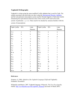


© Copyright 2026