
Laurie Churchman University of Pennsylvania LogoCities Symposium Concordia University, Montreal Canada
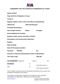
Laurie Churchman
University of Pennsylvania
Delivered at:
LogoCities Symposium
Concordia University, Montreal Canada
May 5, 2007
This text is modified and updated from the presentation
and doesn’t include all of the images.
TYPE AHOY: Boat lettering and graphics
Boat names have been recorded from as early as 1500 BC. Not with names such as Wet
Spot, Bite Me, or Salty II but with names of Egyptian god-kings, Greek mythological
figures or Roman deities—names worthy of their warships.
© Carla Christopher
© Carla Christopher
© Carla Christopher
There is debate among historians and nautical archeologists as to when names were
placed on ships although historian William Murray argues it is as early as 480 BC. His
research documents the Greek term “ptychë” as the place on the prow (or front) of the
boat where the name is inscribed. In the sgraffito image to the left of a warship from
the 3rd century BC found in Nymphaion, Murray states that this ship was
named ISIS and the name was inscribed in the position known as the
“ptychë.” You can see that the artist was very precise in representing the
quality of the engraved letters with their flared terminals (Murray, 253).
Prior to inscribed names, some of the earliest ships had intricate carvings,
markings and paintings on the prow and stern—front and back. These were
used as identifying devices and called “parasemon” or translated, “namedevices.” Lionel Casson, who wrote Ships and Seamanship in the Ancient
World, says that the stern “was where were placed ornamental representations of deities or other creatures that served as common markings...”
(Casson 344–346). We have come along way since those early days, however,
the stern is still the most common area for a boat name to be positioned,
and on modern boats the area is called the transom.
Hermitage Museum , St. Petersburg
There are other characteristics of early warship names that have carried
through the centuries to become traditions followed in the naming of both military and
pleasure vessels. For instance in Greek times names were feminine and still today vessels are nearly always referred to as “she” and written about in the feminine. In Roman
times warship names derived from deities, animals, geography, or common nouns and
adjectives that might describe attributes of the boat. Some of their descriptors are incorporated into today’s names referencing sun, speed, courage or water (Casson, ch. 15).
What marks the largest departure from ancient times to now is the visual representation of a boat name. As seen in the ISIS image, even though the warship might be
ornately carved and painted, the lettering of the name was an unembellished presentation of capital letters. Today we have anything from 4/C vinyl graphics to 3-dimensional
illuminated signage.
Fast forwarding to boat lettering and graphics in the US on pleasure craft, this presentation looks at how the introduction of certain machine changed the design of boat names
over the last 25 years.
Boat names in the United States in the last century were either lettered by the boat
owner, or more likely, by a sign painter who specialized in painting the names and hailing ports on boats. Many letterers learned the trade through apprenticeships, although,
some may have had fine arts training in high school, post secondary trade courses or
may have attended a sign art school. Most letterers considered themselves either tradespeople or artists, yet considered each job they painted as a custom piece of work. The
word “design” was rarely a part of the trade lingo.
A paintbrush and paint, along with a
steady hand, good eye, and an understanding of letterforms in space, were
the basic tools of the boat letterer. A
typical toolbox contained an assortment
of brush sizes and styles, paints, mahl
stick, masking tape, grease pencils,
linseed oil, and turpentine. This portable
studio was necessary because boat letterers did the majority of their work on-site,
in locations ranging from marinas and
boat yards to private driveways. The
Blueprint Textbook of Sign and Show Card Lettering, Wagner School of Sign Arts, Publisher
painting was done on land preferably, but
most letterers have more than one story to tell about painting from a dinghy floating in
the water, or worst yet, painting from inside the back of the boat itself while
hanging upside down. The ideal conditions were to paint a dry docked boat on a day
that was not too windy, sunny, rainy, hot or cold. Regardless of weather or location, each
boat came with its own set of conditions requiring an individual solution.
Maker unknown, Salem MA
Once the painting began so did the nuanced creativity. A letterer might use a standard
Roman typeface such as Garamond or Bodoni as their base and then embellish from
there according to the name of the boat. An understanding of letterforms, proportions,
type styles and design afforded the letterer unlimited opportunities to break out of standard constructions to paint ligatures, swashes, commingled characters and whatever
else they thought might enhance the meaning of the boat name. In his book on the art
of hand-lettering, Helm Wotzkow poetically describes the process by saying “An
alphabet is always more or less a lifeless
thing—a collection of signs and symbols
not much more interesting than a box of
building blocks. It is in the hands of the
letterer (who, of course, should also be
able to remodel these blocks to suit his
Maker unknown, Annapolis, MD
purposes) that this material begins to
live and gain expression” (Wotzkow 6).
In most cases, painting in the letters was the first step in creating the boat
name. After that, outlines, drop shadows, highlights, flourishes, and underlines might be incorporated into the text, as well as, symbols, icons or
other graphic devices. Considering the integration of all of these elements
to the whole graphic showed the letterer’s artistic expression.
© Lisa Hutchinson
© Cindy Fletcher-Holden
For instance in this example of Valhalla, painting dimensional shadows
around hand-turned gold leaf interiors enabled the name to stand off the
transom giving it presence appropriate to its meaning. The boat, Valhalla,
is a replica of Ernest Hemingway’s boat and the name is Norse for “hall of
the slain.”
But for all of the tools and techniques available in the boat letterer’s
toolbox, the ones that were most valuable didn’t come in the kit, they were
parts of the human body—the hand, the eye and the mind. To make a successful design it took imagination, creativity and the ability to improvise
on the fly. Boat names could be recognized by the signature style of certain
boat letterers. Each name and boat transom presented a different design
problem and each solution was unique because of it. It should be said
though, that boat lettering as complex as Bullfrog was more the exception
than the rule for boats of all sizes until well into the 1970’s. Most boat names were relatively classic in style—all capital letters in a Roman face for the name, and small Sans
Serif capitals for the hailport—with somewhat simpler typographic enhancements.
And so it went until the early 1980’s when a new machine started a revolution in boat
lettering.
The machine, an innovative piece of technology called the Gerber Signmaker III, was
an automated lettering system introduced by Gerber Scientific Products in 1982. The
product enabled letterers and sign makers to set type and output it as cut vinyl letters.
That single piece of equipment changed the hand lettering trade and sign business
permanently.
The Gerber Signmaker III® (SMIII/GX3®) was a simple, all-in-one machine that by current
standards of computerization could be compared to today’s label makers available at an
office supply store. It produced one line of cut vinyl letters at a time (up to 12” high) and
could hold a limited number of fonts, each of which came on its own disc and had to be
bought separately. Some of the most common fonts were Helvetica Bold, University
Roman, Optima Bold, Clarendon Bold and Brush Script (Hutchinson).
It was called the Signmaker III®, , not because it was third in a series, but because it
could do three things: cut vinyl, pounce patterns, and make pen plots. Unfortunately one
of those 3 things didn’t include allowing the user to view their work. It had no monitor to view formatted type, it had only a keyboard to type in the text and a LED viewing
space to see what had been typed (up to 12 characters at a time.) The styling couldn’t be
reviewed at all. So while it brought automation to the lettering process, it had a major
drawback in its lack of WYSIWYG, especially for letterers who relied on visualization in
their work for decision making. Gerber quickly innovate though, and by 1986 the
Gerber Sprint™ I was introduced with a separate video monitor for WYSIWYG viewing
(“Product Timeline”).
Freehand letterers who wanted to learn the Gerber technology initially found the
process frustrating and too expensive. For experienced letterers the early equipment
offered little value and the letter-cutting time was so slow that hand lettering was often
more efficient. Creativity was also another point in favor of the hand since the vinyl
technology was limited by size, type style and vinyl colors available, in a way that the
imagination wasn’t limited by paint.
And what about the pleasure derived from painting custom designs? For letterers accustomed to using their hands and heads, how could sitting in front of a machine compare?
Initially many letterers felt their creative freedom, and in fact their entire livelihood,
challenged.
No letterer would say that the transition from hand to machine was easy, in fact most
will tell you that it was a scary and angst-ridden experience, but few had the option
to ignore it and risk becoming a “signosaurus.” Carla Christopher of Boat Art in Fort
Lauderdale, FL says of the process: “I bought this [computer] and I didn’t even know how
to turn it on. You’d be amazed at how fast you learn, when you are starving to death…”
“I was starting to get buried by the vinyl sign
companies. And they were just sticking out
stock stuff with clip art.” “...so you didn’t have
to be super artistic, but I thought—well, I am
artistic…so you know, I could do custom stuff”
(Christopher).
Maker unknown, Annapolis, MD
Maker unknown, Mystic, CT
The limited functionality of the Gerber did
impact the uniqueness of boat graphics solutions at first. In particular, fonts were very
expensive so very few shops had an extensive
library. As a result, the same type styles like
Brush Script and Zapf Chancery appeared
in boat graphics frequently regardless of the
name. The rolls of vinyl for the letters came in
a limited palette too, so seeing the same type
in the same colors became commonplace for a
time. The freedom to experiment and nuance
Maker unknown, Annapolis, MD
the letterforms, previously done with paint,
was temporarily suspended. The vinyl system
lacked the ability to do much more than straight, uniform lines of text.
Maker unknown, Annapolis, MD
According to SignCraft magazine, Gerber sold over 25,000 units by 1991 (Understanding the Sign). By the mid 1990’s the technology had improved to such an extent that the
possibilities for creating boat names were nearly endless. Letterers who owned a Gerber
or PC had access to great drawing programs, enormous font libraries, and the ability to
view multiple ideas within seconds. Some techniques that had been difficult to do well
in paint, such as blends or gradations
were made simple. Other options for
including imagery, adding dimensionality, or exploring nearly limitless
color variations opened up all new
design possibilities. Technology had
caught up with the creativity of the
minds and hands of boat letterers.
© Renee Anderson
Interestingly, the temptation to overornament seemed ripe given all of the
© Renee Anderson
tools—in the same way that technology
enabled the deconstruction of typography in graphic design in the early 1990’s—yet boat
graphics developed by traditional letterers never followed that zeitgeist. Letterers didn’t
have a style or philosophy they were rebelling against, the classic appearance of earlier
boat names wasn’t reviled, it remained as viable a design solution as the newer work.
Robert Venturi’s often quoted postmodern notion of “less is a bore,” didn’t resonate in
boat graphics either.
It should be noted though, that the ability to embrace and maximize the tools has created boat graphics unseen until just a few years ago. There are far more intricate designs,
some with almost narrative imagery, that have advanced the sophistication of boat
names to a different form. The mantra again seems to be that you are only limited by
your imagination. Truly custom work has not only found its way back, its moved itself
far forward. Renee Anderson of Signs by Renee in Marathon, FL says the main challenge
for her now is to continue drawing new images and icons instead of sampling from her
own library of hand drawn work (Anderson).
However, there are always new challenges when technology advances, and sometimes
from unexpected places. At first, boat letterers had only to contend with competition
from other letterers and upstart sign shops that had invested in the technology. Some
of these shops relied on clip art and other image sources to generate less inspired, and
often less expensive, boat names. Having hand skills or artistic ability wasn’t a prerequisite anymore since visual resources could be appropriated and assemble from the
online toolbox. This started to create a divide in the definition of “custom” boat graphics
and encouraged artistic letterers to find ways to distinguish their unique designs from
sampled solutions.
Yachting Magazine, June, 1967
The real shift however came with the introduction of web-based boat graphics storefronts which allow individual boat owners to design and order their own boat names.
Formerly the domain of a letterer or sign shop, virtual boat graphics companies enable a
whole new market of users while creating a new slice in the competition pie. Long gone
are the days of the early DIY’ers, who painted, or used press-on letters.
Today’s do-it-yourself options for generating boat names are available at
web sites such as FirstBoat.com where preview software enables a user
to view their boat graphic once they have selected a name, font and color
from a menu. The site offers the Top Ten boat names for the year, along
with a palette of vinyl colors and a font list containing 37 offerings, all
from which a boat owner can sample until they are satisfied with a preview image. One final mouse click will order the boat graphic and have it
shipped to them for self-application.
FirstBoat.com
As an example, by choosing ‘Aquaholic’ from the Top Ten list and setting it in Jokerman type in a metallic bright blue with a mild arc effect, a
preview presents exactly what you might expect, a boat graphic that says
water, blue, tipsy, and fun, but is easily replicated by any other user of the
site or anyone else who could put that combination together for another
purpose, such as a themed water park or a new beverage, once equipped
with this “custom” design process. The final graphic bears little mark of
the creator yet may still be perceived as unique, or certainly custom, because individual
color, image, and type selections were made.
A second try in this software using one of the most common typefaces, Mistral, with
the most common color, blue, gets a very acceptable but generic result. However, no arc
shape option is available, narrowing the creative choices for the user, because the software isn’t programmed to curve this style of script face. Good news for Mistral since it’s
not constructed to work well on an arc—actually a positive assessment by the software
that it can’t be enabled.
These limitations are felt by the user when they decide that both an arc and a script
typeface would enhance the meaning of their boat name but have to compromise on one
or the other to get results. The difference in process between a boat owner and a boat
graphics designer is revealed by this example. A boat graphics designer would be able to
use their knowledge of type and design to satisfy both objectives.
The FirstBoat web site is familiar territory in the DIY or custom internet world. It appears simplistic in comparison to a site such as NikeID for sneakers, where there are
nine categories of choices, with anywhere from two to 10 subchoices, and the ability to
name each shoe separately. Comparatively the NikeID site gives the user more actual
menu options, although in reality boat sites have the ability to create more unique solutions. The difference in the two is that sneakers have a pre-determined form,
the shoe shape, onto which the user’s choices are applied. In contrast, the boat
name can theoretically have any combination of letters, numbers or symbols,
in any shape; along with clip art imagery in any position; all of which can be
composed and integrated by the owner when applying the vinyl to the boat.
From this it could be construed that the more options a user has the greater
his/her ability is to create unique work. While this may be true for some users,
it isn’t the norm with boat graphics. In the initial design step using the online
software the user lacks a way to visualize, or layout, all of the pieces together.
The screen for selecting the font is separate from the screen for selecting any
imagery so the user isn’t afforded the chance to consider integrating the elements in a final design. All of the pieces are priced, purchased and physically
separate as well, leading the user to think of them in that way. Ultimately the
user allows the inventiveness of the name to be constrained to the choices defined by
the software. As stated, there is a second opportunity for expression and visual integration during the self-application of the vinyl, however the upfront software experience
seems to preclude the user from thinking of the elements as anything but separate
parts.
Design historian Victor Margolin provides insight into a product user’s experience by
describing a product as having two dimensions, operative and reflective. “The operative
dimension refers to the way we make use of products for our activities. The reflective
dimension addresses the way we think or feel about a product and give it meaning.” He
says that operative parameters are limited by the product itself, meaning we can’t do
more with a product than it allows, while reflective parameters are unlimited and vary
because thoughts and feelings about something are individualistic (Margolin 42–43).
His description of the operative dimension aptly describes the experience of users for
online boat graphics software—there are an array of choices from which they select
the font, its styling and any imagery. The process is simple and clear, and the preview
screen provides visual assurance of their choices. From there the price for each choice is
tallied, and later the completed vinyl pieces are shipped. The software manages expectations throughout, using a step-by-step process, and the majority of time the software
delivers.
Users will think differently about other aspects of the process, not related to actual
usability though. Some may find it more or less creative. Others may feel liberated by
the do-it-yourself aspect, feel wise for their perceived efficiency or cost-savings, feel
nostalgic for the old days, or feel just plain indifferent. All of these experiences contribute to how the graphic is completed and are all examples of Margolin’s definition of the
reflective dimension of a product.
Margolin goes on to say “When we are able to access a product’s service, we have established a successful relation with it and this results in a satisfying experience. Satisfaction comes from our ability to make the product work, which then enables us to carry
out actions that are important to us. Products thus provide the conditions for us to grow
as human beings by helping us to transform our projects into actions. They also affirm
our competency to master the devices we require for the purpose” (Margolin 48).
Herein lies the key to why the overall product experience with online software trumps
the desire for creativity in the final product, the boat name. When users successfully
order their boat graphics there is a sense of satisfaction in their engagement with the
product. And once the boat name is applied, each time a user sees the name it may reinitiate that feeling of satisfaction. The ability to master the software and get results becomes as, or more, fulfilling than the action of developing a design. Operative software
limitations discourage the inventiveness of a design initially and then a user’s satisfaction with merely meeting the demands of the software during the process ultimately
acts to overshadow the actual design process. The end result is the focus is directed
away from the formal design process.
As a result of this there is a trade-off by boat owners to accept the limits of customization over the opportunities for uniqueness. This seems contrary to the spirit of a boat
name which can be a very personal reflection of the boat owner, akin to a monogram or
brand, and would be expected to demand a unique solution. Especially considering that
an online survey conducted by Sports Illustrated reported that 22% of boaters said that
naming their vessel was harder than naming their children or pets (Sports Illustrated).
But perhaps the idea of uniqueness is a case of “perception versus reality” or “degrees
of definition.” The notion that the boat owner began by selecting a name for their boat,
crafted the look of it—even if from existing parts online— and mastered the software
perhaps constitutes enough personalization.
Artist unknown, Annapolis, MD
In the popular book Boat Naming Made Simple, John Marston writes a chapter on the
use of graphics that points to the same notion of customization. He considers three
choices for creating the name and starts with a question to the boat owner “Do you want
to pick from a ready made cafeteria of ideas or do you want to create your own custom
look?” He names Cafeteria Style as the first choice, describing it as a menu of options offered by most sign shops available in their shop or online. Choice two, Custom Designs,
utilizes a sign shop as well, and suggests asking the graphics designer to work up some
ideas for review. But his third choice, Using Your Own Computer, is where the idea of
customization takes a turn. Marston starts “Ok, so you have found a font on your computer that you like and you have developed some skills in how to transfer files over the
internet?” From there the text continues for many sentences to describe how to properly
prepare a computer file for uploading to the web (Artof 32–33). What’s missing is any
discussion of what can creatively be done with that font, or any recognition that simply
outputting the boat name in an available font constitutes something custom. The do-ityourself action of mastering the technology firmly takes the place of any actual design
interaction.
Encouragement to design one’s own boat graphic can also be attributed to the democratization of fonts and the comfort with which people use them in their daily lives. Selecting fonts for a boat name is not really a far step from selecting fonts for a PowerPoint
presentation or holiday card. And likewise for available imagery. This comfort level
makes the action of designing a boat name not only accessible, but seemingly creative,
in a way that was not imaginable prior to personal computing.
Artist unknown, Annapolis, MD
As described, the quality of boat graphics developed online can vary significantly depending on the inventiveness of the user to assembly the parts. Common problems, as
critiqued by boat graphics designers, include poor letterspacing, improper size relationships, and inappropriate font choices. These issues are a result of the typographic
simplicity of the software combined with the novice’s understanding of typography.
In the two examples to the left, Baguette, exhibits all of the mentioned criticisms, and
Debauchery suffers from a poor and undescriptive typeface choice.
Although the same tools are often employed, there is a significant creative difference
in the inventiveness of graphics done by online users versus boat graphics designers.
The choice to use typography that relies on stylization for communication is the most
obvious example. As in Aquaholic earlier, an online user is more apt to select a highly
stylized typeface to conjure up the meaning of a boat name visually versus a designer
who could render type in several ways to suggest a concept. In the examples to the left,
Handbasket uses a predictable typeface to represent basket weave while Party Girl uses
several design elements and principles such as scale, rhythm, variation, contrast, and
asymmetry, along with combining imagery and different typefaces to
visualize the name. And Impetuous’ choice of typeface and use of the
sun icon seem at odds with the meaning of the word, while Kismet is
designed to integrate the name, hailport, and imagery into an almost
three-dimensional celestial space reflective of the name.
Artist unknown, Annapolis, MD
Artist unknown, Annapolis, MD
© Carla Christopher
Artist unknown, Fort Lauderdale, FL
In conclusion, it should be said that boat lettering and graphics have
changed dramatically over the last 25 years. Traditional, classic lettering
seen from ancient times up to about the 1970’s has been superseded by
more varied and inventive graphics. Technology has played a major part
in this shift but so has culture in general. It is an interesting convergence that calls into question the notion of custom boat graphics. Customization is no longer tied to the hand nor has it been made obsolete by
the machine, instead it has been redefined into levels of inventiveness
and acceptance. Technology has provided new access into the design process for a much larger pool of users. Depending on where the user enters
the process, and what their expectation is for the process, determines
their level of satisfaction with the uniqueness of the artifact. A single
shared definition of “custom” is no longer possible.
And the next design evolution in boat graphics is already here.
Judging by recent megayachts (80 feet and over) the trend is away from
vinyl towards dimensional metal letters that are illuminated by various
lighting techniques. A visit to the homepage of Yachtsign.com features
promotional text that reads “We design and manufacture lighted and
salt water resistant letters and signs that will truly customize your
yacht. All our products are individually designed and hand crafted to
your specifications” (“Yachtsign”).
Artist unknown, Fort Lauderdale, FL
Works Cited
Anderson, Renee. Personal interview. 11 May 2006.
Artof, Susan. Boat Naming Made Simple. 3rd ed. Thousand Oaks, CA: Center Press, 1999.
Bechtel, Mark and Stephen Cannella. “Go Figure.” Sports Illustrated 28 March 2005, Vol. 102:13.
Christopher, Carla. Personal interview. 29 Oct. 2004.
Casson, Lionel. Ships and Seamanship in the Ancient World. Baltimore: Johns Hopkins UP, 1995.
“Product Timeline: Years of Innovation: The 1980’s” Web page. Gerber Scientific Products. 2005.
<http.www.gspinc.com/about/timeline-80.html>.
Hutchinson, Lisa. Personal interview. 17 May 2005.
Margolin, Victor. The Politics of the Artificial. Essays on Design and Design Studies.
Chicago: U Chicago P, 2002.
Murray, W. M. “A Trireme named Isis: the sgraffito from Nymphaion.” International Journal of
Nautical Archaeology 30.2 (2001): 250-256.
“Understanding The Sign Industry: Types of Sign Work.” Web page. Signcraft. Page 7.
< www.signcraft.com/UnderstandingTheIndustry.pdf>
Wotzkow, Helm. The Art of Hand-Lettering: Its Mastery and Practice. New York: Watson-Guptill,
1952.
“Yachtsign.” Web page. Yachtsign. Homepage. <www.yachtsign.com>


© Copyright 2024