
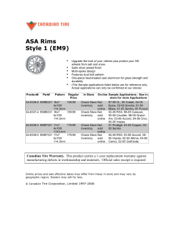
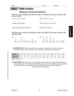
The Market Watch Monthly Desert Housing Report
The Market Watch Monthly Desert
Housing Report May 2015
CV median price per sq. ft.
2002 - May 2015
$260
$240
Price per sq. ft.
$220
$200
$180
$183.08
$160
$177.84
$140
$120
$100
Median Price per Sq. Ft.
3.5% Growth Curve
Summary
The median price per sq. ft. in the Valley registered $183.08 in May compared to $177.84 one year ago. This is a year over year gain of
2.9%. On a city by city basis there is much greater variation in year over year returns, going from a high of 26.9% for the City of
Coachella to minus 10.5% for Indian Wells. Home sales, which have been slowly declining for the last two years and are down 13%
from peak levels, show definite signs of stabilizing and growing again. Inventory, at 4,615 units and “months of sales” at 6.6 months,
are acceptable numbers in our opinion. For seasonal reasons, we expected them to decline for the next three or four months.
Home sales in the Coachella Valley continue to run at thirty percent below pre-bubble norms. In our opinion the new complex
lending regulations for banks are responsible. We believe we need to return to the lending and FICO standards that worked so well
for thirty and forty years before the crisis and think the move to more non-bank lending is key. The non-bank market share of
mortgage originations that Fannie Mae and Freddie Mac buy is growing at an astronomical pace, moving from 27% in 2012 to almost
50% in 2014. We believe this is the first step in getting back to the lending standards that worked so well for so many years.
Prepared for the Members of PSRAR as a Member benefit
12 months change in city price per sq. ft.
City of Coachella
Cathedral City
Rancho Mirage
Desert Hot Springs
Palm Springs
Indio
Palm Desert
La Quinta
Indian Wells
May-15
$121.33
$158.83
$236.77
$102.30
$255.15
$143.77
$187.06
$199.94
$257.74
May-14
$95.61
$137.31
$217.47
$95.35
$240.61
$138.73
$184.80
$219.74
$287.83
12 mos
change
26.9%
15.7%
8.9%
7.3%
6.0%
3.6%
1.2%
-9.0%
-10.5%
% from all2006 High time high
$215.01
-55.5%
$236.76
-42.0%
$331.15
-34.3%
$186.94
-49.0%
$306.60
-21.5%
$216.45
-35.9%
$267.07
-30.8%
$292.55
-24.9%
$358.83
-19.8%
Changes in City Price per sq. ft.
At the end of May seven cities had positive year over year returns while two – La Quinta and Indian Wells- are now negative. The
distribution of year over year city returns is widening with a high of +26.9% for the City of Coachella to a low of minus 10.5% for
Indian Wells. This is a difference of 37.4% between the highest and lowest returns. The high positive returns for the City of
Coachella and Cathedral City, while very real, are a little deceptive in that they are more the result of the rapid decline in the
number of low priced distressed homes then it is in the actual rise of prices of normal homes in those cities.
Prepared for the Members of PSRAR as a Member benefit
Coachella Valley Home Sales
April 2010 to May 2015
1,200
1,000
851
853
Units
800
699
600
695
400
200
Avg monthly sales past 3 months
Avg monthly sales past 12 months
0
Monthly Sales
For the first time in two years we believe there is clear evidence that the slow contraction in sales that occurred during that period
has ended and that a period of slowly expanding sales has begun. The ending of the decline is seem in both the three month and
twelve month average of sales, which show comparable numbers to a year ago. The three month, which shows the region’s
seasonality, averaged 853 units in May versus 851 units last May. Likewise, sales over the last twelve months have averaged 695
units compared to 699 units a year ago.
Prepared for the Members of PSRAR as a Member benefit
Home Sales Per Month by City
3 month avg sales
250
May 2015
Year Ago
192
200
194
180
Units
164
150
117
127
137
104
100
77
62 62
41
50
52
27
12 13
12
81
34
11
4
1
0
BERMUDA CATHEDRAL COACHELLA DESERT HOT
DUNES
CITY
SPRINGS
INDIAN
WELLS
INDIO
LA QUINTA
PALM
DESERT
PALM
SPRINGS
RANCHO
MIRAGE
THOUSAND
PALMS
Home Sales per Month by City
While the entire region shows almost identical sales to the same time last year, we find a slightly different picture on a city by
city basis. Five cities show lower to slightly lower sales while two – Palm Springs and Indio - show measurably higher sales. In
fact, sales in Palm Springs are 18% higher than a year ago and is one important reason why this city has become the leader in
the Valley.
Prepared for the Members of PSRAR as a Member benefit
Home Sales by Price Range
246
250
207
200
185
165
155
155
Units
150
91
100
91
58
56
53
33 40
50
21 24
17 17
64
9 15
0
< $200K
$200-300K $300-400K $400-500K $500-600K $600-700K $700-800K $800-900K
Avg Sales Last Three Months
$900-1M
>$1M
Same Time Last Year
Home Sales by Price Range
We know from the chart two pages ago that three month sales are almost unchanged from a year ago – 853 units compared to 851
units. However, this isn’t true of sales in all price ranges; some are higher while some lower. Sales in homes priced under $200k
are down 11%, primarily because there are fewer homes priced under $200k in the Valley. Sales of homes priced from $200k to
$300k are up 19% from a year ago. In general sales of homes priced over $600k are down slightly.
Prepared for the Members of PSRAR as a Member benefit
Valley Housing Inventory
June 1st 2015
6,500
6,000
5,500
5,000
U
n 4,500
i 4,000
t
s 3,500
4,615
3,787
3,000
Jun-15
Apr-15
Feb-15
Dec-14
Oct-14
Aug-14
Jun-14
Apr-14
Feb-14
Dec-13
Oct-13
Aug-13
Jun-13
Apr-13
Feb-13
Dec-12
Oct-12
Aug-12
Jun-12
Apr-12
Feb-12
Dec-11
Oct-11
Aug-11
Jun-11
Apr-11
Feb-11
Dec-10
Oct-10
Aug-10
2,000
Jun-10
2,500
Monthly Coachella Valley Home Inventory.
As expected from past seasonal patterns, inventory declined 395 units from May 1st to June 1st. If the seasonal pattern continues
inventory should continue to get smaller until probably August or September which is usually the seasonal low. It will be
important to see at that time where inventory is. The secret to keeping inventory from getting to high is for sales to increase and
we personally think this has already started with the recent large increase in the percent of non-bank mortgage lending.
Prepared for the Members of PSRAR as a Member benefit
"Months of Sales" and "Days on the Market"
9.0
100
90
6.6
80
8.0
74
7.0
6.0
5.4
70
60
5.0
50
4.0
Days
Months
91
40
3.0
30
2.0
20
1.0
10
0.0
0
Months of Sales
DOM
“Months of Sales” and “Days on the Market”
“Month of Sales” takes the inventory on June 1st and divides it by average monthly sales for the last twelve months. This longer
sales period takes out unwanted, seasonal variations. On June 1st the ratio was 6.6 months. Last year on June 1st it was 5.4
months. Six months is often considered a good cut off number; consistently higher ratios than that can become a little worrisome.
The current number in our opinion is acceptable. If sales expand as we expect, we think this ratio could get below six months,
which would be very good. The median “Days on the Market” has stabilized over the last nine months in the low 90 days.
Prepared for the Members of PSRAR as a Member benefit
Months of Sales by Price Range
uses avg. twelve month sales
20.0
18.2
18.0
June 1st 2015
Year ago
16.0
13.5
14.0
12.5
Months
12.1
12.0
10.0
9.1
8.8
8.0
7.4
6.6
6.0
4.0
10.7
9.8
4.7 4.6
3.8
6.5
6.5
9.9
7.6
7.3
5.4
2.8
2.0
0.0
< $200K
$200-300K $300-400K $400-500K $500-600K $600-700K $700-800K $800-900K
$900-1M
>$1M
Months of Sales by Price Range
If we divide up inventory into different price brackets and then divide that inventory by twelve month average sales in that price
bracket, we can calculate “Months of Sales” for different price ranges. The graph above shows this for every $100k price range
starting at under $200k to over a million dollars. We see that the ratio on June 1st was higher in every price bracket compared to
June 1st one year ago. We also note the tendency for “months of sales” to be higher for higher priced homes. The current
distribution of ratios in our opinion shows a somewhat “normal” market in almost all price ranges
Prepared for the Members of PSRAR as a Member benefit
Months of Sales by City
city inventory divided by average twelve month sales
16.0
13.5
14.0
June 1st 2015
Year Ago
12.0
M
o
n
t
h
s
10.0
8.0
6.1
6.0
4.0
2.0
4.5
3.2
2.7
4.6 4.7 4.1
5.4
5.2
3.9
9.3
7.6
7.1
6.6
9.7
9.2
8.9
6.1
6.0
6.7
4.1
3.1
1.7
0.0
Changes in City Price per sq. ft.
When we measure “months of sales” for each city, we find that six of eleven cities have ratios less than the Valley average of 6.6
months. While most have ratios higher than last year only two cities in our opinion have ratios that might be troublesome. These
are Bermuda Dunes and La Quinta. La Quinta, with a ratio over nine months, is especially worrisome. This high ratio is one
primary reason for the rather large 9% year over year price decline in that city. The high ratios of both Indian Wells and Rancho
Mirage are somewhat normal for these two, high priced cities.
Prepared for the Members of PSRAR as a Member benefit
Distressed Sales by City
percent of total sales
40%
May-2015
1 Year Ago
2 Years Ago
30%
20%
10.6%
10%
1.7%
2.7%
3.7%
3.9%
4.9%
5.3%
5.5%
7.0%
8.2%
10.8%
9.0%
0%
Distressed Sales by City.
Distressed sales (REO and short sales) are rapidly returning to pre bubble norms and effectively no longer influence the fair
pricing and appraisal values of normal homes. Two years ago distressed sales were about 17% of total sales throughout the
Valley; the average today is now only 4.9%. Palm Desert and Palm Springs are down to 1.7% and 2.7% respectively. The rapid
decline in distressed sales for the Cities of Coachella and Cathedral City, shown clearly in the graph, is the primary reason for the
recent large price gains of these two cities.
Prepared for the Members of PSRAR as a Member benefit
Sale Price Discount from List
0.0%
-0.5%
-1.0%
-1.5%
-2.0%
-2.9%
-2.5%
-3.0%
-2.9%
-3.5%
-4.0%
-4.5%
May-15
Apr-15
Feb-15
Mar-15
Jan-15
Dec-14
Nov-14
Oct-14
Sep-14
Aug-14
Jul-14
Jun-14
May-14
Apr-14
Feb-14
Mar-14
Jan-14
Dec-13
Nov-13
Oct-13
Sep-13
Aug-13
Jul-13
Jun-13
May-13
Apr-13
Feb-13
Mar-13
Jan-13
Dec-12
Nov-12
Oct-12
Sep-12
Aug-12
Jul-12
Jun-12
May-12
Apr-12
Mar-12
-5.0%
Sale Price Discount from List
The “Sale Price Discount from List” is the median value for the last three months of the percent difference between the sale price
and the asking list price on all transactions. The current value is minus 2.9% which is unchanged from a year ago. This percent
implies that the selling discount to a home listed for $300,000 home was approximately $8,700.
Prepared for the Members of PSRAR as a Member benefit
Attached Units - median pr per sq. ft.
May 2015
$180
$167
$170
Pr per sq. ft.
$160
$170
$150
$140
$130
$120
$110
$100
$90
May-15
Apr-15
Mar-15
Feb-15
Jan-15
Dec-14
Nov-14
Oct-14
Sep-14
Aug-14
Jul-14
Jun-14
May-14
Apr-14
Mar-14
Feb-14
Jan-14
Dec-13
Nov-13
Oct-13
Sep-13
Aug-13
Jul-13
Jun-13
May-13
Apr-13
Mar-13
Feb-13
Jan-13
Dec-12
Nov-12
Oct-12
$80
Attached Units - Median Price per sq. ft.
The median price per sq. ft. of all attached units in the Valley was $167 in May, just three dollars less than the same time last year.
There appears to be a slight seasonal pattern to attached prices with the peak prices usually coming around May followed by a
slow decline from there until November or December. Al least this has been the pattern for the last two years. It will be instructive
to see if it holds true again in 2015.
Prepared for the Members of PSRAR as a Member benefit
Attached Units - Sales
May 2015
430
380
301
Units
330
280
230
249
180
130
80
Attached Units - Sales
The three month average of sales of attached units was 301 units this May, considerably higher than the 249 units last May.
However, we are entering the slow seasonal period for sales and expect this number or next month’s sales number to be the high
for the season, with a slow trailing off of sales as we enter the hotter summer months.
Prepared for the Members of PSRAR as a Member benefit
Explanation and Description of Market Watch’s Graphs and Calculations
Prices: All prices for the region and for cities are the median value of all transaction over the last three months. For example, the median
price for the month of May will be the median value of all sales in March, April and May. This longer time period tremendously reduces the
amount of wide and meaningless variation that one gets taking only the last month’s transactions and provides more reliable information.
While we do show the median selling price in our city reports, we try to emphasize the median price per sq. ft. in both these and our
regional reports. For technical reasons this metric is more reliable than median price and presents us and the reader with fewer
meaningless monthly variations.
Sales: Sales are reported either as three month average sales or twelve month averages. The three month average measures and shows
the seasonal variations of the region. These three month averages should only be compared against the same three months of previous
years. For example, one should never compare three month sales in spring to that of the fall. The twelve month average takes out all
seasonality and is very useful when trying to assess the long term growth or contraction of sales in the region and at the city level.
Inventory and Months of Sales: When we provide a monthly report for say the month of May, all sales and pricing are done using
transactions throughout that month and the previous two months. However, when we measure inventory at the end of May, it’s the
inventory as of June 1st the next month. Remember sales and prices are accumulative while inventory is a momentary snapshot of
inventory on a specific date. To avoid confusion, the inventory reported in the May report is for June 1st. and our graphs and charts for
inventory and months of sales will give this date and not the date of the month of the report.
When calculating “months of sales” we almost always use average sales over the last twelve months and not three months. If we do use
three months we will indicate that we are dividing inventory by three month sales and not the normal twelve month average.
Days on the Market and Sale Price Discount from List Price: These calculations are also the median value of the metrics reported from
the MLS listing and are calculated over the last three months of transactions like price and sales. This is done also to reduce unnecessary
variation and random movements.
Call Out Numbers: The two numbers inserted in the charts are the most recent value(s) and the value(s) one year ago. Each number is
generally connected to the point on the chart it refers to by a small thin line.
Scatter Diagram Value Curve: In the individual city reports we provide a Scatter Diagram Value Curve which plots the price per sq. ft. of
every sale for the last three months versus the square feet of that home. In the graph each small blue circle represents a sale. Then a best
fit 2nd order polynomial is calculated through those points to arrive at the value curve. The value curve represents the price per sq. ft. that
the market is generally giving different size homes.
Prepared for the Members of PSRAR as a Member benefit


© Copyright 2026