
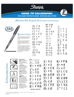
Calligraphy Lesson- Gothic Font
Calligraphy Lesson- Gothic Font
1. Always hold the tip of your pen at a 45˚ to the paper.
2. Keep letters verticle.
3. Always use a downward or left-right motion.
4. Do not go upwards “against” the nib (tip).
5. Start by making the main part of the letter and add the accents second.
6. It is easiest to use lined paper. You can either draw light pencil guidelines and then erase them later, or
place lined paper or a template underneath your piece of paper.
These dashes are the basic strokes you will need in order to form almost
every letter in the alphabet, both upper and lower case.
Hold the pen at a 45˚ and
do a small uphill then downhill
Hold the pen at a 45˚
and go stright down
Hold the pen at a 45˚ and
go up 45˚ then 45˚ down
Capital letters in the Gothic style
Lower-case letters in the Gothic style.
Hold the pen at a 45˚ and
go up 45˚ then 45˚ down
then back up 45˚
Hold the pen at a 45˚
and make a circlular
motion stopping before
you begin to go up.
Hold the pen at a
45˚ and arc up
to the right.
Hold the pen at a 45˚
and make a dot using
the width of the nib.
Hold the pen at a Hold the pen at a 45˚
and go down at a 45˚,
180˚then gown
the same angle the nib
straight down.
is at.


© Copyright 2026