
Document 28787
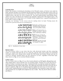
SIGN
There are general guidelines to follow in the
design of highway signs in order to conform to
basic standards. Many of these pointers are mentioned in various sections of the Manual on
Uniform Traffic Control Devices (MUTCD) while
others are derived from accepted practice in sign
design and layout. Highway signs with standardized designs conforming to the general guidelines
(Iike most regulatory, warning, civil defense,
school, railroad-highway grade crossing, and bicycle signs), are contained in this booklet and may
be shown with different fixed standard sizes
depending on the types of highway or facility
where the sign is intended to be used. Although
some guide signs also have been standardized and
are included in this booklet, most guide signs need
to be designed separately because of the variability
in message or legend. For most guide signs, there
can be no rigid standardized sizes.
Sign DimeneIoa
Message variability controls the overall sign
dimensions and, whenever practicable, the overall
dimensions of the sign plates should be in
multiples of 6 inches.
The use of a smaller than “standard” size sign
may sometimes be justified. For instance, a sign
mounted over a particular roadway lane to which
it applies may have to be limited in width to the
lane width. In some cases, vertical clearances may
limit the vertical dimension of the sign. On the
other hand, a larger than “standard”
size sign
may be desirable where greater legibility or emphasis is needed. When a variation in the
“standard” size is necessary, a reduced or enlarged (as the case may be) letter height, interline,
and edge spacing may be used but should be as
nearly comparable to standards as possible.
Type of letters used shah be those shown in
either the I!466 edition or the 1977 Metric Edition
of the Standard Alphabets for Highway Signs
booklet. As a guide to choice of alphabets, tests
have shown that, for any given legend, better
legibility can be obtained by using a relatively wide
spacing between letters than by using wider and
taller letters with a cramped space.
Sign lettering shah be in uppercase letters except
that destination names may be in lowercase lettering, with initial uppercase. The initial uppercase
letters used in conjunction with lowercase letters
wiU be Series E(M) and shall be approximately 1 i/j
times the “loop” height of the lowercase letters.
Use of the Series B alphabet is restricted to
street name signs, parking signs, and other similar
signs where limited breadth and stroke widths are
required for design purposes.
‘REPRINTED FROM STANDARD HIGHWAY SIGNS AND STANDARD ALPHABETS FOR HIGHWAY SIGNS COURTESY OF THE
FEDERAL HIGHWAY ADMINISTRATION
B-l
-GUIDE
SIGN DESIGN
Sixe of Lettering
For guide signs on expressways and freeways,
the prescribed numeral and letter sizes, according
to interchange classification and component of
sign legend, appear in Tables II-l and II-2 of the
MUTCD. The minimum sizes specified should be
exceeded where conditions indicate a need for
greater legibility.
For conventional
roads in rural districts on
major routes, the principal legend on guide signs
shall be in letters at least 6 inches in height. On less
important rural roads and on urban streets, the
principal legend shall be in letters at least 4 inches
high.
Lettering on street name signs should be at least
4 inches high. Supplementary lettering to indicate
the type of street or section of city may be in
smaller lettering but at least 2 inches high.
An accepted “rule-of-thumb”
to follow for
legibility for signs other than Interstate is to have 1
inch of letter height for every 50 feet of desired
legibility.
Amount of Legend
The MUTCD states that regardless of letter size,
the legend on a guide sign must be kept to a
minimum to be instantly legible. For example, on
expressways, the legend on a guide sign should
only have two destinations and the directional
copy. Directional copy, not exceeding three lines,
may include symbols, route numbers, arrows, cardinal directions, interchange number(s), and other
exit instructions. Conventional road guide signs
should be limited to three lines of principal legend
which includes place names, route numbers, and
street names.
Arrows
In the Appendix, two sets of arrows are illustrated for use in highway signs. With few exceptions, which include guide signs, the “standard
arrow” is for all types of signs. The “Up” and
“Down” arrows are to be used for guide signs and
recommended applications are stated in Section
ZD-8 of the MUTCD.
Borden
With few exceptions, the MUTCD requires all
signs to have a border of the same color as the
B-2
legend. A dark border should be set in from the
edge, while a white border should extend to the
edge of the panel.
A suitable border for 3CGnch signs with a light
background is from one-half to three-quarters of
an inch in width, one-half inch from the edge. For
similar signs with a white border, a width of an
inch is appropriate. For other signs, the border
widths should be of similar proportions
but
should not exceed the stroke width of the major
lettering of the sign. For guide signs, smaller than
6 feet by 10 feet, a width of approximately 1%
inch may be used; for those exceeding 6 feet by 10
feet, the border should be about 2 inches wide;
and for unusually large signs, a border 3 inches
wide is appropriate.
The comers of all sign borders shall be rounded
and, where practicable, the comers of the sign
panels should also be rounded to fit the border.
On guide signs, corner radii of sign borders should
be approximately
one-eighth of the lesser side
dimension except that the radii should not exceed
12 inches on any sign. The area outside the corner
radius on large guide signs need not be trimmed.
Interline
spacing should be approxlmatley
three-fourths (X) the average of uppercase letter
heights in adjacent lines of letters.
The spacings to the top and bottom borders
should be approximatley equal to the average of
the letter height of the adjacent line of letters. The
lateral spacing to the vertical borders should be
essentially the same as the height of the largest
letter.
Spacings between words, words and arrow, a
letter and arrow, or a word and numeral in a line
copy should be approximately 1 to 1% times the
uppercase letter height used in that line of copy.
An example in the design of a guide sign using
the above guidelines is shown on the following
pages.
GUIDE SIGN DESIGNExample in the Design of an Overhead Advance GmHt w
A=L+2H+2F
H = Border: Signs larger than 10 ’ x 6’,
approximately. Signs smaller than 10 ’ x
1 l/ “. Unusually large signs, use 3 *. H
not exceed the stroke width of the
lettering.
borders is equal to the height of the uppercase
letter.
use 2”
6 I, use
should
major
J = Corner radii: Approximately ‘/s of lesser dimension (B). J should not exceed 12 inches.
C = Average of the letter height of the adjacent
line of letters; C = M(G + K).
D = Depth of route marker: 24”. 36” or 48 “.
E = Interline
spacing:
approximately
% the
average of uppercase letter heights in adjacent
lines of letters; E = % w).
F=Height
of uppercase letter (refer to Table
11-2. MUTCD). Lateral spacing to the vertical
G=Height
of numeral
MUTCD).
K= Height of
MUTCD).
word
(refer
(refer
to Tabk
to
Table
11-2,
11-2,
L = Length of “New York City”.
I. Calculate total width, A:
“New York City” has the longest kryh in any
line of copy; hence, it determines the 4th
of
the guide sign.
Adopt:
Upper case-16” Series E(M) = F
Lower case- 12 ”
Refer to (1977 Metric Edition of the Standard
Alphabet Booklet) subsequent pages for tables on
letter widths and spacings.
B-3
-GUIDESiGN
DESIGN
Word
Widlh.9
LCllCr
Widths
N
Adopt spacing between words equal to 1% times
the height of the uppercase letter in the line of
copy; i.e., 1% x 16”=24”.
12.75
L=47.63+24+55.01+24+49.63=200.27,
201”.
5.50
e
10.13
W
15.75
3.50
38.63
+
9.00
Adopt H = 3 “.
=
47.63
‘.
A=L+ZH+ZF.
A=201 +2(3)+2(16)=239;
Y
16.08
0
10.50
r
7.75
use 240” or 20’-0”.
2.00
Adopt D = 36 “; G = 15 ” Series E; K = 10 ” Series E;
J=12”.
4.88
c=l/
(15+10)=12L/I”.
E=J/r w=l2”
3.75
k
say
10.13
2. Calculate vertical depth, B:
44.38
C
+
10.63
=
55.01
=2(3)+2(12Yz)+36+3(12)+2(16)+15
12.75
5.25
i
3.00
t
8.00
Y
B-4
B=ZH+ZC+D+3E+2F+G
=150”or
12’-6”.
4.50
NOTE:
3.25
(1) The lengths of “Philadelphia” and “2 miles” are deermined in the same way as “New York City”.
12.88
(2) Refer to p. 3-2 for the design of the Interstate Shield.
36.63
(3) The EXIT panel above lhe sign is not illustrated in the example but is designed in the same way as the example.
+
13.00
=
49.63
GUIDESIGN
OESIGN-
-'AB C D E 1 2 3 4
-ABCDE1234
-ABCDE1234
-ABCDE 12 34
*ABCDE 12 34
STANDARD
ALPHABET-NUMERAL
SERIES
FOR SIGN
“SAGE
B-5
I
I
I
I
I
I
I
I
I
I
I
I
.HROUGH S-13 REPRINTED FROM STAN~DARDALPHABETS FOR HIG
I
I
I
I
I
I
I
I
JAY SIGNSCOURTESY FHWA.
I]
Gum
I
I
I
t
I
SIGN DESIGN-
,
Next Page


© Copyright 2026