
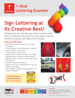
• Color-fast vinyl stays bright for years— even outlasts paint
ANNAPOLI
S, MD
• Color-fast vinyl stays bright for years—
even outlasts paint
• Made from premium 2 ml high-performance vinyl
• Most layouts delivered complete and ready
for one-step application including jobs with
multiple colors
• Easy-to-follow instructions
1. Determine the area
of the graphic
SYOSSET, NY
The application area should be non-porous and smooth, flat or with
minimal curve, and free of obstacles such as rivets, hardware or
raised panels.
The application area given when ordering is the area that the graphic
must be confined to including all “ascending” and “descending” letter
strokes. The area should be rectangular with height and width given in
inches. Odd shaped areas require correspondence and/or proofs.
Coast Guard regulations require that a documented boat have the boat
name and the hailing port at least 4” high. The words “Port of” are not
required and have no size restrictions, but the two-lettering designation
for the state are now required.
How to Order!
All you need to do to get a quick quote:
By Phone:
1. Determine the area of the graphic.
2. Choose the letter style.
3. Specify ALL CAPITALS, all lower case, or a combination of
Upper and Lower Case Letters.
4. Determine the size of the letters.
5. Select the color(s).
6. Optional elements: if desired, select design options and
graphic symbols.
By Mail or FAX:
Send us clean camera ready artwork, a picture, or e-mail us the artwork from
your computer (call for instructions regarding e-mailed files).
Be sure to answer steps 1 thru 6 above.
Call 1-800-BOATING or FAX 1-831-768-5400
Measure usable space
Account for “ascenders” and “descenders”
Space that’s available
Account for variances in typestyle
3" minimum height
Registration numbers must be “block” style
Registration numbers must be a least 3” tall and be of a “block” type style
(Univers for example). Be sure to refer to the regulations which apply in your area
for placement and color requirements.
2. Choose the letter font
Throw Rings
Lettering for throw rings is ordered by
simply checking the throw ring size. If
there is an unusual or unique size, the
outer diameter and inner diameter of the
ring will be required. Ordering the
specific lettering is done the same way
as the boat graphics.
Find the style that you like and that compliments the name of your boat.
Take into account the space available. If there is little space available, a
narrower font might be advisable (EUROSTYLE is the widest and
WESTERN is the narrowest). UNIVERS 67 is a popular font for hailing
ports—easy to read but doesn't overwhelm the boat name.
Width Ratio:
Caps .92, Lower case .87
Natural
Slant
+25
Width Ratio: Caps .74, Lower case .50
Slant, All Caps not recommended.
All outlines, Arc, not available.
Natural
Slant
+20
Width Ratio: Caps 1.20, Lower case .6
Outline, Outline Shadow, All Caps not recommended. Double Outline and Voided Outline n/a.
Natural
Slant
+25
Width Ratio: Caps 1.15, Lower case .65
Slant, All Caps, not recommended.
All Outlines and Arc not available.
Width Ratio:
Caps .86, Lower case .74
Natural
Slant
+25
Width Ratio: Caps 1.00, Lower case .65
Voided, Shadow and Reg. Outlines, Slant, All Caps
not recommended. Double Outline n/a.
Natural
Slant
+20
Width Ratio: Caps .62 Lower case .54
Slant not recommended.
All Outlines and Arc not available
Natural
Slant
+12
Width Ratio: Caps 1.00, Lower case .6
Outline, Outline Shadow, All Caps not recommended. Double and Voided Outline n/a.
Width Ratio:
Caps 1.58, Lower case .8
All caps not recommended. Oversized character accents.
Natural
Slant
+15
Width Ratio: Caps 1.10, Lower case .78
Voided, Outline Shadow and Reg. Outline
not recommended. Double Outline n/a.
Width Ratio: Caps .85, Lower case .55
Slant, All Caps, Shadow not recommended.
All Outlines not available.
Natural
Slant
+20
Width Ratio: Caps 1.13, Lower case .9
Voided Outline not recommended.
Double Outline not available.
Width Ratio:
Caps 1.00, Lower case .8
Natural
Slant
-3
Width Ratio:
Caps 1.15, Lower case .85
Width Ratio:
Caps .88, Lower case .75
Double Outline not recommended.
Natural
Slant
+25
Width Ratio: Caps 1.10, Lower case .6
Slant, All Caps, not recommended. All
Outlines and Arc not available.
Width Ratio: Caps .82, Lower case .65
Slant not recommended.
All Outlines not available.
Width Ratio:
Caps 1.35, Lower case 1.0
Width Ratio:
Caps 1.00, Lower case .75
Double, Voided Outlines not recommended
Width Ratio:
Caps .85, Lower case .67
Width Ratio: Caps .99, Lower case .85
Voided, Reg. Outlines not recommended.
Double Outline not available.
Width Ratio:
Caps .78
Width Ratio:
Caps .91, Lower case .77
Double Outline not recommended.
Natural
Slant
+15
Width Ratio: Caps .98, Lower case .52
Double, Voided, and Reg. Outline
not available.
Width Ratio:
Caps .7, Lower case .6
Width Ratio:
Caps 1.05, Lower case .73
Double Outline not recommended.
Width Ratio: Caps .96, Lower case .67
Slant, Outline Shadow, All Caps not recommended. Double, Voided, and Reg. Outline n/a.
Width Ratio:
Caps .9, Lower case .7
Width Ratio: Caps .55
Slant not recommended.
3. Specify ALL CAPITALS, all lower case, or a
combination of Upper and Lower Case Letters.
Lettering may be ordered in ALL CAPITALS, all lower case, or a
Combination of Both. (We strongly recommend not using all capitals on
ATHLETIC, COMMERCIAL, KESTREL, BRUSH, OLD ENGLISH,
KALLIGRAPHIA, CANDICE, MURRAY HILL, GILLIES AND VICTORIAN—
see example). Some letter styles only come in the capital letters such as
WESTERN and FULL BLOCK. If lower case letters are not shown in the
examples on the previous page, they are not available.
Interchanging fonts on the same line of text can be done for an additional
cost but is not recommended. For instance, in the word “BOAT” you could
use a capital “B...” in KESTREL with the lower case “...oat” in PRETORIAN.
Numbers and some symbols are available with each font.
All caps
Upper and lower
Some styles, like this
example in Candice,
do not look very
good in “all caps”
All lower
4. Determine the size of the letters.
Lettering can be made in any size
from 1” to 28” tall in whole or
fractional increments. The height
refers to the height of the capital
letter in that style. More ornate
capital letters may be larger than
Account
forfor“Descenders”
and “Ascenders”
Account
“Descenders” and “Ascenders”�
the specified height and all lower
case letters are about 1/2 the height of CAPITALS. Height may be
expressed in fractions or decimals. To judge the width of a letter, a good
rule of thumb is that a letter is generally as wide as it is tall, a capital “A”
4" tall will be 4" wide.
Lower case is approx. 1/2 the
of Caps
Lowerheight
case is approx.
1/2�
the height of Caps
If you need to be more exact, the “Width Ratio” will help you estimate
the width of the graphic you are ordering. Multiply the letter height by
the number of characters, then multiply by the factor given beside the
font you are ordering.EXAMPLE SHOWN ABOVE : “PELICAN”; Font
EUROSTYLE; Height 4” — Height (H) X Number of Letters (N) X
Ratio (R) = Width (4” X 7 X1.35 = 37.8”)
If a specific height is requested on an order and it will not fit within the
area specified, we will condense by a small percentage to make the
graphic fit. If this condensing in any way distorts the lettering, we will
notify you and suggest a proof before continuing.
Extending-distortion occurs in the 150% and 200% examples
Original @ 100%
Original @ 100%
@ 110%
@ 150%
Negative spacing–no distortion
@ 200%
Condensed 90%
Original with no spacing
One space between letters
Two spaces between letters
Condensed 70%
Condensed 80%
Condensed 60%
Condensed 50%
Extending and Spacing
Condensing and Negative Spacing
Lettering can be made to fill more space with either of these options.
By extending, the letters and spaces themselves become wider to
extend the word length out to a specified length. If the height of the
area you are working with is limited, extending the boat name will make
it seem much larger. Extension by a small percentage (110%) is hardly
noticeable whereas a larger extension (150%) will distort the letters
and we recommend a proof. Text extending is limited to 200%. If a
specific length is desired, this length should be entered in the space
“SPECIFIC LENGTH.” There may be an additional cost.
Spacing between the letters can be a way to fill space or simply to
add designation to each letter. Spacing requires additional material and
therefore additional cost. A 10% extension will increase the price of the
letter by 10%; a 100% extension will increase the price by 100%.
Lettering can be reduced in length to fit a smaller area. If the
working area given will not support the natural length of the lettering,
we will condense the lettering automatically up to the point where
visible distortion occurs. Word condensing can be expressed by
either a percentage of the original length or by the length desired.
If a specific length is desired, this length should be entered in the
column “SPECIFIC LENGTH. Negative spacing will reduce the
spacing between the letters up to the point just before the letters
touch. Before committing vinyl to extremes of the options, a proof is
recommended. There is no additional charge for condensing or
negative spacing.
Graphics come in one piece and
ready to apply—no puzzles, no
mistakes.
5. Determine the color(s).
B. Graduated Fills
A. Custom Colors for Boat Graphics and Striping Tape
Dark
Aqua
001
Vibrant
Green
002
Almond
004
Regal
Purple
007
Cardinal
015
Buckskin
068
Aqua
006
Cocoa
071
Peacock
Blue
058
Sapphire
83
Dark
Yellow
073
Orange
076
Dark Red
078
Fiesta
025
Blue
082
Olympic
Blue
057
Black
061
Burgundy
089
White
065
Camel
067
Marine
Gray
101
Lt. Ash
Gray
135
Note: Std. print inks
cannot duplicate the
color of metallic paint.
The spotted
Dark Blue
representations of the
090
Metallic paints, at
right, are designed to
Forest
Green
show the difference
097
between small (std.)
Wineberry flecks and large, Ultra
102
flecks.
Metallics_____________________________
Metallic
Copper
070
Metallic
Mist Blue
085
Metallic
Burgundy
050
Metallic
Charcoal
062
Metallic
Silver
064
Metallic
Brown
088
Metallic
Royal Blue
091
Metallic
Blue
092
Metallic
Gold
099
Metallic
Red
099
Ultra Metallics________________________
Ult. Metal
Wintermint
107
Ult. Metal.
Gold
019
Ult. Metal.
Black
011
Ult. Fire
Opal
181
Ult. Metal.
Silver
014
Ult. Cobalt
Blue
182
Shade one color from group A, into another from group
B. These graphics will last five to seven years without
fading or peeling. Example:
White
Ruby Red
Black
Burgundy
Grey
Light Purple
Brown
Purple
Beige
Peacock Blue
Lemon
Yellow
Olympic Blue
Yellow
Intense Blue
Sunflower
Cobalt Blue
Kumquat
Aqua
Orange
Teal
Pink
Green
Tomato Red
Forest Green
Available Custom Graphics or Symbols
Sizes can be described by graphic height or width, and available area (we will produce
the largest possible graphic to fit within the area). Some of the more intricate graphics have
a minimum size, but none have color restrictions. To assign an additional color to a graphic,
there must be a closed shape for the second color. A single shape cannot have two colors.
G-1
G-2
G-3
G-4
G-5
G-6
G-7
G-8
G-9
G-10
G-11
G-12
G-13
G-14
G-15
G-16
G-17
G-18
G-19
G-20
G-21
G-22
G-23
G-24
G-25
G-26
G-27
G-28
G-29
G-30
G-32
G-33
G-34
G-35
G-36
G-37
G-38
G-39
G-40
G-41
G-42
G-43
G-44
G-45
G-46
G-47
G-48
G-49
G-50
G-51
G-52
G-53
G-54
G-55
G-56
G-57
G-58
G-59
G-60
G-61
G-62
G-63
G-64
G-65
G-66
G-67
G-68
G-69
G-70
G-71
G-72
G-73
G-74
G-75
G-76
G-77
G-78
G-79
G-80
G-89
G-90
G-31
G-88
G-81
G-82
G-83
G-84
G-85
G-86
G-87
G-91
G-92
G-93
G-94
G-95
G-96
G-97
G-98
G-99
G-100
G-101
G-102
G-103
G-104
G-105
G-106
G-107
G-108
G-109
G-110
G-111
G-112
G-113
G-114
G-115
G-116
G-117
G-118
G-119
G-120
G-121
G-122
G-123
G-124
G-125
G-126
G-127
G-128
G-129
G-130
G-131
G-132
G-133
G-134
G-135
G-138
G-139
G-136
G-137
G-150
G-140
G-141
G-142
G-143
G-145
G-146
G-147
G-148
G-149
G-151
G-152
G-153
G-154
G-155
G-156
G-157
G-158
G-159
G-160
G-161
G-162
G-163
G-164
G-165
G-166
G-167
G-168
G-169
G-170
G-171
G-172
G-173
G-174
G-175
G-176
G-177
G-178
G-179
G-180
G-181
G-182
G-183
G-184
G-185
G-186
G-187
G-188
G-189
G-190
G-191
G-192
G-193
G-194
G-196
G-198
G-200
G-201
G-202
G-203
G-204
G-205
G-207
G-208
G-199
G-209
G-210
G-211
G-212
G-213
G-214
G-215
G-216
G-217
G-218
G-220
G-221
G-222
G-223
G-224
G-225
G-226
G-227
G-228
G-229
G-230
G-231
G-232
G-233
G-234
G-235
G-236
G-237
G-238
G-239
G-240
G-241
G-242
G-243
G-244
G-245
G-246
G-247
G-248
G-249
G-251
G-252
G-253
G-254
G-255
G-257
G-258
G-259
G-261
G-262
G-270
G-263
G-264
G-272
G-281
G-282
G-265
G-266
G-267
G-268
G-269
G-271
G-273
G-274
G-275
G-276
G-277
G-278
G-279
G-280
G-283
G-284
G-285
G-286
G-287
G-288
G-289
G-290
G-292
G-294
G-295
G-296
G-308
G-297
G-298
G-299
G-300
G-303
G-311
G-312
G-313
G-314
G-310
G-304
G-305
G-307
G-309
G-315
G-316
G-317
G-318
G-319
G-320
G-321
G-322
G-323
G-324
G-325
G-326
G-327
G-328
G-329
G-330
G-331
G-332
G-333
G-334
G-335
G-337
G-338
G-339
G-340
G-341
G-342
G-344
G-345
G-352
G-346
G-347
G-348
G-349
G-350
G-351
G-355
G-354
G-356
G-357
About Colored Graphics and Symbols
G-358
Choose any color listed on page 3 for Graphics or Symbols. To assign a different color to a graphic, there must
be a closed shape for the second color. A single shape cannot have two colors. A single closed shape can have
a Graduated Fill, if so desired.
G-359
6. Select the design options and graphic symbols
Positive Arc
Negative Arc
Heavy (H)�
�
Shadow defaults to
lower left
Medium (M)
On letters with a positive slant, �
the shadow defaults to lower right
Medium
Drop Shadow
This popular two color option gives the appearance that the lettering is
off the surface, casting a shadow behind it. The color of the “foreground”
lettering is considered the main color, and the shadow the secondary
color.
DROP SHADOW is available with all fonts, but is not recommended
with script or fonts with fine stroke widths.
DROP SHADOW comes pre-assembled with the shadow usually
dropped to the lower left. On letters with a positive slant, the shadow
will be dropped to the lower right. Specific instructions should be given
if one wants the shadow in a particular position, or if the graphic should
be delivered in two separate pieces to apply them yourself.
Light hull
Light
Medium hull
�
Light (L)
Heavy
Grey shows imaginary arc, red shows specific measurement guidelines
Arc
Arcs can be either positive or negative referring to their arcing higher in
the middle or dipping lower in the middle respectively. The arc can be
referred to as light (L), medium (M), or heavy (H). It can also be entered by
a specific curvature of the arc (measured from the horizontal to the bottom
of the center letter for positive arcs–horizontal to the top of the center letter
for negative arcs). Connected script fonts should not be arced.
Dark hull
Original, no slant
Outline
Outlining is a two color option in which the main body of the type will
be the primary color, and the outline is a different color.
Primary color–Cardinal Red
Dark hull
“Halo” is boat hull
showing thru
Secondary color–Orchid
“Halo” is boat hull
showing thru
Light hull
Most dramatic effect offered, the main lettering has a white halo around
it with a drop shadow of the same or complimentary color appearing
behind it. If the drip shadow is the same color, it is still considered and
ordered as a second color. OUTLINE SHADOW is available on any of the
fonts, but it's use on ornate or fine lined fonts are not recommended. A 3"
minimum size is required for this option.
Double Outline
Mirror
An attractive eye-catching effect that works well
on letter styles which retain a relatively thick stroke
throughout the letter. Not viable on any scripts or
block type lettering where the stroke varies in width.
A 3" minimum size is required for this option.
Very popular for
application on the
inside of a glass to
be read from the
outside.
30 degree slant
-10 degree slant
-20 degree slant
-30 degree slant
Port
If you want the name to slant “forward”�
on both sides of the boat, you must �
specify negative slant for the port side. �
�
Otherwise the order will be processed �
with the same slant for both sides.
Slant
The amount of slant is measured in degrees off perpendicular. The
degrees are usually stated in increments of 5 (i.e. 15, 20, 25). Direction
of slant to the right is designated by a positive (+) sign and a slant to the
left would be designated by a negative (-) sign (i.e. +10 or -10). Lettering
can be slanted up to 45 degrees positive or negative.
We do not recommend ordering any of the script type letters with an
additional slant but if it is requested, we suggest a proof before
committing the order to vinyl.
Hand drawn shape
with second color
Unique/Personal Graphics and lettering
One-of-a-kind custom graphics can be made from camera-ready
artwork, pictures, or computer generated art (call for instructions
regarding e-mailed files). FAX art for quote purposes only, FAXed art
is not camera-ready-art. There will be a charge for all graphics
reproduced from customer’s art. All art will be returned with the order
and will not be reproduced for anyone else. All graphics can be
reproduced in any size for different applications.
20 degree slant
Starboard
Medium hull
Outline Shadow
10 degree slant
Font from personal
computer
Standard lettering with outline
on custom two-color shape
Custom
Graphic #
G-3
Custom Graphics
Inside of this guide are hundreds of Custom
Graphics or symbols to choose from. Be sure to
include the full graphic name and a description.
Phone 1-800-BOATING
FAX 1-831-768-5400
Expert Service • Fast Quotes • Quick Delivery
West Marine • 500 Westridge Drive • Watsonville, CA 95076
SKU 5074072
Rev. 8/09


© Copyright 2026