
Brand & Graphics Standards established 2013
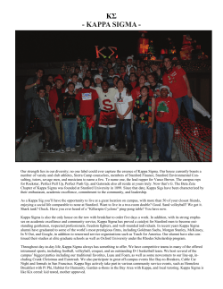
N AT I O N A L
Brand & Graphics Standards
established 2013
Kappa Kappa Psi & Tau Beta Sigma National Headquarters
PO Box 849 • Stillwater, OK • 74076-0849
Telephone: (405) 372-2333 • Fax: (405) 372-2363 • E-Mail: [email protected]
http://www.kkpsi.org | http://www.tbsigma.org | http://www.kkytbs.org
Kappa Kappa Psi - Brand & Graphics Standards Page 1
BRAND FOUNDATION
A brand may be defined as all that is known, thought or experienced by the public about an organization. How
we present ourselves and how we communicate to our audience is very important in the public’s perception.
While Kappa Kappa Psi has almost 100 years of symbolism in our crest, letters, colors and other fraternal
identifiers, we’re most commonly thought of as “the band fraternity.” That doesn’t tell anyone anything
about who we are or what we believe in and strive for.
During the 2011-2013 biennium, President Adam Cantley asked several Brothers who were working in the
marketing and design industries to serve on a task force to create a national logo identity and brand strategy for
Kappa Kappa Psi. The goal was to launch this new identity at the 2013 National Convention along with a guidebook clearly detailing the standards and styles of the brand. This would allow the Fraternity to begin the next
biennium with a new marketing strategy and the tools to help make it successful.
As a nationally recognized and public organization, it is important to maintain a professional image that conveys
our fraternal ideals and promotes excellence. Key questions for the task force were who we want to market to,
who we interact with on a regular basis, and what image we want those people to come away with. The
materials in this guide are results of the group’s work.
This style guide was adopted by the National Fraternity at the 2013 National Convention in Springfield, Mass.,
and a four-year moratorium was placed on making changes to it. Once the moratorium has passed, a committee
shall be appointed to look into the brand, styles, and public images used to promote the Fraternity and decide
upon any changes. Those changes can then be submitted to the National Convention delegation and voted
upon accordingly.
KAPPA KAPPA PSI BRAND PROMISE
Great brands are built on the promise that an organization can make to its constituents. This promise is the key
to capturing the mind share and loyalty that successful organizations require. What does Kappa Kappa Psi’s
brand promise deliver for those who engage with our members?
Kappa Kappa Psi’s brand expression can be summed up as: MUSICIANSHIP. LEADERSHIP. SERVICE.
This brand statement ties together statements reflective both of what we stand for, and how we affect for our
communities and membership. Kappa Kappa Psi is a guiding light with which band students can grow, learn,
and develop themselves and their band programs. Kappa Kappa Psi is an organization of opportunity and quality, brimming with historic, well-developed leadership and membership programming that students use to
become great leaders, better band members and better adapted young adults prepared for what lies ahead
of them. Like the members themselves, Kappa Kappa Psi’s brand promise is indicative of what makes a great
student and band member and of a promising future. Kappa Kappa Psi’s engagements are always evolving – dynamically and proactively in response to its students and the times in which they live – but this brand shows the
pillars with which our students “Strive for the Highest.”
Kappa Kappa Psi - Brand & Graphics Standards Page 2
COLOR PALLETTE
When printing the logo in a color other than black, we suggest that you use the colors presented on this page.
These are designated Pantone® colors. Pantone® is a color matching system that your local printer will use. It’s
also known as PMS. Use only the colors shown.
PMS Reflex Blue Coated
PMS Reflex Blue Uncoated
PMS 123 Coated
PMS 123 Uncoated
Keep in mind that for commercially printed jobs, a specified Pantone (PMS) color will be acceptable, however, for
in-house printing (desktop) a CMYK equivalent will be required, as desktop printers do not have the capability to
print in PMS colors. The CMYK equivalents for the Pantone colors are:
CMYK EQUIVALENT
C = 94.9, M = 73.33, Y = 7.45, K = 1.57
C = 1.57, M = 19.61, Y = 91.76, K = 0
The color examples below are rendered in Web (hexadecimal).
WEB COLOR VERSIONS
# 09268a
# ffc61e
Computer applications such as PowerPoint require RGB (red, green, blue) values.
RGB
R = 9, G = 38, B = 138
R = 255, G = 198, B = 30
FOUR-COLOR PROCESS (CMYK) VS. SPOT COLOR (PMS)
Four-color Process (CMYK) is a mixture of various densities of cyan, magenta, yellow and black inks. Spot Colors
(PMS) are inks that are mixed before being loaded into the printing press. Many colors are markedly different when
printed as CMYK vs. PMS. Certain PMS colors may appear to match closely when converted while others may vary
greatly. It is recommended, when possible, to print PMS Reflex Blue and PMS 123 Golden Yellow as spot colors.
Kappa Kappa Psi - Brand & Graphics Standards Page 3
CORRECT CREST USAGE
If reduced to smaller than 1 inch in width, the Kappa Kappa Psi full color crest becomes very difficult to read. We
recommend that you not use a full color crest smaller than 1 inch in width.
1 inch
VERY IMPORTANT!
The crest, as well as the official fraternity logo, should have the visual space to breathe and maintain its
prominence. If art or typography is placed too close to these elements, it hinders their recognition and strength.
A space of one-quarter the width of the crest should surround the crest on all sides in all visual communications.
1/2 inch
2 inches
Kappa Kappa Psi - Brand & Graphics Standards Page 4
CORRECT LOGO USAGE
If reduced to smaller than 1/2 inch in height, the Kappa Kappa Psi logo becomes very difficult to read. We recommend that you not use the full width logo with brand statement smaller than 1/2 inch in height.
1/2 inch
VERY IMPORTANT!
The official fraternity logo, like the crest, should have the visual space to breathe and maintain its prominence. If art
or typography is placed too close to these elements, it hinders their recognition and strength. A space equivalent
to the height of the capital K in the first Kappa should surround the logo on all sides in all visual communications.
“K” Height
“K” Height
Kappa Kappa Psi - Brand & Graphics Standards Page 5
ONE-COLOR TREATMENTS
While the crest should be used with the official fraternity colors in most instances, there are times when a
one-color, line art crest should be used. The logo of the Fraternity, while usually displayed in blue, will at times
need to be displayed in other formats where this color is not applicable. One-color treatments may be required
for fax letterhead, newspaper articles, etc. and can be supplied online for download.
REVERSING THE CREST AND LOGO ART
When either the crest or logo is placed on a dark-colored background, it is important to remember that using a
reversed treatment or a treatment with a color such as PMS 123 Golden Yellow will give the artwork the best
readability. Note the different style of logo used without the bar (details on page 8 for this usage). A reversed
logo treatment can be supplied by the National Headquarters.
Kappa Kappa Psi - Brand & Graphics Standards Page 6
CORRECT ARTWORK USAGE (CONTINUED)
The crest and logo are actually a combination of communication elements. All elements have been designed to
exist in relation to one another. In the case of the crest, these elements were specifically chosen with symbolism
in mind and have been adapted to the Fraternity’s exact purposes over its existence. The display of said
iconography should not be taken lightly. When using the crest or the logo, it is preferred that you use either
exactly as shown in this document.
CREST OPTIONS
Official Crest – The Kappa Kappa Psi Fraternity Crest was specifically
created for representing the Fraternity and is one of our trademarked
items. It has been adapted to perfectly fit a set of standards since its inception. Its proportions, line weight, and color are not to be altered.
Quick Usage Notes: This standard crest in most publications and is the
ONLY crest used for Ritual activities. Used in a wide variety of media, this is the
crest most often seen and most often abused. The colors within our Fraternal
crest should always be the Pantone® color set detailed in this style guide.
One-color Treatment/Line-art Crest – The Kappa Kappa Psi Fraternity
Crest without the official colors showcasing only the line-art makeup of
the crest itself.
Quick Usage Notes: This crest is used in places where the crest will be
displayed where no color is available (BW publications, etc.) or where a single
color will be used (blue, red, white, etc.). Use solid colors only; no mixed colors
are permitted within this crest variant. Use the same height and weight
standards as with the Official Crest.
Silhouette Crest/Shadow Crest – The Kappa Kappa Psi Fraternity Crest
in solid silhouette.
Quick Usage Notes: The Silhouette Crest (otherwise known as the Shadow
Crest) is used as a watermark or as the back drop to a larger logo (such as
for programs) affiliated with the Fraternity. This crest is used to associate a
program with the Fraternity while not being a part of any formal symbolism,
or in places where the area to display the crest is too small for a line-art or
normal crest. It can incorporate any solid color or slight gradient; that is, a
gradient moving from one color to a similar color shade (blue to purple or
aqua).
Outline Crest – The Kappa Kappa Psi Fraternity Crest line-art form with a
thick, contrasting shadow/outline around its edges.
Quick Usage Notes: The Outline Crest is used for notifications, forms, signage and other informational materials of an informal nature to add a slight
variation/alternative to the line art crest. It should only be used in solid colors
where the background (the crest’s outline) is in color and the line crest within
the outline matches the color of the plane behind the background (in this
case white with the background of this document.
Distressed Crest – The Kappa Kappa Psi Fraternity Crest line-art form
with distressed look.
Quick Usage Notes: The least often used crest is the Distressed Crest, mostly
used for modern graphic tees, flyers used for promotional purposes, or in instances such as the fraternity passport where a distressed look is needed for
added authenticity. This crest is displayed using a single solid color, usually
as part of a design to attract students. While still maintaining the overall look
of our crest, the look gives it a more graphic/grunge feel to fit with certain
modern, youthful design aesthetics and appeal.
Kappa Kappa Psi - Brand & Graphics Standards Page 7
CORRECT ARTWORK USAGE (CONTINUED)
The logo was created in 2013 as a means to unify the designs and brand of the Fraternity. When using either the
crest or the logo, it is preferred that you use either exactly as shown in this document.
LOGO OPTIONS
Official Logo – The Kappa Kappa Psi Fraternity Logo has been specifically created to incorporate the rich history of the Fraternity
with the Fraternity’s foundations. Its proportions, line weight, and color are not to be altered (unless certain specified criteria are
met).
Quick Usage Notes: The Official Logo is used in most publications and is the main logo used for official fraternal documents. Used in a wide
variety of media, this is the logo most often seen. The color within our Fraternal logo should always be the Pantone® color set detailed in this
style guide.
Type Treatment Logo – The Kappa Kappa Psi Fraternity Logo without icon bar around the brand statement.
Quick Usage Notes: Same standard height and weight as the official logo. This logo can be used in places where the logo will be displayed and no color is available (BW publications, etc.), or where a single color other than PMS Reflex Blue will be used (red, white, etc.).
This is to ensure that the blue field works to resemble our flag. Use solid colors only; no gradients or mixed colors (i.e. different colors for
Greek words and star/brand statement) within this logo variant.
Greek Letters w/ Icon – The Kappa Kappa Psi Greek letters with the layered star icon between the two K’s.
Quick Usage Notes: This text and icon graphic can be used in instances where the larger long logo may not fit or be appropriate, or for
specific Greek letter designs on t-shirts. The Icon Logo was designed to reflect the fraternity flag, just as the Official Logo was. The star
should not be used without the Greek letters.
Tagline – The Kappa Kappa Psi logo tagline. This tagline has been typeset in this format and cannot be altered. It can be used
independently in specific instances and can be used in the encased formats or free text format.
Quick Usage Notes: The tagline is to be used whenever possible along with the logo, but sometimes placing it as reinforcement within
documents or in places of importance could prove to broaden the brand and strengthen the tagline itself when placed properly.
Kappa Kappa Psi - Brand & Graphics Standards Page 8
INCORRECT ARTWORK USAGE
Following is a list of incorrect logo and crest uses. Placing the logo on photos and patterns is not authorized.
Separating the logo or crest elements is not authorized. Always verify that the logo and crest are being scaled
proportionally and never change the logo color or official Fraternity crest colors.
DO NOT DO THIS
print the Official Crest in the wrong colors of blue and/or
yellow
DO NOT DO THIS
print the crest in unauthorized colors and
color combinations
DO NOT DO THIS
print the logo/official crest in the wrong color of blue
DO NOT DO THIS
print the star in a different color from the Greek letters in
the icon logo
Text Here
Text
Here
DO NOT DO THIS
print any crest (except the Silhouette Crest) or logo in a
gradient transition
DO NOT DO THIS
eliminate or cover part of any crest (other than the
Silhouette Crest) or our logo in a design
DO NOT DO THIS
stretch, alter or distort any crest or logo out of its
proper proportions
DO NOT DO THIS
print any crest or logo in a reverse on any background that
doesn’t provide sufficient contrast
Kappa Kappa Psi - Brand & Graphics Standards Page 9
INCORRECT ARTWORK USAGE
Following is a list of incorrect logo and crest uses. Placing the logo on photos and patterns is not authorized.
Separating the logo or crest elements is not authorized. Always verify that the logo and crest are being scaled
proportionally and never change the logo color or official Fraternity crest colors.
DO NOT DO THIS
print any crest or the logo/icon in inappropriately bright or
clashing colors
DO NOT DO THIS
print any logo/icon or crest on a patterned
background image
DO NOT DO THIS
print a colored logo/crest on top of a color photo
DO NOT DO THIS
display our logos or crests in anyway that is not right-side
up and respectful in placement (such as on clothing)
DO NOT DO THIS
alter the spacing between elements in either the logo/icon
or crest
DO NOT DO THIS
enclose the logo or crest in a shape or outline without
proper spacing as defined on pages 4 and 5
The Most Honorable
Fraternity, Inc.
DO NOT DO THIS
alter, distort, or add to any logo or crest
DO NOT DO THIS
add type or add graphics to the crest
or logo
Kappa Kappa Psi - Brand & Graphics Standards Page 10
OTHER LOGOS & ARTWORK
The crest and logo are only a couple of the graphics in use by the Fraternity as a national organization. We also
have a national joint publication, as well as an alumni association. There are also guidelines to be used when
creating a local or chapter affiliate logo design. When using any of these designs or rules it is preferred that you
use them exactly as shown in this document.
OTHER ARTWORK
Official Alumni Association Logo - FORMAL – The Kappa Kappa Psi
Alumni Association has two logos, the first of which is the formal logo,
used in most documents.
Quick Usage Notes: This standard logo is used by the KKPsiAA in most of
their documents. It showcases the letters of Kappa Kappa Psi as well as the
Alumni Association’s creed. When using this, treat it as an official logo of the
Fraternity with the same rules and governances.
Official Alumni Association Logo - INFORMAL – The Kappa Kappa Psi
Alumni Association has two logos, the second of which is the informal
logo.
Quick Usage Notes: This informal logo is used in places such as social media and on items of less importance for the KKPsiAA.
Chapter and District Logos – Kappa Kappa Psi allows individual
chapters and districts to produce their own chapter/district logos so long
as each logo follows all of the rules pertaining to the Fraternity Crest/
Logo AND:
• Displays the letters and/or actual name of the Fraternity along with the
chapter name in a legible format in all iterations
• Does not display or allude to a chapter or college/university mascot
• Remains professional in appearance and symbolizes the professional
and honorary nature of the Fraternity
Quick Usage Notes: Chapter logos can be used on shirts and in any media
where the chapter or district wishes to advertise their activities in a professional or informal recruitment fashion. However, this logo should not overtake the official fraternity graphic identifiers such as the crest or national
logo, especially in cases of Ritual or national programming advertisement.
Kappa Kappa Psi - Brand & Graphics Standards Page 11
TYPOGRAPHY
We encourage you to limit the use of typography for marketing materials to Myriad Pro and Trajan Pro typesets.
In those instances where a serif font is necessary or more appropriate we encourage the use of Adobe Caslon
Pro. This will keep communications unified and allow for a fully connected feel between publications, cards and
brand items.
Myriad Pro Condensed
ABCDEFGHIJKLMNOPQRSTUVWXYZ
abcdefghijklmnopqrstuvwxyz - 1234567890
Myriad Pro Condensed Italic
ABCDEFGHIJKLMNOPQRSTUVWXYZ
abcdefghijklmnopqrstuvwxyz - 1234567890
Myriad Pro Condensed Bold
ABCDEFGHIJKLMNOPQRSTUVWXYZ
abcdefghijklmnopqrstuvwxyz - 1234567890
Myriad Pro Condensed Bold Italic
ABCDEFGHIJKLMNOPQRSTUVWXYZ
abcdefghijklmnopqrstuvwxyz - 1234567890
Myriad Pro Light
ABCDEFGHIJKLMNOPQRSTUVWXYZ
abcdefghijklmnopqrstuvwxyz - 1234567890
Myriad Pro Light Italic
ABCDEFGHIJKLMNOPQRSTUVWXYZ
abcdefghijklmnopqrstuvwxyz - 1234567890
Myriad Pro Regular
ABCDEFGHIJKLMNOPQRSTUVWXYZ
abcdefghijklmnopqrstuvwxyz - 1234567890
Myriad Pro Italic
ABCDEFGHIJKLMNOPQRSTUVWXYZ
abcdefghijklmnopqrstuvwxyz - 1234567890
Myriad Pro Semibold
ABCDEFGHIJKLMNOPQRSTUVWXYZ
abcdefghijklmnopqrstuvwxyz - 1234567890
Myriad Pro Semibold Italic
ABCDEFGHIJKLMNOPQRSTUVWXYZ
abcdefghijklmnopqrstuvwxyz - 1234567890
Myriad Pro Bold
ABCDEFGHIJKLMNOPQRSTUVWXYZ
abcdefghijklmnopqrstuvwxyz - 1234567890
Myriad Pro Bold Italic
ABCDEFGHIJKLMNOPQRSTUVWXYZ
abcdefghijklmnopqrstuvwxyz - 1234567890
Myriad Pro Black
ABCDEFGHIJKLMNOPQRSTUVWXYZ
abcdefghijklmnopqrstuvwxyz - 1234567890
Myriad Pro Black Italic
ABCDEFGHIJKLMNOPQRSTUVWXYZ
abcdefghijklmnopqrstuvwxyz - 1234567890
Kappa Kappa Psi - Brand & Graphics Standards Page 12
TYPOGRAPHY (CONTINUED)
Trajan Pro
ABCDEFGHIJKLMNOPQRSTUVWXYZ
abcdefghijklmnopqrstuvwxyz - 1234567890
Trajan Pro Bold
ABCDEFGHIJKLMNOPQRSTUVWXYZ
abcdefghijklmnopqrstuvwxyz - 1234567890
Adobe Caslon Pro Regular
ABCDEFGHIJKLMNOPQRSTUVWXYZ
abcdefghijklmnopqrstuvwxyz - 1234567890
Adobe Caslon Pro Italic
ABCDEFGHIJKLMNOPQRSTUVWXYZ
abcdefghijklmnopqrstuvwxyz - 1234567890
Adobe Caslon Pro Semibold
ABCDEFGHIJKLMNOPQRSTUVWXYZ
abcdefghijklmnopqrstuvwxyz - 1234567890
Adobe Caslon Pro Semibold Italic
ABCDEFGHIJKLMNOPQRSTUVWXYZ
abcdefghijklmnopqrstuvwxyz - 1234567890
Adobe Caslon Pro Bold
ABCDEFGHIJKLMNOPQRSTUVWXYZ
abcdefghijklmnopqrstuvwxyz - 1234567890
Adobe Caslon Pro Bold Italic
ABCDEFGHIJKLMNOPQRSTUVWXYZ
abcdefghijklmnopqrstuvwxyz - 1234567890
Kappa Kappa Psi - Brand & Graphics Standards Page 13
BUSINESS CARDS
The Fraternity shall use the same style of business card for all National Officers, as well as those National Headquarters employees who work exclusively under the Kappa Kappa Psi name, specifically Chapter Field
Representatives. These cards were designed with the existing symbolism of our colors and flag in mind, and
showcase the brand of Kappa Kappa Psi.
FRONT
John Doe
National Officer
Kappa Kappa Psi
National Honorary Band Fraternity
P.O. Box 849, Stillwater, OK 74076-0849
Nat’l Office: 405.372.2333 Cell: 405.555.5555
E-mail: [email protected]
Website: www.kkpsi.org
The front of the business card showcases the crest. It is laid out much like the flag with the blue and white color fields, each
taking up 50% of the available space each and using both Myriad Pro (in the name and position) as well as Adobe Caslon Pro (in
the general information field). The crest is the first thing one sees reading from left to right, but doesn’t take away from the name
or person’s information.
BACK
The back of the card has our crest and logo brand front and center. It’s very clean, showcases our signature color, and includes our
brand statement - Musicianship - Leadership - Service. We want this to be what someone remembers about anyone from Kappa
Kappa Psi after meeting them.
Kappa Kappa Psi - Brand & Graphics Standards Page 14
LETTER HEAD
The Fraternity letterhead incorporates all of the same symbolism as the previous graphics. The letterhead is on
standard 8.5” by 11” paper. The spacing uses scholar standards, with a two-inch left margin for any departmental
information (committee that this letter is coming from, names and contact information of others receiving the
letter, etc.). At the very bottom - again to leave a mark on the reader - we have the brand logo with our brand
statement, Musicianship - Leadership - Service.
1 in
John Doe
National Officer
2 in
Scholar’s Margin
1 in
1 in
P.O. Box 849 | Stillwater, OK 74076-0849 | Office: 405.372.2333 | Cell: 405.612.2047 | E-mail: [email protected] | Website: www.kkpsi.org
Kappa Kappa Psi - Brand & Graphics Standards Page 15
NEXT STEPS
As a fraternity, it is important for Kappa Kappa Psi to have traditions and values set to a certain level and that
remain a constant. As a national organization, it is also important to maintain a professional image, one that
speaks the messages and ideals we want to put forward, and one that continues to promote only the highest
level of excellence.
This means that while we adopt this brand and these style guidelines as a national organization, and as we continue to move forward in time as an organization built upon our purposes and creed, we must also look at the
public symbol(s) of our Fraternity and ensure that our message continues to be one that truly reflects our goals
and purposes. Just as our Ritual has evolved over time, our brand and public image should also evolve, expand,
and adapt.
OUR PUBLIC BRAND,
OUR NATIONAL STANDARD
This brand will be what defines us as a national organization to those who are not close or who are just coming
to know our membership. We should no longer be known simply as “the band fraternity”, but instead be known
as a brotherhood that stands for MUSICIANSHIP, LEADERSHIP, and SERVICE. When speaking to prospective
members, family members, or friends, use our brand language. Speak to them about becoming the best
MUSICIANS they can be. Speak to them about developing true LEADERSHIP skills, about working with your
director for the betterment of an entire collegiate program. Speak to them about SERVING your band,
your university, your community.
This brand sets the standard that we will no longer be known simply for wearing letters and going to band we strive to become the standard of MUSICIAN, LEADER, and STEWARD for those around us.
Kappa Kappa Psi - Brand & Graphics Standards Page 16
NOTES:
Kappa Kappa Psi - Brand & Graphics Standards Page 17


© Copyright 2026