
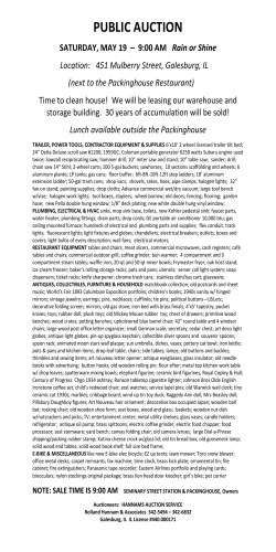
Working with Woods (PE5) In this tutorial, we will look at
Working with Woods (PE5)
In this tutorial, we will look at
different ways to make wood using Photoshop
Elements (PE). While I will be using PE 5.0
for my examples, these techniques will also
work with PE 3 and PE 4. Our project will be
to create a heart made of wood with an arrow
through it for Valentine’s Day. When we are
done, our image will look something like this.
Creating the Wood Pattern
Want to make some wood? Try searching on the Internet for this phrase: wood photoshop
tutorial. I got some great hits using Google, and that’s where I found this first technique. You can
find it on pegaweb.com, a design web site by a graphic artist from Australia. He has a tutorial
called “Creating a Realistic Wood Texture in Photoshop”, at
http://www.pegaweb.com/tutorials/woodtexture/adobe-photoshop-wood-texture.htm . I will use
some of his initial steps to create the wood, followed by my own variations to create the heart
shape and add the arrow, text and background.
Applying Gradients to an Area
First select File > New with an area of
600 x 600 pixels, 72 pixels per inch, RGB
Color, White Background. Save the file as
wood.psd. Add a new layer and fill it with a
medium brown color. [Note: one easy way to
pick a color is to use Google Image Search.
Search for wood pine, and you can find some
great images. Pick one with colors you like,
bring a copy of the image into Photoshop
Elements and sample the colors to get a brown
you want.]
Select the brown square using Ctrl + A. We are now going to add three layers, and apply a
gradient to each layer. So add a new layer, but keep the area selected. Click on the Gradient Tool
in the Tool Bar, and then click on the picture of the Gradient in the Option Bar above. That opens
the Edit capability for the Gradient. When you open the Gradient Editor, find the Gradient Type
and change it to Noise. Then pick one of the gradients from the Presets and click OK.
Instructional Material is ©2008 John Durrett, sunlaker.com
1
Go back to your new layer, maintaining the
selection, and click and drag the Gradient
Tool vertically down from the top (holding the
Shift key will keep it perfectly aligned). Your
new layer will be the colors of your pick, and
not brown. But don’t worry.
Next make two new layers and apply a
variation of the noise gradient to each, using
the Randomize feature of the Gradient
Editor.
Now go back to each of the layers with the
gradients and remove the color (but not the
texture) by selecting Enhance > Adjust Color
> Remove Color (Ctrl + Shift + U). This is
also known as desaturating. The final step is
to change the Blending Mode on each of the
gradient layers from Normal mode to Soft
Light using the drop-down menu at the top of
the layers palette. The initial brown layer
gives the image its color, and the gradients
give it the texture.
Rotate and Apply Liquify Filter
Ok, this is a good wood, but it is far too
smooth to look natural. For the next step,
save the file as wood2.psd. Then merge the
layers of the file into a single layer using
Layer > Merge Visible. Now select Image >
Rotate > 90 deg Right. This will allow us to
use the Liquify filter next. First make a copy
of the single background layer. That way if
we don’t like what we get with the filter, we
can throw away the layer. On the copy of the
background layer, apply Filter > Distort >
Liquify. You will get a new screen for applying
the Liquify filter. Make your brush size 60
pixels. Then click and drag the brush
horizontally along short sections of the wood.
Try several different locations. Go for short
strokes; not sweeping drags. Try dragging
the brush right several times, and then back
to the left in new spots.
A nice variation on this is to add some knots
after the initial liquify drags. Bring the
Liquify filter up again, and choose the Twirl
Clockwise Brush. Change your brush size to
around 40 pixels, and click and hold your
brush over some of the darker lines of wood.
Hold down long enough and you have knots.
Instructional Material is ©2008 John Durrett, sunlaker.com
2
Now this will look good, but there is one final
step that will give the wood some needed
intensity. First, duplicate the layer you used
to add the variations to the wood. Then
change the mode of that copied layer from
Normal to Soft Light. That additional layer
enhances the original wood layer. Now you
have a great piece of wood. [For some
surprising colors, change the Soft Light to
Overlay in the duplicate layer.]
Make the Heart
One nice tool in Photoshop Elements is the Custom Shape Tool. Select it from the Tool Bar
on the left. Then go to the Options Menu and choose the Heart from the available Shapes.
Next take and drag that Heart Shape Tool
over the wood in the image on the screen.
You will think you have goofed because it will
look like a brown heart on the wood.
Now a trick from Photoshop that also works
in Elements. To make a selection out of this
heart shape, hold down the Ctrl key and click
your mouse on the small thumbnail on the
heart shaped layer.
Instructional Material is ©2008 John Durrett, sunlaker.com
3
This gives you a heart selection. Before you
use that selection, make a copy of the wood
layer. Click on the layer with the copy of the
wood and choose Select > Inverse from the
menu. Hit the delete key (or Backspace key),
and all the wood is cut away except for the
heart shape. Turn off the visibility of the
background layer and the shape layer to see
your real heart of wood.
Hearts and Arrows
Add an arrow and the text and we are
almost through. Using the Custom Shaped
tool, choose the Line Tool and then add the
arrowhead function. Make the Weight of the
arrow 7 pixels, and click and drag the arrow
from the lower left to the upper right
across the heart. Ctrl + Click the thumbnail
to get a selection for the arrow, and add a
new layer. Fill the selection on the new layer
with brown for the arrow shaft. Then use the
Polygonal Lasso Tool to create a selection for
the tail feathers and then fill with the brown.
Now take the Polygonal Lasso Tool and make
a selection to cut out the center of the
arrow shaft, to represent the arrow piercing
the wood. When you have made that
selection, Delete the center of the arrow.
You should have the following.
Add Text and a Background
Now we follow last month’s approach to
add text and a background. Select the Text
Tool and type Be My Valentine. It will go into
a new layer. I changed the font to Tabitha,
adjusted the font size to fit the heart area,
and changed the font color to a light
tan/yellow. Then I added a Simple Outer
Bevel and a Drop Shadow to the text layer
using the Layer Effects. The interim heart
now looks like this.
The final step consists of adding a new layer beneath the wood layer and choosing a color that is
light, but complementary to the wood. Fill the new layer with that color and add texture for that
new background using Filter > Noise > Add Noise (Gaussian), and then Filter > Brush Strokes >
Instructional Material is ©2008 John Durrett, sunlaker.com
4
Crosshatch. Then one last touch. To set the heart and arrow off from the background, add a Low
Drop Shadow Layer Effect to the layers that contain the heart and the arrow. The final version
is shown here.
Not the same one we had when we started this paper. Is it? Each time, you get something new.
Closing comments: You could always use a duplicate of the wood layer and use a selection of the
arrow’s shaft to cut a shaft out of wood. You could also try different variations on the kind of
wood you use for the heart. Janee has a very nice tutorial where she shows how to make a piece of
pine wood using a different technique. You can find her “Make Your Own Wood” tutorial at
http://www.myjanee.com/tuts/wood/wood.htm .
Instructional Material is ©2008 John Durrett, sunlaker.com
5


© Copyright 2026