
Flare Images Guide
MadCap Software
Images Guide
Flare 11
Copyright 2015 MadCap Software. All rights reserved.
Information in this document is subject to change without notice. The software described in this document
is furnished under a license agreement or nondisclosure agreement. The software may be used or copied
only in accordance with the terms of those agreements. No part of this publication may be reproduced,
stored in a retrieval system, or transmitted in any form or any means electronic or mechanical, including
photocopying and recording for any purpose other than the purchaser's personal use without the written permission of MadCap Software.
MadCap Software
7777 Fay Avenue
La Jolla, California 92037
858-320-0387
www.madcapsoftware.com
THIS GUIDE WAS CREATED USING MADCAP FLARE.
CONTENTS
CHAPTER 1 Introduction
Raster Versus Vector Images
PDF Files as Images
Tasks Associated with Images
CHAPTER 2 Adding and Inserting Images
Adding Images to Projects
Inserting Images
Adding Screen Capture Files to Projects
Inserting Screen Capture Images
CHAPTER 3 Editing Images
Ways to Edit Images
Editing Image Properties Using Styles
Editing Image Properties Using Local Formatting
Opening Images in Capture for Editing
Adding Backgrounds to Images
Adding Borders to Images
Moving Images in Content Files
Using Absolute Positioning on Elements
Using Floats for Positioning Elements
Resizing Images
Matching the Image Resizing Behavior of Previous Versions
Adding Margins to Images
5
6
10
14
21
22
24
33
39
45
46
48
51
57
58
61
64
65
109
114
122
123
Adding Padding to Images
Auto-sizing Capture Image Objects to Fit Text
Previewing Thumbnails
Showing Images as Thumbnails in Output
Showing Images as Thumbnails While Editing
Showing and Hiding Web Images in the XML Editor
Creating Watermarks
CHAPTER 4 Additional Image Tasks
Selecting an Image for the About Box
Applying Empty Alt Text
Deleting Images from Content Files
Deleting Image Files from the Project
Inserting Image Hyperlinks
Creating Image Maps
Adding Images to Page Layout Frames
Patching Stylesheets and Image Links for HTML Help
Creating a List of Images
Launching MadCap Capture
Embedding Images in Microsoft Word Output
Opening Images
Pasting Images from Other Programs
Regenerating Images
Removing Images from Headings in a Generated TOC
Creating Single-Source Images
Generating Web-Safe Images
APPENDIX PDF Guides
iv
125
127
130
133
138
141
142
145
146
148
150
150
151
156
165
166
167
169
170
171
172
173
176
177
180
181
CHAPTER 1
Introduction
Supported In:
You can insert images into content files (e.g., topics, snippets). Flare supports the following
types of raster and vector image files: BMP, EMF, EPS, EXPS, GIF, HDP, JPG, JPEG,
PDF, PNG, PS, SVG, SWF, TIF, TIFF, WDP, WMF, XAML, XPS.
This chapter discusses the following:
Raster Versus Vector Images
PDF Files as Images
Tasks Associated with Images
6
10
14
Raster Versus Vector Images
Flare supports common raster image formats such as BMP, GIF, JPG, and PNG. In addition, it supports
vector image formats such as EPS, PS, and SVG.
A vector image comprises geometric elements such as lines, points, and curves, based on mathematical
equations. On the other hand, raster graphics are made up of pixels. A vector image is ideal for print-based
output because the clarity is maintained even when you reduce the size of the graphic. Vector images are
supported in PDF output. If you generate another type of output, you may find that some vector formats
(e.g., SVG) are supported while others (e.g., EPS) are not due to limitations of the browser or application.
When a vector image is not supported in an output, it is converted to PNG.
It is sometimes difficult to tell the difference between a vector and raster graphic when viewing it at 100%.
But if you zoom in the difference becomes apparent. Following is an example of a PDF document with the
same image in JPEG and SVG format.
6
The text in the SVG image is a little more readable. And if we zoom in, we can see why.
CHAPTER 1│Images Guide
7
Here is what the JPEG image looks like when we zoom in at 300%. Notice that the pixels look blurry when
enlarged.
8
And here is what the SVG image looks like. Notice that the text still looks as clear as it does at a much
smaller size.
CHAPTER 1│Images Guide
9
PDF Files as Images
You can insert pages from PDFs as images. When you select a PDF file, you can choose the specific page
from it to be inserted as an image.
10
PDF images are supported in all outputs. However, the way these files are treated depends on the output
format:
PDF If you generate PDF output, the page you inserted is kept as a PDF. So it's sort of like a onepage PDF within a big PDF. You'll find that you can select text in that PDF image, just like you can
in the larger PDF.
CHAPTER 1│Images Guide
11
Also, any vector-based information is retained, therefore retaining the quality and clarity you expect.
This is especially useful if you inserted a PDF that contains Microsoft Visio diagrams or vector drawings from CAD (computer-aided design) software.
12
All Other Outputs If you generate any output other than PDF, the PDF page you inserted is converted to a PNG file, even if it contains vector-based drawings. That's largely due to the fact that
browser-based output types do not support vector images. Because the image displays in a raster
format, you will find that it is not as crisp as its vector counterpart in PDF output.
CHAPTER 1│Images Guide
13
Tasks Associated with Images
You can accomplish the following with images.
ADDING AND INSERTING IMAGES
Image File (Add) These steps show you how to add an image to your project, without inserting it
into a topic. See "Adding Images to Projects" on page 22.
Images (Insert) These steps show you how to insert an image file that already exists. See "Inserting Images" on page 24.
Screen Capture (Add) Follow these steps if you have MadCap Capture installed on your computer
and you want to capture an image from your screen and add it to the project, without inserting it into
a topic at the same time. See "Adding Screen Capture Files to Projects" on page 33.
Screen Capture (Insert) Follow these steps if you have MadCap Capture installed on your computer and you want to capture an image from your screen and insert it into a topic at the same time.
See "Inserting Screen Capture Images" on page 39.
EDITING IMAGES
Background (Add) You can add background settings to an image. This includes the ability to specify a color, another image, and a repeating pattern for the background image. Normally you would
not see an image's background, but if you give the image a certain amount of padding, you would
see the background around the edges of it. See "Adding Backgrounds to Images" on page 58.
Borders (Add) You can add borders around an image, specifying the border size, color, and type.
See "Adding Borders to Images" on page 61.
Image (Edit) If you have MadCap Capture installed on your computer, you can open any image in
your project. The image opens in Capture, where you can make changes to it. See "Editing Images"
on page 45.
Image (Move) After you insert a picture or screen capture image into a content file, you can easily
move that image around. See "Moving Images in Content Files" on page 64.
Image (Resize) You can resize images with various methods. See "Resizing Images" on page 114.
Margins (Add) You can adjust the margins around an image so that there is extra space above,
below, to the right, or to the left of it. See "Adding Margins to Images" on page 123.
14
Objects (Auto-size) If you have inserted MadCap Capture images that contain objects with text,
you can auto-size those objects automatically when the output is generated. This can be done by
selecting an option in the Advanced tab of the Target Editor. The original image file and its associated properties (.props) file remain unchanged. Only the output image is affected. See "Auto-sizing
Capture Image Objects to Fit Text" on page 127.
Padding (Add) You can add padding (i.e., extra space) between an image's border and the image
itself. See "Adding Padding to Images" on page 125.
Position You can position an image so that content wraps around it. See "Using Absolute Positioning on Elements" on page 65 and "Using Floats for Positioning Elements" on page 109.
Thumbnails (Preview) In the XML Editor, when you are viewing a topic or snippet that contains a
thumbnail image, you can right-click on that thumbnail and select Preview Image from the context
menu. This enlarges the thumbnail image within the editor so that you can more easily see it and
read any callouts within it. You can then click on the full-size image to return it to a thumbnail. See
"Previewing Thumbnails" on page 130.
Thumbnails (Show in Output) When you insert images into Flare content, you can specify that
the images should be displayed as thumbnails (i.e., much smaller versions of the image) in the output. This is a way to condense topics so that images are not taking up as much real estate. When
you use this feature, you can specify ways that the user can enlarge the image to see its full size
(e.g., by hovering over the thumbnail, by clicking the thumbnail). See "Showing Images as Thumbnails in Output" on page 133.
Thumbnails (Show While Editing) You can specify that thumbnail images should be shown while
you are editing the content. This is simply a feature for you as the author, allowing you to scale all
images down to 48 pixels high (if the original size is larger than that). This lets you see more content
and less of your images as you edit topics. The images are only scaled for your editing purposes;
they are not shown as thumbnails in the output. See "Showing Images as Thumbnails While Editing" on page 138.
Web Images (Show/Hide in XML Editor) If you have many image tags that link to websites (e.g.,
<img src="http://www.madcapsoftware.com/images/home/company.png" />), rather than linking to
images in the project, slow website response times may slow down your work in the Flare project.
Therefore, you might want to disable the rendering of such images in the XML Editor. See "Showing
and Hiding Web Images in the XML Editor" on page 141.
CHAPTER 1│Images Guide
15
ADDITIONAL IMAGE TASKS
About Box in Skin (Select) You can select an image to be used for the "About box" in the output
window. You can use this About box for any purpose you like. See "Selecting an Image for the
About Box" on page 146.
ALT Text (Add Empty) You can add an empty "alt" (alternate text) attribute to images that do not
have one. The attribute gets added to the output when the target is generated. See "Applying Empty
Alt Text" on page 148.
Background for Topics/Watermark (Add) You can add a background image on topics by using
the body style. See "Creating Watermarks" on page 142.
Delete These steps show you how to delete an image that you have previously inserted into a
topic. You can also remove an image file from a project. See "Deleting Images from Content Files"
on page 150 and "Deleting Image Files from the Project" on page 150.
Hyperlink and Image Map (Insert) After you insert an image, you can turn that picture into a hyperlink, connecting it to another topic, a topic in an imported HTML Help file, an external file (such as a
website), or an email. See "Inserting Image Hyperlinks" on page 151. You can also create multiple
hyperlinks for specific sections of the image, and even place conditions on those sections. This is
called an "image map." See "Creating Image Maps" on page 156.
Image Frame (Add) You can draw an image frame in a page layout. The image you select is added
to a frame of the same size, which you can place on the page as necessary. This allows you to
place an image automatically on multiple pages in the output. You might use this feature, for
example, if you want to place your company logo somewhere on each page. See "Adding Images to
Page Layout Frames" on page 165.
Links for HTML Help (Patch) If you generate Microsoft HTML Help output, some topics may not
look as intended when they are printed from the CHM file, due to stylesheet-related problems. You
can use this feature to "patch" those problems, ensuring the printed topics will look as intended.
Why would you not use this option? The only reason not to use this option is when you plan to
rename the generated CHM file. If this option is enabled and you rename the CHM file, styles in the
output are broken. This happens because, when the option is enabled, the file name of the CHM is
hardcoded into the CHM itself. See "Patching Stylesheets and Image Links for HTML Help" on
page 166.
16
List of Images (Create) You can use the List-Of proxy to generate a list of various types of elements (e.g., tables, images) in your output, with links to the corresponding content. See "Creating a
List of Images" on page 167.
MadCap Capture (Launch) If you have MadCap Capture installed on your computer, you can
launch it from within Flare. You can then use Capture to edit any images in your project. See
"Launching MadCap Capture" on page 169.
Microsoft Word Output (Embed) An option on the Advanced tab of the Target Editor lets you
ensure that images are embedded in Microsoft Word output. This option is enabled by default. See
"Embedding Images in Microsoft Word Output" on page 170.
Open You can open an image that you have added to your project. When you open the image , it displays in the Image Viewer within Flare. See "Opening Images" on page 171.
Paste You can copy and paste an image from another program, such as Microsoft Word, into a content file (e.g., topic, snippet). When you do this, a copy of the image file is added in PNG format to
your project with a name that you provide. See "Pasting Images from Other Programs" on page 172.
Regenerate If necessary, you can quickly regenerate (update) all of the images in your project. See
"Regenerating Images" on page 173.
Remove from Generated TOC If you have inserted images into the headings in your topics, you
can make sure those images do not appear in the generated TOC of the printed output. See "Removing Images from Headings in a Generated TOC" on page 176.
Resize Images with Low DPI Starting with Flare Version 10, images with a very low DPI are
rendered more accurately in the XML Editor (WYSIWYG) and PDF output, usually resulting in
slightly larger and more blurry images (as is consistent with their lower DPI). Therefore, if you
upgrade from an older version of Flare to Version 10 or higher, you might notice images that looked a
certain size before now look larger and more blurry (because their true DPI is being rendered more
precisely). The best solution, and a long-term one, is to replace your lower-DPI images with higherDPI images to be used in print output (ideally as close to 300 DPI). But you also have the option to
revert back to previous version behavior. If you want to use the more precise resizing from newer
versions of the software, open the Options dialog (View>Options), select the General tab, and
select Automatically resize low DPI images. If you want to use the behavior from older versions
of the software, leave this option disabled.
CHAPTER 1│Images Guide
17
Resized Scaled Images (Generate) When you use Flare's resizing features to scale images, you
can specify whether you want Flare to pre-compile the resized images. You can do this for the online
outputs (DotNet Help, Eclipse Help, Microsoft HTML Help, HTML5, WebHelp, WebHelp AIR,
WebHelp Mobile, WebHelp Plus), as well as for Microsoft Word and Adobe FrameMaker output.
What does this mean? It means that Flare will create new copies of images wherever you have specified resizing, rather than relying on the browser to render the new size from the original. This
means better quality images, but it also means more image files in the output. It is recommended
that you leave the default pre-compile setting as it is (enabled). However, if you want to disable it,
you can open the Target Editor, select the Advanced tab, and select Generate resized copies of
scaled images to remove the check mark. (For Adobe PDF, Microsoft XPS, and XHTML output,
the resized images will always be pre-compiled, whether this option is enabled or not.)
Resolution and Dimensions (View) When you click on an image file in the Content Explorer or
File List window pane, its resolution and dimensions are displayed at the bottom. If you have set the
online or print DPI for an image using MadCap Capture, these values are also shown.
Select To select an image in the XML Editor, you can left-click on it. Another option is to right-click
on it and choose Select from the context menu.
Single-Source Image (Create) If you are creating a project containing images and need to generate output for both online and printed output, chances are good that you require different image settings (e.g., file format, color depth, resolution) for those outputs. In the past, the easiest way to
accomplish this task was to create one set of images for the online output and another set for the
printed output. However, there is another alternative. If you have both MadCap Flare and MadCap
Capture installed, you can single-source your images, producing only one set of images for all outputs. You can specify that the online images should have one group of settings, while the printed
images have another group of settings. You can also single-source images when resizing them.
This can be done through the use of styles (applying the settings to many images at once) or local
formatting (applying the settings to one image). When you generate online output, the image will be
displayed in one size, and when you generate print-based output, the image will be displayed in
another size. See "Resizing Images" on page 114 and "Creating Single-Source Images" on
page 177.
Web-Safe Images If you have used non–web-safe image formats (e.g., WMF, EMF, BMP, TIF,
TIFF, XPS, EXPS) in your project and want those images to be converted to web-safe formats (e.g.,
GIF, JPEG, PNG) when you generate online output—e.g., DotNet Help, Eclipse Help, Microsoft
18
HTML Help, HTML5, WebHelp, WebHelp AIR, WebHelp Mobile, WebHelp Plus—you can use an
option on the Advanced tab of the Target Editor. For print-based output types (Adobe FrameMaker,
Adobe PDF, Microsoft Word, Microsoft XPS, XHTML), the original image file formats will be used
when you generate output. See "Generating Web-Safe Images" on page 180.
Tip: For print-based output, you should try to use images with a high DPI (dots per inch) quality
(300 is typically recommended). The higher the DPI for an image, the more it shrinks in the output,
so you should try to obtain as large as an image as possible to begin with. If that doesn't work, a
lower DPI (e.g., 250, 200, 150) may produce acceptable results in print output. By contrast, online
output is usually displayed at 72 or 96 DPI, so a lower DPI image is okay for those outputs. To produce the best possible images for both online and print-based outputs, you might consider using
different images for those outputs and applying conditions to them. Another option is to use singlesourcing features with MadCap Capture, which lets you accomplish the same thing with only one
image for both online and print outputs. See "Creating Single-Source Images" on page 177.
Note: When you insert an image from outside your project into a topic, a copy of the image file is
added to your project. The image file is stored in the Resources\Images folder of the Content
Explorer, unless you specify another location.
Note: If you import Microsoft Word documents containing embedded images into a project, Flare
places copies of those image files in subfolders within the Resources\Images folder. This is done
in order to avoid naming conflicts with embedded images from other Word documents that you
might import. The subfolders are named after the Word documents being imported.
Note: If you apply certain special effects or artwork (e.g., arrows) to images in Word and then
import them into Flare, those effects will not be retained. For example, a rotated image will return
to its straight, original state. However, there are some workarounds that may allow you to keep
the effects or artwork. One solution is to apply another effect such as a shadow or 3-D to the
image in Word (e.g., add a shadow to a rotated image that you want to keep). This forces Word to
save the image as an entirely new image with the effects. Another possible solution is to save the
CHAPTER 1│Images Guide
19
Word document as a web page, manually copy that HTM file into the Flare folder, and then open it
within Flare. As for text floating around images, this effect is not supported in Flare. When you
import from Word, the text is added below the image.
Note: If you have used non–web-safe image formats (e.g., WMF, EMF, BMP, TIF, TIFF, XPS,
EXPS) in your project and want those images to be converted to web-safe formats (e.g., GIF,
JPEG, PNG) when you generate online output—e.g., DotNet Help, Eclipse Help, Microsoft HTML
Help, HTML5, WebHelp, WebHelp AIR, WebHelp Mobile, WebHelp Plus—you can use an option
on the Advanced tab of the Target Editor. For print-based output types (Adobe FrameMaker,
Adobe PDF, Microsoft Word, Microsoft XPS, XHTML), the original image file formats will be used
when you generate output.
20
CHAPTER 2
Adding and Inserting Images
You can add images and screen captures to a project to insert them into topics and snippets.
This chapter discusses the following:
Adding Images to Projects
Inserting Images
Adding Screen Capture Files to Projects
Inserting Screen Capture Images
22
24
33
39
Adding Images to Projects
The following steps show you how to add an image to your project, without inserting it into a content file. If
you follow the steps for inserting an image, the image file is added to the project as well.
HOW TO ADD AN IMAGE FILE TO A PROJECT
1. Do one of the following, depending on the part of the user interface you are using:
(Recommended) Right-Click In the Content Explorer, right-click on a folder and from the context menu select New>Image.
Tip: When adding a new file to the Content Explorer, the recommended method is to
right-click on the folder in the Content Explorer and use the New menu option. This is
the most efficient way to direct the new file to the folder where you want to store it.
That's because the Add File dialog opens when you add a new content file, and this
method ensures that the folder you want is already selected in that dialog.
Ribbon Select the Project ribbon. In the Content section select New>Image.
You can use the Options dialog to switch between ribbons and the classic tool strip layout. For
more information see the online Help.
Keep in mind that the smaller the application window becomes, the more the options in a ribbon shrink. Therefore, you might only see a small icon instead of text, or you might see only a
section name displayed with a down arrow to access the options in it. You can hover over
small icons to see tooltips that describe them. You can also enlarge the application window or
click one of the section drop-downs in the ribbon to locate a hidden feature.
Tool Strip Select Project>Add Image.
The Add File dialog opens.
2. Click the File Type field at the top of the dialog and select Image.
3. In the Source area select one of the following:
New from template This lets you choose either the factory template file or one of your own
customized template files as a starting point. The new file will take on all of the settings contained in the template. If you want to use the factory template provided by Flare, expand the
Factory Templates folder and click on a template file. If you want to use your own customized
22
template file, expand the appropriate folder and click on a file. For more information about templates, see the online Help.
New from existing This lets you choose an existing file of the same type as a starting point
for your new file. As with template files, your new file will take on all of the settings contained in
the file you select. To use this option, click the browse button , use the Open File dialog to find
a file, and double-click it.
4. (Optional) The Folder field is automatically populated with the folder that has focus in the Content
Explorer. If you want to place the file into a folder that you previously created in the Content
Explorer, in the Folder field click
and select the subfolder. Otherwise, keep the default location.
Note: If you want to place non-topic files in a traditional default folder, you must first make
sure that folder exists in the Content Explorer. If it does not exist, you can easily add it.
Non-Topic File Type
Traditional Default Folder in Content Explorer
Image
Resources\Images
Master Page
Resources\MasterPages
Multimedia
Resources\Multimedia
Page Layout
Resources\PageLayouts
Snippet
Resources\Snippets
Stylesheet
Resources\Stylesheets
Table Stylesheet
Resources\TableStyles
5. In the File Name field, type a new name for the image file.
6. Click Add. The image file is added to the Resources\Images subfolder in the Content Explorer. The
Image Viewer opens to the right, displaying the picture.
CHAPTER 2│Images Guide
23
Inserting Images
The following steps show you how to insert an image into a content file (e.g., topic, snippet), adding the
image file to the project as well if necessary. If instead you follow the steps for adding an image to a project, the image file is added to the project, but not inserted into a topic.
HOW TO INSERT AN IMAGE
1. Open the content file (e.g., topic, snippet).
2. In the XML Editor place your cursor where you want to insert the image.
3. Do one of the following, depending on the part of the user interface you are using:
Ribbon Select the Insert ribbon. In the Multimedia section, select Image.
Tool Strip Select Insert>Image.
Keyboard Shortcut Press CTRL+G.
Local Toolbar In the local toolbar of the XML Editor, click
.
Right-Click Right-click in the editor and select Insert>Image. This context menu option is
available only when your cursor is located in certain places in the editor (e.g., not in a dropdown effect).
The Insert Image dialog opens.
4. Select the General tab.
5. Select an image file to insert. You can do this in various ways.
You can select an image file already in the project by finding and choosing it in the Select File Area.
Use the buttons in the local toolbar to view all files in a list, view files in their folder structure, etc.
Shows all of the files in the project in a list in the area below. If you click the button again, it switches to a folder tree view. In the list, you can click the File, Type,
or Path column headers to sort the list alphabetically by that column data.
Shows or hides the folders that the files are stored in.
Shows or hides the files. If you click this button when the Show Folders button
is selected, the area splits into two halves. The folder is shown on the left side,
and the files and subfolders within it are shown on the right.
24
If the Show Files button
is the only one selected, you can click this button to
move up one folder level.
Lets you filter the kinds of files shown below. Depending on the task you are performing, this field may already be populated with the most appropriate file type(s).
You can click
to find and select an image file outside of the project.
If you want to link to an image stored on a website, rather than adding it to your project, you can
enter the path directly into the field.
If you want to select an image file that you recently inserted, click the down arrow in the field next to
and select the file from the list.
CHAPTER 2│Images Guide
25
EXAMPLE
When you insert an image, the dialog might look something like this:
Note: If you select an image outside the project, that file is then copied and placed inside
the project. The image file is stored in the Resources\Images folder of the Content
Explorer.
26
6. (PDF Images Only) If you selected a PDF file to insert as an image, the Preview section shows a
Page field. In this field, select the specific page you want to insert from the PDF file.
7. (Optional) If you want to apply a specific style class to the image, you can select it from the Style
Class field.
EXAMPLE
Let's say that you have created in your stylesheet a class of the img style called "button"
(i.e., img.button) and you have set a maximum size on that style class. The idea is that you
want to use that style class whenever you insert an image of a button, ensuring that the
image always displays in a very small size. Rather than using the default parent img style
when you insert the image, you select img.button from the Style Class drop-down.
CHAPTER 2│Images Guide
27
8. (Optional) In the Screen Tip field you can type a phrase that will appear when the end user hovers
over the image.
9. (Optional) In the Alternate Text field you can type alternate text to display when the image is not
available, such as when a disabled individual is using a screen reader.
For more information see the online Help.
10. (Optional) In the Tab Index field you can enter a value to specify the order in which users can tab
through images in a topic. So when a user presses the Tab key the first time in a topic, the image
with an index value of 1 will be selected first, the image with a value of 2 will be selected next, and
so on. If you want to skip an image, enter -1 in that field.
EXAMPLE
Let's say you have a table with two columns and two rows, with an thumbnail image in each
cell. You want users to be able to quickly browse through them using the Tab key, so that
they can select an image and then press Enter to temporarily enlarge the thumbnail to full
size. Without tab indexes set, the images will be selected in a horizontal order as the user
presses the Tab key (i.e., the image in the first cell is selected first, followed by the image in
the cell to the right, followed by the image in the first cell of the second row, and finally the
second image in the second row).
28
However, you want the images do be selected downward (i.e., selecting those in the first
column before those in the the second column). Therefore, you edit each image and enter the
appropriate tab index value on it.
Note: This feature is supported only in web outputs—WebHelp, HTML5, WebHelp AIR,
WebHelp Mobile, WebHelp Plus.
11. (Optional) Select Apply the alternate text and screen tip to all image references if you want the
same alternate and screen tip text to be used everywhere the image is used in the project.
CHAPTER 2│Images Guide
29
12. (Optional) Use any of the other tabs to provide additional settings for the image.
SIZE AND PRINT SIZE TABS
You can use these tabs to resize the image. If you want to provide only one group of settings for the
image, use the Size tab. If you want to provide two groups of settings—one for online output and
another for print-based output—use the Size tab for online output, then use the Print Size tab for
print-based output. See "Resizing Images" on page 114.
POSITION TAB
You can use this tab to adjust the positioning of the image on the page. This includes the ability to
wrap text around an image or float an image outside the frame holding the regular flow of text. See
"Using Floats for Positioning Elements" on page 109.
Note: You can also use absolute position (i.e., text wrap) on images via the context (rightclick) menu.
THUMBNAIL TAB
You can use this tab to create a thumbnail version of the image in the output. See "Showing Images
as Thumbnails in Output" on page 133.
BORDERS & MARGINS TAB
You can use this tab to set borders, margins, or padding for the image. See "Adding Borders to
Images" on page 61, "Adding Margins to Images" on page 123, and "Adding Padding to Images" on
page 125.
30
BACKGROUND TAB
You can use this tab to add background settings (e.g., color, image) for the image. See "Adding
Backgrounds to Images" on page 58.
13. Click OK. The image is added.
14. Click
to save your work.
CHAPTER 2│Images Guide
31
HOW TO INSERT AN IMAGE—DRAG AND DROP METHOD
You can also insert images by dragging and dropping the image file from the Content Explorer or File List
window pane to the XML Editor. However, with this method, you can specify any necessary advanced settings for that image only after it is inserted (to do this, right-click on the inserted image and select Image
Properties).
1. Open the Content Explorer or File List window pane.
If necessary, make sure you float and position the window pane or editor so that you can see both it
and XML Editor at the same time.
2. Click and drag the image file from the Content Explorer or File List window pane to the location
where you want it in the XML Editor and drop it.
3. Click
to save your work.
Note: You can also make any image in your online Help interactive by linking it to another topic,
bookmark within a topic, or an external file such as a website. See "Inserting Image Hyperlinks"
on page 151.
Note: If you import Microsoft Word documents containing embedded images into a project, Flare
places copies of those image files in subfolders within the Resources\Images folder. This is done
in order to avoid naming conflicts with embedded images from other Word documents that you
might import. The subfolders are named after the Word documents being imported.
Note: If you are using the "generate web-safe images" option in WebHelp targets, images that
link to external locations, such as websites, are not affected by that option. See "Generating WebSafe Images" on page 180.
Note: You can use a global setting in the Options dialog. This automatically adds an empty alt tag
to images when you insert them into a topic or snippet (unless you specifically add an alt tag to an
image). See "Applying Empty Alt Text" on page 148.
32
Adding Screen Capture Files to Projects
Capture is MadCap's screen capture and editing tool, which is tightly integrated with Flare. If you have Capture installed on your computer, you can use it to do any of the following from within Flare.
You can capture an image on your screen and add the image file to the project (without inserting the picture
into a topic).
HOW TO ADD A SCREEN CAPTURE FILE TO A PROJECT
1. Do one of the following, depending on the part of the user interface you are using:
Ribbon Select the Project ribbon. In the Content section select New>Screen Capture.
Tool Strip Select Project>Add Screen Capture.
Right-Click In the Content Explorer, right-click on a folder and from the context menu select
New>Screen Capture.
The Screen Capture dialog opens.
2. Complete the appropriate setup fields in the dialog:
File name Enter a name for the image that you are capturing, or you can use the default name
provided.
Folder Select the folder where you want the captured image to be stored in the Content
Explorer.
Profile or Format Select the profile or file format that you would like to use when capturing
the image. If you select a file format (BMP, GIF, JPEG, PNG, TIFF), the image will automatically be saved in that format. A profile (created in MadCap Capture) lets you capture the
image with many additional settings applied to the image in advance.
Launch MadCap Capture Editor Select this check box if you want MadCap Capture to be
launched when you capture an image. The image will be displayed in MadCap Capture. This is
a useful option if you want to edit the image (e.g., add callouts, lines, borders) after you capture
it. When you edit and save the image in Capture, the changes will automatically be reflected in
Flare.
CHAPTER 2│Images Guide
33
3. Select the capture option that you want to use, and complete the steps for each one as necessary:
Capture UI Element Captures a fixed area of a window (e.g., menu bar, toolbar, editor, individual button, entire window), depending on where you move your mouse and click. As you
move the mouse in an application, a red border surrounds each separate region.
Capture Application Captures an open application. When you click this button, the Select
window opens, displaying a list of all open applications. You can select the application that you
want to capture.
Capture Region Captures a rectangular region of your computer screen. When you click this
button, a rectangle with a red border displays over your screen. You can move and resize this
rectangle in several ways.
34
DRAG EDGE
You can resize the capture area manually by clicking any of the handles (small squares)
around the edge of the rectangle and dragging them to resize the width and/or height.
CHAPTER 2│Images Guide
35
MOVE ENTIRE CAPTURE AREA
You can move the entire capture area by clicking the size-all icon in the center of the area
and dragging the area to a new location on your screen.
36
TYPE WIDTH OR HEIGHT
You can click in the number fields in the task bar to manually change the width and/or height of
the capture window in pixels.
CHAPTER 2│Images Guide
37
To capture the region, click the red capture button on the task bar.
Capture Regions Consecutively Lets you capture multiple images without having to select
the capture option each time. The most recent capture region is shown each time. In between
each consecutive capture, you can relocate and resize the region as well as manipulate the
onscreen content you want to capture. When you are done capturing images, click the X to finish.
Note: This feature is available only when adding screen captures, not inserting them.
38
Inserting Screen Capture Images
If you have MadCap Capture installed on your computer, you can use it to capture an image from your
screen and insert it into a topic at the same time.
HOW TO INSERT A SCREEN CAPTURE INTO A TOPIC
1. Open the content file (e.g., topic, snippet).
2. In the XML Editor, place your cursor where you want to insert the image.
3. Select Insert>Screen Capture. The Screen Capture dialog opens.
4. Complete the appropriate setup fields in the dialog.
File name Enter a name for the image that you are capturing, or you can use the default name
provided.
Folder Select the folder where you want the captured image to be stored.
Profile or Format Select the profile or file format that you would like to use when capturing
the image. A profile (created in MadCap Capture) lets you capture the image with many additional settings applied to the image in advance.
Launch MadCap Capture Editor Select this check box if you want MadCap Capture to be
launched when you capture an image. The image will be displayed in MadCap Capture. This is
a useful option if you want to edit the image (e.g., add callouts, lines, borders) after you capture
it. When you edit and save the image in Capture, the changes will automatically be reflected in
Flare.
5. Select the capture option that you want to use, and complete the steps for each one as necessary.
Capture UI element Captures a fixed area of a window (e.g., menu bar, toolbar, editor, individual button, entire window), depending on where you move your mouse and click. As you
move the mouse in an application, a red border surrounds each separate region.
Capture application Captures an open application. When you click this button, the Select
window opens, displaying a list of all open applications. You can select the application that you
want to capture.
Capture region Captures a rectangular region of your computer screen. When you click this
button, a rectangle with a red border displays over your screen. You can move and resize this
rectangle in several ways.
CHAPTER 2│Images Guide
39
DRAG EDGE
You can resize the capture area manually by clicking any of the handles (small squares)
around the edge of the rectangle and dragging them to resize the width and/or height.
40
MOVE ENTIRE CAPTURE AREA
You can move the entire capture area by clicking the size-all icon in the center of the area
and dragging the area to a new location on your screen.
CHAPTER 2│Images Guide
41
TYPE WIDTH OR HEIGHT
You can click in the number fields in the task bar to manually change the width and/or height of
the capture window in pixels.
42
To capture the region, click the red capture button on the task bar.
6. Click
to save your work.
Note: When you insert a screen capture into a topic, the image file is added to your project. The
image file is stored in the Resources\Images folder of the Content Explorer. If the screen capture
image has a .props file (used for storing layer information for the image), that file is included in the
project as well, although it is hidden.
CHAPTER 2│Images Guide
43
44
CHAPTER 3
Editing Images
Not only can you add images to your project, you can modify them to meet your needs.
This chapter discusses the following:
Ways to Edit Images
Editing Image Properties Using Styles
Editing Image Properties Using Local Formatting
Opening Images in Capture for Editing
Adding Backgrounds to Images
Adding Borders to Images
Moving Images in Content Files
Using Absolute Positioning on Elements
Using Floats for Positioning Elements
Resizing Images
Matching the Image Resizing Behavior of Previous Versions
Adding Margins to Images
Adding Padding to Images
Auto-sizing Capture Image Objects to Fit Text
Previewing Thumbnails
Showing Images as Thumbnails in Output
Showing Images as Thumbnails While Editing
Showing and Hiding Web Images in the XML Editor
Creating Watermarks
46
48
51
57
58
61
64
65
109
114
122
123
125
127
130
133
138
141
142
Ways to Edit Images
You can edit images in these ways:
Edit Image Properties You can edit the properties for an image, including its size, position, borders, margins, and more. This can be done through styles or by using local formatting. Using styles
is usually recommended because the setting is automatically applied to any content using that style
throughout the project, whereas local formatting affects only the particular content that you are working on.
Edit Image in MadCap Capture If you have MadCap Capture installed, you can open the image in
that application to modify it (e.g., add callouts, crop). (This feature is not supported if you inserted a
PDF file as an image.)
Capture is MadCap's screen capture and editing tool, which is tightly integrated with Flare. If you
have Capture installed on your computer, you can use it to do any of the following from within Flare:
Insert Screen Capture Images into Topics You can capture an image on your screen and
insert it into a topic at the same time. See "Inserting Screen Capture Images" on page 39.
Add Screen Capture Files to Projects You can capture an image on your screen and add
the image file to the project (without inserting the image into a topic). See "Adding Screen
Capture Files to Projects" on page 33.
Edit Images You can send any image in your project to MadCap Capture for editing. This
can be done by right-clicking the image where it's inserted and selecting Edit With MadCap
Capture. After the image opens in Capture, you can make changes to it.
Launch MadCap Capture You can simply open the Capture application from Flare. See
"Launching MadCap Capture" on page 169.
Some advantages of using Capture include the following:
Layers You can add special effects or objects such as callouts, shapes, or lines. Because
layers are used (rather than merging the objects into the image), you can easily return to the
image later after you have saved it and modify just a single object (rather than re-creating the
entire image).
Changes Reflected Automatically As soon as you save the image in Capture, the
changes are automatically reflected anywhere the image was inserted in your project.
46
Single-Sourcing Images This feature reflects Capture's tight integration with MadCap
Flare. For a single image, you can provide one group of settings for online output, and another
group of settings for printed output. For example, you might want to use a resolution of 72
DPI for online output, and a resolution of 300 DPI for printed output. Rather than creating two
separate images, you can single-source the image outputs. For more information see "Creating Single-Source Images" on page 177.
CHAPTER 3│Images Guide
47
Editing Image Properties Using Styles
Following are steps for using your stylesheet to make changes to images in your project.
HOW TO EDIT IMAGE PROPERTIES USING A STYLE
1. From the Content Explorer, open the stylesheet that you want to modify.
2. Complete one of the following sets of steps, depending on whether you want to use the Simplified
view or Advanced view in the Stylesheet Editor:
Simplified The Simplified view is often best for newer users. It provides an easier way to
apply properties to styles, with format options available from a toolbar (similar to the way one
would use the Text Format toolbar to change the look of topic content without a style). In some
cases, only the most common property options are available in the Simplified view (e.g., font,
letter/word spacing, paragraph alignment/indentation, autonumbering format, borders, background). One advantage of the Simplified view is that you can apply a property to multiple
styles at the same time. You can also click a check box to hide the properties in the editor,
allowing you to see only the styles.
Advanced The Advanced view displays style classes and properties in hierarchical tree structures. For beginners, it is not as quick and easy to use as the Simplified view, but it allows you
to edit more settings than are available in the Simplified view.
Warning: Mediums can be used if you want to use one group of settings for online output types and another group of settings for print-based output types. For example, you
might use the "default" medium for your online outputs and you might use the "print"
medium for your print outputs. Make sure the proper medium is selected in the
Stylesheet Editor before you begin (you can do this from the Medium drop-down list). If
you are not using stylesheet mediums for your different outputs or if you want all mediums to have the same settings, just leave the medium set to "default" and
continue. Please note that Flare remembers the last medium that you used when working in the stylesheet, so it may or may not be the one that you want to use the next time
around.
48
IF USING SIMPLIFIED VIEW
a. In the local toolbar, make sure the first button displays
(which means that the Sim-
plified view is currently shown in the editor). If the button displays
instead, then
click it.
b. In the upper-left corner of the editor, click in the Show Styles field and select
.
c. From the area below, select the img tag. If you created classes of the tag, you select the class
instead.
d. In the local toolbar of the editor, click
. The Properties dialog opens.
e. Use the tabs in the dialog to set any of the following:
Background See "Adding Backgrounds to Images" on page 58.
Border See "Adding Borders to Images" on page 61.
Margins See "Adding Margins to Images" on page 123.
Padding See "Adding Padding to Images" on page 125.
Position See "Using Floats for Positioning Elements" on page 109.
Size See "Resizing Images" on page 114.
f. Click OK.
CHAPTER 3│Images Guide
49
IF USING ADVANCED VIEW
a. In the local toolbar, make sure the first button displays
. If the button displays
instead, then click it.
b. In the upper-left corner of the editor, click in the Show Styles field and select
.
c. From the area below, select the img tag. If you created classes of the tag, you can expand the
img style and select the class instead.
d. Use the properties section on the right side of the editor to apply settings for the style.
Background See "Adding Backgrounds to Images" on page 58.
Border See "Adding Borders to Images" on page 61.
Margins See "Adding Margins to Images" on page 123.
Padding See "Adding Padding to Images" on page 125.
Position See "Using Absolute Positioning on Elements" on page 65.
3. Click
50
to save your work.
Editing Image Properties Using Local Formatting
Following are steps for using local formatting to make changes to images in your project.
HOW TO EDIT IMAGE PROPERTIES USING LOCAL FORMATTING
1. Do one of the following:
Open a topic where the image is inserted. Right-click on the image.
OR
In the Content Explorer, locate and right-click the image file that you want to edit (e.g.,
Resources\Images\NameOfFile.png).
2. From the context menu select Image Properties. The Image Properties dialog opens.
3. You can use the General tab to make the following changes.
You can select a different image file. You can do this in various ways.
You can select an image file already in the project by finding and choosing it in the Select File
Area. Use the buttons in the local toolbar to view all files in a list, view files in their folder structure, etc.
Shows all of the files in the project in a list in the area below. If you click the
button again, it switches to a folder tree view. In the list, you can click the
File, Type, or Path column headers to sort the list alphabetically by that
column data.
Shows or hides the folders that the files are stored in.
Shows or hides the files. If you click this button when the Show Folders button is selected, the area splits into two halves. The folder is shown on the
left side, and the files and subfolders within it are shown on the right.
If the Show Files button
is the only one selected, you can click this button
to move up one folder level.
Lets you filter the kinds of files shown below. Depending on the task you are
performing, this field may already be populated with the most appropriate file
type(s).
CHAPTER 3│Images Guide
51
You can click
to find and select an image file outside of the project.
If you want to link to an image stored on a website, rather than adding it to your project, you can
enter the path directly into the field.
If you want to select an image file that you recently inserted somewhere in your project, click
the down arrow in the field next to
and select the file from the list.
Note: If you select an image file outside the project, that file is then copied and placed
inside the project. The image file is stored in the Resources\Images folder of the Content Explorer.
If you want to apply a specific style class to the image, you can select it from the Style Class
field.
EXAMPLE
Let's say that you have created in your stylesheet a class of the img style called "button" (i.e., img.button) and you have set a maximum size on that style class. The idea is
that you want to use that style class whenever you insert an image of a button, ensuring that the image always displays in a very small size. Rather than using the default
parent img style when you insert the image, you select img.button from the Style Class
drop-down.
In the Screen Tip field, you can type a phrase that will appear when the end user hovers over
the image.
In the Alternate Text field, you can type alternate text to display when the image is not available, such as when a disabled individual is using a screen reader.
For more information see the online Help.
52
In the Tab Index field you can enter a value to specify the order in which users can tab through
images in a topic. So when a user presses the Tab key the first time in a topic, the image with
an index value of 1 will be selected first, the image with a value of 2 will be selected next, and
so on. If you want to skip an image, enter -1 in that field.
EXAMPLE
Let's say you have a table with two columns and two rows, with an thumbnail image in
each cell. You want users to be able to quickly browse through them using the Tab key,
so that they can select an image and then press Enter to temporarily enlarge the thumbnail to full size. Without tab indexes set, the images will be selected in a horizontal
order as the user presses the Tab key (i.e., the image in the first cell is selected first, followed by the image in the cell to the right, followed by the image in the first cell of the
second row, and finally the second image in the second row).
CHAPTER 3│Images Guide
53
However, you want the images do be selected downward (i.e., selecting those in the
first column before those in the the second column). Therefore, you edit each image
and enter the appropriate tab index value on it.
Note: This feature is supported only in web outputs—WebHelp, HTML5, WebHelp
AIR, WebHelp Mobile, WebHelp Plus.
Select Apply the alternate text and screen tip to all image references if you want the
same alternate and screen tip text to be used everywhere the image is used in the project.
4. You can use any of the other tabs to provide additional settings for the image.
SIZE AND PRINT SIZE TABS
You can use these tabs to resize the image. If you want to provide only one group of settings for the
image, use the Size tab. If you want to provide two groups of settings—one for online output and
another for print-based output—use the Size tab for online output, then use the Print Size tab for
print-based output. See "Resizing Images" on page 114.
54
POSITION TAB
You can use this tab to adjust the positioning of the image on the page. This includes the ability to
wrap text around an image or float an image outside the frame holding the regular flow of text. See
"Using Floats for Positioning Elements" on page 109.
Note: You can also use absolute position on images via the context (right-click) menu. See
"Using Absolute Positioning on Elements" on page 65.
THUMBNAIL TAB
You can use this tab to create a thumbnail version of the image in the output. See "Showing Images
as Thumbnails in Output" on page 133.
BORDERS & MARGINS TAB
You can use this tab to set borders, margins, or padding for the image. See "Adding Borders to
Images" on page 61, "Adding Margins to Images" on page 123, and "Adding Padding to Images" on
page 125.
CHAPTER 3│Images Guide
55
BACKGROUND TAB
You can use this tab to add background settings for the image. See "Adding Backgrounds to
Images" on page 58.
5. Click OK.
6. Click
56
to save your work.
Opening Images in Capture for Editing
Following are steps for quickly opening an image in MadCap Capture so that you can make changes to it,
which are reflected in Flare immediately. (This feature is not supported if you inserted a PDF file as an
image.)
HOW TO OPEN IMAGES IN MADCAP CAPTURE FOR EDITING
1. Do one of the following:
Open a topic where the image is inserted. Right-click on the image.
OR
In the Content Explorer, locate and right-click the image file that you want to edit (e.g.,
Resources\Images\NameOfFile.png).
2. From the context menu select Edit With MadCap Capture. The image opens in MadCap Capture.
3. Edit the image in Capture. For details, see Capture's online Help.
4. Save your work in Capture.
Note: You can also make any image in your online Help interactive by linking it to another topic,
bookmark within a topic, or an external file such as a website. See "Inserting Image Hyperlinks"
on page 151.
CHAPTER 3│Images Guide
57
Adding Backgrounds to Images
You can add background settings to an image. This includes the ability to specify a color, another image,
and a repeating pattern for the background image. Normally you would not see an image's background, but
if you give the image a certain amount of padding, you would see the background around the edges of it.
The changes do not alter the actual image file; they simply modify the appearance of the image at that location.
This can be done through styles or by using local formatting. Using styles is usually recommended
because the setting is automatically applied to any content using that style throughout the project, whereas
local formatting affects only the particular content that you are working on.
HOW TO ADD A BACKGROUND TO IMAGES USING A STYLE
1. From the Content Explorer, open the stylesheet that you want to modify.
2. In the local toolbar, make sure the first button displays
. If the button displays
instead, then click it.
Note: For steps using the Simplified View, see the online Help.
3. In the upper-left corner of the editor, click in the Show Styles field and select
.
4. From the area below, select the img tag. If you created classes of the tag, you can expand the img
style and select the class instead.
5. From the Show drop-down list on the upper-right side of the editor, select
.
6. In the Properties section, expand the Background group.
The property name is shown in the left column. The right column is used for selecting and entering
values for the property.
58
7. Locate the background property that you want to change, depending on what you are trying to
accomplish.
SET A COLOR FOR THE BACKGROUND
To the right of background-color, click the down arrow and select a color from the popup. For
advanced color options, select More Colors and use the fields in the Color Picker dialog.
ADD AN IMAGE TO THE BACKGROUND
a. To the right of background-image, click and select an image already contained in your
project.
b. If you want the background image to repeat, click in the cell to the right of background-repeat
and select one of the options (definitions from http://www.w3.org).
no-repeat The image is not repeated: only one copy of the image is drawn.
repeat The image is repeated both horizontally and vertically.
repeat-x The image is repeated horizontally only.
repeat-y The image is repeated vertically only.
8. Click
to save your work.
CHAPTER 3│Images Guide
59
HOW TO ADD A BACKGROUND TO IMAGES USING LOCAL FORMATTING
1. Open the content file (e.g., topic, snippet).
2. Right-click on the image.
3. From the drop-down list, select Image Properties. The Image Properties dialog opens.
4. Select the Background tab.
5. Use the tab to specify the settings that you want for the background.
SET A COLOR FOR THE BACKGROUND
In the Color field, click the down arrow and select a color from the popup. For advanced color
options, select More Colors and use the fields in the Color Picker dialog.
ADD AN IMAGE TO THE BACKGROUND
a. Next to the Image field, click the Browse button. The Insert Image dialog opens.
b. Select an image file to insert. You can do this in one of the following ways.
Select an image already in the project by finding and selecting it in the built-in tree.
OR
Click
to find and select an image file outside of the project.
Note: If you want to select an image file that you recently inserted somewhere in your
project, click the down arrow in the field next to the Browse button and select the file
from the list.
c. If you want the background image to repeat, select one of the options from the Repeat field.
You can also set the image position horizontally and vertically by using the X and Y fields.
d. Click OK.
6. In the other dialog, click OK.
7. Click
60
to save your work.
Adding Borders to Images
You can add borders around an image, specifying the border size, color, and type.
The changes do not alter the actual image file; they simply modify the appearance of the image at that location.
This can be done through styles or by using local formatting. Using styles is usually recommended
because the setting is automatically applied to any content using that style throughout the project, whereas
local formatting affects only the particular content that you are working on.
CHAPTER 3│Images Guide
61
HOW TO ADD A BORDER TO IMAGES USING A STYLE
1. From the Content Explorer, open the stylesheet that you want to modify.
2. In the local toolbar, make sure the first button displays
. If the button displays
instead, then click it.
Note: For steps using the Simplified View, see the online Help.
3. In the upper-left corner of the editor, click in the Show Styles field and select
.
4. From the area below, select the img tag. If you created classes of the tag, you can expand the img
style and select the class instead.
5. From the Show drop-down list on the upper-right side of the editor, select
.
6. In the Properties section, expand the Border group.
The property name is shown in the left column. The right column is used for selecting and entering
values for the property.
7. Locate the border property that you want to change. Each side (bottom, left, right, top) has separate
properties that you can set for the color, style, and width (e.g., border-bottom-style). You can set
these properties individually, or you can set the main property for each side (e.g., border-bottom),
which lets you specify the color, style, and width in one place. Even better, if you plan to have the
same settings for all four sides, you can simply use the border property to set the color, style, and
width all the way around.
When you click in the cell to the right of one of the broad properties (e.g., border, border-bottom), a
small popup displays.
a. Use the lower-left area of the popup to enter a number for the border thickness.
b. Use the lower-middle area to select a unit of measurement (e.g., point, pixel, centimeter) for
the number you entered.
c. Use the upper-right area to select a color for the border.
d. Use the lower-right area to select a line type (e.g., solid, double, dashed) for the border.
e. Click OK.
8. Click
62
to save your work.
HOW TO ADD A BORDER TO IMAGES USING LOCAL FORMATTING
1. Open the content file (e.g., topic, snippet).
2. Right-click on the image.
3. From the drop-down list, select Image Properties. The Image Properties dialog opens.
4. Select the Borders & Margins tab.
5. Set the options in the Borders section.
a. Click in any of the individual fields (Left, Right, Top, Bottom) to specify the settings for the
border. If you click the down arrow to the right of all the fields, the settings will be applied to all
of the border fields.
When you click that down arrow or in one of the individual fields, a small popup displays.
b. Use the lower-left area of the popup to enter a number for the border thickness.
c. Use the lower-middle area to select a unit of measurement (e.g., point, pixel, centimeter) for
the number you entered.
d. Use the upper-right area to select a color for the border.
e. Use the lower-right area to select a line type (e.g., solid, double, dashed) for the border.
f. Click OK.
6. In the dialog, click OK.
7. Click
to save your work.
CHAPTER 3│Images Guide
63
Moving Images in Content Files
After you insert a picture or screen capture image into a content file, you can easily move that image
around. To do this, simply click on the image and drag it to the new location. A vertical red bar serves as a
guide as you move the mouse. When you release the mouse button, the image will be moved to the location identified by the vertical red bar.
64
Using Absolute Positioning on Elements
You can use absolute positioning for elements in a topic for PDF or XPS output, as well as for online outputs. When you position an element absolutely, it is removed from the normal flow of text and positioned relative to its first parent that is not static; if it does not have a non-static parent, it is positioned relative to the
<html> tag in the document. In other words, when an element has an absolute setting in Flare, it is freed
from the main text so you can click and drag it anywhere in the topic to reposition it. Absolute positioning
can be accomplished via styles or locally by selecting text wrap options in a context (right-click) menu of
the XML Editor.
You can set absolute positioning on just about any kind of element, including images, div tags, paragraphs,
lists, QR codes, and more. When doing this, you can also specify the element's location and resize it. In
addition, you can determine if text should flow around it, and how.
CHAPTER 3│Images Guide
65
COMMON PROPERTIES AND OPTIONS FOR ABSOLUTE POSITIONING
When you have an element with absolute positioning, you can control its look and behavior as you normally
would, using any number of available properties (e.g., border, font, background), depending on the type of
element. However, you will find that there are a handful of properties and options that are related to and particularly important for absolute positioning, whether they are set on styles or locally.
ABSOLUTE POSITION, Z-INDEX, AND TEXT WRAP OPTIONS
The most important property for this feature is "position" with a value of "absolute." As already mentioned,
this property removes the element from the main flow of the document content. If you are using a style to
control absolute positioning, you can set this property in your stylesheet.
In conjunction with the absolute position setting, the z-index property is used to control the stacking order
of elements. When you use absolute positioning, you will find that there are three primary ways that absolutely positioned elements are displayed with the other content: Square, Behind Text, and In Front of Text.
If you are using a stylesheet, you can set the z-index property in the Positioning property group.
If you are editing a topic locally, you can right-click on the element (in the case of objects such as images or
QR codes) or right-click on the structure bar (in the case of paragraphs, lists, and other content), and from
the context menu select Text Wrap. Then from the submenu, select one of the three options: Square,
Behind Text, or In Front of Text. After you select an option, the absolute and z-index settings are automatically placed on the element locally.
66
CHAPTER 3│Images Guide
67
Square Wraps text around the absolutely positioned element on any or all sides.
By default, this effect uses a z-index of 0.
68
Note: You can select this option when you are working in either Web Layout mode or Print
Layout mode in the XML Editor. However, online output does not support content wrapping
all around the element. Therefore, when you select this option in Web Layout mode, it actually floats the element to the left of content. And that is how it is displayed in the online output . So if you are generating both print and online output from the same topic where you've
used this feature, the PDF or XPS output will display the element with content wrapping all
around it, while the same topic in online output will display the element on the left side of
content.
CHAPTER 3│Images Guide
69
Behind Text Places the absolutely positioned element behind text.
By default, this effect uses a z-index of -1.
The tricky thing about this setting is that you might need a way to select the object, but it's behind
text. You can try hovering the mouse over the object until the cursor changes to an arrow, then click
it. But perhaps an easier method is to triple click on the content where the absolutely positioned
object exists. This selects that block of content. Then click on the object twice slowly to select it.
70
In Front of Text Places the absolutely positioned element in front of text.
By default, this effect uses a z-index of 1.
CHAPTER 3│Images Guide
71
In addition, you might have situations where absolutely positioned elements overlap. You can adjust the zindex values to determine which element appears on top, in the middle, and on the bottom. A simple way to
think about the z-index is that the higher number a style has on the z-index, the closer to the top it will
appear in the order.
EXAMPLE
Let's say you have four different images, and you're using the "In Front of Text" text wrap option on
each of them. Therefore, each one has a z-index of 1 by default. However, because they are overlapping, the one that appears first in the code (Washington) is in back, and the one that appears last
in the code (Roosevelt) appears on top.
72
Suppose you want Washington to be on top, then Jefferson, then Lincoln, and finally Roosevelt on
the bottom. To do this, you could either change the order that they occur in the code (Roosevelt
first, followed in order by Lincoln, Jefferson, and Washington). Alternatively, you can change the zindex value in the HTML code (or in custom style classes) for the images (Washington=4, Jefferson=3, Lincoln=2, Roosevelt=1). This changes the order in which the images are stacked on one
another.
However, there are other facets to the z-index that can make things a bit more complicated than that. For
more information about this property, see http://www.w3.org/TR/CSS2/visuren.html#propdef-z-index.
CHAPTER 3│Images Guide
73
You might have noticed that there is a fourth option available from the Text Wrap submenu when working
locally in a topic.
In Line with Text This integrates the element into the text so that it becomes part of the line where
it was inserted. If the element is taller than the line of text, this results in extra space between that
line of text and the one above it. This option is actually the default method used when inserting an
image. It does not have absolute positioning or a specific z-index setting applied to it. The option is
included in the context submenu simply so that you can change from one of the absolute position
options back to the default inline setting.
74
LEFT AND TOP
These properties control where the element is displayed in the document (i.e., distance from the left and
top). You can set these on a style. Alternatively, if you drag an element around in a topic or snippet, these
settings are automatically placed on the element locally.
CHAPTER 3│Images Guide
75
MARGINS OR PADDING
If you plan to use absolute positioning to wrap text around elements, you will likely want to adjust the margins or padding around the element in order to create space between it and the text.
76
CHAPTER 3│Images Guide
77
HOW TO CREATE ABSOLUTE POSITIONING
Styles are almost always recommended over local formatting when controlling the look of content. In the
case of absolute positioning for elements, there may be times when you will actually find local formatting
preferable.
Styles If you place absolute position settings on style classes, you can easily control the look of
those kinds of elements from one place, your stylesheet. It might be a good idea to use this method
if you plan to have many elements throughout your project with absolute positioning. In most cases,
you'll want to create one or more style classes to meet your needs (e.g., classes of the img style for
images) and adjust the settings for those classes (usually in the Positioning and Box property
groups).
Local Formatting If absolute positioning is a rare occurrence in your project, you might just want to
use local settings. It's often faster and easier.
You might even end up using a hybrid of the two methods. For example, you might want to apply the absolute position, z-index, and margin in the style, but drag the inserted element in the topic to determine its final
location.
78
HOW TO CREATE ABSOLUTE POSITIONING USING STYLES
1. From the Content Explorer, open the stylesheet that you want to modify.
2. Make sure the proper medium is selected in the Stylesheet Editor before you begin (you can do this
from the Medium drop-down list). If you are not using stylesheet mediums for your different outputs
or if you want all mediums to have the same settings, just leave the medium set to "default" and continue.
Mediums can be used if you want to use one group of settings for online output types and another
group of settings for print-based output types. For example, you might use the "default" medium for
your online outputs and you might use the "print" medium for your print outputs.
Please note that Flare remembers the last medium that you used when working in the stylesheet, so
it may or may not be the one that you want to use the next time around.
3. In the local toolbar, make sure the first button displays
. If the button displays
instead, then click it.
4. In the upper-left of the editor, make sure the Show Styles field is set to
.
5. From the area below, select the appropriate style. If you want to use a class of the style, select it
instead. For example:
For images, select the img style or a class below it.
For paragraphs, select the p style or a class below it.
For QR codes, select the MadCap|qrCode style or a class below it.
6. From the Show drop-down list on the upper-right side of the editor, select
.
7. In the Properties section, expand the Positioning group.
The property name is shown in the left column. The right column is used for selecting and entering
values for the property.
8. Click in the cell to the right of the position property and select absolute.
CHAPTER 3│Images Guide
79
9. Click in the cell to the right of the z-index property and type one of the following values, depending
on the kind of effect you want:
0 Wraps text around the absolutely positioned element on any or all sides.
Note: This option is supported only in PDF and XPS outputs . In online outputs the
element will float to the left of content.
80
-1 Places the absolutely positioned element behind text.
CHAPTER 3│Images Guide
81
1 Places the absolutely positioned element in front of text.
10. (Optional) You can click in the cell to the right of the left and top properties and use the small popup
to enter the amount of distance the element should be placed from the left and top. You might complete this step if you know you always want absolutely positioned elements to be positioned in the
same spot in each topic. Otherwise, you can leave these fields blank and manually drag the element
in the topic when you insert it, changing its location at that point.
Note: If you use these settings and apply the style to an element, that element will be positioned accordingly. If you then manually drag the element somewhere else, that will overrule the location set on the style. The easiest way to revert back to the style location is to
select the element, then in the Home ribbon click to remove the local formatting.
11. (Optional) If you want to provide extra space between the edges of the absolutely positioned element and the content around it, expand the Box property group. Then locate the margin or padding
property that you want to change. Each side (bottom, left, right, top) has separate properties that
you can set (e.g., margin-top, padding-bottom). If you plan to have the same settings for all four
sides, you can simply use the margin or padding property.
82
12. Click
to save your work.
Whenever you apply the style to an element, it is absolutely positioned as you have specified. If you are
working with an element such as an image or QR code, it is temporarily repositioned until you make further
changes to it. Other elements, such as paragraphs, are placed into a container that has handles around the
edges.
EXAMPLE
Let's say you want to apply absolute positioning to the italicized paragraph in this topic.
CHAPTER 3│Images Guide
83
First, you apply your special paragraph style class to it. As a result, the paragraph changes, displaying inside a container with handles around the edges. That container can be resized and/or
dragged where you want to place it.
84
HOW TO CREATE ABSOLUTE POSITIONING USING LOCAL FORMATTING
1. In a topic, right-click on the structure bar associated with the element. For elements such as images
and QR codes, you can right-click directly on the element.
2. From the context menu, select Text Wrap. Then choose one of the following three options:
Square Wraps text around the absolutely positioned element on any or all sides.
Note: This option is supported only in PDF and XPS outputs. In online outputs the element will float to the left of content.
CHAPTER 3│Images Guide
85
Behind Text Places the absolutely positioned element behind text.
86
In Front of Text Places the absolutely positioned element in front of text.
CHAPTER 3│Images Guide
87
If you are working with an element such as an image or QR code, it is temporarily repositioned until
you make further changes to it. Other elements, such as paragraphs, are placed into a container that
has handles around the edges.
EXAMPLE
Let's say you want to apply absolute positioning to the italicized paragraph in this topic.
Rather than right-clicking on the paragraph itself, you need to right-click on the paragraph
structure bar associated with it.
88
From the context menu, you can select Text Wrap and then one of the options in the submenu.
CHAPTER 3│Images Guide
89
As a result, the paragraph changes, displaying inside a container with handles around the
edges. That container can be resized and/or dragged where you want to place it.
Note: The option "In Line with Text" shown in the menu does not apply absolute positioning to the element. Rather, it is available if you want to return an element from one of
the other options back to the standard inline mode that is used by default for inserting
images and other objects into text.
3. (Optional) You can perform any of the following common tasks to adjust the element:
Move You can move an element where you want it in the topic. For elements such as images,
you can click in the middle of the element, then drag and drop it. For absolutely positioned elements that are placed into containers (such as paragraphs), you need to hover over the edge of
the container until you see a "move" cursor. Then click and drag the container.
90
Resize You can use the standard methods to resize images that have absolute positioning.
For other elements, such as paragraphs, that are placed into containers, you can click and drag
the handles on the edges to resize it.
Margins or Padding You can add margins or padding around the element to create extra
space between it and the main flow of text. This is particularly useful if you've selected the
"Square" text wrap option.
4. Click
to save your work.
CHAPTER 3│Images Guide
91
Following is an example where styles were used for most steps, but local formatting was also used to complete the process:
EXAMPLE
Let's say you want to use absolute positioning for many images throughout your project. What
should you set on a style, and what should you set locally?
First, you ask yourself, Do I always want the same kind of effect on these images (i.e., Square, In
Front of Text, Behind Text)? You decide that you usually want images to use the "Square" (text
wraparound) effect, where text can flow around it on any side. In most situations, you decide you
don't want to put images behind or in front of text. Therefore, you open your stylesheet and create a
class of the img style. Maybe you name this class "AbsoluteTextFlowAround."
In the stylesheet you set the position property to absolute, and you set the z-index to 0.
92
Next, you ask yourself, Do I want margins or padding around those images? You decide that you
want to use some margins so that there is space around each of those images, separating it from
the wraparound text. So you set the margin property to 10 px (you only need to set margin; the
same value is automatically used for margin-bottom, margin-left, margin-right, and margin-top,
unless you override one of those).
Finally, you ask yourself, Do I want the image to be placed at the same location everywhere it's
used? If you wanted each image to be placed in the exact same location of each topic, you might
decide to set the left and top properties on that style class. But in this case, you decide that the location of each image is going to be different in each topic. Therefore, you decide to set the location
for each image locally after it is inserted in the topic, rather than setting it ahead of time in the
stylesheet.
CHAPTER 3│Images Guide
93
In the topic, you make sure the Print Layout mode is selected (because the Square wraparound
effect is displayed only in print-based output). You click anywhere in the topic and insert the image.
Then you apply the img.AbsoluteTextFlowAround style class to it. As soon as this style class is
applied to the image, it is immediately separated from the main flow of content (because it has the
absolute position setting), and it has a margin around it. Initially, the image is displayed in the upperleft corner of the topic (because you have not told Flare in the stylesheet where to locate this absolutely positioned image).
94
So you click in the middle of the image and drag it to the location in the topic where you want it.
When you do this, the top and left values are automatically set locally on the image in the HTML
code.
CHAPTER 3│Images Guide
95
ONLINE VERSUS PRINT-BASED OUTPUT
Absolute positioning is supported in PDF, XPS, and all online outputs. But due to some differences
between these outputs and the viewing modes in the XML editor, there are some important things to consider.
No Square Text Wrap in Web Layout Mode and Online Outputs The Square wraparound text
option is available only in PDF and XPS outputs. For online output, absolute positioning is limited to
placing elements either in front of or behind content. Browsers require floats in order to position elements next to text, but you cannot wrap text all around the element like you can in print-based outputs. So if you select the Square wraparound text option in Web Layout mode, it will float the
element to the left text and that's how it will be shown in the online output as well.
EXAMPLE
In Web Layout mode, you can do this:
96
But you can't do this:
If you use the Square wraparound option to position an image, in print output it might look like
this:
CHAPTER 3│Images Guide
97
But when you generate online output, it would automatically be adjusted to look something
like this:
Content May Shift in Output Third, you will notice that content can shift in output, but absolutely
positioned elements do not move along with that content because they are not anchored to it.
Rather, elements with absolute positioning are simply freed from the main flow of content, so if the
main content shifts, the absolutely positioned element stays in place as the rest of the content is
adjusted. This is especially noticeable in online outputs, where end users can resize the browser
window.
98
EXAMPLE
Also, an absolutely positioned element in Print Layout mode will usually display in a different location than in Web Layout mode. That's because Print Layout mode is based on specific page sizes
that do not change, so the positioned element doesn't shift when you resize the XML Editor in Flare,
CHAPTER 3│Images Guide
99
unlike Web Layout mode. However, if you use conditions to exclude some content, you might see
content shifting in print output while absolutely positioned elements stay in place.
EXAMPLE
Let's say you have a topic with absolutely positioned images in three successive paragraphs.
100
If you decide to condition the second image so that it is excluded from the output, the text
below shifts up to compensate for the space no longer used by that picture. But the image in
the third paragraph does not move up with that text.
Use Conditions to Separate Online Elements from Print Elements If you want to position an
element and have it look a certain way in online output and a different way in print-based outputs, we
suggest you insert the element twice (one for online output and one for print output) and use conditions to separate them accordingly. In the XML Editor you can use the condition preview button
in the upper-left corner to display only the appropriate one while you are editing, depending on the layout mode (Web or Print).
CHAPTER 3│Images Guide
101
EXAMPLE
Let's say you want to position an image so that text flows all around it in PDF output. You
realize that this same image will automatically be floated to the left of content in HTML5 output. But suppose you would prefer the image to be floated to the right in the HTML5 output.
Therefore, you decide to have a second copy of the picture positioned to the right, with content flowing to the left of it. So you insert both images, using absolute positioning for the PDF
version and a float for the HTML5 version.
102
Next, you apply an online condition tag to the image using the float and a print condition tag
to the image using absolute positioning.
CHAPTER 3│Images Guide
103
Because the topic is currently being displayed in Print Layout mode, you only want to see the
image to be used for print outputs while you are editing. So on the left side of the top local
toolbar, you click the condition preview button
. This opens the Conditional Text dialog. In
this dialog, you can select which conditions to include or exclude from view while you are
editing. The quickest way to do this is to click the Target Expressions drop-down and
select a target that already has these conditions properly set for inclusion and exclusion.
104
After clicking OK in the dialog, the correct image is shown in the XML Editor while the other
one is hidden.
CHAPTER 3│Images Guide
105
Now you click the toggle button to switch to Web Layout mode with the default style
medium. But the preview conditions are still as you last set them, so the image for print is
still shown. Also, because that image is set with the "Square" wraparound option, it is automatically floated left because that is the default behavior when that option is viewed for
online outputs (and therefore in Web Layout mode).
106
So once again you click the condition preview button
. This time in the Conditional Text dia-
log, you select a target designed for online output.
CHAPTER 3│Images Guide
107
After clicking OK in the dialog, the image for online output is shown in the XML Editor, correctly floated to the right, while the image for print output is hidden.
Note: You can use absolute positioning across multiple columns of content. For example, if you
have two columns of text and want an image to be placed in the middle with text in each column
wrapping around it, you can do that. However, you cannot use absolute positioning across multiple frames in a page layout.
108
Using Floats for Positioning Elements
Using floats, you can adjust the positioning of elements such as images, QR codes, text boxes, and paragraphs. This lets you wrap text to the left or right of an element, or to float an element outside the frame holding the regular flow of text. As an alternative to floats, you can position content absolutely (see "Using
Absolute Positioning on Elements" on page 65).
Positioning elements with floats can be done with styles or local formatting. If you want to position all elements in the same place on the pages where they appear, use a style. If you want to position each element
so that it is in a unique location on the page where it has been inserted, use local formatting.
HOW TO POSITION ELEMENTS USING A STYLE
1. From the Content Explorer, open the stylesheet that you want to modify.
2. Make sure the proper medium is selected in the Stylesheet Editor before you begin (you can do this
from the Medium drop-down list). If you are not using stylesheet mediums for your different outputs
or if you want all mediums to have the same settings, just leave the medium set to "default" and continue.
Mediums can be used if you want to use one group of settings for online output types and another
group of settings for print-based output types. For example, you might use the "default" medium for
your online outputs and you might use the "print" medium for your print outputs.
Please note that Flare remembers the last medium that you used when working in the stylesheet, so
it may or may not be the one that you want to use the next time around.
3. In the local toolbar, make sure the first button displays
plified view is currently shown in the editor). If the button displays
(which means that the Siminstead, then click it.
4. (Optional) In the upper-left corner of the editor, you can click in the Show Styles field and select a
kind of style to decrease the number of them that are shown below (e.g., Show Image Styles, Show
Paragraph Styles).
5. From the area below, select the appropriate style. If you want to use a class of the style, select it
instead.
For images, select the img style or a class below it.
For paragraphs, select the p style or a class below it.
For text boxes, select the div style or a class below it.
CHAPTER 3│Images Guide
109
6. In the local toolbar of the editor, click
. The Properties dialog opens.
7. Select the Position tab.
8. In the Position section, you can select a Float and a Clear setting. You can also set the Vertical
Alignment of the element.
FLOAT
Use this field to specify where to place the element on the page.
None Does not place the element in a specific location.
Left Positions the element on the left side of the page frame, allowing you to type text to the
right of the element.
Right Positions the element on the right side of the page frame, allowing you to type text to the
left of the element.
Center of Column Positions the element in the center of the column on the page.
Outside Left Margin Positions the element beyond the left margin of the topic text.
Outside Right Margin Positions the element beyond the right margin of the topic text.
Outside Frame Positions the element outside of the page frame.
Outside Frame, Top Align Positions the element outside of the page frame, as well as aligning it with the top of the frame.
Left of Frame Positions the element to the left of the page frame.
Right of Frame Positions the element to the right of the page frame.
Center of Frame Positions the element both vertically and horizontally in the middle of the
page frame.
110
CLEAR
Use this field to position an element so that it is "clear" of an adjacent element. For example, let's
say you have already inserted an element and applied the float left property to it. If you then insert
another element immediately after the first element, you want to make sure that the second element
doesn't rest next to the first one. Instead, you want the second element to be placed completely
below the first one. Therefore, you can apply a clear property to the second element.
None Does not apply the clear property to the element.
Left Side The element will be placed below the bottom outer edge of a previous element that is
floating left.
Right Side The element will be placed below the bottom outer edge of a previous element that
is floating right.
Both Sides The element will be placed below the a previous element, whether it is floating left
or right.
VERTICAL ALIGNMENT
Use this field to adjust where the item is positioned vertically.
Baseline The baseline of the element will be aligned with the baseline of the parent box.
Text Top The top of the element will be aligned with the top of the parent element's font.
Text Bottom The bottom of the element will be aligned with the bottom of the line box.
Top The top of the element will be aligned with the top of the line box.
Middle The vertical midpoint of the element will be aligned with the baseline of the parent
box, plus half the x-height of the parent.
Bottom The bottom of the element will be aligned with the bottom of the line box.
9. In the Properties dialog, click OK.
10. Click
to save your work.
CHAPTER 3│Images Guide
111
HOW TO POSITION ELEMENTS USING LOCAL FORMATTING
1. Open the content file (e.g., topic, snippet).
2. Right-click on the element, and from the menu, select the option to edit its properties.
For images, select Image Properties.
For QR codes select Edit QR Code.
For text boxes, select Text Box.
3. In the Properties dialog, select the Size & Position or Position tab.
4. In the Position section, you can select a Float and a Clear setting. You can also set the Vertical
Alignment of the object.
FLOAT
Use this field to specify where to place the element on the page.
None Does not place the element in a specific location.
Left Positions the element on the left side of the page frame, allowing you to type text to the
right of the element.
Right Positions the element on the right side of the page frame, allowing you to type text to the
left of the element.
Center of Column Positions the element in the center of the column on the page.
Outside Left Margin Positions the element beyond the left margin of the topic text.
Outside Right Margin Positions the element beyond the right margin of the topic text.
Outside Frame Positions the element outside of the page frame.
Outside Frame, Top Align Positions the element outside of the page frame, as well as aligning it with the top of the frame.
Left of Frame Positions the element to the left of the page frame.
Right of Frame Positions the element to the right of the page frame.
Center of Frame Positions the element both vertically and horizontally in the middle of the
page frame.
112
CLEAR
Use this field to position an element so that it is "clear" of an adjacent element. For example, let's
say you have already inserted an element and applied the float left property to it. If you then insert
another element immediately after the first element, you want to make sure that the second element
doesn't rest next to the first one. Instead, you want the second element to be placed completely
below the first one. Therefore, you can apply a clear property to the second element.
None Does not apply the clear property to the element.
Left Side The element will be placed below the bottom outer edge of a previous element that is
floating left.
Right Side The element will be placed below the bottom outer edge of a previous element that
is floating right.
Both Sides The element will be placed below the a previous element, whether it is floating left
or right.
VERTICAL ALIGNMENT
Use this field to adjust where the item is positioned vertically.
Baseline The baseline of the element will be aligned with the baseline of the parent box.
Text Top The top of the element will be aligned with the top of the parent element's font.
Text Bottom The bottom of the element will be aligned with the bottom of the line box.
Top The top of the element will be aligned with the top of the line box.
Middle The vertical midpoint of the element will be aligned with the baseline of the parent
box, plus half the x-height of the parent.
Bottom The bottom of the element will be aligned with the bottom of the line box.
5. Click OK.
6. Click
to save your work.
Note: If you want to adjust the space between the object and the text that flows next to it, you can
modify the margins on the object (using the Borders & Margins tab in the dialog).
CHAPTER 3│Images Guide
113
Resizing Images
You can resize images with various methods. Following are the tasks you can perform.
Resize with Styles You can resize many images at once by using the img style in the Stylesheet
Editor. Not only can you select a specific image size, but you can also set a maximum or minimum
height or width. You can set either the width or height on the image tag and let Flare set the other
property automatically, maintaining the aspect ratio (i.e., size proportion of the image). Using this
method, you can take advantage of single-sourcing by also using a print medium in the stylesheet.
Simply specify one group of settings for the medium used for the online output, and use another
group of settings for the medium used for print-based output. See "How to Resize Images by Using
Styles" on the next page.
Resize Locally Using Properties You can resize an image locally by setting its height and width
properties, including maximum or minimum height or width. This is similar to the styles method,
except that the properties are set only for a specific image, not on a style that can be applied to
many images. This method also lets you take advantage of single-sourcing, because there is one
group of settings that can be used for online output and another for print-based output (based on the
medium that you are using for the target—e.g., default, print, non-print).See "How to Resize Images
Locally by Using Properties" on page 118.
Resize Locally Dragging the Icon You can resize an image locally by clicking and dragging the
icon
in the lower-right corner of the image. When you use this feature, Flare automatically sets
the new height and width on the image tag. See "How to Resize Images Locally by Dragging the
Icon" on page 120.
Reset Size If you resize an image and then decide you want it to be its original size (even after you
save your work), you can easily reset it. See "How to Reset the Size of an Image" on page 120.
114
HOW TO RESIZE IMAGES BY USING STYLES
1. From the Content Explorer, open the stylesheet that you want to modify.
2. Make sure the proper medium is selected in the Stylesheet Editor before you begin (you can do this
from the Medium drop-down list). If you are not using stylesheet mediums for your different outputs
or if you want all mediums to have the same settings, just leave the medium set to "default" and continue.
Mediums can be used if you want to use one group of settings for online output types and another
group of settings for print-based output types. For example, you might use the "default" medium for
your online outputs and you might use the "print" medium for your print outputs.
Please note that Flare remembers the last medium that you used when working in the stylesheet, so
it may or may not be the one that you want to use the next time around.
3. In the local toolbar, make sure the first button displays
. If the button displays
instead, then click it.
4. In the upper-left corner of the editor, click in the Show Styles field and select
.
5. From the area below, select the img tag. If you created classes of the tag, you can expand the img
style and select the class instead.
EXAMPLE
Let's say that you are creating a PDF manual that is 8 inches wide and you want to ensure
that none of your largest images are wider than 6 inches. You can create a class of the img
style and name it "MaxWidth6Inches." For most of your images, you can use the parent img
style, but for the large ones, you can use the img.MaxWidth6Inches style class. The large
images will automatically be resized if necessary so that they are no wider than 6 inches.
6. From the Show drop-down list on the upper-right side of the editor, select
.
7. You can use the following steps to specify a precise width or height for the style. You can also specify a maximum or minimum width or height.
CHAPTER 3│Images Guide
115
TO SET A PRECISE WIDTH AND/OR HEIGHT
a. In the Properties section, expand the Box group.
The property name is shown in the left column. The right column is used for selecting and entering values for the property.
b. To the right of height and/or width, click the down arrow and complete the fields in the popup.
First you need to select Length in the top drop-down list. You can then enter a value in the
lower-left area and choose from several different units of measurement (points, pixels, centimeters, etc.) in the lower-right area. Click OK when you are finished.
TO SET THE MAXIMUM WIDTH AND/OR HEIGHT
If the original image is larger than the maximum width or height that is set, it will be reduced in size
so that it is no greater than the maximum value. If the original image is smaller than the maximum
width or height, it will not be resized.
a. In the Properties section, expand the Unclassified group.
The property name is shown in the left column. The right column is used for selecting and entering values for the property.
b. To the right of max-height and/or max-width, click the down arrow and complete the fields in
the popup. First you need to select Length in the top drop-down list. You can then enter a value
in the lower-left area and choose from several different units of measurement (points, pixels,
centimeters, etc.) in the lower-right area. Click OK when you are finished.
TO SET THE MINIMUM WIDTH AND/OR HEIGHT
If the original image is smaller than the minimum width or height that is set, it will be enlarged so that
it reaches the minimum value. If the original image is larger than the minimum width or height, it will
not be resized.
a. In the Properties section, expand the Unclassified group.The property name is shown in the
left column. The right column is used for selecting and entering values for the property.
b. To the right of min-height and/or min-width, click the down arrow and complete the fields in
the popup. First you need to select Length in the top drop-down list. You can then enter a value
116
in the lower-left area and choose from several different units of measurement (points, pixels,
centimeters, etc.) in the lower-right area. Click OK when finished.
8. Click
to save your work.
To apply a particular style class to an image (after you create it in the Stylesheet Editor), simply right-click
the image where it is inserted. Then from the menu, select Style Class and choose the appropriate style.
CHAPTER 3│Images Guide
117
HOW TO RESIZE IMAGES LOCALLY BY USING PROPERTIES
1. Open the content file (e.g., topic, snippet).
2. Right-click on the image.
3. From the context menu, select Image Properties. The Image Properties dialog opens.
4. If you want to provide only one group of settings for the image, select the Size tab and complete the
following steps. If you want to provide two groups of settings—one for online output and another for
print-based output—select the Size tab and complete the following steps for online output, then
select the Print Size tab and complete the same steps for print-based output. When you generate a
target that is using the "default," the "non-print," or a custom medium (specified on the Advanced tab
in the Target Editor), the settings on the Size tab will be used; when you generate a target that is
using the "print" medium, the settings on the Print Size tab will be used.
TO SET A PRECISE WIDTH AND/OR HEIGHT
In the Width and/or Height field of the Size section, provide the settings. First you need to
select Length in the top drop-down list. You can then enter a value in the lower-left area and
choose from several different units of measurement (points, pixels, centimeters, etc.) in the
lower-right area. TO SET THE MINIMUM WIDTH AND/OR HEIGHT
If the original image is smaller than the minimum width or height that is set, it will be enlarged so that
it reaches the minimum value. If the original image is larger than the minimum width or height, it will
not be resized.
In the Width and/or Height field of the Minimum Size section, provide the settings. First
you need to select Length in the top drop-down list. You can then enter a value in the lowerleft area and choose from several different units of measurement (points, pixels, centimeters,
etc.) in the lower-right area. TO SET THE MAXIMUM WIDTH AND/OR HEIGHT
If the original image is larger than the maximum width or height that is set, it will be reduced in size
so that it is no greater than the maximum value. If the original image is smaller than the maximum
width or height, it will not be resized.
118
In the Width and/or Height field of the Maximum Size section, provide the settings. First
you need to select Length in the top drop-down list. You can then enter a value in the lowerleft area and choose from several different units of measurement (points, pixels, centimeters,
etc.) in the lower-right area. 5. Click OK.
6. Click
to save your work.
CHAPTER 3│Images Guide
119
HOW TO RESIZE IMAGES LOCALLY BY DRAGGING THE ICON
1. Open the content file (e.g., topic, snippet).
2. Hover over the image. The following icon displays in the lower-right corner of the image.
3. Click on the icon and drag your mouse either up and to the left (to reduce the size of the image) or
down and to the right (to increase the size of the image).
4. Click
to save your work.
HOW TO RESET THE SIZE OF AN IMAGE
1. Open the content file (e.g., topic, snippet).
2. Right-click on the image.
3. From the context menu, select Reset Size. The image returns to its original size.
4. Click
to save your work.
Note: When you click on an image file in the user interface (e.g., Content Explorer or File List window pane), its resolution and dimensions are displayed at the bottom. If you have set the online or
print DPI for an image using MadCap Capture, these values are also shown.
Note: You can also use show images as small thumbnails in the output (either by using styles or
locally). End users can see the full size of the image by hovering over it or clicking it. See "Showing Images as Thumbnails in Output" on page 133.
Note: When resizing objects, you can ensure the aspect ratio is maintained. For example, if you
want certain objects to be resized so that each is exactly 3 inches high, you can make sure the
width of each object is adjusted accordingly to stay in proportion. To do this, first set the height at
3 inches. You would not set the width property at all. In the same way, if you were to specify an
exact width, you could maintain the aspect ratio by not setting the height.
120
Note: Please be aware that if you are using percentage for the size of an object, the percentage
refers to the block containing that object, not to the object itself. For example, if you have an
object in a topic and set the width to 60%, this does not mean that the object will be reduced to
60% of its size. Instead, it means that the object will be resized so that its width is 60% of the
"container" where it is inserted.
Note: If you use the "Flare Print tab" feature in MadCap Capture to single-source your images,
you may need to take into account the DPI (dots per inch) setting that you set for the image in Capture. If you specify a large DPI that is recommended for print output (e.g., 300 DPI), you may
notice that the image shrinks when you generate print output. If necessary, you can resize the
width and/or height of the image ahead of time in Capture or later in the Flare project to enlarge the
image as necessary for the generated output. The DPI that you specify will be retained, and you
will end up with the image dimensions that you need. See "Creating Single-Source Images" on
page 177.
Note: When you use Flare's resizing features to scale images, you can specify whether you want
Flare to pre-compile the resized images. You can do this for the online outputs (DotNet Help,
Eclipse Help, Microsoft HTML Help, HTML5, WebHelp, WebHelp AIR, WebHelp Mobile,
WebHelp Plus), as well as for Microsoft Word and Adobe FrameMaker output. What does this
mean? It means that Flare will create new copies of images wherever you have specified resizing,
rather than relying on the browser to render the new size from the original. This means better quality images, but it also means more image files in the output. It is recommended that you leave the
default pre-compile setting as it is (enabled). However, if you want to disable it, you can open the
Target Editor, select the Advanced tab, and select Generate resized copies of scaled images
to remove the check mark. (For Adobe PDF, Microsoft XPS, and XHTML output, the resized
images will always be pre-compiled, whether this option is enabled or not.)
CHAPTER 3│Images Guide
121
Matching the Image Resizing Behavior of Previous Versions
Starting with Flare Version 10, images with a very low DPI are rendered more accurately in the XML Editor
(WYSIWYG) and PDF output, usually resulting in slightly larger and more blurry images (as is consistent
with their lower DPI). Therefore, if you upgrade from an older version of Flare to Version 10 or higher, you
might notice images that looked a certain size before now look larger and more blurry (because their true
DPI is being rendered more precisely). The best solution, and a long-term one, is to replace your lower-DPI
images with higher-DPI images to be used in print output (ideally as close to 300 DPI). But you also have
the option to revert back to previous version behavior.
HOW TO MATCH THE IMAGE RESIZING BEHAVIOR OF PREVIOUS VERSIONS
1. Do one of the following, depending on the part of the user interface you are using:
Ribbon Select File>Options.
Tool Strip Select Tools>Options.
The Options dialog opens.
2. Select the General tab.
3. Select Automatically resize low DPI images or remove the check mark, depending on which
behavior you want to use:
Selected If this option is selected, the new, more precise behavior of Version 10 and later is
used.
Not Selected If this option is not selected, the older behavior of Version 9 and earlier is used.
4. Click OK.
122
Adding Margins to Images
You can adjust the margins around an image so that there is extra space above, below, to the right, or to the
left of it.
The changes do not alter the actual image file; they simply modify the appearance of the image at that location.
This can be done through styles or by using local formatting. Using styles is usually recommended
because the setting is automatically applied to any content using that style throughout the project, whereas
local formatting affects only the particular content that you are working on.
HOW TO ADD MARGINS TO IMAGES USING A STYLE
1. From the Content Explorer, open the stylesheet that you want to modify.
2. In the local toolbar, make sure the first button displays
. If the button displays
instead, then click it.
Note: For steps using the Simplified View, see the online Help.
3. In the upper-left corner of the editor, click in the Show Styles field and select
.
4. From the area below, select the img tag. If you created classes of the tag, you can expand the img
style and select the class instead.
5. From the Show drop-down list on the upper-right side of the editor, select
.
6. In the Properties section, expand the Box group.
The property name is shown in the left column. The right column is used for selecting and entering
values for the property.
7. Locate the margin property that you want to change. Each side (bottom, left, right, top) has separate
properties that you can set (e.g., margin-top). If you plan to have the same settings for all four sides,
you can simply use the margin property.
8. Click
to save your work.
CHAPTER 3│Images Guide
123
HOW TO ADD MARGINS TO IMAGES USING LOCAL FORMATTING
1. Open the content file (e.g., topic, snippet).
2. Right-click on the image.
3. From the drop-down list, select Image Properties. The Image Properties dialog opens.
4. Select the Borders & Margins tab.
5. Set the options in the Margin section. Click in any of the individual fields (Left, Right, Top,
Bottom) to specify the settings for the margins around the object. If you click the down arrow to the
right of all the fields, the settings will be applied to all of the margin fields.
6. Click OK.
7. Click
to save your work.
Note: Different browsers may treat margin and padding settings differently. For example, Internet
Explorer 8 and Firefox honor padding settings more than they honor margin settings. If you were to
set a left margin at, say, 1 inch, Internet Explorer 7 would show it that way. However, in order to
get the same results in Internet Explorer 8 or Firefox, you would also need to set the left padding at
1 inch.
124
Adding Padding to Images
You can add padding (i.e., extra space) between an image's border and the image itself.
The changes do not alter the actual image file; they simply modify the appearance of the image at that location.
This can be done through styles or by using local formatting. Using styles is usually recommended
because the setting is automatically applied to any content using that style throughout the project, whereas
local formatting affects only the particular content that you are working on.
HOW TO ADD PADDING TO IMAGES USING A STYLE
1. From the Content Explorer, open the stylesheet that you want to modify.
2. In the local toolbar, make sure the first button displays
. If the button displays
instead, then click it.
Note: For steps using the Simplified View, see the online Help.
3. In the upper-left corner of the editor, click in the Show Styles field and select
.
4. From the area below, select the img tag. If you created classes of the tag, you can expand the img
style and select the class instead.
5. From the Show drop-down list on the upper-right side of the editor, select
.
6. In the Properties section, expand the Box group.
The property name is shown in the left column. The right column is used for selecting and entering
values for the property.
7. Locate the padding property that you want to change. Each side (bottom, left, right, top) has separate properties that you can set (e.g., padding-top). If you plan to have the same settings for all four
sides, you can simply use the padding property.
8. Click
to save your work.
CHAPTER 3│Images Guide
125
HOW TO ADD PADDING TO IMAGES USING LOCAL FORMATTING
1. Open the content file (e.g., topic, snippet).
2. Right-click on the image.
3. From the drop-down list, select Image Properties. The Image Properties dialog opens.
4. Select the Borders & Margins tab.
5. Set the options in the Padding section. Click in any of the individual fields (Left, Right, Top, Bottom) to specify the settings for the padding. In the left side of the field, enter a number for the
amount of padding. In the right side of the field, select a unit of measurement (e.g., point, pixel, centimeter) for the number you entered.
If you click the down arrow to the right of all the fields, the settings will be applied to all of the padding fields. When you click that down arrow, a small popup displays.
6. Click OK.
7. Click
to save your work.
Note: Different browsers may treat margin and padding settings differently. For example, Internet
Explorer 8 and Firefox honor padding settings more than they honor margin settings. If you were to
set a left margin at, say, 1 inch, Internet Explorer 7 would show it that way. However, in order to
get the same results in Internet Explorer 8 or Firefox, you would also need to set the left padding at
1 inch.
126
Auto-sizing Capture Image Objects to Fit Text
If you have inserted MadCap Capture images that contain objects with text, you can auto-size those
objects automatically when the output is generated. This can be done by selecting an option in the
Advanced tab of the Target Editor. The original image file and its associated properties (.props) file remain
unchanged. Only the output image is affected.
You might use this option in case you accidentally cut off text in your image callouts or if they are translated
into another language that requires more characters in the translation.
EXAMPLE
Let's say you have a MadCap Capture image in a topic that looks like this, with a blue text callout:
CHAPTER 3│Images Guide
127
You send your project away to be translated into Spanish. When the translator returns the project to
you, the callout looks like this, with some words cut off:
Unfortunately, you do not speak Spanish, so you're not aware of the issue. Therefore, in the target
in Flare, you select the option to auto-size the callout object holding the text as necessary.
When you generate the output, the callout is automatically resized so that it looks like this, showing
all of the translated text:
128
HOW TO AUTO-SIZE CAPTURE IMAGE OBJECTS TO FIT TEXT
1. Open a target.
2. On the Advanced tab of the Target Editor, select Auto-size Capture objects to fit text.
3. Click
to save your work.
Tip: It is a good idea to check the callouts in your output after using this feature to ensure the
auto-sizing did not cause any problems, such as overlapping callouts or other placement issues.
CHAPTER 3│Images Guide
129
Previewing Thumbnails
In the XML Editor, when you are viewing a topic or snippet that contains a thumbnail image, you can rightclick on that thumbnail and select Preview Image from the context menu. This enlarges the thumbnail
image within the editor so that you can more easily see it and read any callouts within it. You can then click
on the full-size image to return it to a thumbnail.
This feature can be used when you are authoring in the XML Editor, as well as when you are reviewing files
sent from others.
HOW TO PREVIEW THUMBNAILS
1. Open the content file (e.g., topic, snippet).
2. Right-click a thumbnail image, and from the context menu select Preview Image.
3. Click the full-size image again to return it to a thumbnail size.
EXAMPLE
Let's say you receive a topic for review from another author. The topic includes a thumbnail image
with a text callout. Without enlarging the image you cannot see the details of the image, let alone
read the callout.
130
Therefore, you right-click on the thumbnail and select Preview Image.
CHAPTER 3│Images Guide
131
You can now see all of the image details and read the callout.
To return the image to the thumbnail size, you click on it.
Note: You can also show images as thumbnails in output (see "Showing Images as Thumbnails
in Output" on the next page) or while you are editing (see "Showing Images as Thumbnails While
Editing" on page 138).
132
Showing Images as Thumbnails in Output
Supported In:
When you insert images into Flare content, you can specify that the images should be displayed as thumbnails (i.e., much smaller versions of the image) in the output. This is a way to condense topics so that
images are not taking up as much real estate. When you use this feature, you can specify ways that the
user can enlarge the image to see its full size (e.g., by hovering over the thumbnail, by clicking the thumbnail).
This can be done through styles or by using local formatting. Using styles is usually recommended
because the setting is automatically applied to any content using that style throughout the project, whereas
local formatting affects only the particular content that you are working on.
CHAPTER 3│Images Guide
133
HOW TO SHOW IMAGES AS THUMBNAILS BY USING STYLES
1. From the Content Explorer, open the stylesheet that you want to modify.
2. In the local toolbar, make sure the first button displays
. If the button displays
instead, then click it.
Note: For steps using the Simplified View, see the online Help.
3. In the upper-left corner of the editor, click in the Show Styles field and select
.
4. Select the appropriate image style. For example, you can select the parent img tag, or you can
expand the img style select a class that you may have created.
EXAMPLE
Let's say that you are creating a WebHelp system that contains small images (e.g., less
than 48 pixels high) as well as bigger images (e.g., larger than 48 pixels high). Suppose you
want all of the bigger images to appear as thumbnails in the output. In that case, you might
create a class of the img style and name it "BigImages." For the smaller images, you can
use the parent img style (or even a style class), but for the larger ones, you can use the
img.BigImages style class. The large images will automatically be displayed as thumbnails
in the output, until the end user performs an action to see the image in its full size.
5. From the Show drop-down list on the upper-right side of the editor, select
.
6. In the Properties section, expand the Thumbnail group.
The property name is shown in the left column. The right column is used for selecting and entering
values for the property.
7. To the right of mc-thumbnail, enter one of the following.
hover The end user can see the image in its full size by hovering the mouse over the thumbnail. As a result, the full size of the image will be shown in a popup window.
link The end user can see the image in its full size by clicking the thumbnail. As a result, the
full size of the image will be shown.
134
popup The end user can see the image in its full size by clicking the thumbnail. As a result, the
full size of the image will be shown in a popup window.
Note: If you enter none, the image will not be shown as a thumbnail. If you enter normal,
the image will be replaced with its thumbnail.
8. If you want to set a maximum height or width for thumbnail images, complete the mc-thumbnailmax-height or mc-thumbnail-max-width fields. You probably only need to complete one of these
areas.
The default setting is to show images as thumbnails if they are more than 48 pixels high. If that is
the case, the image will be resized in the output to be 48 pixels high, and the width will be adjusted
accordingly. The image will be shown in its full size when the user performs one of the actions you
specified in the previous step.
If you want to change either the maximum width or height settings, click to the right of either field
and enter the appropriate width or height (e.g., 60px, 1in).
9. Click
to save your work.
To apply a particular style class to an image (after you create it in the Stylesheet Editor), simply right-click
the image where it is inserted. Then from the menu, select Style Class and choose the appropriate style.
CHAPTER 3│Images Guide
135
HOW TO SHOW IMAGES AS THUMBNAILS LOCALLY BY USING PROPERTIES
1. Open the content file (e.g., topic, snippet).
2. Right-click on the image.
3. From the context menu, select Image Properties. The Image Properties dialog opens.
4. Select the Thumbnail tab.
5. In the area on the left, select one of the options.
Mouse Over The end user can see the image in its full size by hovering the mouse over the
thumbnail. As a result, the full size of the image will be shown in a popup window.
Hyperlink The end user can see the image in its full size by clicking the thumbnail. As a result,
the full size of the image will be shown.
Popup The end user can see the image in its full size by clicking the thumbnail. As a result,
the full size of the image will be shown in a popup window.
Note: If you select None, the image will not be shown as a thumbnail. If you select
Inherit, the image will use whatever thumbnail settings are applied to the parent <img>
tag.
6. If you want to set a maximum width or height for thumbnail images, complete the Max Width or Max
Height fields. You probably only need to complete one of these areas.
The default setting is to show images as thumbnails if they are more than 48 pixels high. If that is
the case, the image will be resized in the output to be 48 pixels high, and the width will be adjusted
accordingly. The image will be shown in its full size when the user performs one of the actions you
specified in the previous step.
If you want to change either the maximum width or height settings, first click in the upper-right dropdown and select Length. Enter a number in the field and use the down arrow in the lower-right corner
to select a unit of measurement.
7. Click OK.
8. Click
136
to save your work.
Note: You can also preview thumbnails (see "Previewing Thumbnails" on page 130) and show
images as thumbnails while you are editing (see "Showing Images as Thumbnails While Editing"
on the next page).
CHAPTER 3│Images Guide
137
Showing Images as Thumbnails While Editing
You can specify that thumbnail images should be shown while you are editing the content. This is simply a
feature for you as the author, allowing you to scale all images down to 48 pixels high (if the original size is
larger than that). This lets you see more content and less of your images as you edit topics. The images are
only scaled for your editing purposes; they are not shown as thumbnails in the output.
EXAMPLE
Let's say you are working on a topic that looks like this, with a large image in the middle of the content:
138
It's a bit difficult to see the text that follows the image. You might need to scroll down to see it all in
the XML Editor.
However, another option is to click the down arrow next to the Show Tags button
in the local
toolbar. Then you can select the Show All Images As Thumbnails option.
CHAPTER 3│Images Guide
139
After you select this option, the topic looks like this:
If you want to see the image at its full size once more, simply select that option again from the dropdown list.
HOW TO SHOW IMAGES AS THUMBNAILS WHILE EDITING
1. Open the content file (e.g., topic, snippet).
2. In the local toolbar of the XML Editor, click the down arrow of the Show tags button
. Then
select Show All Images As Thumbnails to add the check mark next to it. (If you select this option
and the check mark is removed, images are shown in their full size again.)
Note: You can also preview thumbnails (see "Previewing Thumbnails" on page 130) and show
images as thumbnails in output (see "Showing Images as Thumbnails in Output" on page 133).
140
Showing and Hiding Web Images in the XML Editor
You might have many image tags that link to websites, rather than linking to images in the project.
For example: <img src="http://www.madcapsoftware.com/images/home/company.png" />
Keep in mind that slow website response times may slow down your work. Therefore, you might want to
disable the rendering of such images in the XML Editor.
HOW TO SHOW AND HIDE WEB IMAGES IN THE XML EDITOR
1. Do one of the following, depending on the part of the user interface you are using:
Ribbon Select File>Options.
Tool Strip Select Tools>Options.
The Options dialog opens.
2. Select the XML Editor tab.
3. Click Show web images. A check mark in the box indicates that the feature is enabled.
Note: If you are using the "generate web-safe images" option in WebHelp targets, images that
link to external locations, such as websites, are not affected by that option. See "Generating WebSafe Images" on page 180.
CHAPTER 3│Images Guide
141
Creating Watermarks
A watermark is an image that is set in the background behind all your other content. You can make watermarks for both online and print-based output.
HOW TO CREATE A WATERMARK
1. Create an image watermark with the watermark you want to use. Using your graphics software, you
may need to edit the image to lighten appropriately for background use.
2. From the Content Explorer, open the stylesheet that you want to modify.
3. In the local toolbar, make sure the first button displays
. If the button displays
instead, then click it.
4. In the upper-left of the editor, make sure the Show Styles field is set to
.
5. In the Styles section on the left side of the editor, find and select the body tag.
6. From the Show drop-down list on the upper-right side of the editor, select
7. In the Properties section, expand the Background group.
8. To the right of background-image, click and select an image file.
142
.
9. If you want a specific position for the background image, click in the cell to the right of backgroundposition and enter the appropriate command (definitions from http://www.w3.org).
percentage A percentage X aligns the point X% across (for horizontal) or down (for vertical)
the image with the point X% across (for horizontal) or down (for vertical) the element's padding
box. For example, with a value pair of '0% 0%',the upper left corner of the image is aligned with
the upper left corner of the padding box. A value pair of '100% 100%' places the lower right
corner of the image in the lower right corner of the padding box. With a value pair of '14% 84%',
the point 14% across and 84% down the image is to be placed at the point 14% across and
84% down the padding box.
length A length L aligns the top left corner of the image a distance L to the right of (for horizontal) or below (for vertical) the top left corner of the element's padding box. For example, with
a value pair of '2cm 1cm', the upper left corner of the image is placed 2cm to the right and 1cm
below the upper left corner of the padding box.
top Equivalent to '0%' for the vertical position.
right Equivalent to '100%' for the horizontal position.
bottom Equivalent to '100%' for the vertical position.
left Equivalent to '0%' for the horizontal position.
center Equivalent to '50%' for the horizontal position if it is not otherwise given, or '50%' for the
vertical position if it is.
10. If you want the background image to repeat, click in the cell to the right of background-repeat and
select one of the options (definitions from http://www.w3.org).
no-repeat The image is not repeated. Only one copy of the image is drawn.
repeat The image is repeated both horizontally and vertically.
repeat-x The image is repeated horizontally only.
repeat-y The image is repeated vertically only.
11. Click
to save your work.
CHAPTER 3│Images Guide
143
144
CHAPTER 4
Additional Image Tasks
In addition to the many features already covered in this guide, there are many more imagerelated that you can perform in Flare.
This chapter discusses the following:
Selecting an Image for the About Box
Applying Empty Alt Text
Deleting Images from Content Files
Deleting Image Files from the Project
Inserting Image Hyperlinks
Creating Image Maps
Adding Images to Page Layout Frames
Patching Stylesheets and Image Links for HTML Help
Creating a List of Images
Launching MadCap Capture
Embedding Images in Microsoft Word Output
Opening Images
Pasting Images from Other Programs
Regenerating Images
Removing Images from Headings in a Generated TOC
Creating Single-Source Images
Generating Web-Safe Images
146
148
150
150
151
156
165
166
167
169
170
171
172
173
176
177
180
Selecting an Image for the About Box
Supported In:
You can select an image to be used for the "About box" in the output window. You can use this About box
for any purpose you like. When users click the icon…
… your image is displayed. When users click the image, it disappears.
HOW TO SELECT AN IMAGE FOR THE ABOUT BOX
1. Open a Standard or Mobile skin.
2. Select the About tab.
3. Click Include About in output.
4. Click the Browse button.
5. In the Open dialog, find and select the image file that you want to use for the About box. A preview of
the image is shown at the bottom of the tab.
6. Click
to save your work.
Note: If you want to remove the image, click the Reset button.
Note: This feature is available for Microsoft HTML Help only if you add a web toolbar to the skin
being used for that target. For more information see the online Help.
146
HOW TO SELECT A DIFFERENT IMAGE FOR THE ICON
What if you want to use an image other than the default MadCap icon (the image that users click to open
the "About" box image")?
Use the following steps to accomplish this.
1. In the skin select the Styles tab.
2. In the Styles section, expand the Toolbar Item node.
3. Under it, click Logo.
4. Select the Property Groups option.
5. In the Properties section, click in the cell to the right of Icon.
6. Select Browse for Image.
7. In the dialog that opens, find and double-click the image that you want to use.
8. Click
to save your work.
CHAPTER 4│Images Guide
147
Applying Empty Alt Text
Supported In:
By default, a new image does not contain an "alt" (alternate text) attribute when you insert it into a topic or
snippet, unless you specifically add alt text in the Insert Image dialog. However, alt attributes on images
are required for Section 508 compliance, even if the string is empty or null (alt=""). Also, by adding empty
alt attributes to images, you can search the files to find the images without alternate text and then add it as
needed.
There are a couple of ways to quickly add empty alt tags to images:
When Output is Generated You can select an option in the Advanced tab of the Target Editor. As
a result, empty alt tags are automatically added to images that do not already have them. The empty
alt attribute gets added to the output when the target is generated.
When Images are Inserted You can use a global setting in the Options dialog. This automatically
adds an empty alt tag to images when you insert them into a topic or snippet (unless you specifically
add an alt tag to an image).
In addition to images, this also works for QR codes and equations, since those elements are converted to
images in the output.
148
HOW TO APPLY EMPTY ALT TEXT WHEN OUTPUT IS GENERATED
1. Open a target.
2. On the Advanced tab of the Target Editor, select Use empty ALT text for images that do not
have ALT text.
3. Click
to save your work.
HOW TO APPLY EMPTY ALT TEXT WHEN IMAGES ARE INSERTED
1. Do one of the following, depending on the part of the user interface you are using:
Ribbon Select File>Options.
You can use the Options dialog to switch between ribbons and the classic tool strip layout. For
more information see the online Help.
Keep in mind that the smaller the application window becomes, the more the options in a ribbon shrink. Therefore, you might only see a small icon instead of text, or you might see only a
section name displayed with a down arrow to access the options in it. You can hover over
small icons to see tooltips that describe them. You can also enlarge the application window or
click one of the section drop-downs in the ribbon to locate a hidden feature.
Tool Strip Select Tools>Options.
The Options dialog opens.
2. Select the XML Editor tab.
3. Select the Insert Empty Alt Text check box. A check mark indicates the feature is enabled.
4. Click OK.
CHAPTER 4│Images Guide
149
Deleting Images from Content Files
Use the following steps to delete an image that you previously inserted into a content file.
HOW TO DELETE AN IMAGE FROM A CONTENT FILE
1. Open the content file (e.g., topic, snippet).
2. In the XML Editor, right-click the image.
3. From the context menu, click Delete. The image is deleted from the file.
4. Click
to save your work.
Deleting Image Files from the Project
Use the following steps to remove an image file from a project. Image files are added to the project automatically when you insert an image into a topic.
HOW TO DELETE AN IMAGE FILE FROM THE PROJECT
1. Open the Content Explorer.
2. Expand the Resources folder, and double-click the Images folder to open it (unless you stored the
image in a custom folder somewhere).
3. Locate and select the image file that you want to delete.
4. On your keyboard press Delete.
5. You may be asked if you are certain you want to send the file to the recycle bin. If so, click Yes.
150
Inserting Image Hyperlinks
Supported In:
After you insert an image, you can turn that picture into a hyperlink, connecting it to another topic, a topic in
an imported HTML Help file, an external file (such as a website), or an email.
HOW TO INSERT AN IMAGE HYPERLINK
1. Open the content file (e.g., topic, snippet).
2. In the XML Editor, right-click the image that you want to use as a hyperlink.
3. In the context menu, select Hyperlink Image. The Insert Hyperlink dialog opens.
4. From the Link to drop-down field, select a way to identify the topic, bookmark, or file to which you
want to link. Based on the option you choose, the section below gives you a list of selections or additional fields to complete.
FILE IN PROJECT This option lets you search for a file within your project. After you select this option, use the area
below to navigate to the file that you want to link to and select it. By using the buttons in the local
toolbar, you can view all files in a list, view files in their folder structure, and use other options.
Shows all of the files in the project in a list in the area below. If you click the button again, it switches to a folder tree view. In the list, you can click the File, Type,
or Path column headers to sort the list alphabetically by that column data.
Shows or hides the folders that the files are stored in.
Shows or hides the files. If you click this button when the Show Folders button
is selected, the area splits into two halves. The folder is shown on the left side,
and the files and subfolders within it are shown on the right.
CHAPTER 4│Images Guide
151
If the Show Files button
is the only one selected, you can click this button to
move up one folder level.
Lets you filter the kinds of files shown below. Depending on the task you are performing, this field may already be populated with the most appropriate file type(s).
You can also click
to display and select any bookmarks within the destination file, or
if you
have selected a PDF file.
PLACE IN THIS DOCUMENT
This option displays any headings and bookmarks in the current file. After you click this option, use
the section below to choose the heading or bookmark to which you want to link.
EXTERNAL FILE This option lets you search for a file (e.g., HTM, HTML, XML, PDF, Microsoft Office files) outside
your project. This is especially useful if you want to link from one topic to another in separate project
outputs, such as CHM files. After you select this option, enter the path to the file in the field next to
the External File button.
You can also click
to display and select any bookmarks within the destination file, or
if you
have selected a PDF file.
Note: Because the link usually needs to be relative, based on the final locations of your output files, it is preferable to enter the text directly into the field, rather than clicking the
External File button.
WEBSITE
This option lets you enter the path to an external file, such as the URL for a website. After you click
this option, simply type the path in the field next to the Website field (e.g., http://www.acme.com).
You can create links to specific topics in HTML5, WebHelp, WebHelp Plus, or WebHelp Mobile output. This includes the ability to incorporate search strings and skin references (for some outputs).
152
EMAIL This option lets you add email addresses and subject line so that the user can quickly send an
email. To add multiple email addresses, separate them with semi-colons.
EXAMPLE
You might use this feature to help the end user send an email to your company's technical
support department. When users click the link, it opens their email program and begins a
new email message for them, inserting the email address and subject line for them. After you
click this option, complete the E-mail address and Subject fields to the right (or select a
recent email address from the list below).
HTML HELP FILE This option lets you search for a topic within an HTML Help (CHM) file that you have added to your
project. After you select this option, click the External File button. In the Link to HTML Help dialog,
you can do one of the following.
Select Project Files and then use the area below to navigate to the file that you want to link to
and select it. By using the buttons in the local toolbar, you can view all files in a list, view files
in their folder structure, and use other options.
CHAPTER 4│Images Guide
153
Shows or hides the folders that the files are stored in.
Shows or hides the files. If you click this button when the Show Folders button
is
selected, the area splits into two halves. The folder is shown on the left side, and the
files and subfolders within it are shown on the right.
Select Import Existing. In the dialog that opens, find and double-click the CHM file. Then
from the drop-down—which displays "(root folder)" by default, you can select a specific content folder in your project to place the CHM file.
After the CHM file is selected, in the Topic field click
. In the dialog that opens, find and double-
click the topic that you want to link to.
When you are finished, click OK in the Link to HTML Help dialog.
5. (Optional) In the Screen Tip field, you can type a phrase that will appear when the end user hovers
over the hyperlink in the output. This is added not only a "title" attribute, but as an "alt" (alternate
text) attribute as well.
6. (Optional) Next to the Style Class field, click the Select button. This opens the Select Class dialog,
which lets you apply one of the defined hyperlink styles (a.NameOfStyleClass) from your stylesheet
to the link. After you select a style class in the dialog, click OK. The Style Class field displays the
selected style. (If you do not specify a style class, Flare uses the parent "a" style.)
7. (Optional) In the Target Frame field, click the drop-down arrow to select the way the linked destination will open. This option can be used to open the destination topic or file in a popup.
(default) The destination file will open in the same window as the output window.
Parent Frame The destination file will open in the parent frame of the current topic while hiding
that topic.
New Window The destination file will open in a new browser window.
Same Frame The destination file will open in the same window frame as the current topic.
Top Frame The destination file will open in the same output window, removing all other
framesets. You might use this option, for example, if the destination topic has its own
frameset.
Popup Window The destination file will open in a popup box on top of the current topic.
154
8. (Optional) In the Tab Index field you can enter a value to specify the order in which users can tab
through links. So when a user presses the Tab key the first time, the hyperlink with an index value of
1 will be selected first, the link with a value of 2 will be selected next, and so on. If you want to skip a
link, enter -1 in that field.
Note: This feature is supported only in web outputs—WebHelp, HTML5, WebHelp AIR,
WebHelp Mobile, WebHelp Plus.
9. Click OK. The hyperlink is added to the image in the topic. When a user hovers the cursor over the
image in the output, the cursor changes to a hand.
10. Click
to save your work.
Warning: It is recommended that you avoid creating links to snippets.This is primarily due to
the nature of snippets, which are designed to be inserted into multiple files. Let's say you have
a heading style in a snippet and that snippet is then inserted into 12 different topics. In another
topic, you might decide to create a cross-reference that points to the heading in that snippet.
But which of those 12 topics is it supposed to point to in the output? There is no way for Flare to
know this, so you could end up with some very undesirable results. For this reason, it's a good
idea not to link to any content in a snippet.
Note: You can also create an image map on top of a picture. This lets you insert multiple hyperlinks for specific sections of the image, as opposed to creating one hyperlink for the entire image.
See "Creating Image Maps" on the next page.
Note: You can edit image hyperlinks that you have inserted into a topic in the following ways: (1)
edit the destination and properties of the hyperlink, and (2) remove the hyperlink from the image.
For more information see the online Help.
CHAPTER 4│Images Guide
155
Creating Image Maps
Supported In:
After you insert an image, you can create multiple hyperlinks for specific sections of the image. This is
called an "image map."
HOW TO CREATE AN IMAGE MAP
1. Open the content file (e.g., topic, snippet).
2. In the XML Editor, right-click the image on which you want to create an image map.
3. In the context menu, select Image Map. The Image Map Editor opens, with the image displayed.
4. In the Standard toolbar of the Image Map Editor, click one of the shape drawing buttons, depending
on the area of the image that you want to use as a hyperlink.
Click this button if you want to draw an odd shape over a section of the image.
Click this button if you want to draw a rectangle over a section of the image.
Click this button if you want to draw a circle over a section of the image.
5. In the image, click and drag your mouse over the area to be used as a hyperlink. Release the mouse
button when you are satisfied with the size and location of the shape. You should now see the shape
on top of the image, connected by a series of points.
6. In the toolbar, click
156
.
7. From the Link to drop-down field, select a way to identify the topic, bookmark, or file to which you
want to link. Based the option you choose, the section below gives you a list of selections or additional fields to complete.
FILE IN PROJECT
This option lets you search for a file within your project. After you select this option, use the area
below to navigate to the file that you want to link to and select it. By using the buttons in the local
toolbar, you can view all files in a list, view files in their folder structure, and use other options.
Shows all of the files in the project in a list in the area below. If you click the button again, it switches to a folder tree view. In the list, you can click the File, Type,
or Path column headers to sort the list alphabetically by that column data.
Shows or hides the folders that the files are stored in.
Shows or hides the files. If you click this button when the Show Folders button
is selected, the area splits into two halves. The folder is shown on the left side,
and the files and subfolders within it are shown on the right.
If the Show Files button
is the only one selected, you can click this button to
move up one folder level.
Lets you filter the kinds of files shown below. Depending on the task you are performing, this field may already be populated with the most appropriate file type(s).
You can also click
to display and select any bookmarks within the destination file, or
if you
have selected a PDF file.
PLACE IN THIS DOCUMENT
This option displays any headings and bookmarks in the current file. After you click this option, use
the section below to choose the heading or bookmark to which you want to link.
CHAPTER 4│Images Guide
157
EXTERNAL FILE This option lets you search for a file (e.g., HTM, HTML, XML, PDF, Microsoft Office files) outside
your project. This is especially useful if you want to link from one topic to another in separate project
outputs, such as CHM files. After you select this option, enter the path to the file in the field next to
the External File button.
You can also click
to display and select any bookmarks within the destination file, or
if you
have selected a PDF file.
Note: Because the link usually needs to be relative, based on the final locations of your output files, it is preferable to enter the text directly into the field, rather than clicking the
External File button.
WEBSITE
This option lets you enter the path to an external file, such as the URL for a website. After you click
this option, simply type the path in the field next to the Website field (e.g., http://www.acme.com).
You can create links to specific topics in HTML5, WebHelp, WebHelp Plus, or WebHelp Mobile output. This includes the ability to incorporate search strings and skin references (for some outputs).
EMAIL This option lets you add email addresses and subject line so that the user can quickly send an
email. To add multiple email addresses, separate them with semi-colons.
EXAMPLE
You might use this feature to help the end user send an email to your company's technical
support department. When users click the link, it opens their email program and begins a
new email message for them, inserting the email address and subject line for them. After you
click this option, complete the E-mail address and Subject fields to the right (or select a
recent email address from the list below).
158
HTML HELP FILE This option lets you search for a topic within an HTML Help (CHM) file that you have added to your
project. After you select this option, click the External File button. In the Link to HTML Help dialog,
you can do one of the following.
Select Project Files and then use the area below to navigate to the file that you want to link to
and select it. By using the buttons in the local toolbar, you can view all files in a list, view files
in their folder structure, and use other options.
Shows or hides the folders that the files are stored in.
Shows or hides the files. If you click this button when the Show Folders button
is
selected, the area splits into two halves. The folder is shown on the left side, and the
files and subfolders within it are shown on the right.
Select Import Existing. In the dialog that opens, find and double-click the CHM file. Then
from the drop-down—which displays "(root folder)" by default, you can select a specific content folder in your project to place the CHM file.
After the CHM file is selected, in the Topic field click
. In the dialog that opens, find and double-
click the topic that you want to link to.
When you are finished, click OK in the Link to HTML Help dialog.
CHAPTER 4│Images Guide
159
8. (Optional) In the Screen Tip field, you can type a phrase that will appear when the end user hovers
over the hyperlink in the output. This is added not only a "title" attribute, but as an "alt" (alternate
text) attribute as well.
9. (Optional) In the Target Frame field, click the drop-down arrow to select the way the linked destination will open. This option can be used to open the destination topic or file in a popup.
(default) The destination file will open in the same window as the output window.
Parent Frame The destination file will open in the parent frame of the current topic while hiding
that topic.
New Window The destination file will open in a new browser window.
Same Frame The destination file will open in the same window frame as the current topic.
Top Frame The destination file will open in the same output window, removing all other
framesets. You might use this option, for example, if the destination topic has its own
frameset.
Popup Window The destination file will open in a popup box on top of the current topic.
10. (Optional) In the Tab Index field you can enter a value to specify the order in which users can tab
through hyperlinks in the image. So when a user presses the Tab key the first time in a topic, the
hyperlink with an index value of 1 will be selected first, the hyperlink with a value of 2 will be selected next, and so on. If you want to skip a hyperlink, enter -1 in that field.
Note: This feature is supported only in web outputs—WebHelp, HTML5, WebHelp AIR,
WebHelp Mobile, WebHelp Plus.
11. Click OK. The hyperlink is added to the image map.
12. If you want to add more hyperlinks to the image, select a shape button again and repeat the steps
above.
13. When you are finished creating hyperlinks on the image, click OK in the Image Map Editor.
Notice that when the object is selected in the Image Map Editor, the link property fields at the bottom are populated with the information you provided.
14. Click
160
to save your work.
BUTTONS AND SECTIONS IN THE IMAGE MAP EDITOR
Following are descriptions of buttons and sections found in the Image Map Editor.
Description
Edit
Use this menu to select basic editing options (such as undo, redo, cut, copy, and paste). You
can also open the properties for an object or apply conditions to it.
Click this button to toggle between seeing a clear image of the picture and a faded image.
Click this button to hide the shapes that you draw over areas of the image.
Click this button to fill the shapes that you draw over areas of the image.
Click this button to open the Area Properties dialog, which lets you find and select a destination
file to link to a shape that you've drawn. You must select a shape before this button is enabled.
Click this button to delete a selected point in the editor.
Click this button to enable "Select" mode so that you can click on shapes that you have drawn
in the editor.
Click this button to draw a polygon shape over an area of the image. You can then select the
shape and link it to a destination file.
Click this button to draw a rectangle shape over an area of the image. You can then select the
shape and link it to a destination file.
Click this button to draw a circle shape over an area of the image. You can then select the
shape and link it to a destination file.
Click this button to bring a shape up one layer (if it is overlapped by one or more other shapes).
Click this button to bring a shape up to the top layer (if it is overlapped by one or more other
shapes).
Click this button to move a shape down one layer (if it is overlapped by one or more other
shapes).
CHAPTER 4│Images Guide
161
Description
Click this button to move a shape down to the bottom layer (if it is overlapped by one or more
other shapes).
Opens the Condition tags dialog, which lets you apply condition tags to content.
Link
Displays the path to the linked destination file for the selected object. This field is automatically
populated after you click to find and select a destination file.
Screen Displays the screen tip (or "alt" text) for the selected object. An alt tag provides a textual equiTip
valent for the image. This code allows the page to be usable by persons with graphics turned
off or who are blind and using a screen reader. This field is automatically populated after you
click and enter the screen tip text.
Tab
Displays the tab index value that you entered in the Area Properties dialog for the selected
Index
object. The tab index is a value to specify the order in which users can tab through links on an
image. So when a user presses the Tab key the first time, the link with an index value of 1 will
be selected first, the link with a value of 2 will be selected next, and so on. If you want to skip a
link, enter -1 in that field. This feature is supported only in web outputs—WebHelp, HTML5,
WebHelp AIR, WebHelp Mobile, WebHelp Plus.
162
OVERLAPPING OBJECTS AND PDF OUTPUT
PDFs are limited to rectangular-shaped image map objects. Therefore, if you have an image map with
circle or polygon objects, those will be redrawn as rectangles in the PDF output. If this occurs, Flare will
include a compile warning. Also, keep in mind that if objects overlap one another, the one on the top layer
(usually the last one drawn) takes precedence.
EXAMPLE
Let's say you have an image of the Olympic circles inserted into a topic:
You create an image map, drawing round objects around each of the five circles, and you link each
of these objects to a different website. For the purposes of this example, we're showing dark green
circles to represent each image map object:
Notice that the circles overlap in some places. In those locations, the circle object that is on the top
layer will win. Therefore, if the user clicks in that area, the website linked to the object on top will be
opened.
CHAPTER 4│Images Guide
163
Now, if you generate online output, such as HTML5, the circle shapes on the image map will be
retained, just as you see them above. But if you generate PDF output, each of the circle objects will
be converted to a rectangle, like this:
Therefore, the link areas (as well as the overlapping areas) are adjusted accordingly.
Warning: It is recommended that you avoid creating links to snippets.This is primarily due to
the nature of snippets, which are designed to be inserted into multiple files. Let's say you have
a heading style in a snippet and that snippet is then inserted into 12 different topics. In another
topic, you might decide to create a cross-reference that points to the heading in that snippet.
But which of those 12 topics is it supposed to point to in the output? There is no way for Flare to
know this, so you could end up with some very undesirable results. For this reason, it's a good
idea not to link to any content in a snippet.
164
Adding Images to Page Layout Frames
Supported In:
If you want to insert an image so that it automatically appears in several (or all) pages in the output, you can
create an image frame in a page layout.
HOW TO ADD IMAGES TO PAGE LAYOUT FRAMES
1. Open the page layout. The Page Layout Editor opens.
2. In the local toolbar, click the New Frame button
.
3. In the drop-down, select New Image Frame. The Insert Image dialog opens, prompting you to
provide an image file.
4. Select an image file to insert. You can do this in one of the following ways.
Select an image already in the project by finding and selecting it in the built-in tree.
OR
Click
to find and select an image file outside of the project.
Note: If you want to select an image file that you recently inserted somewhere in your project, click the down arrow in the field next to the Browse button and select the file from the
list.
5. Click OK. The image is added to a frame of the same size, which you can place on the page as
necessary.
6. Click
to save your work.
Note: In addition to using image frames, you can open other content frames (header, footer, decoration) and insert images as you normally would.
CHAPTER 4│Images Guide
165
Patching Stylesheets and Image Links for HTML Help
Supported In:
If you generate Microsoft HTML Help output, some topics may not look as intended when they are printed
from the CHM file, due to stylesheet-related problems. You can use this feature to "patch" those problems,
ensuring the printed topics will look as intended.
Why would you not use this option? The only reason not to use this option is when you plan to rename the
generated CHM file. If this option is enabled and you rename the CHM file, styles in the output are broken.
This happens because, when the option is enabled, the file name of the CHM is hardcoded into the CHM
itself.
HOW TO PATCH STYLESHEETS AND IMAGE LINKS FOR HTML HELP
1. Open a target.
2. On the Advanced tab of the Target Editor, select Patch stylesheet and image links for HTML
Help printing.
3. Click
166
to save your work.
Creating a List of Images
Supported In:
You can use the List-Of proxy to generate a list of various types of elements (e.g., tables, images) in your
output, with links to the corresponding content.
HOW TO CREATE A LIST OF IMAGES
1. Add a new topic as you normally would.
2. At the top of the topic, enter a title for your list (e.g., "List of Figures").
3. Select Insert>Proxy>Insert List-Of Proxy. The List-Of Proxy dialog opens.
4. In the Tag Name field, select the parent tag to be used for creating the list.
EXAMPLE
Let's say you have added a caption below each image in your project (e.g., Figure 5: My
Image Caption). Perhaps you created a class of the p style called "ImageCaption" (i.e.,
p.ImageCaption). In a case such as this, you would select p from the Tag Name field when
inserting the List-Of proxy.
CHAPTER 4│Images Guide
167
5. (Optional) In the Tag Class field, select the style class to be used for creating the list.
EXAMPLE
Using the example above, you would select "ImageCaption" from this field.
6. (Optional) In the Stylesheet class for each generated entry field, you can select yet another style
class. This class can be used to determine how each item in the generated list looks. You would use
this style class, for example, if you want to change the font of the entries or add a leader (e.g., series
of dots) between the entries and the page numbers. For more information about using styles, including steps, see the online Help or the Flare Styles Guide.
7. (Optional) In the Stylesheet class for proxy field, you can select a class to affect the look of the
entire list. You might create and use a proxy style class, for example, if you want to add a border
around the generated list. If you do not select a class from this field, the list will use the style settings from the parent MadCap|listOfProxy style. You have the option of creating a class for this
proxy style in the Stylesheet Editor. To do this, select the MadCap|listOfProxy style and click Add
Class to create a class. The class will then be available from this field.
8. Click OK. The proxy is added to the topic.
9. Click
168
to save your work.
Launching MadCap Capture
You can open MadCap Capture from the Flare interface.
HOW TO LAUNCH MADCAP CAPTURE
Select Tools>MadCap>MadCap Capture.
WHAT IS CAPTURE?
Capture is MadCap's screen capture and editing tool, which is tightly integrated with Flare. If you have Capture installed on your computer, you can use it to do any of the following from within Flare:
Insert Screen Capture Images into Topics You can capture an image on your screen and insert
it into a topic at the same time. See "Inserting Screen Capture Images" on page 39.
Add Screen Capture Files to Projects You can capture an image on your screen and add the
image file to the project (without inserting the image into a topic). See "Adding Screen Capture Files
to Projects" on page 33.
Edit Images You can send any image in your project to MadCap Capture for editing. This can be
done by right-clicking the image where it's inserted and selecting Edit With MadCap Capture.
After the image opens in Capture, you can make changes to it. See "Editing Images" on page 45.
Launch MadCap Capture You can simply open the Capture application from Flare.
Some advantages of using Capture include the following:
Layers You can add special effects or objects such as callouts, shapes, or lines. Because layers
are used (rather than merging the objects into the image), you can easily return to the image later
after you have saved it and modify just a single object (rather than re-creating the entire image).
Changes Reflected Automatically As soon as you save the image in Capture, the changes are
automatically reflected anywhere the image was inserted in your project.
Single-Sourcing Images This feature reflects Capture's tight integration with MadCap Flare. For a
single image, you can provide one group of settings for online output, and another group of settings
for printed output. For example, you might want to use a resolution of 72 DPI for online output, and a
resolution of 300 DPI for printed output. Rather than creating two separate images, you can singlesource the image outputs. For more information see "Creating Single-Source Images" on page 177.
CHAPTER 4│Images Guide
169
Embedding Images in Microsoft Word Output
Supported In:
An option on the Advanced tab of the Target Editor lets you ensure that images are embedded in Microsoft
Word output.
HOW TO EMBED IMAGES IN MICROSOFT WORD OUTPUT
1. Open the target being used for Word output.
2. Select the Advanced tab.
3. Click the check box next to Embed images in output so that it contains a check mark.
4. Click
170
to save your work.
Opening Images
You can open an image that you have added to your project. When you open the image , it displays in the
Image Viewer within Flare.
HOW TO OPEN AN IMAGE
1. Open the Content Explorer.
2. Expand the Resources folder, and double-click the Images subfolder. Traditionally, image files are
displayed under the Images subfolder (although they can also be placed in custom folders).
3. Do one of the following:
Locate and double-click the image file that you want to open.
Locate and click the image file that you want to open. In the local toolbar, click
.
The image opens in the Image Viewer.
Note: You can also right-click on an image where it has been inserted and select Open Link from
the context menu.
Note: If you have inserted a PDF file as an image, the actual PDF file opens. This is different from
other image formats, where the image opens by itself in the Image Viewer.
Note: If you have imported a project that already contained images, Flare keeps the images in the
file structure of the source project (as opposed to placing the image files in the Resources folder).
CHAPTER 4│Images Guide
171
Pasting Images from Other Programs
You can copy and paste an image from another program, such as Microsoft Word, into a content file (e.g.,
topic, snippet). When you do this, a copy of the image file is added in PNG format to your project with a
name that you provide.
Tip: Before copying an image from another application, you should set its size to 100%. This
enables you to resize the image later within Flare without loss of quality. On the other hand, let's
say you resized the image to 50% in Microsoft Word and then pasted the image into Flare. Later,
you decide to enlarge the image in Flare. But in the output the quality does not look very good
because it was necessary to add pixels.
HOW TO PASTE IMAGES FROM OTHER PROGRAMS
1. After copying the image in the other program, open a content file (e.g., topic, snippet) in Flare.
2. Place your cursor where you want to paste the image.
3. Press CTRL+V on your keyboard.
4. In the Save Image dialog that opens, find and select the folder where you want to add the copy of the
image in your project (the default location is the Resources\Images folder). You can use the buttons
in the local toolbar to navigate.
Shows or hides the folders that the files are stored in.
Shows or hides the files. If you click this button when the Show Folders button
is selec-
ted, the area splits into two halves. The folder is shown on the left side, and the files and subfolders within it are shown on the right.
Shows or hides hidden files and folders.
If the Show Files button
is the only one selected, you can click this button to move up
one folder level.
5. In the File name field, enter a name for the image.
6. Click Save. The image is added.
7. Click
172
to save your work.
Regenerating Images
You can quickly regenerate (update) all of the images in your project.
HOW TO REGENERATE IMAGES
Select Tools>Regenerate Captured Images.
The two primary reasons for using this option are:
Remove Trial Watermarks If you install Flare on a trial basis before purchasing the product, watermarks appear on all images that you capture and insert during the trial period. After you become a
licensed user, you can use this option to remove the watermarks on all images.
Modify PROPS Files If you manipulate the PROPS file that accompanies an image file, the image
file becomes out of sync with the PROPS file. The "Regenerate Captured Images" option updates
the images based on the latest PROPS files.
What is a PROPS (or "Properties") file? It is a file created along with an image file in MadCap Capture to hold all of the property information about that image.
EXAMPLE
Let's say you use MadCap Capture to create a JPG image and you name it "MyImage." You
add a text callout to the image in Capture. Therefore, when you are finished you will have one
file called "MyImage.jpg," which is the raw image file. Along with this file, you will have
another file called "MyImage.jpg.props," which contains the information about the text callout that you added to the image.
CHAPTER 4│Images Guide
173
One reason to manipulate the PROPS file is to translate the text into another language.
EXAMPLE
Let's say you write an English version of your Flare project, and you have it translated into
Spanish as well. This includes any text found in your images, such as this one.
You make a copy of this image file and the associated PROPS file, and you add them to the
Spanish version of your Flare project. Now you need to translate the callout text for the
image. So you open the PROPS file in Notepad and you change the text.
But when you look at the image in the Spanish version of the Flare project, the callout text for
the image is still in English. Therefore, you select Tools>Regenerate Captured Images.
The image is updated and now looks like this in your project.
174
Note: If you need to translate image callouts in a Flare project, it is recommended that you
use MadCap Lingo, rather than manually editing each PROPS file in an editor such as Notepad.
CHAPTER 4│Images Guide
175
Removing Images from Headings in a Generated TOC
Supported In:
If you have inserted images into the headings in your topics, you can make sure those images do not
appear in the generated TOC of the printed output.
This option works somewhat differently for Word output than it does for the other outputs.
WORD
If the option is disabled, images appear in both content headings and the print TOC.
If the option is enabled, images are removed from both content headings and the print TOC.
PDF, XHTML, XPS, FRAMEMAKER
If the option is disabled, images appear in content headings only.
If the option is enabled, images are removed completely.
HOW TO REMOVE IMAGES FROM HEADINGS IN A GENERATED TOC
1. Open the target.
2. In the Target Editor, select the Advanced tab.
3. In the Generated TOC section, select Remove images from paragraphs with heading levels.
4. Click
to save your work.
Note: Keep in mind that, with this feature, the images are also removed from the heading in the
content of the document. Therefore, if you want to have the images in the content, but not in the
print TOC, you should not use this feature. Instead, you must remove the images from the print
TOC manually after generation (if you compile an editable output, such as Word or FrameMaker).
176
Creating Single-Source Images
If you are creating a project containing images and need to generate output for both online and printed output, chances are good that you require different image settings (e.g., file format, color depth, resolution) for
those outputs. In the past, the easiest way to accomplish this task was to create one set of images for the
online output and another set for the printed output. However, there is another alternative. If you have both
MadCap Flare and MadCap Capture installed, you can single-source your images, producing only one set
of images for all outputs. You can specify that the online images should have one group of settings, while
the printed images have another group of settings.
EXAMPLE
Let's say you create a Flare project and you are using Capture to produce images for it. You want to
generate two different outputs from that Flare project. Let's say the first output is an online Help system to be placed on a website, and the other output is a PDF document, which you will send to a
printer. Right away, you have a dilemma when it comes to the DPI (dots per inch) setting for the
images in your project. The typical DPI setting for images displayed in an Internet browser is usually somewhere between 72 and 96. The DPI is automatically set for online output when you capture the image, depending on the computer that you are using. However, the DPI setting for printed
output often needs to be higher (say, 300 DPI). Therefore, when you edit the image in Capture, you
use the Format tab in the Image Properties dialog to specify the image settings for the online output
(you may elect not to change any of the default settings). For print-based output, you use the Flare
Print tab to specify the image settings; in the DPI field, you may want to select 300. In Flare, you
insert the Capture image. When you generate output for the website (e.g., WebHelp), Flare displays
the image in the DPI used when you captured the image (e.g., 96 DPI). When you generate the PDF
output from the project, Flare displays the same image in 300 DPI.
CHAPTER 4│Images Guide
177
HOW TO CREATE A SINGLE-SOURCE IMAGE
This requires a combination of tasks in MadCap Capture, followed by tasks in Flare.
MADCAP CAPTURE TASKS
1. Capture the image. (You also have the option of initiating this step from Flare. See "Inserting Screen
Capture Images" on page 39.)
2. In the Capture Editor, double-click on the image. The Image Properties dialog opens.
3. On the Format tab, enter the appropriate settings for image when it is displayed in online output. For
more details about these settings, see Capture's online Help.
4. On the Flare Print tab, enter the appropriate settings for the image when it is used in outputs intended for printed distribution.
Note: The Flare Print Format tab is displayed only if the image in question already exists in
a MadCap Flare project.
5. Click OK.
6. Save the changes to the image.
MADCAP FLARE TASKS
7. After completing the MadCap Capture tasks above, insert the image into the appropriate topic(s).
8. Make sure you develop targets for online and printed outputs.
9. When you are finished with your project, build the targets.
10. View the output for the targets.
In the output, notice that the images for online outputs (DotNet Help, Eclipse Help, Microsoft HTML
Help, HTML5, WebHelp, WebHelp AIR, WebHelp Mobile, WebHelp Plus) contain the online settings. Meanwhile, the images in the printed outputs (Adobe FrameMaker, Adobe PDF, Microsoft
Word, Microsoft XPS, XHTML) contain the printed settings.
178
Note: When you click on an image file in the user interface (e.g., Content Explorer or File List window pane), its resolution and dimensions are displayed at the bottom. If you have set the online or
print DPI for an image using MadCap Capture, these values are also shown.
CHAPTER 4│Images Guide
179
Generating Web-Safe Images
Supported In:
If you have used non–web-safe image formats (e.g., WMF, EMF, BMP, TIF, TIFF, XPS, EXPS) in your project and want those images to be converted to web-safe formats (e.g., GIF, JPEG, PNG) when you generate online output—e.g., DotNet Help, Eclipse Help, Microsoft HTML Help, HTML5, WebHelp, WebHelp
AIR, WebHelp Mobile, WebHelp Plus—you can use an option on the Advanced tab of the Target Editor.
For print-based output types (Adobe FrameMaker, Adobe PDF, Microsoft Word, Microsoft XPS, XHTML),
the original image file formats will be used when you generate output.
HOW TO GENERATE WEB-SAFE IMAGES
1. Open a target.
2. Select the Advanced tab.
3. Select Generate "web-safe" images.
4. From the drop-down list, select the image format that you want to use.
5. Click
to save your work.
Note: If you are using this option, images that link to external locations (such as websites), rather
than to images within the project, are not affected.
Note: Vector images, such as SVG, are preserved in the output, unless you use this option to generate web-safe image formats.
180
APPENDIX
PDF Guides
The following PDF guides are available for download from the online Help:
Accessibility Guide
Key Features Guide
Analyzer Guide
Language Support Guide
Autonumbers Guide
Movies Guide
Condition Tags Guide
Navigation Links Guide
Context-sensitive Help Guide
Print-based Output Guide
DotNet Help Guide
Project Creation Guide
Eclipse Help Guide
Pulse Guide
Getting Started Guide
QR Codes Guide
Global Project Linking Guide
Reports Guide
HTML Help Guide
Reviews & Contributions Guide
HTML5 Guide
Search Guide
Images Guide
SharePoint Guide
Importing Guide
Shortcuts Guide
Index Guide
Skins Guide
Snippets Guide
Templates Guide
Source Control Guide: Git
Topics Guide
Source Control Guide: Perforce
Touring the Workspace Guide
Source Control Guide: Subversion
Transition From FrameMaker Guide
Source Control Guide: Team Foundation Server Tutorials Guide: Product Foldout 3-Fold Template
Source Control Guide: Visual SourceSafe
Tutorials Guide: Top Navigation Adv Template
Styles Guide
Tutorials Guide: Tripane and PDF Adv Template
Tables Guide
Variables Guide
Tables of Contents Guide
WebHelp Outputs Guide
Targets Guide
What's New Guide
182


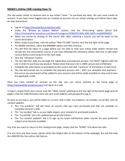


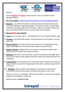
© Copyright 2026