
âCommunicating health through package color and materialâ
Master thesis “Communicating health through package color and material” The influence of color and material of food packaging on perceived product healthfulness Rianne van Lith Enschede, March 2015 Supervisors: Dr. A. Fenko & Dr. M. Galetzka Communication studies University of Twente 1 Preface In the last few months, talking about this thesis, several people told me that the choice they have in supermarkets overloads them. They do not wish to choose between so many products and they find it hard to decide which product to pick. Personally, I state the more choice the better. Intrigued by the overwhelming amount of different products on the shelves, getting groceries takes me about twice as long as the average consumer. The inspiration for this master thesis came from the master course ‘Multisensory Marketing and Product Experience’, lectured by my supervisor Dr. Anna Fenko. Did you know that the same fruit juice is perceived sweeter from an orange package than from a white one? And did you know that water is perceived of lower quality when from a plastic cup? All of this happens in your mind. It inspired me to write my master thesis about the influence of color and material of food packaging on the consumers health perception. If a color can make juice sweeter and a material can make water taste worse, why can’t the both of them together make food healthier? Of course I like to mention some people who contributed to this master thesis. First, I would like to thank Anna Fenko and Mirjam Galetzka for their great expertise and the pleasant meetings we had. Kees, thank you for your support, for always backing me up and for always believing in me. My parents and sisters I thank for their everlasting support and interest. Without Lysette, my master thesis would have looked a lot less professional. She designed the stimuli products and helped me out with some other graphical issues. Thank you for your creativity and help! Miriam and Patrick did a great job shooting the product pictures that can be found in this report. Last but not least I want to thank Bart Lavrijsen from Al Printing for providing me the plastic packages and Peter Oosterhoff, Bianca van de Wakker and Teun van Etten from the local supermarkets for letting me gather the data in their stores. Let’s hope this study will help to make shopping just a little bit easier for all those people having a hard time choosing from the loaded shelves in the supermarket. Enjoy reading! 2 Abstract People are getting more conscious about their health. Numerous studies confirm how destructive a bad diet is for the human body. The awareness is growing and therefore an increasing number of consumers are looking for healthy products. The design of a food package can have a huge effect on the consumers perception of a product. Factors like material and color play an important role. By just looking at the design of a package, people form expectations and draw conclusions out of past experiences. Consumers make their food choices mainly based on the packages’ appearance. However, few studies describe which associations people have with a product’s healthiness, communicated by its colors and materials. This study investigates to what extent the color and material of food packaging influence the consumer’s perception of a product’s healthfulness. The study has a 2 (unhealthy material vs healthy material) by 2 (unhealthy color vs healthy color) between subjects design and was executed for two different products. One healthy (knäckebröd) and one unhealthy (chocolate) product. Material and color were manipulated. Healthiness, naturalness, attractiveness, expected tastiness, perceived tastiness, credibility and intention to buy were measured. Finally, general health interest was added as a covariate. Before starting the main study, two preliminary studies were conducted in order to find out which materials and which colors had to be used for the main study. The main study itself was performed in several medium sized supermarkets in the Netherlands. All participants filled out a questionnaire in written while observing the food packages and sampling the products. The results of the study show that both package material and package color can have a significant influence on the perceived healthfulness of the containing product. In addition to previous research, this study shows that package design can actually affect people’s attitude towards food products. Package material turns out to be of influence on the perception of chocolate. It is perceived healthier from the package of healthy material (cardboard paper) than from the package of unhealthy material (plastic). For knäckebröd package color does turn out to be of influence. It is perceived healthier from the healthy colored package (brown) than from the unhealthy colored package (yellow). In addition, consumers with a high general health interest rate chocolate as less tasty compared to consumers with a low general health interest. Few studies investigate the influence of package color and material on perceived healthiness of food products. The study at hand can help food producers and marketers to anticipate on today’s growing interest in healthy foods by communicating health through food packages by using the right colors and materials. 3 Table of contents Preface..................................................................................................................................................... 2 Abstract ................................................................................................................................................... 3 1. Introduction ..................................................................................................................................... 6 2. Literature review ............................................................................................................................. 8 2.1 Packaging & expectations.............................................................................................................. 8 2.2 Communicating health through package ...................................................................................... 8 2.3 Influence of material ..................................................................................................................... 9 2.4 Influence of color........................................................................................................................... 9 2.5 The influence of congruence ....................................................................................................... 10 2.6 General health interest ............................................................................................................... 11 2.7 Food & taste ................................................................................................................................ 11 2.8 Research design ........................................................................................................................... 12 2.9 Design preliminary studies & main study .................................................................................... 13 3. Preliminary studies ........................................................................................................................ 14 3.1 Study design ................................................................................................................................ 14 3.1.1 Product design ...................................................................................................................... 14 3.1.2 Participants ........................................................................................................................... 14 3.1.3 Stimulus materials pre-study 1 – Materials ......................................................................... 15 3.1.4 Stimulus materials pre-study 2 – Colors............................................................................... 18 3.1.5 Research instrument & measures ........................................................................................ 21 3.1.6 Procedure ............................................................................................................................. 21 3.1.7 Data Analysis ........................................................................................................................ 21 3.2 Results preliminary study 1 ......................................................................................................... 21 3.2.1 Results Knäckebröd .............................................................................................................. 21 3.2.2 Results Chocolate ................................................................................................................. 23 3.3 Results preliminary study 2 ......................................................................................................... 24 3.3.1 Results Knäckebröd .............................................................................................................. 24 3.3.2 Results Chocolate ................................................................................................................. 26 4. Main study ..................................................................................................................................... 28 4.1 Study design ................................................................................................................................ 28 4.2 Participants .................................................................................................................................. 29 4.3 Stimulus material......................................................................................................................... 30 4.4 Research instrument & measures ............................................................................................... 33 4 4.5 Procedure .................................................................................................................................... 35 4.6 Data Analysis ............................................................................................................................... 35 4.7 Results ......................................................................................................................................... 35 4.7.1 Knäckebröd ........................................................................................................................... 36 4.7.2 Chocolate .............................................................................................................................. 41 5. Discussion & Conclusions .............................................................................................................. 46 5.1 Discussion .................................................................................................................................... 46 5.2 Conclusions .................................................................................................................................. 50 5.3 Limitations & Future Research .................................................................................................... 50 5.4 Marketing Implications................................................................................................................ 51 6. References ..................................................................................................................................... 52 7. Appendices .................................................................................................................................... 56 7.1 Questionnaire preliminary test 1 ................................................................................................ 57 7.2 Questionnaire preliminary test 2 ................................................................................................ 58 7.3 Questionnaire main study ........................................................................................................... 59 5 1. Introduction People are getting more and more conscious about their health. Numerous studies confirm how destructive a bad diet is for the human body. Because the awareness is growing (Proper, Bakker, Van Overbeek, Verheijden, & van Mechelen, 2006), consumers are looking for healthy products on the shelves in the supermarket. A striking example for this is the current popularity of the so called ‘superfoods’ that are available in almost every self-respecting supermarket these days. According to Finkelstein and Fishbach (2010) choosing what to buy and eat is a very complex decision making process. Consumers have several goals while picking every day foods. The food should be low in price, taste great and moreover, it should be healthy. Ideally, all these goals will be achieved (Finkelstein & Fishbach, 2010). For consumers it is not always easy to select healthy products out of the overwhelming selection of products in today’s supermarkets. This can especially be difficult when people are in their daily rush. It would attribute to the customer’s comfort to be able to see the healthiness of a food product in the blink of an eye without getting lost in the ocean of currently existing health labels. Products that stand out by ‘looking healthy’, could easily be recognized by them. If consumers can recognize healthy products by looking at the product itself, it would make it easier to buy healthy food. In that way it takes little effort to find the right products, which could actually encourage consumers to maintain a healthy lifestyle. The package of a product plays an important role when shopping for food. A product’s package is a great method to attract attention and to communicate with potential buyers. While standing in front of a shelve in the supermarket, consumers often do not have time or motivation to look thoroughly to the nutritional values of the foods they pick. They only want to make a quick purchase decision (Charters, Lockshin, & Unwin, 1999). Therefore, they mostly select their food based on the visual appearance of the package (Becker, van Rompay, Schifferstein, & Galetzka, 2011; Fenko, Schifferstein, & Hekkert, 2010; Van Rompay & Pruyn, 2011). All features that are present in the design of a food package, like color, material, shape, typeface, odor and labeling do communicate certain symbolic meanings among which healthiness (Hekkert, 2006). A package is a powerful marketing tool, if not the most powerful one (Schoormans & Robben, 1997). It evokes certain expectations of the containing product. Based on past experiences, consumers draw conclusions and form expectations about the product by just looking at the package design (Becker et al., 2011). These expectations may prove to be accurate or not. Because the package of a food product is a powerful part of store communication (Schoormans & Robben, 1997) and the consumer’s interest in healthy foods increases, marketers have growing interest in healthy foods too (Wansink, Ittersum, & Painter, 2004). They detect business opportunities that could develop to commercial success. According to Asp (1999) food decisions made by consumers influence the success or failure of today’s food products. People make their own decisions about what to eat, which makes it difficult to find out which factor or combination of factors effects the decision making process the most. Apart from external characteristics, lifestyle factors and psychological factors, cultural factors and food trends play an 6 undeniable role (Asp, 1999). This research focusses on two of the extrinsic factors of a food package: material and color. Aim of the study Is it possible to communicate (the symbolic meaning of) health trough package material and package color? This study investigates to what extent the color and material of food packaging influence the consumer’s perception of a product’s healthfulness. Already in 1954 Cheskin found that changing sensory features of product packages also changes the attitude of the consumer towards the product. However, few studies describe which associations people have with a product’s healthiness, communicated by its colors and materials. According to Chapman and Maclean (1993), fat, sugar and cholesterol are the things that distinguish a healthy product from an unhealthy one. For this study, knäckebröd was used as relatively healthy product, while chocolate was used as relatively unhealthy product. This choice was made because of the nutritional values of both products. Knäckebröd being low in fat and sugar, belonging to the ‘functional foods’ as van Kleef, van Trijp, and Luning (2005) describe these kind of foods. Chocolate was chosen being a hedonic product, containing a lot of fat and sugar and considered a snack. Both knäckebröd and chocolate are well known and can be found in most people’s kitchens. The preliminary studies investigated which package materials and package colors of a food product are associated with healthiness. The main study is meant to find the answer on the central research question. “To what extent do the color and material of food packaging influence the consumer’s perception of a product’s healthfulness?” The research also investigates this question for both features separately in two of the sub questions “To what extent does the color of a food package influence the consumer’s health perception of the containing product?” and “To what extent does the material a food package is made off influence the consumer’s health perception of the containing product?” Finally, the third and last sub question investigates if any interaction effect shows between the features color and material of food packaging in relation to consumers’ health perception towards the actual product. In addition, the possible roles of congruence and general health interest are investigated. “Does any interaction effect show between the color and the material of a food package? To what extent does congruence play a role?” Structure of the report The next chapter (chapter 2) of this report provides an overview of the literature concerning this research topic. Including the hypotheses that derive from the literature. Chapter 3 describes both preliminary studies’ research design, methods and results. For the main study, all of this can be found in chapter 4. Followed by the discussion and conclusions in chapter 5. At the end of this report limitations, future research and marketing implications are being discussed. 7 2. Literature review In this part of the paper the relevant concepts of the study will be discussed. After the expectations that derive from packaging (§2.1) communicating health through packaging will be discussed (§2.2). Followed by the influence of (package) material (§2.3), the influence of (package) color (§2.4), the importance of congruence (§2.5), general health interest (§2.6) and the relation between health and taste (§2.7). In §2.8 the research model will be explained and §2.9 provides an overview of the study designs of both the preliminary studies and the main study. 2.1 Packaging & expectations The design of a food package can have a huge influence on the consumers perception of a product. Factors like material and color play an important role. By just looking at the design of a package, people form expectations and draw conclusions out of past experiences (Becker et al., 2011). According to Crilly, Moultrie, and Clarkson (2004) and Fenko et al. (2010) consumers make their food choices mainly based on the packages’ appearance. Becker et al. (2011) state that the food package is a convenient way to communicate symbolic meanings that affect taste evaluations and can even change overall product evaluation. It impacts how the food is perceived and experienced by the consumer (Schifferstein, Fenko, Desmet, Labbe, & Martin, 2013). All features that are present in the design of a food package, like color, shape and font do communicate symbolic meanings like healthiness, luxury or casualty (Hekkert, 2006). The Implicit Product Theory of Pinson (1986) confirms that product characteristics and features can mediate product inferential judgments. Amongst other things, odor, color, packaging and price create an inference in people’s minds, even if those people have never seen or experienced the product before. Consumers draw inferences of the food by looking at the shape, color and material of the package. This is even the case if the package does not match what is inside. Underwood and Ozanne (1998) state that this makes the package of a food product of high importance, because the containing product itself is usually not visible for the consumer. The design first helps to find out to which category and brand the product belongs. After that, it helps to confer meaning to the product or to recollect existing associations about it. Packaging is especially important while buying a product. When consumers have to make their choices in a store, vision is the most important factor. As time goes by, the other sensory modalities become more important. After a month, the sense of touch has gained importance and after a year of usage vision and touch (and audition) all have about the same level of importance (Fenko et al., 2010). Schifferstein and colleagues (2013) also describe that the shape and packaging of a food product plays an important role in the supermarket because consumers detect the product from a distance and at an angle before they are close enough to actually read the information written on the front. In addition, the researchers argue that packaging should help the product to be noticed. It has to stand out while standing in between similar products in the supermarket or drugstore. 2.2 Communicating health through package There are several ways to communicate food healthiness through packaging. As mentioned before, all features that are present in the design of a food package, like color, material, shape and font do communicate certain symbolic meanings among which healthiness (Hekkert, 2006). Although this 8 study focusses on package material and package color, more features are able to transfer the message of health to the consumer. A very noticeable and frequently used feature is (front of pack) labeling (Grunert & Wills, 2007). As helpful as labels and logos can be, the amount of currently existing ones also increases skepticism (Sirieix, Delanchy, Remaud, Zepeda, & Gurviez, 2013). One of the reasons for this is the overwhelming amount of available labels, from which some are certified and some are not. Van Kreijl and Knaap (2004) state that the label system is not working optimally and they argue that research is needed to find other and easier ways to communicate the healthiness of a product to the consumer. 2.3 Influence of material A study by Schifferstein (2009) made clear that a product experience is very much influenced by the material a food package or container is made of. The sensory features of a food package do actually affect the experience and evaluation of the product it contains. Brown (1958) already proved that the perceived freshness of bread increased when it is wrapped in paper with a crispy sound. Also dessert was perceived fresher when served in a cold glass bowl. Furthermore, Krishna and Morrin (2008) showed in their study that water in a flimsy cup was perceived to be of lower quality. This suggests that the attitude towards a product and the perceived quality of a product can change by only changing some haptic characteristics (Schifferstein, 2009; Spence & Gallace, 2011). Schifferstein (2009) states that over the years the effect of package characteristics on the perception of its content has grown. This makes that for the food industry selection of package materials has become more important as a critical determinant of product perception. It is hypothesized that: H1: ‘A package made of a ‘healthy’ material leads to a higher degree of perceived healthiness of the containing product compared to a package made of ‘unhealthy’ material.’ 2.4 Influence of color People are always surrounded by colors and much research is conducted about the influence of it. Elliot, Maier, Moller, Friedman, and Meinhardt (2007) claim that colors come with psychological effects. They also state that people pick up specific associations to colors because of repeated concepts or experiences in which particular colors are present. In a very recent study of Elliot and Maier (2014) the researchers state that color can transfer meaning and strongly influences people’s affect, cognition and behavior. When someone is frequently exposed to a certain color, he or she will associate this color with the experiences that came with it (Mehta & Zhu, 2009). Color helps people to draw inferences about products. Deliza, MacFie, and Hedderley (1996) for example found that the same fruit juice is perceived to be sweeter from an orange package than from a white package. It influenced not only the expectations, but also the actual taste evaluation. This means that consumers adjusted their review of the fruit juice to the expectations evoked by the color of the package (Becker et al., 2011). According to Garber, Hyatt, and Starr (2000) color enables people to correctly identify the flavor of a food product. In a study by Shankar, Levitan, Prescott, and Spence (2009) participants had to rate brown and green M&M’s as being more or less ‘chocolaty’. Although all candies were exactly alike, apart from the color, the brown version was assessed as significantly more ‘chocolaty’ than the green version. 9 Part of color associations is about cultural differences. For example, chocolate bars have different colors in different countries. In the Netherlands for example, dark chocolate will almost always be wrapped in a red colored package whereas milk chocolate almost always gets a blue wrapper. Although it has to be mentioned that one of the most famous chocolate brands in the Netherlands (Verkade) uses blue for dark chocolate and the pink (cyclamen) for milk chocolate. It is expected that due to earlier associations people are primed in advance. The same goes for potato chips and dairy products in different countries and cultures. Color is one of the most powerful features a food package can communicate to its user (Deliza, Macfie, & Hedderley, 2003) and it is the feature that triggers the fastest response (Swientek, 2001). It has a very strong impact on human beings (Elliot et al., 2007). As has become clear in the previous, color is a very powerful marketing tool. Therefore, it is hypothesized that: H2: ‘A product in a ‘healthy’ colored package leads to a higher degree of perceived healthiness of the containing product compared to a product in an ‘unhealthy’ colored package.’ 2.5 The influence of congruence Designs that are perceived as congruent are more favorable by people than designs that are not perceived as congruent. Previous research by Van Rompay and Pruyn (2011) shows that consumers perceive a bottle with a round shape and a round, feminine typewriting (Script) and a bottle with an angular shape and a more angular, masculine typewriting (Helvetica) as more favorable than bottles with mixed up features. When visual design aspects are perceived as congruent, consumers are able to process packaging stimuli more easily. Fast and effortless processing of information is experienced as more pleasant (Lee & Labroo, 2004). Research by Veryzer (1993) also describes that the perceived unity in a design of a product positively affects the responses of the customer. In contrary, if the design is perceived as ambiguous, the consumer can get confused by the mixed signals the package shows. Van Rompay, Pruyn, and Tieke (2009), state that this can be explained by people’s need for structure. People that like everything to be structured have an extra positive attitude towards products that show congruent features and a negative attitude towards products that show ambiguous features. This is supported by studies of Bottomley and Doyle (2006) and Van Rompay and Pruyn (2011). The researchers found that congruence has various different consumer responses such as perceived brand credibility, brand impression, perceived product value and brand choice. According to Reber (2004), packages that are considered congruent by the consumer are also seen as true and more credible. Furthermore, because congruent packaging is seen as more attractive, people expect those products to be more expensive and exclusive (Van Rompay & Pruyn, 2011). It is hypothesized that: H3a: ‘There is an interaction effect between the color and the material of a food package. Color and material strengthen each other. ’ 10 H3b: ‘Products with congruent features are considered healthier and more attractive as opposed to products with incongruent features.’ 2.6 General health interest According to Zandstra, De Graaf, and Van Staveren (2001), general health interest (G.H.I.) is a good predictor of food intake and it is linked to a healthier dietary behavior. High G.H.I predicts a higher intake of fruits and vegetables and a lower intake of fat. Consumers who are high in general health interest tend to eat healthier than those who are low in general health interest (Zandstra et al., 2001). For this research, part of the research instrument from the article ‘Quantification of consumer attitudes to health and hedonic characteristics of foods’ from Roininen, Lähteenmäki, and Tuorila (1999) was used. With a Cronbach’s alpha of α=0.89 this General Health Interest Scales seems to be a good instrument to measure if participants are (very) conscious about their health or not (at all). The scale consists of 8 items and in this study it reached a Cronbach’s alpha of α=.84. Also see table 12 on page 34. A further explanation of this scale, including items, can be found in §4.4. It is hypothesized that: H4: ‘General health interest moderates the effect of package color and package material on the consumer.’ 2.7 Food & taste In all four countries that are investigated in the study of Rozin, Fischer, Imada, Sarubin & Wrzesniewski (1999) females associate food mostly with health instead of pleasure, in contrast to males, who associate food mostly with pleasure instead of health. Roininen et al. (1999) state that females care more about the healthiness and taste of food than males do. The researchers also found that young people are less interested in the health of a product and more interested in the taste. Older people on the other hand care more about the health of a product than they do about the taste. Mai and Hoffmann (2012) and Verbeke (2005) state that consumers prefer the taste of food over the health benefits. They describe three different groups of people, assigned by their way of selecting food. The first group is the ‘Taste lovers’, these people do not care so much about the healthiness of the food. They select their food on a basis of (perceived) tastiness. The second group is called ‘Nutrition Fact Seekers’, they do care about their health and are very much aware of the possible consequences of a bad diet. For Nutrition Fact Seekers, the health of a product is more important than the taste. They are willing to compromise on taste if this means that the nutritive value of the food increases. Both Taste lovers and Nutrition fact seekers can be divided in two levels, light and heavy. The last and third group of people that Mai and Hoffmann (2012) distinguish is the ‘Undecided’, this group does not have a clear food selection method. When people think of taste as the most important feature of food, they pay less attention to the nutritive information on the 11 package. As opposed to consumers who are willing to compromise on taste in order to eat healthier, they spend more time looking at the package of a product (Visschers, Hess, & Siegrist, 2010). According to Lappalainen et al. (1997) and Verbeke (2006), taste is the most important characteristic of food and consumers are not prepared to give in on taste in order to eat healthier. Recent studies show that consumers in the USA think of unhealthy food as more tasty (Raghunathan, Naylor, & Hoyer, 2006). In France on the other hand, food described as healthy is considered tastier, more enjoyable and of higher quality than when presented as unhealthy (Werle, Trendel, & Ardito, 2013). This example makes clear that perceived taste of health is also a matter of culture. According to Liem, Toraman Aydin, and Zandstra (2012) negative associations of a product or ingredient can actually change perceived taste. They state for example that if a consumer thinks negatively about soy, a product is perceived less tasty when labeled as soy containing than the exact same product when not labeled as soy containing. When the consumer thinks positively about the product or the ingredient, it works the other way around (Liem et al., 2012). Wansink et al. (2004) found that food labeled as healthy or dietary is perceived lower in flavor and less satiating. Raghunathan et al. (2006) state that emphasizing the healthy nature of a product can negatively influence taste, naturalness and convenience of the food. The researchers also claim that people subconsciously think that unhealthy foods taste better than healthy foods. It is hypothesized that: H5a: ‘After tasting, participants experience a product wrapped in healthy material as significantly less tasty compared to the same product wrapped in unhealthy material.’ H5b: ‘After tasting, participants experience a product wrapped in the healthy color as significantly less tasty compared to the same product wrapped in the unhealthy color.’ 2.8 Research design The following research model gives an overview of all components of this study (see figure 1 at the next page). The color and material of a healthy (knäckebröd) and an unhealthy (chocolate) product package were manipulated in order to find out whether they influence perceived healthiness. Perceived naturalness, perceived attractiveness, expected tastiness, perceived tastiness and intention to buy were also taken into account. Finally, general health interest was added as a moderator. 12 Figure 1 – Research model 2.9 Design preliminary studies & main study The research includes two preliminary studies and the main study. The goal of the pre-studies was to determine which package materials (pre-study 1) and package colors (pre-study 2) were perceived as most (un)healthy by the consumers. Based on the results of the pre-studies, stimuli for the main study were developed. In the main study package material and package color were manipulated and healthiness, naturalness, attractiveness, expected tastiness, perceived tastiness, credibility and intention to buy were measured in a 2 by 2 between subjects design. General health interest was added as a covariate. 13 3. Preliminary studies Before starting the main study, two preliminary studies were conducted in order to find out which materials (pre-study 1) and which colors (pre-study 2) had to be used for the main study. Because both studies were composed and conducted in the same way, the study design and procedure as described below go for both preliminary studies (§3.1). The results of both studies are described separately in §3.2 and §3.3. 3.1 Study design 3.1.1 Product design The researcher chose to use two different products to judge as healthy or unhealthy by the participants. To prevent bias, a product that is generally perceived as healthful (knäckebröd) and a product that is generally perceived as unhealthful (chocolate bar) were assessed by the participants. Knäckebröd does not contain a lot of fat, sugar, cholesterol, preservatives and calories and chocolate on the other hand does. According to Chapman and Maclean (1993) those are the things that distinguish healthy products from unhealthy products in the eye of the consumer. These specific products were chosen because they can be bought in many kinds of package materials and in many different colors. The researcher could easily manipulate the appearance of the package. It was also important that the packages only differ in material and color. They have the exact same label, shape and typeface and provide the exact same information on nutrients to rule out bias. A non-existing brand was made up and a new logo was designed to prevent bias because of brand associations. The typeface is neutral and the color fields are wide to make sure the different colors come out well. The overall design was kept simple to prevent distraction. Also the goal was to create a package as realistic as possible. According to the scores of both products on credibility (knäckebröd: M=6.08, SD=.986 and chocolate: M=5.65, SD=1.347, (scale 1-7)) this goal has been achieved. 3.1.2 Participants A total of 23 people was asked to fill out a questionnaire in written. All of the participants observed 5 knäckebröd packages and 5 chocolate packages and gave their opinion about it. The participants in this preliminary study were between 22 and 67 years of age (M = 32.30, SD = 12.60). 6 of them male and 17 female. A total of 6 participants followed intermediate vocational education, 6 got their bachelors and 11 participants finished a master study. Also see table 1. Respondent demographics Male Female Total Mean age MBO HBO WO 6 17 23 32,30 6 6 11 Table 1 – Respondent demographics 14 3.1.3 Stimulus materials pre-study 1 – Materials For both the healthy and the unhealthy product, five different package materials were selected to be rated by the participants. Organic paper, cardboard paper, plain paper, low shine plastic and high shine plastic were used. See table 2 below. Overview of stimuli products – Preliminary study 1 Material Productnr. knäckebröd Plain paper Cardboard paper High shine plastic Organic paper Low shine plastic 1 2 3 4 5 Productnr. chocolate 6 7 8 9 10 Table 2 – Overview of materials Knäckebröd Product 1 - Plain paper Product 2 – Cardboard paper 15 Product 3 – High shine plastic Product 4 – Organic paper Product 5 – Low shine plastic 16 Chocolate Product 6 - Plain paper Product 7 – Cardboard paper Product 8 – High shine plastic 17 Product 9 – Organic paper Product 10 – Low shine plastic 3.1.4 Stimulus materials pre-study 2 – Colors For both the healthy and the unhealthy product, seven different colors were selected to be rated by the participants. Light brown, yellow, pink, green, blue, dark brown and red were used. See table 3 below. Color Product nr. knäckebröd Product nr. chocolate CMYK number Light brown Yellow Pink Green Blue Dark brown Red 1 2 3 4 5 6 7 8 9 10 11 12 13 14 0-27-63-16 0-0-81-0 0-100-12-0 69-0-78-0 74-26-0-0 0-39-91-45 0-91-92-0 Example CMYK number logo Example 0-11-24-6 0-0-32-0 0-30-4-0 30-0-34-0 21-7-0-0 0-17-39-19 0-41-41-0 Table 3 - Overview of colors 18 Knäckebröd Product 1 – Light brown Product 2 – Yellow Product 3 – Pink Product 4 - Green Product 5 – Blue Product 6 – Dark brown Product 7 - Red 19 Chocolate Product 8 – Light brown Product 9 – Yellow Product 10 – Pink Product 11 - Green Product 12 – Blue Product 13 – Dark brown Product 14 – Red 20 3.1.5 Research instrument & measures For every version of both products the dependent variables ‘perceived healthiness’, ‘perceived naturalness’, ‘perceived attractiveness’ and ‘expected tastiness’ were measured. This was done by using a 7-point Likert scale (healthiness: 1=not healthy at all, 7=very healthy) (naturalness: 1=not natural at all, 7=very natural) (attractiveness: 1=not attractive at all, 7=very attractive) (tastiness: 1=not tasty at all, 7=very tasty). Only the results of the healthiness variable were used to decide which materials and colors were to be used for the main study. Also see appendix 7.1 and 7.2. 3.1.6 Procedure This pre-study took place by showing the product packages in a real life setting1. The participants got to see the product packages and filled out a physical paper form. After answering some screening questions to exclude people with allergies, the participants assessed a set of 10 product packages (5 packages of knäckebröd and 5 chocolate bars) regarding healthiness, naturalness, attractiveness and taste for the first pre-study about material. For the second pre-study about color, participants assessed a set of 14 product packages (7 packages of knäckebröd and 7 chocolate bars). All knäckebröd packages and all chocolate bars were exactly alike, apart from the five different materials (pre-study 1) or seven different colors (pre-study 2). 3.1.7 Data Analysis The gathered data was analyzed by using Repeated Measures ANOVA in SPSS. An alpha level of 0.05 was used. 3.2 Results preliminary study 1 The first preliminary study was conducted to find out which package material was perceived as ‘most healthy’ and which package material was perceived as ‘least healthy’. These materials are subsequently used in the main study. 3.2.1 Results Knäckebröd Healthiness Repeated Measures ANOVA reveals significant differences between the five different package materials (F(4, 19)=5.787, p=.003) regarding healthfulness. Pairwise Comparisons analysis using Bonferroni correction reveals that cardboard paper was perceived as most healthful package 1 Originally, the pre-studies took place over both the internet and by actually showing the physical products in a real life setting. 24 participants filled out the questionnaire online (pictures of the products) and 23 others got to see the products in real life and filled out a physical paper form. After the data was analyzed, a significant difference between the online and offline version showed for both pre-studies. This made clear that the main study should be conducted showing the products in real life. Consequently, only the ‘offline’ data of the prestudies was used to decide which materials and which colors were to be used for the main research. This choice was made to prevent bias in the main study caused by the different perceptions of a product from an online picture and a product in real life. 21 material for knäckebröd (M = 5.91, SD = .949). This material differs significantly from high shine plastic (p=.048), organic paper (p=.045) and low shine plastic (p=.002). Low shine plastic (M = 4.96, SD = .928) was perceived as least healthful package material. It differs significantly from cardboard paper (p=.002) and organic paper (p=.019). Naturalness Repeated Measures ANOVA reveals significant differences between the five different package materials (F(4, 19)=5.747, p=.003) regarding naturalness. Pairwise Comparisons analysis using Bonferroni correction shows that cardboard paper (M = 5.83, SD = .887) was perceived as most natural package material for knäckebröd. This material differs significantly from high shine plastic (p=.001), organic paper (p=.021), and low shine plastic (p=.003). Low shine plastic (M = 4.83, SD = .887) was perceived as least healthful package material. It differs significantly from cardboard paper (p=.003). Attractiveness Repeated Measures ANOVA reveals no significant differences between the five different package materials (F(4, 19)=2.169, p=.112) regarding attractiveness. Pairwise Comparisons analysis using Bonferroni correction shows that none of the separate package materials do differ significantly from each other also. (Expected)Tastiness Repeated Measures ANOVA does not reveal significant differences between the five different package materials (F(4, 19)=.366, p=.830) regarding (expected) tastiness. Pairwise Comparisons analysis using Bonferroni correction shows that none of the separate package materials do differ significantly from each other also. Descriptive statistics pretest 1 – Knäckebröd Healthiness N Mean SD Plain paper 23 5.57 .896 Cardboard paper 23 5.91 .949 High shine plastic 23 4.96 1.224 Organic paper 23 5.39 .988 Low shine plastic 23 4.96 .928 Naturalness Mean SD 5.48 1.163 5.83 .887 4.70 1.146 5.22 1.043 4.83 .887 Attractiveness Mean SD 4.39 1.158 4.65 .885 4.70 .876 4.74 1.421 4.52 1.039 Exp. Tastiness Mean SD 4.70 .876 4.96 .976 4.74 1.137 4.83 1.072 4.65 .885 Table 4 – Descriptive statistics pretest 1 - Knäckebröd 22 Package material - Knäckebröd 6 5,5 5 4,5 4 3,5 3 2,5 Plain paper Healthiness Cardboard High shine plastic Organic paper Low shine plastic Naturallness Attractiveness Exp.Tastiness Figure 2 - Results pretest 1 – Knäckebröd 3.2.2 Results Chocolate Healthiness Repeated Measures ANOVA reveals significant differences between the five different package materials (F(4, 31)=2.813, p=.042) regarding healthfulness. Pairwise Comparisons analysis using Bonferroni correction reveals that cardboard paper was perceived as most healthful package material for chocolate (M = 3.97, SD = 1.071). This material differs significantly from low shine plastic (p=.036). Low shine plastic (M = 3.49, SD = 1.040) was perceived as least healthful package material. Naturalness Repeated Measures ANOVA reveals marginal significant differences between the five different package materials (F(4, 31)=2.12, p=.070) regarding naturalness. Pairwise Comparisons analysis using Bonferroni correction shows that organic paper (M = 4.23, SD = 1.374), was perceived as most natural package material for chocolate. Organic paper differs marginal significantly from high shine plastic (M = 3.77, SD = 1.060) (p=.042). Attractiveness Repeated Measures ANOVA reveals significant differences between the five different package materials (F(4, 31)=3.065, p=.031) regarding attractiveness. Pairwise Comparisons analysis using Bonferroni correction shows that high shine plastic (M = 4.71, SD = 1.250), was perceived as most attractive package material for chocolate. It differs significantly from cardboard paper (M = 4.03, SD = 1.339) (p=.025), which was perceived least attractive. High shiny plastic also difference significantly from organic paper (M = 3.74, SD = 1.540) (p=.036). (Expected)Tastiness Repeated Measures ANOVA does not reveal significant differences between the five different package materials (F(4, 31)=2.282, p=.083) regarding (expected) tastiness. Pairwise Comparisons 23 analysis using Bonferroni correction shows that none of the separate package materials do differ significantly from each other also. Descriptive statistics pretest 1 – Chocolate Healthiness N Mean SD Plain paper 35 3.69 .993 Cardboard paper 35 3.97 1.071 High shine plastic 35 3.63 1.031 Organic paper 35 3.91 1.222 Low shine plastic 35 3.49 1.040 Naturalness Mean SD 4.17 1.014 4.20 .933 3.77 1.060 4.23 1.374 3.74 1.039 Attractiveness Mean SD 4.09 1.292 4.03 1.339 4.71 1.250 3.74 1.540 4.34 1.282 Exp. Tastiness Mean SD 4.37 1.437 4.31 1.491 4.97 1.272 4.09 1.669 4.71 1.226 Table 5 - Descriptive statistics pretest 1 - Chocolate Package material - Chocolate 6 5,5 5 4,5 4 3,5 3 2,5 Plain paper Cardboard Healthiness High shine plastic Organic paper Low shine plastic Naturallness Attractiveness Exp.Tastiness Figure 3 - Results pretest 1 – Chocolate 3.3 Results preliminary study 2 A second preliminary study was conducted to find out which color is perceived as ‘most healthy’ and which color is perceived as ‘least healthy’. These materials are subsequently used in the main study. 3.3.1 Results Knäckebröd Healthiness Repeated Measures ANOVA reveals significant differences between the seven different package colors (F(6, 17)=4.709, p=.005) regarding healthfulness. Pairwise Comparisons analysis using Bonferroni correction reveals that light brown (M = 5.29, SD = .988) was perceived as most healthful color for knäckebröd packaging. This color differs significantly from yellow (p=.005), pink (p=.002), green (p=.023) and red (p=.023). Yellow was perceived as least healthful package color and it differs significantly from light brown (p=.005) and dark brown (p=.042). 24 Naturalness Repeated Measures ANOVA reveals significant differences between the seven different package colors (F(6, 17)=7.973, p<.001) regarding naturalness. Pairwise Comparisons analysis using Bonferroni correction shows that dark brown (M = 5.09, SD = .848) was perceived as most natural package color for knäckebröd. This color differs significantly from yellow (p=.003), pink (p<.001), green (p=.006), blue (p=.010) and red (p=.003). Pink was perceived as least natural package color (M = 3.17, SD = .887). It differs significantly from light brown (p<.000), blue (p=.027) and dark brown (p<.000). Attractiveness Repeated Measures ANOVA reveals significant differences between the seven different package colors (F(6, 17)=3.510, p=.019) regarding attractiveness. Pairwise Comparisons analysis using Bonferroni correction proves that light brown (M = 4.65, SD = 1.027) was perceived as most attractive package color for knäckebröd. This color differs significantly from green (M = 3.70, SD = 1.396), which is also the color that was perceived as least attractive for knäckebröd (p=.018). (Expected)Tastiness Repeated Measures ANOVA does not reveal significant differences between the seven different package colors (F(6, 17)=1.579, p=.213) regarding (expected) tastiness. Pairwise Comparisons analysis using Bonferroni correction reveals that the separate package colors of knäckebröd do also not cause significant difference in (expected) taste. Descriptive statistics pretest 2 – Knäckebröd Healthiness Color N Mean SD Light brown 23 5.39 .988 Yellow 23 3.91 1.411 Pink 23 4.00 1.382 Green 23 4.43 1.376 Blue 23 4.70 1.063 Dark brown 23 5.04 .976 Red 23 4.43 1.121 Naturalness Mean SD 4.96 .928 3.39 1.469 3.17 .887 4.00 1.279 4.00 1.044 5.09 .848 3.70 1.185 Attractiveness Mean SD 4.65 1.027 3.78 1.536 4.30 1.608 3.70 1.396 4.26 1.096 4.52 .898 4.39 1.373 Exp. Tastiness Mean SD 4.83 .937 4.26 1.514 4.26 1.657 4.17 1.193 4.43 1.080 4.87 1.140 4.39 1.340 Table 6 - Descriptive statistics pretest 2 - Knäckebröd 25 Package color - Knäckebröd 6 5,5 5 4,5 4 3,5 3 2,5 Light brown Yellow Healthiness Pink Naturallness Green Blue Dark brown Attractiveness Red Exp.Tastiness Figure 4 – Results pretest 2 – Knäckebröd 3.3.2 Results Chocolate Healthiness Repeated Measures ANOVA reveals marginal significant differences between the seven different package colors (F(6, 17)=2.370, p=.076) regarding healthiness. Pairwise Comparisons analysis using Bonferroni correction reveals that red (M = 3.91, SD = 1.164) was perceived as most healthful color for chocolate packaging. This color differs significantly from yellow (p=.029), which is the color that was perceived as least healthful for chocolate. Naturalness Repeated Measures ANOVA reveals significant differences between the seven different package colors (F(6, 17)=4.771, p=.005) regarding naturalness. Pairwise Comparisons analysis using Bonferroni correction shows that dark brown (M = 4.48, SD = 1.123) was perceived as most natural package color for chocolate. This color differs significantly from yellow (p=.039) and pink (p=.002). Pink was perceived as least healthful package color (M = 2.96, SD = 1.261). It differs significantly from light brown (p=.006), blue (p=.004) and dark brown (p=.002). Attractiveness Repeated Measures ANOVA reveals no significant differences between the seven different package colors (F(6, 17)=1.730, p=.175) regarding attractiveness. Pairwise Comparisons analysis using Bonferroni correction prove that the separate package colors of chocolate packaging also do not cause significant difference in attractiveness. (Expected)Tastiness Repeated Measures ANOVA does not reveal significant differences between the seven different package colors (F(6, 17)=1.450, p=.253) regarding (expected) tastiness. Pairwise Comparisons analysis using Bonferroni correction indicates that the separate package colors of chocolate packaging do also not cause significant difference in (expected) taste. 26 Descriptive statistics pretest 2 – Chocolate Healthiness Color N Mean SD Light brown 23 3.48 1.275 Yellow 23 3.04 1.107 Pink 23 3.22 1.413 Green 23 3.52 1.238 Blue 23 3.87 .920 Dark brown 23 3.87 1.180 Red 23 3.91 1.164 Naturalness Mean SD 4.17 1.403 3.22 1.126 2.96 1.261 3.78 1.204 4.09 1.240 4.48 1.123 3.87 1.456 Attractiveness Mean SD 4.26 1.453 3.57 1.502 3.83 1.614 4.00 1.595 4.83 1.302 4.04 1.261 4.78 1.380 Exp. Tastiness Mean SD 4.74 1.514 3.96 1.331 4.26 1.421 4.13 1.576 4.83 1.230 4.57 1.273 4.91 1.311 Table 7 – Descriptive statistics pretest 2 - Chocolate Package color - Chocolate 6 5,5 5 4,5 4 3,5 3 2,5 Light brown Yellow Healthiness Pink Naturallness Green Blue Dark brown Attractiveness Red Exp.Tastiness Figure 5 - Results pretest 2 – Chocolate Materials & colors main study The results of preliminary 1 show that in the main study, the following materials have to be used. For the both the unhealthy and the healthy product, low shine plastic should be used as unhealthy material and cardboard paper should be used as healthy material. The results of preliminary 2 show that in the main study, the following colors have to be used. For the unhealthy product yellow should be used as unhealthy color and red should be used as healthy color. For the healthy product yellow should be used as unhealthy color and brown should be used as healthy color. 27 4. Main study In this chapter, the main study will be discussed in detail. First, the study design will be explained (§4.1), followed by the participants (§4.2), stimulus materials (§4.3), research instruments and measures (§4.4), data analysis (§4.5) and procedure (§4.6). Finally, the results of the main study will be disclosed (§4.7). 4.1 Study design After determining the colors and the materials that were perceived as most (un)healthy by conducting two preliminary studies, the main study was performed. The study has a 2 (unhealthy material vs healthy material) by 2 (unhealthy color vs healthy color) between subjects design and was executed for two different products. One healthy (knäckebröd) and one unhealthy (chocolate). Material, color and type of product are independent variables. Healthiness, naturalness, attractiveness, credibility, intention to buy and expected vs perceived taste are dependent variables. Finally, general health interest is a covariate. The participants were randomly assigned to one of the four conditions. Every participant got to see a set of two products to answer questions about. One version of both products, for example product A and product H or product D and product E (table 8). Example: a participant that got to see the knäckebröd in the ‘unhealthy’ package material of the ‘unhealthy’ color, got to see the chocolate that was wrapped in the ‘healthy’ material of the ‘healthy’ color. To make it more clear: if a participant got to see the knäckebröd in the yellow shiny plastic condition (product A), the chocolate he got to see would be in the red cardboard paper condition (product H). This was all done to avoid bias because of overlap from either material or color. Unhealthy material (plastic) Healthy material (paper) Unhealthy color (yellow) Product A (Set 1) Yellow/Plastic Healthy color (brown) Product C (Set 3) Brown/Plastic Knäckebröd Healthy material (paper) Chocolate Unhealthy material (plastic) Product B (Set 2) Yellow /Paper Unhealthy color (yellow) Product E (Set 4) Yellow/Plastic Product F (Set 3) Yellow/Paper Product D (Set 4) Brown /Paper Healthy color (red) Product G (Set 2) Red /Plastic Product H (Set 1) Red /Paper Table 8: Stimuli overview 28 4.2 Participants For the main study, 102 people were asked to fill out a questionnaire in written. All of them observed two different product packages and gave their opinion about it. Which makes a total of 204 observations. 7 observations were taken out because of food allergies for either gluten and/or milk and 14 observations were taken out because the form was not or not properly filled out. In the end, 185 observations were left. To ensure robustness, each cell needs to contain a minimum of 20 observations (Pallant, 2010) (table 11). The participants in this study were between 15 and 82 years of age (M = 40,73, SD = 17.02). 27 of them were male and 66 were female. Just 1 participant only completed primary school. A total of 13 participants only completed high school, 34 followed intermediate vocational education, 27 got their bachelors and 18 participants finished a master study. Knäckebröd conditions Product A Color unhealthy Material unhealthy B unhealthy healthy C healthy unhealthy D healthy healthy F unhealthy healthy G healthy unhealthy H healthy healthy Table 9 - Knäckebröd conditions Chocolate conditions Product E Color unhealthy Material unhealthy Table 10 - Chocolate conditions Respondents Demographics Condition 1 Set 1 (A+H) Male 5 Female 19 Total 24 Mean age 45,25 Primary school 1 High school 5 MBO 6 HBO 6 WO 6 Condition 2 Set 2 (B+G) 8 16 24 41,46 0 4 8 9 3 Condition 3 Set 3 (C+F) 8 14 22 38,91 0 2 10 8 2 Condition 4 Set 4 (D+E) 6 16 23 36,09 0 3 10 3 7 Table 11 - Respondent demographics 29 4.3 Stimulus material For the main study, the same design as in the preliminary studies was used for both products. As a result of preliminary study 1, cardboard paper was for both knäckebröd and chocolate used as most healthy material. Plastic was used as most unhealthy for both products. As a result of preliminary study 2, for both products yellow was used as least healthy color. For knäckebröd brown was used as most healthy color and for chocolate red was used as most healthy color. Features of the packages were mixed up and this led to a total of 8 different products. 4 knäckebröd packages and 4 chocolate packages. Each participant got to see two of the 8 different products, in 4 different compositions and in a different order. For an extensive description of the (design of the) products below, see § 3.1.1 Knäckebröd Product A – unhealthy color/ unhealthy material Product B – unhealthy color/ healthy material 30 Product C – healthy color/ unhealthy material Product D – healthy color/ healthy material Product E – unhealthy color/ unhealthy material 31 Product F – unhealthy color/ healthy material Product G – healthy color/ unhealthy material Product H – healthy color/ healthy material 32 4.4 Research instrument & measures The questionnaire was composed as follows. Healthiness/Naturalness/Attractiveness/(Expected) Tastiness The dependent variables ‘healthiness’, ‘naturalness’, ‘attractiveness’ and ‘(expected) tastiness’ were all measured by an 7-point Likert scale (healthiness: 1=not healthy at all, 7=very healthy) (naturalness: 1=not natural at all, 7=very natural) (attractiveness: 1=not attractive at all, 7=very attractive) (tastiness: 1=not tasty at all, 7=very tasty). (perceived) Tastiness The perceived tastiness is a dependent variable measured by 3 items on a 7-point Likert scale (1=not at all, 7= very). The three items together proved to form a reliable scale to measure the perceived tastiness of both knäckebröd (α = .93) and chocolate (α = .93). Credibility Also credibility is a dependent variable measured by 3 items on a 7-point Likert scale (1=strongly disagree, 7=strongly agree). The three statements together proved to form a reliable scale to measure the credibility of both knäckebröd (α = .88) and chocolate (α = .92). Intention to Buy Intention to buy is a dependent variable measured by 3 items on a 7-point Likert scale (1=strongly disagree, 7=strongly agree). The three statements together proved to form a reliable scale to measure the intention to buy of both knäckebröd (α = .97) and chocolate (α = .96). General Health Interest General health interest is a covariate measured by a scale of 8 items on a 7-point Likert scale (1=strongly disagree, 7=strongly agree). This scale was first found by Roininen et al. (1999). The eight items together proved to form a reliable scale to measure the General Health Interest (α = .84). See table 12 on the next page for an overview of the multiple item scales as described above. 33 Overview multiple item scales Measures N Perceived taste 3 Credibility 3 Intention to buy 3 General Health Interest 8 Items “This product is: (1=not nice at all, 7= very nice)” “This product is: (1=not good at all, 7= very good)” “This product is: (1=not tasty at all, 7= very tasty)” “I think this is a real product” “I expect to find this product in the supermarket” “I think this product can be found in stores” “I would get this product from the supermarket” “I would take this product home after shopping” “I would buy this product when I see it in a store” “The healthiness of a food has little impact on my food choices” “I am very particular about the healthiness of food I eat” “I eat what I like and I do not worry much about the healthiness of food” “It is important for me that my diet is low in fat” “I always follow a healthy and balanced diet” “It is important for me that my daily diet contains a lot of vitamins and minerals” “The healthiness of snacks makes no difference to me” “I do not avoid foods, even if they may rise my cholesterol” Chronbach’s Alpha Knäckebröd: α=.93 Chocolate: α=.93 Knäckebröd: α=.88 Chocolate: α=.92 Knäckebröd: α=.97 Chocolate: α=.96 α=.84 Table 12 - Overview multiple item scales For the questionnaire, see Appendix 7.3. 34 4.5 Procedure The study was performed in several medium sized supermarkets in the Netherlands. The researcher was standing in the shopping area behind a bar table, containing the set of products that had to be assessed by the participants. The researcher kindly asked the customers whether they were willing to participate in a study, although not telling them what the study was exactly about. Customers that positively replied to the request got a form with the questionnaire and were asked to look very closely at the product packages. Before answering the questions about (perceived) taste and intention to buy, they were asked to taste a piece of the product. Participants were under the assumption that they were tasting the products coming from the shown packages. After the form was filled out completely, people were thanked for participating and possible questions were answered. Informed consent To make sure the participants participated voluntarily, all of them signed an informed consent before starting the questionnaire. “I agree to take part in this study and I reserve the right to withdraw this consent without given reason. I do realize I can stop the experiment at any time without consequences.” Screening questions Before starting the actual questionnaire, participants had to answer three screening questions to know for certain that they did not have any allergies that prevented them from participating. The questions that were asked: ‘Did you ever have any kind of knäckebröd?’, ‘Did you ever have any kind of chocolate?’ and ‘Do you have any allergies/diseases that prevent you from eating knäckebröd or chocolate?’. In case questions 1 and/or 2 were answered with no or question 3 was answered with yes, the participant was excluded from the study. 4.6 Data Analysis The gathered data was analyzed by using MANCOVA (Multivariate Analysis of Covariance). Two separate MANCOVA’s were conducted to keep apart the dependent variables that were based on only the (design of the) package and those that were also based on the actual taste of the product. Product expectation versus product experience. The first MANCOVA is conducted with color and material as independent variables, healthiness, naturalness, attractiveness and expected tastiness as dependent variables and general health interest as a covariate. A second MANCOVA was conducted with again color and material as independent variables and general health interest as covariate, but with perceived tastiness, credibility and intention to buy as dependent variables. Regression analysis was performed on the covariate general health interest. Repeated Measures ANOVA was used in order to find out if and how the expected taste of both products differed from the perceived taste. For all of above mentioned calculations an alpha level of 0.05 was used. 4.7 Results For knäckebröd, the results of the first MANCOVA (with healthiness, naturalness, attractiveness and expected taste as dependent variables) show a significant main effect for color (F(4, 85)=2.888, p=.027), but not for material (F(4, 85)=.366, p=.832). The second MANCOVA (with perceived taste, credibility and intention to buy as dependent variables) did not show a significant effect for either 35 color (F(3, 80)=.401, p=.752) or material (F(3, 80)=1.895, p=.137). When looking at the dependent variables separately, color turned out to be of influence on perceived healthiness and perceived naturalness. Also see table 13. For chocolate, the results of the first MANCOVA (with healthiness, naturalness, attractiveness and expected taste as dependent variables) show a significant main effect for both material (F(4, 84)=3.005, p=.023) and color (F(4, 84)=2.991, p=.023). The second MANCOVA (with perceived taste, credibility and intention to buy as dependent variables) did show a significant effect for color (F(3, 81)=3.673, p=.016), but nor for material (F(3, 81)=.521, p=.669). General health interest also shows a main effect (F(3, 81)=3.341, p=.0.23). When looking at the dependent variables separately, material turned out to be of influence on perceived healthiness and perceived naturalness, color turned out to be of influence on perceived tastiness and general health interest causes effect on perceived taste. Also see table 13. P-values color, material & general health interest Knäckebröd Color Material G.H.I. Healthiness P=.027 P=.703 P=.814 Naturalness P=.007 P=.431 P=.241 Attractiveness P=.594 P=.872 P=.537 Exp. Tastiness P=.802 P=.672 P=.983 Perc. Tastiness P=.280 P=.079 P=.422 Credibility P=.881 P=.331 P=.458 Int. to buy P=.379 P=.089 P=.282 Color P=.088 P=.320 P=.674 P=.119 P=.049 P=.076 P=.636 Chocolate Material P=.024 P=.022 P=.704 P=.116 P=.379 P=.366 P=.386 G.H.I. P=.185 P=.055 P=.055 P=.057 P=.038 P=.056 P=.348 Table 13 - P-values color, material & general health interest 4.7.1 Knäckebröd Healthiness Color - MANCOVA shows a significant main effect of package color on healthiness (F(1, 88)=5.046, p=.027). Participants thought of the knäckebröd in the healthy color as significantly more healthy (M=5.89; SD=.935) in comparison to the knäckebröd in the unhealthy color (M=5.37; SD=1.196). Material - MANCOVA shows no significant main effect of package material on healthiness (F(1, 88)=.147, p=.703). Participants even thought of the knäckebröd wrapped in the healthy material as slightly less healthy (M=5.57; SD=1.037) compared to the knäckebröd that wrapped in the unhealthy material (M=5.67; SD=1.175). For healthiness no interaction effect was found between package material and package color (F(1, 88)=.002, p=.968). General health interest does not influence healthiness (F(1, 88)=.056, p=.8814). 36 Healthiness knäckebröd 6 5,5 5 4,5 4 Unhealthy color Unhealthy material Healthy color Healthy material Figure 6 - Healthiness knäckebröd Naturalness Color - MANCOVA shows a significant main effect of package color on naturalness (F(1, 88)=7.624, p=.007). Participants experienced the knäckebröd in the healthy color as significantly more natural (M=5,60; SD=1.321) compared to the knäckebröd in the unhealthy color (M=4.81; SD=1.483). Material - MANCOVA shows no significant main effect of package material on naturalness (F(1, 88)=.626, p=.431). Participants even saw the knäckebröd wrapped in the healthy material as a little less natural (M=5.13; SD=1.498) than the knäckebröd wrapped in the unhealthy material (M=5.26; SD=1.421). For naturalness no interaction effect was found between package material and package color (F(1, 88)=.115, p=.735). General health interest does not influence naturalness (F(1, 88)=1.392, p=.241). Naturalness knäckebröd 6 5,5 5 4,5 4 Unhealthy color Unhealthy material Healthy color Healthy material Figure 7 - Naturalness knäckebröd 37 Attractiveness Color - MANCOVA shows no significant main effect of package color on attractiveness (F(1, 88)=.286, p=.594). Participants thought of the knäckebröd in the healthy color as only slightly less attractive (M=4.56; SD=1.358) in comparison to the knäckebröd in the unhealthy color (M=4.71; SD=1.129). Material - MANCOVA shows no significant main effect of package material on attractiveness (F(1, 88)=.026, p<.872). Participants thought of the knäckebröd wrapped in the healthy material as just a little more attractive (M=4.68; SD=1.353) than the knäckebröd wrapped in the unhealthy material (M=4.59; SD=1.127). For attractiveness no interaction effect was found between package material and package color (F(1, 88)=.549, p=.461). General health interest does not influence attractiveness (F(1, 88)=.385, p=.537). (Expected) tastiness Color - MANCOVA shows no significant main effect of package color on expected tastiness (F(1, 88)=0.065, p=.799). Before tasting, participants expected the knäckebröd in the healthy color to be only a little less tasty (M=4.56; SD=1.470) compared to the knäckebröd in the unhealthy color (M=4.63; SD=1.084). Material - MANCOVA shows no significant main effect of package material on expected tastiness (F(1, 88)=.063, p=.802). Before tasting, participants expected the knäckebröd wrapped in the healthy material to be just a bit less tasty (M=4.53; SD=1.381) than the knäckebröd wrapped in the unhealthy material (M=4.65; SD=1.178). For expected tastiness no interaction effect was found between package material and package color (F(1, 88)=.029, p=.866). General health interest does not influence expected tastiness (F(1, 88)=.000, p=.983). (Perceived) tastiness Color - MANCOVA shows no significant main effect of package color on perceived tastiness (F(1, 82)=1.181, p=.280). After tasting, participants experienced the knäckebröd in the healthy color as just slightly more tasty (M=5.02; SD=1.146) in comparison to the knäckebröd in the unhealthy color (M=4.74; SD=1.379). Material - MANCOVA shows a marginally significant effect of package material on perceived tastiness (F(1, 82)=3.163, p=.079). After tasting, participants experienced the knäckebröd wrapped in the healthy material as less tasty (M=4.61; SD=1.440) in comparison to the knäckebröd wrapped in the unhealthy material (M=5.16; SD=1.013). For perceived tastiness no interaction effect was found between package material and package color (F(1, 82)=.228, p=.634). General health interest does not influence perceived tastiness (F(1, 82)=.651, p=.422). 38 Perceived taste knäckebröd 6 5,5 5 4,5 4 Unhealthy color Unhealthy material Healthy color Healthy material Figure 8 - Perceived taste knäckebröd Credibility Color - MANCOVA shows no significant main effect of package color on credibility (F(1, 82)=.022, p=.881). Participants saw the package of the healthy color as only slightly more credible (M=6.14; SD=.937) in comparison to the package of the unhealthy color (M=6.10; SD=.955). Material - MANCOVA shows no significant main effect of package material on credibility (F(1, 82)=.957, p=.331). Participants saw the package of the healthy material as just a little more credible (M=6.24; SD=.691) than the package of the unhealthy material (M=5.99; SD=1.146). For credibility no interaction effect was found between package material and package color (F(1, 82)=.031, p=.860). General health interest does not influence credibility (F(1, 82)=.556, p=.458). Intention to buy Color - MANCOVA shows no significant main effect of package color on intention to buy (F(1, 82)=.782, p=.379). The participant’s intention to buy was only slightly higher when the package had the healthy color (M=4.78; SD=1.644) in comparison to when the package had the unhealthy color (M=4.49; SD=1.722). Material - MANCOVA shows a marginally significant effect of package material on intention to buy (F(1, 82)=2.953, p=.089). The participants intention to buy was only a bit lower when the package was made of the healthy material (M=4.36; SD=1.805) in comparison to the package of the unhealthy material (M=4.90; SD=1.513). For intention to buy no interaction effect was found between package material and package color (F(1, 82)=.278, p=.600). General health interest does not influence intention to buy (F(1, 82)=1.173, p=.282). 39 Expected versus perceived taste Repeated Measures ANOVA reveals that for knäckebröd a main effect shows between the expected and the perceived taste (F(1, 84)=4.923, p=.029). Color does not cause an effect on this (F(1, 84)=1.604, p=.209), but material does (F(1, 84)=5.315, p=.024). When from a plastic (unhealthy) package, the perceived taste (M=5.16; SD=1.001) is significantly higher than the expected taste (M=4.56; SD=1.161). When from a paper (healthy) package, no difference shows between expected (M=4.62; SD=1.302) and perceived taste (M=4.61; SD=1.440). Healthiness Naturalness Attractiveness Exp. Tastiness Perc. Tastiness Credibility Int. to buy Health Int. Descriptive statistics knäckebröd Product M SD A 5,42 1,35 B 5,33 1,05 C 5,95 0,90 D 5,83 0,98 A 4,87 1,48 B 4,75 1,51 C 5,68 1,25 D 5,52 1,41 A 4,58 1,10 B 4,83 1,17 C 4,59 1,18 D 4,52 1,53 A 4,71 1,00 B 4,54 1,18 C 4,59 1,37 D 4,52 1,59 A 5,06 1,22 B 4,42 1,48 C 5,28 0,69 D 4,80 1,40 A 5,97 1,15 B 6,10 0,83 C 6,06 1,12 D 6,17 0,86 A 4,90 1,64 B 3,94 1,78 C 5,02 1,31 D 4,51 2,00 A 4,54 1,22 B 4,63 1,24 C 3,86 0,59 D 4,99 1,14 N 24 24 22 23 24 24 22 23 24 24 22 23 24 24 22 23 23 23 20 22 24 24 22 23 24 24 21 23 24 24 22 23 Table 14 - Descriptive statistics knäckebröd 40 4.7.2 Chocolate Healthiness Color - MANCOVA shows a marginal significant main effect of package color on healthiness (F(1, 87)=2.979, p=.088). Participants thought of the chocolate in the healthy color as more healthy (M=3.52; SD=1.444) in comparison to the chocolate in the unhealthy color (M=3.02; SD=1.131). Material - MANCOVA shows a significant main effect of package material on healthiness (F(1, 87)=5.301, p=.024). Participants thought of the chocolate wrapped in the healthy material as significantly more healthy (M=3.61; SD=1.453) compared to the chocolate wrapped in the unhealthy material (M=2.96; SD=1.095). For healthiness no interaction effect was found between package material and package color (F(1, 87)=.907, p=.344). General health interest does not influence healthiness (F(1, 87)=1.789, p=.185). Healthiness chocolate 5,5 5 4,5 4 3,5 3 2,5 Unhealthy color Unhealthy material Healthy color Healthy material Figure 9 - Healthiness chocolate Naturalness Color - MANCOVA shows no significant main effect of package color on naturalness (F(1, 87)=1.000, p=.320). Participants even experienced the chocolate in the healthy color as a little less natural (M=3.94; SD=1.450) compared to the chocolate in the unhealthy color (M=4.16; SD=1.363). Material - MANCOVA shows a significant main effect of package material on naturalness (F(1, 87)=5.468, p=.022). Participants saw the chocolate wrapped in the healthy material as significantly more natural (M=4.39; SD=1.422) than the chocolate wrapped in the unhealthy material (M=3.70; SD=1.314). For naturalness no interaction effect was found between package material and package color (F(1, 87)=1.182, p=.280). General health interest does marginal significantly influence naturalness (F(1, 87)=3.768, p=.055). 41 Naturalness chocolate 5,5 5 4,5 4 3,5 3 2,5 Unhealthy color Unhealthy material Healthy color Healthy material Figure 10 - Naturalness chocolate Attractiveness Color - MANCOVA shows no significant main effect of package color on attractiveness (F(1, 87)=.178, p=.674). Participants thought of the chocolate in the healthy color as only slightly less attractive (M=4.50; SD=1.624) in comparison to the chocolate in the unhealthy color (M=4.57; SD=1.561) Material - MANCOVA shows no significant main effect of package material on attractiveness (F(1, 87)=.145, p=.704). Participants even thought of the chocolate wrapped in the healthy material as a little less attractive (M=4.50; SD=1.588) than the chocolate wrapped in the unhealthy material (M=4.57; SD=1.601). For attractiveness no interaction effect was found between package material and package color (F(1, 87)=.095, p=.759). General health interest does marginal significantly influence attractiveness (F(1, 87)=3.782, p=.055). (Expected) tastiness Color - MANCOVA shows no significant main effect of package color on expected tastiness (F(1, 87)=2.474, p=.119). Before tasting, participants expected the chocolate in the healthy color to be only a little less tasty (M=4.77; SD=1.547) compared to the chocolate in the unhealthy color (M=5.18; SD=1.402) Material - MANCOVA shows no significant main effect of package material on expected tastiness (F(1, 87)=2.517, p=.116). Before tasting, participants expected the chocolate wrapped in the healthy material to be just a bit more tasty (M=5.24; SD=1.286) than the chocolate wrapped in the unhealthy material (M=4,70; SD=1.631). For expected tastiness no interaction effect was found between package material and package color (F(1, 87)=.927, p=.338). General health interest does marginal significantly influence expected tastiness (F(1, 87)=3.723, p=.057). 42 (Expected) tastiness chocolate 5,5 5 4,5 4 3,5 3 2,5 Unhealthy color Unhealthy material Healthy color Healthy material Figure 11 - Expected tastiness chocolate (Perceived) tastiness Color - MANCOVA shows a significant main effect of package color on perceived tastiness (F(1, 83)=4.005, p=.049). After tasting, participants experienced the chocolate in the healthy color as less tasty (M=4.80; SD=1.169) in comparison to the chocolate in the unhealthy color (M=5.26; SD=1.488) Material - MANCOVA shows no significant main effect of package material on perceived tastiness (F(1, 83)=.781, p=.379). After tasting, participants experienced the chocolate wrapped in the healthy material as only a little more tasty (M=5.18; SD=1.244) in comparison to the chocolate wrapped in the unhealthy material (M=4.88; SD=1.438). For perceived tastiness no interaction effect was found between package material and package color (F(1, 83)=.735, p=.394). General health interest does influence perceived tastiness (F(1, 83)=4.462, p=.038). A simple regression analysis was calculated to predict taste appreciation based on general health interest. A marginally significant regression equation was found R=.041 (F(1, 86)= 3.691. General health interest causes a negative effect on perceived taste. The higher the consumer’s general health interest, the lower the taste appreciation. Credibility Color - MANCOVA shows a marginally significant effect of package color on credibility (F(1, 83)=3.236, p=.076). Participants saw the package of the healthy color as slightly less credible (M=5.51; SD=1.394) in comparison to the package of the unhealthy color (M=5.94; SD=1.248). Material - MANCOVA shows no significant main effect of package material on credibility (F(1, 83)=.825, p=.366). Participants saw the package of the healthy material as just a little less credibility (M=5.62; SD=1.408) than the package of the unhealthy material (M=5.81; SD=1.268). 43 For credibility no interaction effect was found between package material and package color (F(1, 83)=1.911, p=.171). General health interest does marginal significantly influence credibility (F(1, 83)=3.770, p=.056). Intention to buy Color - MANCOVA shows no significant main effect of package color on intention to buy (F(1, 83)=.226, p=.636). The participant’s intention to buy was only slightly higher when the package had the healthy color (M=4.40; SD=1.692) in comparison to when the package had the unhealthy color (M=4.53; SD=1.862). Material - MANCOVA shows no significant main effect of package material on intention to buy (F(1, 83)=.758, p=.386). The participants intention to buy was only a bit higher when the package was made of the healthy material (M=4.65; SD=1.592) in comparison to the package of the unhealthy material (M=4.28; SD=1.921). For intention to buy no interaction effect was found between package material and package color (F(1, 83)=.086, p=.770). General health interest does not influence intention to buy (F(1, 83)=.892, p=.348). Expected versus perceived taste Repeated Measures ANOVA reveals that for chocolate no difference shows between the expected and the perceived taste (F(1, 84)=.003, p=.959). Both color (F(1, 84)=.334, p=.565) and material (F(1, 84)=.495, p=.483) do not cause effect . 44 Healthiness Naturalness Attractiveness Exp. Tastiness Perc. Tastiness Credibility Int. to buy Health Int. Descriptive statistics chocolate Product M SD E 2,82 0,96 F 3,23 1,27 G 3,08 1,21 H 3,96 1,55 E 3,64 1,22 F 4,68 1,32 G 3,75 1,42 H 4,12 1,48 E 4,64 1,71 F 4,50 1,44 G 4,50 1,53 H 4,50 1,75 E 5,05 1,68 F 5,32 1,09 G 4,37 1,56 H 5,17 1,47 E 4,98 1,74 F 5,56 1,14 G 4,78 1,10 H 4,82 1,26 E 6,21 0,77 F 5,59 1,56 G 5,38 1,53 H 5,46 1,29 E 4,39 2,08 F 4,55 1,70 G 4,11 1,78 H 4,42 1,71 E 5,01 1,17 F 4,68 1,14 G 4,63 1,24 H 4,54 1,22 N 22 22 24 24 22 22 24 24 22 22 24 24 22 22 24 24 22 21 23 22 22 22 24 24 22 22 24 24 22 22 24 24 Table 15 - Descriptive statistics chocolate 45 5. Discussion & Conclusions To what extent do the color and the material of a food package influence the consumer’s perception of a product’s healthfulness? In this chapter the main findings of the study at hand are described in §5.2. After that, §5.3 gives an overview of study limitations and provides recommendations for future research. This paper ends with some marketing implications (§5.4). But first, results of the study are being discussed in §5.1. 5.1 Discussion In this part of the study, the main findings and individual hypotheses are discussed. The table below provides an overview of the set hypotheses. It also tells if they were confirmed or not for each of the products (healthy and unhealthy). Overview of hypotheses Hypotheses A package made of a ‘healthy’ material leads to a higher degree of perceived healthiness of the containing product compared to a package made of ‘unhealthy’ material Confirmed? Healthy product: no Unhealthy product: yes H2 A product in a ‘healthy’ colored package leads to a higher degree of perceived healthiness of the containing product compared to a product in an ‘unhealthy’ colored package Healthy product: yes Unhealthy product: marginally H3a There is an interaction effect between the color and the material of a food package. Color and material strengthen each other Healthy product: no Unhealthy product: no H3a Products with congruent features are considered healthier and more attractive as opposed to products with incongruent features Healthy product: no Unhealthy product: no H4 General health interest moderates the effect of package color and package material on the consumer Healthy product: no Unhealthy product: partially H5a After tasting, participants experience a product wrapped in healthy material as significantly less tasty compared to the same product wrapped in unhealthy material Healthy product: marginally Unhealthy product: no H1 H5b After tasting, participants experience a product wrapped in the healthy color as significantly less tasty compared to the same product wrapped in the unhealthy color Healthy product: no Unhealthy product: yes Table 16 - Overview of hypotheses 46 Both color and material can have a significant influence on the perceived healthfulness of a food product. Package color is of influence on the unhealthy product chocolate. Package material is of influence on the healthy product knäckebröd. The unhealthy product chocolate is perceived less tasty when wrapped in a healthy colored package than when wrapped in a unhealthy colored package. Consumers with a high general health interest rate the unhealthy product chocolate as less tasty compared to consumers with a low general health interest. The first hypothesis states that a package made of ‘healthy’ material will lead to a higher degree of perceived healthiness than a package made of unhealthy material.’ For the healthy product, this is not the case. Knäckebröd is not perceived healthier when wrapped in organic looking paper with a cardboard print than when wrapped in shiny plastic. However, chocolate does actually score higher on healthiness when wrapped in the healthy looking paper than when wrapped in shiny plastic. Based on literature it was expected that both knäckebröd and chocolate would prove to be perceived healthier coming from a package with a healthy appearance. A study by Schifferstein (2009) made clear that product experience is very much influenced by the material a food package or container is made of. According to Becker et al. (2011) product packages can communicate symbolic meanings that can change product evaluation, and Hekkert (2006) emphasizes this by saying that all features present in a design transfer symbolic meanings. According to Hypothesis 2, a product in a ‘healthy’ colored package will lead to a higher degree of perceived healthiness than a product in an ‘unhealthy’ colored package. This holds true for knäckebröd, while chocolate comes really close with marginally significant results. This outcome was to be expected. Deliza et al. (2003) already found that color may be one of the most powerful tools a food package can communicate with. Swientek (2001) even claims that color is the feature that triggers the fastest response. The first couple of hypotheses show an interesting situation. Both color and material cause an effect on the food products, but color only (significantly) affects the healthy product, while material only affects the unhealthy product. A possible explanation could be that products in a (organic looking) paper package look more exclusive and luxurious in contrast to those in a plastic package, which gives the product a cheap look. Healthfulness of the product itself might not be an issue anymore, because chocolate is considered to be a treat and not healthy in terms of fat, sugar or calories in any way. And because chocolate is perceived a treat, people might choose the exclusive, organic looking package over the cheap looking one. Both being exclusive and being organic is often linked to good quality, which can be linked to a greater healthfulness of the product. Knäckebröd is a product that is not perceived as exclusive or luxurious, but as healthy, daily and functional. In this case, consumers might not find the cheaper looking package a problem or even experience it as a positive characteristic because it is a daily product which has to be bought regularly. Furthermore, by consuming knäckebröd, people are aware of themselves eating healthy. This evokes positive feelings about eating healthy and making the right choices. The consumer might choose healthy, natural looking colors over unhealthy and unnatural looking colors because they seem to fit naturally to the healthy product they are going to buy. 47 A disadvantage of the use of a chocolate bar as stimuli product is that in case of chocolate, color is strongly linked to the different available flavors. Red for example is linked to dark, blue to milk and yellow to white chocolate. This could also have influenced the results by overpowering the health message the colors were supposed to communicate. Which could explain why colors do not cause a significant effect on health. Hypothesis 3a assumed that there is an interaction effect between the color and the material of a food package, but this is not the case. The color and the material of both product packages do not strengthen or weaken each other. The two variables seem to be totally independent from each other. Noteworthy mentioning is that both material and color do not interact on any of the dependent variables. For hypothesis 3b, the products with congruent features were expected to be considered healthier and more attractive as opposed to products with incongruent features. This is not the case for the healthy as well as the unhealthy product. This outcome is not in line with literature from Veryzer (1993) which describes that the perceived unity in a design of a product positively affects the response of the customer. And in contrary, if the design is perceived as ambiguous, the consumer can get confused by the mixed signals the package shows. Packages that are considered congruent are also seen as true, more credible and of greater product value (Bottomley & Doyle, 2006; Reber, 2004; Van Rompay & Pruyn, 2011). Hypotheses 4 suggests that the effect of the material and color of a food package on a person that is conscious of his or her health differs from the effect on a person that is not. For the unhealthy product, an effect of general health interest on perceived taste is found. Consumers with a high general health interest rate the chocolate as less tasty compared to consumers with a low general health interest. It could be that people with a high general health interest are more critical of their foods and therefore do not only expect the product to be healthy, but to be tasty at the same time. None of the other dependent variables used in this study for both knäckebröd and chocolate are influenced by general health interest. It does not change the consumers perception of the product other than perceived taste on chocolate. A reasonable explanation could be that consumers do not perceive the products differently, they only make different choices when it comes to food. According to the confirmed hypotheses 1 and 2 people get the message, but this doesn’t change their behavior. People perceive (healthiness of) products in the same way, but they cope differently with this information. Story and Resnick (1986) found that most people are well informed about health and nutrition but they do not translate this knowledge into food related decisions. Consumers blame this on a lack of time, discipline and sense of urgency. Consumers with high general health interest might be more willing to make an effort in order to eat healthy. Apparently, changing health perception of a food product is one thing, but changing behavior is another. Hypothesis 5a was not confirmed for both products, although results on the healthy product are marginally significant. After tasting, participants experience the knäckebröd wrapped in healthy material as slightly less tasty compared to the same knäckebröd wrapped in unhealthy material. Interesting is that consumers do not expect much from the taste of knäckebröd when it comes from a plastic package, but after tasting the perceived taste is experienced almost significantly better. For 48 the knäckebröd from the paper package no difference shows between the expected and the perceived taste. Because the plastic package looks cheaper and less exclusive than the paper version, the consumer might be pleasantly surprised by the taste of the product, while for the product from the paper package a good taste was expected. Package material does have a significant effect on perceived healthiness of a chocolate bar (H1). Therefore it is surprising that chocolate is not perceived less tasty when wrapped in ‘healthy’ paper than when wrapped in ‘unhealthy’ plastic. This would have made sense because of the relation between health and taste as described before. Also Wansink et al. (2004) found that food labeled as healthy or dietary is perceived lower in flavor and less satiating. Maybe it has to do with chocolate being an unhealthy product. Chocolate is generally perceived as hedonic and therefore people may care less about the nutritional value because it is perceived as a treat. If it is a snack they might choose taste over health even more than they do with food in general. Hypothesis 5b suggested that after tasting, participants experience the product wrapped in the healthy colored package as significantly less tasty compared to the same product wrapped in the unhealthy colored package. This statement is confirmed for the unhealthy product chocolate. This was expected based on a study of Raghunathan et al. (2006) that states that emphasizing the healthy nature of a product can negatively influence taste, naturalness and convenience of the food. Raghunathan et al. (2006) also claim that people subconsciously think that unhealthy foods taste better than healthy foods. Research from Mai and Hoffmann (2012) and Verbeke (2005) shows that consumers prefer the taste of food over the health benefits. According to Lappalainen et al. (1997) and Verbeke (2006), taste is the most important characteristic of food and consumers are not prepared to give in on taste in order to eat healthier. No effect shows for the healthy product knäckebröd. This was not expected because, like mentioned earlier, color is one of the most powerful features of a food package (Swientek, 2001). Furthermore, the confirmed hypotheses 2 shows that color does have a significant effect on perceived healthiness of knäckebröd. It could therefore be expected to be perceived less tasty when from a ‘healthy’ colored package then when from a ‘unhealthy’ colored package. This would have made sense because of the relation between health and taste as Raghunathan et al. (2006) found in their study described in the paragraph above. There are a few more variables to discuss in this study. Naturalness for example turns out to be healthiness’ best friend. A high correlation exists between the two. The same goes for attractiveness and expected tastiness. Noteworthy mentioning is that both duos often go in opposite direction and thus are inversely related. This is supported by research of Raghunathan et al. (2006). If a product is perceived as healthy and natural, it is often perceived as unattractive and not expected to be tasty. The same goes the other way around. If a product is perceived as unhealthy and unnatural, it is often perceived as attractive and tasty. This pattern is in line with literature from Raghunathan et al. (2006). It states that emphasizing the healthy nature of a product can negatively influence taste. The researchers also argue that when food is perceived as unhealthy, this has “the ironic effect of enhancing its attractiveness”. Wansink et al. (2004) also found that food labeled as healthy or dietary is perceived lower in flavor and less satiating. 49 5.2 Conclusions The goal of this study was to investigate if and to what extent package material and package color do influence the consumers perception of a product’s healthfulness. Concluded can be that both package material and package color can have an significant influence on the perceived healthfulness of the containing product. In addition to previous research this study shows that package design can actually affect people’s attitude towards food products. Package material turns out to be of influence on the unhealthy product (chocolate). The product in the package of healthy material is indeed perceived healthier compared to the exact same product in the package of unhealthy material. For the healthy product (knäckebröd) the package material does not cause an effect. Package color turns out to be of influence on the healthy product (knäckebröd). The product in the healthy colored package is perceived healthier compared to the exact same product in the unhealthy colored package. Worth noticing is that package color also causes a marginally significant effect in the same direction for the unhealthy product (chocolate). No interaction effects between the package material and package color are found within this study. And against expectations, congruent features also do not cause higher scores on health than incongruent features do for either of the products. After tasting, participants experience the healthy product with the healthy colored package as significantly less tasty compared to the same product in the unhealthy colored package. 5.3 Limitations & Future Research Earlier in this paper, cultural differences in packaging color are discussed. For example, packages of potato chips, chocolate bars and dairy products have different colors in different countries. In the Netherlands for example, dark chocolate will almost always be wrapped in a red colored package whereas milk chocolate almost always gets a blue wrapper. It is to be expected that due to earlier associations with these colors people are primed in advance. This could have biased the second preliminary study, because dark chocolate is generally seen as healthier than for example milk chocolate. It could be the reason the red package was perceived most healthful of the colors tested. Also the main study could be slightly influenced by this. Because this study was conducted in the Netherlands, it would be interesting to see if the same results show in other countries and thus if (cultural) priming has a part in this type of study. In this study knäckebröd and chocolate were used as relatively healthy and relatively unhealthy products, but it would be worth investigating if different (healthy and unhealthy) products cause different outcomes. For example fruit yogurt and chocolate cookies or muesli bars and potato chips. In their study about labeling, Bialkova, Sasse, and Fenko (2014) found that the effect of health labels could be biased by the (perceived healthiness of) the product category used. The same could be the case for material and/or color. The variables perceived healthiness, perceived naturalness, perceived attractiveness and expected taste are measured by only one item. This in contrary to the rest of the dependent variables. For future similar research, it would be better to use multiple item scales for all variables. 50 Another limitation is that because each participant got to see a healthy and an unhealthy product, these two product categories are not fully independent anymore. This makes it difficult to compare the results of both products to each other. For future research it is recommended to provide each respondent with only one product package to assess. Although, this does mean that the researcher needs to gather double the amount of participants in order to reach the same amount of observations. Consumers often are in a rush while shopping for groceries. Earlier in this paper, it was mentioned that consumers do not take time to actually read the nutritional information on the package of a food product because of a lack of time (Charters et al., 1999). It could be interesting to add another factor to this type of research, namely time pressure. 5.4 Marketing Implications Food producers, marketers and product designers can benefit from this research by anticipating on the results of this study. They can adjust their marketing strategies and increase their sales by changing the package of their products. Because consumers are currently getting more conscious of their eating behavior and the impact of unhealthy food on their bodies, it could well be that the sale of healthful looking products will significantly increase. Interest in healthy food increased over the past few years (Wansink et al., 2004). In today’s reality in which superfoods are getting big, it plays an undeniable role and it is getting more important to a growing group of people (Proper et al., 2006). When selling a healthy product, the package color should be taken into account. As the results of the second preliminary study show, ‘happy’ and bright colors should be avoided in order to make the package communicate healthiness. The colors yellow and pink in particular, because those colors were by far perceived as least healthful of the set of colors tested. Brown colors (light and dark) on the other hand are the better choice in case of healthy product types. In case of an unhealthy product, it is recommended to take the package material into account. Organic looking paper does a great job looking natural and healthy. The color of the package also could be used as a health communication feature, although this influence on health perception was only proved to be marginally significant. A practical finding of this study is that the exact same product (package) is perceived significantly different online then in its physical form. It seems that a product really has to be in front of the consumer to get the correct impression of it. Food producers and marketers should not take the risk of testing their new package designs only online. They need to show the actual physical product in real life to the consumer in order to receive a useful opinion about it. 51 6. References Asp, E.H. . (1999). Factors affecting food decisions made by individual consumers. Food policy, 24 (2223), 287-294. Becker, Liza, van Rompay, Thomas J. L., Schifferstein, Hendrik N. J., & Galetzka, Mirjam. (2011). Tough package, strong taste: The influence of packaging design on taste impressions and product evaluations. Food Quality and Preference, 22(1), 17-23. doi: http://dx.doi.org/10.1016/j.foodqual.2010.06.007 Bialkova, Svetlana, Sasse, Lena, & Fenko, Anna. (2014). Backfired Expectations: The Effect Of Labels And Advertising Claims On Consumers Response. Bottomley, Paul A., & Doyle, John R. (2006). The interactive effects of colors and products on perceptions of brand logo appropriateness. Marketing Theory, 6(1), 63-83. doi: 10.1177/1470593106061263 Brown, Robert L. (1958). Wrapper influence on the perception of freshness in bread. Journal of Applied Psychology, 42(4), 257-260. doi: 10.1037/h0046879 Chapman, Gwen, & Maclean, Heather. (1993). “Junk food” and “healthy food”: meanings of food in adolescent women's culture. Journal of Nutrition Education, 25(3), 108-113. Charters, Steve, Lockshin, Larry, & Unwin, Tim. (1999). Consumer responses to wine bottle back labels. Journal of Wine Research, 10(3), 183-195. Cheskin, Louis. (1954). Color guide for marketing media. Crilly, Nathan, Moultrie, James, & Clarkson, P John. (2004). Seeing things: consumer response to the visual domain in product design. Design studies, 25(6), 547-577. Deliza, Rosires, Macfie, HAL, & Hedderley, Duncan. (2003). Use of computer-generated images and conjoint analysis to investigate sensory expectations. Journal of Sensory Studies, 18(6), 465486. Deliza, Rosires, MacFie, Halliday J. H., & Hedderley, Duncan. (1996). I-15. Effects of expectation on the sensory evaluation of passion fruit juice. Food Quality and Preference, 7(3–4), 328. doi: http://dx.doi.org/10.1016/S0950-3293(96)90201-3 Elliot, Maier, M. A., Moller, A. C., Friedman, R., & Meinhardt, J. (2007). Color and psychological functioning: The effect of red on performance attainment. Journal of Experimental Psychology-General, 136(1), 154-168. doi: 10.1037/0096-3445.136.1.154 Elliot, & Maier, M.A. (2014). Color psychology: Effects of perceiving color on psychological functioning in humans. Annual review of psychology, 65, 95-120. Fenko, Anna, Schifferstein, Hendrik NJ, & Hekkert, Paul. (2010). Shifts in sensory dominance between various stages of user–product interactions. Applied ergonomics, 41(1), 34-40. 52 Finkelstein, Stacey R. , & Fishbach, Ayelet (2010). When Healthy Food Makes You Hungry. Journal of Consumer Research, 37(3), 357-367. doi: 10.1086/652248 Garber, Lawrence L, Hyatt, Eva M, & Starr, Richard G. (2000). The effects of food color on perceived flavor. Journal of Marketing Theory and Practice, 59-72. Grunert, Klaus G, & Wills, Josephine M. (2007). A review of European research on consumer response to nutrition information on food labels. Journal of Public Health, 15(5), 385-399. Hekkert, Paul. (2006). Design aesthetics: principles of pleasure in design. Psychology science, 48(2), 157. Krishna, Aradhna, & Morrin, Maureen (2008). Does Touch Affect Taste? The Perceptual Transfer of Product Container Haptic Cues. Journal of Consumer Research, 34(6), 807-818. doi: 10.1086/523286 Lappalainen, R, Saba, A, Holm, L, Mykkanen, H, Gibney, MJ, & Moles, A. (1997). Difficulties in trying to eat healthier: descriptive analysis of perceived barriers for healthy eating. European journal of clinical nutrition, 51, S36-40. Lee, Angela Y, & Labroo, Aparna A. (2004). The effect of conceptual and perceptual fluency on brand evaluation. Journal of Marketing Research, 41(2), 151-165. Liem, D. G., Toraman Aydin, N., & Zandstra, E. H. (2012). Effects of health labels on expected and actual taste perception of soup. Food Quality and Preference, 25(2), 192-197. doi: http://dx.doi.org/10.1016/j.foodqual.2012.02.015 Mai, Robert, & Hoffmann, Stefan. (2012). Taste lovers versus nutrition fact seekers: How health consciousness and self-efficacy determine the way consumers choose food products. Journal of Consumer Behaviour, 11(4), 316-328. doi: 10.1002/cb.1390 Mehta, R., & Zhu, R. (2009). Blue or Red? Exploring the Effect of Color on Cognitive Task Performances. Science, 323(5918), 1226-1229. doi: 10.1126/science.1169144 Pinson, C. (1986). An implicit product theory approach to consumers inferential judgments about products. International journal of research in marketing, 3. 19-38. Proper, KI, Bakker, I, Van Overbeek, K, Verheijden, MW, & van Mechelen, W. (2006). De effectiviteit van interventies ter stimulering van gezonde voeding. TBV–Tijdschrift voor Bedrijfs-en Verzekeringsgeneeskunde, 14(6), 285-292. Raghunathan, Rajagopal, Naylor, Rebecca Walker, & Hoyer, Wayne D. (2006). The Unhealthy = Tasty Intuition and Its Effects on Taste Inferences, Enjoyment, and Choice of Food Products. Journal of Marketing, 70(4), 170-184. Reber, RolfSchwarz NorbertWinkielman Piotr. (2004). Processing Fluency and Aesthetic Pleasure: Is Beauty in the Perceiver's Processing Experience? Personality & Social Psychology Review (Lawrence Erlbaum Associates), 8(4), 364-382. 53 Roininen, K., Lähteenmäki, L., & Tuorila, H. (1999). Quantification of Consumer Attitudes to Health and Hedonic Characteristics of Foods. Appetite, 33(1), 71-88. doi: http://dx.doi.org/10.1006/appe.1999.0232 Rozin, P., Fischler, C., Imada, S., Sarubin, A., & Wrzesniewski, A. (1999). Attitudes to Food and the Role of Food in Life in the U.S.A., Japan, Flemish Belgium and France: Possible Implications for the Diet–Health Debate. Appetite, 33(2), 163-180. doi: http://dx.doi.org/10.1006/appe.1999.0244 Sara, Rod. (1990). Packaging as a Retail Marketing Tool. International Journal of Physical Distribution & Logistics Management, 20(8), 29-30. doi: doi:10.1108/EUM0000000000372 Schifferstein, Hendrik N. J. (2009). The drinking experience: Cup or content? Food Quality and Preference, 20(3), 268-276. doi: http://dx.doi.org/10.1016/j.foodqual.2008.11.003 Schifferstein, Hendrik N. J., Fenko, Anna, Desmet, Pieter M. A., Labbe, David, & Martin, Nathalie. (2013). Influence of package design on the dynamics of multisensory and emotional food experience. Food Quality and Preference, 27(1), 18-25. doi: http://dx.doi.org/10.1016/j.foodqual.2012.06.003 Schoormans, Jan P. L., & Robben, Henry S. J. (1997). The effect of new package design on product attention, categorization and evaluation. Journal of Economic Psychology, 18(2–3), 271-287. doi: http://dx.doi.org/10.1016/S0167-4870(97)00008-1 Shankar, Maya U, Levitan, Carmel A, Prescott, John, & Spence, Charles. (2009). The influence of color and label information on flavor perception. Chemosensory Perception, 2(2), 53-58. Sirieix, Lucie, Delanchy, Marion, Remaud, Hervé, Zepeda, Lydia, & Gurviez, Patricia. (2013). Consumers' perceptions of individual and combined sustainable food labels: a UK pilot investigation. International Journal of Consumer Studies, 37(2), 143-151. Spence, Charles, & Gallace, Alberto. (2011). Multisensory design: Reaching out to touch the consumer. Psychology & Marketing, 28(3), 267-308. Story, Mary, & Resnick, Michael D. (1986). Adolescents' views on food and nutrition. Journal of Nutrition Education, 18(4), 188-192. doi: http://dx.doi.org/10.1016/S0022-3182(86)80015-2 Swientek, Bob. (2001). Uncanny developments. Beverage Ind, 92, 38-39. Underwood, Robert L, & Ozanne, Julie L. (1998). Is your package an effective communicator? A normative framework for increasing the communicative competence of packaging. Journal of Marketing Communications, 4(4), 207-220. van Kleef, Ellen, van Trijp, Hans C. M., & Luning, Pieternel. (2005). Functional foods: health claimfood product compatibility and the impact of health claim framing on consumer evaluation. Appetite, 44(3), 299-308. doi: http://dx.doi.org/10.1016/j.appet.2005.01.009 Van Kreijl, CF, & Knaap, AGAC. (2004). Ons eten gemeten: Gezonde voeding en veilig voedsel in Nederland: Bohn Stafleu van Loghum. 54 Van Rompay, Thomas J.L., & Pruyn, Ad T. H. (2011). When Visual Product Features Speak the Same Language: Effects of Shape-Typeface Congruence on Brand Perception and Price Expectations*. Journal of product innovation management, 28(4), 599-610. doi: 10.1111/j.1540-5885.2011.00828.x Van Rompay, Thomas J.L., Pruyn, Ad T. H., & Tieke, Peter. (2009). Symbolic Meaning Integration in Design and its Influence on Product and Brand Evaluation. International journal of design, 1926. Verbeke, Wim. (2005). Consumer acceptance of functional foods: socio-demographic, cognitive and attitudinal determinants. Food quality and preference, 16(1), 45-57. Verbeke, Wim. (2006). Functional foods: consumer willingness to compromise on taste for health? Food Quality and Preference, 17(1), 126-131. Veryzer, Jr Robert W. (1993). Aesthetic Response and the Influence of Design Principles on Product Preferences. Advances in Consumer Research, 20(1), 224-228. Visschers, Vivianne HM, Hess, Rebecca, & Siegrist, Michael. (2010). Health motivation and product design determine consumers’ visual attention to nutrition information on food products. Public health nutrition, 13(07), 1099-1106. Wansink, Brian, Ittersum, K van, & Painter, James E. (2004). How diet and health labels influence taste and satiation. Journal of Food Science, 69(9), S340-S346. Werle, Carolina O. C., Trendel, Olivier, & Ardito, Gauthier. (2013). Unhealthy food is not tastier for everybody: The “healthy = tasty” French intuition. Food Quality and Preference, 28(1), 116121. doi: http://dx.doi.org/10.1016/j.foodqual.2012.07.007 Zandstra, E. H., De Graaf, C., & Van Staveren, W. A. (2001). Influence of health and taste attitudes on consumption of low- and high-fat foods. Food Quality and Preference, 12(1), 75-82. doi: http://dx.doi.org/10.1016/S0950-3293(00)00032-X 55 7. Appendices 56 7.1 Questionnaire preliminary test 1 Did you ever have any kind of crackers or knäckebröd? Did you ever have any kind of chocolate? Do you have allergies/diseases that prevent you from eating crackers and/or chocolate? O ja O ja O nee O nee O ja O nee Pretest 1 Product 1 To me this product seems: Not healthy at all Not natural at all Not attractive at all Not tasty at all O O O O O O O O O O O O O O O O O O O O O O O O O O O O Very healthy Very natural Very attractive Very tasty ------------------------------------------------------------- Product 2-9 -------------------------------------------------------Product 10 To me this product seems: Not healthy at all Not natural at all Not attractive at all Not tasty at all O O O O What is your age? ………….. What is your gender? O Male O Female What is your highest level of education? O O O O O O O O O O O O O O O O O O O O O O O O O O O O O O Very healthy Very natural Very attractive Very tasty Primary school Highschool Intermediate vocational education (MBO) Bachelor (HBO) Master (WO) Other, namely: ……………………………………..…. 57 7.2 Questionnaire preliminary test 2 Did you ever have any kind of crackers or knäckebröd? Did you ever have any kind of chocolate? Do you have allergies/diseases that prevent you from eating crackers and/or chocolate? O ja O ja O nee O nee O ja O nee Pretest 2 Product 1 To me this product seems: Not healthy at all Not natural at all Not attractive at all Not tasty at all O O O O O O O O O O O O O O O O O O O O O O O O O O O O Very healthy Very natural Very attractive Very tasty ------------------------------------------------------------- Product 2-13 ------------------------------------------------------Product 14 To me this product seems: Not healthy at all Not natural at all Not attractive at all Not tasty at all O O O O What is your age? ………….. What is your gender? O Male O Female What is your highest level of education? O O O O O O O O O O O O O O O O O O O O O O O O O O O O O O Very healthy Very natural Very attractive Very tasty Primary school Highschool Intermediate vocational education (MBO) Bachelor (HBO) Master (WO) Other, namely: ……………………………………..…. 58 7.3 Questionnaire main study University of Twente - Master thesis This questionnaire is part of my graduation assignment for the master Marketing Communications at Twente University. Thank you for helping me! Filling out takes about 5 minutes. The questionnaire is anonymous and there are no right or wrong answers. It is about how you think about it. Good luck! I agree to take part in this study and I reserve the right to withdraw this consent without given reason. I do realize I can stop the experiment at any time without consequences. Did you ever have any kind of crackers or knäckebröd? Did you ever have any kind of chocolate? Do you have allergies/diseases that prevent you from eating crackers and/or chocolate? O ja O ja O nee O nee O ja O nee Have a close look at Product 1 Product 1 To me this product seems: Not healthy at all Not natural at all Not attractive at all Not tasty at all I think this is a real product Totally disagree O O O O O O O O O O O O O O O O O O O O O O O O O O O O Very healthy Very natural Very attractive Very tasty O O O O O O O Totally agree I expect to find this product in the supermarket Totally disagree O O O O O O O Totally agree I think this product can be found in stores Totally disagree O O O O O O O Totally agree 59 STOP! Ask for a piece of cracker I find the taste of this product: Not nice at all O O O O O O O Not great at all O O O O O O O Not tasty at all O O O O O O O Very nice Very great Very tasty I would get this product from the supermarket Totally disagree O O O O O O O Totally agree I would take this product home after shopping Totally disagree O O O O O O O Totally agree I would buy this product when I see it in a store Totally disagree O O O O O O O Totally agree Have a close look at product 2 Product 2 To me this product seems: Not healthy at all Not natural at all Not attractive at all Not tasty at all I think this is a real product Totally disagree O O O O O O O O O O O O O O O O O O O O O O O O O O O O Very healthy Very natural Very attractive Very tasty O O O O O O O Totally agree I expect to find this product in the supermarket Totally disagree O O O O O O O Totally agree I think this product can be found in stores Totally disagree O O O O O O O Totally agree 60 STOP! Ask for a piece of chocolate I find the taste of this product: Not nice at all O O O O O O O Not great at all O O O O O O O Not tasty at all O O O O O O O Very nice Very great Very tasty I would get this product from the supermarket Totally disagree O O O O O O O Totally agree I would take this product home after shopping Totally disagree O O O O O O O Totally agree I would buy this product when I see it in a store Totally disagree O O O O O O O Totally agree General questions 1. The healthiness of a food has little impact on my food choices Not true at all O O O O O O O Very true 2. I am very particular about the healthiness of food I eat Not true at all O O O O O O O Very true 3. I eat what I like and I do not worry much about the healthiness of food Not true at all O O O O O O O Very true 4. It is important for me that my diet is low in fat Not true at all O O O O O O O Very true 5. I always follow a healthy and balanced diet Not true at all O O O O O O O Very true 6. It is important for me that my daily diet contains a lot of vitamins and minerals Not true at all O O O O O O O Very true 7. The healthiness of snacks makes no difference to me Not true at all O O O O O O O Very true 8. I do not avoid foods, even if they may rise my cholesterol Not true at all O O O O O O O Very true 61 What is your age? ………….. What is your gender? O Male O Female What is your highest level of education? O O O O O O Primary school Highschool Intermediate vocational education (MBO) Bachelor (HBO) Master (WO) Other, namely: ……………………………………..…. Thanks for helping me out! 62


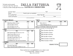
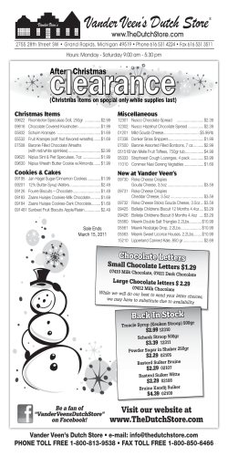


© Copyright 2026