
MASTER`S THESIS
MASTER'S THESIS Flank Wear Characterization using Image Analysis Christer Johansson 2015 Master of Science in Engineering Technology Materials Engineering Luleå University of Technology Department of Engineering Sciences and Mathematics Acknowledgements First of all I would like to thank my supervisors, Daniel Wedlund at Sandvik Coromant and Esa Vuorinen at the Division of Materials Science at Luleå University of Technology (LTU). Thank you Daniel for your undying patience for my many questions and ideas, and thank you Esa for your help and insights during the entirety of the project. I would also like to thank Johanna, without which this thesis work would not have been possible. I cherish your support and thank you from the bottom of my heart. Finally I would like to thank everybody else involved in the progress of this work, my family, my co-workers at Sandvik Coromant and all the administrative personnel at LTU, hoping that no-one feels forgotten. i Flank wear characterization using Image Analysis Summary This thesis work was done for a master’s thesis in Materials Science and Engineering at Luleå University of Technology in collaboration with Sandvik Coromant in Sandviken. The possibility of using Image Analysis for the characterization and classification of wear has been examined. The wear was exhibited by inserts used in machining operations such as turning and milling, with a classification of which types of wear were exhibited and a subsequent quantification of the extent. The classifier uses a point based system for selecting a wear probability, while the quantifier uses a vertical scanning technique to estimate the wear extent. An algorithm was developed capable of handling images of inserts from turning operations as input, giving the probability of four wear types in the image (unworn, type 1, type 2 and type 1 & 2) and the extent of wear on the flank side as output. To create a generic algorithm great care had to be taken in the selection of commonly available software and tools used for its development, and a photo rig prototype had to be developed in order to create freedom of choice in photo angles and distances. The results were graphically and numerically compared with a manually measured extent of wear performed by operators at the materials development department of Sandvik Coromant, as well as with a manual classification of the wear types present. The rig prototype was created using a 3D printer, and the quick prototyping allowed for further modifications of the design to be made. From the resulting algorithm and photo rig several conclusions could be drawn; The rig prototype was not sufficient for use in image acquisition and the development was halted for future continuation. This was concluded due to the mechanical properties of the rig as well as its size, both a result from the 3D printing process. The classification algorithm does not perform well for any of the wear types (flank or notch wear) due to the fact that it needs more parameters for creation of thresholds to create robustness in the probability selection as compared to the manual measurements. The quantifier measured the wear in two ways using either a mean and maximum value for the wear zone. The maximum value, though visually appealing, overestimated the wear level while the mean value showed good similarity to the manually measured wear. Work needs to be done on both the classifier and the quantifier to allow industrial application. For example, both of them needs to be more capable of correcting for inhomogeneous lighting and for the different coating layers exposed during machining, and both need to improve the mathematical modeling of the inserts position. The software used when developing the algorithm would benefit from a change. In this work the software was chosen for its capabilities for rapid testing of methods, but this could easily have been achieved with an open software library using an interactive programming environment. This would also simplify the development due to the much more extensive documentation. Questions arose about the need of standardization in the measurement of wear types as there are only vague guide lines at the moment, and the results are bound to vary due to the human factor. ii Flank wear characterization using Image Analysis Table of Contents INTRODUCTION ................................................................................................................................................ 1 THESIS WORK DESCRIPTION ........................................................................................................................................ 2 STRUCTURE OF THE THESIS WORK ................................................................................................................................ 2 BACKGROUND .................................................................................................................................................. 3 1.1 WEAR MECHANISMS .......................................................................................................................................... 3 1.2 WEAR TYPES ..................................................................................................................................................... 4 1.2.1 Flank wear ............................................................................................................................................. 5 1.2.2 Notch wear ............................................................................................................................................ 5 TOOL CONDITION MONITORING ...................................................................................................................... 6 2.1 INDIRECT TCM METHODS .................................................................................................................................... 6 2.1.1 Acoustic Emission .................................................................................................................................. 6 2.1.2 Vibrations .............................................................................................................................................. 6 2.1.3 Cutting force .......................................................................................................................................... 6 2.1.4 Trends in Indirect TCM ........................................................................................................................... 7 2.2 DIRECT TCM METHODS ...................................................................................................................................... 7 2.2.1 Overview of the field of Image Analysis ................................................................................................ 7 2.2.2 State of the art of Image Analysis techniques for TCM ....................................................................... 23 2.2.3 Libraries and Softwares ....................................................................................................................... 24 EXPERIMENTAL PROCEDURE .......................................................................................................................... 26 3.1 PROPOSED METHOD ......................................................................................................................................... 26 3.1.1 Classification ........................................................................................................................................ 28 3.1.2 Quantification ...................................................................................................................................... 31 3.2 POSSIBLE VARIATIONS ....................................................................................................................................... 34 RESULTS ......................................................................................................................................................... 36 RECOMMENDATIONS AND DISCUSSION ......................................................................................................... 40 INITIAL RECOMMENDATIONS FOR FUTURE DEVELOPMENT............................................................................................... 40 QUALITY OF RESULTS .............................................................................................................................................. 41 Classifier performance .................................................................................................................................. 41 Quantifier performance ................................................................................................................................ 42 BIBLIOGRAPHY ................................................................................................................................................. A APPENDIX – PLOTS AND FIGURES ..................................................................................................................... C U8179 FOLDER ....................................................................................................................................................... C U8277 FOLDER........................................................................................................................................................ I CLASSIFICATION PLOTS .............................................................................................................................................. N iii Flank wear characterization using Image Analysis Table of Figures FIGURE 1 EXAMPLE OF MANUAL MEASUREMENT OF ONE TYPE OF WEAR. THE MEASUREMENT BY THE OPERATOR RUNS FROM THE TOP OF THE BLACK AREA ABOVE THE INSERT TO THE BOTTOM OF THE FLANK WEAR ZONE. ......................................................... 1 FIGURE 2 HARD TURNING TOOL, WITH THE INSERT IN GOLD CLOSEST TO THE WORK PIECE (LEFT), COPYRIGHT WWW.SANDVIK.COROMANT.COM , AND IMAGE EXPLAINING DIFFERENT REGIONS OF THE INSERT (RIGHT). ............................. 3 FIGURE 3 FLANK WEAR OF A DRILLING TOOL, MEASURED AS VB, WWW.SANDVIK.COROMANT.COM .............................................. 5 FIGURE 4 NOTCH WEAR OF TURNING TOOL, COPYRIGHT WWW.SANDVIK.COROMANT.COM ........................................................ 5 FIGURE 5 PINHOLE CAMERA MODEL. IN THIS MODEL ONLY ONE RAY OF LIGHT FROM EACH POINT ON THE OBJECT GOES THROUGH THE APERTURE IN THE PINHOLE PLANE, AND IS PROJECTED ONTO THE IMAGE PLANE. (BRADSKI & KAEHLER, 2008) ....................... 8 FIGURE 6 REDEFINED PINHOLE MODEL, IN WHICH A POINT Q IS PROJECTED ONTO THE IMAGE PLANE AS THE POINT Q. (BRADSKI & KAEHLER, 2008) ................................................................................................................................................. 8 FIGURE 7 EXPLANATION OF HOMOGRAPHY MAPPING OF CHESSBOARD ONTO IMAGE PLANE. (BRADSKI & KAEHLER, 2008) ............. 10 FIGURE 8 EXAMPLE OF GRAY LEVEL THRESHOLDING, LEFT ORIGINAL 8-BIT IMAGE, RIGHT THRESHOLDED IMAGE ALSO CALLED BINARY IMAGE. (OSKARSSON, 2012)............................................................................................................................... 12 FIGURE 9 INTENSITY HISTOGRAM AND HISTOGRAM EQUALIZATION. (A) ORIGINAL 8-BIT IMAGE, (B) INTENSITY HISTOGRAM FOR ORIGINAL IMAGE HISTOGRAM, (C) CUMULATIVE DISTRIBUTION FUNCTION OF HISTOGRAM, (D) IMAGE AFTER HISTOGRAM EQUALIZATION AND (E) HISTOGRAM AFTER EQUALIZATION. (OSKARSSON, 2012) ........................................................... 13 FIGURE 10 CONVOLUTION OF AN IMAGE WHERE F(X,Y) IS THE INPUT IMAGE, H(X,Y) THE FILTER AND G(X,Y) IS THE OUTPUT IMAGE. THE BLUE SQUARE IS THE NEIGHBORHOOD ON WHICH THE FILTER WILL ACT, AND THE GREEN VALUE (PIXEL) IS THE OUTPUT PIXEL VALUE. (SZELISKI, 2010 DRAFT) ........................................................................................................................... 14 FIGURE 11 GAUSSIAN BLURRING USING DIFFERENT STANDARD DEVIATIONS. (A) ORIGINAL IMAGE IN GRAYSCALE, (B) Σ = 2, (C) Σ = 5, (D) Σ = 10. (SOLEM, 2012) ................................................................................................................................ 14 FIGURE 12 SOBEL EDGE DETECTION FILTER. COPYRIGHT (SZELISKI, 2010 DRAFT) ................................................................... 16 FIGURE 13 EXAMPLE OF DATA WITH AN OUTLIER, ALONG WITH THE ESTIMATIONS OF A FITTING MODEL USING ORDINARY THE LEAST SQUARES METHOD AND THE RANSAC ALGORITHM. ................................................................................................. 17 FIGURE 14 EXAMPLE DECISION TREE USED WITH CORRESPONDING PERSONAL DATA. START WITH TRAINING DATA AT ROOT NODE AND APPLY FIRST CRITERION. DEPENDING ON RESULTS EITHER CONTINUE ONTO THE SECOND NODE OR STOP AT THE TERMINAL NODE. CONTINUE IN THIS WAY TO CLASSIFY THE TRAINING DATA AND REACH A VALUE FOR THE TARGET VARIABLE. (PROF. KON, 2012) ...................................................................................................................................................................... 20 FIGURE 15 EXAMPLE IMAGES FROM DATABASE, SHOWING THE FLANK SIDE OF THE INSERT ALONG WITH ITS NOTCH AND FLANK WEAR. ...................................................................................................................................................................... 27 FIGURE 16 EXAMPLE IMAGES FROM THE DATABASE CONTAINING IMAGES EXHIBITING BOTH NOTCH AND FLANK WEAR, USED FOR DEVELOPING THE CLASSIFICATION ALGORITHM. ........................................................................................................ 27 FIGURE 17 FLOW CHART OF WEAR TYPE CLASSIFIER ALGORITHM ON THE LEFT HAND SIDE, EXAMPLE IMAGES ON THE RIGHT HAND SIDE. ...................................................................................................................................................................... 29 FIGURE 18 EXAMPLE GRAPHS OF IMAGE PROPERTIES PLOTTED AGAINST THE RUNTIME OF THE INSERT. THE GREEN VALUES ARE THE REFERENCE VALUES FOR AN UNWORN AREA, THE BLUE ARE THE VALUES FOUND IN THE WORN AREAS FOR EACH INSERT. ......... 30 FIGURE 19 FLOW CHART FOR THE WEAR ESTIMATION ALGORITHM ON THE LEFT HAND SIDE, EXAMPLE IMAGES ON RIGHT HAND SIDE. 32 FIGURE 20 EXPLANATION OF HOW THE VB IS MEASURED ON THE OUTLINE OF THE CLASSIFIED IMAGE. A LOCAL VB (RED) IS CALCULATED FOR EVERY COLUMN OF THE OUTLINE BY TAKING THE DISTANCE FROM THE REFERENCE LINE (BLUE) TO TE BOTTOM PIXEL ON THE OUTLINE. THE LARGEST LOCAL VB IS THE VB MAX USED IN THE FOLLOWING RESULTS (GREEN). IN ADDITION TO THE MAXIMUM VB, THE MEAN AND MEDIAN VALUES OF THE LIST OF LOCAL VB’S WERE ALSO CALCULATED. THE MEAN VB IS ALSO USED IN THE FOLLOWING RESULTS. ........................................................................................................................ 33 FIGURE 21 GRAPHICAL REPRESENTATION OF THE DIFFERENCES BETWEEN THE ESTIMATED WEAR AND MANUALLY MEASURED WEAR. INCLUDED IN THE GRAPHS ARE THE MAXIMUM FLANK WEAR AND THE MEAN FLANK WEAR, IN BLUE AND RED RESPECTIVELY. THE VBERGA MEASUREMENTS ARE THE MANUALLY MEASURED FLANK WEARS, IN RED. .......................................................... 33 iv Flank wear characterization using Image Analysis FIGURE 22 HISTOGRAM OF HOW CLOSE THE ESTIMATED WEAR CORRESPONDS TO THE MANUALLY ESTIMATED WEAR. AGAIN THE MAXIMUM AND MEAN FLANK WEAR ARE COMPARED TO THE MANUALLY MEASURED WEAR LEVELS. THE HISTOGRAMS SHOW THE ABSOLUTE VALUE OF THE DIFFERENCE BETWEEN VBERGA AND ALGORITHM. ................................................................... 34 FIGURE 23 PROTOTYPE OF PHOTO RIG, DESIGNED IN CAD SOFTWARE AND PRODUCED USING A 3D PRINTER. THE CAMERA IS ATTACHED TO THE CIRCULAR ARM AND ALWAYS FOCUSED ON THE INSERT, EVEN THOUGH THE CAMERA CAN BE MOVED IN PLANE OVER THE ARM AND OUT OF PLANE BY ROTATING THE ARM. ..................................................................................................... 36 FIGURE 24 GRAPHICAL REPRESENTATION OF THE COMPARISON BETWEEN MANUAL AND ALGORITHM CLASSIFICATION. FLANK WEAR ON TOP, NOTCH WEAR ON THE BOTTOM. THE REMAINING PLOTS CAN BE FOUND IN CLASSIFICATION PLOTS, APPENDIX A. ........... 37 FIGURE 25 VISUALIZATION OF THE OUTLINE FOUND BY THE ANALYSIS ON THE ACTUAL IMAGE OF THE INSERT. TYPICAL IMAGE EXPLAINING THE PHENOMENON OF VARYING LOCAL VB. THE RED OUTLINE IS THE SAME OUTLINE AS IN FIGURE 19 BUT DRAWN ON THE WEAR AREA DIRECTLY FOR COMPARISON. THE GREEN LINE CORRESPONDS TO THE MAXIMUM VB FOUND FROM ALL THE LOCAL VB’S FOR THIS IMAGE. ............................................................................................................................... 38 FIGURE 26 COMPARISON BETWEEN HISTOGRAM OF LOCAL VBS AND A NORMAL DISTRIBUTION WITH THE SAME STANDARD DEVIATION AND MEAN VALUE. THE SYMBOLS CORRESPOND TO THE STATISTICAL PROPERTIES OF THE DISTRIBUTION OF LOCAL VBS, USED TO CREATE THE NORMAL DISTRIBUTION. ON THE LEFT HAND SIDE, THE HISTOGRAM CREATED BY THE ALGORITHM IN BLUE WITH THE NORMAL DISTRIBUTION SUPERIMPOSED IN GREEN. ON THE RIGHT HAND SIDE ALSO A BOX PLOT OF THE LOCAL VBS FOR COMPARISON.................................................................................................................................................... 38 FIGURE 27 ORIGINAL IMAGE OF FLANK WEAR FROM U8179 (TEST NUMBER 25844 AFTER 46 MINUTES RUNTIME) AT THE TOP, THE WEKA SEGMENTED IMAGE FOR FINDING THE REFERENCE LINE CORRESPONDING TO THE BLACK AREA AT THE TOP OF THE INSERT IN THE MIDDLE, AND THE OUTLINE OF THE FLANK WEAR AREAS FOUND IN THE BOTTOM IMAGE. THIS BOTTOM IMAGE WILL BE REDUCED TO ONLY THE LARGER OUTLINE SINCE A SELECTION OF ROI TAKES PLACE AT THIS STEP IN THE ALGORITHM. .............. 39 FIGURE 28 ROI SHOWING AN INSERT WITH A BUILT UP EDGE. THE REFERENCE LINE IN BLUE AT THE TOP OF THE IMAGE HAS BEEN MOVED TO THE TOP OF THE BLACK AREA ABOVE THE INSERT AND FOR NORMAL INSERTS THIS WORKS WELL. HOWEVER A BUE WILL ALSO CREATE A SMALLER BLACK AREA DETACHED FROM THE REST OF THE WEAR AREA, CREATING THE PROBLEM OF AN OVERESTIMATED WEAR ZONE EVIDENT IN THIS FIGURE. .............................................................................................. 45 FIGURE 29 PLOTS OF DISTANCE DIFFERENCE BETWEEN THE ALGORITHM AND THE MANUALLY MEASURED WEAR FROM VBERGA FOR THE IMAGES IN THE FIRST TEST FOLDER, U8179. THE LEFT SUBPLOT IS THE MAXIMUM WEAR AND THE RIGHT SUBPLOT IS THE MEAN WEAR. THE TEST NUMBERS ARE, FROM TOP TO BOTTOM ROW-WISE LEFT TO RIGHT; 25778, 25844, 25846, 25847, 25848, 25849, 25850. ................................................................................................................................................. C FIGURE 30 UN-NORMALIZED HISTOGRAMS OF THE DIFFERENCE BETWEEN MANUALLY MEASURED FLANK WEAR FROM VBERGA AND AUTOMATICALLY MEASURED BY THE ALGORITHM DEVELOPED, FOR THE IMAGES IN THE FIRST TEST FOLDER, U8179. THE LEFT SUBPLOT IS THE MAXIMUM WEAR MEASURED AND THE RIGHT ONE IS THE MEAN WEAR MEASURED. THE TEST NUMBERS ARE, FROM TOP TO BOTTOM ROW-WISE LEFT TO RIGHT; 25778, 25844, 25846, 25847, 25848, 25849, 25850. .................. D FIGURE 31 GRAPHICAL REPRESENTATIONS AS SCATTER PLOTS OF THE FLANK WEAR AS MEASURED BY THE ALGORITHM FOR THE IMAGES IN THE FIRST TEST FOLDER, U8179. THE MAXIMUM WEAR IN BLUE, THE MEAN WEAR IN GREEN AND THE WEAR MEASURED MANUALLY BY VBERGA IN RED. THE TEST NUMBERS ARE, FROM TOP TO BOTTOM ROW-WISE LEFT TO RIGHT; 25778, 25844, 25846, 25847, 25848, 25849, 25850. .............................................................................................................. E FIGURE 32 TREND LINES FOR THE SCATTER PLOTS IN FIGURE 31, CALCULATED BY ORDINARY LINEAR REGRESSION FOR THE IMAGES IN THE FIRST TEST FOLDER, U8179. GIVEN AS AN APPROXIMATION ON THE WEAR PROGRESSION. THE MAXIMUM WEAR IN BLUE, THE MEAN WEAR IN GREEN AND THE WEAR MEASURED MANUALLY BY VBERGA IN RED. THE TEST NUMBERS ARE, FROM TOP TO BOTTOM ROW-WISE LEFT TO RIGHT; 25778, 25844, 25846, 25847, 25848, 25849, 25850. THE TREND LINES COULD ALSO HAVE BEEN CALCULATED USING RANSAC TO ENSURE A BETTER FIT, BUT THE LINEAR REGRESSION WAS CHOSEN TO GIVE AN EXAMPLE OF HOW ONE OUTLIER GREATLY AFFECTS THE EQUATION. SEE ESPECIALLY 25850, BOTH THE TREND LINE AND FIGURE 31. ....................................................................................................................................................................F FIGURE 33 COMPARISON OF NORMAL DISTRIBUTIONS. LEFT HAND SIDE; HISTOGRAM OF VB WITH NORMAL DISTRIBUTION SUPERIMPOSED, WITH STANDARD DEVIATION AND MEAN PARAMETERS FROM THE POPULATION OF LOCAL VBS AS TEXT. RIGHT HAND SIDE; A BOX PLOT OF THE SAME LOCAL POPULATION. THE TWO IMAGES ARE FOR INSERTS AFTER 02 AND 12 MINUTES RUNTIME. .......................................................................................................................................................... G FIGURE 34 COMPARISON OF NORMAL DISTRIBUTIONS. LEFT HAND SIDE; HISTOGRAM OF VB WITH NORMAL DISTRIBUTION SUPERIMPOSED, WITH STANDARD DEVIATION AND MEAN PARAMETERS FROM THE POPULATION OF LOCAL VBS AS TEXT. RIGHT v Flank wear characterization using Image Analysis HAND SIDE; A BOX PLOT OF THE SAME LOCAL POPULATION. THE TWO IMAGES ARE FOR INSERTS AFTER 22 AND 32 MINUTES RUNTIME, THUS A CONTINUATION OF THE TWO IMAGES FROM FIGURE 33. ..................................................................... H FIGURE 35 PLOT OF DISTANCE DIFFERENCE BETWEEN THE ALGORITHM AND THE MANUALLY MEASURED WEAR FROM VBERGA FOR THE IMAGES IN THE SECOND TEST FOLDER, U8277. THE LEFT SUBPLOT IS THE MAXIMUM WEAR AND THE RIGHT SUBPLOT IS THE MEAN WEAR. THE TEST NUMBERS ARE, FROM TOP TO BOTTOM ROW-WISE LEFT TO RIGHT; 24094, 25850, 26161, 26182, 26241, 26242. .................................................................................................................................................. I FIGURE 36 UNNORMALIZED HISTOGRAMS OF THE DIFFERENCE BETWEEN MANUALLY MEASURED FLANK WEAR FROM VBERGA AND AUTOMATICALLY MEASURED BY THE ALGORITHM DEVELOPED, FOR THE IMAGES IN THE SECOND TEST FOLDER, U8277. THE LEFT SUBPLOT IS THE MAXIMUM WEAR MEASURED AND THE RIGHT ONE IS THE MEAN WEAR MEASURED. THE TEST NUMBERS ARE, FROM TOP TO BOTTOM ROW-WISE LEFT TO RIGHT; 24094, 25850, 26161, 26182, 26241, 26242. ............................... J FIGURE 37 GRAPHICAL REPRESENTATION AS A SCATTER PLOT OF THE FLANK WEAR AS MEASURED BY THE ALGORITHM FOR THE IMAGES IN THE SECOND TEST FOLDER, U8277. THE MAXIMUM WEAR IN BLUE, THE MEAN WEAR IN GREEN AND THE WEAR MEASURED MANUALLY BY VBERGA IN RED. THE TEST NUMBERS ARE, FROM TOP TO BOTTOM ROW-WISE LEFT TO RIGHT; 24094, 25850, 26161, 26182, 26241, 26242. ......................................................................................................................... K FIGURE 38 TRENDLINES FOR THE SCATTERPLOTS IN FIGURE 31, CALCULATED BY ORDINARY LINEAR REGRESSION FOR THE IMAGES IN THE SECOND TEST FOLDER, U8277. GIVEN AS AN APPROXIMATION ON THE WEAR PROGRESSION. THE MAXIMUM WEAR IN BLUE, THE MEAN WEAR IN GREEN AND THE WEAR MEASURED MANUALLY BY VBERGA IN RED. THE TEST NUMBERS ARE, FROM TOP TO BOTTOM ROW-WISE LEFT TO RIGHT; 24094, 25850, 26161, 26182, 26241, 26242. THE TREND LINES COULD ALSO HAVE BEEN CALCULATED USING RANSAC TO ENSURE A BETTER FIT, BUT THE LINEAR REGRESSION WAS CHOSEN TO GIVE AN EXAMPLE OF HOW ONE OUTLIER GREATLY AFFECTS THE EQUATION. SEE ESPECIALLY 26242, BOTH THE TREND LINE AND FIGURE 37. ........ L FIGURE 39 EXAMPLE ROIS TAKEN FROM THE 26161 TEST FOLDER. THE GREEN LINE CORRESPONDS TO THE MAXIMUM LOCAL VB MEASURED, AND FITS WELL WITH A VISUAL COMPARISON TO THE FLANK WEAR AREA. IN THE VERY TOP OF THE IMAGE A BLUE LINE CORRESPONDING TO THE REFERENCE LINE CALCULATED USING THE RANSAC ALGORITHM IS VISIBLE. THE IMAGES ARE TAKEN AFTER 02, 12, 22 AND 32 MINUTES RUNTIME FOR THE INSERTS. ................................................................................. M FIGURE 40 COMPARISON BETWEEN CLASSIFICATION DONE BY ALGORITHM AND MANUAL CLASSIFICATION DONE BY USER. THE BLUE LINE CORRESPONDS TO THE ALGORITHM AND THE RED LINE TO THE MANUAL CLASSIFICATION. IT CAN BE CONCLUDED FROM THESE PLOTS THAT THE CLASSIFICATION DONE BY THE ALGORITHM DOES NOT PERFORM WELL, SEE RECOMMENDATIONS. .................. N vi Flank wear characterization using Image Analysis Introduction For any machining operation such as hard turning, milling or drilling of a work piece a high quality of the final product is the aim. To ensure this while at the same time decreasing the cost of the processing the industrial trend goes towards automation, since an automatic process will ensure a continuity in the production line and reduce the down-time of the machine in question, thus making the process more cost-efficient. The down-time includes all of the time when the machine is not in use, and one of the most important parameters corresponding to around 20% of the down-time in milling operations is cutting tool failures due to wear or breakage (Zhang & Zhang, 2013). The cost of the cutting tools and their replacement also represents around 12% of the total production cost (Trejo-Hernandez, Osornio-Rios, Romero-Troncoso, Rodriguez-Donate, Domininguez-Gonzalez, & Herrera-Ruiz, 2010). Therefore it is important to understand the process of tool wear and breakage in order to be able to optimize the tool life cycle and minimize the costs associated with it. This includes knowledge about the mechanisms behind the different types of wear as well as an understanding of the materials themselves. A large amount of research has been performed in developing methods to monitor and predict the progression of the tool wear. Some of methods use the machine parameters and others use the process signals to get an estimation of the wear induced and while some methods try to use a more direct measurement of the wear level. One promising method of evaluation is monitoring the wear using Image Analysis (IA) or Computer Vision (CV) algorithms on digital images of the tool wear. This has been proven to give benefits over other methods, and is considered in this work for the potential use in estimating the wear level of turning tool inserts for Sandvik Coromant AB. Sandvik Coromant continuously strives to develop new inserts with new grades and/or geometry, and one important parameter for evaluating the performance is by measuring the wear after predefined runtimes as depicted in Figure 1 below. Figure 1 Example of manual measurement of one type of wear. The measurement by the operator runs from the top of the black area above the insert to the bottom of the flank wear zone. This involves removing the insert from the machine, measuring in a microscope, returning it to the machine and a continuation of the testing. A lot of time could be saved and precision gained if this measurement could be made more automatic, which is one of the reasons why IA could be an important tool for wear estimation. Another reason is that even though the technician has years of experience in measuring wear there will still be differences from day to day simply due to the human factor being involved, and by automatically estimating the wear rules and standards need to be defined that will ascertain a result that does not fluctuate. 1 Thesis work description This work proposes the use of existing algorithms from the field of IA and implementing, improving or developing them for the use in wear estimation. Due to their the almost infinite possibilities of use in various combinations, an evaluation will be done for different techniques and tools on an image database. A selection will then be done to find the methods best suited for the application. Using the selected methods, algorithms for classifying the wear types observed for the metal cutting insert and then quantifying the wear level will be developed. The work will be limited to a predefined set of inserts and wear types, all while aiming to use tools and methods that are both properly documented and as commonly available as possible. This means that for the chosen inserts some specified wear types will be classified and then estimated using acknowledged IA methods written in a common and free programming language. The goals for the work are as follows: To examine if Image Analysis can be used for wear estimation of metal cutting tools. To develop an algorithm that is as generic as possible, capable of handling images of varying quality and with varying content. To use as simple and commonly available tools and methods as possible, to simplify the future development of the algorithm. To develop an algorithm that can correctly classify as many different types of wear as possible; this would be beneficial from an industrial point of view. To develop an algorithm capable of quantifying the wear of different types found by the classifier. Structure of the thesis work Before giving more information about the proposed algorithm a thorough background on the subjects of tool wear monitoring and IA methods will be given in the sections “Background” and “Tool Condition Monitoring”, together with a review of state-of-the-art methods in the area of IA. After this the proposed method and algorithm for finding the wear levels is found in the section “Experimental Procedure”, followed by the results in the “Results” section. Finally there will be a discussion about these results and the conclusions drawn from them in the section “Recommendations and Discussion”, together with some recommendations concerning future development of the algorithm and the test methods. For sources on the citations, see the “Bibliography” section. The results not shown in the main text can be found at the end in “Appendix – plots and figures”. 2 Background It is a natural part of machining operations that the tool used is going to exhibit wear and is finally going to break, and when this happens instead of changing the entire tool which would be costly they are designed as a mounting head where cutting tool inserts are mounted. These inserts are what actually cuts the work piece and when their condition is deemed as no longer fit for operation or when they break, they are replaced by another. Figure 2 Hard turning tool, with the insert in gold closest to the work piece (left), Copyright www.sandvik.coromant.com , and image explaining different regions of the insert (right). When the insert is starting to exhibit wear above a certain degree the surface quality of the work piece will decrease, it can create residual stresses and microstructure changes in the work piece and there will be some extra strain on the machine as well (Dutta, Pal, Mukhopadhyay, & Sen, 2013) (Zhang & Zhang, 2013). Therefore it is important to monitor the progressive wear of the tool in order to prevent a deterioration of the product and to maximize the usage of the insert before a replacement is needed. As mentioned in the “Introduction” more information about the Tool Condition Monitoring (TCM) techniques applied in industry will be given in this section, but before that it is necessary to have a deeper understanding of the underlying wear mechanisms and wear types. 1.1 Wear Mechanisms Firstly the difference between a wear type and a wear mechanism must be made clear. A wear type is classified by the specific appearance of the wear on the insert itself, while the wear mechanism is the methods by which this wear occurs. In literature there are many different classifications and designations for the wear mechanisms, which often describe the same four phenomena in different ways (Performance Testing Group TRT, Sandvik , 2010). The four general wear mechanisms are: Thermo-mechanical load: This is a combination of a mechanical stress and a high temperature on the insert. This wear mechanism is heavily dependent on the cutting parameters, and generally it can be said that with all other parameters unchanged the temperature at the tip of the insert, i.e. the thermal load, increases with increasing cutting speed. It can also be said that the mechanical load on the insert increases with increasing feed rate and depth of cut. This wear mechanism is also highly dependent on if the insert is used in a continuous or intermittent fashion. The first means that the insert stays on the work piece during the entire machining operation leading to high friction energies and high working temperature, while the second means that for various reasons there will be fluctuations of either the mechanical load or the temperature. Fluctuations in temperature will lead to greater strains in the insert because the rapid cooling of the surface will create a 3 temperature difference between the surface and the interior, which in turn creates a stress state with tensile stresses at the surface and compressive stresses in the interior. Mechanical fluctuations can be expected when the insert makes many entrances and exits from the work piece during the machining. Abrasive wear: This wear mechanism is fairly intuitive since it is caused by hard particles that grind against the insert or work piece. Examples of particles that can be problematic are cementite in steel and cast iron as well as sand inclusions on the surface of cast parts. Adhesive wear: Can also be called attrition wear, and is caused by a strong adhesion between the work piece material and the insert meaning that the work piece material will “stick” to the insert. This can lead to tool wear when the material adhering to the insert is removed; if the weakest interfacial strength is found inside the insert and not in the chip or the work piece, then the insert will typically exhibit flaking of the coating and chipping. This wear mechanism has a maximum value at a certain temperature depending on the insert and work piece materials. At lower temperatures the tendency for adhesion is too low while at higher temperatures the work piece becomes softer meaning that the weakest link will be found in the chip or work piece and not in the insert. Chemical wear: This wear mechanism is caused by chemical loads during the machining, either through diffusion or oxidation. Diffusion means that when the temperature increases the mobility of atoms also increase, and if the insert’s tendency to react with the work piece material is high then this mechanism becomes a problem at high cutting speeds. For example, the chip created when turning steel is deficient in carbon and thus it tends to draw out carbon from the insert if possible. Oxygen together with high temperature causes oxidation of most metals, and this situation is found at the end of the contact zone with the chip and can cause chemical wear on the insert. 1.2 Wear Types Now that the reasons for tool wear are known, the way they manifest themselves can be more readily explained. There are a total of 9 wear types (Performance Testing Group TRT, Sandvik , 2010) occurring on the tool inserts namely: Crater wear Flank wear Plastic Deformation (PD) Flaking Cracks Chipping Notch wear Fracture Smearing / Built Up Edge (BUE) These wear types can be found separately or simultaneously on the insert depending on the cutting parameters, and for this review two of the most common wear types used for TCM have been chosen for closer examination; Flank wear and Notch wear. These wear types are classified by the different locations on the insert on which they occur and their appearance and are caused by different mechanisms depending on the type. Therefore some 4 nomenclature is necessary for proper understanding of the different types. As can be seen in Figure 2, there are several important regions on a cutting tool insert. The most important are the flank face which corresponds to the face in contact with the work piece and the rake face which corresponds to the face with normal orthogonal to the normal of the work piece. The chip breaker, which is used to redirect the flow of the chip during machining, is also located on the rake face. Between these two faces one finds the main cutting edge which as the name indicates cuts the work piece. 1.2.1 Flank wear Flank wear occurs on the flank face of the insert close to the main cutting edge. The reason behind flank wear is a loss of coating material due to the sliding of the flank face on the work piece material, thus abrasive wear, but there is also a degree of chemical wear to it. It usually initiates close to the main cutting edge and progresses down on the flank face in a continuous fashion. Flank wear is usually reported as VB, a measure of the width of the flank wear region as shown in Figure 3 below. Figure 3 Flank wear of a drilling tool, measured as VB, www.sandvik.coromant.com 1.2.2 Notch wear This type of wear is a type of damage to the main cutting edge at the end of the cutting zone, which is the zone from the tip of the insert to the end of the region on the edge used to cut the work piece, see Figure 4. This means that if the cutting depth is known, it is also known where to look for notch wear. There is no general consensus as to why this occurs, however the process by which it progresses is better understood. It often starts with a flaking of the coating and then progresses down into the substrate. Sometimes secondary chips forms which contribute to the notch wear, and built up edges of the work piece material on the insert can increase wear level as well. The most important mechanisms are adhesive, thermo-mechanical and chemical. Notch wear is measured in the same way as flank wear, by measuring the vertical extension of the notch on the flank side, from the edge to the bottom of the notch. Figure 4 Notch wear of turning tool, Copyright www.sandvik.coromant.com 5 Tool Condition Monitoring With more knowledge about the causes for tool wear and how it is perceived an introduction to the different monitoring methods is given. Tool condition monitoring (TCM) is, as previously explained, the process of monitoring the progressive wear of a tool in order to optimize its life length, the production rate and the quality of the work piece. There are two groups of TCM methods; indirect and direct. 2.1 Indirect TCM methods In indirect methods the cutting parameters and other machining process signals are used to estimate the degree of wear on a tool, thus the wear is measured indirectly. Signals that are often used are vibrations in the tool, temperatures, cutting forces, acoustic emissions (AE) and the power consumption of various drives. The advantages of indirect methods are a setup that is not very complicated and that they are very suited for practical application, but there are generally some disadvantages. For example the detected signal needs to be compared to a signal from an unworn tool in order to draw conclusions and the relationships between the tool wear and the signals measured need to be prepared in advance, thus indirect methods can be both difficult and inconvenient. This together with the fact that the precision is not as good as that found by direct methods (Zhang & Zhang, 2013) speaks against indirect methods. The sensors are normally adequate to gather the necessary information; the problems lie in the processing of the information and how the decisions will be made to classify the wear state of the tool (Silva & Wilcox, 2008). There are also some problems related to the individual methods, as will be evident in the following sections giving more information on some of the more widely used indirect methods. 2.1.1 Acoustic Emission Acoustic Emission (AE) is a sound/stress wave travelling through the work piece material, and is gathered by an acoustic sensor. The AE’s are divided into two classes, continuous and transient waves, with the first coupled to the wear on the tool face and flank, the second is the result of either tool chipping or breakage. This method has been successfully used in laboratory environments to detect tool wear. Among the indirect methods it is one of the most effective for sensing tool wear with the advantage of using a frequency range higher than the machine vibrations and environmental noises, and does not interfere with the machining operation (Li, 2002). One of the problems that occur is that it is difficult to extract physical parameters from the AE signal, due to the fact that they vary in both time and frequency. This dependency on the frequency of for example chatter makes monitoring of tool wear difficult and mainly allows for detection of tool breakage (Dutta, Pal, Mukhopadhyay, & Sen, 2013). 2.1.2 Vibrations The vibrations in the tool created by the friction when the tools slides on the work piece surface can be measured by an accelerometer, with the main advantage that the method is easy to apply. However this method has only successfully been used to indicate the onset of tool failure, and not to progressively monitor the tool wear. 2.1.3 Cutting force Measuring the cutting force exhibited by the tool on the work piece is a widely recognized way of correlating tool wear to cutting parameters (Dimla & Dimla, 2000), since the friction between work piece and tool will vary depending on the wear level. The cutting force is usually measured by 6 dynamometers on the tool, and this is the source of the problems with this method. Dynamometers are unfortunately not suitable for industrial use due to their high cost, negative impact on the rigidity of the machining system, sensitivity to vibrations and a lack of overload protection. 2.1.4 Trends in Indirect TCM Since the indirect TCM methods themselves cannot adequately monitor the wear in a progressive fashion individually, the trend goes toward using information from multiple sensors and combining them to achieve a better estimation of tool wear. Two examples of methods for combining the information from multiple sensors are the use of Artificial Neural Networks (ANNs) and “smart sensors”. ANNs are mathematical models that try to provide a description between the input variables causing tool wear and the output values of wear estimation, even if this is a non-linear relationship (Silva & Wilcox, 2008). “Smart sensors” are sensors capable of certain functionalities such as processing of the signals and handling several signals simultaneously (Trejo-Hernandez, Osornio-Rios, Romero-Troncoso, Rodriguez-Donate, Domininguez-Gonzalez, & Herrera-Ruiz, 2010) which can lead to better performance of the wear estimation. 2.2 Direct TCM methods In direct methods the flank wear width, the notch wear area, the surface textures etc. are measured directly by using a 3D surface profilometer, optical microscope, Scanning Electron Microscope (SEM), with a Charged Coupled Device (CCD) or Complementary Metal-Oxide Semiconductor (CMOS) camera or other imaging tools. The advantages of direct methods include that they are non-contact methods so they will not risk damaging the product, they are cheap and flexible to implement, they can be remotely and automatically controlled and they are not dependent on machining parameters (Dutta, Pal, Mukhopadhyay, & Sen, 2013). The disadvantages include that appropriate illumination is necessary for good imaging and it is sometimes difficult to produce it homogeneously. A robust algorithm for analyzing the images and extracting information is also necessary and finally these methods demand some kind of processing of the image to be able to use the acquired information. This is where the process of Image Analysis (IA) comes in. IA is a tool used to process an image and to extract the information in it by the use of an algorithm. A neighboring area is aptly named Computer Vision, since it aims to allow a computer to “see” and recognize objects in images and videos. IA as it has been used for TCM will be more thoroughly explained in a later section, but a description of terms used and a general overview of the field are necessary before this. 2.2.1 Overview of the field of Image Analysis 2.2.1.1 Images and camera calibration First, let’s review some basic image acquisition. When light strikes an object some of it is absorbed while the rest is reflected, causing us to perceive different colors depending on which wavelengths being reflected. The light is gathered by our eyes via the lens and collected at the retina from which it is sent for analysis. This is the same geometry found when examining image acquisition using a camera; the light travels from the object, through the lens of the camera to the sensor gathering the light inside it and sending it on for digital analysis. The pinhole camera model is a simple yet efficient way to model this behavior mathematically. This model consists of two imaginary walls, the first called the pinhole plane as is located between the image plane (onto which the image is projected) and the object being photographed. The pinhole 7 plane has a tiny hole at its center collecting the light, where only one single ray enters the pinhole from every point of the object pictured. Through this pinhole the object is then projected onto the image plane. The distance between the pinhole plane and the image plane is called the camera’s focal length f and is the parameter that will change the relative image size of the object on the image plane. See Figure 5 below for a schematic description of the pinhole camera model. Figure 5 Pinhole camera model. In this model only one ray of light from each point on the object goes through the aperture in the pinhole plane, and is projected onto the image plane. (Bradski & Kaehler, 2008) From this image Eq. 1 is derived using similar triangles for both X- and Y-directions: −𝑥 = 𝑓 𝑋 𝑍 Eq. 1 with Z being the working distance. Another equivalent way to look at the problem is to move the image plane to the other side of the pinhole plane, which has the advantage of getting the object the right way up on the image plane and easier mathematical manipulations. This means that the aperture of the pinhole is now the center of projection for the rays coming from the object through the image plane, see Figure 6 below. Figure 6 Redefined pinhole model, in which a point Q is projected onto the image plane as the point q. (Bradski & Kaehler, 2008) The principal point is where the optical axis intersects the image plane, and one might think that in a real camera this means that the principal point is equal to the center of the camera’s sensor. This would imply that the manufacturer attaches the sensor in the camera with micrometer precision, which is rarely the case. Thus a point Q in the real world (X,Y,Z) is projected onto the image plane at (xscreen,yscreen), with points defined as follows (Bradski & Kaehler, 2008): 8 𝑥𝑠𝑐𝑟𝑒𝑒𝑛 = 𝑓𝑥 𝑋 + 𝑐𝑥 𝑍 𝑦𝑠𝑐𝑟𝑒𝑒𝑛 = 𝑓𝑦 𝑌 + 𝑐𝑦 𝑍 Eq. 2 Eq. 3 Where cx and cy corresponds to the possible deviation of the principle point from the center of the sensor, and the subscripts corresponds to the possible variations in focal lengths and deviations in x and y direction. The process of projecting the point Q = (X,Y,Z) onto q = (x,y) is called a projective transform, and when working with these it is convenient if the points are defined in homogeneous coordinates. Basically this means that a 2D (x,y) point in an image can be represented as a vector (x1,x2,x3) where x = x1/x3 and y = x2/x3, so the points x and y are scaled up with a third component by the homogeneous vector, x3 (generally a n-dimensional vector is transformed into a n+1-dimensional vector, adding the last component as a scaling factor). This vector lies on the decided projective plane, which in our case is the image plane. Using this nomenclature and the homogeneous point, Eq. 4 is valid: 𝑥 𝑓𝑥 𝑞 = 𝑀𝑄, 𝑤ℎ𝑒𝑟𝑒 𝑞 = [ 𝑦 ] , 𝑀 = [ 0 𝑤 0 0 𝑓𝑦 0 𝑐𝑥 𝑋 𝑐𝑦 ] , 𝑄 = [𝑌 ] 𝑍 1 Eq. 4 Where M is called the camera intrinsic matrix including the focal lengths (if different in x- and ydirection) and the translations of the principal point. Unfortunately the pinhole model is not a feasible way of taking a picture since the light collected by the pinhole is not enough for rapid exposure in the camera. For this reason our eyes and cameras use a lens to gather more light and to focus this light in one point. The problem with this is that the lenses are seldom perfect and introduce distortions in the images, leading to the need of being able to mathematically remove them. A solution to the removal of distortions is called a calibration of the camera and can be done in many ways by using known shapes inside the images as references. One popular method is to use chessboards, since they have a predefined number of easily identifiable points, they’re planar with well-known sizes of the squares and they’re easy to handle. When calibrating the camera this chessboard will then be viewed from a variety of angles, making it possible to compute the relative location and orientation of the camera for every view and also to calculate the intrinsic parameters of the camera by localizing the board and calculating the corresponding transformation onto the image plane. When using a regular camera the light needs to be collected by a sensor, most often being rectangular in shape and coming with different resolutions and in different sizes. They can be thought of as grids where every square, or pixel, of the sensor absorbs light and measures the intensity absorbed. The light gathered by the lens is then absorbed on the sensors grid squares, and the different intensities absorbed by squares will give rise to an image when analyzed digitally. This is the basic functioning of a regular CCD camera as mentioned before; when an image is taken the light is gathered by the lens onto the sensor, which measures the intensities for each pixel and send the information to be analyzed and transformed into an image. 9 For the sensor to be used properly the focal length of the lens must match the size of the sensor, the working distance and the field of view desired on the image. It can be concluded when examining Figure 6 that if the image plane is thought of as the sensor, X as the height of the desired field of view for the image and Z as the working distance, then the following equation holds (Point Grey Research, 2013); 𝑓𝑜𝑐𝑎𝑙 𝑙𝑒𝑛𝑔𝑡ℎ = 𝑠𝑒𝑛𝑠𝑜𝑟 𝑠𝑖𝑧𝑒 ∗ 𝑤𝑜𝑟𝑘𝑖𝑛𝑔 𝑑𝑖𝑠𝑡𝑎𝑛𝑐𝑒 𝑓𝑖𝑒𝑙𝑑 𝑜𝑓 𝑣𝑖𝑒𝑤 + 𝑠𝑒𝑛𝑠𝑜𝑟 𝑠𝑖𝑧𝑒 Eq. 5 This equation can for example be used to choose an appropriate lens for a camera system, when the other properties are known. Returning now to transformations onto the image plane, a homography is defined as a projective mapping from one plane to another, meaning that if the points on the chessboard are mapped to the sensor of the camera this will be a planar homography. This can be envisioned as the square chessboard being warped into a quadrilateral by pulling its four corners in different directions. The mapping can be expressed if we use homogeneous coordinates for both every point Q on the chessboard and every point q on the sensor, as defined in the equations and figure below: 𝑄 = [𝑋 𝑌 𝑍 1]𝑇 ; 𝑞 = [𝑥 𝑦 1]𝑇 𝑞 = 𝑠𝐻𝑄 Eq. 6 Eq. 7 Figure 7 Explanation of homography mapping of chessboard onto image plane. (Bradski & Kaehler, 2008) Where H is the homography matrix and s is an arbitrary scale factor. This 3x3 homography matrix has two parts; the first part is the physical transformation locating the object plane we are viewing and the second part is the projection which includes the camera intrinsic matrix (M). With some matrix algebra and some simplifications the mapping of the chessboards points onto the sensor is described by the following equation: 𝑞 = 𝑠𝑀 ∙ [𝑟1 𝑟2 𝒕] ∙ 𝑄 Eq. 8 Where r1 and r2 are rotational vectors of the camera and t is a translational vector. Basically this means that since the appearance of the board is known and by using the images of the board from different views, it is possible to find a transformation (including rotation, translation and intrinsic parameters) based on what the board looks like (square) and how it is seen in the image 10 (quadrilateral). Thus a mapping from a 3D point on a chessboard onto a 2D point on the sensor is completed, and a homography is calculated. The 2D points on the sensor are easily found by IA, and if the 3D points of the cheesboard are defined cleverly (such as for example using the chessboard square sides as a unit length), Eq. 7 can be used to extract one homography matrix from every image taken without knowing anything about the intrinsic parameters of the camera. This is in fact how the camera calibration is done using OpenCV (Bradski & Kaehler, 2008), and the rotations and translations are then read from the conditions put on the homography. The distortions are handled separately due to the fact that these are related to the 2D geometry and how this pattern of points gets distorted in an image. Homographies are very useful in computer vision and are used in situations like Camera Calibration, 3D Reconstruction, Visual Metrology and Stereo Vision (Dubrofsky, Homography Estimation, 2007). Camera calibrations is often a very important first step in computer vision applications since it determines the relationship between an object on an image and where this object is situated in the real world. One interesting example of how camera calibrations, and also homographies, are applied is in the field of automatic sport sequence analysis. The goal is to enable automatic summarization of sport events, the possibility of a virtual view from an arbitrary view-point and also computation of statistics of individual players. To realize this, the camera must be calibrated to each view in real time using the information available on the screen, such as court lines in a football field or tennis court (Farin, Han, & With, 2005). 2.2.1.2 Pre-processing In most vision applications a pre-processing of the image is necessary before the actual analysis can start. This pre-processing improves the quality of the acquired image using methods such as histogram equalization, contrast stretching, noise reduction, sharpening and compensation for inhomogeneous illumination. Pre-processing techniques can be divided into groups depending on the range of pixels used by them; firstly there are pixel operators which act solely on one pixel at a time independently of its neighbors. Secondly there are neighborhood operators which are area-based and map a pixel value depending on input values coming from a small neighborhood surrounding it. Thirdly there are global operators which act on the entire image, where the geometric transforms of an image (rotations, translations, projective transforms) are included (Szeliski, 2010 Draft). Starting with point operators there are several important techniques to understand. Gray level transformation is a basic operation where a color image is transformed into an image of gray levels. This can be done by mapping a pixels intensity value in an input color image to a corresponding gray level intensity in the output gray image. One popular image type is the 8-bit image which consists of 28 = 256 values ranging from 0 to 255, which is suitable for use together with the data types handled by computers. In an 8-bit image the intensity ranges from 0 (black) to 255 (white, also called saturation). The transformation is usually done to preserve the relative brightness for the sum of the three color components to as closely as possible match the human vision system, using special transformation functions (Bioengineering, 2007). When an acceptable gray level image has been acquired, it is usual to further transform this image to improve image quality. For example, a binary threshold can be applied to the 8-bit image, meaning that all pixels having a value under the threshold will be mapped to 0 (black) while the others will be mapped to 255 (white). Pictures like 11 these are also known as binary images since the intensities only take on two values, 1 or 0. An example of this is found in Figure 8 below. Figure 8 Example of gray level thresholding, left original 8-bit image, right thresholded image also called binary image. (Oskarsson, 2012) When considering color images the common practice is to have three color channels of intensities, namely one channel for red, green and blue intensities individually leading to the name RGB images. This leads to 3*8 = 24 bits of information for each pixel in the image if a resolution of 8 bits is used. There are other ways of representing images apart from in RGB and grayscale, such as CMYK and HSV that will not be explored in further detail here. Changing the values of individual pixels is mostly used to manipulate or tone pictures to make them easier to interpret, but there is an approach to determine a more optimal value for the pixel mapping in a more automatic fashion called histogram equalization. The concept is to plot a histogram of pixel intensity values and use it to compute relevant statistics that can be used to further improve the image quality, such as average, minimum and maximum intensity. Using these values it’s possible to equalize the histogram, meaning that the histogram is evened out or flattened so that the intensity values are more homogeneously distributed. This can be done on the entire image or on selected parts. The intensity histogram is used to visualize the intensity distribution of the image, and the equalization can be used to change which intensities should be given more importance. An example follows below in Figure 9. 12 Figure 9 Intensity histogram and histogram equalization. (a) Original 8-bit image, (b) intensity histogram for original image histogram, (c) cumulative distribution function of histogram, (d) image after histogram equalization and (e) histogram after equalization. (Oskarsson, 2012) In Figure 9, the original image is subjected to histogram equalization by using the cumulative distribution function in Figure 9 (c). This is a function that will decrease the highest number of pixels of equal intensity while increasing the lowest number of pixels of equal intensity, leading to the flatter histogram in Figure 9 (e). Proceeding to neighborhood operators, also named local operators, they are often used to filter an image. The filters can add a soft blur to an image, make details like edges sharper or remove image noise. The most common type of neighborhood filter is a linear filter where the value of the output pixel is determined as a weighted sum of the input pixels from the neighborhood: 𝑔(𝑖, 𝑗) = ∑ 𝑓(𝑘, 𝑙)ℎ(𝑖 − 𝑘, 𝑗 − 𝑙) 𝑘,𝑙 Where in this case g(i,j) is the output pixel value, f(k,l) is the input pixel value and h is the kernel used. This type of function is called a convolution and is intuitively explained in Figure 10 below. 13 Eq. 9 Figure 10 Convolution of an image where f(x,y) is the input image, h(x,y) the filter and g(x,y) is the output image. The blue square is the neighborhood on which the filter will act, and the green value (pixel) is the output pixel value. (Szeliski, 2010 Draft) The kernel or filter h(x,y) in Figure 10 can take many forms depending on the application, for example a smoothing/blurring Gaussian kernel (see Eq. 10 below), a moving average filter or a Sobel operator (see Figure 12 in section 2.2.1.3 Contour detection”) for edge detection. 𝐺(𝑥, 𝑦; 𝜎) = 𝑥 2 +𝑦 2 1 − 2𝜎2 𝑒 2𝜋𝜎 2 Eq. 10 In Eq. 10 σ is the standard deviation of the Gaussian kernel and can be thought of as the width of the region for smoothing. The Gaussian kernel itself can be thought of as a circular weighted average of the pixel neighborhood that weighs pixels closer to the center much more strongly than pixels at the boundaries. This leads to the fact that pixels will look like their closest neighbors, thus effectively removing noise in the image. This requires care in the selection of the standard deviation however, since a deviation that is too small (less than a pixel) won’t put any weight on the neighbors, and too large a deviation will lead to removal of image detail together with the noise (Forsyth & Ponce, 2003). Examples of Gaussian blurring with different standard deviations are given in Figure 11 below. Figure 11 Gaussian blurring using different standard deviations. (a) original image in grayscale, (b) σ = 2, (c) σ = 5, (d) σ = 10. (Solem, 2012) There are also a variety of non-linear neighborhood filters such as median filtering where the median value is chosen as the output from the pixels neighborhood, or bilateral filtering where pixels whose values differ too much from the central pixel value are rejected. The median filter works well for many applications since it will be able to filter away shot noise whose values lie well outside the 14 other values found in the neighborhood, but it is not as efficient at removing regular noise. One downside of the bilateral filter is that the computation time is higher than for ordinary filters hence it’s not as applicable to filtering big color images (Szeliski, 2010 Draft). Another important use for non-linear filters is morphology operations which are used to process binary images. After applying a threshold like in Figure 8 there will be an area of white (or ones) inside the image, and the morphological operations change the shape of this area. It is done by first convolving the binary image with a structuring element (say for example a 3x3 square of one’s) to test for each pixel if this structuring element is fully inside the area of ones, if it is touching the area or if it lies completely outside of it at location of the pixel examined. Depending on the criteria of the testing the morphological operation will either be performed or not. Say for example that erosion is desired, and a binary image is tested with the previously defined structuring element. If the element fits inside the area of ones for a specific pixel, this will be allowed to remain as a 1, but if it is just touching the area of ones the pixel value will be set to 0. In this way erosion will remove one layer of pixels on both inner and outer boundaries of the area of ones, thus thinning out or eroding the image. Other morphological operations are dilation which thickens the area of ones, opening which opens small areas of zeros and closing which attempts to close holes in that area them. 2.2.1.3 Contour detection One important operation in IA applications is the detection of lines, edges and other contours in an image. These edges or lines occur at the boundaries between regions having different color, intensity or texture and are often difficult to detect. Since an image consists of pixels with different intensities in different regions, one usual way of detecting edges is to look at rapid variations of intensity in the image. Since the boundaries between objects often leads to a jump in intensity level, searching for these rapid variations will give the edges between them. If the image is thought of as a 3D topographical plot with the spatial directions x and y together with a height z corresponding to the intensity level, these rapid variations will look like steep slopes on the image graph, and a mathematical way of describing these slopes and their directions is through their gradients as follows; 𝜕𝐼 𝜕𝐼 𝐽(𝑥) = ∇𝐼(𝑥) = ( , )(𝑥) 𝜕𝑥 𝜕𝑦 Eq. 11 Where the orientation of the gradient vector, J(x), gives the normal to the local contour in the image’s intensity function, and the magnitude gives an indication of the slope. The problem with this approach is that the image derivative will emphasize high frequencies in an image (meaning where the intensity changes rapidly) thus amplifying noise. Therefore it is necessary to smooth an image with a filter before detecting edges, and normally a Gaussian filter is used for this since it is circularly symmetric around the pixel at the center, which makes the edge detector less dependent or even independent of orientation (see Eq. 10 and associated explanation). The Sobel filter is another kernel used for edge detection, and is defined below. 15 Figure 12 Sobel edge detection filter. Copyright (Szeliski, 2010 Draft) Intuitively the filter in Figure 12 will only detect vertical edges when convolved with an image, while rotating it 90 degrees will detect horizontal edges. Yet another option is to use Gaussian derivatives, which are used to calculate derivatives at any scale, not only that of the image resolution. They are defined as follows. 𝐼𝑥 = 𝐼 ∗ 𝐺𝜎𝑥 𝑎𝑛𝑑 𝐼𝑦 = 𝐼 ∗ 𝐺𝜎𝑦 Eq. 12 Where 𝐺𝜎𝑥 and 𝐺𝜎𝑦 are the x and y derivatives of an ordinary Gaussian kernel (Solem, 2012). One of the most popular edge detectors is called the Canny edge detector. This detector uses the Sobel filter to calculate an edge gradient map and an edge direction map, with edges under a predefined threshold being discarded right away. Next a non-maxima suppression will take place, starting by quantifying the possible directions of the line. Since each pixel only has 8 neighbors, there are only 4 angles that the edge can be quantized into before repeating the angles; 0, 45, 90 and 135 degrees. Considering a pixel with an angle of the gradient of 0 degrees, then the edge would then be going perpendicularly to this, at 90 degrees, since the gradient shows the change in intensity perpendicular to the edge. Thus the neighbors directly to the left and to the right of the center pixel will be examined, and if the center pixel is bigger than both of them it is considered an edge, and if not it’s discarded. In this manner single pixel edges will be created. The final step is a form of thresholding where two thresholds are defined, one high H and one low L. The start of an edge is realized if its grayscale value in the edge image is higher than H, and then the line is followed by looking at the 8 neighbors of the first pixel to find the next pixel of the line. If this next pixel has intensity higher than L, this is also counted to the edge and in this manner the edge is detected pixel by pixel until finally the threshold L is too high and the end of the edge is reached. When the edge is completed the next edge will be detected until the entire image has been searched. The Canny detector provides a list of points which belong to edges in the image; though these points are not of much use if it’s not known which lines they correspond to. For this reason a line fitting is often performed, and one of the most popular is called the Hough transform. The theory behind this transform is that every line can be parameterized as a collection of points (x,y) such that 𝑥 cos(𝜃) + 𝑦𝑠𝑖𝑛(𝜃) + 𝑟 = 0 Eq. 13 Where 0 ≤ θ ≥ 2π and r is the perpendicular distance from the line to the origin and is limited to the size of the image in reality. The idea is to look at a set of pixels individually, and for each pixel determine which lines could pass through it and then giving all these lines one “point”. This process is better thought of as voting for lines passing through a point. If the set of pixels provided from an 16 edge detector is used then there will exist a line with more votes than any of the others, meaning that this line can run through many of the pixels in the edge, and this will be the best matching line to the edge points. There are however some problems to keep in mind. (θ,r) forms a line space which is basically a plane restricted by the fact that r cannot have values larger than the size of the image. Think of this as a graph with r on the x-axis and θ on the y-axis, with r belonging to (0,r) and θ belonging to (0, 2π). The problem then lies in how the sampling of points from this plane should be performed, or how many different points on the plane (every point corresponds to a line (θ,r)), in this case labeled buckets, should there be to vote in. If there are too few, then there is a risk of lines falsely getting many votes since the lines are close together, and too many would mean that no lines would get many points and there would be no clear winner of the voting. Another problem is that the transform is sensitive to noise, if these are included in the points from the edge detector, it also considers them as valid points and this will cause problems with false lines getting votes. One important aspect of fitting a model to some data is to be able to correctly consider the presence of outliers, or points that are corrupted due to noise or other errors in the measurement and thus should not be considered as a part of the model. The RANdom SAmple Consensus (RANSAC) algorithm is used for robust fitting of a model when there are many outliers in the data. For example considering the fitting of a linear model to a set of data points, then ordinary estimation using the least-squares method of minimizing the Euclidian distance from the model to all data points will give a line with a bad fit to the data. The reason for this is that it is fitted to all the points, including the outliers. See example in Figure 13 below. Figure 13 Example of data with an outlier, along with the estimations of a fitting model using ordinary the least squares method and the RANSAC algorithm. The effect of one large outlier can clearly be seen in this graph. Even though almost all of the points are on a line, even one deviation from this causes the Least Squares method to give a bad fit to the rest of the data. RANSAC however will not include outliers in the model, giving it a much better fit. Included in the algorithm is a way to distinguish the points as either inliers or outliers, usually by some kind of distance threshold t between the data point and the model. The algorithm presumes 17 knowledge of the approximate ratio of the number of inliers divided by the number of outliers, w, a manually chosen target probability that the algorithm will find only inliers, p, the number of iterations this algorithm must run in order to produce the target probability p, k, and the number of points needed for the estimation of the model, n. The algorithm starts by choosing n points randomly from the data. Using the rough approximation w, wn is the probability that all n points are inliers meaning that 1- wn is the probability that at least one of the points is an outlier. It follows that (1wn)k is the probability that the algorithm will never select only inliers, which happens to be the inverse of the target probability p leading to Eq. 14: 1 − 𝑝 = (1 − 𝑤 𝑛 )𝑘 Eq. 14 And solving it for k gives Eq. 15: ln(1 − 𝑝) Eq. 15 ln(1 − 𝑤 𝑛 ) Using Eq. 15 it’s possible to calculate how many iterations k that are necessary to reach the target probability p using the ratio w and the number of necessary points n. An example of this is found below. 𝑘= 𝑝 = 0,99, 𝑤 = 0,1, 𝑛 = 2 → 𝑘 = ln(1 − 0,99) = 458 𝑖𝑡𝑒𝑟𝑎𝑡𝑖𝑜𝑛𝑠 ln(1 − 0,12 ) Eq. 16 This means that if you want to have a linear model with only inliers with a probability of 99% when the ratio between points on the model and far away from the model is 10%, you would need to perform the random sampling of the two points 458 times. It is important to note here that if w becomes very small the number of iterations needed will grow rapidly and therefore the computational cost can become very big. Another method for fitting a model to data is the Least Median of Squares (LMS) estimation, which instead of using the sum of the squared residuals in linear regression will use the median. This works as long as the amount of outliers is less than 50%, and has one advantage over RANSAC as it does not need any thresholds or knowledge about the ratio w. However, if more than half the data are outliers the model will give a bad fit, since the median would then correspond to an outlier (Dubrofsky, Homography Estimation, 2009). 2.2.1.4 Segmentation techniques Segmentation of an image means trying to group together pixels that belong to meaningful regions, and in TCM this means to separate the desired tool wear from the background. This is something that humans can do seamlessly; just think about the mind would respond to being shown a picture of a flower in front of some leaves. But how does one define which pixels in an image belongs to the flower and which belongs to the background foliage to a computer? This is a major problem in computer vision applications and there has been extensive research in this area since the 1970’s. Segmentation can be generally classified into the following groups; thresholding methods, clustering, edge-based methods and region-based methods. In 1994 there existed more than 1000 different segmentation techniques, and the number has grown and might even have doubled since then (Chiou, 2010). Comparison of the performance of these segmentation methods is usually made on image databases manually segmented by human subjects, and results are getting better but there still exists a wide gap between computerized and human segmentation (Szeliski, 2010 Draft). 18 The most popular technique for segmenting an image is thresholding, as described in section 2.2.1.2 Pre-processing” and Figure 8. These techniques are either global or regional, meaning that they either threshold the entire image or segment smaller regions individually. They are often preferred due to their computational complexity being low, meaning that these methods are easier to implement in real-time segmentation problems without loss of computational time. One popular variation of these methods is called Otsu’s method, which takes an image with a bimodal intensity histogram (meaning that the histogram has two more or less well-defined peaks) and tries to find a value that lies between the two peaks, effectively segmenting the image into two parts. Clustering methods like the K-means algorithm clusters the image into k clusters or groups iteratively. Then there are edge-based methods which try to detect edges and find closed curves from these, often using methods as those described in section 2.2.1.3 Contour detection”, and these closed curves will then be thought of as meaningful regions for the segmentation. Region-based methods use the properties of different regions of an image to try and segment it into classes which have a maximum homogeneity within the class. These methods can be region growing, splitting, merging or split-and-merge. Growing examines the neighborhood of a seed pixel and grows the region by adding the neighbor pixels that are similar to the seed pixel. This is done iteratively until no growing occurs, and then a new seed pixel is selected. After this merging is normal, which means that neighborhood regions which are similar are merged together forming a bigger region. Splitting on the other hand starts with a big region and splits it into groups with pixels having similar properties. Splitand-merge methods, which split an image into homogeneous regions and then merge similar regions together, have been developed since the split and merge methods by themselves are not adequate; merging is computationally costly and splitting leads to restrictions in the shape of the region. Region-based segmentation is quite time-consuming and computationally costly in general, which is often undesirable for real-time applications. Another popular field is Machine Learning which is basically methods designed to learn to predict a new event based on a priori knowledge manually classified; for example to which of a known set of categories a new element belongs to, based on a training set manually classified so that their membership in a category is known. This type of classifying is called supervised learning since it assumes a training set of correctly identified elements. In IA applications this means that given a set of pixel training data it tries to predict to which class a new pixel belongs to. The ultimate goal is to have a learner that with minimal training data and computation time can perfectly predict the outcome of a given event. Decision tree learning using classification trees is a model in this category that predicts the value of a target variable based on several input variables in a hierarchic fashion. An example tree can be found in the Figure 14 below along with the properties used for classification for an imaginary patient. 19 Is age over 65? Root node. John Doe • Age • Sex • Pulse Is sex male? Deceased Age < 65, second node Age > 65, terminal node/leaf. Is pulse < 70? Deceased Sex is male, terminal node/leaf Sex is female, third node Alive Deceased Pulse < 70, terminal node/leaf Pulse > 70, terminal node/leaf Figure 14 Example decision tree used with corresponding personal data. Start with training data at Root node and apply first criterion. Depending on results either continue onto the second node or stop at the terminal node. Continue in this way to classify the training data and reach a value for the target variable. (Prof. Kon, 2012) Starting at the first/Root node the first criterion/input variable is evaluated and depending on the result the way forward will be different. One possibility is that the tree ends in the terminal node/leaf, which will be the result of the target variable. This means that in this theoretical case, the input data suggests that the patient is deceased, giving the target variable this value. The other possibility is that the next level of the tree is reached, the second node, and another input variable is evaluated. Continuing in this way will classify all the input data (patients) with a value for the target variable (alive/deceased). One problem that can arise from this method is the choice of input variables to use; which ones are the most important and gives the best prediction of the end result? This is problematic when many variables are considered, and one solution to this I called Classification And Regression Trees (CART) (Boulesteix, Janitza, Kruppa, & König, 2012). CART is a technique which produce classification trees by selecting the variable with the most importance to use in the first/Root node, called splitting, using a selection criteria called the “Gini impurity”. The “Gini impurity” basically answers the question how often would a randomly selected element from the training set be labeled incorrectly by the tree if it was labeled randomly using the distribution of labels in the set. Its value reaches zero when all cases in one node have the same value for the target variable (all alive/all deceased), and if this is the case the node will not be split further thus making this a terminal node. Another reason for the node not to be split is if the node cannot have more than one child, meaning that there is only one data point in the node. The “Gini impurity” can be calculated using Eq. 17: 𝑚 𝐼𝐺 (𝑓) = 1 − ∑ 𝑓𝑖 2 Eq. 17 𝑖=1 Where IG is the Gini impurity, m is the number of labels and fi is the fraction of items labeled with i and it can be concluded that if all elements in a node has the same value the impurity will indeed be zero. 20 A further development of the decision tree algorithm is called the Random Forest (RF) algorithm and was first developed by a statistician named Leo Breiman, and in addition to doing the actual classifying it also considers the so called Variable Importance Measures (VIMs) (Boulesteix, Janitza, Kruppa, & König, 2012). The VIMs are automatically computed with each tree in the Random Forest to rank input variables by their ability to predict the response of the algorithm and gives them as output. The algorithm itself could also be seen more as a framework for how to construct the forest than an actual algorithm. It is an ensemble (collection) of individual classification trees, where each tree is constructed from a subset of the training data set and then validated from a sample within the training set which was not a part of constructing the tree itself. This method is called Out Of Bagvalidation (OOB) and is used to calculate the error rate of each tree in the Random Forest. The trees are constructed by randomly choosing n input variables out of the total N (n<<N) at each node and by splitting choosing the best one at each node. n is held constant during the growing of all the trees in the forest, and this means that for every node only a subset of the input variables is considered and this subset changes randomly. Finally each tree is grown to be as large as possible. The error rate of the forest depends on the correlation between any two trees in the forest, and the strength of each individual tree. Increasing correlation increases error rate, while increasing the strength (low error rate for an individual tree) decreases it. n is the only parameter to which the random forests is sensitive, since increasing n means increasing strength and correlation, and vice versa. An optimal value of n is usually found using the OOB-error rate of the forest (Breiman & Cutler). Advantages of the RF algorithm are that it’s accurate, fairly easy to use, fast and robust, but at the same time it can be difficult to interpret and the splitting of input variables can be biased depending on their scale of measurement (Prof. Kon, 2012). Comparing the RF with other supervised learning methods on several metrics yields that it is one of the top-performing classifiers in competition with for example ordinary Decision Trees and Naive Bayes. RF showed excellent performance on all metrics examined and ranked second best after a calibrated result of boosted trees (Caruana & Niculescu-Mizil, 2006) thus further motivating its popularity in classification applications. One popular implementation of machine learning is the Weka (Waikato Environment for Knowledge Analysis) library which is a collection of algorithms written in Java code and available under an open source software license. It contains tools for many applications where classification using RF is one of them and has been developed at the University of Waikato (Hall, Frank, Holmes, Pfahringer, Reuteman, & Witten). In the library there also exists a re-implementation of the RF framework called the Fast RF since it gives some speed and memory usage improvements compared to the original forests. The segmentation will be trained using a set of training features chosen by the user in the Fiji software and the plug-in will then create a stack of images from these features; one image for every feature. Each of these images will be used for training the classifier using the manually inserted points (supervised learning) and some of the features available are explained below. Gaussian blur: this performs a convolution with a Gaussian kernel using a σ of increasing radius in up to a predefine threshold S, in steps of 2n. As mentioned before the Gaussian kernel will blur the images, thus for increasing σ the images will be increasingly blurred. 21 Sobel filter: this filter calculates an image gradient at each pixel as mentioned previously. Prior to the filter being applied the images is also convolved with the same Gaussian kernel as in the previous feature. Hessian matrix: the Hessian is a square matrix of the second order partial derivatives of a function, meaning that for a given image it describes the local curvature at every pixel. As for the Sobel filter feature the image is convolved with a Gaussian kernel prior to the Hessian matrix being calculated. The features for the classification are calculated from the Hessian matrix, as defined below. o 𝑎 𝑏 The [ ] 𝑐 𝑑 Hessian Eq. 18 Matrix, H The Module √𝑎2 + 𝑏𝑐 + 𝑑2 The Trace 𝑎+𝑑 The Determinant The first eigenvalue The 2nd eigenvalue The orientation 𝑎𝑑 − 𝑐𝑏 Eq. 19 Eq. 20 Eq. 21 𝑎+2 4𝑏 2 + (𝑎 − 𝑑)2 +√ 2 2 Eq. 22 𝑎+2 4𝑏 2 + (𝑎 − 𝑑)2 −√ 2 2 Eq. 23 1 arccos(4𝑏 2 + (𝑎 − 𝑑)2 ) 2 Eq. 24 The operation in Eq. 24 gives an angle for which the second derivative is maximal. The gamma normalized square eigenvalue difference The square of gamma normalized eigenvalue difference 22 𝑡 4 (𝑎 − 𝑑)2 ((𝑎 − 𝑑)2 + 4𝑏 2 ) Eq. 25 where t = 13/4 𝑡 2 ((𝑎 − 𝑑)2 + 4𝑏 2 ) where t = 13/4 Eq. 26 Difference of Gaussians: this feature calculates two Gaussian blurred images from the original image and subtracts them from each other, using Gaussian kernels in the same range as in the previous features. Membrane projections: this kernel is represented by a 19x19 zero matrix with ones in the middle column. Then multiple copies of this are created by rotating the kernel by 6 degrees up to 180 degrees, leading to 30 kernels in total. Each of these kernels are convolved with the original image and then projected into a single image using the following 6 methods: the sum, mean, standard deviation, median, maximum and minimum of all the pixels in the image. This results in 6 images which correspond to one feature each. Pixels in lines of pixels with similar value, that are different from the average image intensity, will stand out in these projections. Another important type of segmentation is background subtraction, or foreground detection, which aims to compensate for inhomogeneous illumination. An example of a method for this is the “rolling ball” algorithm, which determines an average background value for each pixel over a very large ball around it. Then this value is subtracted from the original image, thus removing large variations in the background intensities. 2.2.2 State of the art of Image Analysis techniques for TCM In order to obtain an adequate image for further image processing and analysis, the most important aspect is the illumination or lighting system (Dutta, Pal, Mukhopadhyay, & Sen, 2013). Inhomogeneous lighting can lead to an image quality that will not be enough for proper extraction of information. One of the problems that can occur is white level saturation which means that the reflectance of the wear zone on the examined insert is too high and causes pixels in the sensor to be saturated and set to white (or 1) (Kerr, Pengilley, & Garwood, 2006). There has been extensive research into how to complement the TCM methods with good illumination methods. It can be concluded that a highly illuminated and directional lighting is required for accurate tool wear estimations, for example by using fiber optic guided lights, a ring of LED lights around the camera or fluorescent lights set at an angle from the flank face. The two most widely used wear types used to estimate tool life is flank wear and crater wear, as described in section 1.2 Wear Types”. The difference in their measurement lies in that flank wear is often measured by 2D methods, while to measure the crater wear depth it’s necessary to have 3D modeling capabilities by for example using multiple cameras. In this review more attention will be given to flank wear for simplicity. Wang et al. (Wang, Wong, & Hong, 2005) developed a method in which they captured and processed successive images of milling inserts by a cross correlation method of successive image pairs. They used it on moving inserts in order to decrease the downtime and for the system to be used online. The problem with the method was that it was dependent on the threshold selected, and it has not been very useful due to the bad interaction between the illumination and the coating material. This issue was partially resolved in the following work (Wang, Hong, & Wong, 2006) where they developed a threshold independent method based on moment variance to extract the edge lines with sub-pixel accuracy. This method however had a slight problem with a dependency on the accuracy of which a reference line, from which the flank wear width was found, was established. 23 Both of these methods used a form of vertical scanning pixel by pixel from a reference line when searching for the flank wear area information. Zhang et al. (Zhang & Zhang, 2013) extracted tool wear information with an online method by first selecting real-time or in-process mode, where the difference lies in that in real-time mode the milling tool is still moving while in in-process mode it is static. A continuous positioning and illumination of the tool was ensured by first selecting a location and optimized illumination and then programming the milling machine to stop in the exact same position after every run. Then the wear region was detected by creating a critical area using known points on the milling tool and the positioning established in the previous step. After this an initial detection of wear edge points were made, and using these initial points another more exact detection was made with sub-pixel accuracy using a Gauss curve approximation method. Finally the tool wear was extracted using the wear edge points. As in the previous two publications a type of vertical scanning was used in order to find the edges of the wear area. Fadare and Oni (Fadare & Oni, 2009) filtered images using Wiener filtering to remove background noise and then used a Canny edge detection algorithm using the MATLAB® digital image processing toolbox. The edges were then used for the segmentation of the wear area, and the use of the Canny algorithm was motivated by the fact that its double thresholds allows for both stronger and weaker lines to be considered, as long as the weaker edges are connected to stronger ones. Then several descriptors were extracted from the images, such as length, width, equivalent diameter, centroid and solidity, and it was shown that several of these increased in value for each pass on the work piece. This indicates that they might be suitable for TCM applications, and a Tool Wear Index (TWI) was developed by evaluating several of these parameters together with the number of passes. This method would benefit if it was written in another language than MATLAB® since it would improve its speed, and also from better lighting conditions. Kerr et al. (Kerr, Pengilley, & Garwood, 2006) examined four different texture analysis techniques and their results on TCM; histogram based processing, gray level co-occurrence technique, frequency domain analysis and a fractal method. The histogram processing demonstrated the importance of illumination levels and viewing angles, and it was discovered that non-linear pre-processing operators such as the Sobel gradient can be used when segmenting into worn and unworn regions. The frequency analysis using Fourier Transforms reinforced the idea that the surface roughness is directly related to image texture and can be used for TCM, and this analysis is invariant to positioning and illumination. For these reasons it was concluded that the textural analysis showed some promise for direct TCM, but that the illumination and contamination problems of the imaging system (by inhomogeneous lighting, dirt, cutting fluid etc.) would need to be overcome before computer vision can be applied. 2.2.3 Libraries and Softwares ImageJ is a Java based imaging software that features many image analysis and processing tools with freely available source code and an open architecture. This means that there exists many userwritten plug-ins for everything from segmentation to pre-processing and the possibility to use recorded macros for many applications. Fiji, which stands for “Fiji Is Just ImageJ”, is an image processing package based on ImageJ but with many of the plug-ins and functionalities pre-installed. The Fiji project aims to simplify the installation and usage of ImageJ and the usage and development 24 of powerful plug-ins for it (http://fiji.sc/Contributors). In Fiji it’s also possible to develop your own scripts in multiple languages, from the macro language used in the package to Python and Java. However, since the software is written in Java everything needs to be coupled to this language when developing. This means that when writing Python code, for example, it is necessary to use a Javacompatible version called Jython for the software to understand it, and this does unfortunately not support many of the important Python libraries often used in technical applications. One big advantage of using Fiji is that it’s possible to interactively see the effects of a certain processing method, of to quickly see how changing the value of a parameter is going to vary a segmentation result; in other words, quick and intuitive testing of analysis and processing methods. OpenCV (Open Source Computer Vision Library) is a computer vision and machine learning library available under an open source license. It is well-established and features a lot of documentation and examples, and includes over 2500 optimized algorithms. It is written in C, but supports the use of Python, C++, Java and MATLAB® and has collaborations with many well-known companies such as Google and Yahoo (itseez). This is a very handy tool when developing IA algorithms, and one big advantage of this library is the large community that uses it, meaning that there is almost always meaningful documentation to find on a certain application of it. MATLAB® is another frequently used tool both in research and industry and can be described as an environment where computation, visualization and programming can be done interactively. It is used for a range of applications demanding numerical computation, such as video processing, control systems and signal processing. Due to its extensive use the documentation is often vast simplifying usage and there is no shortage of plug-ins available if the base selection does not satisfy the demands. In the field of image analysis and computer vision, MATLAB® offers the possibility of using the Image Processing Toolbox TM, which is a plug-in for the software that offers many standard algorithms and functions for image processing, enhancement and segmentation. It can be used for a wide range of applications in the IA area, for example to restore degraded images, performing geometric transformations, reduction of noise and feature detection. 25 Experimental Procedure This section will explain how the algorithm was developed and for which reasons a certain direction of development was taken. The first subsection will tie the IA methods used together with the tools and weave them together into the final algorithm. This will give an overview of the inner workings of the constructed modules, their requested input and the given output. The second subsection gives an idea of the possible variations of the work, things that were tried out but were later discarded or methods that could have functioned but weren’t thoroughly tested. The idea is to highlight that even though one direction was chosen for use in this work in developing an algorithm, there still exists many others that could function equally well or better. 3.1 Proposed method The first thing necessary for analyzing wear levels is images of adequate quality, acquired from a calibrated camera as described in Section 2.2.1.1 Images and camera calibration”. In order to obtain a high quality image for IA the most important aspect is the lighting conditions, as previously mentioned, since varying illumination in images of the same insert will cause problems during the analysis. Therefore it is of great interest to be able to acquire images where the illumination properties are highly controlled and standardized. To solve this problem of image acquisition and illumination control a photo rig was designed graphically using CAD software and the ideas from the design came from the desired final functions the rig should be able to perform. In an ideal case, both the rig and the algorithm should be able to handle images of inserts from many angles and distances without any problem using mathematical models and the camera’s calibration to estimate where the insert is located. Therefore the rig was designed to have freedom in the photo angle as well as freedom in the working distance, the distance from camera to photographed object. The camera chosen for the application impacted the design since the cameras and lens intrinsic properties, such as the focal length, determine the working distances possible. Another aspect that needed to be considered is the size possible for production in the 3D printer, causing the design to be re-scaled several times. The choice of camera was made from a leading camera manufacturer in the field of surveillance (Point Grey Research, 2013). Simply put the camera needed to have a high resolution in order to be able to observe sufficient details in the images, a focal length that allowed an image of sufficient size at the desired working distances and finally a lens that could be used together with the chosen camera without having to mathematically compensate for use together with the image sensors. The resolution, i.e. the number of pixels on the camera sensor, was calculated roughly by using the resolution in mm desired in the final image and the field of view of the insert necessary, creating a requirement for selection. The choice of the lens was then made using Eq. 6 to calculate a focal length necessary to match the other image properties. The idea of standardized images would greatly benefit the algorithm sought in this work, but the work done on developing the rig did not proceed longer than to the prototype stage. The reasons for this was that the amount of time necessary for further improvement would compete with time for developing the algorithm, and it was discovered that the department for testing new materials within Sandvik Coromant already kept a large database of images of the kind that could be used for this work. Therefore it was decided that even though the rig would be beneficial it would be put on hold for a future thesis work where the current algorithm will be improved, and more focus would be 26 given to testing the IA methods on the image database from the materials group, or on images taken on site using a rig. The images in this database were of two types. The first type of images was taken from the flank side of the insert at two minute intervals during the testing until the failure criterion for the test was reached. Accompanying the database was a spreadsheet with the test parameters and the manually measured wear levels at each time interval. Example images from the database can be seen below in Figure 15: Figure 15 Example images from database, showing the flank side of the insert along with its notch and flank wear. The two images in Figure 15 are from the same test series but after different runtimes, and already in these two it’s possible to see the variations in illumination causing problems for the analysis. The images in this database exhibit both flank and some notch wear, leading to the decision of focusing on these wear types when developing the algorithm. The second database consists of fewer images focused mainly on measuring the notch wear of inserts while still exhibiting measureable flank wear. They were mainly used to develop the classification algorithm, due to the fact that both types of wear examined were present in the images, and a spreadsheet with manually measured wear levels accompanied this database as well. Examples of images from this database can be seen below in Figure 16. Figure 16 Example images from the database containing images exhibiting both notch and flank wear, used for developing the classification algorithm. 27 To analyze the images the software package Fiji, as described in section 2.2.3 Libraries and Softwares”, was used. State-of-the-art IA methods, some of which are mentioned in section 2.2.2 State of the art of Image Analysis techniques for TCM”, have served as initial inspiration for the development of the algorithm. They were then further evaluated by testing on the database using Fiji plug-ins and tools, on several images simultaneously in order to ensure consistency in the effects. The software itself was also thoroughly explored and documentation was examined to discover novel methods and integrated tools that could be of assistance. If promising they too were tested on a multitude of images to evaluate the possibility of use in one of the algorithm modules. 3.1.1 Classification Before estimating the progress of wear on an insert a classification of which types of wear exhibited needs to be performed. The general outline of the developed algorithm for this purpose can be found below in Figure 17. As can be seen in the flow chart, the first step of the algorithm is to perform WEKA segmentation on the original image using the Fast Random Forest classifier. This is done to find the outline of the top of the inserts, and the features explained in section 2.2.1.4 Segmentation techniques” were used for the training of the classifier. The second image in the second column of Figure 17 gives an example of how the classified image might turn out. A line is fitted to the classified image using the RANSAC algorithm, and this then serves as the top-most line of the Region Of Interest (ROI) containing the wear zone (see third image on the second column of Figure 17 for example of ROI). The right and left hand boundaries of the ROI are calculated by preprocessing the original image (see third box, first column in flow chart) and selecting a bounding box from the binary image. This simply calculates the outmost pixels on the top, bottom, left and right and creates a rectangle out of these values. The rightmost value will correspond to the outer edge of the insert, and using the a priori knowledge of the cutting depth the leftmost value can also be found. Finally the bottom value of the ROI is chosen to be a set distance from the top line, the distance being large enough to ensure that the entire wear region is inside the ROI. 28 Figure 17 Flow chart of wear type classifier algorithm on the left hand side, example images on the right hand side. After the ROI is chosen the image properties mean gray level, standard deviation from gray level and minimum and maximum gray level are measured for both the notch and flank wear regions. These are properties that are easily calculated by the Fiji software, and it was found that the differences of the values between the worn and unworn areas of the inserts could be exploited when constructing the classifier. The image properties were plotted as property vs. runtime to analyze the correspondence between the worn and unworn areas of the insert. An example of the graphs created can be found in Figure 18 below. 29 Figure 18 Example graphs of image properties plotted against the runtime of the insert. The green values are the reference values for an unworn area, the blue are the values found in the worn areas for each insert. Using the difference between worn and unworn area, thresholds were created to be used in the classifier. The thresholds were created by analyzing the differences and by comparing them to the classification done manually by a technician in the spreadsheets accompanying the image database. The idea is that if the difference for one property exceeds this threshold the classifier gains one classifier point or vote, and when the total numbers of votes are summed a rough probability of wear is found. It was decided to not use the mean gray level as one of the classifier properties, due to the fact that it did not show the consistent behavior needed when selecting a property threshold. The classifier decision scale can be seen in Table 1 below. Table 1 Classifier points and their corresponding probabilities. Classifier votes 0 1 2 3 Probability of wear Non-existent Low Medium High This means that the classifier gives a conditional probability of wear according to the following equation. 𝑃[𝑤𝑒𝑎𝑟 |𝑎𝑏𝑠(µ) > 𝑡ℎ𝑟𝑒𝑠ℎ𝑜𝑙𝑑] = 0,33 Eq. 27 Meaning that if the absolute value of the difference between worn and unworn area, µ, for one of the properties exceeds the threshold set, then the probability that wear is exhibited will be 0,33. The total probability is then the summed probabilities from each property. So for example if an inserts property difference exceeds the set threshold for 2 out of 3 properties there will be a medium probability of wear, i.e. 66,6%, meaning that it is probably wise to continue with the wear quantification module. So the final result of the classification module will be several probabilities of wear, one for each wear type, that will help to decide if the quantification should be performed or not. 30 The performance of the classifier was evaluated for both types of wear examined. This was done by first manually classifying a subset of the original database obtained from the materials group at Sandvik Coromant using the same scale as the algorithm. Then, for each image i.e. runtime, the two classifications were graphically examined and compared to each other. The result was a simple plot of probability of wear versus runtime for the insert, with the manually and algorithm classifications in the same figure. However it should be pointed out that no classification was done on totally unworn inserts, due to the lack of such images in the databases provided. 3.1.2 Quantification Now that a classification of which types of wear are present in the image has been performed the next step is to quantify the level of wear exhibited. The quantification algorithm developed measures the flank wear present in the images from the database, and a general outline of the algorithm is given in Figure 19. The first parts of the algorithm are similar to the classification algorithm. The original image is first classified using WEKA segmentation in order to find the reference line and to create the ROI. There are only minor differences; a further step is added in the preprocessing (removal of outliers in the binary image) to ensure that the correct area is found, the distance to the bottom line from the reference line will be different and the reference line itself will be moved upward to the top-most pixel in the classified image. This last step is done to be able to compare the flank wear measured by the algorithm to the wear measured by the technician in the spreadsheet; see Figure 1 with the corresponding explanation in which the top line is aligned with the top-most pixel in the black area. The ROI itself is then preprocessed for further analysis according to the flow chart, and it includes transforming to 8-bit, a background subtraction by the rolling ball algorithm and an automatic threshold to transform the image to binary form. Following the preprocessing the analysis of the wear area is commenced by searching for particles bigger than a predefined threshold, in order to exclude smaller outliers that exist due to inhomogeneous lighting and reflections of the insert. If the ROI is correctly found then the largest particle will be the wear zone, meaning that in theory the search could be performed only for the largest particle. The particle analyzer will return the outline of the found wear zone as output, as seen in the fourth image in the second column of Figure 19. This outline of the flank wear area will then serve as the basis for measuring the flank wear. The image containing the outline will be evaluated from top to bottom column wise. The first value that belongs to the outline in each column will be stored in a list as the starting point, and the last value in the column will be stored in another list as the end value of the wear region. There are two calculated flank wears for each column, the first being an adapted VB (see Section 1.2 Wear Types”) corresponding to the end value minus the starting value. The second flank wear is calculated as the end value minus the starting value of the reference line (the top of the ROI as calculated by RANSAC). The two values differ since the first one only calculates the visible flank region (the areas in grey hue in the flank wear zone) while the second one finds the VB as measured by the technicians in the materials department (gray hues plus the black reference line zone). The results can be stored and analyzed in a variety of ways, and in this work the second type of flank wear was considered as more interesting since it offered a way of comparison with other known 31 results. Since the start- and endpoints were stored in two different lists they can be individually processed, which is favorable since especially the list of endpoints fluctuates quite significantly. To find a representative of this fluctuation several properties of the data were extracted, such as the mean, maximum, minimum and median values, in order to evaluate which of these gave the best correspondence to the manually estimated wear. An example of the ROI with the maximum wear measured in this way can be found as the bottom image in the second column of Figure 19, and an example of how it was calculated can be found in Figure 20. Figure 19 Flow chart for the wear estimation algorithm on the left hand side, example images on right hand side. 32 Figure 20 Explanation of how the VB is measured on the outline of the classified image. A local VB (red) is calculated for every column of the outline by taking the distance from the reference line (blue) to te bottom pixel on the outline. The largest local VB is the VB max used in the following results (green). In addition to the maximum VB, the mean and median values of the list of local VB’s were also calculated. The mean VB is also used in the following results. The second type of flank wear measured is compared to the manually measured values by graphically comparing them. In addition to traditional plotting, the difference in mm between the estimated wear from the algorithm and the manually measured wear were compiled into histograms. These are designed to show how close a given portion of the estimated wears are to those manually measured. See the two samples in Figure 21 and Figure 22 below, a graph with comparisons and a histogram respectively. Figure 21 Graphical representation of the differences between the estimated wear and manually measured wear. Included in the graphs are the maximum flank wear and the mean flank wear, in blue and red respectively. The Vberga measurements are the manually measured flank wears, in red. 33 Figure 22 Histogram of how close the estimated wear corresponds to the manually estimated wear. Again the maximum and mean flank wear are compared to the manually measured wear levels. The histograms show the absolute value of the difference between Vberga and algorithm. In Figure 21 three different flank wears are visible, the maximum flank wear, the mean and the manually measured (named Vberga after the location where the measurement took place). Graphs like these were created for the other properties calculated for the endpoint list, but only the maximum and mean wears were chosen for further analysis. This choice was made since the maximum value corresponds well to a naked eye measurement, i.e. how the flank wear would be estimated using only a visual estimation, and the mean value corresponds the best to the manually measured values. In Figure 22 the histograms for the absolute value of the difference between manually and automatic wear for the two above mentioned properties are displayed side by side. In this sample graph, it can clearly be seen that the mean flank wear corresponds better to the manually measured values since over 40 % of the pointwise measurements are located between a 0.00-0.02 mm of the manual measurements. 3.2 Possible variations One area in which the work could have been done differently is the preprocessing of the images. The algorithm developed tries to correct for inhomogeneities in illumination by using methods that work for images regardless of their lighting quality. Another way to approach the problem would have been to try to correct the inhomogeneous lighting at the beginning, for example by histogram equalization or contrast correction. This was briefly examined, but at an early stage discarded in favor of the preprocessing. Another approach to the evaluation of IA methods is also available as opposed to Fiji, namely OpenCV. This library could have simplified the testing on many images for several reasons; the documentation is extensive, the coding could more easily have been implemented in Python instead of Jython which is necessary in Fiji and the library is more commonly used. 34 Instead of using only 3 properties in the classification there are many others that could complement them and improve the quality of the classification. For example, doing the same analysis on Gaussian blurred images, or doing frequency-domain based analysis could have given more parameters to the classifier and would ensure a more robust algorithm. Also, the method for selecting thresholds is still manual but they should preferably be automatically calculated for an industrial algorithm. Something applicable to both algorithms would be to evaluate the classifier and compare it with the performance of others. This could be done for several well-known variations in the WEKA environment in Fiji and would ensure that the classifier works as well as is expected, even though the results were good upon visual inspection. It would also have been possible to create histograms which show the distribution of local VBs without using the absolute value for the difference between worn and unworn area. This would lead to a histogram showing the wear distribution on both positive and negative scale, meaning it says how many pixels will over- and underestimate the wear compared to the manual measurements. This was not done due to the fact that an indication of this is already given in the scatter plots created for every image, see for example Figure 21. Another thing that would improve the result would be to have a fully correct scale between pixels and millimeters for the images in the database. In this work an approximately correct scale has been used, provided by the operator who captured the images, with some margin of error for recalibration of the cameras that were used. One important improvement that could be made when a rig is developed is the availability of unworn inserts in the same positions as the worn inserts. In the databases acquired from Vberga there were only worn inserts and the unworn area was taken from an unworn section of an insert with a very low runtime. Another benefit would be control over the positioning of the insert, to avoid a placement that puts the inserts edge outside of the image. Finally in the quantification of the wear the algorithm should have been developed for notch wear as well, in the same way as for flank wear. 35 Results As mentioned in the section “Experimental Procedure” it would have been of great interest if high quality images could be taken on site while performing this thesis work, and thus a rig was developed for this purpose. The design was meant to enable the user to take pictures from many different angles while always keeping focus on the insert, and can be seen below in Figure 23. Figure 23 Prototype of photo rig, designed in CAD software and produced using a 3D printer. The camera is attached to the circular arm and always focused on the insert, even though the camera can be moved in plane over the arm and out of plane by rotating the arm. The circular arm with the rail is where the camera is to be mounted using a mounting plate, attaching the plate using two screws that were to be put in the notch pairs visible on the arm. This ensures that the camera can be rotated in-plane, while the attachment of the arm using cog wheels with a certain rotational spacing allowed for out of plane rotation. The insert is centered in the design and attached using a spring that pushes it in position against a pin extruded from the main body of the rig. The camera chosen had a resolution of roughly 1000 lines per mm, capable of resolving enough detail to image the wear types desired. The threshold of resolution was provided by the supervisor’s experience in the area. The field of view chosen to match the size of the inserts was chosen to be a rectangle of roughly 25*25 mm and the working distances possible were calculated by using the size of the rig (i.e. the radius of the arm and a possible attachment plate). The focal length necessary for the lens would then be 25 cm and a lens corresponding to this value, which also matched the cameras mounting system, was chosen from the same manufacturer. The classification done by the algorithm was compared to a manual classification using graphical representation in a figure, and one resulting plot can be found below in Figure 24. In this figure the blue lines correspond to the wear probability estimated by the algorithm and the red line with the manual classification made by the user. On the y-axis the scale ranges from 0 to 3, i.e. wear probability from zero to high according to Table 1, and on the x-axis the index of the inserts sorted by runtime, from shortest to longest. For the remaining resulting plots comparing the classification please see the section “Appendix – plots and figures”. 36 Figure 24 Graphical representation of the comparison between manual and algorithm classification. Flank wear on top, notch wear on the bottom. The remaining plots can be found in Classification plots, Appendix A. The quantification results produced include a graphical comparison of algorithm and manually measured VB, ROI’s of the images with the maximum wear and the reference line drawn for graphical analysis, histograms of the local VB compared to normal distributions with the same properties and classified images and outlines for calculations. The comparisons of algorithm versus manually measured wear can be found in the section “Appendix – plots and figures”. It consists of histograms displaying the difference between automatic and manual measurements in mm, scatter plots of the automatic and manual wear and their trend lines, for both halves of the first image database. The two halves are labeled U8179 and U8277 after the test protocols used during the manual measurements. The histograms consist of two subplots; the left hand side displays the maximum VB and the right hand side the mean VB, as explained in section 3.1.2 Quantification”. The binaries are found on the xaxis, chosen to be 0,02 mm, with the probability density or number of pixels on the y-axis depending on if the histogram is normalized or not. A normalized histogram gives a distribution in percentages, while an un-normalized histogram gives the distribution in number of pixels i.e. columns in the image. The scatter plots are simply plots of the individual points, with the runtime on the x-axis and the measured flank wear on the y-axis. The trend lines are tied together with the scatter plots since they are calculated using linear regression on those points. In both the trend lines and the scatter plots the green line corresponds to the mean VB calculated from the list of local VBs and the blue to the maximum VB in the same manner. The red line gives the manual measurements from Vberga, made by an operator in the field. Region Of Interests (ROI) have been saved for all the quantified flank wears, with lines drawn for the reference line and the maximum flank wear. The fluctuations in the list of end pixels from the outline 37 as mentioned in the proposed method are graphically visualized together with the other lines in the example ROI displayed in Figure 25 below. For more examples see the section “Appendix A - U8277 folder”. Figure 25 Visualization of the outline found by the analysis on the actual image of the insert. Typical image explaining the phenomenon of varying local VB. The red outline is the same outline as in Figure 19 but drawn on the wear area directly for comparison. The green line corresponds to the maximum VB found from all the local VB’s for this image. In Figure 25 it is clearly visible that the top of the wear area is found with high probability, while the bottom outline can vary in shape due to inhomogeneities in illumination or due to the fact that layers of coating with different optical properties are exposed. The longer the insert is run in the test machine, the more of the coating layers will be visible causing problems for the algorithm. This phenomenon occurs for almost every image analyzed, with exceptions of very low runtimes since the different layers of coating are not yet revealed. The green line shows the maximum VB calculated from the list of local VB’s for this image, and is seen to correspond well with the end of the wear zone. The histograms of the local VBs calculated for every image was compared graphically to a normal distribution with the same standard deviation and mean values. The conclusion was one such comparison plot for each image for the first type of image database (U8179 and U8277), and example images can be found in Figure 26 below as well as in the section “Appendix A - U8179 folder”. Figure 26 Comparison between histogram of local VBs and a normal distribution with the same standard deviation and mean value. The symbols correspond to the statistical properties of the distribution of local VBs, used to create the normal distribution. On the left hand side, the histogram created by the algorithm in blue with the normal distribution superimposed in green. On the right hand side also a box plot of the local VBs for comparison. 38 These normal distribution plots show that the wear progression often display this type of behavior, which could be used in the future to predict the wear behavior. If these curves could be considered as prior knowledge then for a certain runtime it can be assumed that a certain degree of wear should be exhibited, simplifying the analysis. This however requires the parameters to be unchanged between inserts which would only be the case if standardizations in the image acquisition were made. It would also require knowledge of the insert types used and previous work on creating the normal distributions, but offers an interesting possibility for use in the future algorithm. The classified images and outlines saved by the algorithm were used to improve runtime when the process needed iteration for example after a parameter was changed. One example of this is the WEKA classification, which was the most computationally costly process in the algorithm and a substantial shortening of the runtime could be achieved by removing this process from the iteration. An example of these two images can be found in Figure 27 below, as well as in the flow charts in section “3.1 Proposed method”. Figure 27 Original image of flank wear from U8179 (test number 25844 after 46 minutes runtime) at the top, the WEKA segmented image for finding the reference line corresponding to the black area at the top of the insert in the middle, and the outline of the flank wear areas found in the bottom image. This bottom image will be reduced to only the larger outline since a selection of ROI takes place at this step in the algorithm. 39 Recommendations and Discussion Initial recommendations for future development The first thing that could and should have been made differently is the photo rig, designed to allow much freedom in the photo angle and camera orientation. It would have been possible to make a much simpler design in a first stage to be able to take images on site and the image properties could have been controlled by the user. One problem with this would then have been that inserts with different progression of wear and of different types would have to be ordered and produced, and this would cost both time and money. Another advantage of this is that even though the inserts in the Vberga database does not always fit in the image, making the detection of the bounding box very difficult and giving an incorrect positioning using the a priori cutting depth (section 3.1.1 Classification”), with a rig the positioning can be tailored to fit the algorithm. When the insert does not fit wholly inside the image, as in the top image in Figure 27 for example, the prior knowledge of the cutting depth used to create the ROIs becomes useless since it cannot be known from where to start the measurement. Thus the algorithm will consider the right end of the image as the rightmost end of the bounding box, severely misjudging the ROIs. This can be considered as one of the major weaknesses of the algorithm, since it was developed assuming a certain positioning of the inserts and when it is changed the result will be unsatisfactory. It is important to be able to benchmark the algorithm using ground truth data, and therefore it is necessary to have a large database of images where the exact wear level is known. These could be produced using the development and testing sequences already being performed at Sandvik Coromant, with the addition of test protocols for the production of the desired results. The manual classification of this large database should not be considered as an obstacle for future development of the algorithm as it’s often a major part in IA applications; there is often a need for a subset of images with known content to be able to analyze the algorithm created. Thus, the recommendation is to develop a rig with a simple design to be able to take images on site with good quality, with inserts in predetermined positions for simplicity and letting the freedom in photo angles and corresponding mathematical modeling of the inserts position come at a later stage. The second thing that would benefit from a change is the software used. Fiji is a capable software that can be used for a multitude of applications, but as this thesis work’s algorithm was written in Python, due to it being available under a free license and is commonly used, it is probably not the most suitable. This is due to the software being written in Java code so the scripts written, even though the script editor recognizes Python as an alternative programming language, needs to be understood by Java. This leads to a blend of the two languages, Jython, to being used and it is not nearly as widespread as Python which greatly impacts the amount of documentation available; documentation for Jython as used in Fiji applications is even scarcer. Another disadvantage of this language is that many of the large scientific Python libraries, such as NumPy, SciPy and MatPlotLib, can’t be used since they are not written in pure Python. These libraries would have been very useful for mathematical purposes which had to be done using other means when necessary. One great advantage of this software is the quick prototyping for the algorithm, writing macros that do combinations of tasks with a single click, but this could also be achieved by using OpenCV with an interactive interpreter. This would benefit the development due to the vast sea of information about OpenCV for various IA applications, and even though this library is written in C code it also has a Python binder making it very easy to use. Another possibility would be using MATLAB® for the 40 development and even though it offers powerful tools the major downside is the requirement for licenses for everyone using the software, making it expensive and complicating the use. Therefore the recommendation is to continue developing the algorithm using OpenCV; all the IA methods and functions needed, free to use for everyone and documentation making implementation easier. The porting from the Jython-written code should be fairly straightforward since it is written largely in Python, with some modifications needed and many improvements possible by using the libraries discussed previously. Quality of results To discuss the quality of the results and thus the performance of the algorithm the easiest way is to work through the algorithm chronologically, as was done in section 3.1 Proposed method”. This means that the classifier will be evaluated first, and the quantifier/flank wear measurement afterwards. Classifier performance By examining Figure 24 and the section “Classification plots”, unfortunately it is very clear that the performance of the classifier is poor. For example, while the manual classifier for notch wear starts with a low probability of wear and gradually increases as the runtime increases, the algorithm does not take the runtime into account and only analyze the image properties in the ROI. This design has been intentional, since the algorithm should be able to handle any image of an insert without prior knowledge such as the runtime. It should be pointed out however, that the manual classification was not done by an experienced operator and therefore a fair margin of error should be allowed and the performance and robustness of the classifier could be improved with a professional estimation of the probabilities. If first examining the flank wear classifier a little closer it’s obvious that the algorithm underestimates the probability of wear. The reason for the high probability from the manual estimation is that some degree of flank wear is visible for all the images in the subset of images analyzed, thus the probability should be as high as possible and the classifier should always give a high output. The level of probability is continuous, but not as high as desired unfortunately. Overall the classifier gives decent and repeatable results but leaves a desire for better performance. Continuing to the notch wear classifier this does not perform as well as the flank wear classifier. Examining any of the graphs for classification included in this work, such as those in the section “Appendix A - Classification plots”, reveals that the manual classification increases gradually from low to high with increasing runtime. The algorithm however makes a zig-zag pattern of jumps between low and medium wear probability, with no regard for the wear level of the previous image and not showing a consistent behavior indicating robustness. These bad results are due to the inhomogeneities in illumination and the different layers of coating as mentioned previously, and need to be corrected in a future development of the algorithm. One improvement of this would be to demand a wear possibility at least equal to the possibility for the image with a lower runtime, but this in turn demands some prior knowledge about how long the insert has been used and also knowledge about previous runtimes. Which prior knowledge that is available to the algorithm will have to be decided by the future user of it, whether it will be the cutting depth, runtimes, wear types present or any other knowledge. However, the knowledge necessary for the algorithm to function needs to be standardized to ensure a good performance. In 41 this work the cutting depth and the scale of the images were assumed to be known, which allowed for simplifications to the modeling of the insert position. However, the scale received from Vberga was not the actual scale used when producing the images but something similar since the camera used was re-calibrated in the pastime, thus some margin of error is included due to this simple fact that is not possible to solve exactly. While the point-based classifier system works quite well it is clear that for a robust algorithm there needs to be many more parameters taken into account than the three used in this work (standard deviation, minimum and maximum pixel intensity) since the reliability of the results depend too heavily on all three being correctly measured. If more properties were used then it would matter less if one of them did not perform, the remaining would still give a good estimation. Even if the properties are weak for classification individually they could be strong together, and the parameters used also need to be thoroughly analyzed to understand the correlation to the wear type and to the other properties. For example, it should be analyzed closer how the effect of the different coating layers will affect the image properties and perhaps create a multilayer algorithm that treats the layers separately. One major step in the right direction would be to improve the image acquisition by designing the rig as mentioned before in this section. By doing this and gaining control over image properties any other sources of error can be excluded and no correction needs to be made before the analysis can start. The trade-off here lies in simplicity for development of the algorithm versus correspondence to industrial situations; the simpler the image acquisition becomes the less generic the algorithm becomes and it corresponds less with a real life situation. An improvement to the algorithm could be achieved if information from the three channels of data (red,green and blue) was uses instead of just converting to gray-scale as was done in this work. This would mean that each channel could be handled separately and then merged together at a later stage after the desired preprocessing has been done. The 8-bit images chosen in this work were used to be able to neglect color differences in the images, since the images from Vberga were of varying quality and the inserts sometimes being of different color. A method for correcting the varying image quality and lighting was researched and tried with Fiji, but the results were inconsistent and thus the method previously described was chosen instead. With control of image properties an algorithm working with RGB images could be developed offering more possibilities of analysis. This applies to both the classifier and the quantifier, as they are used on the same types of images. Quantifier performance The best way to start analyzing the performance of the quantification of the wear level is to examine the ROI images of the flank wear zone found in the section “Appendix A - U8277 folder” and in Figure 25. The green line corresponding to the maximum VB calculated from the list of local VB’s gives a visually appealing result, corresponding well to the bottom region of the wear zone. This could serve as an indication for a future development of a standardization of the measuring procedure for flank wear; the algorithm gives an unbiased flank wear based on the image properties which would be an improvement to the measured wear done today by operators. This is not a questioning of the skill levels of the people involved in the measurements, only a reference to the ever-present human factor that is going to affect the results. Removing the biased opinion of a human which depends on things like mood, time of day and level of fatigue would give both a more accurate result and would speed up the process considerably. At the moment of writing the full algorithm including the WEKA segmentation to find the reference line takes roughly 10-15 second per image, going down to around 42 5 seconds if previously classified images are available. However, this assumes a functioning algorithm that performs well under any given condition. By examining Figure 25 and the drawn outline of the wear area that is used for the measurements it is clear that in this work the most reliable flank wear measurement acquired using the maximum VB. If other properties were to be used, such as the mean or median VB, the resulting wear would be dependent on the whole population of local VB’s which in some cases is not desired due to the variations in the bottom line of the wear area. An improved algorithm capable of handling the different layers of coating with different optical properties, greatly benefited again by a new design for the rig, would allow for further examination of possible methods of flank wear measurement where the entire list of local VB’s is given consideration. For example, if the unworn area was to be excluded from the analysis or subtracted from the results it would be possible to find only the worn areas even though they have different layers of coating. At the moment the algorithm is generic only in terms of the software and programming language used, not in terms of insert position, photo angle, lighting conditions and image scale for example. The benefits of an improved rig for standardized images have already been stressed, and here too it would permit a continued development of the modeling necessary for the algorithm to be more capable of handling different situations. Using mathematical modeling that finds the characteristic shapes and points on the inserts and relates them to an insert in a known position and with known image properties, the changes necessary to transform this image to the known situation can be calculated. It is similar to the use of homographies, as explained in section “2.2.1.1 Images and camera calibration”, where a chessboard distorted into a quadrilateral is transformed to the camera sensor by calculating its position using the known points of the squares. So simply put the points and lines on the insert are found and compared to the points and lines of the same insert in a reference position, and then working backwards a transformation to the reference position can be done. It is not only the points and lines being transformed but the entire insert including the wear areas, so if this is implemented in the algorithm an insert in any position can be used as input and the modeling tells the algorithm where it is situated. From there one could simply use the already developed wear algorithm transformed to the new location for measuring the extent of the wear. This implementation would greatly improve the performance of the algorithm and make it more generic, i.e. capable of handling images taken from various angles and positions, and would also be applicable in an industrial application. For example, imagine a scenario where the operator needs to perform manual image acquisition on the insert in the machine because the automatic option is unavailable due to malfunctioning or not needed. Then the modeling would be necessary to ensure a consistent behavior of the algorithm. To ensure a generic algorithm in terms of lighting, meaning that the algorithm should be able to handle images with varying degrees of illumination, further development needs to be done by examining methods to correct the images before analysis. This could be done in many ways; two examples being histogram equalization or contrast correction, and this would be an important step towards industrialization of this method. As mentioned before the camera would need to be used in industrial environments, meaning dirt, inadequate lighting and vibrations, which is sufficient driving force to continue striving for an algorithm as generic as possible. 43 Even though the maximum VB gives a measurement that is pleasing to the eye it does not perform well when compared to the manually measured wear levels which is made obvious by the histograms, scatter plots and trend lines in the sections “U8179 folder folder” and “U8277 folder” in “Appendix A”. This is in spite of the fact that the manual measurements have served as a reference when developing the algorithm. An examination of both subplots of the histograms reveal that the maximum VB is seldom within 0,04 mm of the manually measured wear while for many of the histograms the mean VB shows a majority of flank wears closer than this value to the corresponding manual wear. This is somewhat surprising after the visual analysis which concluded that the maximum VB would be better to use for a future algorithm, and underlines the fundamental differences in how the VB is measured between algorithm and operator. Therefore there needs to be a distinction done indicating which way is the undisputedly correct way of measuring flank wear, which would not only improve the tests on new grades and insert geometries performed at Vberga but also would benefit the future of the developed algorithm. The organization as a whole would have much to gain by standardizing these measurements for more exact test results overall. One way in which the performance could be improved would be to optimize the WEKA segmentation for finding the reference line. At the moment only a visual choice has been made comparing the result from the same type of classifier, namely the Fast Random Forest as explained in section “2.2.1.4 Segmentation techniques”. There are other commonly used classifiers available and a comparison of these could well have improved the positioning of the reference line. More of the image features could also have been used for the classifier to be able to better compare the results, but since more features means more computational power it was decided to proceed with the standard selection of features chosen by Fiji. In the current work the reference line used by the quantifier was found by segmenting the image, using RANSAC to find the line containing the most inliers and finally moving the entire line to the top of the black area above the insert. This led to comparatively good results for most images as compared to the manually measured wear as previously explained; however there were some problems that need to be solved for better performance. It would even have been possible to implement a choice of classifier in the algorithm itself so that it always makes a choice of the “right” classifier to use. This however demands a thorough examination of how a correct classifier should react and needs to be examined in the same way as evaluating the classifier, by manually classifying a subset and then testing the algorithm on the rest of the data. However implementing this would be computationally expensive since the classifiers are often demanding in terms of calculations. One of these problems related to the reference line was that during machining the work piece material can be smeared onto the insert and attach itself to it, forming a new cutting edge called a Built Up Edge (BUE). This is visible on the insert in Figure 28, along with the reference line in blue. 44 Figure 28 ROI showing an insert with a Built Up Edge. The reference line in blue at the top of the image has been moved to the top of the black area above the insert and for normal inserts this works well. However a BUE will also create a smaller black area detached from the rest of the wear area, creating the problem of an overestimated wear zone evident in this figure. In this figure the reference line is going to lead to an overestimated wear zone size, due to the fact that the BUE creates a black area that is detached from the rest of the wear zone. Therefore the algorithm needs to be improved by recognizing BUE’s to ensure a correct estimation of the wear area. 45 Bibliography Bioengineering, D. o. (Ed.). (2007, April 29). Basic Gray Level Transformation. Retrieved October 22nd, 2013, from www.bioen.utah.edu/wiki: http://www.bioen.utah.edu/wiki/index.php?title=Basic_Gray_Level_Transformation Boulesteix, A.-L., Janitza, S., Kruppa, J., & König, I. R. (2012, July 25). Overview of Random Forest Methodology and Practical Guidance with Emphasis on Computational Biology and Bioinformatics. WIRE's Data Mining & Knowledge Discovery. Bradski, G., & Kaehler, A. (2008). Learning OpenCV. Sebastopol: O'Reilly Media, Inc. Breiman, L., & Cutler, A. (n.d.). Random Forests - Leo Breiman and Adele Cutler. Retrieved December 15, 2013, from Classification/Clustering: http://www.stat.berkeley.edu/~breiman/RandomForests/cc_home.htm Caruana, R., & Niculescu-Mizil, A. (2006). An Empirical Comparison of Supervised Learning Algorithms. Proceedings of the 23rd International Conference on Machine Learning. Chiou, Y.-C. (2010). Intelligent segmentation method for real-time defect inspection system. Computers in Industry, 61, 646-658. Dimla, E., & Dimla, S. (2000). Sensor signals for tool-wear monitoring in metal cuttin operations - a review of methods. International Journal of Machine Tools & Manufacture, 40, 1073-1098. Dubrofsky, E. (2007). Homography Estimation. Vancouver: The Faculty of Graduate Studies (Computer Science), The University of British Columbia. Dubrofsky, E. (2009). Homography Estimation. Computer Science, The Faculty of Graduate Studies. Vancouver: The University of Brittish Columbia. Dutta, S., Pal, S., Mukhopadhyay, S., & Sen, R. (2013). Application of digital image processing in tool condition monitoring: a review. CIRP Journal of Manufacturing Science and Technology(6), 212-232. Fadare, D., & Oni, A. (2009, June). Development and application of a machine vision system for measurement of tool wear. ARPN Journal of Engineering and Applied Sciences, 4(4), 42-49. Farin, D., Han, J., & With, P. H. (2005, July 6-8). Fast camera calibration for the analysis of sports sequences. IEEE International Conference on Multimedia and Expo (ICME). Forsyth, D. A., & Ponce, J. (2003). Computer Vision - A modern approach. Upper Saddle river, NJ: Pearson Education, Inc. Hall, M., Frank, E., Holmes, G., Pfahringer, B., Reuteman, P., & Witten, I. H. (n.d.). The WEKA Data Mining Software: an Update. waikato, New Zealand. Retrieved December 2013, from http://www.cs.waikato.ac.nz/ml/weka/index.html http://fiji.sc/Contributors. (n.d.). Fiji. Retrieved 2013, from About Fiji: http://fiji.sc/About A itseez. (n.d.). About. Retrieved 2013, from OpenCV: http://opencv.org/about.html Kerr, D., Pengilley, J., & Garwood, R. (2006). Assessment and visualisation of machine tool wear using computer vision. The International Journal of Advanced Manufacturing Technology(28), 781791. Li, X. (2002). A brief review: acoustic emission method for tool wear monitoring during turning. International Journal of Machine Tools & Manufacture(42), 157-165. Oskarsson, M. (2012, September 4). Lecture notes from Image Analysis course. Lund, Sweden: Centre for Mathematical Sciences LTH. Retrieved from http://www.maths.lth.se/media/FMA170/2012/f01_mo_2012.pdf Performance Testing Group TRT, Sandvik . (2010). Wear guide - Educational material from Performance testing in Västberga. Västberga, Stockholm: Sandvik. Point Grey Research. (2013, April 5). Selecting a Lens for your Camera. Technical Application Note TAN2010002. Prof. Kon, M. (2012, Spring). Decision Trees and Random Forests. Boston University. Retrieved December 16, 2013, from http://math.bu.edu/people/mkon/MA751 Silva, R. G., & Wilcox, S. J. (2008, July 2-4). Sensor Based Condition Monitoring Feature Selection Usind a Self-Organizing Map. Proceedings of the World Congress on Engineering 2008, Vol II. Solem, J. E. (2012). Programming Computer Vision with Python (Pre-production draft ed.). Creative Commons. Szeliski, R. (2010 Draft). Computer Vision: Algorithms and Applications. Springer. Trejo-Hernandez, M., Osornio-Rios, R. A., Romero-Troncoso, R. d., Rodriguez-Donate, C., Domininguez-Gonzalez, A., & Herrera-Ruiz, g. (2010). FPGA-Based Fused Smart-Sensor for Tool-Wear Area Quantitative Estimation in CNC Machine Inserts. Sensors(10), 3373-3388. Wang, W., Hong, G., & Wong, Y. (2006). Flank wear measurement by a threshold independent method with sub-pixel accuracy. International Journal of Machine Tools & Manufacture(46), 199-207. Wang, W., Wong, Y., & Hong, G. (2005). Flank wear measurement by succesive image analysis. Computers in Industry(56), 816-830. Zhang, C., & Zhang, J. (2013). On-line tool wear measurement for ball-end milling cutter based on machine vision. Computers in industry, 64, 708-719. Zhang, C., & Zhang, J. (2013). On-line tool wear measurement for ball-end milling cutter based on machine vision. Computers in Industry(64), 708-719. B Appendix – plots and figures U8179 folder Figure 29 Plots of distance difference between the algorithm and the manually measured wear from Vberga for the images in the first test folder, U8179. The left subplot is the maximum wear and the right subplot is the mean wear. The test numbers are, from top to bottom row-wise left to right; 25778, 25844, 25846, 25847, 25848, 25849, 25850. C Figure 30 Un-normalized histograms of the difference between manually measured flank wear from Vberga and automatically measured by the algorithm developed, for the images in the first test folder, U8179. The left subplot is the maximum wear measured and the right one is the mean wear measured. The test numbers are, from top to bottom rowwise left to right; 25778, 25844, 25846, 25847, 25848, 25849, 25850. D Figure 31 Graphical representations as scatter plots of the flank wear as measured by the algorithm for the images in the first test folder, U8179. The maximum wear in blue, the mean wear in green and the wear measured manually by Vberga in red. The test numbers are, from top to bottom row-wise left to right; 25778, 25844, 25846, 25847, 25848, 25849, 25850. E Figure 32 Trend lines for the scatter plots in Figure 31, calculated by ordinary linear regression for the images in the first test folder, U8179. Given as an approximation on the wear progression. The maximum wear in blue, the mean wear in green and the wear measured manually by Vberga in red. The test numbers are, from top to bottom row-wise left to right; 25778, 25844, 25846, 25847, 25848, 25849, 25850. The trend lines could also have been calculated using RANSAC to ensure a better fit, but the linear regression was chosen to give an example of how one outlier greatly affects the equation. See especially 25850, both the trend line and Figure 31. F Figure 33 Comparison of normal distributions. Left hand side; histogram of VB with normal distribution superimposed, with standard deviation and mean parameters from the population of local VBs as text. Right hand side; a box plot of the same local population. The two images are for inserts after 02 and 12 minutes runtime. G Figure 34 Comparison of normal distributions. Left hand side; histogram of VB with normal distribution superimposed, with standard deviation and mean parameters from the population of local VBs as text. Right hand side; a box plot of the same local population. The two images are for inserts after 22 and 32 minutes runtime, thus a continuation of the two images from Figure 33. H U8277 folder Figure 35 Plot of distance difference between the algorithm and the manually measured wear from Vberga for the images in the second test folder, U8277. The left subplot is the maximum wear and the right subplot is the mean wear. The test numbers are, from top to bottom row-wise left to right; 24094, 25850, 26161, 26182, 26241, 26242. I Figure 36 Unnormalized histograms of the difference between manually measured flank wear from Vberga and automatically measured by the algorithm developed, for the images in the second test folder, U8277. The left subplot is the maximum wear measured and the right one is the mean wear measured. The test numbers are, from top to bottom row-wise left to right; 24094, 25850, 26161, 26182, 26241, 26242. J Figure 37 Graphical representation as a scatter plot of the flank wear as measured by the algorithm for the images in the second test folder, U8277. The maximum wear in blue, the mean wear in green and the wear measured manually by Vberga in red. The test numbers are, from top to bottom row-wise left to right; 24094, 25850, 26161, 26182, 26241, 26242. K Figure 38 Trendlines for the scatterplots in Figure 31, calculated by ordinary linear regression for the images in the second test folder, U8277. Given as an approximation on the wear progression. The maximum wear in blue, the mean wear in green and the wear measured manually by Vberga in red. The test numbers are, from top to bottom row-wise left to right; 24094, 25850, 26161, 26182, 26241, 26242. The trend lines could also have been calculated using RANSAC to ensure a better fit, but the linear regression was chosen to give an example of how one outlier greatly affects the equation. See especially 26242, both the trend line and Figure 37. L Figure 39 Example ROIs taken from the 26161 test folder. The green line corresponds to the maximum local VB measured, and fits well with a visual comparison to the flank wear area. In the very top of the image a blue line corresponding to the reference line calculated using the RANSAC algorithm is visible. The images are taken after 02, 12, 22 and 32 minutes runtime for the inserts. M Classification plots Figure 40 Comparison between classification done by algorithm and manual classification done by user. The blue line corresponds to the algorithm and the red line to the manual classification. It can be concluded from these plots that the classification done by the algorithm does not perform well, see Recommendations. N

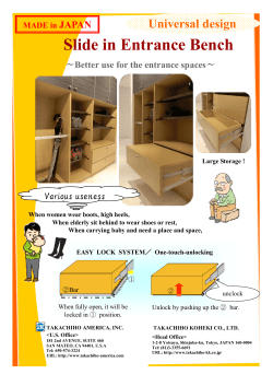


© Copyright 2026