
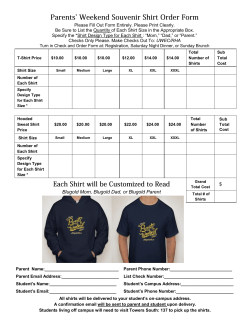
T-Shirt Making 101
T-Shirt Making 101
By Pat
I’ve had a number of people ask for some pointers on making team shirts and since this is
a little detailed for a dart night discussion, I wrote down some tips and tricks. I certainly
don’t claim to know everything there is to know about this but hopefully you can learn
some things from my mistakes.
So where do we start?
First, you need images to work with – high resolution scans, digital photos, heck if you’re
talented enough you could draw your own. Don’t worry too much about the overall
design just yet, armed with a general idea of what you’re looking for, just go search for
images. I mostly use Google Images and Clipart.com. See what you can find, the bigger
the image the better.
Now what?
Time to start designing. Don’t mess with your images yet – they’re going to need some
work (removing backgrounds, scaling up, replacing colors, etc) but until you know which
ones you’re going to use you’re wasting time. Just plug them into power point (or
something similar) where you can control the display order, move/resize things easily and
create ‘wordart’ (fancy text). Fiddle around with it until you’ve got something you like.
Things to keep in mind:
• It’s good to have a bounding shape, this gives you a solid line to trim your
transfer to, on a dark shirt this is critical (more on this later), a clear transfer on a
light shirt will also show the outline of the transfer paper but it’s not as obvious
and it’ll fade over time. I generally use dart boards or Underground logos (it’s
always nice to get in a plug for your sponsor) but anything will work. There are
some examples at the end.
• You can’t print white. There are two kinds of transfer paper, light t-shirt transfer
paper is clear and anything white will show up as the color of the shirt
underneath. Dark t-shirt transfers are a white sheet, anything not printed on will
be white (just like paper). The only drawback to using the dark transfers is that
they have a kind of ‘plasticy’ feel to them so it’s important to have a solid edge to
trim to. The color of the shirt has a tendency to bleed through clear transfers, so a
gray shirt will darken the colors applied on top of it.
• Do more than one design. Don’t spend a lot of time agonizing over details, just
bang’em out and let’em sit for a while. Come back and see which ones you like, I
generally end up pulling ideas from several of my first attempts for the final
version. It’s also nice to have a second opinion.
Fix your images
Image cleanup is an art you learn the hard way - I use paintshop and am by no means an
expert so I can only give you some general ideas.
• Remove the background, fiddle with colors, etc. Best to do this now before
reformatting the image. Get to know your magic wand (flood selection tool with
a color matching tolerance), used with flood fill this is a great tool for replacing
backgrounds or cleaning up speckles. Inverting and/or feathering the selection are
helpful too.
• Inevitably, the image you like the best will be too small and when you blow it up
to t-shirt size it comes out blurry and pixilated. Sometimes it’s just too small and
can’t be fixed, in which case you’ll have to use it on a pocket or something
instead of a big pic on the back. The texture of the shirt fabric will help hide a
little pixilation or blurriness - but not much. First thing to do is resize the image
in an image editor, go ahead and make it BIG, you can adjust the size in the
layout later. This will increase the number of pixels you have to work with but
won’t help the look of the image much, it’ll still be blocky. Next I use a tool
called ‘edge preserving smooth’ or ‘soften’ this gets rid of the blockiness (you
might have to smooth it several times) but makes the image blurry. The sharpen
tool will bring the details back out of the blurriness without bringing the old
pixilation with it, once again you’ll probably need to do this several times.
• Antialiasing – you see this option in a lot of image editing tools, feathering is a
similar option. What this does is blur the edges slightly so if you’ve replaced a
color or clipped something out it blends the colors together and gets rid of jagged
edges.
• Transparent images – set your transparent color and save the image as a gif, most
of the other image formats don’t support transparent colors.
Text
I like to do the text in power point – I know, I know, power point is for slide shows, not
for graphic design – but it’s easier (for me anyway) to resize things and combine images
at different resolutions in power point than in paintshop. I use wordart, pick your font
(something big and blocky) and play around with the fill settings. There are a ton of free
fonts out there, including fonts for most movies titles, tv shows, comic books, etc. Make
sure it’s big enough to read from a couple steps away (how close do you get when
reading someone else’s shirt?). Shadows, 3d effects and illumination effects will also
help make the text stand out – take your time, good looking text is key.
So much for the fun part
Now it gets to be work. After printing it on paper to make sure everything is the way you
like it, it’s time to print to the transfer paper. For clear transfers you need to print the
image reversed (mirrored) as it will be placed face down on the shirt, dark transfers print
just like regular paper since you put it on the shirt face up. I usually set my printer to
‘best quality’ so the transfer is nice and crisp, make sure to let it dry a little. Then grab
your scissors, sit in front of the tv and trim them out, this rapidly gets old but it’ll be
worth the effort. Oh – and most transfer paper is for ink jets, I don’t know if they make
them for laser printers or not (I doubt it).
Shirts
Part of the joy of making your own design is that blank t-shirts are cheap. I like ones
with pockets and they’re only about $5 apiece. You can go with nicer shirts if you like,
make sure they’re cotton or a poly blend and the texture is uniform. Herringbone patterns
etc won’t work, the raised part of the texture will bleed through. This is more of a
problem with dark transfers than with light ones. You can order shirts online if you need
special sizes or colors, I usually go to walmart and see what I can find. Wash them
before putting on your transfer, it’ll stick better.
Placement
You want all your shirts to be about the same, the image straight and centered between
the shoulders, it’s very easy to have your shirt twisted a little and end up with a crooked
design or a logo on your butt. I put on one of the shirts, hold the design where it looks
best and measure down from the seam of the collar (doesn’t have to be exact, for me it’s
usually about four fingers). Then fold the shirt in half and put a very light crease down
the center to use as a reference, the crease will iron out as you apply the transfer paper.
Ironing
Read the instructions and get a scrap to practice with, you only get one shot per shirt, this
stuff won’t peel off. The important thing here is that the image is getting heated from
both sides. I’ve got a piece of ¾” plywood with some laminate glued on it, it’s the
remains of an old crappy counter top but it’s awesome for reflecting heat – don’t use an
ironing board, it’s designed to disperse heat not reflect it, almost any other hard smooth
surface will work.
•
•
•
•
Drain ALL the water out of your iron (what, you mean there’s water in there?)
and set it almost all the way up. Put a pillow case under your shirt, it gives you
something to squish into when applying pressure and keeps the edge of the iron
from scraping.
Start with a light pass working from the center out to the edges to stick it in place,
then go over the whole thing slowly while applying pressure to melt it into the
shirt, paying special attention to the edges. Use the ironing times from the
instructions, keeping in mind that if you push too hard on a dark transfer the shirt
color will bleed through.
Remember, light transfers go face down, dark transfers go face up (after you peel
off the backing). LET IT COOL before removing the paper on top, for light
transfers this is the backing, for dark ones it’s a piece of parchment paper
included with the transfer. For dark transfers it’s best to use a piece of parchment
paper that’s bigger than your design, if the iron hits the plastic transfer…well, I’m
sure you get the idea. You can use baking parchment paper if you run out, it’s the
same stuff. Beware of reusing parchment paper, I’m not sure why but it causes
little bubbles in the transfer after it gets a little scorched, not spreading out the
heat enough I suppose.
Make sure there isn’t a pocket or another transfer directly under what you’re
ironing – another transfer will melt and pocket seams will show through.
Care
These are, after all, iron-ons, not professional silk screens and will show their age after a
season or two. It helps to turn them inside out before putting them into the wash and if
you feel the need to iron your t-shirts, do it lightly from the inside. I’ve been really
surprised at how well these hold up considering the cost of making them.
Examples
•
My first attempt, they were a little rough but I put them on Hawaiian shirts
(dark transfer paper) so they were *cool*.
Back:
•
Front:
Second effort, light transfer paper on a gray shirt. Had great fun with the
Underground logo/Greenie. Love the tongue. Greenie was on dark transfer
paper so his teeth, the letters and the sparkle on his tongue wouldn’t be gray.
Back:
Front:
•
Superheroes are fun to make shirts for, I found some great images. Dark
transfer, blue shirt. Did you know there are very few superheroes with
mustaches? Each hero has his own pocket. Note the highlighted five on the
dartboard – I went over the top on this one (and we won it all).
Back:
Front:
• This one’s a little more conservative, but as a light transfer on a white shirt it
came out great – the most professional looking one so far.
Back:
•
Front:
By request, I made one for the enemy… Dark transfer, black shirt with a
different monster on each pocket. Can you name five zilla monsters?
Back:
Front:
•
And finally, my latest effort. Light transfer, white shirt. Once again, finding
a good image made the design, wooly bully rocks (even after I blew him up
300%). Red circle, blue/white text is a nod to our sponsor (in case you didn’t
get it).
Back:
Front:
So there you have it, anybody can make a t-shirt and there’s plenty of free graphics out
there to work with. Office Max is a good source for transfer paper, walmart/target are hit
or miss, sometimes they don’t stock both kinds of transfers. If you need help
finding/cleaning up images, email me and I see what I can do – as for trimming and
ironing, you’re on your own…


© Copyright 2026