
The Greater Boston Housing Report Card 2014
U N D E R S T A N D I N G B O S T O N The Greater Boston Housing Report Card 2014-2015 Fixing an Out-of-Sync Housing Market Barry Bluestone Catherine Tumber Nancy Lee Alicia Sasser Modestino Lauren Costello Tim Davis with assistance from James Huessy William Reyelt Prepared by The Kitty and Michael Dukakis Center for Urban and Regional Policy Northeastern University for The Boston Foundation Edited by Rebecca Koepnick The Boston Foundation March 2015 The Boston Foundation, Greater Boston’s community foundation, is one of the largest community foundations in the nation, with net assets of some $1 billion. In 2014, the Foundation and its donors made more than $112 million in grants to nonprofit organizations and received gifts of nearly $112 million. In celebration of its Centennial in 2015, the Boston Foundation has launched the Campaign for Boston to strengthen the Permanent Fund for Boston, the only endowment fund focused on the most pressing needs of Greater Boston. The Foundation is proud to be a partner in philanthropy, with more than 1,000 separate charitable funds established by donors either for the general benefit of the community or for special purposes. The Boston Foundation also serves as a major civic leader, think tank and advocacy organization, commissioning research into the most critical issues of our time and helping to shape public policy designed to advance opportunity for everyone in Greater Boston. The Philanthropic Initiative (TPI), an operating unit of the Foundation, designs and implements customized philanthropic strategies for families, foundations and corporations around the globe. For more information about the Boston Foundation and TPI, visit tbf.org or call 617-338-1700. The Kitty and Michael Dukakis Center for Urban and Regional Policy at Northeastern University conducts interdisciplinary research, in collaboration with civic leaders and scholars both within and beyond Northeastern University, to identify and implement real solutions to the critical challenges facing urban areas throughout Greater Boston, the Commonwealth of Massachusetts, and the nation. Founded in 1999 as a “think and do” tank, the Dukakis Center’s collaborative research and problem-solving model applies powerful data analysis, a bevy of multidisciplinary research and evaluation techniques, and a policy-driven perspective to address a wide range of issues facing cities and towns. These include affordable housing, local economic development, workforce development, transportation, public finance, and environmental sustainability. The staff of the Dukakis Center works to catalyze broad-based efforts to solve urban problems, acting as both a convener and a trusted and committed partner to local, state, and national agencies and organizations. The Center is housed within Northeastern University’s innovative School of Public Policy and Urban Affairs. The Warren Group collects public record data on real estate sales and ownership throughout New England and offers a range of real estate products, information services and printed publications, including the weekly newspapers Banker & Tradesman and The Commercial Record. The company also produces and organizes trade shows and events for a variety of industries, including bankers, mortgage brokers, credit unions and lawyers. Based in Boston, the company was established in 1872 and is now in its fourth generation of family ownership and management. UNDERSTANDING BOSTON is a series of forums, educational events and research sponsored by the Boston Foundation to provide information and insight into issues affecting Boston, its neighborhoods, and the region. By working in collaboration with a wide range of partners, the Boston Foundation provides opportunities for people to come together to explore challenges facing our constantly changing community and to develop an informed civic agenda. Visit www.tbf.org to learn more about Understanding Boston and the Boston Foundation. Design: Kate Canfield, Canfield Design Cover Photo: Richard Howard, Richard Howard Photography © 2015 by the Boston Foundation. All rights reserved. Contents Letter from Paul Grogan. . . . . . . . . . . . . . . . . . . . . . . . . . . . . . . . . . . . . . . . . . . . . . . . . . . . . . . . . . . . . . . . . . . . . . . . . . . . . . . . . . . . . . . . 4 Executive Summary. . . . . . . . . . . . . . . . . . . . . . . . . . . . . . . . . . . . . . . . . . . . . . . . . . . . . . . . . . . . . . . . . . . . . . . . . . . . . . . . . . . . . . . . . . . . 5 CHAPTER ONE Introduction. . . . . . . . . . . . . . . . . . . . . . . . . . . . . . . . . . . . . . . . . . . . . . . . . . . . . . . . . . . . . . . . . . . . . . . . . . . . . . . . . . 11 CHAPTER TWO Greater Boston’s Demographic Revolution. . . . . . . . . . . . . . . . . . . . . . . . . . . . . . . . . . . . . . . . . . . . . . . . . . . . . 19 CHAPTER THREE Home Sales, Housing Production and Foreclosures in Greater Boston. . . . . . . . . . . . . . . . . . . . . . . . . . 29 CHAPTER FOUR Home Prices and Rents in Greater Boston. . . . . . . . . . . . . . . . . . . . . . . . . . . . . . . . . . . . . . . . . . . . . . . . . . . . . 43 CHAPTER FIVE Public Policy and Public Spending in Support of Housing. . . . . . . . . . . . . . . . . . . . . . . . . . . . . . . . . . . . . . . 55 CHAPTER SIX Toward a New Housing Policy. . . . . . . . . . . . . . . . . . . . . . . . . . . . . . . . . . . . . . . . . . . . . . . . . . . . . . . . . . . . . . . . . . 60 Endnotes . . . . . . . . . . . . . . . . . . . . . . . . . . . . . . . . . . . . . . . . . . . . . . . . . . . . . . . . . . . . . . . . . . . . . . . . . . . . . . . . . . . . . . . . . . . . . . . . . . . . . 65 APPENDICES APPENDIX A: Municipal Scorecard . . . . . . . . . . . . . . . . . . . . . . . . . . . . . . . . . . . . . . . . . . . . . . . . . . . . . . . . . . . . . . . . . . . . . . . . . . . . . . . 68 LIST OF FIGURES AND TABLES FIGURE 1.1 Annual Real GSP/GDP Growth Rates Massachusetts vs. U.S. 2009–2015. . . . . . . . . . . . . . . . . . . . . . . . . . . . . . . . . . . . . . . . 12 FIGURE 1.2 Total Non-Farm Employment: Seasonally-Adjusted Massachusetts 2009–2014. . . . . . . . . . . . . . . . . . . . . . . . . . . . . . . . . . . . 12 FIGURE 1.3 Civilian Unemployment Rate, Massachusetts 2009–2014. . . . . . . . . . . . . . . . . . . . . . . . . . . . . . . . . . . . . . . . . . . . . . . . . . . . . 13 FIGURE 1.4 Prime Age (Age 25–54) Employment Rate Massachusetts vs. U.S. 2008–2014. . . . . . . . . . . . . . . . . . . . . . . . . . . . . . . . . . . . . 13 FIGURE 1.5 Five-County Greater Boston Total Non-Farm Employment. . . . . . . . . . . . . . . . . . . . . . . . . . . . . . . . . . . . . . . . . . . . . . . . . . . 13 FIGURE 1.6 Percent Change in Private Sector Real Average Weekly Earnings Massachusetts 2001–2014. . . . . . . . . . . . . . . . . . . . . . . . . . 14 TABLE 1.1 Demographic Profile of Greater Boston 1990 – (2009–2013) . . . . . . . . . . . . . . . . . . . . . . . . . . . . . . . . . . . . . . . . . . . . . . . . . . . 15 FIGURE 1.7 Change in Greater Boston Population by Age Group 1990–2000 vs. 2000–(2009–2013). . . . . . . . . . . . . . . . . . . . . . . . . . . . . . 16 TABLE 1.2 Housing Cost Burden–Greater Boston . . . . . . . . . . . . . . . . . . . . . . . . . . . . . . . . . . . . . . . . . . . . . . . . . . . . . . . . . . . . . . . . . . . 17 FIGURE 1.8 Change in Share of Boston Families Across the Income Distribution 1990–2010. . . . . . . . . . . . . . . . . . . . . . . . . . . . . . . . . . . 18 FIGURE 2.1 Percent Change in Population for Greater Boston Municipalities 1950–1980. . . . . . . . . . . . . . . . . . . . . . . . . . . . . . . . . . . . . . 19 TABLE 2.1 U.S. Household Size 1950–2010. . . . . . . . . . . . . . . . . . . . . . . . . . . . . . . . . . . . . . . . . . . . . . . . . . . . . . . . . . . . . . . . . . . . . . . . . 20 FIGURE 2.2 Percent Change in Population by Greater Boston County, Age 0–19 2000–2010 . . . . . . . . . . . . . . . . . . . . . . . . . . . . . . . . . . . 21 TABLE 2.2 Household Size in Greater Boston Counties (2009–2013). . . . . . . . . . . . . . . . . . . . . . . . . . . . . . . . . . . . . . . . . . . . . . . . . . . . . 21 FIGURE 2.3 Percent Change in Population by Greater Boston County, Age 20–34 2000–2010. . . . . . . . . . . . . . . . . . . . . . . . . . . . . . . . . . . 21 FIGURE 2.4 Percent Change in Population by Greater Boston County, Age 35–64 2000–2010. . . . . . . . . . . . . . . . . . . . . . . . . . . . . . . . . . . 22 FIGURE 2.5 Percent Change in Population by Greater Boston County, Age 65+ 2000–2010 . . . . . . . . . . . . . . . . . . . . . . . . . . . . . . . . . . . . 22 FIGURE 2.6 Small Households (1–2 Persons) as Percent of All Households vs. Multi-unit Housing as a Share of All Housing Units in Greater Boston (2009–2013). . . . . . . . . . . . . . . . . . . . . . . . . . . . . . . . . . . . . . . . . . . . . . . . . . . . 23 FIGURE 2.7 Percent Change in Population by Age Group, Boston 1990–2000 vs. 2000–2010 . . . . . . . . . . . . . . . . . . . . . . . . . . . . . . . . . . . 23 FIGURE 2.8 Percent Change in Population by Age Group, Cambridge 1990–2000 vs. 2000–2010. . . . . . . . . . . . . . . . . . . . . . . . . . . . . . . . 24 FIGURE 2.9 Percent Change in Population by Age Group, Newton 1990–2000 vs. 2000–2010 . . . . . . . . . . . . . . . . . . . . . . . . . . . . . . . . . . 24 FIGURE 2.10 Percent Change in Population by Age Group, Somerville 1990–2000 vs. 2000–2010 . . . . . . . . . . . . . . . . . . . . . . . . . . . . . . . . 24 FIGURE 2.11 Net Domestic Migration Greater Boston and Massachusetts, 2001–2013. . . . . . . . . . . . . . . . . . . . . . . . . . . . . . . . . . . . . . . . . 25 FIGURE 2.12 Annual Net Migration Rates by Age Group as Percent of Population Greater Boston 2007–2012. . . . . . . . . . . . . . . . . . . . . . 25 FIGURE 2.13AOne Year Net Migration Rates by Age Group as Percent of Population, Suffolk County 2007–2012. . . . . . . . . . . . . . . . . . . . 26 FIGURE 2.13B One Year Net Migration Rates by Age Group as Percent of Population, Middlesex County 2007–2012 . . . . . . . . . . . . . . . . . 26 FIGURE 2.14AAverage Annual Net Migration Rate for Age 18–24 Cohort by Greater Boston County 2007–2012. . . . . . . . . . . . . . . . . . . . . 26 FIGURE 2.14B Average Annual Net Migration Rate for Age 25–34 Cohort by Greater Boston County 2007–2012. . . . . . . . . . . . . . . . . . . . . 26 FIGURE 2.15 Projected Change in Number of Metro Boston Households by Age of Householder 2010–2030 . . . . . . . . . . . . . . . . . . . . . . 27 FIGURE 2.16 Projected Increase in Number of Metro Boston Households by Household Size 2010–2030. . . . . . . . . . . . . . . . . . . . . . . . . . 28 FIGURE 3.1 Annual Number of Sales of Single-Family Homes in Five-County Greater Boston Region 2000–2014. . . . . . . . . . . . . . . . . . 30 FIGURE 3.2 Annual Number of Sales of Condominiums in Five-County Greater Boston Region 2000–2014. . . . . . . . . . . . . . . . . . . . . . . 30 FIGURE 3.3 Annual Number of Sales of Homes in Two-Unit and Three-Unit Structures in Five-County Greater Boston Region, 2000–2014 . . . . . . . . . . . . . . . . . . . . . . . . . . . . . . . . . . . . . . . . . . . . . . . . . . . . . . . . . . . . . . . . . . . . . . 31 TABLE 3.1A Municipal Leaders in Single-Family Home Sales in Greater Boston, 2010–2014 (est) . . . . . . . . . . . . . . . . . . . . . . . . . . . . . . . 32 TABLE 3.1B Municipal Leaders in Sales of Condominiums in Greater Boston, 2010–2014 (est) . . . . . . . . . . . . . . . . . . . . . . . . . . . . . . . . . 32 FIGURE 3.4 Number of Housing Permits Issued in Greater Boston 2000–2014 . . . . . . . . . . . . . . . . . . . . . . . . . . . . . . . . . . . . . . . . . . . . . 33 FIGURE 3.5 Number of Housing Units Permitted in Five-County Greater Boston Region, by Structure Type 2000–2014. . . . . . . . . . . . . 34 TABLE 3.2 Single-Family and Multifamily Building Permits in Greater Boston, 2000–2014. . . . . . . . . . . . . . . . . . . . . . . . . . . . . . . . . . . 34 TABLE 3.4A Municipalities Adding the Most New Housing Units in 2014 and 2010–2013 TABLE 3.4B Municipalities Adding the Most New Single-Family Homes in 2014 and 2010–2013 . . . . . . . . . . . . . . . . . . . . . . . . . . . . . . . 36 TABLE 3.4C Municipalities Adding the Most New Units in 5+ Structures in 2014 and 2010–2013 . . . . . . . . . . . . . . . . . . . . . . . . . . . . . . . 36 TABLE 3.4D Permitting by Housing Type for Five Greater Boston Counties, 2013–2014. . . . . . . . . . . . . . . . . . . . . . . . . . . . . . . . . . . . . . . 37 TABLE 3.5 Housing Units Constructed in Chapter 40R Smart-Growth Districts in Massachusetts. . . . . . . . . . . . . . . . . . . . . . . . . . . . . . 38 TABLE 3.5 Summary. . . . . . . . . . . . . . . . . . . . . . . . . . . . . . . . . . . . . . . . . . . . . . . . . . . . . . . . . . . . . . . . . . . . . . . . . . . . . . . . . . . . . . . . . . 39 TABLE 3.6A Municipal Leaders in Foreclosures on Single Home Sales in Greater Boston, 2010–2014 . . . . . . . . . . . . . . . . . . . . . . . . . . . . 40 Municipal Leaders in Foreclosures on Homes in Three-Unit Structures in Greater Boston, 2010–2014. . . . . . . . . . . . . . . . . . 40 TABLE 3.6C Municipal Leaders in Foreclosures on Condominiums in Greater Boston, 2010–2014. . . . . . . . . . . . . . . . . . . . . . . . . . . . . . . 40 FIGURE 3.6 Annual Number of Foreclosure Deeds in Single-Family Homes in Five-County Greater Boston Region, 2000–2014. . . . . . . 41 FIGURE 3.7 Annual Number of Foreclosure Petitions in Single-Family Homes in Five-County TABLE 3.6B Greater Boston Region, 2000–2014 . . . . . . . . . . . . . . . . . . . . . . . . . . . . . . . . . . . . . . . . . . . . . . . . . . . . . . . . . . . . . . . . . . . . . . FIGURE 4.1 41 Annual Percent Change in Case-Shiller Single-Family Home Price Index, Greater Boston Metropolitan Area, 1987–2014 . . . . . . . . . . . . . . . . . . . . . . . . . . . . . . . . . . . . . . . . . . . . . . . . . . . . . . . . . . . . . 44 FIGURE 4.2 Homeowner Vacancy Rates, Greater Boston vs. U.S. Metro Areas 1990–2014 . . . . . . . . . . . . . . . . . . . . . . . . . . . . . . . . . . . . . 45 FIGURE 4.3 Annual Median Price of Single-Family Homes in Five-County Greater Boston Region 2000–2013. . . . . . . . . . . . . . . . . . . . . 45 FIGURE 4.4 Greater Boston Housing Cycles, 1988–1997 vs. 2005–2014 Case-Shiller Single-Family Home Price Index . . . . . . . . . . . . . . . 46 FIGURE 4.5 Annual Median Price of Condominiums in Five-County Greater Boston Region 2000–2014 . . . . . . . . . . . . . . . . . . . . . . . . . 47 FIGURE 4.6 Ratio of Condominiums to Single-Family Home Prices in Five-County Greater Boston Region 2000–2014. . . . . . . . . . . . . . 47 FIGURE 4.7 Annual Median Price of Homes in Two-Unit and Three-Unit Structures in Five-County Greater Boston Region, 2000–2014. . . . . . . . . . . . . . . . . . . . . . . . . . . . . . . . . . . . . . . . . . . . . . . . . . . . . . . . . . . . . . . . . . . . . . . . . . . . . 48 FIGURE 4.8 Boston Metro Area Rental Vacancy Rates 2000–2014:Q3 . . . . . . . . . . . . . . . . . . . . . . . . . . . . . . . . . . . . . . . . . . . . . . . . . . . . . 49 FIGURE 4.9 Average Annual Asking Rent and Effective Rent in Greater Boston 2000–2014:Q3. . . . . . . . . . . . . . . . . . . . . . . . . . . . . . . . . 49 FIGURE 4.10 Average Monthly Effective Rents in Selected U.S. Metro Areas, 2014:Q3. . . . . . . . . . . . . . . . . . . . . . . . . . . . . . . . . . . . . . . . . 50 TABLE 4.1 Boston Point-in-Time Homeless Census, Results for Adults. . . . . . . . . . . . . . . . . . . . . . . . . . . . . . . . . . . . . . . . . . . . . . . . . . . 51 TABLE 4.2 Boston Point-in-Time Homeless Census, Results for Number of Families. . . . . . . . . . . . . . . . . . . . . . . . . . . . . . . . . . . . . . . . 51 TABLE 4.3 Boston Point-in-Time Homeless Census, Results for Number of Persons in Families. . . . . . . . . . . . . . . . . . . . . . . . . . . . . . . 51 FIGURE 4.11 Percentage of Persons Living in Poverty That Are NOT Served by HUD Housing Programs, 2013. . . . . . . . . . . . . . . . . . . . 52 FIGURE 4.12 Percentage of Total Housing Units in HUD Housing Programs, 2013. . . . . . . . . . . . . . . . . . . . . . . . . . . . . . . . . . . . . . . . . . . 52 FIGURE 4.13 Average Number of Months on a Waiting List for a HUD Housing Program, 2013. . . . . . . . . . . . . . . . . . . . . . . . . . . . . . . . . 53 FIGURE 4.14 Percentage of Subsidized Housing Households Where the Head of Household is Within the Following Age Groups, 2013. . . . . . . . . . . . . . . . . . . . . . . . . . . . . . . . . . . . . . . . . . . . . . . . . . . . . . . . . . . . . . . . . . . . . . . . . . . 53 FIGURE 4.15 Majority Income Sources for HUD Housing Program Participants, 2013. . . . . . . . . . . . . . . . . . . . . . . . . . . . . . . . . . . . . . . . . 54 TABLE 5.1 Sources of New Housing Production, 2010–2030. . . . . . . . . . . . . . . . . . . . . . . . . . . . . . . . . . . . . . . . . . . . . . . . . . . . . . . . . . . 55 FIGURE 5.1 DHCD State-Supported Operating Funds (FY2014 $), FY1989–FY2015. . . . . . . . . . . . . . . . . . . . . . . . . . . . . . . . . . . . . . . . . . 57 FIGURE 5.2 Total Real Federal Spending (FY2014 $), FY1989–FY2015. . . . . . . . . . . . . . . . . . . . . . . . . . . . . . . . . . . . . . . . . . . . . . . . . . . . . 58 FIGURE 5.3 Total Real DHCD Spending (FY2014 $), Including Federal Share and ARRA, FY1989–FY2015 . . . . . . . . . . . . . . . . . . . . . . . 59 Letter Dear Friends, During this, the Boston Foundation’s Centennial year, we are reflecting on the role the Foundation has played in the life of this city, including its long and deep history in the housing arena in Boston. Beginning in the 1960s, it made critical early grants to community development corporations, such as South End Community Development, today called The Community Builders, one of the largest nonprofit developers in the country. The Foundation also played a central role in establishing the Boston office of Local Initiatives Support Corporation (LISC). Since 2001, the Foundation has been serving not only as a grant maker but also as a civic leader. Through our Understanding Boston model, we support leading-edge research into issues affecting Boston, its neighborhoods and the region—sharing the results of that research in a series of open forums. One of the very first reports we published was the 2002 Greater Housing Report Card, researched and written by Barry Bluestone, Director of Northeastern University’s Kitty and Michael Dukakis Center for Urban and Regional Policy. That first Report Card spawned the creation of the Commonwealth Housing Task Force, which was convened by the Boston Foundation as a coalition of business leaders, housing advocates and other civic leaders committed to addressing the housing crisis in the state. The Task Force played a major role in passing Smart Growth Housing legislation—Chapter 40R and Chapter 40S—which have led to the development of more than 12,000 units of new housing in the Commonwealth. This is the 12th Housing Report Card prepared by Barry and his team of experts, informed by data from The Warren Group. It covers 2014 and the early months of 2015 and offers a clear and compelling presentation of where we stand today. Like past reports, it provides an analysis of housing volume and construction starts, home prices, rents and government policies that affect Greater Boston’s housing market. But it also offers an analysis of a “demographic revolution” taking place in our city. Aging baby boomers as well as young millennials, the two fastest growing segments of our population, are seeking just the kind of housing our community is not providing or currently planning to provide in sufficient quantities, despite ambitious plans by the City of Boston and the Commonwealth: affordable condos and apartments in multi-unit buildings in the locations these two groups want to live. In other words, the housing that exists and that is being planned is out of sync with the needs of today and the future. This report card also draws attention to a serious challenge facing all residents of Greater Boston, especially those living in poverty. Individuals and families are paying a higher and higher percentage of their income on housing—a situation that simply must change in order to give everyone the chance to succeed and thrive in our community. How we proceed from where we stand today in response to this demographic revolution and the forces that are squeezing too many people out of the housing market, will have powerful consequences for our city and our region. Thanks to Barry Bluestone’s leadership, we have an insightful and thoughtful analysis of the current landscape and a series of powerful recommendations to lead us into the future. Paul S. Grogan President and CEO The Boston Foundation 4 U n d e r s t a n d i n g B o s t o n Executive Summary From its inception in 2002, the Greater Boston Housing Report Card has chronicled a remarkable period that saw housing prices soar and then plummet during the Great Recession, only to rise again with the region’s economic recovery. During the past five years, prices and rents have increased to the point where housing costs as a share of income have increased sharply for a growing proportion of the region’s households. This 12th report in the series opens a new chapter in our housing studies, one that assigns a central role to demographic change. In brief, our analysis of the data reveals that Greater Boston is not only experiencing a serious housing shortage, but also an escalating mismatch between the type of available housing and the type of housing most desired by its two fastest growing demographic clusters: aging baby boomers and young millennials. With the metro economy robust and growing, the local housing market is increasingly “out of sync” with demand. As a result, where young millennials are making due by doubling up and tripling up in multi-unit housing in Boston and its nearby communities, working families for which such housing was originally built are being squeezed out. Many aging baby boomers are seeking smaller housing units, but finding it difficult to locate such units at affordable prices in the communities where they have lived for much of their adult lives. Like past reports, the current Greater Boston Housing Report Card analyzes housing volume and construction starts, home prices and rents, and federal, state, and local government policies that affect the five- county region’s housing market. This year’s report also furthers an analysis introduced in 2013: an assessment of local zoning regulations that play a critical role in the development — or lack thereof — of housing units consistent with economic and demographic projections for the region. T h e G r e a t e r B o s t o n H o u s i n g R e p o r t C a r d The Current State of the Greater Boston Economy The Commonwealth’s recovery from the Great Recession of 2007–2009 has been as strong, if not stronger, than the nation as a whole. Despite some wobble in 2013, by November of 2014 the state’s unemployment rate stood at 5.8 percent — down from 9.5 percent in 2010. This is all the more impressive given that the state’s labor force grew at more than twice the rate of the United States as a whole, adding new participants to the region’s job market. Thanks to its growing life sciences, information technology, health care, financial services, and higher education sectors, Greater Boston performed even better, with a 4.7 percent unemployment rate by November 2014. After a long period of stagnation, real average weekly earnings also improved, increasing by 3.8 percent during the first half of 2014 — the largest increase since at least 2002. Yet despite Greater Boston’s economic recovery, the area’s high cost of living — led by housing and health care — has steadily eroded the real standard of living for nearly all but the affluent. The share of homeowners who are “cost burdened” — spending more than 30 percent of their income on housing — has skyrocketed from less than 27 percent in 2000 to more than 38 percent now. Over the same time period, the number of cost burdened renters has increased from 39 percent to more than 50 percent. And more than a quarter of renters are now spending more than half their income on rent alone — up from 18 percent in 2000. A Third Demographic Revolution At the same time that the economy is recovering, Greater Boston is in the midst of a demographic revolution every bit as consequential for the region’s housing market as the two that preceded it. From 1880 through 1920, the City of Boston more than doubled in population, from 363,000 residents to 748,000, as a result of both annexation and the great wave of immigration from Europe. To accommodate these newcomers, developers in the city and its surrounding 2 0 1 4 - 2 0 1 5 5 communities constructed various forms of small multi- unit housing, most notably the classic “triple-decker,” which provided an economical means of housing thousands of working families. Even today, two-to-four unit structures comprise a large portion of the local housing stock — nearly 35 percent in Cambridge, 39 percent in Boston, and nearly half or more in Watertown and Somerville. The second great era of housing construction began after World War II to accommodate returning veterans who were forming families and raising an unprecedented number of children who would become known as baby boomers. Consisting of mostly single-family houses on quarter-acre lots far from the urban core — a settlement pattern made possible by the GI Bill and the new interstate highway system — the suburbs became home to many of these young boomers. The great exodus to the suburbs led to population loss and poverty in the urban core, where African-Americans and other minorities, barred from housing and jobs in the suburbs, remained. Between 1950 and 1980, the population of the City of Boston fell from 801,000 to fewer than 563,000, while the number of residents in Lexington, for example, grew by more than 70 percent and Burlington’s population soared ten-fold. Now, with the core cities of Greater Boston attracting young millennials, and aging suburban baby boomers seeking housing more appropriate to their status as empty-nesters, smaller housing units in both urban and suburban areas are becoming fashionable. Yet Boston and the region’s core cities have an undersupply of multi-unit housing while suburban communities increasingly have an oversupply of single-family housing. As such, the region is on a collision course with shifting demographic techtonics that will continue at least until 2030. Between 2010 and 2030, demographic projections suggest that Greater Boston will be home to 138,000 additional single-person households, 156,000 households with no more than three persons, but only 22,000 larger households of four or more persons. The evolving housing mismatch can be described briefly as follows: ■■ With the large baby boom generation born between 1946 and 1964 aging, many are looking to downsize their housing by either “aging in place” in smaller suburban living accommodations or moving to smaller urban living quarters. 6 ■■ Many in the millennial generation born between 1981 and 2000 are seeking to live in urban neighborhoods in Boston and nearby municipalities and find they can do so by doubling up or tripling up with roommates in order to afford rental housing now soaring in price. ■■ The baby bust generation, born between 1965 and 1980 and at least 20 percent smaller than the millennial cohort, is providing a market for suburban single-family housing as it goes through (delayed) child-rearing, but their numbers are unlikely to be large enough to absorb the existing supply of suburban single family homes that aging baby-boomers may put on the market plus the number of new single-family homes under construction. ■■ Working middle-class families are increasingly being priced out of the region’s rental and homeowner market by millennials who are outbidding them for the older stock of duplexes and triple-deckers. ■■ Low-income households, often facing gentrification pressure, are increasingly finding themselves with excessive housing cost burdens and the potential for homelessness. Data on household size confirm these demographic trends. While U.S. average household size has declined significantly, from 3.37 persons in 1950 to 2.58 in 2010, county-level data suggests that the decline has been much more acute in Greater Boston. Nearly 30 percent of the area’s housing units are now home to a single individual with 60 percent of all housing units having no more than two persons. Only 23 percent of the region’s housing units have four or more people living in them. While average household size has declined and Greater Boston’s population continues to age, its housing stock beyond Suffolk County remains dominated by the single-family home. Meanwhile, demand for multi-unit housing in all five counties has risen among aging baby boomers, millennials, working families, and low-income households. Once the baby- bust generation passes through its child-rearing years, the demand for this type of smaller housing will likely be even greater. Clearly, the Greater Boston housing market must now plan for what will be an extraordinary shift in housing demand. Unfortunately, the cost of construction and zoning restrictions throughout the region make it exceptionally difficult to synchronize housing supply with housing demand. U n d e r s t a n d i n g B o s t o n Greater Boston’s Housing Volume and Pricing Over the past four years, we have been guardedly optimistic about the regional housing market’s return to health. Housing construction has increased and there has been a welcome shift toward the production of multi-unit housing. But over the past year, the volume of new production and price data give us cause for concern once again. For the first time since 2008, the number of permits for new housing units in Greater Boston has declined from the previous year even as the region’s population has grown. Permitting data provides evidence that developers are neither keeping up with demand nor building the right variety of housing in sufficient volume. Single-family housing starts are on the rise again, while multifamily and condominium construction plans are flagging. Of particular concern, permits for five-plus-unit building dropped by 6.2 percent over the past year. Developers could reduce spiraling price pressure in older family-size multi-unit structures, now kept as lucrative rentals to serve undergraduates, graduate students, medical interns and residents, and other millennials, by building a higher volume of smaller units for those now bunking together in large apartments, but they are not doing so in anywhere near sufficient numbers at prices these young adults can afford. Foreclosures and foreclosure petitions have also risen slightly, after being held up by a brief period of procedural revision, although we do not expect that foreclosure rates will return to post-housing-bust levels. The one bright light is evidence of mounting plans for 40R Smart Growth Overlay Districts — after a shaky recession-related start. Under 40R developers are now building a relatively significant number of appropriate multi-unit structures. This year’s report also touches on the geography of housing, uncovering two evolving trends. First, single-family home sales have been declining in the more affluent, closer-in communities, such as Newton and Needham, while rising by double-digits in lower price communities like Lynn and Lowell. The decline of single-family home sales in more affluent communities combined with sharp sales increases in most poorer Gateway Cities suggests that younger T h e G r e a t e r B o s t o n H o u s i n g R e p o r t C a r d families, particularly those that have suffered stagnating incomes, are being pushed farther afield from Boston to find affordable homeownership. Second, condo sales continued to decline for the third straight year in downtown Boston and in Brookline, and fell to their lowest level in five years in Cambridge — three communities with extraordinarily high condo prices. In contrast, condo sales rose in Somerville, Dorchester, Quincy, and Salem — communities with more modestly priced units. Younger families and empty-nesters are apparently opting to buy in communities where condo prices are not as far above their price range. Our analysis of home prices, rents, and vacancy rates reveals that housing prices continue to rise throughout much of Greater Boston, which already has the third highest metro-area-wide rents in the country. But we have identified significant disparities in price pressure by housing type. Single-family home prices, while almost back to pre-recession levels, are flattening in nearly all but the most affluent Boston neighborhoods and suburbs and in gentrifying Boston neighborhoods. By contrast, rising prices in multi-unit buildings and condos show no sign of abating, with the condo unit to single-family home price ratio standing at 88 percent — a 20 percentage point rise since 2000. This price rise is also reflected in effective rents, which rose 17.3 percent between 2009 and the third quarter of 2014. With rental vacancy rates remaining near 4 percent, considerably below the 5.5 percent rate needed for a balanced rental housing market, rents will continue to rise due to insufficient rental housing supply and the number of young households unable to make the transition to ownership. We also expect that, in the absence of plans to build significantly more rental housing, moderateand low-income families will continue to bear the brunt of Greater Boston’s housing crisis. The rise in condo prices and rents combined with slower appreciation in the price of single-family homes provides the clearest evidence of how housing supply and housing demand in Greater Boston is increasingly out of sync. How Public Policy Can Address Greater Boston’s Housing Mismatch Greater Boston’s housing crunch has hardly gone unnoticed by state and local political leadership. Former Governor Deval Patrick, former Boston Mayor Tom Menino, and the city’s new Mayor Marty Walsh 2 0 1 4 - 2 0 1 5 7 have proposed ambitious plans for meeting the housing needs of the state and the city. Mayor Walsh, for example, calls for building 53,000 units of housing by 2030 in a mix that includes subsidized moderate-and low-income housing, and preserves most privately owned affordable rental units. On the state level, a Transformative Development fund has been created to incentivize mixed-use development in Gateway Cities, and the Department of Housing and Community Development (DHCD) has absorbed the Department of Transitional Assistance, streamlining operations and freeing up funds for homeless assistance. The state has also provided new funding streams for the Chapter 40R and Compact Neighborhood programs, making it possible for developers to build houses on smaller lots and dense, multi-unit housing. Nonetheless, the homelessness numbers are grim. A large portion of the approximately 10 percent of Greater Boston residents living at or below the poverty line (21 percent in Suffolk county) is not receiving state or federal assistance and is thus forced onto the private rental market; their applications for public housing or federal vouchers land on waiting lists for two full years on average. While current planning for new housing is commendable, we propose several policy approaches to the four out-of-sync “housing segments” we have identified. ■■ With a large and growing undergraduate, gradu- ate, and young adult working population in need of rental housing, we propose building 10,000 or more small apartments and “micro” units of housing in a new form we call millennial villages. With shared common living space, ground floor amenities, and proximity to public transit, these developments aimed at young millennials would alleviate much of the market pressure currently exerted on two-to- four unit structures and multi-unit buildings, freeing them up for working families at more affordable rents. We need to create a broad coalition of architects, developers, construction firms, the building trades, and universities and medical institutions to work with local and state governments to construct this new form of housing. ■■ Working families would also benefit from building smaller, more appropriate “starter homes” in suburban communities. This requires two types of zoning reform. One involves reducing minimum lot sizes, which lowers the cost of land for new development. The other involves more widespread use of Chapter 8 40R districts that promote greater density and Chapter 40S, which provides additional state aid for local schools in Chapter 40R districts in the interest of easing community fears over the cost of educating more children. The state should market these programs more aggressively. ■■ The population in Massachusetts is aging faster than in other parts of the country, we need to find ways of accommodating aging baby boomers’ housing needs as they downsize from single-family homeownership. For many of these empty-nester couples and an increasing number of older singles, multifamily condominium and rental units could meet that need, as could accessory apartments in single- family homes with or near loved ones. Here again, zoning reform is called for. Many communities ban multi-unit apartment buildings and accessory apartments while other regulations make it difficult for developers to construct such housing. For many years, there have been no permits issued for multi-family housing in the vast majority of Greater Boston’s communities. To induce such permitting, we stand by three important programmatic enhancements identified in our 2013 housing report card: enactment of Chapter 40R Smart Growth Overlay Zoning, high-density “cluster development” zoning, and inclusionary zoning by-laws that require developers to set aside 10 to 20 percent of new units in large projects for prices affordable to low-and moderate-income households. ■■ Particularly at risk are a high proportion of cost- burdened 65+ seniors who live in Boston rental properties or cannot stay ahead of upkeep, taxes, and utilities for homeownership on fixed incomes. With the aging of the baby boom generation, the number of cost-burdened older households will rise by an estimated 56 percent by 2020, requiring an additional 22,400 units of new affordable housing for this demographic alone. Major advocacy for increased funding is needed at both the state and federal level — the latter of which has cut the Section 202 HUD affordable housing program and slashed the Community Development Block Grant program by a third since 2005. Although the City of Boston has done a reasonably good job of supplying more than half of its senior renters with subsidized housing, it should consider offering city-owned land and abandoned buildings to developers for the production of new, more affordable housing for them. For U n d e r s t a n d i n g B o s t o n its part, the Commonwealth could do much more to encourage communities near Boston to adopt 40R regulations and encourage communities to meet their Chapter 40B obligations of providing at least 10 percent affordable housing stock. Conclusions Based on our analysis of the available evidence, we cannot stress strongly enough how critical it is for for-profit and nonprofit developers, policy and civic leaders, and banking institutions to pivot away from their longstanding focus on single-family housing. The good news is that Greater Boston’s economy is thriving, driven by the life sciences, health care, financial services, and higher education sectors. As a result, young millennials want to live here again and are doing so in greater numbers, with a strong preference for walkable, transit-serviced urban neighborhoods in or near Boston. The bad news is that we do not know where to put them without displacing an ever larger number of working families. Moreover, rising rents are leading to greater instances of homelessness, while baby boomers aging out of their single-family suburban homes find it increasingly difficult to locate affordable smaller units either in the suburban communities where they now live or in the city. In sum, Greater Boston has entered a third demographic revolution. This one is led not by massive immigration as in the first, or the rise of predominantly white postwar suburban settlements as in the second. Instead it is shaped by the needs and preferences of our two fastest growing generational cohorts: aging baby boomers and young adult millennials. Greater Boston’s housing market is already out of sync with demand and is undermining the housing security of low-income working families. To temper soaring housing costs, we must build not only more housing but the right types: small multi-unit housing for millennials in our urban neighborhoods and multi-unit housing for baby boomers in the suburbs. Correcting our overpriced, mismatched housing stock will require a whole new level of political will and economic imagination. T h e G r e a t e r B o s t o n H o u s i n g R e p o r t C a r d 2 0 1 4 - 2 0 1 5 9 CHAPTER ONE Introduction Since the 2002 release of the original Greater Boston Housing Report Card, each of its eleven editions has been devoted to an exploration of data related to the region’s housing market focusing on home sales, production, prices, rents, affordability, and developments in local, state, and federal housing policy. The current report maintains this tradition but this time focuses on a remarkable set of demographic and economic trends that already has begun to fundamentally alter the housing landscape in Greater Boston and which will continue to transform housing demand through at least 2030. Many of the region’s baby boomers will be retiring and new workers will be needed to fill vacant positions. Will these new workers be able to find appropriate and affordable housing in the region? Many of the now empty-nester baby boomers will likely want to downsize from their large single-family homes in the suburbs but not necessarily move out of the communities where they have lived for years. Will there be appropriate housing for them? Planning and implementing a strategy to meet the rapidly changing demand for housing based on the new demography and strengthening economy of Greater Boston will require concerted action in both the core cities and the suburbs of the region. Governor Deval Patrick recognized a number of these demographic and economic trends during his second term (2010–2014) and called for an accelerated response to the Commonwealth’s housing needs. Two years ago, the Governor called for the production of 10,000 units of new multifamily housing each year through 2020 to meet the expected demand for apartments and condominiums. More recently, Mayor Marty Walsh’s housing task force issued its seminal report Housing a Changing City: Boston 2030 which calls for a comprehensive strategy to address the future housing needs of the city that in fifteen years could be home to more than 700,000 residents — 50,000 more than at present and demographically different in profound ways from today’s population. Municipalities throughout the region will also experience dramatic changes in the age distribution of their populations making it necessary T h e G r e a t e r B o s t o n H o u s i n g R e p o r t C a r d for virtually every community in Greater Boston to consider new approaches to housing in order to meet the needs of their current and future residents. Past reports have suggested that the region produced less housing than needed leading to an explosion in home prices and rents. The new demographic and economic data suggest that not only is the sheer number of new housing units inadequate to meet housing demand, but the type of housing that dominates the region is “out of sync” with what its population will increasingly need. To illuminate the demographic changes altering Greater Boston’s housing landscape, this report will consider four distinct “housing market segments” representing four demographic groups, each facing its own housing problem and requiring its own public policy responses. ■■ Young millennials who are settling in dense urban neighborhoods in Boston and in its surrounding municipalities ■■ Working families who increasingly are being priced out of the region’s rental and homeowner market ■■ Aging baby boomers, many of whom are looking to remain in the communities where they have lived for decades but wish to move into smaller housing units ■■ Low-income households who increasingly find themselves facing excessive housing burdens and the potential for homelessness In most markets, when demand increases or tastes change, firms alter what they produce and how much of it. The demand for smaller fuel-efficient cars, for example, was met by an influx of foreign imports when Detroit failed to produce what customers wanted in the wake of the early 1970s oil crisis. Ultimately, the U.S. auto industry’s failure contributed to the Motor City’s current plight. Because of the high cost of producing new housing in the Greater Boston market and because of zoning and building code restrictions placed on new construction in most of the region’s 2 0 1 4 - 2 0 1 5 11 6% FIGURE 1.1 FIGURE 1.2 Annual Real GSP/GDP Growth Rates Massachusetts vs. U.S. 2009–2015 Total Non-Farm Employment: Seasonally-Adjusted Massachusetts 2009–2014 3,450,000 U.S. Massachusetts 5.4% 3,412,300 3,400,000 5% 3,358,100 3.8% 4% 3% 2.7% 3.4% 3.1% 3.0% 2% 3,350,000 3.7% 3.0% 2.5% 1.7% 3,310,000 3,300,000 3,256,500 3,250,000 1.6%1.7% 3,200,000 1% 3,204,100 3,217,300 0.4% 3,150,000 0% -0.2% -1% 3,100,000 2009 2010 2011 2012 2013 2014 2015: Jan-June (Projected) Source: Mass Benchmarks; World Bank cities and towns, developers face substantial barriers in their attempts to match housing supply to changing housing demand. The resulting undersupply and housing mismatch will have to change. To that end, this report concludes with a list of suggestions for new housing policy to help meet the particular housing needs of these four demographic groups. The Massachusetts Economy But first, let us consider the state of the Massachusetts economy and the Greater Boston region comprising Essex, Middlesex, Norfolk, Plymouth, and Suffolk counties. All continued to expand at a modest to strong pace during 2014, outpacing the U.S. in terms of overall economic growth thanks to strong performance in such key sectors as information, education, health care, and financial services. Since 2009, growth in the Commonwealth’s real Gross State Product (GSP) has outpaced national GDP by a fair margin as shown in Figure 1.1. During the past two years, both the Massachusetts and U.S. economies have returned to reasonably healthy growth after a weak performance in 2012. According to estimates from MassBenchmarks, when the final calendar 12 2009 2010 2011 2012 2013 2014 Source: U.S. Bureau of Labor Statistics year data are released, real gross domestic product is projected to have expanded at an annual rate of 3.4 percent in Massachusetts in 2014 compared to 2.5 percent for the nation. Going forward, economic growth is projected to accelerate to better than a 5 percent annual growth rate in Massachusetts during the first half of 2015 — although the rate may be affected by the harsh winter the state has experienced. This relatively healthy economic growth has made Massachusetts a prime location for young workers who now have a strong reason to remain here or to migrate here from other regions. Employment data confirm the strengthening of the Massachusetts economy and its labor market appeal. As Figure 1.2 reveals, total seasonally-adjusted employment in Massachusetts has risen steadily since 2009. In 2014 alone, employment in information services grew by 8.5 percent; in education and health by 2.5 percent, and in financial services by 2.2 percent.1 According to the latest New England Economic Partnership (NEEP) projections, job growth in Massachusetts is expected to accelerate a bit more in 2015 and 2016 and then fall off as baby boomers exit the labor force in greater numbers, eventually offsetting entrants into the labor market by the end of the forecast in 2018. U n d e r s t a n d i n g B o s t o n FIGURE 1.3 FIGURE 1.4 Civilian Unemployment Rate, Massachusetts 2009–2014 Prime Age (Age 25–54) Employment Rate Massachusetts vs. U.S. 2008–2014 8.5% 8.2% 8.3% 82% 8.0% 81% 7.5% 80% 7.3% 7.0% 7.1% 80.8% 80.9% 79.8% 79% 6.8% 79.5% 79.2% 77.5% 77% 6.0% 76.3% 76% 5.5% 5.5% 78.8% 78.3% 78% 6.5% U.S. Massachusetts 81.0% 75.1% 75% 76.7% 75.0% 75.0% 74% 5.0% 73% 4.5% 4.0% 72% 2009 2010 2011 2012 2013 2014 (December) 2008 2009 2010 2011 2012 2013 2014 Source: Analysis of Census Data by Evan Horowitz, The Boston Globe, December 30, 2014 (January-October each year) Source: U.S. Bureau of Labor Statistics FIGURE 1.5 The result of this strong employment growth has been a further decline of the Bay State’s unemployment rate during 2014 as shown in Figure 1.3. As of December 2014, the Massachusetts jobless rate stood at 5.5 percent — considerably below the peak of 8.7 percent in October 2009 during the Great Recession. Even more impressive, the Commonwealth was able to reduce the unemployment rate while absorbing an influx of new entrants into the labor force. Year over year, the labor force in Massachusetts increased by 2.3 percent (through November 2014) compared to a rise of less than 1 percent for the nation.2 NEEP projects that the unemployment rate will fall only slightly over the next several years — mainly the result of a fast growing economy attracting people back into the active labor force at a pace only slightly higher than overall job creation. Employment growth has been so strong in Massachusetts that the percentage of prime age residents (age 25–54) at work in 2014 has risen to just below pre-Great Recession levels. As Figure 1.4 reveals, 80.9 percent of this age cohort was employed, nearly as high as the 81.0 percent in 2008. In this particular regard, Massachusetts is clearly outpacing the United States. Employment trends in Greater Boston largely reflect those of the state. Data for the five counties that make up Greater Boston shown in Figure 1.5 indicate that T h e G r e a t e r B o s t o n H o u s i n g R e p o r t C a r d Five-County Greater Boston Total Non-Farm Employment 2,350,000 2,330,203 2,300,000 2,261,961 2,250,000 2,223,938 2,200,000 2,150,000 2,181,936 2,141,957 2,153,689 2,100,000 2,050,000 2,000,000 2009 2010 2011 2012 2013 2014 (June) Source: U.S. Bureau of Labor Statistics total employment in the eastern part of the state increased steadily from 2.14 million in 2009 to 2.33 million as of June 2014. This growth includes a gain of 68,000 jobs in the first half of 2014 alone. With improving economic conditions and therefore increased competition for labor, worker earnings have finally begun to rise in the Commonwealth. From 2002 through 2013, inflation-adjusted weekly earnings fluctuated from year to year, but on average increased 2 0 1 4 - 2 0 1 5 13 FIGURE 1.6 Percent Change in Private Sector Real Average Weekly Earnings Massachusetts 2001–2014 5% 3.8% 4% 3% 2.8% 2.5% 2% 1.6% 1% 0.6% 0.4% 0.5% 0.0% 0% -0.1% -0.1% -0.4% -1% -2% -3% -1.6% 2002 -1.9% 2003 2004 2005 2006 2007 2008 2009 2010 2011 2012 2013 2014 (Jan–June) Source: Massachusetts Department of Labor - ES202 Data by only 0.4 percent per year. But as Figure 1.6 demonstrates, real annual average private sector hourly earnings increased sharply during the first half of 2014. Indeed, the 3.4 percent growth in real wages between January and June of 2014 exceeds the best record of wage growth in any year since at least the 1990s. Greater Boston Demographic and Economic Profile While overall population growth and a strengthening economy will almost inevitably add to the demand for housing in the region, demographic shifts may have an even greater impact on the kind of housing demanded. Updated demographic data for the region are provided in Table 1.1. As the table suggests, Greater Boston continues to gain population, although at a somewhat declining rate. Between 1990 and 2000, the region’s population expanded by 5.8 percent. According to the latest U.S. Census Bureau American Community Survey, since 2000 the population has increased by another 4.5 percent. What is more dramatic is the aging of the existing population. Between 1990 and the 2009–2013 period, the median age of Greater Boston’s population increased from 33.4 years to 38.6 years. This trend is 14 driven by a decline in the population aged 44 and younger combined with a continuing expansion of the population over age 45. As Figure 1.7 reveals, during the 1990s the number of children, teenagers, and young adults increased only modestly in the entire five-county Greater Boston region. Out of a total increase of more than 215,000 residents, only about 22,000 were this young. The number of younger prime age (25–44 year old) residents actually declined by nearly 10,000 during this decade — a fact that many policymakers feared could lead to serious labor shortages in the future. What made up for this shortfall, however, was a large increase in older prime age residents, age 45 to 64. Their ranks increased by nearly 180,000 — equivalent to more than 80 percent of the net increase in Greater Boston’s population. Finally, during the 1990s, the older population (age 65+) increased by a modest 27,000. Since 2000, the earlier trends have only intensified. The number of children, teenagers, and young adults increased by another 23,000 by the period (2009– 2013) — about the same as during the 1990s. But the number of young prime age adults plummeted. Now there were nearly 140,000 fewer than in 2000. What exploded after 2000 was the number of older prime age residents with an addition of a quarter million U n d e r s t a n d i n g B o s t o n TABLE 1.1 Demographic Profile of Greater Boston 1990 – (2009–2013) 1990 2000 2009–2013 % Change, 1990–2000 % Change, 2000– (2009–2013) Total Population 3,783,817 4,001,752 4,183,724 5.8% 4.5% Households 1,412,190 1,532,549 1,592,436 8.5% 3.9% Age Percent 0–24 33.7% 32.5% 31.6% -1.3% -2.6% Percent 25–44 34.7% 32.6% 27.8% -2.1% -14.6% 22.8% Percent 45–64 18.7% 22.1% 27.2% 3.4% Percent 65 and Older 12.8% 12.8% 13.2% -0.0% 5.0% Median Agea 33.4 36.1 38.6 8.2% 7.0% Household Size Average Household Size 2.61 2.51 2.55 -2.6% -0.2% Average Household Size, Owner-Occupied Units 2.86 2.75 2.73 -3.9% -0.8% Average Household Size, Renter-Occupied Units Percent of Households with One Person 2.22 2.16 2.21 -2.5% 2.2% 26.4% 28.2% 29.1% 1.9% 3.1% Race/Ethnicity Percent White 88.1% 82.0% 77.0% -6.1% -6.1% Percent Black 6.2% 6.6% 8.3% 0.4% 25.4% Percent Asian 3.1% 4.9% 7.2% 1.9% 46.3% Percent Hispanic (Any Race) 4.9% 6.9% 10.1% 2.0% 45.9% 57.5% 59.8% 60.6% 2.3% 1.3% Household Composition Percent Owner-Occupied 42.5% 40.2% 39.4% -2.2% -2.0% Number of Owner-Occupied Percent Renter-Occupied 812,660 916,659 964,981 12.8% 5.3% Number of Renter-Occupied 599,530 616,160 627,445 2.8% 1.8% Median Household Income (Nominal)a $40,160 $55,108 $73,935 37.2% 34.2% Household Income Median Household Income (2010 $) $67,002 $69,772 $69,206 4.2% -0.8% Median Homeowner Income (Nominal)a $51,682 $71,437 $99,891 38.2% 39.8% Median Homeowner Income (2010 $)a $86,225 $90,460 $93,502 4.9% 3.4% Median Renter Income (Nominal)a $26,245 $34,207 $42,075 30.3% 23.0% Median Renter Income (2010 $)a $43,787 $43,316 $39,384 -1.1% -9.1% $642 $786 $1,226 22.4% 55.9% a Housing Costs Median Gross Rent (Nominal)a a Median Gross Rent (2010 $) $1,071 $995 $1,147 -7.1% 15.3% Median Monthly Owner Cost (w Mortgage) (Nominal)a $1,087 $1,504 $2,327 38.5% 54.7% Median Monthly Owner Cost (w Mortgage) (2010 $)a $1,813 $1,905 $2,178 5.1% 14.3% Notes a. These are averages (weighted according to the proper unit of analysis) of the median statistics in Essex, Middlesex, Norfolk, Plymouth, and Suffolk Counties. Sources: U.S. Census Bureau, 1990 Census of Housing, General Housing Characteristics, Massachusetts; U.S. Census Bureau, 1990 Census of Population, General Population Characteristics, Massachusetts; U.S. Census Bureau, 1990 Census of Population and Housing, Summary Social, Economic, and Housing Characteristics, Massachusetts; U.S. Census Bureau, 1990 Census of Housing, Detailed Housing Characteristics; U.S. Census Bureau, 2000 Profile of General Demographic Characteristics; U.S. Census Bureau, 2010 Profile of General Population and Housing Characteristics; U.S. Census Bureau, 2009–2013 American Community Survey. All data are collected at the county level for Essex, Middlesex, Norfolk, Plymouth, and Suffolk Counties. T h e G r e a t e r B o s t o n H o u s i n g R e p o r t C a r d 2 0 1 4 - 2 0 1 5 15 FIGURE 1.7 Change in Greater Boston Population by Age Group 1990–2000 vs. 2000–(2009–2013) 300,000 251,347 250,000 200,000 216,830 184,972 177,200 150,000 100,000 50,000 50,057 27,351 22,251 23,437 0 -9,972 -50,000 -100,000 -150,000 -200,000 -139,869 0-24 25-44 45-64 1990–2000 65+ Changes in household size will also affect the structure of housing demand. Over the past several decades, Greater Boston has experienced a modest decline in household size from 2.61 persons in 1990 to 2.55 according to the Census Bureau’s latest estimate. Part of this decline is due to the relative growth in the number of single-person households from 26 percent in 1990 to 29 percent, possibly reflecting both the aging of the population as well as the delay of household formation among the younger millennial generation. Regardless of the reason, trends toward smaller households and more people living alone are likely to result in a shift away from large single-family homes toward smaller units as either rentals or condos. Total 2000–(2009-2013) Source: U.S Census Bureau, American Community Survey Note: Data for 2009–2013 reflect the average for this five-year period based on the American Community Survey results for each year. Sample sizes require that data be averaged over years to provide reliable estimates. (+251,000). The region also experienced a growth of more than 50,000 adults age 65 and over. Most of this change in demographics was simply due to the aging of the existing Greater Boston population. Births were responsible for maintaining the number of children and teenagers and adding slightly to their numbers. The dearth of 25 to 44 year olds after 2000 was due to many of those in the 1990s turning 45 or older. The same was true for the increase in the oldest cohort. So far, these large demographic shifts have done little to affect the Greater Boston labor market or its housing market. But as we shall see in Chapter 2, the continued aging of the population — particularly those now age 45 to 64 — will profoundly change both markets. Given that most of these older residents are retired or will be retiring in the next decade, it begs the question whether the Commonwealth will be able to fill the jobs vacated by these older workers. Beyond the labor market, such a massive shift in the age profile of the Greater Boston region will almost inevitably change the types of housing demanded by empty-nesters and other older households — many of whom may wish to vacate their single-family homes for other types of living quarters. 16 Household Size Racial/Ethnic Profile Greater Boston continues to become demographically diverse. Between 1990 and the latest estimate for 2009– 2013, the white share of the population has dropped by more than 11 percentage points from 88.1 to 77.0 percent. Meanwhile, the African-American population grew to 8.3 percent from 6.2 percent while both the Asian and Hispanic populations more than doubled to 7.2 percent and 10.1 percent, respectively.3 The growth in these minority populations accounted for roughly 43 percent of total population growth in the Greater Boston region and an even greater source of labor force growth. Ensuring that these new households have access to housing throughout the region must be an important goal of public policy. Household Income Despite continued job growth since the end of the Great Recession and the spike in real average weekly earnings in 2014, median household income has been largely stagnant for more than a decade. Adjusting for inflation, the latest Census estimate for real median household income is virtually unchanged since 2000 and only 3.2 percent higher than what it was in 1990. This pattern is not confined to Greater Boston. Nationwide, income growth has stagnated as a result of many factors: the continuing shift toward services and away from higher wage manufacturing, a breakdown in the historic relationship between productivity growth and worker compensation, the decline in unionization, and U n d e r s t a n d i n g B o s t o n TABLE 1.2 Housing Cost Burden–Greater Boston 1990 2000 2009–2013 Renter-Occupied Households Paying More than 30% of Income on Rent 41.7% 39.2% 50.6% Renter-Occupied Households Paying More than 50% of Income on Rent 19.6% 18.4% 26.4% Owner-Occupied Households with Mortgages Paying More than 30% of Income on Housing 28.3% 26.7% 38.4% Source: U.S. Census Bureau increased global competition. Since 2000, homeowners who tend to be older and have greater work experience have fared better than renters, experiencing a modest increase of 3.4 percent in real median income compared to a loss of 9.1 percent for renters. The Rising Cost of Housing in Greater Boston If stagnant household incomes were offset by falling housing costs, they would be less of a concern. Yet since 2000, costs for both homeowners and renters have risen by roughly 15 percent in the Greater Boston region, even after adjusting for changes in the overall level of inflation. In nominal terms, median gross rent jumped by 56 percent from $786 per month in 2000 to $1,226 per month based on the 2009–2013 Census estimate. Similarly, median mortgage payments increased by 55 percent from $1,504 per month in 2000 to $2,327. Housing costs are part of the reason why Greater Boston is the third most expensive large metro area in the nation, trailing only New York and Washington, D.C.4 Among the big-ticket items driving this cost of living differential for the Greater Boston area are health care, transportation, and housing. It should come as no surprise that stagnant or falling real incomes, combined with rising rents and house prices, have significantly increased the share of households in the Greater Boston area facing substantial housing cost burdens. The severity of the housing burden has increased as well. During the 1990s, the share of renter households that were considered “cost burdened” — spending more than 30 percent of their income on rent — actually declined as household income rose faster than rents. The same was true for homeowners. But since 2000, housing cost burdens in Greater Boston have soared as revealed in Table 1.2. T h e G r e a t e r B o s t o n H o u s i n g R e p o r t C a r d Among renter households, 39.2 percent were paying more than 30 percent of their income on rent in 2000. The latest estimate suggests more than half (50.6%) of all renter households in the region are now paying more than 30 percent. Even more alarming, at least a quarter of all renter households are now paying half or more of their annual income on rent — up from 18.4 percent in 2000. This is largely because renters face a “double- whammy” of both falling incomes and rising rents. Homeowners also face a mounting affordability issue. However, declining affordability for homeowners stems largely from rising prices rather than falling incomes. Between 2000 and the latest American Community Survey estimates, the share of owner households considered “cost burdened” rose by nearly 12 percentage points from 26.7 to 38.4 percent. This is despite record-low interest rates that allowed many homeowners to refinance and obtain a lower monthly mortgage payment — if they had sufficient equity. Growing Income Disparities The gap in housing affordability between owners and renters is also reflected in the growing income disparity across all households in the Greater Boston area. Figure 1.8 provides a graphic image of the change in the share of families between 1990 and 2010 by income class. During this period, the share of families with incomes that were below two times the prevailing poverty line increased by 2.1 percentage points from 30.3 percent in 1990 to 32.4 percent in 2010.5 At the same time, the share of families earning more than five times the prevailing poverty line jumped by 5.5 percentage points from 26.9 percent in 1990 to 32.4 percent in 2010. However, the share of families in the middle of the income distribution — those earning between 2 0 1 4 - 2 0 1 5 17 FIGURE 1.8 Change in Share of Boston Families Across the Income Distribution 1990–2010 8% 5.5% Pts 6% 4% 2% 2.1% Pts 0% -2% -4% -6% -8% -10% -7.6% Pts <2X Poverty Line 2X to 5X Poverty Line > 5X Poverty Line Source: Federal Reserve Bank of Boston, New England City Data Base two and five times the poverty line — dropped by 7.6 percentage points. This hollowing out of the middle of the income distribution suggests that the cost of unsubsidized housing for working families continues to be a barrier for those wishing to live in the Greater Boston area. Moderate- and middle-income families have neither sufficient income nor access to subsidized housing. In effect, they are being priced out of the Boston housing market. 18 Summing Up Greater Boston’s growing population and economic strength, if maintained, will add to overall housing demand and put continued pressure on home prices and rents. But given the population’s changing demographics, varying segments of the housing market have already begun to experience different price pressures. Overall, the aging of the population will likely keep the price of the traditional single-family home from rising as rapidly as in the past. Conversely, increased demand for rental apartments and condominiums will lead to continued price hikes and higher housing cost burdens unless there is a concomitant increase in housing supply. What we shall discover in the next chapter is that the demographic shifts are remarkably varied across the five counties and between the central cities of the region and their suburbs. This will suggest the need for a variety of housing policies to meet the shifting needs of Greater Boston’s evolving demographics. U n d e r s t a n d i n g B o s t o n CHAPTER TWO Greater Boston’s Demographic Revolution Greater Boston has experienced two remarkable eras of housing construction. The first came during the great immigration wave that lasted from the 1880s through the early 1920s. During this period, the City of Boston alone saw its population more than double in size from 363,000 residents to 748,000.1 To meet the massive influx of new residents, the City and its surrounding communities developed the iconic “triple-decker” and various other forms of small multi-unit housing. The triple-decker, typically of light-framed wood construction, provided an economical means of housing thousands of newly arriving immigrants to the region. Even today, triple-deckers, two-family duplexes, and four- household-unit buildings provide a huge amount of housing in Boston and its nearby cities and towns. In the city itself, 2–4 unit structures including the classic triple-decker comprise nearly 39 percent of all housing units; in Waltham, 26 percent; in Cambridge, 35 percent; in Watertown, 49 percent; and in Somerville, 59 percent.2 This housing stock was well-suited to Irish, Italian, German, and Eastern European working families who were getting their bearings in their newly adopted land, and it still provides a major share of housing for working families in the region. The second era of great housing construction began almost immediately after World War II. The post-war baby boom plus the expansion of America’s highway system would lead to a massive outflow from densely populated older central cities to ever expanding suburban communities. The GI Bill for returning veterans made it possible for young families to move into new single-family Levittown-like homes in the suburbs with only a small down payment and a modest monthly mortgage. With the movement to the suburbs, Greater Boston’s cities hollowed out. Between 1950 and 1980, the City of Boston saw its population shrink from 801,000 to less than 563,000 residents. As Figure 2.1 reveals, the loss of 238,000 people represented a hemorrhaging of nearly 30 percent of the city’s population. Chelsea saw an even greater net outmigration, losing 35 percent of its residents. Both Cambridge and Somerville experienced population declines of more than 20 percent. Close-in affluent suburbs like Newton were left with a total population nearly unchanged over this thirty year period. The result was that suburbs further from the central core of the region experienced a population explosion: Braintree saw its population expand by almost 57 percent and Lexington by more than 70 percent. Andover saw its population more than double while Sharon nearly tripled its number of residents. FIGURE 2.1 Percent Change in Population for Greater Boston Municipalities 1950–1980 200% 180.6% 150% 112.0% 100% 70.1% 56.9% 50% 2.0% 0 -50% -34.6% -29.8% Chelsea Boston -24.3% -21.1% Somerville Cambridge Newton Braintree Lexington Andover Sharon Source: U.S. Census Bureau T h e G r e a t e r B o s t o n H o u s i n g R e p o r t C a r d 2 0 1 4 - 2 0 1 5 19 Located on Rte. 128, the first limited access circumferential highway completed in 1951, Burlington saw its population soar by a factor of ten — from less than 2,300 to more than 23,000 between 1950 and 1980. To meet the needs of these new residents, hundreds of thousands of new single-family homes were constructed in the region’s suburbs. The single-family home of that era remains the mainstay of Greater Boston’s housing stock, particularly in the suburbs. As the preeminent “durable good,” housing lasts for generations. Indeed, more than three- fourths of the region’s housing stock was built before 1980, nearly two generations ago.3 But demographics change much faster and the two — the supply of housing stock and the demand for appropriate places to live — are already “out of sync.” As we shall see in the rest of this chapter, the demographic tectonics of Greater Boston will be shifting over the next decade and a half even more dramatically than during the past thirty years. Meeting our housing needs will require a powerful commitment to developing housing that is both demographically and economically appropriate. A Trend Toward Smaller Households According to the official Census definition, a household consists of all the people who occupy a housing unit. A household can consist of a single person, two or more unrelated individuals, or two or more related individuals who comprise a family.4 During the early part of the post-World War II era, households were relatively large. In 1950, the average number of individuals living in a household was 3.37. Fewer than 11 percent of all households were single-person households while nearly 38 percent of the U.S. population lived in households with four or more individuals. The share of these larger households would peak in 1960 at 40.2 percent. Not surprisingly, many of these larger households opted for single-family homes in the suburbs where many raised their children. By 1980, however, household size had shrunk considerably (see Table 2.1). The average household size was down to 2.76. Nearly 23 percent of all households contained just one person and the number of households with four or more persons had fallen to under 20 TABLE 2.1 U.S. Household Size 1950–2010 1-Person Households 4 or more Person Households Average Number of Persons per Household 43,468 10.9% 37.8% 3.37 52,610 13.1% 40.2% 3.35 1970 62,874 17.0% 36.9% 3.14 1980 80,776 22.7% 28.5% 2.76 1990 93,347 24.6% 25.9% 2.63 2000 104,705 25.5% 25.0% 2.62 2010 116,716 27.5% 23.0% 2.58 Number of Households (in 000s) 1950 1960 Source: U.S. Census 29 percent. This trend toward smaller household size has continued up to the present, although the rate of decline has been slowing. By the time of the 2010 Census, the average household contained 2.58 persons. Today, more households consist of people living alone (nearly 28% of all households) than the number of households containing four or more residents (23%). Now more than three-fourths of all U.S. households contain three or fewer residents. The number of individuals in the typical household in Greater Boston is even lower than the national average (2.53 vs. 2.58).5 The latest American Community Survey (2009–2013) estimate for Suffolk County is just 2.40 with only 17 percent of all households containing four or more individuals while individuals living alone occupy 37 percent of the county’s housing stock.6 In Middlesex County, average household size is down to 2.52 and in Essex and Norfolk Counties to just 2.56. Only Plymouth County, with an average household size of 2.7, exceeds the national average. Table 2.2 provides data on household size by Greater Boston county. Nearly 30 percent of all the occupied housing units in Greater Boston are home to a single individual with 60 percent having no more than two persons. Only 23 percent of all housing units have four or more persons living in them. For Suffolk County, more than two-thirds of the households have two or fewer persons with just one out of six units housing larger households. Even in Plymouth County, more than half (56.2%) of all housing units are home to either one or two residents. U n d e r s t a n d i n g B o s t o n TABLE 2.2 Household Size in Greater Boston Counties (2009–2013) # of Households 1-Person Households 2-Person Households 4 or more Person Households Average Number of Persons per Household Essex 306,605 28.0% 31.2% 24.2% 2.56 Middlesex 581,120 27.9% 32.2% 23.3% 2.52 Norfolk 257,914 27.9% 31.2% 24.8% 2.56 Plymouth 179,617 23.7% 32.5% 27.1% 2.70 Suffolk 288,240 37.0% 30.8% 17.2% 2.40 1,613,496 29.1% 31.6% 23.0% 2.53 Greater Boston Source: American FactFinder — 2009–2013 American Community Survey 5-Year Estimates FIGURE 2.2 FIGURE 2.3 Percent Change in Population by Greater Boston County, Age 0–19 2000–2010 Percent Change in Population by Greater Boston County, Age 20–34 2000–2010 2.0% 15.0% 1.3% 1.0% 10.0% 10.2% 0.0% 5.0% -1.0% -1.2% -2.0% 0.0% -3.0% -1.9% -5.0% -4.0% -5.0% -3.7% Norfolk Middlesex Essex -3.8% Suffolk -8.9% -10.0% Plymouth The demographics affecting the housing market go beyond the shrinking size of households. In Greater Boston as a whole and in many of its 161 communities, the age structure of the population is shifting dramatically. Just in the past decade, the number of children age 0 through age 19 has declined in all but Norfolk County and there the growth in this young population has been no greater than 1.3 percent (see Figure 2.2). This helps to explain the decline in average household size. B o s t o n H o u s i n g R e p o r t C a r d Suffolk Essex Middlesex Norfolk Plymouth Source: U.S. Census: American FactFinder The Changing Age Structure of Greater Boston G r e a t e r -5.1% -4.0% Source: U.S. Census: American FactFinder T h e -3.0% Similarly, each of the counties but Suffolk has experienced a decline in its young (age 20–34) population. This is particularly true of Plymouth County which lost nearly 9 percent of this age cohort between the 2000 and 2010 Census (see Figure 2.3). It had fewer younger residents reaching the age of 20–34 and few in-migrants of this age to offset the aging of its young adult cohort or offset the out-migration of this age group from the county. 2 0 1 4 - 2 0 1 5 21 12.0% FIGURE 2.4 FIGURE 2.5 Percent Change in Population by Greater Boston County, Age 35–64 2000–2010 Percent Change in Population by Greater Boston County, Age 65+ 2000–2010 25.0% 11.3% 10.0% 23.4% 20.0% 8.5% 7.9% 8.0% 15.0% 7.3% 6.0% 6.0% 10.0% 4.0% 5.0% 2.0% 0.0% 5.2% 4.8% 3.8% -0.6% 0.0% Plymouth Essex Norfolk Middlesex Suffolk Source: U.S. Census: American FactFinder The age cohort that grew the fastest over the past decade in all five counties is that of older prime age residents (age 35–64), as Figure 2.4 makes clear. The youngest of these were the Baby Bust or Gen X cohort born in 1970; the oldest were born in 1946 at the beginning of the Baby Boom when many young families were moving to the suburbs. As Figure 2.5 demonstrates, those born before 1946 also make up a larger share of the Greater Boston population. Indeed, in Plymouth County, the ranks of those age 65 and older grew by more than 23 percent during the past decade. Only Suffolk County experienced a decline in the size of this oldest cohort. Family Structure vs. Housing Stock While average household size has declined and Greater Boston’s population continues to age, its housing stock outside of Suffolk County continues to be dominated by the traditional single-family home. As Figure 2.6 demonstrates, nearly 60 percent of Essex County’s households have at most two persons. Yet, less than 40 percent of the housing stock is multi-unit. The same is true in Middlesex County. In Norfolk and Plymouth Counties, the disparity between household size and type of housing appears even more out of 22 -5.0% Plymouth Middlesex Essex Norfolk Suffolk Source: U.S. Census: American FactFinder sync. Only Suffolk County, dominated by the City of Boston, has a large multi-unit housing stock consisting of duplexes, triple-deckers, and apartment/condominium complexes. Probing Deeper into the Demographic Revolution Data on a representative sample of Greater Boston municipalities sheds even more light on demographic change in Greater Boston. Here we present a finer age breakdown to search a bit deeper for the population dynamics unwinding in each community and compare the changes during the 1990s with the demographic changes between 2000 and 2010. During the 1990s, Boston’s total population grew by just 2.6 percent. But as Figure 2.7, shows, it was losing young prime age workers between the ages of 20–24 and between ages 25–34. These changes reflected a combination of shifting cohorts as well as migration patterns. Essentially, those who had been this age in the earlier decade were getting older and now were 35 to 44 and a large number of 35 to 44 year olds in 1990 were now 45 to 54. Behind them was the smaller Baby Bust or Gen X cohort that grew up during the 1970s and early 1980s. Moreover, these smaller young adult cohorts were not U n d e r s t a n d i n g B o s t o n FIGURE 2.6 Small Households (1–2 Persons) as Percent of All Households vs. Multi-unit Housing as a Share of All Housing Units in Greater Boston (2009–2013) 90% Multi-Unit Housing 1-2 Person Households 80% 80.6% 67.8% 70% 60% 60.7% 59.1% 60.1% 59.2% 56.2% 47.6% 50% 43.8% 44.9% 37.6% 40% 30% 25.1% 20% 10% 0% Essex Middlesex Norfolk Plymouth Suffolk Greater Boston Source: U.S. Census: American FactFinder — 2009–2013 American Community Survey 5-Year Estimates being supplemented by young newcomers to the city. As a consequence, the number of 20 to 24 year olds fell by 8 percent and the number of 25 to 34 year olds by nearly 6 percent. Early Greater Boston Housing Report Cards and a good number of civic leaders worried that Boston was facing a loss of young talent in part because of the region’s high cost of living and especially the high cost of housing. This trend has reversed dramatically since 2000. Boston’s total population expanded faster during the past decade than during the 1990s and the faster paced growth was fueled primarily by a more than 25 percent jump in 20–24 year olds as the Echo Boom or so-called millennial generation came of age. There was even a reversal among 25 to 34 year olds with a 3 percent gain in this cohort since 2000. Meanwhile, the population of 35 to 44 year olds declined by nearly 11 percent, along with what appears to be their cohort of children, as the Baby Bust generation became empty-nesters. While there were 21 percent more 45–64 year olds and 1.5 percent more who were 65 or older, the large influx of younger residents brought the median age of Boston’s population down from 31.1 years in 2000 to 30.8 years in 2010. While the 20–34 year old cohort represented 33 percent of Boston’s population in 2000, the growth in this cohort was responsible for 75 percent of the net population growth in the city between 2000 and 2010.7 Many of the youngest of these 20–24 year olds are graduate students, medical residents and interns, T h e G r e a t e r B o s t o n H o u s i n g R e p o r t C a r d FIGURE 2.7 Percent Change in Population by Age Group, Boston 1990–2000 vs. 2000–2010 30.0% 1990–2000 2000–2010 25.7% 25.0% 19.5% 20.0% 20.7% 15.0% 10.6% 10.0% 5.9% 4.8% 5.0% 2.7% 1.5% 2.6% 0.0% -5.0% -4.5% -10.0% -5.7% -7.0% -8.0% -10.5% -15.0% 0–19 20–24 25–34 35–44 45–64 65+ Total Source: U.S. Census: American FactFinder and other young professionals who came to Boston because of its world-class universities and teaching hospitals, its expanding labor market, and its growing reputation as an “awesome” place to live. Like others in their cohort who settled in New York and San Francisco despite a rental market even more pricey than Boston’s, they came despite the high cost of housing. In a notable departure from the past, more of this cohort 2 0 1 4 - 2 0 1 5 23 FIGURE 2.8 FIGURE 2.9 Percent Change in Population by Age Group, Cambridge 1990–2000 vs. 2000–2010 Percent Change in Population by Age Group, Newton 1990–2000 vs. 2000–2010 35.0% 1990–2000 2000–2010 30.3% 30.0% 25.0% 20.0% 17.6% 10.0% 10.0% 7.6% 5.6% 5.0% 3.2% 3.0% 5.8% -15.0% 3.8% -8.1% 20–24 25–34 35–44 45–64 65+ Total -40.0% 65+ Total -23.5% -28.6% 0–19 20–24 25–34 35–44 Source: U.S. Census: American FactFinder is remaining in Boston after completing college, graduate studies, or medical school. Cambridge has experienced something of the same phenomenon, but it has been attracting younger residents for a longer period of time, as Figure 2.8 reveals. The city just across the Charles River has undergone a growth spurt among older millennials, age 25–34. Presumably, many of these have come to work in the city’s burgeoning life sciences sector located in Kendall Square while others are 20–24 year olds who have chosen to stay in the city as they have gotten older. The size of Cambridge’s 20–24 age population has remained relatively stable over the past decade after increasing sharply during the 1990s. The close-in suburb of Newton has experienced a very different pattern of population growth as shown in Figure 2.9. During the 1990s, its population grew very slowly — by only 1.5 percent. Most of this slow growth was due to a loss in population among the three age cohorts that comprise 20 to 44 year olds. There was nearly a 30 percent decline in 20–24 year olds and more than a 20 percent loss of 25 to 34 year olds. Those living in Newton in the 1990s apparently stayed put adding to the 45–64 year old cohort, but few young individuals came into the city to replace those who were aging out of the younger cohorts. Newton’s high cost of housing may have deterred young people from 24 1.5% 1.6% -16.1% -20.6% -30.0% -7.8% -9.6% -10.0% 2.8% 2.7% -5.6% -10.0% -20.0% -0.5% 0–19 15.7% 9.0% 9.0% 8.5% 0.0% 0.0% -10.0% 1990–2000 2000–2010 29.1% 30.0% 20.0% 19.7% 15.0% -5.0% 40.0% 45–64 Source: U.S. Census: American FactFinder FIGURE 2.10 Percent Change in Population by Age Group, Somerville 1990–2000 vs. 2000–2010 20.0% 1990–2000 2000–2010 13.7% 15.0% 11.4% 10.0% 9.7% 7.1% 6.1% 5.0% 1.7% 0.0% -5.0% -2.9% -2.2% -4.5% -7.4% -7.7% -10.0% -15.0% -20.0% -25.0% -13.9% -14.7% -18.6% 0–19 20–24 25–34 35–44 45–64 65+ Total Source: U.S. Census: American FactFinder moving there, despite the city’s reputation for some of the finest public elementary, middle, and high schools in the Commonwealth. Where are these older (age 25–34) millennials going? The answer appears to be communities like Somerville. As Figure 2.10 reveals, while the overall population of U n d e r s t a n d i n g B o s t o n FIGURE 2.11 Net Domestic Migration Greater Boston and Massachusetts, 2001–2013 10 Net In-Migration 5 0 -5 -10 -15 -20 Net Out-Migration Essex Middlesex Norfolk Plymouth Suffolk Massachusetts -25 -30 -35 -40 2001 2002 2003 2004 2005 2006 2007 2008 2009 2010 2011 2012 2013 Source: Population Division, U.S. Census Bureau. Note: Rates are shown as migrants per 1,000 residents in the previous year. Somerville hardly grew at all between 1990 and 2000 and contracted a bit during the following decade, its population of 25 to 34 year olds expanded during the entire twenty-year period. One likely reason: Somerville’s more affordable housing stock. FIGURE 2.12 Annual Net Migration Rates by Age Group as Percent of Population Greater Boston 2007–2012 4.0% Shifting Migration Patterns What might be most encouraging are migration data by age cohort. These suggest that a larger and larger share of the millennial generation is now staying in Greater Boston rather than departing for other regions of the country. This is not only true for the younger millennials (age 18–24), many of whom have migrated here to attend college or university, but for older millennials (age 25–34) who after leaving college are staying in the region in greater numbers than ever before.8 This phenomenon can clearly be seen in recent net migration patterns into the Greater Boston area by T h e G r e a t e r B o s t o n H o u s i n g R e p o r t C a r d 2.84% 3.0% The recent growth of Greater Boston’s population and the spurt in the number of 20–34 year olds are largely due to a dramatic change in migration patterns. Whereas in the early 2000s, policymakers and business leaders were concerned about the large number of residents exiting the region, after 2004 the out-migration trend began to reverse itself such that by the end of the decade in-migration practically matched out-migration (see Figure 2.11). 2007 2010 2012 3.49% 3.5% 2.5% 2.13% 2.14% 2.0% 1.5% 1.0% 1.30% 0.94% 0.65% 0.60% 0.79% 0.55% 0.5% 0.11% 0.21% 0.0% -0.5% -0.31% -1.0% 0–17 -0.33% 18–24 25–34 35–54 -0.52% 55+ Source: 3-Year samples of the American Community Survey: 2005–2007, 2008–10, and 2010–12. Note: Net migrant share of population is calculated by dividing the number of net migrants in a specific age group in year t by the population of the age group in year t-1. age group. Figure 2.12 reveals that in 2007 there was a net migration rate into Greater Boston of more than 2 percent among individuals age 18 to 24 and nearly 1 percent among those age 25 to 34. By contrast, the contribution of net migration to the population of all other age groups was negative in 2007. Moreover, the 2 0 1 4 - 2 0 1 5 25 FIGURE 2.13A FIGURE 2.13B One Year Net Migration Rates by Age Group as Percent of Population, Suffolk County 2007–2012 One Year Net Migration Rates by Age Group as Percent of Population, Middlesex County 2007–2012 20% 18.0% 2007 2010 2012 14.6% 14.0% 15% 6.0% 5.7% 2007 2010 2012 5.0% 3.9% 4.0% 10% 3.0% 2.9% 2.4% 2.0% 5% 1.3% 1.2% 1.1% 0.9% 0% -0.1% -1.2% -1.9% -2.1% -5% 3.4% 2.9% 0–17 -1.8% -0.5% -1.1% -0.9%-0.9% -1.7% -3.2% 18–24 25–34 35–54 55+ 0.9% 1.0% 0.0% -0.3% -0.3% -1.0% 0–17 18–24 25–34 -0.1% -0.5% -0.5% 35–54 55+ Source: 3-Year samples of the American Community Survey: 2005–2007, 2008–10, and 2010–12. Note: Net migrant share of population is calculated by dividing the number of net migrants in a specific age group in year t by the population of the age group in year t-1. FIGURE 2.14A FIGURE 2.14B Average Annual Net Migration Rate for Age 18–24 Cohort by Greater Boston County 2007–2012 Average Annual Net Migration Rate for Age 25–34 Cohort by Greater Boston County 2007–2012 20% 4.0% 15.5% 3.2% 10% 2.8% 3.0% 3.8% 0% -4.5% -10% -5.5% 1.0% -20% 0.6% 0.0% -30% -1.0% -33.2% -40% 1.9% 2.0% Suffolk Middlesex Norfolk Essex Plymouth -2.0% -1.7% Suffolk Middlesex Norfolk Essex Plymouth Source: 3-Year samples of the American Community Survey: 2005–2007, 2008–10, and 2010–12 Note: Net migrant share of population is calculated by dividing the number of net migrants in a specific age group in year t by the population of the age group in year t-1. 26 U n d e r s t a n d i n g B o s t o n The Demographic Future of Greater Boston in-migration of college age individuals and young adults continued to help increase these populations in 2010 and 2012. Within the region, it is clear that Suffolk and Middlesex counties, where so many of the region’s universities and colleges are located, continue to be magnets for young (age 18–24) millennials as Figure 2.13A and Figure 2.13B depict. While Suffolk County still has a small net out-migration rate for older millennials (age 25–34), Middlesex County with its strong life sciences sector has also been attracting this age cohort as well as those age 35 to 54. Essex, Norfolk, and Plymouth Counties experience a net outflow of young millennials as they go off to college, but each has been successful in attracting older millennials to migrate into their communities, presumably after they graduate and begin to form families (see Figure 2.14A and Figure 2.14B). In sum, migration patterns across the Greater Boston area since 2001 played a role in reinforcing the demographic shifts taking place during the 2000s. Whereas in the earlier part of the decade large numbers of residents were exiting the region, that trend has now been reversed. Moreover, it appears that Greater Boston is now attracting a large number of college-age individuals, some of whom choose to stay in the area upon graduation, adding to the region’s stock of young, educated professionals. At present, relatively strong job growth is helping Greater Boston hold on to these young and talented individuals. However, rising rents could become an even a greater threat to the region as a result. Saddled with large student loan debt, millennials appear to be shying away from the homeowner market. While recent college graduates can double up and triple up to save on rent, middle-income families do not have that option. This dynamic is having a powerful impact on rents and the price of working family housing — and on who can afford to live in the region. The demographic trends of the past decade serve as prelude to what will be an even greater demographic revolution over the next decade and a half. The future of the region will be led by the rapid aging of the baby boom generation. Drawing on household projections generated by the Metropolitan Area Planning Council (MAPC), Figure 2.15 suggests the number of metro Boston households headed by someone 24 or younger will actually decline over the next decade and half.9 By 2030 MAPC expects there will be between 8,800 and 11,500 fewer such households in Greater Boston — depending on whether the region experiences roughly the same economic growth as it has over the past decade or the economy grows a bit stronger, creating more job opportunity for individuals of working age. The number of households headed by someone age 45 to 64 will also decline by anywhere between 42,000 and 51,000, mostly as the result of younger baby boomers aging in place. All of the growth in the number of households will be among older baby boomers and, to some extent, aging millennials. The projections suggest that metro Boston will be home to as many as 74,000 additional households headed by someone 25 to 44 FIGURE 2.15 Projected Change in Number of Metro Boston Households by Age of Householder 2010–2030 300,000 250,000 281,758 8,600 Stronger Region Addition Status Quo 200,000 150,000 273,158 100,000 73,800 50,000 0 -50,000 -100,000 48,000 2,729 25,800 -11,500 8,600 -50,800 -8,800 -42,200 15-24 25-44 45-64 65+ Source: Metropolitan Area Planning Council Demographic Projections T h e G r e a t e r B o s t o n H o u s i n g R e p o r t C a r d 2 0 1 4 - 2 0 1 5 27 FIGURE 2.16 Projected Increase in Number of Metro Boston Households by Household Size 2010–2030 180,000 156,000 160,000 140,000 120,000 Stronger Region Status Quo 138,000 20,000 38,000 100,000 80,000 60,000 118,000 118,000 40,000 22,000 20,000 22,000 0 1 Person 2–3 Persons 100 4+ Person Source: Metropolitan Area Planning Council Demographic Projections years old if the economy continues to grow strongly. But the real increase in the number of households will be among those headed by someone age 65 or older: 282,000 additional households. The vast majority of these household members already live here; they simply will be growing older. As a consequence of this dramatic shift in the age of the population, it is projected that the number of single-person households will increase in metro Boston by up to 138,000 by 2030 as Figure 2.16 suggests. The number of 2–3 person households will expand by up to 156,000. What will not grow are larger households of 4 or more persons. At most there may be another 22,000 such households if the economy performs even more strongly than expected. Among younger households, most demographers expect smaller families. Among the older population will be a large number of empty-nesters and widows and widowers. 28 A Housing Market Well Out of Sync All of this suggests that the current supply of housing and the expected demand for housing are increasingly at odds. For the waves of immigrants more than a century ago, we developed the triple-decker and produced a huge supply of them. For the parents of the post-World War II baby boom generation, we developed the suburban subdivision filled with hundreds of thousands of single-family homes. Now with this third demographic revolution, we will need to find a way to develop housing that meets the needs of both young millennials and aging baby boomers. Remarkably, many need similar housing — smaller apartments and condominiums in multi-unit structures. For many of the millennials, including graduate students, medical residents and interns, and other young professionals, we will need this housing in the City of Boston and in the close-in cities of Cambridge, Somerville, and Chelsea. Many of the baby boomers will wish to trade in their single-family suburban homes for smaller, more convenient units, where they can “age in place” close to long-time friends and convenient institutions. In short, the greatest demand in the near future will be for multi-unit housing for millennials in the city and multi-unit housing for baby boomers in the suburbs. The need for more singlefamily homes will be quite limited. U n d e r s t a n d i n g B o s t o n CHAPTER THREE Home Sales, Housing Production and Foreclosures in Greater Boston Over the past four years, The Greater Boston Housing Report Card has been guardedly optimistic about the five-county metro region’s housing market. After a four-year housing slump tied to the Great Recession beginning in 2007, sales and construction permits began to tick up throughout many of Greater Boston’s 161 communities. Between 2008 and 2013, annual sales of single-family homes increased by nearly 31 percent. Between 2009 and 2010, the number of building permits for new housing units increased almost 22 percent. By 2013, new unit construction was more than twice as high as it was four years earlier. The number of foreclosure deeds on single-family homes, which had soared from just 25 in 2003 to more than 3,000 in 2008, dropped by nearly 30 percent in the following year, rose again in 2010, and fell sharply through 2013. After sinking by more than 16 percent between 2005 and 2009, the median price of a single-family home in the region has rebounded by close to 14 percent. In last year’s report, we found solid improvement in housing production, home sales, foreclosure activity and median prices, in spite of some across-the-board wobble in 2011. Reflecting a stronger overall economy, the evidence convinced us that the Greater Boston housing market was amid a real turnaround. This year, the data give us cause for concern once again. The housing production numbers are languishing or falling off, even as the region’s population has grown. This time, the trouble lies not in economic turmoil, as was the case eight years ago, but in both a mismatch between available housing type and demographically driven housing demand, and an insufficient supply in general. Home Sales Volume Last year, we expected both single-family and condominium sales to continue to climb in 2014, but that turned out not to be the case. After a significant two-year rise in single-family home sales in 2012 and 2013, we now project— when all the year’s data are T h e G r e a t e r B o s t o n H o u s i n g R e p o r t C a r d in —a 2.8 percent drop in 2014, with an estimated 836 fewer such units changing hands. Condo sales rose by only 1.7 percent. Greater Boston, it seems, reflects a nationwide trend: homeownership rates are falling and, in 2014, reached 1995 levels.1 Diminished homeownership rates are especially acute among first-time homebuyers, who have been held back by more stringent borrowing standards, stagnant wages, and (for the college educated) unprecedented levels of student loan debt. To those impediments, the Greater Boston area can add a third: the high price of residential real estate — the third most expensive in the country, after New York and Washington, D.C. Moreover, Boston proper is now home to the highest proportion of 20 to 34 year olds of any large city in the United States. This age cohort makes up a third of the population, and even larger percentages of young adults live in Cambridge and Somerville. Most of these potential first-time home buyers are being pushed into the rental market.2 As Figure 3.1 illustrates, in Greater Boston 22,635 single-family homes had been sold by the end of 2011 followed by a 20.9 percent increase in sales in the following year and another 11.3 percent increase to 29,792 homes by the end of 2013. This strong rebound in sales since the days of the Great Recession suggests that historically low mortgage rates had been successful in restoring some buoyancy to the regional housing market. Although mortgage-interest rates spiked in mid-2013, they have steadily declined since and by December 2014 were back to 2012 levels. Nonetheless, lowered interest rates are no longer boosting the volume of single-family home sales in Greater Boston. We estimate that by the end of 2014, sales were down by 2.8 percent from the previous year and the market for single-family housing may now be stabilizing at a level somewhat below the artificially inflated sales volume of the 2000–2004 boom years, a period at least partially fueled by lax mortgage-qualifying terms. 2 0 1 4 - 2 0 1 5 29 FIGURE 3.1 Annual Number of Sales of Single-Family Homes in Five-County Greater Boston Region 2000–2014 40,000 35,000 35,444 33,310 31,000 31,395 33,317 32,485 30,000 27,927 25,886 25,000 29,792 28,956 2013 2014 (est.) 27,372 22,787 23,482 23,534 2009 2010 22,635 20,000 15,000 10,000 5,000 0 2000 2001 2002 2003 2004 2005 2006 2007 2008 2011 2012 Source: The Warren Group FIGURE 3.2 Annual Number of Sales of Condominiums in Five-County Greater Boston Region 2000–2014 30,000 26,127 25,000 20,000 23,194 17,798 16,844 18,108 22,335 20,615 19,093 16,027 15,000 14,980 16,752 17,042 2013 2014 (est.) 15,437 14,471 12,269 10,000 5,000 0 2000 2001 2002 2003 2004 2005 2006 2007 2008 2009 2010 2011 2012 Source: The Warren Group 30 U n d e r s t a n d i n g B o s t o n FIGURE 3.3 Annual Number of Sales of Homes in Two-Unit and Three-Unit Structures in Five-County Greater Boston Region, 2000–2014 6,000 5,539 5,000 Two-Unit 5,209 5,022 4,599 4,468 4,451 4,000 3,791 2,510 2,248 2,441 2,161 2,000 3,431 3,374 3,216 3,075 3,000 3,110 3,300 2,886 2,575 2,430 2,101 1,672 1,352 1,396 1,388 1,142 933 1,000 0 Three-Unit 2000 2001 2002 2003 2004 2005 2006 2007 2008 2009 2010 2011 1,268 2012 1,331 2013 1,282 2014 (est.) Source: The Warren Group Given the demographic trends discussed in Chapter 2, it is possible that single-family home sales might continue to trend downward. Even if mortgage rates remain reasonably low, a return to high demand for single-family housing supply is unlikely for the foreseeable future. As indicated in Figure 3.2, condominium sales continue to rise, albeit to a level only 1.7 percent higher than in 2013. Unlike the trend in single-family home sales, it is possible that this upward trend in condo sales will continue given an anticipated strong market for this housing type among both aging baby boomers who may consider renting out their large family-size homes to relocate to smaller quarters and millennials who appear to prefer and may better afford walkable urbanism to car-dependent suburban-style housing. As for two-unit duplexes and New England’s iconic three-unit “triple-deckers,” which are plentiful in Greater Boston’s cities, sales numbers continue to remain relatively stable with little up or down trend since 2008. Figure 3.3 shows sales volume for both housing types hovering at approximately the same level with annual sales of approximately 3,400 duplexes and 1,300 triple decker units. Annual sales of these small multi-unit dwellings are well below what they were during the housing bubble when speculators T h e G r e a t e r B o s t o n H o u s i n g R e p o r t C a r d were buying up this housing stock in much larger numbers as investment properties. It is not surprising what types of housing are selling most briskly in which Greater Boston communities. Following a building pattern that goes back to the suburban boom after World War II, single-family home sales have been highest in outlying communities including some Gateway Cities now stitched into the exurban orbit. As Table 3.1A makes clear, a combination of these communities — Newton, Quincy, Framingham, and Plymouth, along with Brockton and Lowell — has consistently led single-family home sales since 2010. Taunton fell off our estimated top-ten estimates for 2014, while Waltham jumped aboard. But what is notable in 2014 is the decline in single- family home sales in a number of these communities. In Newton, after four straight years of increased home sales, we estimate that in 2014 sales were off by more than 8 percent. The same was true in Weymouth. This general pattern of at least a pause in single-family home sales can be detected in Needham, Quincy, Brockton, and Framingham. In contrast, such sales are up nearly 17 percent in Lynn and 12 percent in Lowell. The decline of single-family home sales in more affluent communities combined with sharp sales increases in most poorer Gateway Cities suggests that younger families, 2 0 1 4 - 2 0 1 5 31 TABLE 3.1A Municipal Leaders in Single-Family Home Sales in Greater Boston, 2010–2014 (est) Number of Sales (Ranking in Parentheses) Newton 2010 2011 2012 2013 2014 Est. 578 (2) 582 (1) 671 (1) 691 (1) 635 (1) Plymouth 501 (3) 512 (3) 582 (3) 617 (4) 620 (2) Brockton 624 (1) 552 (2) 659 (2) 660 (2) 616 (3) Framingham 452 (4) 408 (6) 498 (5) 627 (3) 601 (4) Quincy 388 (8) 394 (7) 507 (4) 576 (5) 542 (5) Lynn 434 (5) 356 (9) 394 (11) 418 (9) 488 (6) Lowell 412 (6) 411 (4) 419 (8) 425 (8) 475 (7) Weymouth 368 (10) 340 (10) 450 (7) 500 (6) 458 (8) Waltham 282 (16) 252 (21) 297 (25) 376 (12) 411 (9) Needham 392 (7) 356 (8) 396 (10) 414 (10) 385 (10) Source: The Warren Group TABLE 3.1B Municipal Leaders in Sales of Condominiums in Greater Boston, 2010–2014 (est) Number of Sales (Ranking in Parentheses) Downtown Boston 2010 2011 2012 2013 2014 Est. 1,622 (1) 1,575 (1) 1,864 (1) 1,827 (1) 1,657 (1) Cambridge 817 (2) 790 (2) 918 (2) 937 (2) 765 (2) South Boston 568 (3) 527 (3) 692 (3) 721 (3) 711 (3) Brookline 561 (4) 476 (4) 635 (4) 540 (4) 489 (4) Somerville 413 (6) 340 (5) 450 (5) 430 (5) 476 (5) Dorchester 515 (5) 340 (6) 352 (7) 374 (10) 456 (6) Jamaica Plain 364 (7) 302 (7) 368 (6) 411 (6) 408 (7) Newton 287 (10) 254 (9) 322 (10) 378 (9) 345 (8) Quincy 300 (9) 198 (16) 340 (8) 328 (11) 331 (9) Salem 254 (12) 202 (15) 269 (13) 315 (13) 324 (10) Source: The Warren Group 32 U n d e r s t a n d i n g B o s t o n FIGURE 3.4 Number of Housing Permits Issued in Greater Boston 2000–2014 16,000 15,107 14,000 12,713 12,000 10,000 12,332 11,120 9,563 10,938 9,772 8,929 8,558 10,263 7,966 8,000 6,529 5,823 6,000 4,714 5,275 4,000 2,000 0 2000 2001 2002 2003 2004 2005 2006 2007 2008 2009 2010 2011 2012 2013 2014 (est.) Source: U.S. Census Bureau, Building Permits Survey for Essex, Middlesex, Norfolk, Plymouth, and Suffolk Counties particularly those that have suffered stagnating incomes, are being pushed farther afield from Boston to find affordable homeownership. As shown in Table 3.1B, condo sales continued to decline for the third straight year in downtown Boston and in Brookline, and fell to their lowest level in five years in Cambridge — three communities with extraordinarily high condo prices. In contrast, condo sales rose in Somerville, Dorchester, Quincy, and Salem — communities with more modestly priced units. Rapidly rising prices for condominiums in more affluent neighborhoods, which we reported in last year’s Housing Report Card, seem finally to be affecting condo sales in these communities. Younger families and empty-nesters are apparently opting for communities where condo prices are not out of their price range. Housing Permits It could be argued that the numbers we have presented thus far represent a temporary blip in upward home sales trends under way since 2009. Figures on housing permits for future construction, however, dispel any notion that Greater Boston’s housing crunch will abate any time soon. As Figure 3.4 makes clear, when all the data are in for 2014 we project a drop in T h e G r e a t e r B o s t o n H o u s i n g R e p o r t C a r d housing permits from 10,938 in 2013 to 10,263 in 2014. The upward trend in construction that we celebrated in our 2013 report has apparently stalled — despite a brightening economy and increased population. That 6.2 percent decrease may seem like a mild course correction compared with the 127.6 percent upward sweep in permitting between 2009 and 2013, from 4,714 to 10,938. But given the magnitude of Greater Boston’s housing crunch — the general rise in population, the mismatch between available housing and types of demand, and the pricing out of both middle- class homeowners and working-poor renters — it is cause for concern that housing permit numbers are moving any other way than upward. However slight the decrease in permitting, it is a clear indicator, along with unimpressive sales volume, that the housing market cooled in 2014. The news gets worse. Not only are developers slowing construction in general, they are pulling fewer permits for the type of housing Greater Boston needs most: five-unit-plus structures containing apartments and more affordable condominiums. As Figure 3.5 and Table 3.2 demonstrate, overall housing production soared between 2009 and 2013, increasing by an average annual rate of 23.4 percent. Single-family construction increased by a more modest 13.1 percent 2 0 1 4 - 2 0 1 5 33 FIGURE 3.5 Number of Housing Units Permitted in Five-County Greater Boston Region, by Structure Type 2000–2014 8,000 7,000 7,564 Single-Family Two- to Four-Unit 5 or More Unit 6,552 6,376 6,359 6,000 5,607 5,000 4,228 4,000 4,107 3,000 2,507 2,000 2,527 1,000 660 0 1,929 1,180 2000 472 2001 2002 2003 2004 2005 2006 2007 2008 2009 2010 2011 2012 512 2013 2014 (est.) Source: U.S. Census Bureau, Building Permits Survey for Essex, Middlesex, Norfolk, Plymouth and Suffolk Counties TABLE 3.2 Single-Family and Multifamily Building Permits in Greater Boston, 2000–2014 Year Total Units 2000 9,563 2001 8,929 % Change from Prior Year (Total Units) Units in Single-Family Structures % Change from Prior Year (SF Units) Units in 2–4 Unit Structures -12.1% 642 6,376 -6.6% 5,604 % Change from Prior Year (Units in 2–4 Unit Structures) 660 Units in 5+ Unit Structures % Change from Prior Year (Units in Buildings with 5+ Units) 2,527 -2.7% 2,683 6.2% 2002 8,558 -4.2% 5,531 -1.3% 709 10.4% 2,318 -13.6% 2003 11,120 29.9% 5,290 -4.4% 1,067 50.5% 4,763 105.5% 2004 12,713 14.3% 6,222 17.6% 985 -7.7% 5,506 15.6% 2005 15,107 18.8% 6,552 5.3% 991 0.6% 7,564 37.4% 2006 12,332 -18.4% 4,910 -25.1% 1,180 19.1% 6,242 -17.5% 2007 9,772 -20.8% 4,139 -15.7% 636 -46.1% 4,997 -19.9% 2008 6,529 -33.2% 2,682 -35.2% 376 -40.9% 3,471 -30.5% 2009 4,714 -27.8% 2,507 -6.5% 278 -26.1% 1,929 -44.4% 2010 5,823 23.5% 3,057 21.9% 340 22.3% 2,426 25.8% 2011 5,275 -9.4% 2,773 -9.3% 226 -33.5% 2,276 -6.2% 2012 7,966 51.0% 3,461 24.8% 374 65.5% 4,131 81.5% 2013 10,938 37.3% 4,107 18.7% 472 26.2% 6,359 53.9% 2014 (est.) 10,263 –6.2% 4,228 2.9% 512 8.5% 5,607 –11.8% Percentage Change 2000–2005 58.0% 2.8% 50.2% 199.3% 2005–2009 –68.8% –61.7% –71.9% –74.5% 2009–2013 132.0% 63.8% 69.8% 229.6% Annual Average Percentage Change 2009–2013 23.4% 13.1% 14.1% 34.8% 2013–2014 (est.) –6.2% 2.9% 8.5% –11.8% Source: U.S. Census Bureau, Building Permits Survey for Essex, Middlesex, Norfolk, Plymouth, and Suffolk Counties Note: The annualized estimates of 2014 housing permits were calculated by multiplying the number of permits issued through October by 1.2. 34 U n d e r s t a n d i n g B o s t o n Housing Production by Type and Location along with a 14.1 percent annual increase in 2–4 unit structures. The most impressive growth was among multi-unit buildings with 5+ units which increased by an average annual rate of nearly 35 percent. By 2013, developers had pulled nearly 6,400 permits for such housing construction compared with permits for little more than 1,900 units in 2009. For 2014, our best estimate suggests that new construction permits declined by 6.2 percent in Greater Boston, led by nearly a 12 percent drop in larger multi-unit housing developments — precisely the type of housing the region needs. Indeed, permits for new single- family housing were up by about 3 percent. Putting the matter bluntly, we are not building nearly enough housing to meet Greater Boston’s needs, and permitting data suggests that we are not building the right type of housing for our changing demographics: homes in multi-unit structures that appeal to young adult millennials and aging baby boomers alike. Where is the most new housing being built and of which type? Each year, the Housing Report Card tracks this information up through the year for which we have the most complete data. Here we rank the fifteen Greater Boston communities that issued the largest number of housing permits in 2014 (through November) and compare these numbers with data for the previous four years. As Table 3.4A reveals, with more than 2,600 permits issued in 2014, the City of Boston tops the list. During the past five years going back to 2010, the city has issued permits for nearly 8,100 individual units of housing. Moreover, the city has increased the number of permits each year over the past five years, although the rate of increase slowed dramatically in 2014. The City of Everett takes second place in the permit count adding 402 in 2014 (through November). The city has issued 1,066 permits since 2010. However, the number of permits dropped in 2014. The City of Chelsea takes third place in 2014, but since 2010 it has issued more TABLE 3.4A Municipalities Adding the Most New Housing Units in 2014 and 2010–2013 2014 Rank Most Permits Municipality 2014 (through Nov.) 2013 2012 2011 2010 Total Units Permitted 2010–2014 1 Boston 2,602 2,561 1,776 785 351 8,075 2 Everett 402 432 108 68 56 1,066 3 Chelsea 360 332 165 113 112 1,082 4 Cambridge 349 995 392 34 38 1,808 5 Salisbury 284 45 17 10 23 379 6 Plymouth 208 241 185 149 223 1,006 7 Natick 204 57 548 65 34 908 8 Tewksbury 198 42 42 33 42 357 9 Swampscott 193 0 0 0 0 193 10 Littleton 181 42 31 12 12 278 11 Watertown 176 468 14 220 9 887 12 Brockton 174 97 32 24 27 354 13 Middleborough 128 123 87 52 60 450 14 Methuen 114 124 102 38 51 429 15 Arlington 111 100 89 13 53 366 Source: U.S. Census Bureau, Annual New Privately-owned Residential Building Permits for Places in Massachusetts T h e G r e a t e r B o s t o n H o u s i n g R e p o r t C a r d 2 0 1 4 - 2 0 1 5 35 TABLE 3.4B Municipalities Adding the Most New Single-Family Homes in 2014 and 2010–2013 2014 Rank Most Permits Municipality 2014 (through Nov.) 2013 2012 2011 2010 Total Units Permitted 2010–2014 1 Plymouth 208 239 185 149 132 913 2 Methuen 110 122 98 38 51 419 3 Needham 98 104 73 43 58 376 4 Hopkinton 98 59 36 33 37 263 5 Acton 79 83 59 62 48 331 6 Lexington 80 82 97 59 71 389 7 Hingham 68 78 50 59 38 293 8 Kingston 68 69 35 20 18 210 9 Natick 63 26 24 29 32 174 10 Lowell 59 27 11 44 39 180 11 Wellesley 57 66 69 41 49 282 12 Salisbury 56 45 14 10 20 145 13 Newton 55 123 68 74 82 402 14 Brockton 52 45 30 21 25 173 15 Boston 46 34 40 33 17 170 Source: U.S. Census Bureau, Annual New Privately-owned Residential Building Permits for Places in Massachusetts TABLE 3.4C Municipalities Adding the Most New Units in 5+ Structures in 2014 and 2010–2013 2014 Rank Most Permits Municipality 2014 (through Nov.) 2013 2012 2011 2010 Total Units Permitted 2010–2014 1 Boston 2,371 2,361 1,571 692 264 7,259 2 Everett 388 413 89 54 35 979 3 Chelsea 360 332 156 108 112 1,068 4 Cambridge 319 979 359 20 30 1,707 5 Salisbury 220 0 0 0 0 220 6 Swampscott 184 0 0 0 0 184 7 Watertown 163 457 0 214 0 834 8 Littleton 144 0 0 0 0 144 9 Natick 138 19 515 36 0 708 10 Tewksbury 126 0 0 6 0 132 11 Brockton 118 46 0 0 0 164 12 Canton 105 95 68 38 35 341 13 Quincy 98 100 80 71 62 411 14 Medfield 92 0 0 0 0 92 15 Arlington 88 80 81 54 40 343 121 municipalities out of 161 did not permit any multifamily housing in 2014 Source: U.S. Census Bureau, Annual New Privately-owned Residential Building Permits for Places in Massachusetts 36 U n d e r s t a n d i n g B o s t o n housing permits than any other municipality save Boston and Cambridge. Cambridge had a banner year in 2013, but the number of new permits in 2014 is the lowest since 2011. In 2014, several communities increased their permitting substantially. These include Salisbury, Tewksbury, Swampscott, and Littleton. Also high on the list of municipalities issuing the most housing permits is Plymouth because it continues to lead in permitting single-family units, as reflected in Table 3.4B. In fact, all of the town’s projected 2014 permits were for single-family housing and it has led this list since at least 2010. Nearly all top single-family permit issuers were in far-flung suburban and exurban communities. Not surprisingly, with the exception of Boston and Lowell, all of the leaders in the single- family permit category are suburban communities. Of the top eight communities permitting single-family housing, none permitted even a single unit of housing in a building with at least five units. Together they permitted over 800 single-family homes in 2014 and nearly 3,200 since 2010. Given urban-minded baby boomers’ preference to downsize yet age in place, these communities are very likely permitting much fewer multi-unit developments than will be needed. By contrast, Table 3.4C shows the leaders in apartment and condominium permitting. The City of Boston has boosted such permit activity every year from just 264 in 2010 to nearly 2,400 in 2014. Also permitting a large number of such units were Everett, Chelsea, and Cambridge. Over the five-year period ending in 2014, Cambridge permitted nearly 1,700 units in larger buildings while Everett and Chelsea had totals in excess of 900. Watertown and Natick were each responsible for permitting more than 600 such units over the past five years. By way of sharp contrast, 121 of Greater Boston’s 161 communities did not permit even one building for multi-unit housing in 2014. Table 3.4D provides a snapshot of how the 6.2 percent drop in overall permitting, from 2013 to 2014, was distributed by county. The biggest decline was in Middlesex County (-27.4%), where the largest bite by far — a 41 percent decline — came in multi-unit structures, while single-family permit numbers remained almost constant. Suffolk County saw a much less dramatic total reduction in permit activity (-2.7%) with a 3.4 percent reduction in multi-unit housing permits. To their credit, both Essex and Norfolk Counties saw large increases in multi-unit permitting. For the most part, then, and in most communities, total permitting is well below what will be required over the next fifteen years. What is equally a challenge is that production, while moving in the direction of multi-unit housing, is still much too focused on single- family housing. The Greater Boston housing market is TABLE 3.4D Permitting by Housing Type for Five Greater Boston Counties, 2013–2014 County Essex Middlesex Norfolk Plymouth Suffolk Year Single Family 2–4 Units 5+ Units Total Units % Change in Total Units 2013 752 86 312 1150 39.4% 2014 865 106 632 1603 2013 1587 119 2878 4584 2014 1572 97 1660 3329 2013 794 20 290 1104 2014 752 20 511 1283 2013 935 65 166 1166 2014 979 80 217 1276 2013 39 182 2713 2934 2014 60 209 2587 2856 –27.4% 16.2% 9.4% –2.7% Source: U.S. Census Bureau, Annual New Privately-owned Residential Building Permits for Places in Massachusetts T h e G r e a t e r B o s t o n H o u s i n g R e p o r t C a r d 2 0 1 4 - 2 0 1 5 37 TABLE 3.5 Housing Units Constructed in Chapter 40R Smart-Growth Districts in Massachusetts Units Constructed or Under Construction Under 40R Permits Single-Family Units Units in 2- to 3-Unit Structures Units in Multiunit Structures Total Units Built or in Construction Municipality District Name Amesbury Gateway Village 0 0 0 0 Belmont Oakley Neighborhood 2 11 4 17 Boston Olmstead Green 0 0 0 0 Bridgewater Waterford Village 0 0 0 0 Brockton 102 Green (BHA) 0 2 0 2 Brockton Station Lofts (Capstone) 0 0 25 25 Brockton Residences at Center & Main Ph.1 0 0 113 113 Chelsea Gerrish Ave 0 0 120 120 Chicopee Chicopee Center SGOD 0 0 0 0 Dartmouth Village at Lincoln Park 0 0 0 36 Dartmouth Lincoln Park 0 0 0 0 Easton Queset Commons 0 0 50 50 Easthampton Cottage Square 0 0 50 50 Fitchburg Riverside Commons 0 0 105 105 Haverhill Hamil Mill Lofts 0 0 305 305 Haverhill Hayes Building 0 0 57 57 Holyoke 71–75 & 108–114 Walnut St 1 4 0 5 Holyoke Chestnut Park (Holyoke Catholic) 0 0 54 54 Kingston 1021 Kingston's Place 0 0 0 0 Lakeville Kensington Court 0 0 204 204 Lawrence Malden Mills (Phase 1) 0 0 75 75 Lowell Counting House Lofts 0 0 52 52 Ludlow Smart Growth Overlay District 0 0 0 0 Lunenburg Tri-Town Landing 0 0 99 99 Lynnfield ArborPoint at Market Street 0 0 180 180 Marblehead Pleasant Street 0 0 0 0 Marblehead Vinnin Square 0 0 0 0 Natick Natick Mews (Paperboard) 0 0 138 138 North Andover Osgood 0 0 0 0 North Reading Edgewood Northampton Villages @ Hospital Hill Norwood Pending Building Permits 249 319 52 0 0 406 406 11 3 48 62 St. George’s Church 0 4 11 15 Norwood Plimpton 0 0 0 0 Pittsfield Silk Mill 0 0 45 45 Pittsfield New Amsterdam & Wood Bros. 0 0 67 67 Plymouth Cordage Park 0 0 0 0 Reading (Gateway) Reading Woods (Phase 1) 0 0 200 200 Reading (Downtown) 30 Haven 0 0 53 53 Sharon Sharon Commons 0 0 0 0 167 Swampscott Vinnin Square 0 0 0 0 68 Westfield Southwick Road 0 0 0 0 14 24 2,461 2,535 Totals 240 1,043 *Units Built or In Construction Source: Massachusetts Department of Housing and Community Development, August 2013 38 U n d e r s t a n d i n g B o s t o n undersupplying units and its housing supply is increasingly out of sync with what will likely be the future structure of housing demand. The Role of Chapter 40R in Housing Production When the Commonwealth adopted its Chapter 40R Smart Growth zoning law a decade ago, it was hoped that the reform would spur development of more affordable, transit-oriented, multi-unit housing. We have been tracking municipal adoption of the Commonwealth’s Chapter 40R housing legislation since its passage in 2004. Chapter 40R established monetary incentives to encourage the state’s cities and towns to create Smart Growth Overlay Zoning Districts where denser, transit-oriented, “as-of-right” housing could be produced. The early record of this legislation was somewhat discouraging. Almost as soon as its regulations were promulgated and distributed to communities throughout the state, the housing bubble burst and almost no new housing of any type was being built—in 40R districts or anywhere else. As a result of its shaky first few years, Chapter 40R seemed to be a failure. While a group of municipalities went to the effort of creating 40R zoning districts within their communities, the actual production of housing within these districts was quite limited. This initial construction slump began to change for the better in 2011 as the housing market began to recover. By August of that year, 31 cities and towns in Massachusetts had approved Smart Growth Districts under Chapter 40R, 20 of them in the Greater Boston area.3 Within these approved districts, land was set aside that could ultimately accommodate the as-of-right construction of 12,000 units of housing, 7,500 of which were in municipalities within the Boston metro region. additional units pending issue of building permits, for a total of 3,578 units. That represents a sizable 41.6 percent jump from the total number of 2,089 for 2013. The total number of 40R districts also rose from 33 to 41, and the percentage of those districts with units completed, under construction or pending moved up from 58 percent to 73 percent. What is even more encouraging, as Table 3.5 makes clear, is that of the 2,535 units already built, all but a handful (1.5 percent) are units in multi-family structures — precisely the type of housing so badly needed in the Commonwealth. More than half of the constructed units have two bedrooms or more, making many family-friendly. Eighty-five percent are rental units while 38 percent are affordable for households earning 80 percent or less of area median income. None are age-restricted.4 The existing 41 Smart Growth Districts in the original 31 Chapter 40R municipalities still have room for more than 9,500 additional as-of-right housing units. Even if the housing market stagnates through 2015, we can expect more housing to be built under this landmark legislation. Table 3.5 Summary Total units constructed, under construction, or pending: Number of 40R districts with completed units: 3,578 17 Additional 40R districts with units under construction: 5 Additional 40R districts with pending building permits: 4 Total number of 40R districts with units completed, under construction, or pending: 30 Total number of approved 40R districts: 41 Percentage of approved 40R districts with units completed, under construction, or pending: 73.2% A year later, in August 2012, the Massachusetts Department of Housing and Community Development reported that 1,211 units of housing had been completed within 12 of the original 40R districts, with two additional communities reporting that construction was under way in their designated 40R neighborhoods. Over the past two years, Chapter 40R construction has continued apace. As of December 2014, a total of 2,535 units were complete or under construction, with 1,043 T h e G r e a t e r B o s t o n H o u s i n g R e p o r t C a r d 2 0 1 4 - 2 0 1 5 39 Foreclosure Activity in Greater Boston In contrast to our discouraging news on the housing construction front and overall sales and permitting numbers, we can breathe a tentative sigh of relief over the state of residential foreclosures in Greater Boston. Between 2007 and 2011, the number of foreclosures on single-family homes hovered around 2,000, and even exceeded 3,000 during 2008 and 2010—peak years of the housing collapse. In 2013, as Figure 3.6 shows, the number of such foreclosure deeds dropped sharply from the recession period’s six-year spate. We project a slight rise in 2014, from 737 to 865, as banks and mortgage companies move more aggressively to clear these foreclosures from their books. Tables 3.6A, 3.6B, and 3.6C drill down into the geography of foreclosure, ranking over time the six municipalities with the most foreclosure deeds by housing type. In 2014, Brockton once again leads in single-family foreclosures, as it has every year since 2010. Also on the list are four other Gateway Cities — Lowell, Taunton, Lynn, and Haverhill — which reflects the drubbing already-weak-market cities took during the recession. But in each of these cases, foreclosure deeds have fallen to just 15 to 30 percent of their peak. Like Brockton, Plymouth consistently makes this top-five list but for very different reasons: with the largest municipal land mass in the state, a middle-class median income, and a population that quadrupled between the prime single-family-building years of 1970 and 2010, Plymouth has a relatively large number single-family dwellings many of which were purchased during the housing boom and some with unsustainable mortgage financing. Dorchester leads in foreclosures of triple-deckers, followed by Brockton, Revere, Haverhill, and Lynn — all struggling older industrial settlements with an abundance of this housing type. Here, we find much overlap with communities burdened by the most condominium foreclosures, in part because older rental multifamily housing of the sort commonly found in these traditional “blue-collar” communities has been converted to condominium housing. Plymouth is on this list too, since new condominium construction was popular during its years of Sunbelt- like population explosion. Lowell and Lynn share 40 TABLE 3.6A Municipal Leaders in Foreclosures on Single Home Sales in Greater Boston, 2010–2014 Number of Deeds (Ranking in Parentheses) 2014 2010 2012 2013 (through Nov.) Brockton 234 (1) 158 (1) 83 (1) 48 (1) Lowell 120 (3) 76 (3) 29 (4) 35 (2) Plymouth 98 (4) 63 (5) 44 (2) 19 (3) Taunton 74 (8) 72 (4) 28 (5) 17 (9) Lynn 124 (2) 85 (2) 32 (3) 26 (5) Haverhill 79 (7) 33 (10) 19 (6) 12 (15) TABLE 3.6B Municipal Leaders in Foreclosures on Homes in Three-Unit Structures in Greater Boston, 2010–2014 Number of Deeds (Ranking in Parentheses) 2010 2012 2014 2013 (through Nov.) Dorchester 86 (1) 27 (1) 8 (2) 4 (1) Brockton 49 (2) 21 (2) 11 (1) 4 (1) Revere 10 (11) 2 (14) 2 (4) 0 (4) Haverhill 18 (7) 3 (13) 5 (2) 0 (4) Lynn 42 (4) 16 (3) 3 (3) 0 (4) Lowell 15 (8) 6 (7) 2 (4) 2 (3) TABLE 3.6C Municipal Leaders in Foreclosures on Condominiums in Greater Boston, 2010–2014 Number of Deeds (Ranking in Parentheses) 2014 2010 2012 2013 (through Nov.) Lowell 86 (2) 42 (1) 26 (1) 20 (1) Haverhill 58 (4) 40 (3) 17 (2) 20 (1) Plymouth 49 (9) 19 (12) 12 (4) 7 (7) Lynn 57 (5) 26 (5) 12 (4) 13 (2) Dracut 34 (11) 25 (6) 9 (7) 11 (3) Dorchester 181 (1) 26 (5) 10 (6) 9 (5) Source: The Warren Group U n d e r s t a n d i n g B o s t o n FIGURE 3.6 Annual Number of Foreclosure Deeds in Single-Family Homes in Five-County Greater Boston Region, 2000–2014 3,500 3,055 3,000 3,015 2,500 2,168 2,061 2,000 2,146 1,880 1,500 1,000 500 0 811 244 2000 192 2001 135 2002 25 50 2003 2004 737 865 180 2005 2006 2007 2008 2009 2010 2011 2012 2013 2014 (est.) Source: The Warren Group FIGURE 3.7 Annual Number of Foreclosure Petitions in Single-Family Homes in Five-County Greater Boston Region, 2000–2014 10,000 8,977 8,686 8,000 7,714 6,439 6,173 6,000 5,859 4,127 4,000 3,168 2,522 2,000 561 0 1,682 1,533 2000 751 821 863 2001 2002 2003 2004 2005 2006 2007 2008 2009 2010 2011 2012 2013 2014 (est.) Source: The Warren Group the dubious distinction of appearing on all three foreclosure-by-housing-type lists since 2010, with Haverhill just hugging third place. Not surprisingly, all three cities have struggled for many decades with structural economic shifts in the U.S. manufacturing economy from which they have yet to recover. Figure 3.7 provides reason to conclude that Greater Boston might not yet be out of the foreclosure woods. T h e G r e a t e r B o s t o n H o u s i n g R e p o r t C a r d This bar graph charts foreclosure petitions — a legal action taken prior to actual foreclosure. While petitions fell dramatically between 2012 and 2013, from 5,849 all the way down to 1,682, we project that in 2014 they ticked upward again by a third to reach 2,522. As Cassidy Murphy, editorial director of the Warren Group, noted, “2013 was an unusual year in the foreclosure world as foreclosure procedures and legislation 2 0 1 4 - 2 0 1 5 41 underwent revisions. Now that most of that has been settled, lenders are more comfortable moving forward with foreclosures from a legal standpoint.”5 With the “foreclosure world” back in business after a two-year lull, it is quite possible that Greater Boston could be hit by a substantial increase in these painful bank recoveries, in spite of the Bay State’s improved economy and December 2014 unemployment rate of 5.5 percent. Conclusion In our 2013 Greater Boston Housing Report Card, we confessed to feeling “a bit gun shy about making predictions in such an unstable market.” Yet after four years of erratic numbers in area home sales, housing production, and foreclosures, we saw a trend toward “solid improvement” and grounds for claiming “a real turnaround in the Greater Boston housing market.” Two potential complications we anticipated were a likely rise in historically low mortgage interest rates and employment stagnation, neither of which came to pass. rise in single-family housing construction even more unnecessary. We do see one bright light on the housing volume horizon. With the recovery of the housing market, more developers are taking advantage of Chapter 40R to construct housing in communities with the foresight to create Smart Growth Overlay Districts. Not only did the number of communities creating such districts grow from 33 to 41 over the past year, but the number of units constructed within them jumped by over 40 percent. This visionary incentive program, it appears, aligns well with the cultural trend toward urban, transit-oriented tastes, and developers’ ability to meet the demand. Although metro Boston’s housing market has seemingly recovered from the housing collapse and subsequent recession of the mid-to-late 2000s, we appear to be entering choppy waters once again. This time, the sources are cultural and demographic: a great historic shift in taste toward urban living, particularly among aging baby boomers and young millennials — both born during periods of high birth rates. Our sales and permitting evidence shows that developers are neither keeping up with demand nor building the right types of housing in sufficient volume. Single-family housing starts are on the rise, while multifamily structures and condominium construction plans are flagging or declining. The trouble is that smaller multi-unit urban structures are precisely what our two largest demographics prefer. By not building enough of them, communities and developers are engaging in a significant supply-demand mismatch. Moreover, developers could take the pressure off older family-size two-to- three unit structures, now kept as lucrative rentals to serve the student and multi-generational immigrant populations, by building a higher volume of smaller units for those bunking together in large apartments. Doing so would restore family-size structures to single-family use, rendering today’s disproportionate 42 U n d e r s t a n d i n g B o s t o n CHAPTER FOUR Home Prices and Rents in Greater Boston Our previous Greater Boston Housing Report Card, released in October 2013, noted that home prices were finally increasing after falling or stagnating for seven straight years. It noted that lower prices, highly favorable mortgage rates, and modest improvements in Boston’s job market were all incentivizing homeownership. In 2013, the median price of a single-family home in the region would increase by 7.2 percent, the highest single-year increase in home values since 2005. Since that report was released, the regional economy has improved even more, providing for a rapidly expanding job market. The state and the region have reversed years of out-migration and the number of households in U.S. cities similar to Boston is on the rise. Moreover, as data in the last chapter suggests, housing production slipped in 2014 for the first time in four years. With housing demand increasing and new supply stabilizing, one would expect a substantial increase in home prices during the past year. Indeed, in a number of communities in Greater Boston, single-family home prices rose sharply. According to the Warren Group, the median price of such housing increased by more than 15 percent between mid- 2013 and mid-2014 in twenty-five of the region’s 161 communities (see Appendix A). In Cambridge, for example, the median selling price in 2014 was more than 40 percent higher than in 2013.1 In Lexington, Weston, and Brookline, single-family sales prices were up by 24, 20, and 18 percent, respectively. This upward movement might suggest that Greater Boston is on the verge of another housing bubble with prices rising in some communities as rapidly as during the pre-Great Recession housing boom. Between the boom years of 1998 and 2004, annual single-family home prices in the region as a whole increased, on average, by nearly 12 percent, leaping by 15.6 percent in 2001 alone. Based on the Case-Shiller price index, we estimate that the median price for a single-family home in the five-county Boston metro area increased by 118 percent during this period. In the span of just six years, many homeowners saw their single-family homes more than double in value.2 T h e G r e a t e r B o s t o n H o u s i n g R e p o r t C a r d For many families who purchased homes at inflated prices under relaxed lending conditions, the dream of homeownership grew to represent a heavy financial burden and an altogether untenable one for those who lost employment during the Great Recession. Soon after the recession took hold in late 2007, foreclosures increased at a rapid rate and a sudden excess supply of housing drove prices sharply lower in many metropolitan areas. In just the three years between 2006 and 2008, the U.S. housing market was flooded with three million newly vacant housing units.3 Compared with other major metro areas, Boston’s housing price collapse was relatively modest. Between July 2006 and March 2012, according to the Case- Shiller index, Boston experienced an 18 percent drop in single-family home prices, while the 20 largest metropolitan regions were hit with an average 35 percent decrease.4 Cities with the largest pre-recession growth faced the worst consequences of the housing bubble. Las Vegas led all regions with home prices plunging by nearly 62 percent. Phoenix prices fell by more than half (53 percent), while the typical home in Miami and in San Diego lost at least 40 percent of its value.5 Is this boom-bust cycle about to happen again in Greater Boston? As it turns out, this time around the story is much more complex. Home Prices in Greater Boston In Greater Boston, as Figure 4.1 shows, single-family home prices dropped each year between 2006 and 2009, recovered slightly in 2010, and then fell further in 2011. In 2012, prices inched up by only 0.5 percent. In 2013, however, prices rose on average across the region by a strong 7.2 percent led by price spikes in some of Boston’s gentrifying and more attractive neighborhoods and in a few of the more prestigious suburbs.6 Yet, despite the strengthening economy in Massachusetts and increased population, we do not anticipate that area single-family home prices will continue to rise at anywhere near the rates of the last housing price boom because of the demographic trends we reported 2 0 1 4 - 2 0 1 5 43 FIGURE 4.1 Annual Percent Change in Case-Shiller Single-Family Home Price Index, Greater Boston Metropolitan Area, 1987–2014 20% 15.6% 15% 14.3% 12.8% 11.7% 11.5% 10% 9.5% 6.0% 5% 4.0% 3.0% 2.2% 9.8% 9.4% 7.2% 7.1% 6.0% 4.0% 2.2% 1.9% 0.5% 0% -0.3% -0.8% -1.9% -5% -5.7% -10% -2.0% -4.0% -5.8% -4.8% -8.1% 1987 1988 1989 1990 1991 1992 1993 1994 1995 1996 1997 1998 1999 2000 2001 2002 2003 2004 2005 2006 2007 2008 2009 2010 2011 2012 2013 2014 (Sept.) Source: Case-Shiller Home Price Index in Chapter 2. Indeed, in the past year, the annual growth rate for single-family home prices retreated from 7.2 percent to 6.0 percent in the first three quarters of 2014. In view of regional demographic trends and price data for other housing types described below, this decline in the rate of single-family home prices is, we believe, a harbinger of a historic shift in housing preference. Homeowner Vacancy Rates and Housing Prices Homeowner vacancy rates and housing prices are intrinsically related. As homeowner vacancy rates decrease, the demand for those fewer available units drive up prices. As seen in Figure 4.2, home price increases before 2005 in both Greater Boston and across all metro areas in the U.S. can be attributed to an extremely low number of vacant properties — less than one percent of single-family housing stock in Greater Boston and less than 2 percent elsewhere across the United States. In general, statistical evidence suggests that when homeowner vacancy rates are under 2 percent, single-family home prices trend upward. 44 With Greater Boston’s homeowner vacancy rate still well below 2 percent, it is not surprising that single- family home prices continue to increase in many of the region’s cities and towns. But with the aging of the baby boom generation and younger millennials either less interested in homeownership or income constrained from qualifying for a home mortgage, we expect that vacancy rates will continue to rise for single-family homes, reducing price pressure in this segment of the housing market. Data from the Warren Group that tracks all housing sales in Greater Boston reinforces this conjecture about the future of single-family housing prices. The Case- Shiller index follows the change in sales prices of individual homes over time. As such, it is a better measure of actual housing price appreciation because it does not conflate changes in prices with changes in the types of homes up for sale. The Warren Group simply measures the change in median sales price of all homes in a community. As such, if more homebuyers in one period are in the market for more pricey homes and in another a larger share of homebuyers are looking for more affordable housing, the change in median sales price can reflect a change in the type of housing being purchased. Nonetheless, the value of the Warren Group data is that it provides a reasonable measure of home price appreciation for individual towns and cities, something the Case-Shiller index does not. U n d e r s t a n d i n g B o s t o n FIGURE 4.2 Homeowner Vacancy Rates, Greater Boston vs. U.S. Metro Areas 1990–2014 3.0 Boston Metropolitan Area All U.S. Metropolitan Areas 2.5 2.9 2.8 2.6 2.6 2.5 2.4 1.9 2.0 1.8 1.7 1.6 1.5 2.0 2.0 1.9 2.0 1.9 1.8 1.7 1.5 1.5 1.4 1.4 1.2 1.3 1.2 1.2 1.3 1.0 0.8 0.7 0.6 1.8 0.6 0.5 0.6 0.5 0.3 0.0 2000 2001 2002 2003 2004 2005 2006 2007 2008 2009 2010 2011 2012 2013 2014 Q1 2014 Q2 2014 Q3 Source: U.S. Census Bureau, Housing Vacancy Survey FIGURE 4.3 Annual Median Price of Single-Family Homes in Five-County Greater Boston Region 2000–2013 450,000 $405,059 400,000 $385,560 $394,571 $397,928 $359,086 $353,178 350,000 $354,207 $339,123 $345,037 $348,096 2011 2012 $380,931 $385,368 2013 2014 Jan-Nov $326,657 300,000 $284,713 $260,196 250,000 200,000 2000 2001 2002 2003 2004 2005 2006 2007 2008 2009 2010 Source: The Warren Group Based on Warren Group data, Figure 4.3 shows that following a steep 9.4 percent increase in median single-family home prices from 2012 to 2013, prices through the first three quarters of 2014 have increased by a more conservative margin of 1.2 percent — from $381,000 in 2013 to $385,000 a year later. Combined with the Case-Shiller data, this suggests that in 2014 homebuyers were looking for and buying more T h e G r e a t e r B o s t o n H o u s i n g R e p o r t C a r d affordable units in presumably more affordable communities. In the coming years, single-family home prices will depend largely on shifting demographics in the region, mortgage rates, and broader economic trends of the country and region. Indeed, as the baby boomer generation continues to age and the millennial generations increasingly prefer urban-style living and amenities, the demand and consequent prices for 2 0 1 4 - 2 0 1 5 45 FIGURE 4.4 Greater Boston Housing Cycles 1988–1997 vs. 2005–2014 Case-Shiller Single-Family Home Price Index 1.10 1988–1997 Cycle 2005–2014 Cycle 1.05 1.03 1.00 0.97 0.95 0.90 0.90 0.85 0.83 0.80 0.75 0.80 1 4 7 10 13 16 19 22 25 28 31 34 37 40 43 46 0.80 49 52 55 58 61 64 67 70 73 76 79 82 85 88 91 94 97 100 103 106 109 Months Since Beginning of Price Decline Source: Case-Shiller Home Price Index single-family homes may decline as housing needs and preferences change. Evidence of a slower recovery in single-family home prices can also be detected in Case-Shiller data indexing. Figure 4.4 shows that the metro Boston housing price cycle that began with a collapse in home prices in 2005 has been far more erratic and will be of longer duration than that following the last housing price cycle that began with declining prices in 1988. During the first 10-year cycle, from 1988 to 1997, prices fell for 43 months before beginning to recover. Within 39 months, prices were back to 90 percent of their previous peak. Within another two years, prices had returned to their peak. In the current cycle, it also took 43 months for prices to reach their nadir. But unlike the earlier cycle, home prices have taken a much longer and more erratic path to full recovery. Median single-family home prices in Greater Boston were no higher in February 2012 than in April 2009. The median single-family home selling price has not yet reached its previous 2005 peak. In fact, the home price index showed signs of slowing toward the end of 2014, between June and September. This relative flattening of single-family home prices is less the result of economic trends as it is a reflection of shifting demographic composition, preferences, and 46 market choices. Where baby boomers of child-rearing age boosted the market for single-family homes during the 1988–1997 cycle, they are now looking to pare down. Their numbers, combined with those of suburban-averse millennials, are limiting demand for the single-family home so popular and plentiful since the end of World War II. Condominium and Multi-Unit Housing Prices Condominium and multi-unit housing prices weathered the recession and recovery far better than did single-family homes. As Figure 4.5 demonstrates, even before the housing bust, median condo prices were rising rapidly: between 2000 and 2005, they soared by 70 percent, from just under $177,000 to more than $300,000, compared with a 56 percent rise in single- family home prices during the same period. Condo prices outperformed during the crash as well, declining 8.7 percent between 2007 and 2009, in contrast with a 14.7 percent decrease in single-family home prices. Following the 2008 recession, condo prices hit a brief low of $280,000 in 2009 and promptly rose by 22 percent to $341,000 by the third quarter of 2014 while single-family home prices, as we have seen, appear to have leveled off. U n d e r s t a n d i n g B o s t o n FIGURE 4.5 Annual Median Price of Condominiums in Five-County Greater Boston Region 2000–2014 350,000 $333,579 $300,458 300,000 $301,619 $306,523 $304,465 $287,938 $293,679 $302,137 $340,531 $309,940 $279,911 $261,357 250,000 $242,520 $199,576 200,000 $176,686 150,000 2000 2001 2002 2003 2004 2005 2006 2007 2008 2009 2010 2011 2012 2013 2014 Jan-Nov Source: The Warren Group FIGURE 4.6 Ratio of Condominiums to Single-Family Home Prices in Five-County Greater Boston Region 2000–2014 0.95 0.90 0.88 0.89 0.88 0.88 2013 2014 Jan-Nov 0.85 0.85 0.83 0.83 2009 2010 0.80 0.75 0.70 0.76 0.74 0.74 0.75 0.74 2002 2003 2004 2005 0.77 0.70 0.68 0.65 0.60 2000 2001 2006 2007 2008 2011 2012 Source: The Warren Group Another way of capturing the rising relative value of condominiums is by examining price ratios. Figure 4.6 shows that the ratio of condominium to single-family home prices has marched upward steadily since 2000 rising from 0.68 to 0.88 by 2014 — an almost 30 percent increase. Through 2013 and the first three quarters of 2014, condominiums sold for 88 percent of the median price of a single-family home. The rising cost of condominiums and subsequent slowing of single-family T h e G r e a t e r B o s t o n H o u s i n g R e p o r t C a r d home prices reflects an increasing preference for this type of housing, and unless more of it comes on the market, we anticipate that the ratio of condominium prices to those of single-family homes will continue to rise. Likewise, prices for two-and-three unit structures in Greater Boston have risen dramatically. Figure 4.7 provides data on the annual median price of homes 2 0 1 4 - 2 0 1 5 47 FIGURE 4.7 Annual Median Price of Homes in Two-Unit and Three-Unit Structures in Five-County Greater Boston Region, 2000–2014 $500,000 $492,182 $483,192 $458,565 $450,000 Two-Unit $454,028 Three-Unit $451,983 $412,859 $394,060 $400,000 $355,418 $347,050 $350,000 $314,274 $300,000 $250,000 $273,328 $275,885 $263,289 $244,172 $225,460 $200,000 $150,000 $100,000 2000 2001 2002 2003 2004 2005 2006 2007 2008 2009 2010 2011 2012 2013 2014 Jan–Nov Source: The Warren Group in two-and-three-unit structures in the Greater Boston region from 2000 through November 2014. Even more than single-family home and condominium prices, the price for multi-unit structures grew dramatically from 2000 to 2005. During this time, the median price for three-unit housing skyrocketed from $225,500 to $492,200. Investment practices partly explain these disproportionate numbers. During the housing boom, investors in the Greater Boston area were eager to purchase triple-decker units that could produce lucrative rental income, driving up prices drastically. When the housing bubble burst, many investors were faced with foreclosure, with the consequence that prices of multi-unit structures retreated to levels last seen in 2000. Over the past five years, however, the multi-unit housing market has experienced another price explosion as investors are once again competing to purchase these units. Since a post-recession low in 2009 of $244,000 for a three-unit triple-decker, the typical triple-decker unit is now selling for $452,000 — an 85 percent increase in just five years. This is more than six times the increase in single-family home prices and just under four times the appreciation for condominiums during the same time span. We anticipate that prices will continue to rise for duplexes and triple-deckers as demand for multi-unit 48 housing continues to grow. The effect on Greater Boston’s rental market is already significant, as investors are charging ever higher rents for what historically were affordable units for working class families. The Rental Market in Greater Boston Like home prices, rents are linked to vacancy rates — the proportion of the rental stock vacant and potentially available for occupancy. Our statistical analysis suggests that at rental vacancy rates of roughly 5.5 percent rents tend to stabilize. At vacancy rates below this level, rents rise as renters compete for a smaller pool of existing units. Figure 4.8 provides a snapshot of Greater Boston’s rental vacancy rate from 2000 through the third quarter of 2014. Similar to single-family home vacancies, the rate in 2000 was extremely low (0.7 percent), but rose sharply to 5.4 percent during the brief post-9/11 recession. Rates remained relatively high through 2010, hovering around 5.5 percent before dropping significantly to an average of 4 percent from 2011 through the first three quarters in 2014. With rental vacancy rates generally remaining below the 5.5 percent range, rents have steadily marched upward in Greater Boston as shown in Figure 4.9. With U n d e r s t a n d i n g B o s t o n FIGURE 4.8 Boston Metro Area Rental Vacancy Rates 2000–2014:Q3 7.0 6.0 5.6 5.4 5.0 Vacancy Rate Rent Stable Vacancy Rate 6.0 4.0 5.2 5.2 5.2 5.5 5.1 4.3 4.0 4.1 4.0 3.9 4.0 2011 2012 2013 2014 Q1 2014 Q2 4.2 3.0 2.0 2.3 1.0 0.6 0.0 2000 2001 2002 2003 2004 2005 2006 2007 2008 2009 2010 2014 Q3 Source: Reis.com FIGURE 4.9 Average Annual Asking Rent and Effective Rent in Greater Boston 2000–2014:Q3 $2,000 Asking Rent $1,957 Effective Rent $1,926 $1,900 $1,879 $1,800 $1,773 $1,740 $1,700 $1,778 $1,796 $1,812 $1,825 $1,834 $1,887 $1,896 $1,857 $1,851 $1,773 $1,738 $1,696 $1,678 $1,644 $1,600 $1,529 $1,500 $1,400 $1,600 $1,580 $1,537 $1,462 2000 $1,532 $1,553 $1,446 2001 2002 2003 2004 2005 2006 2007 2008 2009 2010 2011 2012 Q1 2012 Q2 2012 Q3 2012 Q4 2013 Q1 2013 Q2 2013 Q3 2013 Q4 2014 Q1 2014 Q2 2014 Q3 Source: Reis.com rates now hovering for the sixth straight year at no more than 4.2 percent, it is not surprising to see that rents have risen in every single year since 2009 and in every single quarter since at least the beginning of 2012. As such, since 2009, the average asking rent in Greater Boston increased by 15.4 percent while the average effective rent rose by 17.3 percent. The recent sharp rise in the price of two-and three- unit structures suggests that investors will be hard T h e G r e a t e r B o s t o n H o u s i n g R e p o r t C a r d pressed to raise rents in the near future to reap a return on the inflated prices they have paid for these buildings. Unless the supply of rental units in Greater Boston is large enough to drive the vacancy rate to 5.5 percent or higher, effective rents will continue to increase. When it comes to moderating rents, the only substitute for greater supply of rental housing is a decline in demand, which would signal increased net out-migration from the state — something that would 2 0 1 4 - 2 0 1 5 49 FIGURE 4.10 Average Monthly Effective Rents in Selected U.S. Metro Areas, 2014:Q3 2.0 1.8 1.72 Monthly Effective Rent 1.6 1.4 1.2 1.19 1 .0 1.0 0.82 0.8 0.79 0.79 0.64 0.6 0.63 0.59 0.56 0.52 0.49 0.47 0.46 0.45 0.45 0.45 0.43 0.4 0.40 0.40 0.2 0.0 o ity cisc kC ran Yor F w n Ne Sa ton Bos on, s Wa gt hin . go eles D.C Die Ang an s S o L ttle Sea mi Mia o s cag eapoli n n i M Chi ver Den nd, tla Por Ore pa Tam las Dal Las s a Veg roit Det nta Atla te rlot Cha nd vela Cle x eni Pho Source: Reis.com not bode well for the economic future of the Commonwealth or Greater Boston. The continued upward trend in rents is due not merely to flagging supply but also to changes in the type of housing residents are seeking. Young households that might have been ready to make the transition from renting to homeownership have found it difficult to afford homeownership or have opted to remain in the rental market for other reasons. This has contributed to low vacancy rates and higher rents. Equally important, the number of undergraduate and graduate students, as well as medical interns and residents, continues to multiply in the region, putting additional pressure on the rental housing stock. The number of undergraduate students in the Greater Boston increased by more than 25,000 just between 2000 and 2009; the number of graduate students increased by 22,000 during this same period. While more than half of the area’s undergraduate students are housed on campus, more than 92 percent of all of the region’s graduate students live off- campus—almost all competing for rental housing with working families.7 Rents in Greater Boston are particularly high compared to other U.S. metro areas. Figure 4.10 indexes effective rents in Greater Boston to 20 other U.S. metro regions of various types and locations. Only rents in New York and San Francisco are more expensive. Ranking just below Boston, the Washington, D.C. metro area’s 50 effective rent is 18 percent lower; rents in Seattle are 21 percent lower; and monthly apartment rents are less than half of Boston’s in nine other metros: Portland, Tampa, Dallas, Las Vegas, Detroit, Atlanta, Charlotte, Cleveland, and Phoenix. Younger households will surely take note of these vast rental cost disparities and look elsewhere if they continue or grow more extreme. Greater Boston is an attractive place to live, but if household incomes continue to stagnate amid rising rents, the cost of living could once again outweigh livability. Even if rising rents do not deter young millennials from remaining in Greater Boston, rising rents will almost certainly continue to force working families to seek housing in communities with lower cost housing. Without a massive increase in rental housing, working families will face the brunt of the housing crisis. Rising House Cost Burden With increases in home prices and rents outstripping increases in household income, the proportion of Greater Boston households who find themselves in the position of paying an ever larger portion of their income for housing has mushroomed remarkably, as we noted back in Chapter 1. As Table 1.2 in that chapter demonstrated, more than half (50.6%) of Greater Boston renters are now paying in excess of 30 percent of their gross income for rent, up from less than 40 U n d e r s t a n d i n g B o s t o n TABLE 4.1 TABLE 4.2 Boston Point-in-Time Homeless Census, Results for Adults Boston Point-in-Time Homeless Census, Results for Number of Families Number of Homeless Families Number of Adults Location of Families 2012 2013 % Change Congregate Shelter 281 354 26% Scattered Site Shelter 512 534 4% Transitional Housing Programs 111 108 –3% 8% Families in Motels in Boston 159 151 –5% 253 16% Domestic Violence Programs 70 54 –23% 293 268 –9% 5 6 20% Single Adults in Family Programs Homeless Youth with Children 20 23 15% 1 2 100% Domestic Violence Shelter Families in Hospitals 14 19 36% 27 25 –7% Homeless/ Runaway Youth 36 28 –22% 1,166 1,234 6% 3,597 3,714 3% Location of Adults 2012 2013 % Change Unsheltered Homeless/ Street Count 193 180 –7% Emergency Shelter 1,367 1,511 11% Transitional Housing Programs 762 685 –10% Detox/Substance Abuse Program 694 747 Hospitals and Medical Respite 218 Mental Health Facilities Total Detox/Other Substance Abuse Total Source: City of Boston Emergency Shelter Commission, 2014 Source: City of Boston Emergency Shelter Commission, 2014 TABLE 4.3 percent in 2000. The housing cost burden is even steeper for the more than a quarter (26.4%) of all renters who pay more than half their income in rent — up from less than 18.4 percent in 2000. Homeowners are not immune to these cost pressures with more than 38 percent paying more than 30 percent of their gross income in mortgages and taxes, up from 27 percent at the beginning of last decade. Homelessness and Housing Insecurity Those at the very bottom of the income distribution face an even harsher reality, experiencing serious housing insecurity or, worse yet, homelessness. The causes of housing insecurity and homelessness are complex and fall under two broad categories: economic factors including the cost of housing, low wages, and unemployment; and sociological factors such as disabilities, substance abuse, or domestic violence. T h e G r e a t e r B o s t o n H o u s i n g R e p o r t C a r d Boston Point-in-Time Homeless Census, Results for Number of Persons in Families Number of Persons in Families Location of Homeless Families 2012 2013 % Change 663 810 22% 1,804 1,812 0% Transitional Housing Programs 300 272 –9% Families in Motels in Boston 422 448 6% Domestic Violence Programs 140 125 –11% 10 12 20% 1 5 400% 55 57 4% 3,395 3,541 4% Congregate Shelter Scattered Site Shelter Homeless Youth with Children Families in Hospitals Detox/Other Substance Abuse Total 2 0 1 4 - 2 0 1 5 Source: City of Boston Emergency Shelter Commission, 2014 51 FIGURE 4.11 FIGURE 4.12 Percentage of Persons Living in Poverty That Are NOT Served by HUD Housing Programs, 2013 Percentage of Total Housing Units in HUD Housing Programs, 2013 60% 25% 55% 54% 49% 50% 49% 20% 20% 40% 15% 30% 26% 10% 20% 7% 10% 0% 6% 5% Essex Middlesex Norfolk Plymouth Suffolk 0% Essex Middlesex 5% 5% Norfolk Plymouth Suffolk Source: U.S. Census, American Community Survey 2008–2012; HUD, Picture of Subsidized Housing, 2013 Source: US Census, American Community Survey 2008–2012; HUD, Picture of Subsidized Housing, 2013 The City of Boston conducts an annual point-in-time census of the homeless.8 The 34th Homeless Census was conducted by the Emergency Shelter Commission on December 16, 2013. The Homeless Census found that the total number of people living on the street had decreased by seven percent from the previous year despite the fact that the number of homeless adults had increased by over three percent and the number of homeless families by nearly six percent. The number of homeless children rose by just over four percent between 2012 (1,971 children) and 2013 (2,056 children). What kept the number of homeless on the street from significantly increasing was an 11 percent increase in the number of adults placed in emergency shelters. The 2012 and 2013 Homeless Census findings for adults are summarized in Table 4.1 while the results for families and children are summarized in Table 4.2 and Table 4.3. easily become homeless if they lose their jobs, experience rent increases, become ill, or are forced to move out of a family member’s or friend’s home. Within the five-county region of Greater Boston, approximately 10 percent of residents are living at or below the poverty line.9 The largest percentage of impoverished residents is found in Suffolk County (21%) followed by Essex (11%), Middlesex (8%), Plymouth (7%), and Norfolk Counties (6%). Where housing policy can be most effective in mitigating homelessness is among the individuals and families who are considered housing insecure. Those who have insecure housing include individuals and families who live paycheck to paycheck and are behind in their rent, pay half or more of their gross income on rent or mortgage and thus are severely cost-burdened, live in overcrowded or doubled-up conditions, or reside in substandard housing. These people could 52 Among this impoverished population a large percentage are not in public housing or receiving federal or state rental vouchers. They are forced to find housing on the open market where rents, as we have shown, have increased sharply. As Figure 4.11 reveals, in Essex, Middlesex, Norfolk, and Plymouth Counties nearly half or more families in poverty are not currently being served by any federal program. The one exception is Suffolk County where nearly three of four (74%) poor persons are benefiting from some type of federal housing program. Within the Greater Boston region, eight percent of all housing units (141,094 units out of 1,702,165 units) are subsidized by federal housing programs administered by the Department of Housing and Urban Development (HUD). Figure 4.12 illustrates the percentage of all housing units for each county benefiting from U n d e r s t a n d i n g B o s t o n FIGURE 4.13 FIGURE 4.14 Average Number of Months on a Waiting List for a HUD Housing Program, 2013 Percentage of Subsidized Housing Households Where the Head of Household is Within the Following Age Groups, 2013 50 45 45% 43 40% 40 35 40.2% 38.4% 35% 30 30 30% 25 23 22 20 25% 17 20.2% 20% 15 15% 10 10% 5 0 5% Essex Middlesex Norfolk Plymouth 1.2% Suffolk 0% Source: HUD, Picture of Subsidized Housing, 2013 24 Years Old or Less 25 to 50 Years Old 51 to 60 Years Old 62 Years or Older Source: HUD, Picture of Subsidized Housing, 2013 one or another HUD program. Suffolk County has the highest proportion (20%), while Essex, Middlesex, Norfolk, and Plymouth each has from five to seven percent of its housing stock supported by a HUD program. 3.5 years in Essex County. Wait times for those seeking state rental vouchers are even longer. While the Commonwealth has its own Massachusetts Rental Voucher Program (MRVP), it serves a relatively small percentage of needy families — fewer than 8,000 households statewide. During 2014, less than 800 units of such housing were available for new families seeking assistance.10 A vulnerable period for subsidized housing applicants is the time spent waiting for housing that is affordable, safe, and reliable. During this period, an applicant may be living in over-crowded, sub-standard, or unsafe conditions and may be susceptible to becoming homeless. Among the participants in HUD housing programs in 2013, the average waiting period before being placed in subsidized housing ranged from 17 months in Plymouth County to 43 months in Essex County. Figure 4.13 shows the average wait times for each of the Greater Boston counties. Across the entire region, those applying for public housing or federal housing vouchers are now waiting, on average, at least two full years until subsidized housing is available to them and more than T h e G r e a t e r B o s t o n H o u s i n g R e p o r t C a r d Who comprises these households? Overwhelmingly, they are elderly and those headed by women. Figure 4.14 breaks down by age group the percentage of Greater Boston households participating in HUD housing programs. Nearly 40 percent of participants are in the 25-to-50-year-old age group and approximately another 40 percent are in the 62 and older group. Exploring the family structure of HUD program participants, data indicate that 76 percent have female heads of household, while the smallest proportion are those households with at least two adults and one or more minor children (three percent). Although many assume that beneficiaries of subsidized housing programs are also welfare dependent, HUD data suggest otherwise. Figure 4.15 provides county specific percentages of income sources among 2013 HUD housing program participants in Greater Boston. Averaging these figures for all five counties, only six percent of these households relied on welfare as their major source of income. Meanwhile, 25 percent of household heads were wage earners and 68 percent received income from sources other than welfare or wages such as Social Security, disability payments, unemployment insurance, or family contributions. 2 0 1 4 - 2 0 1 5 53 FIGURE 4.15 Majority Income Sources for HUD Housing Program Participants, 2013 80% 75% 72% 70% 69% 64% 61% 60% 50% 40% 30% 20% 20% 10% 0% 5% 4% Essex 30% 27% 26% 23% Middlesex Majority of Income from Welfare 8% 8% 5% Norfolk Majority of Income from Wages Plymouth Suffolk Majority of Income from Other Sources Source: HUD, Picture of Subsidized Housing, 2013 The Future Trajectory of Home Prices and Rents Although forecasting future trends in home prices and rents in Greater Boston is fraught with difficulty given the myriad factors at play, we anticipate that continued economic growth, better employment numbers, and rising incomes will increase the number of homebuyers in the region. But the trends we have documented this year suggest that demographic change will continue to play a central role in the Greater Boston housing market and affect a significant shift in housing demand. The Boston area’s aging population as well as an expanding younger population drawn to Boston’s high-tech job market and urban amenities will likely play an increased role in shaping the housing market away from single-family suburban homes and closer to apartments, condos, and two-and three-unit properties in or near the urban core. As the Greater Boston population continues to grow older, it is likely that “empty-nesters” will decide to sell their existing homes or rent them out, downsizing to smaller living quarters, condominiums, or rental units. Young millennials will seek similar types of housing. Both demographic trends will certainly help stabilize single-family home values and eventually could lead to price reductions. By contrast, condo prices and rents will continue to 54 rise until there is a major increase in multi-unit housing production. With the third highest rents in the country, the Boston area is in danger of pushing housing cost burdens even higher, particularly among the young who are just beginning to establish their financial footing and working families who are struggling to stay afloat. To ward off that real possibility, we will need new policies to make it possible for developers to increase the type of smaller, more urban housing stock that is now in such high demand. After almost 70 years oriented around single-family suburban home construction, Greater Boston’s cities and towns, along with the real estate, insurance, and financial industries will be wise to pivot more aggressively in this direction. To be successful, this is going to require major changes in state housing policy and local zoning reform, and a much higher level of coordination and collaboration among all the players in the housing market. U n d e r s t a n d i n g B o s t o n CHAPTER FIVE Public Policy and Public Spending in Support of Housing For the past three years, Governor Deval Patrick and Mayors Thomas Menino and Marty Walsh have put forward ambitious plans to meet the housing needs of the Commonwealth and the city. In late 2012, the former Governor called for the construction of 10,000 units of multifamily housing each year statewide through 2020 — consistent with the goal set in that year’s Greater Boston Housing Report Card. In his final year as Boston’s Mayor, Menino released a blueprint for tackling the high cost of housing in Boston, while a year later his successor announced an even more aggressive plan.1 Mayor Menino’s 2013 blueprint called for 30,000 new housing units by 2020. This could be accomplished, according to the plan, by allowing the construction of taller structures with smaller units, making public land available to developers at a discounted price, and using subsidies to spur development of affordable units. Altogether, the blueprint called for $16.5 billion in public and private investment, raised in part through selling large tracts of city-owned land, increasing fees on developers to help fund affordable housing, speeding up permitting approval, and adopting the state’s Community Preservation Act, which allows cities to add surcharges to commercial and residential tax bills to help pay for affordable housing, open space, and historic preservation.2 To build 5,000 units of middle-income housing within the overall plan, Mayor Menino called for spending $1.5 to $2 billion to promote development in lower-cost neighborhoods including East Boston, Dorchester, and Roxbury. The city would also provide direct subsidies to moderate- income households to help fund down payments and no-interest loans to cover any cash shortages at closing. The plan also called for the production of housing for 10,000 full-time students. Little of this was accomplished during Mayor Menino’s final year in office, but his successor in city hall picked up where the former mayor left off. Before the end of his first year in office, Mayor Walsh released an ambitious plan that exceeded Menino’s targets in order T h e G r e a t e r B o s t o n H o u s i n g R e p o r t C a r d to accommodate an anticipated increase in Boston’s population to more than 700,000 from its current 635,000. Instead of planning for 30,000 units by 2020, Walsh’s plan calls for 53,000 by 2030.3 This includes finding ways to preserve at least 97 percent of Boston’s privately owned affordable rental units, including more than 85 percent of the 4,200 units currently at risk of moving to market rate. Table 5.1 lists the new plan’s goals for housing production in the city. Of the total, 12,000 units would be affordable for low-income and moderate-income households through rent subsidies — adding to the 52,800 units of affordable housing in place today. With full implementation, Mayor Walsh’s plan would go a long way toward meeting the future housing needs of Boston. TABLE 5.1 Sources of New Housing Production, 2010–2030 Production Source New Units City Assisted Low-Income: Non-Senior 6,500 City Assisted Low-Income: Senior 1,500 Middle-Income Inclusionary/Assisted 4,000 Middle-Income Unassisted: Non-Senior 11,000 Middle-Income Unassisted: Senior 2,500 Middle-Income Units Released via Dorm Production 5,000 Market-Rate Unassisted Senior & Non-Senior 18,500 Market-Rate Units to Support Market- Stabilizing Vacancy Rate Total 2 0 1 4 - 2 0 1 5 4,000 53,000 Source: Housing a Changing City: Boston 2030 55 New Massachusetts Housing Initiatives While the City of Boston is setting ambitious goals, a number of state initiatives are already under way that could help meet the housing needs of the Commonwealth’s older industrial Gateway Cities including Fall River, Brockton, and Pittsfield.4 A bill filed by the Gateway City Caucus (HB311) proposes expanding the State Historic Tax Credit program which helps finance renovated housing. The bill would increase the annual authorization to $60 million from $50 million for the purpose of encouraging development in Gateway Cities. It also extends the sunset date for the Brownfields Tax Credit program which could help drive faster development. The most notable feature of HB311, however, is the establishment of a dedicated Transformative Development Fund for Gateway Cities administered by MassDevelopment. The bill ensures that economic development resources are deployed as effectively as possible in former manufacturing cities most in need of assistance. Rather than investing in a one-size-fits-all manner, the Transformative Development program is place-based. It would award initial funding to projects put together by financially committed public-private collaborations that have identified districts most likely to reintegrate a neighborhood’s economic and housing fabric, with the anticipation of incremental growth over time. The bill would also eliminate the difficulty developers face when they are allocated small amounts of credit in successive funding rounds — typically three per year — making it extremely difficult to retain control over developable parcels and to pull together the full complement of private and nonprofit financing. This bill will likely be taken up in the 2015 legislative session. In addition to HB11, the state’s Department of Housing and Community Development (DHCD) made more funding available in 2014 through the Priority Development Fund program for both Chapter 40R Smart Growth Overlay District proposals and the new Compact Neighborhood program, which provides incentives for communities to create as-of-right districts with a minimum of four units per acre for single-family homes and/or eight units per acre for multifamily units. There is currently approximately $130,000 available for planning both types of districts, 56 with neither program having preference. The DHCD incentive program will also include priority for certain state discretionary funding. Public Spending on Housing in the Commonwealth The Commonwealth has two funding sources to assist homeowners, renters, and developers of housing. One draws from the state’s own revenue, the other from a variety of federal programs. A large chunk of the state’s funds used for housing are annual operating funds; the remainder are capital or trust funds used for investment in public housing and to subsidize affordable housing construction. All of these funds are processed through the state’s Department of Housing and Community Development (DHCD). Traditionally, DHCD operating funds have been used largely to provide rental assistance and public housing subsidies, and to pay for administration of the agency. Since FY2010, operating funds for homelessness programs have also been administered by DHCD. As a result, efforts to address homelessness and the overall need for affordable housing are increasingly integrated. DHCD also manages capital funds that preserve and create new affordable housing. These funds are authorized every five years through passage of a housing bond bill. The most recent, for $1.4 billion, was passed in late 2013. Federal funds for housing are made available directly to a number of local entities, such as Massachusetts’ larger municipalities and local public housing authorities, but DHCD also receives federal funds for other programs covering Section 8 rental vouchers, for new and rehabilitated housing development, energy assistance, and for various neighborhood stabilization programs. Since 2009, however, DHCD has been on a funding rollercoaster. The agency both benefitted from a temporary surge in federal funds from the 2009 American Recovery and Reinvestment Act (ARRA), and suffered from deep cuts resulting from the Budget Control Act of 2011 (“Sequestration”). For federal FY2014, these cuts were reversed, and small increases in funds from HUD are expected for federal FY2015. Through all of these funding sources, DHCD had $1.11 billion in resources in FY2014, and potentially $1.10 billion in FY2015. U n d e r s t a n d i n g B o s t o n FIGURE 5.1 DHCD State-Suppled Operating Funds (FY2014 $), FY1989–FY2015 $500 Operating Funds $450 $400 Operating Funds, Homelessness $387.55 $350 Millions $300 $250 $200 $158.83 $150 $155.70 $100 $79.03 $50 $0 1989 1990 1991 1992 1993 1994 1995 1996 1997 1998 1999 2000 2001 2002 2003 2004 2005 2006 2007 2008 2009 2010 2011 2012 2013 2014 2015 Fiscal Year Source: Massachusetts/DHCD budget documents, the Massachusetts Budget Dashboard, and the Massachusetts Budget and Policy Center. DHCD Operating Funds In FY1990, DHCD operating funds peaked at $388 million (in FY2014 dollars), followed by declines each year through FY2004, with the exception of FY1999 (see Figure 5.1). While funding for some programs, such as the Housing Innovations Fund, were shifted from the operating account to the capital account during this period, on balance, funding for affordable housing declined. By FY2004, the agency’s operating funds had declined to $79 million, an 80 percent decline in real dollars since FY1990. Operating funds increased each year from FY2005 through FY2008, before being slashed again in the wake of the Great Recession in FY2009. Bringing housing and homelessness programs under one agency has provided an opportunity for state attempts to respond to increased demand by families for the state’s largest homelessness program, Emergency Assistance (EA). From July 2010 through November 2014, as rents and housing prices were rapidly rising, the number of families eligible for EA increased 85 percent, forcing the state to use scare state resources on shelters and motel rooms.5 This increase occurred despite the state’s efforts to lay the groundwork for a “Housing First” model. In this approach, preserving existing tenancies with short-term T h e G r e a t e r B o s t o n H o u s i n g R e p o r t C a r d assistance or the provision of rental assistance is considered more cost effective than shelters or motels. DHCD is responding to the crisis and the ongoing need for motel rooms through an integrated approach that includes homelessness prevention/diversion, creation of more supportive housing, and provision of more rental subsidies. For example, for FY2014 there was a 36 percent increase in funding for the Massachusetts Rental Voucher Program (MRVP), and it was hoped that the need for EA would decline. Need for EA continued to increase, however, and spending for shelters and motels increased 20 percent from FY2013 to FY2014. New efforts to increase the supply of shelter spaces and congregate housing brought on line over 1,000 new units from August 2013 to November 2014 (a 54 percent increase), marking a big success for DHCD.6 Still, as of November 2014, an average of 1,800 families were housed in motels each night. For FY2015, the state has planned another substantial 23 percent increase in spending on MRVP, but paired with an intended 12 percent decline in spending on EA for both shelters and motels. While the shift from homelessness programs to long-term housing is welcome, high demand for affordable housing in general will make it difficult to reduce EA demand sufficiently to end the use of motels, and the Massachusetts budget is facing headwinds that 2 0 1 4 - 2 0 1 5 57 FIGURE 5.2 Total Real Federal Spending (FY2014 $), FY1989–FY2015 $900 Federal Spending Federal ARRA Spending $847.80 Federal Homelessness Spending $800 $700 $659.06 Millions $600 $480.30 $500 $400 $329.58 $300 $200 $100 $0 1989 1990 1991 1992 1993 1994 1995 1996 1997 1998 1999 2000 2001 2002 2003 2004 2005 2006 2007 2008 2009 2010 2011 2012 2013 2014 2015 Fiscal Year Source: Massachusetts/DHCD budget documents, and the Massachusetts Budget Dashboard. forced Governor Patrick to announce budget cuts in November (“9C” cuts) that included a one percent cut in MRVP.7 Federal Spending through the State Housing Department Through the 1990s, as illustrated in Figure 5.2, inflation-adjusted federal spending through DHCD was relatively stable, averaging $325 million a year (in FY2014 dollars). From FY2000 to FY2009, federal spending increased every year, with the exception of FY2005 and FY2007. As a result of these increases, federal funds to DHCD peaked in FY2009, at $659 million. American Recovery and Reinvestment Act (ARRA) funds contributed to a further expansion of the state’s housing efforts, with $110 million in federal funding in FY2010 and $193 million in FY2011. As a result, total federal funding to DHCD for housing climbed further to $848 million in FY2011. Now, however, with ARRA funds depleted and the federal implementation of “sequestration,” federal funds to DHCD declined sharply to $433 million in FY2013, and a very small $470 million in FY2014. Some of the cuts made by the sequestration were restored in federal FY2014, but a bill passed 58 in mid-December essentially level-funded HUD in federal FY2015. There have been some shifts in HUD spending priorities, however, with increases in tenant-based rental assistance ($385 million) and the Public Housing Operating Fund ($75 million), while $187 million was cut from the Project-Based Section 8 program, $100 million from HOME Investment Partnerships, and $34 million from Community Development Block Grants (CDBG).8 At the state level, DHCD is expecting a six percent increase in federal funds for FY2015. Figure 5.3 shows changes in total DHCD spending (federal, as well as state operating and capital funds), excluding homelessness funding, from FY1989 to FY2015 (in FY2014 dollars). From FY1989 to FY1997, total funds declined 45 percent, from $1.12 billion to $616 million. While there was some recovery in total spending from FY1998 to FY2008, even larger federal cash infusions in FY2010 and FY2011 pushed total funding back over the $1 billion threshold, before falling back due to the expiration of ARRA funds, combined with other federal cuts. From FY2013 to FY2014, total funding from these sources increased five percent. For FY2015, given that federal and state sources have rebounded slightly, total spending on housing is increasing four percent from FY2014 to FY2015. U n d e r s t a n d i n g B o s t o n FIGURE 5.3 Total Real DHCD Spending (FY2014 $), Including Federal Share and ARRA, FY1989–FY2015 (excluding homeless program funds) $1,200 $1,124.50 State Spending Federal Spending Federal ARRA Spending $1,134.80 $1,000 $854.30 Millions $800 $600 $400 $200 $0 1989 1990 1991 1992 1993 1994 1995 1996 1997 1998 1999 2000 2001 2002 2003 2004 2005 2006 2007 2008 2009 2010 2011 2012 2013 2014 2015 Fiscal Year Source: Massachusetts/DHCD budget documents, the Massachusetts Budget Dashboard, and the Massachusetts Budget and Policy Center Conclusions For the past three years, the Commonwealth and the City of Boston have been putting in place ambitious plans to meet the current and future housing needs of the region. The use of Chapter 40B and 40R, the newer Compact Neighborhoods program, plans for aiding the Gateway Cities, and the new comprehensive plan for the City of Boston all point in the right direction. In this fiscal environment, new ways of bringing together the private and public sectors to address our housing needs will be needed. Hence, in the final chapter we turn to an array of new initiatives that might be undertaken to finally make significant headway on the housing front. We will need fundamental changes in how we produce housing in order to generate a sufficient quantity of the right types of housing we need for aging baby boomers, for young millennials, and for working families. For low income households, we must find a way to increase funding to subsidize adequate housing for them and to prevent homelessness. Unfortunately, federal funds will likely decline in the near future given the current composition of the U.S. Congress. The Commonwealth’s ability to fund housing programs will likely diminish as well due to long-term structural deficits associated with the growing cost of public pensions and health care. T h e G r e a t e r B o s t o n H o u s i n g R e p o r t C a r d 2 0 1 4 - 2 0 1 5 59 CHAPTER SIX Toward a New Housing Policy As we noted in the introduction to this report, four key demographic groups are underserved by Greater Boston’s housing market. Given demographic trends, young millennials, working middle-income families, aging baby boomers, and low-income households will find it more and more difficult to meet their housing needs given the available stock. This mismatch requires a strong policy response. The private market has worked well for affluent households who can afford to rent or buy in Greater Boston despite the high cost of housing. The market has found ways to produce homes on large lots in the suburbs and luxurious condominiums in urban centers to satisfy much of this demand. For a growing number of others, the housing market is out of sync and the mismatch will only grow larger if major new housing initiatives are not undertaken. Here we present a set of policy suggestions that could augment both former Governor Patrick’s housing plans and that of Mayor Walsh. We believe these proposals can help meet the needs of those most adversely affected by Greater Boston’s housing crunch. A New Housing Design for Millennials At present, tens of thousands of young millennials including undergraduate and graduate students, medical residents and interns, and a large array of other young professionals starting out in their careers can afford housing in Greater Boston only by living with roommates in the region’s older housing stock. A little over half of all undergraduate students in Greater Boston are housed on-campus, but of the area’s more than 100,000 graduate students, 92 percent live off- campus.1 While the undergraduate population is relatively stable, graduate enrollments continue to increase putting more pressure on the local housing market each year. Altogether, more than 290,000 young millennials age 20 to 34 now live in Boston, Cambridge, and Somerville.2 60 Retaining these young workers and attracting others benefits the region’s economy, but the shortage of suitable living quarters for them has led to rapid rent increases that threaten the ability of working families to afford the two-to-four-unit dwellings built originally for such households. By combining their rental budgets, students and young workers are, in effect, competing with working families for a more or less fixed quantity of housing. As a result, once-affordable neighborhoods are gentrifying and more working families are in need of public housing — also in short supply relative to demand. Adding further pressure to the market are baby boomers eager to downsize, many of them in the city. The situation is serving none of these demographic groups well. While we should continue to find ways of building more housing affordable for working families, a more immediate first step may be to develop a substantial amount of appropriately-sized and -priced housing for 20 to 34-year-olds.3 Doing so will require fresh thinking about the design, development, construction, and financing of 8,000 to 10,000 units of new housing for this demographic, a new form that we might call millennial villages. Apartment buildings with a range of units from tiny or “micro” apartments to small studios and small multi- bedroom units, millennial villages would offer varying rents affordable for both the low-income graduate student and the more well-heeled student or young professional. To compensate for their scaled-down private living spaces, these villages would include common-space lounges, seminar rooms, study areas, music practice rooms, work-out facilities, and offices that can act as small business incubators; ground floors to house retail establishments such as grocery stores, drycleaners, and coffee shops; and perhaps roof gardens for entertaining. Where possible, these villages should be located near public transit with limited parking for Zipcars and bicycles. Adding to affordability, some floors could offer units with shared kitchens and laundry facilities. U n d e r s t a n d i n g B o s t o n Facilitating the development of millennial villages will require close collaboration among private for-profit and nonprofit developers, quasi-public and commercial lenders, universities and teaching hospitals, architects and construction firms, the unionized building trades, and municipal and state government. Our recommendations for each of their roles are as follows. ■■ In order to maintain affordability, private develop- ers should agree to rental rates from which they make a reasonable, but not excessive, return on their investments. ■■ Quasi-public agencies including MassDevelop- ment, MassHousing, the Massachusetts Housing Partnership, and the Massachusetts Housing Investment Corporation should play a role in the financing of millennial villages. ■■ To assure commercial financing for these develop- ments, local universities and teaching hospitals should join together and offer master leases for most millennial village units, with each nonprofit agreeing to take a share of leases with the right to trade shares among themselves. Universities and teaching hospitals can then market this housing to their graduate students, interns, and medical residents. Unoccupied units to which they hold leases could be rented out to others, including recent alumni. ■■ Through sponsored competitions, architecture firms should be encouraged to produce new designs that include attractive “micro” units, studio apartments, and other compact apartment models with a range of common spaces. Such plans also should include experimentation with modular or panelized construction design.4 ■■ Construction companies should develop local manufacturing facilities within Greater Boston capable of producing a large number of modular or panelized units of the sort useable in millennial villages. ■■ To reduce construction costs and in exchange for a large volume of building and manufacturing work with improved working conditions, the unionized construction trades should provide some relief on their normal labor rates. The trades should be encouraged, perhaps with the assistance of existing workforce-education subsidies, to hire apprentices from inner city neighborhoods and to work closely T h e G r e a t e r B o s t o n H o u s i n g R e p o r t C a r d with the region’s vocational schools to align skill training with production demand. ■■ To keep millennial village units as affordable as possible, municipal government should reform zoning regulations to permit smaller unit sizes and allow higher density development in these housing projects and reduce or eliminate parking requirements given the expectation that few of these residents will have private automobiles. In view of the public benefit accruing to the entire community from the construction of these units, the city also should make surplus municipal-owned land available for their construction at a substantial reduction in market price. ■■ Also in the interest of affordability, state govern- ment should use its bonding authority, primarily through existing quasi-public lending agencies, to provide low-interest construction loans; offer state tax credits to private developers of these housing projects; and make available state-owned surplus land and MBTA sites at a substantial reduction in market price. The millennial village concept is relatively new and untested. Building the first of these projects will require great feats of policy coordination, political will, and economic imagination. Above all, it will require intensive collaboration among state and local political leaders committed to leveraging public, private, and nonprofit resources for solving a long-standing problem in Greater Boston. Initially, an incremental approach might be the wisest course of action. Once the first millennial villages are built, further construction can proceed based on the extent of their success and whatever demand they uncover. We are convinced, however, that in some configuration these projects have the capacity to alleviate rent pressures not only on millennials but also on working families. A New Housing Landscape for Working Families Although at first glance it might seem counterintuitive, successful development of millennial villages in Boston and its surrounding communities has the potential to provide the greatest of amount of housing for middle- income families in these municipalities. Expanding the pool of housing with millennial villages would help 2 0 1 4 - 2 0 1 5 61 slow increases in rents and condo prices in duplex units and triple-deckers, freeing up and making more affordable this older housing stock for the middle-income families for whom it was originally constructed. In the suburbs, housing for middle-income families can be made more affordable in at least two ways, both of which involve zoning. One involves reducing minimum lot sizes, which in turn reduces the cost of land for new development of “starter” homes. A recent study found that existing lot size regulations have a statistically significant impact on housing prices of up to 20 percent.5 Ultimately, according to another study focusing on Greater Boston, minimum lot size requirements have become a potent constraint on the development of new housing because the region has extremely little undeveloped land and larger lot requirements reduce opportunities to subdivide land into developable properties.6 Starter homes could also grow more affordable through expansion of Chapter 40R Smart Growth zoning to more communities than the current 31. The use of Chapter 40S, which provides additional state aid for local schools in Chapter 40R districts, could ease community fears over the cost of schooling additional children. The Commonwealth could help increase the use of Chapter 40R and 40S by more aggressively marketing these housing development tools to local communities and assuring that their continuous funding will be included in all future state budgets. New Housing Horizons for Aging Baby Boomers Over the next two decades, the biggest need in Greater Boston’s suburbs will be to develop housing for an aging but active population who do not require assisted living quarters. We explained why in our Greater Boston Housing Report Card 2013:7 As the Baby Boomer generation enters its retirement years, many members will choose to “age in place” and continue to occupy their homes as long as they can. However, many others will feel the financial and emotional weight of having “too much house” (and perhaps too much grass to mow) and will want to sell their homes at some point during their retirement and move into housing that is smaller, more affordable, and easier to maintain. 62 This transition is occurring nationwide, but given that the population in Massachusetts is aging faster than in other parts of the country, the phenomenon is that much more critical here. One national study has found that while 80 percent of 65-year-olds nationwide are homeowners (the highest homeownership rate of any age group), approximately four percent of senior homeowners move each year, and about three-fifths of those who move relocate into some form of rental housing.8 Here again, zoning reform is needed. For many of these empty-nester couples and an increasing number of older singles, multifamily condominium and rental units could fill the bill, as could accessory apartments in single-family homes. But some communities outlaw larger multiunit apartment-style buildings and others have zoning regulations that make it difficult for developers to construct such projects. In many communities, homeowners are not permitted to create accessory apartments in their single-family homes. Indeed, the scarcity of new rental housing is evidenced by the fact that in 2014, 121 of Greater Boston’s 161 municipalities did not issue a single permit for new multifamily housing. Providing housing for longtime residents and others who wish to live in these communities will require zoning reform. According to an analysis carried out for the 2013 Greater Boston Housing Report Card, the three factors most important to inducing multifamily housing production are local provisions for cluster development, inclusionary zoning, and enactment of Chapter 40R Smart Growth Overlay Zoning. The term “cluster development” refers to a residential development that places homes closer together than allowed by underlying zoning ordinances in order to conserve open space for recreation. As a primary goal of cluster development is to conserve otherwise undeveloped open space, it is most prevalent in communities where there tends to be a surplus of land. In these communities cluster development often takes the form of a self-contained development that is at a higher density than is typical of traditional single-family subdivisions. Cluster development can be an especially useful tool for communities looking to permit higher density residential development in concentrated areas without affecting their underlying zoning. Our analysis found that municipalities that allowed multifamily housing in cluster developments experienced some of the U n d e r s t a n d i n g B o s t o n largest increases in multifamily housing production from 2005 to 2012. Communities with inclusionary zoning by-laws also had higher than average rates of multifamily production. Such zoning requires developers of large housing projects to set aside anywhere from 10 to 20 percent of these new units with prices or rents affordable to lowand moderate-income households. Implicit in such zoning is permission to build multifamily housing. To foster development of multiunit housing for the large aging baby boom population, state and local government officials, along with local civic leaders, must begin to make housing for aging baby-boomers a higher profile issue and urge communities to adopt zoning for cluster development, inclusionary zoning, and Chapter 40R. A Stronger Commitment to Low-Income Households For our most vulnerable population of low-income households, political pressure is needed to increase federal funds for additional housing vouchers and for the construction of new lower density public housing projects. No matter how much new housing we develop for millennials, middle-income working families, and aging baby boomers, it is unlikely that unsubsidized rents will fall to anywhere near the level that low-income households can afford. The only way to reduce long and growing waiting lists for such housing is to increase the number of available housing vouchers and public housing units. This is ultimately the answer to homelessness and the increasing pressure on homeless shelters among those who are most disadvantaged in our communities. A large proportion of seniors (age 65+) residing in rental housing in the City of Boston live in low-income households.9 The American Community Survey for 2008–2012 estimates that of the nearly 23,000 such households, more than 70 percent had incomes of $25,000 or less and 84 percent were living on $50,000 or less. As a result, 30 percent of these households are paying more than half of their annual income on rent. The city has done a reasonably good job of supplying more than half of the senior renter households with subsidized housing which has kept the T h e G r e a t e r B o s t o n H o u s i n g R e p o r t C a r d proportion of heavily cost-burdened senior renters down to 30 percent. But this still leaves more than 5,700 low-income senior renters without any form of subsidized housing. In addition, while more than half of senior homeowners in Boston have incomes above $50,000 and nearly 60 percent have paid off their mortgages, Census estimates suggest there are more than 4,000 “extremely low-income Boston senior homeowners for whom upkeep, taxes, and utilities can present significant challenges.”10 With the aging of the baby boom generation, the number of seniors is expected to increase by 56 percent in the City of Boston and there will be the need for an additional 22,400 housing units to house them. Up to two-thirds of these units will require subsidies in order to keep the proportion of housing cost-burdened senior households from rising. In the past, the federal government provided subsidies for such housing through its Section 202 HUD program, but in 2010 this program stopped providing development subsidies. The other source of funding for such housing has been the Community Development Block Grant (CDBG) program, but this source of funds has been reduced by a third over the past decade.11 Funding subsidies for the development of low-income housing for a larger proportion of low-income households, including seniors, will require major advocacy efforts directed at both the Commonwealth and the federal government. Using city land and abandoned buildings to reduce the cost of production of this housing must also be considered. Allowing the development of more accessory apartments in existing larger homes for single low-income individuals and especially for seniors should be explored as well, particularly as younger families become caregivers for aging parents. The City of Boston cannot do this work on its own. The city leads Greater Boston in the share of affordable housing available for households who earn 80 percent or less than the median income in the region. Nearly one out of five housing units in the city are affordable for households in this income range, a proportion much higher than in surrounding communities.12 As a result, Boston has been taking on the burden of housing a disproportionate number of low-income households. The state can help rectify this situation by 2 0 1 4 - 2 0 1 5 63 encouraging more communities near Boston to adopt Chapter 40R and to meet the Chapter 40B requirement of providing 10 percent affordable housing stock. Summary Given the dramatic demographic changes that are unfolding in Greater Boston, we need to develop housing for a set of individual “housing market segments” each serving a distinct population. Most important will be the development of “millennial village” housing for the growing number of younger individuals who are choosing to live in Boston and its close-in surrounding communities. This will not only help retain and attract these young workers to Greater Boston, but free up more of the central cities’ older housing stock for working families who are being priced out of this market, allowing them to continue to live here. In the suburbs, we will need to lower minimum lot sizes to allow for the development of starter homes and to take aggressive steps to reform zoning regulations so that appropriate multi-unit housing can be constructed in large numbers for aging baby boomers who wish to downsize but remain in the communities where they have lived much of their lives. And for low-income households, we need to recommit ourselves to funding rental vouchers and constructing more public housing for those who cannot afford housing in the region without subsidy. This is a tall order for any region, but unless we begin immediately to address these housing needs, Greater Boston’s demographic revolution will soon leave us with younger millennials who face mounting rents and condo prices, working families forced to move further and further away from the central city, aging baby boomers stuck in homes they no longer wish to maintain, and more low-income households facing homelessness. Now is the time to act. 64 U n d e r s t a n d i n g B o s t o n Endnotes Chapter 1 1.New England Economic Indicators, Federal Reserve Bank of Boston. 2.New England Economic Indicators, Federal Reserve Bank of Boston. 3. See U.S. Census Bureau, American FactFinder for the racial and ethnic distribution in Greater Boston’s five counties. www.factfinder.census.gov. 4. For details on cost of living, see Basic Family Budgets published by the Economic Policy Institute, Washington, D.C. www.epi.org. 5. In 2010, the poverty threshold for a family of four was $22,050. http://aspe.hhs.gov/poverty/10poverty.shtml Chapter 2 1. See U.S. Census Historical Trends as reported in Wikipedia entry “Boston” http://en.wikipedia.org/wiki/ Boston#Demographic. 2. See U.S. Census American FactFinder for detail on the number of housing units by structure type. http:// factfinder.census.gov/faces/nav/jsf/pages/index.xhtm. 3. According to Census data, 83 percent of Suffolk county’s housing units were built before 1980; 76 percent of the units in Essex and Middlesex counties, 74 percent in Norfolk county, and 70 percent in Plymouth county. In Suffolk county, the majority (55%) of housing units was built before 1939. http://factfinder.census.gov/faces/nav /jsf/pages/index.xhtm. 4. A household can also contain a family and unrelated individuals living with them. 5. See U.S. Census American FactFinder for detail for the average size of household. http://factfinder.census.gov/ faces/nav/jsf/pages/index.xhtm. 6. According to the American Community Survey 5-year estimate for 2009–2013, the average household size for owner-occupied units in Suffolk County was 2.55 while the average for renter-occupied units was 2.31. The overall average for all units was 2.40. See http:// factfinder.census.gov/faces/nav/jsf/pages/index.xhtm. 7. In 2000, Boston’s population was 589,141. Over the ensuing decade, it increased by 28,453. The 20–34 year old age cohort in the city increased by 21,367 or 75.1 percent of the city’s population growth. 8. Sasser, Alicia C. 2008. “The Future of the Skilled Labor Force in New England: The Supply of Recent College Graduates.” Federal Reserve Bank of Boston: New England Public Policy Center, Research Report 08–1. 9. These data and projections are based on research undertaken by the Metropolitan Area Planning Council based on U.S. Census data and projections. See Tim Reardon and Meghna Hari, “Population and Housing Demand Projections for Metro Boston.” December 2013. Chapter 3 1. See http://www.bloomberg.com/news/2014–10–28/u-s -homeownership-rate-falls-to-lowest-since-early-1995 .html. 2. See http://www.bostonglobe.com/metro/massachusetts /2014/11/30/boston-young-adults-are-influential-and -often-burdened/ 3. For a discussion of the Chapter 40R legislation, see Barry Bluestone, et al. The Greater Boston Housing Report Card 2011 — Housing’s Role in the Ongoing Economic Crisis (Boston, MA: The Boston Foundation, October 2011), pp. 59–60. 4. These data were supplied by the Massachusetts Department of Housing and Community Development. 5. See http://www.thewarrengroup.com/2014/09/bay -state-foreclosure-petitions-continue-to-rise-in-july/. T h e G r e a t e r B o s t o n H o u s i n g R e p o r t C a r d 2 0 1 4 - 2 0 1 5 65 Chapter 4 Chapter 5 1. For data on single-family home prices in previous years, see Appendix A in earlier Greater Boston Housing Report Cards. 1. See Jenifer B. McKim, “Governor Patrick Details Multifamily Housing Plan,” Boston Globe, November 14, 2012; Casey Ross, “Menino Pushes Plan to Boost Housing,” Boston Globe, September 30, 2013; Casey Ross, “Walsh Wants 53,000 More Housing Units in Boston by 2030,” Boston Globe, October 19, 2014. 2. The Case-Shiller Single-Family Home Price Index for Greater Boston in January 1998 was 79.24. The index in December 2004 stood at 173.42, indicating a 118 percent increase in home prices over this period, with a 2004 median single-family home price of $385,560, according to data released by the Warren Group. 3. U.S. Census Bureau, “Housing Vacancy and Homeownership” op.cit. 4. Standard and Poor’s, Case-Shiller Single-Family Home Price Index. 5. See http://www.boston.com/real-estate/news/2014/10 /14/home-prices-raise-the-roof-greater-boston/ 6. Jonathan Levine, Zoned Out: Regulation, Markets, and Choices in Transportation and Metropolitan Land Use (New York: Resources for the Future Press, 2006). 7. For data on the student population in Greater Boston, see Bluestone, et al, The Greater Boston Housing Report Card 2010, Chapter 4, pp. 39–47. 8. Emergency Shelter Commission, City of Boston. 2014. City of Boston 34th Annual Homeless Census. http:// www.bphc.org/whatwedo/homelessness/emergency -shelter-commission/Pages/Annual-Homeless-Census .aspx. Accessed on July 10, 2014. 9. US Census Bureau, “American Community Survey.” various years. http://factfinder.census.gov/faces/nav/jsf /pages/index.html. 2. See Casey Ross, “Menino Pushes Plan to Boost Housing,” op. cit. 3. Mayor Martin J. Walsh, Housing a Changing City: Boston 2030, City of Boston, October 2014. 4. For greater detail on these legislative initiatives, see the Commonwealth Housing Task Force, Quarterly Report, December 31, 2014. 5. Massachusetts Department of Housing and Community Development homeless family case data (http://www.mass.gov/hed/docs/dhcd/hs/ea/ homelessnumberchart.pdf). 6. Massachusetts Department of Housing and Community Development (2014). “Building on Success: State Action Plan for Creating 1,000 New Units of Supportive Housing in Massachusetts.” Accessed December 29, 2014 at http:// www.mass.gov/hed/docs/dhcd/news-updates/s-111 -buildingonsuccess-stateactinplan.pdf 7. For more information, see http://www.mass.gov/and /budget-taxes-and-procurement/state-budget/fy15 -budget-info/fy15-budget-cut-information/. 8. National Low Income Housing Coalition, “FY15 Budget Chart for Selected HUD and USDA Programs.” http:// nlihc.org/sites/default/files/FY15HUD-USDA_Budget -Chart-12.17.14.pdf, accessed on 12/29/2014. 10. Vasiliades, Charlie, Housing Specialist at Massachusetts Rental Voucher Program, Department of Housing and Community Development, Telephone Interview, August 10, 2014. 66 U n d e r s t a n d i n g B o s t o n Chapter 6 1. Data on university and college students was gathered in 2010 from a number of sources including College Navigator, College-Insight, and the IPEDS data center, National Center for Education Statistics. 2. See U.S. Census, American Fact Finder, http://factfinder .census.gov/faces/nav/jsf/pages/index.html. 3. Washington, D.C. has already embarked on producing housing specifically for millennials. See http://www .washingtonpost.com/realestate/new-apartment- -buildings-are-geared-for-millennials/2014/04/17 /4b6ef750-929f-11e3-b46a-5a3d0d2130da_story.html 4. See, for example, http://www.studiomaud.com/#!the -millennial-village/cv1o. 5. Jeffrey Zabel and Maurice Dalton. “The Impact of Minimum Lot Size Regulations on House Prices in Eastern Massachusetts.” Regional Science and Urban Economics, Vol. 41, no. 6 (2011): 571–583. 6. Edward L. Glaeser and Bryce A. Ward. “The Causes and Consequences of Land Use Regulation: Evidence from Greater Boston,” Journal of Urban Economics, Vol. 15. No. 3, May 2009. 7. Barry Bluestone, et. al., The Greater Boston Housing Report Card 2013: What Follows the Housing Recovery, The Boston Foundation, October 2013, p. 50. 8. Mary Umberger, “Get ready for Great Senior Sell-Off.” Chicago Tribune. April 1, 2013. See http://articles .chicagotribune.com/2013–04–01/classified/sc-cons-0328 -umberger-20130329_1_boomers-housing-market-homes. 9. See City of Boston, Housing a Changing City: Boston 2030, Chapter 4, Table 22, p. 62. 10. City of Boston, Housing a Changing City: Boston 2030, op. cit., p. 63. 11. City of Boston, Housing a Changing City: Boston 2030, op. cit., p. 66. 12. City of Boston, Housing a Changing City: Boston 2030, op. cit., p. 29. T h e G r e a t e r B o s t o n H o u s i n g R e p o r t C a r d 2 0 1 4 - 2 0 1 5 67 Appendix A Municipal Scorecard Production and Sales Municipality Total Housing Units (2010 Census) Units Permitted in 2014 (through Nov.) Units Permitted in 2014 (through Nov.) 5+ Units Number of Single Family Home Sales Jan.– June 2013 Number of Single Family Home Sales Jan.– June 2014 Percent Change in Number of Single Family Sales, June 2013– June 2014 Median Single Family Home Selling Price Jan.–June 2013 Median Single Family Home Selling Price Jan.– June 2014 Percent Change in Median Single Family Sales Price, June 2013– June 2014 Abington 6,377 14 0 55 56 1.8% $245,000 $297,200 21.3% Acton 8,530 79 0 83 92 10.8% $472,500 $535,138 13.3% Amesbury 7,110 17 0 70 77 10.0% $293,750 $290,000 -1.3% Andover 12,423 60 0 147 155 5.4% $549,900 $585,000 6.4% Arlington 19,974 111 88 135 137 1.5% $537,000 $615,000 14.5% Ashland 6,609 71 60 74 62 -16.2% $326,875 $367,450 12.4% Avon 1,769 2 0 20 16 -20.0% $266,950 $247,500 -7.3% Ayer 3,462 27 0 24 23 -4.2% $251,000 $275,000 9.6% Bedford 5,368 33 0 63 69 9.5% $549,900 $586,000 6.6% Bellingham 6,365 38 0 68 73 7.4% $249,000 $252,000 1.2% Belmont 10,184 9 0 84 70 -16.7% $768,500 $894,500 16.4% Berkley 2,187 22 0 16 29 81.3% $290,000 $325,000 12.1% Berlin 1,189 10 11 10.0% $407,500 $325,000 -20.2% Beverly 16,641 9 0 144 148 2.8% $337,500 $372,500 10.4% Billerica 14,481 42 0 159 159 0.0% $327,000 $337,000 3.1% Blackstone 3,628 3 0 28 33 17.9% $258,625 $249,900 -3.4% Bolton 1,738 29 40 37.9% $415,000 $492,000 18.6% Boston 272,481 2,602 2,371 517 490 -5.2% $541,948 $579,011 6.8% Boxboro 2,073 4 0 24 15 -37.5% $480,313 $627,500 30.6% Boxford 2,757 6 0 56 54 -3.6% $544,450 $532,500 -2.2% Braintree 14,302 69 65 142 131 -7.7% $348,250 $365,000 4.8% 8,336 26 0 78 63 -19.2% $300,700 $310,000 3.1% Brockton 35,552 174 118 307 267 -13.0% $175,000 $199,000 13.7% Brookline 26,448 12 0 84 79 -6.0% $1,253,500 $1,480,000 18.1% Burlington 9,668 51 0 86 85 -1.2% $402,500 $435,000 8.1% Cambridge 47,291 349 319 66 57 -13.6% $854,000 $1,200,000 40.5% Canton 8,762 106 105 94 92 -2.1% $425,500 $489,950 15.1% Carlisle 1,758 39 26 34 28 -17.6% $682,500 $727,000 6.5% Carver 4,600 22 5 54 47 -13.0% $239,000 $267,000 11.7% Chelmsford 13,807 10 0 149 137 -8.1% $329,900 $347,900 5.5% Chelsea 12,621 360 360 21 14 -33.3% $237,000 $262,500 10.8% Cohasset 2,980 21 0 48 48 0.0% $836,000 $714,000 -14.6% Concord 6,947 41 0 112 79 -29.5% $843,250 $922,500 9.4% Danvers 11,135 28 0 89 90 1.1% $340,000 $379,250 11.5% Dedham 10,191 12 0 120 125 4.2% $367,500 $390,000 6.1% Bridgewater 68 U n d e r s t a n d i n g B o s t o n Appendix A Municipal Scorecard, continued Foreclosure Activity Affordability and At-Risk Units Foreclosure Deeds (2013) as a Percentage of Total Units (2010) Petitions to Foreclose, 2013 Foreclosure Auctions, 2013 Foreclosure Deeds, 2013 17 29 18 0.28% 7 33 15 0.18% Amesbury 20 8 5 0.07% 0 Andover 18 23 0 0.00% 97 0.03% 0 Municipality Abington Acton Arlington 21 3 5 Ashland 10 32 17 0.26% 6 9 1 0.06% Avon Expiring Use Units at Risk 2015 0 Y 2002 0 Y 2002 0 0.17% Y 2001 20 Y 2001 0 Ayer 6 6 6 Bedford 2 4 2 0.04% 24 21 1 0.02% Bellingham Adoption of Community Preservation Act Year of Election Approving Community Preservation Act 0 0 Belmont 0 5 3 0.03% Berkley 3 10 16 0.73% 0 Berlin 3 0 4 0.34% 40 27 22 6 0.04% 0.08% 81 Beverly Y Y 2010 2012 0 0 Billerica 34 39 12 Blackstone 11 21 13 0.36% 48 Bolton 0 6 4 0.23% 0 Boston 358 473 138 0.05% 1389 Boxboro 6 6 6 0.29% 0 Boxford 5 6 3 0.11% Y 2001 0 Braintree 20 12 1 0.01% Y 2002 157 Bridgewater 23 30 22 0.26% Y 2005 0 Brockton 189 305 141 0.40% Brookline 7 11 0 0.00% 0 0.06% 113 0 Burlington 5 10 6 Cambridge 12 33 8 0.02% Y 2001 110 Canton 10 4 3 0.03% Y 2012 25 Carlisle 2 2 1 0.06% Y 2001 18 Carver 15 25 14 0.30% Y 2006 0 Chelmsford 29 28 21 0.15% Y 2001 0 Chelsea 46 10 28 0.22% Cohasset 3 16 1 0.03% Y 2001 0 Concord 4 9 1 0.01% Y 2004 0 Danvers 17 29 15 0.13% 83 2 6 0.06% 0 Dedham T h e G r e a t e r 21 B o s t o n H o u s i n g R e p o r t C a r d 2 0 1 4 - 2 0 1 5 87 69 Appendix A Municipal Scorecard, continued Production and Sales Municipality Total Housing Units (2010 Census) Units Permitted in 2014 (through Nov.) Units Permitted in 2014 (through Nov.) 5+ Units Number of Single Family Home Sales Jan.– June 2013 Number of Single Family Home Sales Jan.– June 2014 Percent Change in Number of Single Family Sales, June 2013– June 2014 Median Single Family Home Selling Price Jan.–June 2013 Median Single Family Home Selling Price Jan.– June 2014 Percent Change in Median Single Family Sales Price, June 2013– June 2014 Dighton 2,591 25 29 16.0% $250,000 $259,900 4.0% Dover 1,969 28 0 32 41 28.1% $854,375 $857,000 0.3% Dracut 11,351 38 0 98 118 20.4% $257,500 $260,000 1.0% Dunstable 1,098 11 0 16 17 6.3% $375,450 $390,000 3.9% Duxbury 5,875 36 0 104 106 1.9% $567,450 $572,625 0.9% East Bridgewater 4,906 27 0 45 55 22.2% $274,000 $276,000 0.7% Easton 8,155 106 78 92 97 5.4% $374,000 $385,000 2.9% Essex 1,600 8 0 18 8 -55.6% $329,500 $476,250 44.5% 16,715 402 388 44 46 4.5% $256,250 $277,450 8.3% Foxborough 6,895 26 0 63 54 -14.3% $355,000 $368,000 3.7% Framingham 27,529 63 12 269 231 -14.1% $332,000 $330,000 -0.6% Franklin 11,394 50 0 129 94 -27.1% $355,000 $412,250 16.1% 3,044 14 0 43 36 -16.3% $355,000 $375,663 5.8% Everett Georgetown 14,557 60 18 76 70 -7.9% $306,500 $371,750 21.3% Groton 3,989 12 0 48 49 2.1% $415,251 $362,000 -12.8% Groveland 2,439 14 0 23 26 13.0% $340,000 $344,250 1.3% Halifax 3,014 16 0 29 37 27.6% $285,000 $265,000 -7.0% Hamilton 2,880 5 0 44 37 -15.9% $442,500 $478,800 8.2% Hanover 4,852 12 0 60 68 13.3% $386,500 $425,500 10.1% Hanson 3,589 56 0 40 52 30.0% $303,500 $297,500 -2.0% Gloucester Harvard 2,047 29 37 27.6% $530,000 $581,500 9.7% Haverhill 25,657 66 16 155 153 -1.3% $253,000 $260,000 2.8% Hingham 8,953 68 0 127 123 -3.1% $633,500 $655,000 3.4% Holbrook 4,274 10 0 62 63 1.6% $239,150 $242,600 1.4% Holliston 5,087 27 0 52 67 28.8% $389,000 $425,000 9.3% Hopedale 2,285 14 22 57.1% $333,500 $303,500 -9.0% Hopkinton 5,128 98 0 90 83 -7.8% $535,000 $520,000 -2.8% Hudson 7,998 22 0 70 83 18.6% $268,000 $305,000 13.8% Hull 5,762 7 0 47 60 27.7% $305,000 $333,050 9.2% Ipswich 6,007 28 0 65 50 -23.1% $400,000 $399,500 -0.1% Kingston 5,010 68 0 61 72 18.0% $331,250 $337,000 1.7% Lakeville 4,177 19 0 61 39 -36.1% $262,900 $325,000 23.6% Lancaster 2,614 21 26 23.8% $280,000 $312,500 11.6% Lawrence 27,137 22 5 76 76 0.0% $172,750 $194,000 12.3% Lexington 12,019 80 0 199 169 -15.1% $777,000 $960,000 23.6% 70 U n d e r s t a n d i n g B o s t o n Appendix A Municipal Scorecard, continued Foreclosure Activity Municipality Petitions to Foreclose, 2013 Foreclosure Auctions, 2013 Affordability and At-Risk Units Foreclosure Deeds, 2013 Foreclosure Deeds (2013) as a Percentage of Total Units (2010) Adoption of Community Preservation Act 2010 Expiring Use Units at Risk 2015 Dighton 6 16 5 0.19% Dover 0 1 0 0.00% Dracut 0 0 0 0.00% Y 2001 0 Dunstable 1 3 0 0.00% Y 2006 0 Duxbury 6 0 7 0.12% Y 2001 0 East Bridgewater 15 9 4 0.08% Easton 21 58 20 0.25% Y 2001 0 3 6 0 0.00% Y 2007 0 Everett 26 3 22 0.13% 0 Foxborough 11 1 5 0.07% 64 Framingham 52 101 44 0.16% 218 Franklin 15 32 5 0.04% 58 Georgetown 12 10 2 0.07% Y 2001 38 Gloucester Essex Y Year of Election Approving Community Preservation Act 0 0 0 12 29 17 0.12% Y 2008 0 Groton 6 3 8 0.20% Y 2004 0 Groveland 7 2 1 0.04% Y 2004 0 10 20 8 0.27% 0.07% Y 2005 0 Halifax 0 Hamilton 3 8 2 Hanover 9 25 1 0.02% Y 2004 0 Hanson 7 30 11 0.31% Y 2008 0 Y 2001 Harvard 4 5 2 0.10% Haverhill 97 99 71 0.28% 0 Hingham 13 20 8 0.09% Holbrook 21 13 0 0.00% Holliston 8 19 9 0.18% Hopedale 10 15 9 0.39% Hopkinton 6 11 4 0.08% Y 2001 0 0.26% Y 2007 40 155 Y 2001 Y 2001 0 0 0 0 Hudson 19 32 21 Hull 15 0 12 0.21% 0 Ipswich 13 14 6 0.10% 28 Kingston 14 30 8 0.16% Lakeville 10 0 5 0.12% 0 Lancaster 6 7 2 0.08% 0 Lawrence 62 93 0 0.00% Lexington 6 7 2 0.02% T h e G r e a t e r B o s t o n H o u s i n g R e p o r t C a r d 2 0 1 4 - 2 0 1 5 Y 2005 20 151 Y 2006 56 71 Appendix A Municipal Scorecard, continued Production and Sales Municipality Total Housing Units (2010 Census) Units Permitted in 2014 (through Nov.) Units Permitted in 2014 (through Nov.) 5+ Units Number of Single Family Home Sales Jan.– June 2013 Number of Single Family Home Sales Jan.– June 2014 Percent Change in Number of Single Family Sales, June 2013– June 2014 Median Single Family Home Selling Price Jan.–June 2013 Median Single Family Home Selling Price Jan.– June 2014 Percent Change in Median Single Family Sales Price, June 2013– June 2014 Lincoln 2,617 72 64 26 34 30.8% $982,500 $1,089,000 10.8% Littleton 3,477 181 144 46 39 -15.2% $422,473 $439,900 4.1% Lowell 41,431 100 29 193 198 2.6% $210,000 $220,000 4.8% Lynn 35,776 60 48 182 214 17.6% $217,750 $229,000 5.2% 4,354 29 5 55 56 1.8% $495,000 $526,750 6.4% 25,161 11 0 96 113 17.7% $308,500 $318,000 3.1% Lynnfield Malden Manchester 2,394 11 0 28 30 7.1% $698,000 $758,000 8.6% Mansfield 8,746 23 0 75 71 -5.3% $350,000 $362,500 3.6% Marblehead 8,838 16 0 114 88 -22.8% $525,000 $574,000 9.3% Marlborough 16,416 27 0 126 108 -14.3% $278,250 $285,750 2.7% Marshfield 10,940 25 0 132 123 -6.8% $336,500 $372,200 10.6% Maynard 4,447 33 26 59 57 -3.4% $320,000 $310,000 -3.1% Medfield 4,237 110 92 66 61 -7.6% $570,950 $621,000 8.8% Medford 24,046 7 0 113 123 8.8% $385,000 $410,000 6.5% Medway 4,613 25 0 52 55 5.8% $368,450 $350,000 -5.0% Melrose 11,751 3 0 97 108 11.3% $405,000 $450,000 11.1% Mendon 2,091 20 0 20 30 50.0% $336,000 $387,450 15.3% Merrimac 2,555 50 46 20 26 30.0% $335,250 $370,500 10.5% Methuen 18,340 114 0 160 168 5.0% $245,000 $268,950 9.8% 9,023 128 61 79 97 22.8% $245,000 $272,500 11.2% Middleborough 3,045 29 0 28 32 14.3% $391,250 $655,000 67.4% 11,412 37 0 89 97 9.0% $280,000 $275,000 -1.8% Millis 3,158 24 0 28 31 10.7% $332,950 $385,000 15.6% Millville 1,162 10 11 10.0% $212,075 $189,000 -10.9% Milton 9,700 6 0 128 137 7.0% $490,500 $520,099 6.0% Nahant 1,677 0 0 8 10 25.0% $390,288 $475,000 21.7% Natick 14,121 204 138 166 161 -3.0% $422,500 $440,000 4.1% Needham 11,122 98 0 185 174 -5.9% $730,000 $825,000 13.0% Newbury 2,936 15 0 29 36 24.1% $384,000 $472,500 23.0% Newburyport 8,264 12 0 93 104 11.8% $490,000 $471,950 -3.7% Newton 32,648 67 0 313 283 -9.6% $855,000 $939,000 9.8% Norfolk 3,121 43 0 62 57 -8.1% $439,125 $450,000 2.5% North Andover 10,964 41 0 121 112 -7.4% $438,000 $477,500 9.0% North Reading 5,633 29 0 75 75 0.0% $422,000 $444,500 5.3% Norton 6,741 18 0 73 79 8.2% $280,000 $259,900 -7.2% Middleton Milford 72 U n d e r s t a n d i n g B o s t o n Appendix A Municipal Scorecard, continued Foreclosure Activity Municipality Petitions to Foreclose, 2013 Foreclosure Auctions, 2013 Affordability and At-Risk Units Foreclosure Deeds, 2013 Foreclosure Deeds (2013) as a Percentage of Total Units (2010) Adoption of Community Preservation Act Year of Election Approving Community Preservation Act Expiring Use Units at Risk 2015 Lincoln 0 1 2 0.08% Y 2002 0 Littleton 4 9 2 0.06% Y 2007 0 Lowell 117 185 101 0.24% 317 Lynn 103 165 72 0.20% 257 6 6 1 0.02% 0 34 4 25 0.10% 35 2 0 2 0.08% 0.16% 0 Lynnfield Malden Manchester Y 2005 0 Mansfield 18 28 14 Marblehead 10 22 5 0.06% 0 Marlborough 24 47 30 0.18% 0 Marshfield 27 27 13 0.12% Y 2001 0 Maynard 6 22 6 0.13% Y 2006 0 Medfield 6 6 0 0.00% Medford 17 9 10 0.04% Medway 8 7 2 0.04% Melrose 23 28 19 0.16% Mendon 3 5 1 0.05% 0.27% 24 0 0 0 Y 2001 0 0 Y 2002 0 Merrimac 5 9 7 Methuen 58 51 0 0.00% Middleborough 34 2 22 0.24% Y 2010 16 Y 2004 48 8 5 6 0.20% Milford 26 36 15 0.13% Millis 11 15 1 0.03% Middleton 61 Y 2006 0 7 4 4 0.34% 0 Milton 15 0 2 0.02% 139 Nahant 4 2 0 0.00% Natick 12 20 5 0.04% 0.02% Millville Y 2004 Y 2004 0 0 Needham 4 6 2 Newbury 5 2 1 0.03% Newburyport 12 18 4 0.05% Y 2002 0 Newton 30 30 4 0.01% Y 2001 75 Norfolk 6 9 1 0.03% Y 2001 0 North Andover 25 37 2 0.02% Y 2001 0 North Reading 12 2 6 0.11% 0 Norton 32 38 18 0.27% 24 T h e G r e a t e r B o s t o n H o u s i n g R e p o r t C a r d 2 0 1 4 - 2 0 1 5 0 0 73 Appendix A Municipal Scorecard, continued Production and Sales Municipality Total Housing Units (2010 Census) Units Permitted in 2014 (through Nov.) Units Permitted in 2014 (through Nov.) 5+ Units Number of Single Family Home Sales Jan.– June 2013 Number of Single Family Home Sales Jan.– June 2014 Percent Change in Number of Single Family Sales, June 2013– June 2014 Median Single Family Home Selling Price Jan.–June 2013 Median Single Family Home Selling Price Jan.– June 2014 Percent Change in Median Single Family Sales Price, June 2013– June 2014 3,675 36 0 73 62 -15.1% $560,000 $552,000 -1.4% Norwood 12,479 9 0 100 114 14.0% $353,500 $381,250 7.9% Peabody 22,220 23 0 141 157 11.3% $315,000 $335,000 6.3% Pembroke 6,552 22 0 90 80 -11.1% $308,950 $302,450 -2.1% Pepperell 4,348 13 0 61 56 -8.2% $295,000 $299,950 1.7% Plainville 3,482 44 20 34 34 0.0% $352,250 $353,613 0.4% Plymouth 24,800 208 0 255 278 9.0% $275,000 $299,450 8.9% Plympton 1,043 6 0 11 22 100.0% $268,000 $267,400 -0.2% Quincy 42,838 108 98 248 212 -14.5% $330,000 $355,000 7.6% Randolph 12,008 14 0 126 116 -7.9% $229,500 $245,000 6.8% Raynham 5,066 33 0 35 65 85.7% $271,800 $308,000 13.3% Reading 9,617 65 50 113 100 -11.5% $445,000 $467,750 5.1% 22,100 46 30 86 69 -19.8% $250,000 $290,000 16.0% Rockland 7,051 30 0 65 62 -4.6% $238,000 $273,000 14.7% Rockport 4,223 8 0 25 30 20.0% $387,500 $405,000 4.5% Rowley 2,253 32 0 28 19 -32.1% $420,200 $439,000 4.5% Norwell Revere 19,130 6 0 103 68 -34.0% $295,000 $321,300 8.9% 4,550 284 220 21 22 4.8% $245,000 $295,700 20.7% Saugus 10,775 12 0 108 88 -18.5% $297,500 $320,500 7.7% Scituate 8,035 27 0 106 119 12.3% $434,000 $487,500 12.3% Sharon 6,456 13 0 115 85 -26.1% $444,800 $495,225 11.3% Sherborn 1,495 3 0 28 25 -10.7% $720,000 $765,000 6.3% Shirley 2,427 16 0 23 19 -17.4% $234,000 $312,400 33.5% Salem Salisbury 33,720 0 0 44 37 -15.9% $520,500 $562,000 8.0% Southborough 3,460 11 0 66 42 -36.4% $453,500 $623,450 37.5% Stoneham 9,458 19 0 79 81 2.5% $371,000 $390,000 5.1% Stoughton 10,787 40 21 104 101 -2.9% $287,000 $300,000 4.5% Stow 2,526 12 10 44 35 -20.5% $446,500 $473,000 5.9% Sudbury 5,951 23 0 119 94 -21.0% $675,000 $657,500 -2.6% Swampscott 5,888 193 184 62 62 0.0% $406,000 $437,000 7.6% Somerville Taunton 23,896 89 42 167 137 -18.0% $225,000 $234,000 4.0% Tewksbury 10,848 198 126 116 124 6.9% $317,500 $339,906 7.1% Topsfield 2,175 5 0 28 25 -10.7% $466,250 $567,000 21.6% Townsend 3,385 18 0 34 30 -11.8% $226,450 $224,000 -1.1% Tyngsborough 4,206 20 0 46 38 -17.4% $345,000 $350,000 1.4% 74 U n d e r s t a n d i n g B o s t o n Appendix A Municipal Scorecard, continued Foreclosure Activity Affordability and At-Risk Units Foreclosure Deeds (2013) as a Percentage of Total Units (2010) Petitions to Foreclose, 2013 Foreclosure Auctions, 2013 Norwell 11 19 5 0.14% Norwood 15 0 2 0.02% Peabody 40 62 31 0.14% Y 2001 Pembroke 21 42 17 0.26% Y 2006 Pepperell 14 11 7 0.16% 40 Plainville 5 11 1 0.03% 0 Plymouth 17 29 18 0.07% Y 2002 58 3 6 1 0.10% Y 2008 0 Quincy 76 102 18 0.04% Y 2006 322 Randolph 58 77 13 0.11% Y 2005 185 Raynham 12 17 6 0.12% 0 Reading 5 4 7 0.07% 0 Revere 53 9 24 0.11% 0 Rockland 28 12 20 0.28% Rockport 4 9 4 0.09% Y 2002 0 Rowley 7 7 4 0.18% Y 2001 0 41 64 40 0.21% Y 2012 72 0.22% 0 0 Municipality Plympton Salem Foreclosure Deeds, 2013 Adoption of Community Preservation Act Year of Election Approving Community Preservation Act Y 2002 Expiring Use Units at Risk 2015 0 35 172 0 0 Salisbury 13 17 10 Saugus 24 28 16 0.15% Scituate 14 12 3 0.04% Y 2002 64 Sharon 8 15 4 0.06% Y 2004 0 Sherborn 4 4 0 0.00% 0 Shirley 10 9 4 0.16% 0 Somerville 23 29 10 0.03% Y 2012 16 2 9 1 0.03% Y 2003 0 Stoneham 11 5 13 0.14% Y 2013 0 Stoughton 34 46 6 0.06% Y 2008 130 3 3 2 0.08% Y 2001 22 10 10 3 0.05% Y 2002 0 9 13 1 0.02% 121 107 58 0.24% 30 14 14 0.13% Topsfield 4 4 3 0.14% Townsend 12 17 12 0.35% Tyngsborough 19 19 8 0.19% Southborough Stow Sudbury Swampscott Taunton Tewksbury T h e G r e a t e r B o s t o n H o u s i n g R e p o r t C a r d 2 0 1 4 - 2 0 1 5 0 14 Y 2006 0 0 0 Y 2001 0 75 Appendix A Municipal Scorecard, continued Production and Sales Municipality Total Housing Units (2010 Census) Units Permitted in 2014 (through Nov.) Units Permitted in 2014 (through Nov.) 5+ Units Number of Single Family Home Sales Jan.– June 2013 Number of Single Family Home Sales Jan.– June 2014 Percent Change in Number of Single Family Sales, June 2013– June 2014 Median Single Family Home Selling Price Jan.–June 2013 Median Single Family Home Selling Price Jan.– June 2014 Percent Change in Median Single Family Sales Price, June 2013– June 2014 2,832 6 0 49 25 -49.0% $353,000 $395,000 11.9% 10,500 16 0 86 111 29.1% $390,000 $420,000 7.7% Walpole 9,040 51 0 105 93 -11.4% $400,000 $440,000 10.0% Waltham 24,926 51 0 162 187 15.4% $400,250 $448,000 11.9% Wareham 12,256 28 0 128 136 6.3% $203,000 $187,000 -7.9% Watertown 15,584 176 163 53 40 -24.5% $450,000 $532,500 18.3% Wayland 5,021 24 0 74 69 -6.8% $575,500 $625,000 8.6% Wellesley 9,189 51 0 158 154 -2.5% $1,026,500 $1,148,250 11.9% Wenham 1,430 7 0 28 10 -64.3% $465,250 $539,500 16.0% West Bridgewater 2,669 15 0 29 34 17.2% $279,900 $264,500 -5.5% West Newbury 1,580 13 0 26 19 -26.9% $525,000 $425,000 -19.0% Westford 7,876 24 0 128 90 -29.7% $460,000 $457,500 -0.5% Weston 4,008 24 0 81 64 -21.0% $1,172,400 $1,402,500 19.6% Westwood 5,431 21 0 70 94 34.3% $557,500 $632,500 13.5% Weymouth 23,480 71 43 184 196 6.5% $280,000 $315,000 12.5% Whitman 5,522 24 0 48 59 22.9% $235,000 $259,000 10.2% Wilmington 7,808 30 0 129 100 -22.5% $349,900 $362,500 3.6% Winchester 7,986 33 0 118 95 -19.5% $807,500 $877,500 8.7% Winthrop 8,320 44 44 40 34 -15.0% $322,450 $363,250 12.7% 16,309 62 22 115 112 -2.6% $330,100 $369,950 12.1% 3,869 41 0 50 55 10.0% $406,250 $385,000 -5.2% Upton Wakefield Woburn Wrentham Sources: Data on the number of sales and median sales prices, along with data on foreclosure petitions, auctions, and deeds, were provided by the Warren Group. Foreclosure data represent the number of foreclosures on single-family, 2-family, 3-family, and condominium properties. Data on building permits are taken from the U.S. Census Building Permit Survey. Data on Expiring Use Units at Risk come from the Community Economic Development Assistance Corporation (CEDAC), Database of Expiring Use Properties in Massachusetts 2010, available from the Citizens’ Housing and Planning Association (CHAPA) at http://www.chapa.org/sites/default/files/CEDACatriskreportAugust2011.pdf. 76 U n d e r s t a n d i n g B o s t o n Appendix A Municipal Scorecard, continued Foreclosure Activity Municipality Petitions to Foreclose, 2013 Foreclosure Auctions, 2013 Affordability and At-Risk Units Foreclosure Deeds, 2013 Foreclosure Deeds (2013) as a Percentage of Total Units (2010) Adoption of Community Preservation Act 3 3 6 0.21% 14 0 8 0.08% 0 Walpole 16 0 2 0.02% 0 Waltham 20 0 12 0.05% Y 2005 0 Wareham 48 53 23 0.19% Y 2002 0 8 28 5 0.03% 12 8 2 0.04% Y 2001 0 0.00% Y 2002 13 Watertown Wayland 2003 Expiring Use Units at Risk 2015 Wakefield Upton Y Year of Election Approving Community Preservation Act 0 40 Wellesley 3 10 0 Wenham 1 2 0 0.00% Y 2005 0 West Bridgewater 4 4 1 0.04% Y 2008 0 West Newbury Westford Weston 2 3 1 0.06% Y 2006 0 10 15 9 0.11% Y 2001 0 2 3 1 0.02% Y 2001 0 Y 2005 174 Westwood 6 11 0 0.00% Weymouth 66 85 7 0.03% Whitman 17 6 8 0.14% 0 Wilmington 13 2 10 0.13% 0 6 2 0 0.00% 0 Winthrop 33 4 14 0.17% 0 Woburn 19 0 14 0.09% 119 9 24 2 0.05% 0 Winchester Wrentham T h e G r e a t e r B o s t o n H o u s i n g R e p o r t C a r d 2 0 1 4 - 2 0 1 5 32 77 Notes 78 U n d e r s t a n d i n g B o s t o n HOLLAND WALES SPENCER SOUTHBRIDGE STURBRIDGE DUDLEY STERLING LEOMIN STER CLIN TON WEBSTER OXFORD AUBURN DOUGLAS SUTTON MILLBURY WORCESTER MENDON MEDWAY HOLLISTON SEEKONK DIGHTON TAUNTON WHITMAN WESTPORT FALL RIVER NEW BEDF ORD DARTMOUTH FREETOWN BERKLEY WAREHAM CARVER MARION MAT TAPOISETT ACUSHNET ROCHESTER DUXBURY MARSHFIELD KINGSTON PLYMPTON HALIFAX PEMBROKE MIDDLEBOROUGH LAKEVILLE BRIDGEWATER WEST BRIDGEWATER RAYNHAM HANSON EAST BRIDGEWATER BROCKTON SCIT UATE NORWELL ROCKLAND HANOVER ABINGTON HOLBROOK AVON STOUGHTON EASTON HINGHAM COHASSET HULL GLOUCESTER MANCHESTER ESSEX SALEM MARBLE HEAD BEVERLY SWAMPSCOTT BRAINTREE WEYMOUTH QUINCY CANTON RANDOLPH MILTON SWANSEA SOMERSET REHOBOTH NORTON MANSFIELD AT TLEBORO NORTH ATTLEBOROUGH PLAINVILLE WRENTHAM SHARON FOXBOROUGH WALPOLE NORWOOD WESTWOOD BOSTON BROOKLINE DEDHAM NEWTON NEEDHAM DOVER MEDFIELD LYNN PEABODY HAMILTON WENHAM TOPSFIELD IPSWICH MALDEN NAHANT MEDFORD REVERE ARLINGTON EVERETT BELMONT CHELSEA SOMERVILLE WALTHAM WINTHROP CAMBRIDGE WATERTOWN WELLESLEY NORFOLK MILLIS SHERBORN FRANKLIN BELLINGHAM HOPEDALE MILF ORD BLACKSTONE M ILLVIL LE UXBRIDGE NORTHBRIDGE UPTON HOPKIN TON NATICK WAYLAND WESTON WAKEFIELD WOBUR N STONEHAM SAUGUS WINCHESTER MELROSE BURLINGTON NEWBURY ROWLEY DANVERS MIDDLETON NORTH READING WILMINGTON READING LYNNFIELD LEXINGTON BEDFORD LINC OLN CONCORD CARLISLE GEORGETOWN GROVELAND SALISBURY NEWBURYPORT WEST NEWBURY BOXFORD NORTH ANDOVER ANDOVER TEWKSBURY BILLERICA LOWELL DRACUT CHELMSFORD FRAMINGHAM SUDBURY ASHLAND SOUTHBOROUGH WESTBOROUGH GRAFTON SHREWSBURY HUDSON STOW MAYNARD MARLBOROUGH NORTHBOROUGH BERLIN BOLTON ACTON LIT TLETON WESTFORD DUNSTABLE TYNGSBOROUGH BOXBOROUGH HARVARD AYER GROTON PEPPERELL SHIRLEY LANCASTER LUNENBURG TOWNSEND WEST BOYLSTON BOYLSTON HOLDEN LEICESTER CHARLTON EAST BROOKFIELD BROOKFIELD BRIMFIELD WARREN WEST BROOKFIELD NORTH BROOKFIELD PAXTON ASHBY FITCHBURG PRINCETON WESTMINSTER RUTLAND HUBBARDSTON OAKHAM NEW BRAINTREE HARDWICK BARRE PETERSHAM ASHBURNHAM GARDNER WINCHENDON TEMPLETON PHILLIPSTO N AT HOL ROYALSTON LAWRENCE METHUEN HAVERHILL AMESBURY MERRIMAC BOURNE PLYMOUTH SANDWICH BARNSTABLE YARMOUTH DENNIS PROVINCETOWN HARWICH BREWSTER ORLEANS EASTHAM WELLFLEET TRURO Other Municipalities in Greater Boston Metro Area Five-County Greater Boston Region ROCKPORT The Greater Boston Housing Report Card 2014-15 Communities

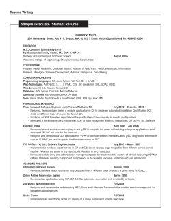


© Copyright 2026