
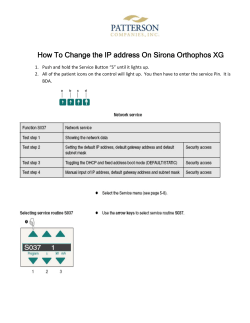
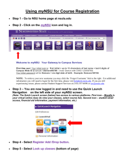
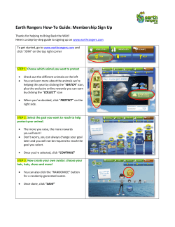
The Elders Preference for Skeuomorphism as App - CED
The Elders Preference for
Skeuomorphism as App Icon Style
Minji Cho*
Kun-pyo Lee
Dept. of Industrial Design, KAIST Dept. of Industrial Design, KAIST
291 Daehak-ro, Yuseong-gu,
291 Daehak-ro, Yuseong-gu,
Daejeon, Republic of Korea
Daejeon, Republic of Korea
[email protected]
[email protected]
Soyoung Kwon*
Hyeon-Jeong Suk
Dept. of Industrial Design, KAIST Dept. of Industrial Design, KAIST
291 Daehak-ro, Yuseong-gu,
291 Daehak-ro, Yuseong-gu,
Daejeon, Republic of Korea
[email protected]
Daejeon, Republic of Korea
[email protected]
Nooree Na
Dept. of Industrial Design, KAIST
291 Daehak-ro, Yuseong-gu,
Daejeon, Republic of Korea
[email protected]
* Both authors contributed
equally to this work
Permission to make digital or hard copies of part or all of this work for
personal or classroom use is granted without fee provided that copies are
not made or distributed for profit or commercial advantage and that
copies bear this notice and the full citation on the first page. Copyrights
for third-party components of this work must be honored. For all other
uses, contact the Owner/Author.
Copyright is held by the owner/author(s).
CHI'15 Extended Abstracts, Apr 18-23, 2015, Seoul, Republic of Korea
ACM 978-1-4503-3146-3/15/04.
http://dx.doi.org/10.1145/2702613.2732891
Abstract
We explored the value of skeuomorphism as an icon
style particularly for the elderly people. To identify the
proper approach of skeuomorphism we articulated two
factors such as degree of realism and level abstraction.
We employed “call”, “contact”, and “camera” icons and
created eight alternatives, four degrees of realism by
two levels of abstraction for each. We conducted semistructured interviews with 30 Korean elderly and asked
about their preference and understandability depending
on how the app icons are visualized. A conjoint analysis
revealed that the degree of realism is more important
for having an aesthetic satisfaction, whereas the
abstraction level is more relevant for better
understanding the function of an icon. Overall, the
degree of realism is positively correlated with both
preference and understandability. Moreover a direct
metaphoric icon has an advantage to appeal more and
to inform more efficiently, particularly for female or
novice elderly users.
Author Keywords
Icon design style; Skeuomorphism; Elderly
ACM Classification Keywords
H.5.2. Information interfaces and presentation (e.g.,
HCI): User interfaces.
Introduction
Figure 1. A notepad application
icon of iOS 6 in skeuomorphic style
(left) and that of iOS 7 in flat style
icon which is more simplified
(right).
Population ageing is taking place in nearly all of the
countries around the world, and a great effort has been
made to improve the access to technologies and design
which enhances aging in place [10, 12]. As an
increasing number of the elderly has moved from
simple cell phones to smartphones [13], the industry
sees this as an opportunity to create a new market
segment. The smartphone industry becomes more
competitive than ever before, and therefore studies on
the elderly users are highly demanding [4, 5].
In this study we investigated the elderly’s preference
for the graphic user interface (GUI) in context of
smartphone application icons. The design of application
icons influences greatly on the users’ first impression
when browsing. Often, the characteristics of icons of
smartphone application represent the graphic identity
of operating systems. For example, as Apple recently
released iOS7, it set off a graphical style trend moving
from skeuomorphic to a simpler flat style.
Figure 2. Docomo Raku-Raku
Smartphone released in 2014 (F09E)
In general, along the advancement of GUI design, the
improvement contributes to achieve higher usability
and greater attention[3] and emotional satisfaction.
With regard to enhancement of affective quality
through graphical representation of icons, some recent
studies examined the affective quality while the color
attributes of icons are manipulated[8, 11]. As another
competent graphic technique, Skeuomorphic icons
offered the benefits of high learnability and
metaphorical pleasure. Basically, the skeuomorphic
style illustrated realistically with a textured treatment
making elements appear as real objects [6]. How to
manipulate the degree of realistic appeal strongly
influenced the identity of GUI design. However, while
depicting an object in the world, skeuomorphic style
easily can become superfluous. In line with this, there
are still on-going debates, as smartphone users
nowadays anticipate a new GUI style after having
experienced diverse skeuomorphic icons, and now
being confronted with Apple’s simple and flat style [15].
On the other hand, we considered that the
skeuomorphic style adequately links human and
machine through its rich and illustrative approach.
Particularly for the elderly who start using the
smartphones in their later years, an intuitive graphical
guide is essential. In this study we identified what
appeals more to the elderly smartphone users,
particularly focusing on comparing the effects of
Skeuomorphism and minimalism.
Skeuomorphism
Skeuomorphism in UI design has received much
attention and criticism about its usefulness and purpose
in the design of smartphone applications. We found
several definitions of Skeuomorphism which lacked
clarity. For example, Techopedia defined
‘skeuomorphism’ as a design principle in which design
cues are taken from the physical world. The design has
traditionally aimed to recall the real world - such as the
use of folders and file images for computer filing
systems to make computers feel more familiar to users
[9]. Whereas, Bop Design defined ‘skeuomorphism’ as
how the design is illustrated realistically with a textured
treatment making elements appear as real objects [6].
As shown in Figure 1, we can easily compare the
difference between skeuomorphic and flat style.
Icon Style Preference
As the smart device market rapidly expands, there are
many studies related to icon design. Arledge identifies
how filled-in and outline icon style influences usability
[1]. Also, Hou, clarifies the potential relationship
between icon style and the users’ emotion [7]. Yet,
research regarding the seniors’ preference and level of
understanding for icon styles has not been clearly
defined. As shown in Figure 2, Docomo introduced the
Raku-Raku, which was a smartphone specifically
targeting the elderly. Considering the elderly’s poor
legibility, the icons are displayed much larger than in
other smartphones. By doing so, the layout design is
much simpler admitting that the elderly are not capable
of using smartphone services. However such support
for deficiency should be addressed in a more positive
way to properly achieve emotional satisfaction and
cognitive performance.
Plan for Empirical Study
To distinguish Skeuomorphism from minimalism, we
took two independent factors into consideration. One
was the degree of realism, and the other the level of
abstraction. The degree of realism indicated how
realistic an icon is. The level of abstraction meant for
semantic connection to the metaphoric object.
Composition of an icon set
We collected four different smartphones that were
deliberately designed for the elderly, such as, Docomo
Raku-Raku smartphone series (F-06F, F-09E) (Figure.
2) and Softbank simple smartphones (204SH) and Doro
PhoneEasy 740. Among those smartphones, we
selected the three most frequently icons: “call”,
“contact”, and “camera”.
Factor 1: degree of realism
We drafted each of the call, contact, and camera icons
in four different degrees of realism. Then we let five
designers rank the order of the four degrees. We
modified the icon designs iteratively, until all agreed.
Factor 2: abstraction level
The abstraction level was divided into the two aspects
of (a) a metaphor that signifies the object which links
to the function in the real world (b) a metaphor that
does not signify the object in the real world.
With the three icon sets chosen, we designed both
metaphoric icon and non-metaphoric icon in four
different degrees of realism. The following Table 1
displays the eight types of “contact” icons according to
the two abstraction levels and four degrees of realism.
Abstraction level
Degree of
realism
(a)metaphoric
: Drawn object that
performs the same
function in the real
world.
(b)non-metaphoric
: Drawn object that
does not match with
the same function in
the real world.
1: Flat style icon
that only consists
ofbasic shape.
2: Flat style icon
that is more
illustrative.
3: Realistic style
icon that consist of
color and contrast.
4: Realistic style
icon that is close to
photorealism.
Table 1. Eight alternatives of a smartphone application icon,
“contact” characterized in terms of two abstraction levels and
four degrees of realism. The elderly were presented with a pair
of contact icons and asked about preference and
understandability.
Questionnaire
Considering the nature of elderly responses to the
stimuli, we planned a pairwise comparison to minimize
cognitive workload. As illustrated in Figure 3, a pair of
“call” icons were presented in a card. Firstly, we asked
“which one looks better?” (preference)Then we asked,
“which one do you think would perform the given
feature?” (understandability) Consequently, we
prepared 84 (=8C2×3sets) cards as stimuli.
Empirical Study
Figure 3. The actual survey card.
Characteristic
Gender
Male
no.(%)
Female
Smartph < 6 months
one
usage
> 1 year
no.(%)
Subjects
10 (33.3)
Subjects
We visited two senior centers in South Korea where we
could recruit a total of 38 participants ranging from 65
to 91 years. The average age was 76.5 (SD= 8.19).
According to the WHO’s definition of an elderly, we
chose the age range over 65 years[10]. We inquired
the participants’ experience in using smartphone as
well as the period of using a smartphone and what
features they used or are still using.
20 (66.7)
18 (60.0)
12 (40.0)
Table 2. Demographics and
baseline characteristics of the
sample
Procedure
Two experimenters conducted a semi-structured
interview with the elders to overcome the elders’
vulnerability such as declining concentration or
eyesight. They presented the 84 cards one by one in
random order. However, the final valid samples turned
out to be 30, as summarized in Table 2. It took 10 to
20 minutes per person on average for the whole
questionnaire. In addition, the interviewer occasionally
had to help by reading the questions out loud and
having the participants point out their responses.
Furthermore, during the interview, they tended to get
exhausted after 10 minutes, but soon concentrated
back, which speeded up.
Results
Based on the elders’ choice, we accumulated the
frequency of selected icons. Considering the frequency
data as the score, we computed the rank data between
1st and 8th place among 8 alternatives. Using SPSS 21,
we performed a Conjoint Analysis to identify which
factor has contributed more to the judgment of
preference or understandability. Moreover, we tried to
observe the utility change as the levels of each factor
varied.
Figure 4 shows the results of both preference and
understandability. The average relative importance
indicates how largely each factor influenced the elderly
to make a judgment on preference for or
understandability of a smartphone application icon. For
example, when they decided for the preference for an
icon, the degree of realism (63.61%) had twice the
impact compared to the abstraction level (36.39%),
[(F(1,58)=30.94, p<.05)]. In particular, a positive
correlation existed between the degree of realism and
preference. Regarding the level of abstraction, the
metaphoric style was preferred [(F(1,58)=43.07,
p<.05)].
Similarly, there was a positive correlation between
degree of realism and understandability. Also the
elderly considered the metaphoric style being better for
understanding the meaning of an icon. The mean
difference between two utility values was statistically
significant as well [F(1,58)=164.47, p<.05)]. Differently
from the preference, we observed that the elderly
considered the level of abstraction much more
important than degree of realism, when having to
identify the meaning of an icon. The average relative
importance of level of abstraction was 63.47% while
that of degree of realism was 36.53%. However the
mean difference is not statistically different at the
significant level of 0.05, and therefore, the relative
importance between the two factors is an individual
matter. For example, for some elders taking a
metaphoric object is more relevant in order to
understand the meaning of an icon. At the same time
for the other, how realistically an icon is illustrated is
more relevant.
realism (F(1,38)=15.48, p<.05), while it was not for the
male group (F(1,18)=5.81,p<.05). This implies
skeuomorphic style is an especially efficient method
when explaining to female elders about the meaning of
an icon. In addition, for the non-smartphone user
group, the relative importance of abstraction level was
higher than that of realism (F(1,34)=11.49, p<.05),
whereas the previous smartphone user group had no
significant difference between abstraction and realism
(F(1,22)=.23, p=.64) (Figure. 6).
Discussion and Conclusion
Figure 5. Value of relative
importance for understandability by
gender group.
Figure 6. Value of relative
importance for understandability by
smartphone and non- smartphone
user group.
Figure. 4 (left) Utility values and average relative importance
of preference. (right) Utility values and relative importance of
understanding.
From the further analysis by subgroups, we found a
noticeable effect of gender and previous smartphone
usage on the understandability. For the female group,
abstraction level was more important than degree of
Preference-wise, the level of abstraction had the most
significance, and skeuomorphic icons were more
preferred to abstract icons. This supports previous
studies. Hou identifies that users prefer miniaturized
designs of real goods to abstract icon designs, while
doubting the success of skeuomorphism due to the new
generation of users’ higher preference for abstract
icons [7]. Also, it is shown that elderly prefer realistic
and photographical representations to simple and flat
icons. Though this is slightly different from Robbins’
findings the age group of 46 and older had a slight
preference for flat design, it was not clarified how many
participants of the group were above 65 [14]. In terms
of the understandability, there was no significant
difference in the relative importance score. A higher
degree of realism was had a tendency to help
understanding. With the understandability, key factors
were found for both gender and the smartphone usage
period. We found that our results were different from
Chanwimalueng’s argument, in that heavy smartphone
users show the best perception and satisfaction with
concrete complex icon, while occasional users do the
same with concrete simple icon [2].
In conclusion, using the same metaphor from the real
world has influence on the elders’ understandability,
while illustrative and realistic representations play an
important role on the elder preference. The elderly
seem to prefer familiar expressions that look realistic.
The elder might need a cue to guess the function. In
addition, this result indicate that there is a
contradiction between actual usability and emotional
judgment. It is expected for services targeting elderly
users to depict an icon rather realistic and
skeuomorphic than flat and abstract.
Further work
This study has potential improvements that suggest
some directions for future research. This study might
further extend target participants to younger age
groups. After comparing results for different age
groups, it will be more objectively clarified if this result
is due to elderly-unique characteristics or overall
tendency. Lastly, it is required to evaluate the validity
of icon design guidelines for the elder. In order to test
this guideline, a new comparison set can be prepared
by modifying the existing icons of smartphone and
public devices to follow the guidelines. After examining
the elder’s preference for those modified icons and
existing icons, the validity of this guideline will be
shown.
References
[1] C. Arledge, Filled-in vs. Outline Icons: The Impact of
Icon Style on Usability, Carolina Digital Repository, 2014.
[2] W. Chanwimalueng and M. K. Kasemsan, The
acceptance and satisfaction of smartphone users toward
icon concreteness and complexity, in Proceeding of 16th
Business Information Management Conference on
Innovation and Knowledge Management a Global
Competitive Advantage, 783-790.
[3] K. Choi and H. J. Suk, Optimal employment of color
attributes to achieve saliency in icon matrix designs, Color
Research & Application (2014).
[4] S. J. Czaja and C. C. Lee, The Human-computer
Interaction Handbook, J. A. Jacko and A. Sears, Eds., L.
Erlbaum Associates Inc., Hillsdale, NJ, USA, 2003, 413–
427.
[5] A. D. Fisk, et al., Designing for Older Adults:
Principles and Creative Human Factors Approaches, Second
Edition, 2 edition ed., CRC Press, Boca Raton, 2009.
[6] D. Hill. Flat vs. Skeuomorphism Design: Which to
Choose? Available: https://www.bopdesign.com/bopblog/2014/02/flat-vs-skeuomorphism-design-which-tochoose/
[7] K.-C. Hou and C.-H. Ho, A Preliminary study on
Aesthetic of Apps Icon design, 2013-08-27 (2013).
[8] J. Jang and H.-J. Suk, Disappearing icons:
Informative effect through changing color attributes of app
icons, in Consumer Electronics (ICCE), 2014 IEEE
International Conference on, 341-342.
[9] C. Janssen. What is Skeuomorphism? Available:
http://www.techopedia.com/definition/28955/skeuomorphi
sm
[10] C. Jaschinski, Ambient Assisted Living: Towards a
Model of Technology Adoption and Use Among Elderly
Users, 319–324.
[11] S.-W. Ju, et al., Changing the color attributes of
icons to inform of the application status, in Consumer
Electronics (ISCE 2014), The 18th IEEE International
Symposium on, 1-2.
[12] C. Lee, User-centered system design in an aging
society : an integrated study on technology adoption,
Thesis, Massachusetts Institute of Technology, 2014.
[13] V. Oksman, Young People and Seniors in Finnish
'Mobile Information Society', Journal of Interactive Media in
Education 2006 2006-11-03 (2006), 2.
[14] W. Robbins, Design Practices in Mobile User
Interface Design, Graphic Communication 2014-06-01
(2014).
[15] A. Zhou, Cybernetics and human-computer
interaction: Case studies of modern interface design, in
Norbert Wiener in the 21st Century (21CW), 2014 IEEE
Conference on, 1-6.


© Copyright 2026