
Document 186404
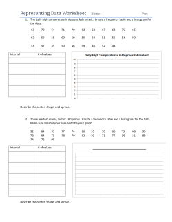
How to Get Microsoft Excel to Create Box-and-Whisker Plots (Note: This tutorial was created using Excel 2003.) Assignment: Create a box-and-whisker plot for the 5-number summary given below for 2001 SAT scores: statistics scores MIN 200 Q1 440 median 510 Q3 590 MAX 800 Although Microsoft Excel has a “chart wizard” that will allow one to make several different graphs, it does not have the capability to make a box-and-whisker plot directly. Therefore, we will need to adapt what is available. Just follow these step-by-step instructions and you should be able to produce a box plot without too much difficulty. 1. In a new worksheet, enter the necessary information (as shown in the figure): in cell A1: in cell A2: in cell A3: in cell A4: in cell A5: statistics median Q1 MIN Q3 in cell B1: in cell B2: in cell B3: in cell B4: in cell B5: 2001 SAT 510 440 200 590 You need to enter the information in the order as presented for this to work properly. So make sure that you are entering the correct information. 7. When the next dialog box appears, under the LEGEND tab, clear the SHOW LEGEND option. 1. Highlight cells A1 through B6. 2. Select the “chart wizard” by clicking on its icon in the tool bar located on the top of the screen. 3. When the chart type dialog box appears, choose the STOCK chart type and the fourth chart subtype. 8. Under the GRIDLINES tab, clear all gridlines. 4. Click NEXT. 5. When the next dialog box appears, select the ROW (rather then the COLUMN) option for the “series in” category. 9. Under the AXES tab, clear the VALUE (Y) AXIS for the secondary axis. 6. Click NEXT. Monmouth University Mathematics Department instructor: Donna M. Wacha Box Plots & Excel page 2 of 4 19. The large purple column will disappear, leaving an asterisk in the middle of the graph. Right-click on the asterisk. Select FORMAT DATA SERIES on the short-cut menu. 10. Then, click FINISH. 11. Right-click on the grayshaded (plot) area. Select the FORMAT PLOT AREA option on the short-cut menu that appears. 20. On the “format data series” dialog box: • Change the marker to a plus sign (+). • Make the foreground black. • Make the marker’s size at least 9. 12. In the “format plot area” dialog box, choose the NONE options under both border and area. 13. Click OK. 21. Click OK after all of the changes are made. The box plot will now look like: 14. Aim the cursor at the horizontal axis and rightclick the mouse. Choose the CLEAR option on the short-cut menu. 15. Click once somewhere on the purple (colored) column to select the series. (Do not click on the white column.) 16. Under the CHART menu at the top of the screen, select CHART TYPE. 17. When the chart type dialog box appears, select LINE. 18. Click OK. Monmouth University 22. Aim the cursor at the vertical axis and right-click. Choose the FORMAT AXIS option on the shortcut menu 23. On the “format axis” dialog box, PATTERNS tab: • Select the CROSS option for the major tick mark type. • Select the CROSS option for the minor tick mark type. Mathematics Department instructor: Donna M. Wacha Box Plots & Excel page 3 of 4 24. On the “format axis” dialog box, SCALE tab: • Make the minimum value = MIN = 200. • Make the maximum value = MAX = 800. • Make the major unit = 100. • Make the minor unit = 20. • Select the VALUES IN REVERSE ORDER option at the bottom of the box. 25. On the “format axis” dialog box, ALIGNMENT tab: Make the ORIENTATION = –90 degrees. 26. Click OK. 29. On the “format chart area” dialog box, PROPERTIES tab: Select the second choice under OBJECT POSITIONING. (You should do this so that the graph is not affected when you change column widths.) 30. Click OK. 31. Now, to resize the box plot – click anywhere near the border to the graph. Small black boxes will appear on the border of the graph. To resize the graph, you will click-and-drag the cursor in a particular direction so that the graph is resized. Since we want to make the graph smaller, clickand-drag to little box that is indicated by a RED arrow. Move the cursor to the left until the graph fits into 4 columns. 27. Right-click anywhere near the border of the box plot. Choose the FORMAT CHART AREA option on the short-cut menu. In the illustration at the right, the box plot was made to fit within cells D2 to H21. 28. On the “format chart area” dialog box, FONT tab: • Select the font you wish to use. (I suggest using ARIAL but any will do.) • Select the font • style. (I suggest REGULAR.) • Select the size. (I suggest font size 8.) • Clear the AUTO-SCALE option. NOTE: If you wish to CUT&PASTE the box plot into Microsoft Word, you will need to have the word processing software open before you complete the next step. (You need to do these steps so that when you resize your graph the software doesn’t change the font size that you selected.) Monmouth University 32. Right-click near the border of the box plot. Select the COPY option on the shortcut menu. Mathematics Department instructor: Donna M. Wacha Box Plots & Excel page 4 of 4 33. Then go to Microsoft Word, click wherever you want the box plot to appear in your document and PASTE in the box plot. (You can PASTE into a Word document in a number of ways: EDIT menu → PASTE, RIGHT-CLICK → PASTE, or the CRTL+V keyboard shortcut.) These additional steps will reorient the box plot as that the axis appears on the bottom of the graph: 34. Right-click the copied box plot. Choose the SHOW PICTURE TOOLBAR option. The copied box plot will look like the one below. (For instructional purposes, this graph is the actual size that will be PASTED into your document.): 200 300 35. The 7th icon from the right in the “picture toolbar” is a ROTATE LEFT 90° option. (This will flip the box plot so that the axis will now appear on the bottom.) 400 500 36. Click the ROTATE LEFT 90° icon. 600 700 800 The final product will look like this (actual-sized) box-and-whisker plot: If you don’t care about the orientation of the copied box plot, you have finished creating your graph. (You do not need to complete the next steps.) However, if you wish to have the box plot flipped so that the axis appears on the bottom, continue with the next few steps. 200 300 400 500 600 700 800 The 5-number summary is illustrated within the box-and-whisker plot: • MIN = far left tip of left-hand “whisker” • Q1 = left-hand side of the rectangle • MEDIAN = plus sign (+) • Q3 = right-hand side of the rectangle • MAX = far right tip of right-hand “whisker” Monmouth University Mathematics Department instructor: Donna M. Wacha


© Copyright 2026