
A SPATIO-TEMPORAL APPROACH By Stephen Strand
ABSTRACT
MOTORSPORT PERFORMANCE ANALYSIS:
A SPATIO-TEMPORAL APPROACH
By
Stephen Strand
May 2015
As data logging technologies advanced, a point was reached where amateur
motorsport enthusiasts could now log their vehicle’s data while competing in motorsport
events. Many drivers take advantage of these new data logging technologies but lack
options for analyzing the data during and after motorsport events beyond standard tables
and two-dimensional graphs. This thesis investigated the use of GIS as a tool for
analyzing data collected during a motorsport event through time geography approaches
and three-dimensional geovisualization techniques. Data were collected from the vehicle
to analyze the speed and handling of the car while heart rate data were collected from the
driver to help understand the driver’s emotional state while navigating the course.
Analysis of the data showed that time geography visualizations in a three-dimensional
environment could help drivers better understand the data that had been collected from
their vehicles and themselves and use it to improve their future performances when
driving in motorsport events.
MOTORSPORT PERFORMANCE ANALYSIS:
A SPATIO-TEMPORAL APPROACH
A THESIS
Presented to the Department of Geography
California State University, Long Beach
In Partial Fulfillment
of the Requirements for the Degree
Master of Arts in Geography
Committee Members:
Hyowon Ban, Ph.D. (Chair)
Suzanne P. Wechsler, Ph.D.
Deborah Thien, Ph.D.
College Designee:
Amy Bippus, Ph.D.
By Stephen Strand
B.A., 2007, California State University Long Beach, Long Beach, California
May 2015
UMI Number: 1584460
All rights reserved
INFORMATION TO ALL USERS
The quality of this reproduction is dependent upon the quality of the copy submitted.
In the unlikely event that the author did not send a complete manuscript
and there are missing pages, these will be noted. Also, if material had to be removed,
a note will indicate the deletion.
UMI 1584460
Published by ProQuest LLC (2015). Copyright in the Dissertation held by the Author.
Microform Edition © ProQuest LLC.
All rights reserved. This work is protected against
unauthorized copying under Title 17, United States Code
ProQuest LLC.
789 East Eisenhower Parkway
P.O. Box 1346
Ann Arbor, MI 48106 - 1346
Copyright 2015
Stephen Strand
ALL RIGHTS RESERVED
ACKNOWLEDGEMENTS
My sincerest gratitude goes to my thesis advisor, Dr. Hyowon Ban for her
support, guidance and patience.
I would also like to extend my most grateful feelings to
my thesis committee members, Dr. Suzanne P. Wechsler and Dr. Deborah Thien for their
constructive comments and valuable feedback. My appreciation goes to the Department
of Geography at California State University, Long Beach for providing me with a highly
academic environment and for allowing me to complete my Master’s degree. Thank you
to my friends and family who supported me through the process and were there with me
every step of the way.
iii
TABLE OF CONTENTS
Page
ACKNOWLEDGEMENTS .........................................................................................
iii
LIST OF FIGURES .....................................................................................................
vi
ACRONYMS ............................................................................................................... viii
CHAPTER
1. INTRODUCTION ...........................................................................................
1
The Purpose of the Study ...........................................................................
Outline of the Thesis ..................................................................................
3
4
2. LITERATURE REVIEW ................................................................................
6
Data Acquisition and Analysis...................................................................
Data Acquisition Use in Vehicles ..............................................................
Data Acquisition Use in Motorsports ........................................................
Data Analysis in Motorsports ....................................................................
The Emotions of Motorsport ......................................................................
Time Geography Approach........................................................................
6
7
7
11
13
16
3. DATA ACQUISITION AND ANALYSIS METHODOLOGY .....................
21
Data Acquisition Hardware........................................................................
Data Collection and Processing .................................................................
Development Using Model Builder and Python Language .......................
Heart Rate Data Collection ........................................................................
Heart Rate Data Analysis ...........................................................................
The Space-Time Path .................................................................................
The Space-Time Activity Density Surface ................................................
The Space-Time Prism ...............................................................................
25
28
30
35
35
36
39
40
iv
CHAPTER
Page
4. DATA ANALYSIS RESULTS .......................................................................
44
Data Results Reviewed During the Event ..................................................
Lap One Analysis.................................................................................
Lap Two Analysis ................................................................................
Lap Three Analysis ..............................................................................
Lap Four Analysis ................................................................................
Data Results Viewed After the Event ........................................................
Space-Time Path Analysis ...................................................................
Space-Time Activity Density Surface Analysis ..................................
Space-Time Prism--Performance Prism Analysis ...............................
Emotions of Autocross Analysis ..........................................................
47
48
54
59
64
68
68
72
76
82
5. CONCLUSION ................................................................................................
90
REFERENCES ......................................................................................................
95
v
LIST OF FIGURES
FIGURE
Page
1. The Space-time Aquarium and Related Pieces .......................................
16
2. A Formula One Racecar’s Friction Circle ..............................................
18
3. Kwan’s Space-time Activity Density Surface ........................................
20
4. Aerial View of the Autocross Event…………………………………...
23
5. Change in Speed Tool .............................................................................
31
6. A Part of the Python Script .....................................................................
33
7. Space-time Path Example Showing Change in Speed ............................
37
8. Triangulated Irregular Network ..............................................................
42
9. Hand Drawn Autocross Course Map ......................................................
44
10. The Author Navigating the Final Slalom ................................................
46
11. Downloaded Data Before GIS Clean Up ................................................
48
12. Lap One Turn Three................................................................................
50
13. Lap One Turn Six....................................................................................
52
14. Lap Two Turn Three ...............................................................................
55
15. Lap Two Turn Six ...................................................................................
57
16. Lap Three Turn Three .............................................................................
60
17. Lap Three Turn Six .................................................................................
62
vi
FIGURE
18. Lap Four Turn Three ...............................................................................
65
19. Lap Four Turn Six...................................................................................
67
20. All Laps – Space-time Path Change in Speed ........................................
68
21. Lap One and Lap Four - Space-time Path Change in Speed...................
70
22. Lap Three and Lap Four – Space-time Path Change in Speed ...............
71
23. Space-time Activity Density Surface – Speed/RPM/Throttle ................
72
24. Space-time Activity Density Surface – Speed/RPM ..............................
74
25. Space-time Activity Density Surface – Throttle .....................................
75
26. G Force Data Point Cloud .......................................................................
77
27. G Force Generated TIN File ...................................................................
78
28. All Laps – Performance Prism ................................................................
79
29. Lap One and Lap Four – Performance Prism Front ................................
80
30. Lap One and Lap Four – Performance Prism Rear .................................
80
31. Lap One and Lap Four Turn Three – Performance Prism ......................
81
32. Heart Rate Data While Not Racing .........................................................
83
33. The Author on the Starting Grid .............................................................
85
34. All Laps – Heart Rate Data .....................................................................
86
35. All Laps Turn Three – Heart Rate Data ..................................................
88
vii
ACRONYMS
BPM
Beats Per Minute
CSV
Comma Separated Value
g
Acceleration
GIS
Geographic Information System
GPS
Global Positioning System
hp
Horsepower
MPH
Miles Per Hour
OBD-II
On-Board Diagnostics System II
OS
Operating System
RPM
Revolutions Per Minute
SAE
Society of Automotive Engineers
SCCA
Sports Car Club of America
TIN
Triangular Irregular Network
viii
CHAPTER 1
INTRODUCTION
Auto racing has been a part of history dating back to the nineteenth century and as
competition levels rose, technologies developed to allow for better performance of racing
vehicles. In the 1970s race team engineers began equipping vehicles with computer
components which gave them the ability to make adjustments to the vehicle more easily
and provide configuration systems to more accurately dial in the best performance for the
vehicle (Haney 2001). These systems enabled racecar drivers to work with their team
engineers to find a setup that was as perfect as possible for the vehicle through its
configuration, which boosted the driver’s confidence and positive emotions while
driving. This gave them the confidence to push their vehicle closer to its performance
capacity and drive faster (Watkins 2006).
For racing teams, vehicle components need precise tuning and computer systems
that provide higher accuracy for the tuning and better monitoring of the vehicle
components (Khan and Sonti 2009). As racing teams developed engineering and
software systems that could monitor their vehicles’ components and related performance
on the track with utmost precision, the technologies began to be incorporated in standard
road vehicles. The U.S. Federal Government mandate that vehicles sold since 1996
would require on-board diagnostic (OBD-II) systems has led to a quick and easy way for
any driver to plug-in and access their vehicle’s computer and sensor system (EPA420-F1
02-014). With that inclusion of computer systems and advanced sensor units in vehicles
that are available from a dealership, the technology is accessible for a broad audience to
monitor their vehicle’s performance.
At the same time, recent Global Positioning System (GPS) technology has been
advancing with the introduction of smaller devices that provide high levels of accuracy.
GPS has been incorporated into many devices such as cameras and smart phones—e.g.,
the Apple iPhone or Android —to enable users to geo-tag (attaching GPS metadata) their
location when taking pictures or using other applications on their smartphones.
Standalone GPS devices with Bluetooth technology are also available to provide an
option for even higher accuracy and increased data collection rates, such as one tenth
second, in comparison to typical camera or smart phone devices which collect every
second or slower.
As ODB-II and GPS technologies have advanced, a point has been reached where
people who race as a hobby can now log their vehicle’s data while competing in
motorsport events. Statistics from a 2007 Sports Car Club of America (SCCA)
Membership Demographics study found that in October of 2006 there were over fifty
thousand registered members in the club (SCCA 2007). This represents only a small
fraction of people racing in their free time, as there are a number of other racing groups
which have competitions running year round. Many of these racing drivers are taking
advantage of these new data logging technologies, as can be seen by the number of
devices and phone apps now on the market. Drivers can log their data using an
assortment of high end data logging units or off-the-shelf OBD-II readers that
communicate with many different smart phone applications. The downfall for these
2
hobbyists is that they have no useful way to visualize their data during or after an event
due to the limitation of existing data logging technologies.
The majority of people in the racing community are unaware of what GIS is,
resulting in large amounts of untapped data that could be more informative in a GIS
setting. There might be some people who bring their data into online mapping services
such as Google Earth to create their data as maps, however it is difficult for them to
spatially analyze the data and visualize it without advanced Google Maps development
knowledge. Currently, GIS systems are used little in the motor racing community and
industry that are largely relying on tables and advanced scripting tools through languages
such as Java or Python.
The Purpose of the Study
The research ideas, processes, and work put forth in this thesis come from the
personal experiences and insight of the author that indicate GIS could be used
successfully with motorsport data. Goals of this thesis include to (1) develop a GIS
application for motorsport analysis, (2) demonstrate that the application provides the
drivers with more advanced ways to analyze their data than existing applications without
GIS, and (3) understand relationships between the driver’s emotions and his or her
performances. The GIS application developed in this thesis was based on existing
knowledge of time geography concepts. Data for this research were collected including
spatio-temporal information of a vehicle and heart-beat rate and emotions of the driver
using a system that is common amongst hobbyist racers. The data and the GIS
application were evaluated from a data-quality perspective, assessing the suitability of
data accuracy and visualizations. Specifically, the research addresses the following
3
procedures: (1) use GIS to model the performance of a driver and vehicle based on
approaches of time geography; (2) geovisualize the combined aspects of racing
performance to determine where a driver could perform better; and (3) assess the
capabilities and limitations of motorsport data in a GIS environment. Time geography
has rarely been used in motorsports and there exists a gap in the existing research of a
topic. Therefore a new study that applies GIScience methodologies to motorsports
application is necessary.
Outline of the Thesis
This thesis consists of six chapters. Chapter 2 reviews existing literature that will
set the basis for this research, but which also leaves much to be researched. In chapter 2
data logging equipment, its use in motorsport applications, approaches of time geography
and emotional geography will be reviewed through literature. Chapter 3 discusses data
collection in the field study and analysis methodology used in this research. The chapter
consists of a device for data acquisition, a vehicle used in the experiment in the field, and
the location where the motorsport data were collected. The vehicle’s engine, chassis and
sensor specifications will be discussed to justify why each was used. The methodology
of the data analysis introduces specific time geography concepts that were modified for
use with motorsport data, specifically the performance prism. These concepts are
discussed from their design based on time geography concepts to their application in
motorsports data and other possible topics. In addition, data collection and analyses of
the heart rate and emotional data of the driver are included in chapter 3. Chapter 4
introduces the empirical data recorded from the vehicle and the results of the combined
4
data discussed through each type of analysis done in this study. Chapter 5 summarizes
the findings of this thesis and highlights the contributions to the field of geography.
5
CHAPTER 2
LITERATURE REVIEW
This chapter will address three focused areas of interest for this thesis: I review
existing studies that deal with (1) data acquisition equipment and the current use of those
data in motorsports, (2) time geography methods and their application in both sports and
vehicle movement, and (3) comparing literature that provides standards for GIS data in
regards to accuracy, usability, and visualization. I will argue that the lack of
geographical setting in a map environment and also the absence of three-dimensional
visualization can leave much of the data unused. Second, I will focus on existing
methodologies of time geography approach and their limitation of application in both
sports and urban vehicle movement.
Data Acquisition and Analysis
Data acquisition refers to computer systems which are used to collect and process
signals that measure conditions in the real world. These signals typically come from a
sensor of some kind. The sensor will record physical parameters and convert them into
electrical signals which are then sent to the computer to be recorded. Data acquisition
can be used in practically every subject matter to record some sort of signal, with
common uses in fields such as meteorology, biology, engineering, and chemistry.
Data acquisition equipment was first developed by IBM in 1963 with the
announcement of the IBM 7700 data acquisition system. The technology could collect
6
data from up to thirty-two sources simultaneously and then process and transmit them to
up to sixteen remote display or printing devices. And with computer technology
advancing at a very fast pace, data acquisition systems were constantly being upgraded to
use less space, collect data from more sources, and process results more quickly.
Data Acquisition Use in Vehicles
Data acquisition eventually made its way into the automotive market to collect
vehicle data for businesses, educational research and civic applications. The wide variety
of uses for vehicle data has led to a large offering of devices which can be used in
applications, such as analyzing traffic flow (Hassan and Patterson 2006).
Data Acquisition Use in Motorsports
Before data acquisition was first used by Chevrolet in the 1970s (Haney 2001),
the process of engineering a better racecar was acquired from the direct input of the
driver as they spent long periods of time in the vehicle, driving it around a test track.
This was done to determine if changes to the engine and/or chassis gave the car better
handling and/or speed (Parker 2010). With the technological advancements in computers
and monitoring systems, these traditional methods of driving by experiences and intuition
have taken a back seat to the more scientific approach to improving the driver and vehicle
(Purnell 1998). While a driver’s personal opinion is still accounted for in vehicle setup,
the tools brought forth by computer technology improve upon the development of a
racecar when compared to a driver’s seat time alone. These tools are very complex and
can be difficult to implement correctly. Before engineers can log a vehicle’s data, they
must first design the system for monitoring and collecting data. This design takes into
account the data acquisition unit itself with its weight, size, and power usage, and also the
7
variables which the unit will record and the sensors that will collect those variables
(Meyer 2002). Complex data acquisition systems bring large amounts of data to
engineers and there is often times discussion of the problem regarding how to handle the
data that has been collected. Often times, the first thing a team will do is cut down on the
number of variables they monitor (Hemingway 1990).
For motorsports there are two distinct data acquisition device types that are often
used, in-car and out-of-car (Stanfield and Temple 1987). In-car hardware is designed to
monitor different attributes of the vehicle, such as engine temperature or oil pressure, and
display the data in the car itself for the driver to view. The out-of-car system records the
same types of data and processes it outside the vehicle for modeling and analysis. Outof-car systems are more complex than in-car systems because they allow for more data to
be recorded with the option to store it on the device or transmit the data to a computer
where someone else can process the data.
A racecar is a vehicle with a complex design of components that allow it to travel
faster and handle better than a typical road car. Many of the components are adjustable
to allow for precise changes that need to be made depending on the location of a race, the
weather, and the driver using the vehicle. Team engineers constantly monitor these
components and the vehicle’s overall performance using a number of sensors within the
vehicle to determine if there are issues with the car, or if the driver is taking advantage of
the vehicle’s optimum performance (Purnell 1998). Sensor data are used both in real
time analysis and also after a driver has finished to understand what has occurred with the
vehicle and driver during a race (Purnell 1998; Stoffman et al. 2004; Southward and
Conner 2008).
8
Successful racing comes down to the fundamental idea that the vehicle must
complete a lap as fast as possible. This is done by having a vehicle that can have a higher
speed and can handle turns better than other vehicles in the competition. There are a
number of sensors that can record both speed and handling that range in accuracy and
complexity. When determining speed possible sensor choices may include: wheel
rotation, differential air pressure, optical, GPS, and Doppler phase shift (Ramsay 1996;
Ditchi et al. 2002; Corrsys-Datron 2009). Of these devices the Doppler and optical
sensors provide the highest level of accuracy but are extremely expensive (Ramsay 1996;
Ditchi et al. 2002; Corrsys-Datron 2009). GPS accuracy is dependent on the device used
and also the area surrounding the vehicle’s location as interference can occur. The
handling abilities of a vehicle are recorded through the vehicle’s longitudinal and lateral
acceleration (Milliken and Milliken 1995) and can also be recorded by a number of
different accelerometer sensor options. These sensor options all use a similar design of a
mass suspended by a protective casing. The casing is mounted to the vehicle and when
the vehicle moves, the acceleration of the mass connected to the casing creates the
acceleration data. The differences between sensors are based on the supports used and
include a piezoelectric material, a piezoresistive material, or a capacitive plate
(Westbrook and Turner 1994; Segers 2008).
Vehicle health is also an important aspect to monitor in a racecar, as an unhealthy
vehicle can eventually stop working if problems are not addressed early. Two common
problems that arise in a vehicle relate to pressure and temperature of different liquid
components in a vehicle. The pressure and temperature is often monitored to determine
engine health. Fuel, oil, and coolant are the three major liquids that are measured using
9
pressure transducers (Westbrook and Turner 1994). Temperatures for oil, water and air
are typically monitored using thermocouple, thermistor, infrared, or resistive temperature
sensors (Segers 2008). Along with vehicle health, pressure and temperature systems are
also being used to monitor the abilities of the driver. Pressure is used specifically for
brake pedal use and temperature can be used for both brake disc temperature and also tire
temperature. These sensors help determine if a driver is pushing the car too hard, or not
driving it hard enough.
The next most important datasets relate to vehicle positioning on the track and
include sensors for vehicle yaw and vehicle ride height. Vehicle yaw is the rate of
change of the heading angle of the vehicle (Meriam and Kraig 1998) and ride height is
the distance between the race track and the floor of the vehicle (Milliken, Milliken, and
Best 1995). These two factors help determine handling performance as yaw can help
determine if a car is experiencing understeer or oversteer (Pi Research 1997) and ride
height changes can affect the vehicle’s aerodynamics which can result in loss of handling
performance (Milliken, Milliken, and Best 1995). There are sensors that monitor other
aspects of a race car, such as aerodynamics, wheel load, and torque, however they are
much more specialized and do not apply to this research and will not be covered. Many
of the sensor systems found in race cars are now also found in standard vehicles available
from a car dealership. Typically these will consist of the vehicle health sensors to
monitor if the vehicle needs service or is having a major problem. But some car
manufacturers sell performance cars that include more unique sensors such as
accelerometers, torque and yaw sensors. Vehicles manufactured after 1996 include plug-
10
in systems that allow mechanics and owners to access the sensor systems with specialized
hardware (Environmental Protection Agency [EPA] 2002).
Data Analysis in Motorsports
Data analysis in motorsports can be traced back to a single person, Chuck Carrig
(Nisley 2007). In 1963, while working for Ford Motor Company, he completed a
computer program called PG 1493. The program, which was written in the computer
language Fortran and run on an IBM 704 computer, was used to develop suspension
geometry design for the Ford GT40. Users would input a number of desired vehicle
suspension variables, run the program, and receive printed results and graphs of how the
vehicle would perform with the input variable. The computer program took two weeks to
run the process, but when compared to the typical twenty-three week drafting design, this
was considered a leap forward. The program led to suspension geometry designs that
helped Ford claim wins in a number of racings series and sell production model vehicles.
There are currently a number of software applications available that can visualize
data collected from vehicles that include two tiers, racing grade applications and public
applications. Both allow for visualization of the data collected from a vehicle and simple
visualizations with maps or graphs. Many racing applications provide additional analysis
abilities, with each having specialized analysis unique to their software.
There are a number of features that are typically found in racing data analysis
software suites (Parker 2010). These tools include:
1.
Distance Plots--A plot of vehicle attributes on the Y axis in relation to
distance on the X axis.
11
2.
Time Plots--A plot of vehicle attributes on the Y axis in relation to time on
the X axis.
3.
X-Y Plots--Typical a scatter plot of vehicle acceleration rates to view the
handling of the car, commonly referred to as the traction circle.
4.
HistogramsͲͲCharts that allow data to be split into bands which represent
attribute types. The bands are shown on bars with the bar size representing the amount of
time that the band was recorded.
5.
Math ChannelsͲͲMathematical calculations that combine multiple
attributes to determine a represented encompassing attribute which is then shown on a
chart.
6.
Track MapsͲͲA basic map of the race track can be either pre-generated and
part of the software or can be created based on the data collected, as the data will take the
shape of the track. Using the data to create the track map typically shows the lines that
the car drove on the track, but not the true track area.
Applications available to those not in professional auto racing typically include
the basic visualizations mentioned above but do not include any kind of advanced
visualization possibilities with the data. Advanced visualization would be features such
as vehicle animation, driver control animation, or math channels that display computed
attributes. Users can import their data into some existing software such as Microsoft
Excel or other spreadsheet tools. Users of such tools can create graphs, charts, and maps
that display the data from an event in a very simple visualization.
Applications used in a professional auto racing environment enable the engineers
to display data in the basic formats listed above, along with specialized analysis that will
12
be available depending on which software they use. With the advanced tools, often
racing teams are able to analyze and visualize vehicle handling data and other specific
aspects of the race car while it is actively driving. This is a feature that a basic system
does not support. However, neither the common data visualization methods for advanced
nor basic software provide the ability to visualize the data in three dimensions on a map.
The Emotions of Motorsport
As Saville (2008) stated of his parkour experiences, “My emotional engagements
with space changed along with my mobility in it” (896). The same can be said of
“automotive emotions” (Sheller 2004) and the feelings associated with car use. Traveling
through a landscape, be it motorsports, parkour, or anything else, sights and feelings are
taken in different ways and little has been done to relate the place with the movement and
meaning (Spinney 2006). “Emotions are felt in and through the body, but are constituted
by relational settings” (Sheller 2004) and understanding the relationship between the
location on the track and the emotional meaning behind it for that driver will allow for a
greater level of understanding of his/her performance. The work in this thesis uses heart
rate data from the driver to provide a snapshot of the emotional relationship to the track
in order to better understand the overall performance data. A rise in heart rate in an
already intense setting will most likely reveal a location where the driver experienced
fear. If the driver experiences a perceived fear of the car not performing up to standard in
a location on track, there needs to be a reason behind this that can be analyzed (Saville
2008). This is especially true in motorsports, as those fears due to car setup can be
realized: the vehicle may be improperly balanced, or running incorrectly. A driver not
only feels the vehicle itself, but can feel the changes through the vehicle as well (Sheller
13
2004). Team engineers can determine what adjustments to make to a vehicle’s setup as a
response to the emotions that have been shown (Katsis et al. 2008). Sometimes the
vehicle does not need to be corrected but emotions are still detected. When an emotional
response like this occurs, which could possibly alter the behavior of the driver, the
engineers can provide the driver with guidance and support to help them overcome this
response (Katsis et al. 2008). In this thesis, the drivers can use the heart rate data to
determine where they are having emotional responses on the course. Knowing where on
the course they are having an emotional response will allow them to focus on their
performance in those locations.
Along with the emotional response of fear is risk, which is common in
motorsports as pushing a car harder means a greater risk of losing control of the vehicle.
Risk is also combated in motorsports with practice, as perceptions of risk become clearer,
and therefore lessened, with continued movement (Saville 2008). The negative emotion
associated with risk begins to fade as the driver becomes more comfortable with himself
and the vehicle. The measurement of the driver’s heart rate should help visualize this, as
there should be an indirect relationship between the two. As comfort level rises, heart
rate should drop. Risk and comfort will be factors for the driver in this thesis, as they
will be driving a vehicle which they have never driven before. With no prior experience
with the vehicle there will be greater risk driving the car quickly, as the driver will not
know the vehicle’s limits. A driver that is overcome with negative emotions such as fear
(associated with risk) or a general level of stress will have impaired perception, thinking,
and judgment which can lead to misinterpretation of events (Katsis et al. 2008).
Misinterpretation of events is a situation that those in the sport wish to avoid, as a driver
14
may not only compromise himself, but also other drivers, endangering lives (Katsis et al.
2008).
Feelings and emotions for particular time and space can be taken into account to
dictate a person’s reaction in that location (Katsis et al. 2008). Similarly, there are
multiple feelings and emotions that occur when a driver is navigating a race track
(Watkins 2006). These feelings are neither solely created by the driver or the vehicle, but
are a result of the affective relationship between the two (Sheller 2004). Whether it is a
hesitation with the way the vehicle “feels” or a personal hesitation due to not trusting
one’s own abilities, a driver’s lap time can differ greatly because of these emotions
(Katsis et al. 2008). These emotions can play a major factor in contributing to an
increased heart rate during competition, among other things. For example, a comparison
of two drivers shows that Villeneuve, a more emotionally composed driver, keeps his
heart rate 25 bpm slower than another driver, Pironi, while accelerating vehicles to one
hundred miles an hour (Watkins 2006). These differences in heart rate partially
controlled by emotions, lead to differences in driving performance. In this perspective,
“emotions are not simply felt, but invoked, regulated, and managed” (Sheller 2004, 226)
from the routine movements through which a driver moves through a track.
Representing spatio-temporal emotions along with the performance data of the
vehicle in maps might allow for a more complete picture coming from both the brain of
the vehicle and the mind of the person. The emotions in maps are often represented with
multiple colors (Nijdam 2005) and can be brought into time geography very easily.
Color-specific visualization of emotions can help with the larger picture of how and why
drivers navigated the course the way they did.
15
Time Geography Approach
Time geography consists of a number of concepts which study humans in space
and time, using spatial analytical methods and visualization to geographically construct
their individual movements (Kwan and Lee 2004). Torsten Hagerstrand (1970)
developed the approach as a way to provide a more detailed structure to generalized
spatio-temporal social processes. Space and time are represented in time geography
through the use of three dimensional cubes, which represent the locations traveled--i.e., X
and Y coordinates--and also the time spent during traveling or being stationary--i.e., Z
coordinate. Dubbed the “aquarium” (Hagerstand 1974; Miller 2005), other time
geography concepts such as domains, stations, bundles, lifelines, and prisms are found
within this space, as seen in figure 1 below.
Figure 1. The Space-time Aquarium and Related Pieces (Moore et al. 2003).
16
The space-time aquarium and the time geography concepts can be useful to
analyze and visualize motorsport data. The aquarium’s time dimension can represent a
lap of a race track. Figure 1 above shows how the “domain” is a “control area”
(Hagerstrand 1970) which confines travel and which very much resembles a race track
space used in a motorsport race. The “lifeline” is typically a path which an individual
travels in the time frame of the aquarium and that is modified to become the path of the
vehicle through the track environment. The “station” is used as a geographic space
where separate lifelines tend to “bundle” together. In the case of motorsport research,
locations of the stations on the track will be used where individual performance can more
change lap times than a portion of the track that is simple, such as a straight. An example
of a track location where people will perform differently would be a very sharp left turn,
so a station would be designated there to highlight data in that location. The bundle will
be used when more than one lap’s performance is found to be close to identical in a
station, meaning on two separate laps, a corner was driven with similar performance
numbers. Bundles would be used to visualize locations where lap performance is
consistent between laps.
Lastly, motorsport data can be analyzed and visualized by using the space-time
prism (Miller 2005), another concept of time geography. Typically, a space-time prism
exists within a space-time aquarium and represents the total space which is reachable by
an individual in a specific amount of time. In motorsports the space-time prism would
take on a new representation as a friction circle, a diagram which shows vehicle handling
as well as speed. A friction circle is a two dimensional visualization of vehicle handling
relative to speed, as seen in figure 2 below (Milliken and Milliken 1995).
17
Figure 2. A Formula One Racecar’s Friction Circle (Casanova 2001).
Figure 2 visualizes how speed changes the handling of a race vehicle. In the case
of a Formula One car, traction would be higher at faster speeds, due to the downforce of
the vehicle. In figure 2 you can see as the speed of the car increases, the g forces in
cornering rise as well. Because this example is two dimensional, you cannot see a full
relationship between handling and speed easily. If the example was in three dimensions,
speed could be represented on the third axis to create a prism type shape to distinguish
the performance relationship between handling and speed of the vehicle. As racing data
is collected the potential performance that the vehicle can achieve can be represented in a
space. As the driver travels through stations, their handling of the vehicle can be
visualized within a prism of their potential ability. The space-time prism typically shows
18
the potential path space (Tebmann 2006). In this research the prism is used to visualize
the potential performance of the vehicle, rather than the potential path. For the purpose
of this study this approach will be referred to using the term “performance prism.”
The space-time prism is useful concept of time geography, as can be seen with its
applications in other studies. Often these applications modify the space-time prism. An
example of this would be trip planning within transportation networks, where a prism is
designed in which the shape becomes a triangle which visualizes how speed would affect
the individual’s ability to reach a destination in a given time (Tebmann 2006). The prism
has also been used in transportation with distinct networks, showing the possible network
paths within the prism (Downs and Horner, 2012). Similarly, with three dimensional
visualization software becoming more commonly used, space-time prisms have taken on
new shapes with expanded variables such as obstacles in space that impede travel
(Delafontaine et al. 2011). In 3D environments the space-time prism has been a key
success to expanding time geography as a way to model geographic concepts (Kraak
2003).
The space-time activity density surface can be useful to represent the intensity of
activity in space (Kwan and Lee 2004). A 3D raster dataset can be generated using
kernel estimation in a cube which consists of X/Y/Z axes. In the cube, time can be
represented on the X-axis and distance from home can be represented on the Y-axis. In
the cube, the 3D extrusion on the Z axis can represent the density of the type of activity
occurring at that particular time and distance from home. In their work, three density
surfaces were created to visualize the non-employment related activities of employed
women, employed men, and the differences between the two.
19
Figure 3. Kwan’s Space-time Activity Density Surface (Kwan and Lee 2004).
Activity density of employed women is shown in figure 3. This figure
demonstrates a number of activities occurring close to home around 12:00 p.m. and
around 6:00 p.m. As part of their study, the density for employed men show a similar
overall pattern, but nowhere near as spatially correlated as that of women. This type of
relationship would not be easy to visualize if the data were presented on a typical two
dimensional map. The visualization of events based on time allow for clustering of
related data by distance, which on a map might not have been clustered due to being in
opposite directions from the original location. Visualizing a confining distance is done
more effectively with the time-distance chart and could be modified with different
attributes to show other patterns in time.
20
CHAPTER 3
DATA ACQUISITION AND ANALYSIS METHODOLOGY
In this study data were acquired from the field study and analyzed and represented
using GIScience methodologies. This research demonstrates how informed decisions can
be made based on data acquisition in regards to performance of both vehicle and its
driver. One of the goals of this study is to collect data while the vehicle is driven that can
provide the driver real-time feedback. This is because the time it takes to complete a lap
may change based on vehicle setup (e.g., suspension, engine, chassis), vehicle health (e.g.,
air, fuel, internal parts), driver emotions (e.g., fear, confidence, confusion), and so on.
GIS software can provide analysis of driving performance data in a cost-effective
manner, allowing weekend racing-enthusiasts who participate in motorsports on a budget
to gain knowledge that will help them improve their performance. In addition to
numerous open source GIS software choices, ESRI offers a single-use license of their
ArcGIS software suite for one hundred dollars (ESRI 2014). This software suite, which
will be used for this research, is one of the standard choices for well-known GIS software
for major GIS-related industries. Providing this type of methodology and model to
amateur race drivers who do not have professional race team budgets might help them to
gain more detailed knowledge of real-time performance of their vehicle which would lead
them to more enjoyable racing experiences. As stated at a Honda training school, “Better
performance is measurable, even just looking at one corner” (Mitchell et al. 2000, 16).
21
This chapter covers the methodology used to collect data for analysis in GIS,
including the location, the vehicle, and the hardware used for data collection. It will also
cover the methodology used for analyzing and visualizing the data both at the track and
afterwards. Because the author has been racing cars in various ways for over a decade,
there were a number of options for data collection locations for this research based on the
type of racing to compete in. After looking at possible options it was decided to collect
data at an Autocross event described below.
Autocross events are a standard type of time-trial event where drivers compete
one at a time on a course marked with cones. A driver tries to complete a lap as fast as
possible taking penalties to time when cones are hit or navigated incorrectly (SCCA
2009). Autocross events are unique in that they do not occur on a race track, but instead
are held on large areas of open pavement with cones marking the course that will be run.
This allows drivers to lose control of their vehicle in a safe environment and only hit
cones, instead of a barrier found on the edge of a typical race track (SCCA 2009).
Typical autocross courses last up to two minutes and are roughly three quarters of a mile
long, but the intense focus and quick movements of the vehicle can still lead to driver
fatigue during that time. These events can have well over fifty entrants, with each driver
typically receiving four runs of the course to record their fastest lap time. Event winners
are determined based on car class and who has set the fastest lap time (SCCA 2009). The
difference in lap time between the drivers who place first and second will typically be
tenths of a second. Monitoring the vehicle to see where time was lost or gained would
allow drivers to better understand how they could achieve their fastest possible lap.
22
Since Autocross events are held on open pavement, there are not many locations
which allow for this type of event to occur. In Southern California, U.S.A., there are
three locations where Autocross events are typically held; El Toro Airfield in Irvine, CA,
Qualcomm Stadium in San Diego, CA, and Auto Club Speedway in Fontana, CA. An
Autocross event at Auto Club Speedway was chosen as the location for data collection to
be used in this study. This location was selected because they hold multiple events every
year allowing for ample opportunities to collect data. Auto Club Speedway is a
motorsport complex that includes a full sized Nascar oval track with grandstands, a road
track within the oval, and a number of small track areas outside the main grandstand area.
The autocross event for this thesis took place in one of the parking lot areas of the
complex on May 4th, 2014, shown in Figure 4 below. The weather was sunny with the
temperature reaching 88 degrees Fahrenheit.
Figure 4. Aerial View of the Autocross Event.
23
Autocross is a popular racing series because it allows for any vehicle, from a fourdoor sedan to a pickup truck with a racing engine, to enter and compete. The vehicle
used for this research to record data was a 2013 Nissan 370z. The 370z is the latest
model of Z sports car from Nissan which dates back to the original 1970 productions
model. The car has a 3.7 liter V6 engine which produces roughly 330 horsepower
(Edmunds 2013). The car used for the data collection has a six-speed manual
transmission instead of the seven-speed automatic transmission, as manual transmission
is preferred for racing as you have direct control of which gear the car is in. This is
especially important in Autocross, as a driver will technically spend their entire time on
the course in second gear and prefer to have the car not shift into third gear. Shifting into
third gear would result in a brief lull in acceleration and also reduce engine response as
the RPM falls. The current Nissan 370z, along with older models, is commonly seen at
Autocross events and is also used by many racing teams in professional racing series.
The field experiment was intended to use the data and analysis from this study to
showcase what can be done with GIS to other drivers to peak their interest in trying to do
the similar type of analysis of their driving. The car was chosen because it is a car that
the author has never driven before and has no experience with. The author wanted to
collect data in a vehicle where he would have to learn its handling and performance with
each lap he completed. Between laps the author looked over some of the data briefly to
see whether he was doing right or wrong on the course.
Before the Autocross event, the vehicle went through maintenance to insure that it
would be running correctly for data collection. Basic engine maintenance was completed
to install new spark plugs, air filter and oil for better engine health. The brake system
24
fluid was replaced with high-temperature racing fluid and new brake pads were also
installed. At the event, tire pressures were set at specific levels and between each run the
radiator was sprayed with cold water to help keep the engine temperature down. Tire
pressure changes can change the handling of a vehicle (Kasprzak and Gentz 2006) and
during an autocross event handling is key to a fast lap time, so drivers are constantly
checking their tire pressure at an event. This maintenance was done to help the car
perform better and give the author more confidence in pushing the car to its limits,
knowing that is was in good shape for each run through the course.
Data Acquisition Hardware
There are many options for data acquisition in vehicles, from off-the-shelf
pre-built systems to custom-built systems with specific sensors and processors that enable
the users to collect specific data during a race. An advanced data-acquisition system for
vehicles may allow new sensors to be easily installed or removed from the setup of the
vehicle. The system must also be small and light weight as to avoid changing the overall
vehicle weight significantly (Hemingway 1990). For this research it was important to
have equipment that would be both accurate but also affordable to amateur drivers. For
amateurs, professional-level systems may or may not be necessary due to their overspecification required, as some drivers may not need to have large amounts of data. The
ability to log data of basic handling and speed in the vehicle during a race and compare
differences between laps will be the most important data acquisition for amateur drivers.
Along with that, having the option to log other attributes using the data acquisition
system would be beneficial, allowing a driver to further enhance their data logging
equipment and add new variables.
25
Comparing the way a driver maneuvers the course based on handling and speed
between laps of the course will allow them to visualize their driving. In addition, if a
driver could use data from other drivers they could compare their performance with the
other drivers. Considering accessibility to amateur drivers, a data logging system which
supports basic functions built-in and that can be upgraded for better performances could
be necessary. Such a system would include at a GPS device for logging location data of
the vehicle with decent positional accuracy, which would be sub-meter. As smartphones
have become more popular, a number of applications have become available which could
help an amateur driver utilize the built-in GPS, accelerometer, and Bluetooth capabilities
of the phone for collecting data. As of 2013 on the Google Application Store
(play.google.com), there are over three dozen vehicle data acquisition applications being
sold. Most smartphones have an option to setup a wireless connection with external GPS
devices, which would allow for a higher level of GPS accuracy if so desired. The
variables of driving performance collected for this thesis were much less than those used
by professional racing teams, who monitor a number of systems that have few effects on
drivers with little to no skill. Because of this, relatively small amounts of data were
collected in this study. This work is, in a way, a continuance of a training system
discussed in an existing research of Society of Automotive Engineers (SAE) using
vehicle data and simple graphs to show test drivers how their performance compared to
an instructor (Mitchell et al. 2000). In their work, the data collected and used to train the
drivers included speed, throttle position, lateral force and steering angle. The attributes
the author chose to log in the data collected in this study included speed, throttle position,
lateral force, brake force, engine RPM, and the driver’s heart rate.
26
There are multiple options of sensor hardware for vehicle data acquisition,
depending on what attributes a driver wants to collect. When using a custom data
acquisition device, a driver may have many types of sensors to choose that can be
installed in a car for data collection. Recently-built cars which use OBDII systems have
sensors built into the car already, providing easy access to the vehicle’s data through a
single plug. In this thesis, sensor hardware was used due to its low cost and acceptable
accuracy that was average of available hardware in the market. The goal of the field
experiment in this thesis was to collect data in a way that an amateur driver could afford,
therefore the author chose to go with an inexpensive device that provides acceptable
accuracy. This was done through using an OBDII plug which could wirelessly transmit
data to a smartphone that collects GPS location and accelerometer data.
To collect the data for this research, a Samsung Galaxy Note 2 smartphone, a
Scantool On-Board Diagnostics (OBDII) reader and a Zypher HxM wireless heart rate
band were used. On the smartphone two applications were running to collect the data,
Torque and iCardio. Torque is an application available for Android operation system
(OS)-based smartphones which is used to collect OBDII data. This process is done by
first connecting the Scantool OBDII reader to the OBDII plug in a car. Once it is
plugged in, the Torque application and the Scantool OBDII reader can connect
wirelessly, recording data from the vehicle’s sensors to a file in the Torque application.
Torque allows the driver to select from many available sensors in the car to log the
selected data. Torque uses the smartphone’s GPS to record real-time location data of the
vehicle and its internal accelerometer records the lateral and horizontal forces of the
vehicle. Torque combines the vehicle sensor data with the smartphone’s sensor data at
27
one second intervals that can be saved as either a .kmz file or a comma separated value
(.CSV) table format from the smartphone. The application also lets the driver upload the
data in real time to the internet so that it can be downloaded instantly to a computer by
other user(s). ICardio, another application that is available on Android O/S-based
smartphones can be connected through Bluetooth to the Zypher HxM band to collect
heart-rate data in beats per minute (bpm). The application collects data from the Zypher
HxM band at three-second intervals and the data can be uploaded to the web where a user
can download it to a .csv file format. The total cost of hardware to collect the data with
the setup in this study, not including the smartphone, came to $226 including: Scantool
OBDII reader ($140), Zypher HxM Bluetooth Heart Rate Sensor ($75), Torque ($5), and
iCardio ($6). The smartphone as hardware was not included in the cost calculation, as
someone would only be using these applications and devices if they already own a
smartphone device. Overall this is relatively an inexpensive setup when compared to
advanced systems which would typically cost thousands of dollars (Aim Sports 2014).
Data Collection and Processing
Because this research is based upon an empirical dataset collected during an
individual amateur motorsport event, the first step was to collect the data by using the
hardware mentioned in the previous section. During the motorsport event, data were
constantly being collected and recorded to the smartphone device installed in the vehicle
used. This data was also sent directly to the cloud through the smartphone’s data service.
During the event the author, as the driver, was able to view the data processed in GIS and
represented in 2D maps to get an idea of how the vehicle was performing each lap. This
was done by downloading the raw data from the cloud to a laptop running ArcGIS. The
28
laptop was not available in the car, but was retrieved after each lap to download and
process the data to view the 2D maps. The data was collected from the vehicle in CSV
format. Data in the CSV format can be used in GIS, but it must first be pre-processed
before it can be analyzed and visualized correctly in GIS. Once the motorsport event was
completed, the author was able to put together advanced analysis visualizations using
three-dimensional time geography GIS visualizations (e.g. space-time paths, space time
activity density surface, and the space-time prism) to get better knowledge of how the
vehicle was performing during the event.
For this thesis, the data were reviewed by using GIS during the motorsport event
after each lap. At an autocross event time is crucial since a driver only has a few minutes
of free time between laps. To allow a driver the ability to see the data quickly during the
short free time, a number of ArcGIS tools were developed in this study to process the
data through automated GIS. Processing the data through automation allows for the
analysis and visualization of the data being available much more quickly than manual
processing, so that the performance could be reviewed at the motorsport event. The GIS
tools developed in this study processed attribute field names in the CSV tabular data,
created new attributes based on calculation of the data logged, and also automated
visualization of the data in two dimensional maps. The tools were developed using
ArcGIS Model Builder as well as Python, a common computer programming language.
The author chose to develop the tools using Python because it is a language that is wellintegrated with ArcGIS, Microsoft Excel, and many other software packages that allows
seamless automation between multiple programs. Python provides this study the option
to further expand the developed tools in the future.
29
Development using Model Builder and Python Language
Model Builder is a visualization tool in ArcGIS which allows for the user to
create a visual representation of processes which automate operations on GIS datasets
(Pfaff 2004). A model for ArcGIS was developed in this study using the Model Builder
to run a process on the data that comes directly from the vehicle during the motorsport
event. The model cleans attribute field names in the data, creates new fields, and
converts the X/Y coordinate information into spatial data. Sequencing these steps using
the Model Builder helps to create an automated structure which can save post-processing
time after the data collection. It allows a driver to convert the tabular data into GIS data
and calculate important attributes in seconds, rather than minutes that a manual
processing may take for the same procedure.
The developed tool was used immediately after data had been collected from a
driver’s lap through the course. In the tool, the generic attribute fields from the data
logger file were cleaned up and renamed for easier comprehension when accessing them
for mapping in ArcGIS installed in the laptop. The data logger fields included names that
should be cleaned up such as “g(x)” which were renamed to remove the parentheses
because they cannot be used as field names of GIS data. Once this step was completed
the model added new attribute fields to the data including the driver’s name, change in
speed, the lap name they just completed, and track location.
30
Figure 5. Change in Speed Tool.
31
New fields were created by using the attribute values from the collected data and
also from a separate GIS shapefile which marked each section of the course by a location
name. Change in speed was calculated by subtracting the speed of the current data point
by the speed of the previous data point. To automate the calculation of the location on
the track where the driver was, track data was created before the event started. Generally,
drivers are allowed to walk the track before an autocross begins to examine the course
layout that they will be competing on. After walking through the course, a polygon
shapefile was created for this study to mark the major parts of the course. During the
processing after a lap, this shapefile was spatially joined with the point data of the vehicle
to calculate its location on the track. Once the data was calculated the model created a
spatial dataset of the table by using the Latitude and Longitude information to plot each
data point on a map. The spatial dataset was then saved to a geodatabase for use in
ArcGIS software. Once the data was finished with this process, a Python script was used
to quickly create geovisualization.
Python is an open source language that can be used with a variety of software to
automate processes (Wei-Bing Lin 2012). While Python has been used for many years
by some developers, it is only recently becoming a commonly-used scripting language as
more developers are tailoring its use for specific applications by creating targeted
packages of tools for themselves (Wei-Bing Lin 2012). Python has been an integrated
part of the ArcGIS software since version 9.2 of the software which was first introduced
in 2007 for ArcGIS community. As Python grew in the GIS community, more scripts
were developed to be used for spatial processes such as data clean up, georeferencing,
and data creation (Abdella 2010).
32
In this study, Python scripts were developed as part of the automation process to
more quickly create two-dimensional geovisualizations based on the collected data.
ArcGIS has its own set of development tools specific to Python through the use of a
module called “arcpy.” For this research the arcpy module was used to automate the twodimensional mapping process. This process was developed so that a driver could
generate quick reports of the driving data and use it within minutes of completing a lap.
That way the driver could analyze the mistakes and possibly do better on their next lap
with the knowledge gained.
Figure 6. A part of the Python Script.
The Python process was developed to have a pre-designed map document ready to
be used for producing geovisualization. For this thesis a base map document was created
that allowed the driver to choose a location on the track and an attribute to visualize, and
the Python script would output a map in a short time. The steps of the python script were
to add the data to the map, select the location they wanted to see on the map, zoom to the
33
location and then symbolize the data by the requested attribute with the predetermined
symbology settings. The map document was also modified to provide the details of what
was being looked at on the map. The driver’s name, the lap, the location on the track,
and the attribute being visualized were all represented on the document to provide
comprehensive information about the performance reviewed.
To generate maps using Python, the pre-designed map document must have
elements and symbols setup so that they can be referenced in Python. Python will replace
the referenced element with input text from the data to modify the layout of the map. The
processing time of the model developed takes about a minute, which is much faster than
manual creation of a map, which typically takes 10 to 15 minutes for basic
geovisualization. With the ability to create maps in a short time, maps including specific
data were quickly put together after each lap, allowing the driver to analyze his data
efficiently. Having the geovisualization of data available between laps quickly and
effectively provided better understanding of how the driver could do better on upcoming
laps.
For advanced analysis, the data was post-processed after the event to be
represented in 3D visualization. To do this the original data collected from the field was
used to create completely new data sets that would be further analyzed and visualized in
time geography approaches. First, the data was converted from point feature data to line
feature data using the ArcGIS Model Builder. A single line feature data of each dataset
were created and then broken into pieces based on the point data locations. The line
feature data was given attributes of the start speed and end speed of the vehicle and the
34
differences in both types of speed. Next, the tabular data were brought into GIS and
mapped not by its latitude and longitude data, but by the lateral and horizontal force data.
Doing this put all of the data points into a spatial area very close to 0. All of the data for
lateral and horizontal force fell between negative 1.5 and positive 1.5 creating a dataset
that could visualize the friction circle, which is discussed in the next chapter.
Heart Rate Data Collection
Heart rate data was collected during the event and was visualized after the race to
help determine how emotions might have affected the driving performance during the
event. The heart rate data were collected on a separate application from the vehicle data,
so it had to be joined to the vehicle data after the motorsport event. The heart rate data
were combined with the vehicle data set by joining the tabular data using the time fields
from both datasets together. The main issue between the datasets was that the heart rate
dataset was logged at three-second intervals whereas the vehicle dataset was logged at
one-second intervals. When the two datasets were joined together there were gaps in the
heart rate for the seconds that were not recorded when the vehicle did record the data.
These gaps between the two datasets were filled in manually once the datasets were
joined based on the logged intervals of the heart rate between neighboring time values.
For example, if the heart rate was logged at 115 bpm and then three seconds later at 118
bpm, the gaps were filled in at 116 bpm and 117 bpm.
Heart Rate Data Analysis
Once the heart rate dataset was joined with the vehicle dataset, the heart rate
dataset could be analyzed with the vehicle dataset based on attribute comparison or
geographic location. Analyses were done to determine if certain locations on the
35
autocross course caused the heart rate to rise in comparison to other locations. For
example, if the heart rate suddenly spiked coming to a specific turn, it would be easy to
determine that this turn was affecting the way the driver handled themselves while
navigating that location. If heart rate accelerated it might mean that the performance of
the car in that location was not correct and the driver could have suddenly focused more
which resulted in a higher heart rate, as heart rate will rise with level of focus in driving
situations (Mullen 2012). Comparing the heart rate between laps of the course and also
between locations on the track would help determine the emotional factors at play during
the event.
The Space-Time Path
Geovisualization has been applied to analysis of spatio-temporal data in time
geography studies especially utilizing the space-time path and the three-dimensional
representation of moving objects in space and time (Kwan and Lee 2004). At a basic step,
this type of analysis could analyze and visualize a single attribute of a moving object at a
time. For example in this thesis, the driver could see the speed at a location and also see
how the speed changed between data points. Generally, a line of a space-time path does
not represent an attribute and only ties data points together. The line will move from one
location to another over time in a direction, or stay stationary at a location and move
vertically to express the time spent at the same location. For this research, the path of the
vehicle can be represented as a line feature at a location for the corresponding time, and
more detailed information could be conveyed through the data by including more
attributes of the vehicle’s movement for the line feature. For the visualization used in
this research, the line feature is visualized as a polygon shape in a three-dimensional
36
space between the locations. The polygon shape is a line feature that is extruded in a
vertical direction based on a particular attribute being represented. In the case of figure 7
below, change in speed in mph is the attribute represented.
Figure 7. Space-time Path Example Showing Change in Speed.
With the line representing a change in speed in mph, the space-time path makes it
intuitive for a driver to understand how the speed is changing as the vehicle traverses the
autocross course. The driver is also able to compare different laps of the data easily in
this type of visualization since multiple three-dimensional features can be visualized to
represent multiple laps of data. This can be a comparison of laps of the driver’s own data
37
or laps between multiple drivers’ data. Comparison of lap data between multiple drivers
would allow them to quickly see where their speed was better or worse compared to
others, as seen in figure 7 above.
To generate the space-time path of the vehicle, the first step is to convert the point
feature data to line feature data. Once that is done, the speed data from the point features
need to be transferred to the line feature data. Because a line is defined by the distance
between two points there exist three specific attributes that should be included in the line
data: start speed, end speed, and the difference in speed. The start speed is the speed at
the beginning point of the line feature and the end speed is the speed at the end point of
the line. The difference in speed between the points is used to generate the extrusion that
occurs to the lines in the three dimensional visualization. At the same time, the base
height of the line is set at the speed of the start speed. Doing this creates a line feature
shapefile that displays in three dimensions the speed difference between the two adjacent
data points. This is just one example and the data could be geovisualized in threedimension based on other attributes if needed.
In a 3D environment the track location and the attribute can be shown vertically
with height values. The space-time path visualization in 3D is able to provide a much
more clear view of what a driver is doing in comparison to a simple table or a chart. In a
table there are only numbers and/or texts and it rarely gives the driver intuitive
information about the vehicle’s performance. A chart or a graph would provide visual
information of the performance in real-time, but it still may not provide a spatial
reference as maps that show where the performance was taking place. The 3D space38
time geovisualization allows the driver to see where such performances were taking
place.
The Space-Time Activity Density Surface
The next visualization that was developed for analyzing the motorsport data is the
space-time activity density surface. This three-dimensional visualization is typically used
to represent geographic activities based on time and distance from the point of origin
(Kwan and Lee 2004). For this research, the visualization was used to develop different
density surfaces that could represent vehicle data in a non-geospatial visualization. The
purpose of this type of visualization is to provide the driver an information visualization
in a third dimension. That third dimension is density of a certain attribute of the vehicle’s
performance, which would assist the driver in determining if the vehicle was driving
consistently regarding the particular attribute. This can be done by using any two
attributes from the attribute table of the GIS dataset of the vehicle performance for the X
and Y axes in the non-geospatial visualization and having the density of occurrences of
the chosen attribute for the third axis. An example would be plotting the time attribute as
the X axis and the speed attribute as the Y axis. The visualization would help the driver
understand the consistency of the vehicle’s speed on the course based on the time
attribute in the data collected.
To generate space-time density activity surfaces, the tabular data were generated
in a non-geospatial space. The space consists of the time attribute as the X plot and the
speed attribute as the Y plot, and produces a dataset of points. The point dataset can be
run through a spatial statistics tool to generate the third dimension, the density attribute
and creates a raster dataset as the result. The raster dataset can then be brought into a
39
three-dimensional space and visualized with color hues and height values to represent the
consistency of the data.
The Space-Time Prism
The final visualization based on time geography that was used for analysis in this
thesis is based on the space-time prism, modified from the standard space-time prism.
Generally, a space-time prism visualizes available paths in a time frame within a spacetime path (Miller 2005). For example, it could be used to determine where someone
could travel within a 30-minute time span. The modified version of the space-time prism
in this thesis was created as a three-dimensional visualization tool that compared
handling data from a lap to the maximum limits of performance that the vehicle might
achieve. In this thesis the prism is referred to as the “performance prism” and it is
designed to be a three-dimensional visualization used to replace a standard visualization
used in motorsports called the “friction circle” (Milliken and Milliken 1995). The
friction circle enables a driver to visualize the vehicle’s handling performance based on
the horizontal and lateral forces experienced during driving. Typical friction circles are
two dimensional, but because the space-time prism is three-dimensional, it includes a
third attribute with the horizontal and lateral force data. In the analysis of this thesis, the
third dimension is the speed attribute of the vehicle. The speed attribute is used in this
study because it is the main attribute that causes horizontal and lateral forces when
driving the vehicle. With the ability to visualize the speed attribute directly with the
forces to the car, it is possible to create a prism which visualizes the handling abilities of
the car.
40
The space-time prism used in this study was not included within a space-time path
of the vehicle, however, data points from key locations on the track were visualized
within the space-time prism based on where the driver wanted to analyze their data.
Placing the location data within the prism was chosen rather than placing the prism in a
geographic location due to the simplicity of the former versus the latter. The space-time
prism is visualized to see how the car was handled by the driver in a turn during a lap.
The performance prism shows the maximum abilities of the car to turn that can also be
compared with the data points of the car through a specific turn. The comparison is
visualized in a 3D environment that shows how well the driver performed. If a
performance prism has already been created for a car but new data points are beyond the
limitation of the performance prism, it means that the driver was able to exceed the
previous limits of the assumed performance of the car and a new prism will need to be
generated to account for the new data. With more data the performance prism will
become more refined and accurate to address the vehicle performance.
To create the performance prism, the following steps must be completed. The
first step is to convert the tabular data using X/Y coordinates, however instead of using
the latitude and longitude fields the lateral acceleration X and horizontal acceleration Y
fields are used. This process is necessary to plot the point data in a dataset that visualizes
the data in what would typically be a two dimensional friction circle graphic. Once the
points are created they are brought into the program ArcScene, an application of ArcGIS,
where they are visualized in three dimensions, with the speed attribute used as the height
attribute. The speed attribute must be brought into a scale which is easily graphed with
the X and Y attributes, which fall between 1.5 and -1.5, therefore the height values based
41
on the speed data are divided by 50, bringing the data into a roughly similar scale for
visualization. Once the data are represented in a 3D space, points are selected that
represent the top-most layer through the data. The highest Z values anywhere in the X
and Y surface are selected and made into a temporary dataset. Then the same is done
with the lowest points and a temporary dataset of these values is created. Both of these
datasets are then converted into triangulated irregular network (TIN) files.
Figure 8. Triangulated Irregular Network
A TIN depicts a surface as a set of non-overlapping triangular faces of different
sizes (Wang 1999) and are used to display surface data by partitioning geographic space
into non-overlapping triangles based on X, Y, and Z values. In this study the TIN files
42
are used with the tool “Extrude Between” in ArcGIS. The tool uses two TIN features to
generate a 3D polygon feature that fills in the space between the two TIN features. That
3D polygon feature is the finished performance prism and it shows the vehicle’s handling
performances based on the relationships between horizontal force, lateral force, and
speed. This 3D polygon can be viewed in a three dimensional space with vehicle data
points to compare specific points with the optimal performance capabilities of the
vehicle.
43
CHAPTER 4
DATA ANALYSIS RESULTS
Figure 9. Hand Drawn Autocross Course Map.
The data for this study were collected on May 4, 2014 at an SCCA autocross
event held at Autoclub Speedway in Fontana, California, U.S.A. The weather was sunny
with a temperature of 85 degrees Fahrenheit. The event had 143 people registered to
44
compete, and there were 13 registered non-competitors in a “time only” group of which
the author was one of the participants. The “time only” group consists of people who are
not competing but participating in the event for fun. Between 12 p.m. and 1 p.m. on the
day of the autocross event the author was allowed to walk the course that the vehicle for
this study would be running. The author was able to study a map of the course before
walking the course to get a better idea of how to navigate it while driving. The course
consisted of six turns and three slaloms as seen in Figure 4.1. Coming off the starting
line there was a short slalom before entering “turn one”, which was a tight 180 degree
turn. This led into “turn two” which was also 180 degrees, but was much wider and
allowed for faster speeds. The exit of turn two led into turn three which was tight and
guided the driver into the second slalom. By exiting the slalom turns four, five, and six
could be completed. Turn six opened into the final slalom before the finish line.
After examining the course, I used the laptop to draw data in a map to represent
each piece of the track of the vehicle. The data were stored in a shapefile that would be
used in the Model Builder tool for ESRI ArcGIS created for this study to calculate the
track location of the collected vehicle data. Drawing the track pieces in a map was
challenging, as there were no existing detailed maps or spatial data of the parking lot
available for this study. With an aerial image used as a background file in ArcMap, lamp
posts and parking lot paint lines were used at to figure out where each piece of the track
was located.
45
Figure 10. The Author Navigating the Final Slalom
The author completed the laps in the afternoon between 2:30 p.m. and 3:30 p.m.
of the day of the autocross event, collecting data from four laps of the autocross course.
The author drove a 2013 Nissan 370z seen in figure 10, which had no performance
modifications done to it. The data were collected using a Samsung Galaxy Note 2
smartphone, a Scantool OBDII reader, and a Zypher HxM Bluetooth heart rate monitor
for hardware and two smart phone applications, Torque and iCardio. During the data
collection there were no issues with any hardware or software used for this study. Signal
of reception from cellular network tower was good in the area so the data were
transferred to the internet from the smartphone and were downloaded by the laptop
quickly. The laptop was located at outside of the track while the author was driving the
46
vehicle and the data were downloaded to the laptop from the internet after the author’s
run was finished.
Data Results Reviewed During the Event
Data were downloaded and ready to be used when I would bring the vehicle in
from each lap. Using the laptop computer I would run the downloaded data through the
Model Builder toolset to post-process the raw data seen in figure 11 and create GIS data
from it. This process first cleans the table by renaming fields or columns so that they are
easier to understand. Then the data is plotted as point features in the map using values in
the latitude and longitude fields. Using the point features generated, the track location
polygon data were spatially joined based on intersecting locations and the track location
name was calculated to the points. The data were saved locally on the laptop computer
and then the Python script was run, which generated a map of the selected data. This was
done by modifying a pre-produced map document for ArcGIS using the arcpy commands
developed in this study to select specific data, zoom the map to the location, symbolize
the data in the map in a specific way, and create a PDF document of the map. The PDF
document then was used to quickly analyze the author’s driving performance on the
previous lap while waiting to be called for the next lap.
47
Figure 11. Downloaded Data Before GIS Clean Up
.
Between the laps it was decided to focus on three attributes: speed, engine RPMs,
and the horizontal force. It was expected that these three would be the best attributes that
would give the author—the driver—a good idea of where the vehicle could go faster.
With each lap that was completed, the author had a new set of data to compare to the
previous lap that helped understand the bigger picture of what would be the fastest way
around the course.
Lap One Analysis
The first lap of the autocross of the author in this study was mostly a learning
experience of the course and the vehicle. Since every autocross course is not identical,
the course was not familiar to the author. The vehicle was also unfamiliar to the author
since it was intended to drive an unfamiliar vehicle in this study, as to not already be
48
confident with how the vehicle handled. The author had no experiences about how well
the vehicle would handle or how fast it would accelerate. These two factors, along with
the fact that data were being collected for this thesis, caused the author to be nervous and
worried about issues such as the data collection not working correctly, or accidently
damaging the vehicle. As the first lap began, the author was instantly surprised by how
quickly the vehicle would accelerate and it likely caused him to be timid about driving
fast on the first lap. The vehicle had a tendency to lose tire grip due to some small bumps
on the pavement, and the author was worried about the back end of it having oversteer.
Oversteer occurs when the vehicle turns more than what was intended by the driver
which results in the tires losing grip and slowing the vehicle. After racing through the
course, the lap time for the first run was 58.168 seconds. After the first lap the author felt
that the two important locations where he might be losing the most speed would be turns
three and six on the course, which are both followed by slaloms. It would be important to
carry as much speed as possible through those turns to set up the vehicle for a clean entry
into the slaloms, otherwise the vehicle’s speed would drop and the overall lap time would
be higher. The corners that would lead into the locations reviewed, corners two and five,
had exits which would result in fast speeds and so there would be higher entry speeds into
turns three and six. Due to this, the author felt it would be good to review the data of
driving performance of these two locations and make sure that he was using the vehicle
to its full potential at both locations.
49
Figure 12. Lap One Turn Three.
50
Lap One, Turn Three:
Figure 12 shows tracking data of the vehicle collected from the run one, turn three.
This map and following maps were created through the python script developed for this
thesis. The entry of turn three is following a quick exit from turn two, therefore speeds of
the vehicle should not be too low. However, since the turn is sharp it is not a surprise to
see that the speed of the vehicle dropped into the high 20 mph range. The author did
wonder if he was going too slow through the turn, as there were two signs in the data that
pointed to this. First, Figure 12 shows that two point features were collected at which the
vehicle’s speed was 28.5 mph, and it means that the author kept the speed of the vehicle
constant for a portion of the turn. This indicates that the author could have applied the
brakes on the vehicle later as they entered the turn and keep the vehicle’s speed up
slightly longer than they did on this run, as the speeds of the vehicle should constantly be
changing. Second, on the exit of the turn, the lateral force data showed that the vehicle
only reached -.698g which is much lower than the values that vehicle could perform as
seen from the entry of the turn, where the vehicle had reached -.987g. This means on the
exit of the turn the author only used 66% of the vehicle’s handling performance in
comparison to what it had done at the corner entry. To have a better performance the
author could either take the turn more sharply or go through the corner at a higher speed.
51
Figure 13. Lap One Turn Six.
52
Lap One, Turn Six:
Turn six is a wide left turn that allows for higher speeds, however in the turn a
driver could be hesitant to increase the speed due to the upcoming slalom into the finish.
This is how the author felt going through the turn on his first run, making sure that he
didn’t exit the turn so fast that he might miss navigating the slalom correctly. Figure 13
shows that there was hesitation, as the vehicle’s speed was not consistent through the
turn. In the entry of the corner the speed of the vehicle dropped from 45 mph to 41 mph
before it began to rise, heading back up to 43 mph. At this point the author hesitated, as
the speed dropped back down to 42 mph before picking back up to 44 mph at the exit.
Had the author been consistent through the turn, the speed at the exit could have been 2-4
mph higher heading into the slalom. A higher speed was easily obtainable and this was
apparent just by looking at the lateral force data. Entering the turn six the author was
aggressive with the vehicle, reaching -1.171g when the vehicle was at the apex, however
as they exited the turn the vehicle’s lateral force dropped through each data point. This
clearly shows that the author could have been exiting the turn with higher speed than they
had.
The data for the first lap of the course showed that the author was driving
carefully; hesitating to push the vehicle to its limits, leading to slower speeds and an
overall longer time to finish the course. Noting these records, the goal was to have a
shorter time through every turn as the author drove the second lap. The author
remembered that focusing on having a higher speed through the entire course would lead
53
to about one second off their time, putting the vehicle’s lap time somewhere in the 57
second range to finish the course.
Lap Two Analysis
The goal on the second lap was to drive the course faster to cut a full second off
from the previous lap time. On the second lap the author did his best to ignore the feeling
of over-steering in the vehicle and just see what would happen with the vehicle. One of
the most important things about autocross is that if a person drives the vehicle too fast
and loses control, they will only spin to a stop on an open pavement with no risk of
hitting a wall. Knowing that, the author drove the course more aggressively and by the
end of the lap felt accomplished about how he performed. The author was surprised to
see that he was able to take over two full seconds off compared to his previous lap, with a
new time of 56.082 seconds. After returning to the waiting area, the author ran the
reports of the second lap on the same two corners that had been studied on lap one to
compare the previous lap.
54
Figure 14. Lap Two Turn Three
55
Lap Two, Turn Three:
On the second run through turn three the author tried to be more aggressive while
driving. However, the vehicle’s performance was not better than the previous run as can
be seen in figure 14 when compared to figure 13. In the first run there had been two
major flaws: one was braking too early entering the turn and the other was exiting into
the slalom too slowly. The data collected from the second run shows that the author was
going slightly faster as they entered the turn and that the lateral force was higher than the
first run through the course, with the peak going from -.987g to -1.071g. After this peak
though, the vehicle’s speed was slightly slower than in lap one, though the lateral forces
are slightly higher than in lap one. This shows that for the most part, the author was not
able to push the vehicle through this turn any better. Similar to lap one, he held the speed
for a moment, meaning he once again used the brakes on the vehicle too early coming
into the turn. Due to the slightly higher speed, the author must have just used slightly
less braking than before, but what he needed to do was to wait a moment before pressing
the brakes at all. Instead of pushing the vehicle harder using the same trajectory the
author took through the turn in lap one, he instead cut the turn harder through the entry.
This aggressive move resulted in a slightly higher speed coming into the turn, but then
resulted in a loss of some speed when exiting it. It was difficult to determine whether or
not this led to any loss or gain in lap time. However, it is obvious that the author did not
drive through this turn any better on the second lap in comparison with the first. The
56
author would need to be able to push the vehicle correctly and get more from it through
the entire turn in the third lap to show an improvement.
Figure 15. Lap Two Turn Six
57
Lap Two, Turn Six:
The first thing noticed about the data for the second run through turn six was that,
similar to turn three, performance was better in some aspects than the previous lap and
worse in other aspects. As can be seen in figure 15, the author entered turn six at a
slower speed than on the first run, 43 mph v 45 mph and also held the lower speeds
through the apex of the turn longer, with two data points at 43 mph and two points at 41
mph. Therefore, not only did the author enter the turn at a slower speed but he held the
slower speeds longer through the turn. While the lateral force entering the turn started off
higher than the first run, it dropped slightly below what the author had held through the
entry of the turn the first time through. Combining the aspects of slower speed and high
lateral force, it seems that the author had taken the entry of the corner much more sharply
than their first attempt. Similar to the second attempt through turn three, the author tried
to be more aggressive and ended up completely changing the way he drove through the
turn compared to the first lap. While the entry of corner six was not better compared to
the first lap, performance at the exit was much better. Speeds were very different, as the
author held close to 46 mph exiting the turn, compared to 42 mph and 44 mph data points
on the first run. At the same time the lateral forces were higher than on the first run,
holding a more constant number around -.6g. This is still fairly low in comparison to
what the vehicle can do, however compared to the previous lap where one data point was
at -.339g it was almost a doubling of handling performance between laps.
Overall, for the second lap the author was more aggressive with the vehicle, but it
led to him navigating the course in a completely different manner. Generally, it affected
58
the data points through the two turns that were studied, but the different routes made it
more difficult to determine what exactly caused the overall lap time to drop two seconds.
Regardless of speed numbers changing both up and down, one factor that was constantly
improved was the lateral force. The data points were constantly higher than on the first
run. That meant the author was driving the vehicle harder through each turn and in the
end that resulted in a faster overall lap time. After reviewing the data the author decided
to focus on keeping the lateral force as high as possible, as the exit of the turn was where
they were not using the full cornering ability of the vehicle.
Lap Three Analysis
Lateral force was the factor that consistently improved in the author’s driving
between laps one and two which led to more than two-seconds off the overall lap time.
For lap three the author continued to push the vehicle harder out of the exit of each turn,
as this was where he was still missing out on the vehicle’s potential. After completing
the lap the author felt positive because he felt that he had pushed the vehicle harder than
the previous laps. However, the author was aware that he was still not near the maximum
limit of what the vehicle could do. The final time for lap three was 55.680 seconds,
meaning four tenths of a second was taken off versus the previous lap time. That was
definitely better than the previous lap’s performance, however the author made a goal to
have a better result in the next lap.
59
Figure 16. Lap Three Turn Three.
60
Lap Three, Turn Three:
For the third run through turn three, the author’s driving once again was not
consistent through the turn as seen in figure 16, posting both faster and slower speeds
compared to lap two. Entry speed was the same as lap two, changing from 37 mph to 29
mph between data points, however on lap three it then increased and decreased before
increasing consistently with higher speeds out of the turn. The inconsistency of speed
shows that the author was still not traveling through the turn with a smooth rhythm,
which a more skillful driver would perform. Lateral forces remained high during the turn
in comparison to lap two. This shows that while the speed might be fluctuating
significantly the cornering of the vehicle was higher in comparison to lap two. The last
data point in the turn shows that the vehicle was at .772g, showing that the author must
have been turning into the slalom earlier this lap. In laps one and two the lateral force at
this point was around -.3g therefore the vehicle was still coming out of turn three on
those runs. Overall the lap was better than both of the previous as the author pushed the
vehicle harder in regards to lateral force. Still there was room for improvement with
speed, as the author was still hesitating half way through when he should have been
staying on the throttle, which would give the vehicle a greater speed through the rest of
the turn.
61
Figure 17. Lap Three Turn Six.
62
Run Three, Turn Six:
On the third run through turn six the author felt better since he was able to
perform better overall through the entire turn in comparison to the previous two laps.
Both speed and lateral forces through the entire turn were significantly higher than in
runs one and two as can be seen in figure 17. The lowest speed point was 42 mph,
compared to 41 mph previously and the vehicle achieved a new top speed exiting the
turn, reaching 48 mph, while the previous best was 45 mph. The lateral force held strong
through the turn and never dropped below -.663g. The goal of pushing the vehicle harder
and more aggressively was achieved in turn six, with the lowest lateral force data points
in turn six being better with each lap, from -.339g to -.585g to -.663g. Even with the
improvements on the third lap in turn six since there was still a possibility to improve on
the final lap, in terms of performance. The top speed of 48 mph at the lowest lateral force
reading which was at -.663g, and it means that while the author sped up they were not
turning the vehicle as sharp as they could, or they could have been at a higher speed.
Another spot on the course where there was possibility of improvement was in the corner
entry, where the car held the 42 mph speed through two data points. It was another lap
where the author was decreasing the speed of the vehicle and ended up holding the
vehicle at a constant speed, resulting in slower entry speeds than what would have been
possible. At this point in lap three, patterns are obviously emerging, showing that the
author was braking too early into turns and then on the exits they were not fully utilizing
the vehicle’s ability to turn at a faster speed. While there was improvement with each
lap, the author was still not reaching the full potential of the vehicle’s performance,
resulting in lap times that could have been faster than what had been accomplished. For
63
the fourth and final lap the author planned to try and remember these experiences and run
faster than lap three. He did not want to become too aggressive and lose control of the
vehicle, ruining the time of final run of the course.
Lap Four Analysis
During the fourth and final lap the author did not have any issues that he had from
the previous lap through the course. The lap time from the fourth and final lap was
55.677 seconds, meaning the author only took three thousands of a second off of his
previous lap time. Data collected from this lap showed the consistency of speed of the
vehicle through laps three and four since the times were almost identical between them.
If the author’s driving was not consistent it might mean that he was not able to keep the
vehicle on a similar line of driving through the course and any number of variables could
be keeping the vehicle from faster lap times. The author was interested in seeing the
results of turns three and six as well as complete analyses of laps three and four later on
to find out what could be determined from his driving.
64
Figure 18. Lap Four Turn Three.
65
Lap Four, Turn Three:
Looking at the report for the final run through turn three, the author was
disappointed to see that his speed dropped down compared to lap three, shown in figure
18. The vehicle’s lateral force numbers overall were lower as well, however the low
point, -.558g, was higher compared to all previous laps. Consequently, with the overall
speed of the vehicle being lower through turn three on the final run, the performance for
the final lap through turn three was very similar to the first lap. A lower performance
than the previous lap with a faster overall lap time means the author achieved greater
performance in other places on the track to make up for this.
Lap Four, Turn Six:
The author was pleased at the results from the fourth run of turn six. The map of
run three through the turn showed that the author had the best performance in the last run
compared to the previous ones, shown in figure 19. First, the speed of the vehicle at the
turn was at 48 mph, compared to the previous highest speed at 45 mph. It was because
the author not only came into the turn at a faster speed, but kept the overall speed higher
than 42 mph. The author then accelerated out of the turn without dropping any speed.
The performance in terms of lateral acceleration was improved, as it was held between .9g and -1.15g through the majority of the turn. Both the higher speeds and lateral force
show that the author was able to finish the turn with the best speed and handling
compared to previous runs.
66
Figure 19. Lap Four Turn Six.
67
Data Results Viewed After the Event
Once the event was complete the author post-processed the data collected from
the field study and applied several spatial analysis methods based on a time geography
approach. The space-time path, space-time activity density surface, and the space-time
prism concepts were all used to analyze the data to develop three-dimensional
visualizations that would help better understand how the author was performing while
driving on the track. The author created geovisualization works to analyze and represent
each of the attributes logged during the event, to see how they might explain performance
beyond the maps shown in Figures 12 to 19 above that were created during the autocross
event. The geovisualization works included a number of heart-rate focused analyses to
help understand the emotional aspect of the event. The following sections provide the
results of these geovisualizations.
Space-Time Path Analyses
Figure 20. All Laps – Space-time Path Change in Speed
68
After the event was completed the data were processed to be used in a three
dimensional environment and the author created space-time path visualizations using GIS
and geovisualization techniques. These were used to analyze the speed of the vehicle
through the entire course. Figure 20 above shows the space-time path data for each lap
through the autocross course. The paths have a block-look between each data point
which represents the change in speed between data points. This visualization was chosen
to easily understand the speed changes without reading numeric values of speed for each
data point. The taller a block is, the greater the change in speed. In some locations
blocks cannot be seen at all, meaning the speed did not change between data points.
Showing multiple space-time paths in the same visualization can make it difficult to see
what is going on beyond which color is higher than the other, which means a faster speed
in the case of figure 20.
69
Figure 21. Lap One and Lap Four – Space-time Path Change in Speed.
In figure 21, the space-time paths for the lap one and lap four are compared to see
the differences between the slowest and fastest laps through the course. Using the spacetime path it is easy to see that the speeds through the course during the lap four are almost
always higher than those of the first lap. The purple blocks in many locations on the
track are significantly higher than those in orange. Between turn two and three the purple
block is not shown, meaning the speed was held steady at this point, while the orange
block is dropping lower, showing that the speed on the first lap was dropping at this
location.
70
Figure 22. Lap Three and Lap Four – Space-time Path Change in Speed.
In figure 22 above space-time paths are shown for laps three and four. Numeric
data collected from the field showed that there was only three thousandths of a second
difference between the lap times for laps three and four (55.680/55.677), however the
space-time paths shows the speed changes very clearly. The space-time paths in the
figure highlights the inconsistencies in driving the author had while on the course. It is a
back-and-forth battle for which lap has higher speeds through the entire course, with no
locations on the track showing similar speeds. The visualization in figure 22 could help
the driver easily figure out optimal speeds through the course to combine the best
sections from both laps to complete a faster lap time.
71
The space-time path visualization in figures 20, 21, and 22 allow for the viewer to
see the differences between the laps in the graphics without having to read numbers from
the data. The three-dimensional aspect in the visualization can help highlight large and
small differences that might be missed if the viewer looks at the numbers only. As was
shown in figure 4.14, the visualization demonstrates that despite two laps having similar
times, the changes in speed through the course are very different. This can allow drivers
to quickly understand where they doing better or worse on a lap to try and focus on better
driving in specific locations on the track.
Space-Time Activity Density Surface Analyses
Figure 23. Space-time Activity Density Surface – Speed/RPM/Throttle.
72
Space-time activity density surfaces were created for this thesis to visualize the
consistency of vehicle’s performance on the track as seen in figure 4.15. These figures
were created using the combined data from all laps, to compare consistency throughout
the day. The surfaces were plotted in a three dimensional environment where the X axis
represents time, the Y axis represents the attribute that is being analyzed and the Z axis-height--represents the density of the attribute in the X/Y location. A higher value on the
Z axis means the value in the data was more densely populated at this location on the
graph and that the author was driving in a similar way regardless of the lap. In figure
4.15 the space-time activity density surface shows analyses for three attributes: speed,
RPM and throttle position, all represented on the Y axis. To fit the three attributes into a
single chart for comparison, the attributes were normalized. For example, the RPM data
were divided by 100 and the throttle position data were multiplied by 10 so that both
would better match the speed data.
73
Figure 24. Space-time Activity Density Surface – Speed/RPM.
As can be seen in figure 24, the speed and RPM data of the car match up well
which is exactly what should be happening due to the car being in the same gear through
the entire course. Had the author shifted the vehicle into third gear during a lap, there
would be a noticeable gap in relationship between speed and RPM, as the speed would
keep its current level whereas the RPM would have dropped lower. Through the entire
course, the speed and RPM data points are densely packed together, but it can be seen
that there are many flat spots where there are single data points which are not consistent
with the rest of the data. Between the 20 and 30 second time marks there are a number of
flat spots in the speed density surface which are lower than the rest of the data, meaning
during one of the laps speed was much lower in this time frame. This would note for
74
further analysis in the data to determine the reason why the speeds were lower and what
could be done to prevent it from occurring in future laps.
Figure 25. Space-time Activity Density Surface – Throttle.
The space-time activity density surface to analyze the throttle position is
visualized by itself due to the multiple locations with single data points, which look like
flat circles on the graph, as seen in figure 25. Many of these flat circles would not be
visible when visualized with the speed and RPM data. Multiple flat circles in figure 25
show that the throttle position used during laps was not consistent, and also did not
directly relate to RPM or speed. If a driver takes his foot off the accelerator pedal, the
75
throttle position data will drop quickly but the car’s speed will drop much slower,
creating a disconnect between throttle and speed data. The randomness of the throttle
shows that the author was in no way consistent with their footwork while driving. It
would be useful for future research to compare the throttle position of an amateur driver
and a professional driver to see whether a professional has more consistent throttle
positions.
The space-time activity density surface is useful to determining the consistency of
a driver, but beyond that there would not be much use for it. This is because that even if
it shows a driver being consistent on the surface, it does not mean that he or she is driving
well. The driver could be consistently driving slowly and in that aspect, the density
surface would not provide any insight for what is missed during the driving. Instead, the
density surface would be useful to find locations where a driver is inconsistent while
driving, and check the data and analyze it in different ways to determine what happened
in that time frame and location.
Space-Time Prism – Performance Prism Analysis
The performance prism was created to analyze vehicle performance in this thesis
by using a space-time prism (Miller 2005) which visualizes the relationship between
distance and time in travel. The performance prism uses speed and handling rather than
time and distance to generate a three dimensional representation of the vehicles optimal
handling abilities. This prism can be combined with specific data points to compare the
optimal handling of the vehicle to what happened with the car in specific locations on a
track.
76
To generate the performance prism, the data collected from the vehicle goes
through a number of steps to create the final three-dimensional figure using ArcGIS. The
first step is to bring the table into ArcMap, an application of ArcGIS and use the ‘Display
XY Data’, and select the vehicle’s accelerometer X and accelerometer Y data as the
attributes to create a map. Once the dataset is created in this manner, it is brought into
ArcScene, another application of ArcGIS to be visualized in a three dimensional mapping
space. The height of the point data is set based on the speed attribute to show the
relationship between the vehicle’s handling and speed as shown in the point cloud in
figure 26 below.
Figure 26. G-Force Data Point Cloud.
77
Once the point features are displayed correctly, the author navigated through the
point data to select points that were on the outer limits of the point cloud and put them
into two groups, top and bottom. The top and bottom point groups were then used to
generate TIN (Triangular Irregular Network) files.
Figure 27. G-Force Generated TIN File.
As shown in figure 27, the top and bottom TIN features create the upper and
lower limits of what will become the performance prism. The final step in creating the
prism uses the ‘extrude between’ tool in ArcGIS to create the polygon shape that will
represent the performance prism. The tool uses the top and bottom TIN features to
generate a 3D polygon feature that fills in the space between the two TIN features. The
3D polygon feature is the final version of the performance prism, and it represents the
78
vehicle’s handling performances based on the relationships between horizontal force,
lateral force, and speed data.
Figure 28. All Laps – Performance Prism.
The performance prism helps to visualize the relationship between vehicle
handling and speed by representing the optimum performance of these attributes from the
data collected. Then point data are compared to the performance prism to help
understand the overall driving performance for specific locations or laps. Figure 28
shows the performance prism from the autocross event in this study and also the data
points for each lap through the course with lap one in orange, two in yellow, three in
purple and four in green. It is clear to see that point features from laps three and four are
79
lining up at the outer boundaries of the top of the performance prism, showing that these
data points were times where the car was being driven at its peak performance during the
event. At the same time, the outer points on the bottom sides of the prism tend to be data
points from the first and second laps where the car was not performing as well as it could
have been.
Figure 29. Lap One and Lap Four – Performance Prism Front.
Figure 30. Lap One and Lap Four – Performance Prism Rear.
80
Figure 29 and 30 show a comparison of lap one in orange and lap four in green.
Dots that are bright in color are on the outer boundaries of the prism, while points which
are dull are located within the prism itself. As can be seen in the front and rear prism
images in figure 29 and 30, there are a number of green dots which are representing the
outer limits of the prism on both the top and sides of the prism. The data points from lap
four which represent the highest levels of performance in the car help visualize why the
fourth lap had the fastest lap time in comparison to the other laps. At the same time,
there are a number of orange dots at the outer limits of the prism on its bottom side,
where speeds and lateral forces are lower. This coincides with the first lap being the
slowest of all the laps recorded.
Figure 31. Lap One and Lap Four Turn Three – Performance Prism.
81
Figure 31 shows the performance prism along with point data from laps one and
four in turn three. Comparing the points within the prism it can be seen that the data
from lap one is much slower and confined within a smaller area whereas the data from
lap four covers a much wider range of both speed and lateral force. These differences in
handling and speed over the span of the entire course led to a 2.5 second difference
between laps one and four. A hypothetical perfect lap of the course would have the
majority of the data points placed on the outer edges of the prism shape. It must also be
noted that only collecting data for four laps does not fully represent the abilities of the
vehicle. With more laps included, the prism’s shape would be better defined as new data
points would help expand the representation of the performance of the car. In future
studies, the performance prism will be further refined with more data provided to better
determine the maximum performance of the vehicle.
Emotions of Autocross Analysis
The last set of analyses done by the author used the heart rate data that was
collected during the event. The author had never monitored his heart rate during an
autocross and was curious how the data would represent it. After each lap the author
would check his heart rate data but did not run analysis as it couldn’t be joined to the
performance data quickly enough. Instead the data was used for 3D analysis later on.
Space-time paths were generated for each of the laps through the course, visualizing the
heart rate of the author as he drove through the course.
82
Figure 32. Heart Rate Data While Not Racing.
In addition to the heart rate data of the driver during the driving, the same data
were collected while not driving the autocross course. As seen in figure 32, the heart rate
data shows four distinct zones of heart rate change. First, the section highlighted in blue
shows the heart rate of the author as he exited the course and drove slowly back to the
waiting area. During this slow drive, the author’s heart rate slowly dropped down with
each data point as he calmed down from the intensive driving. As was discussed early
with the heart rate of each lap through the course, the overall heart rate is lower after each
83
lap through the course. A high heart rate of 151 bpm through this zone was recorded
while a low heart rate of 139 bpm was recorded.
Once the author returned to the waiting area, highlighted in yellow, the heart rate
dropped significantly, reaching its lowest points of anywhere in the data. The waiting
period between the laps was roughly ten to fifteen minutes, so it gave the author plenty of
time to relax. Even with relaxation, the author’s heart rate never dropped below 101 bpm
and was typically in the 110 bpm range. The author believed that the heart rate also
dropped significantly in the final lap waiting period since he was not worried as much
about the equipment failing, as it had already been through a number of laps on the
course successfully. The waiting period brought the heart rate down to its lowest data
points before the driver would head back to the starting grid.
The third significant zone that showed a change in heart rate, highlighted in green,
was the drive from the waiting area to the starting grid. It was at this point that the
author’s heart rate would climb again, despite the drive being slow and easy to do. The
author’s heart rate at this point climbed to reach bpm’s in the low to high 130’s
depending on which lap he was lining up for. This climb in heart rate could be attributed
to most likely one of two things. Either the author was becoming nervous as he drove to
line up for his next lap or his adrenaline was rising as he became excited to complete
another lap. Based on the bpm falling throughout the course relative to the lap, it might
have even been both, with nervousness causing the rise at first and adrenaline causing the
rise later.
84
Figure 33. The Author on the Starting Grid.
The final zone, which is highlighted in orange in figure 32, was the final starting
grid area. At this point the author was in a single file line with three other cars waiting
for their turn to run the autocross course, as shown in figure 33. It was typically a one to
two minute wait at this point until the author started driving a lap of the autocross course.
The data at that point showed an interesting change, as the author’s heart rate would drop
slightly at this point. After having climbed into the 130 bpm range while driving to the
starting grid, the heart rate would then drop back down into the 120 bpm range, with the
lowest value being 121 bpm as can be seen in figure 32. This may have happened
because the author was not moving the vehicle and instead was stationary. The author
noted that he was also spending this period trying to picture the course in his head and
what changes he needed to do when navigating the course. It is possible that the
concentration distracted the author from the fact that he was lining up to run the course
85
and that distraction cause the lowered heart rate. After sitting in the starting grid for a
short time, the author started a new lap of the autocross course and his heart rate climbed,
as covered previously.
The author’s first assumption of what the heart rate data would show was that
through each lap, the overall heart rate would be less than that of the previous lap, as a
familiarity with the course would lower stress levels. After looking at the data, it was
found that in the first three laps the author’s heart rate was constantly changing and there
was never a significant overall drop. It wasn’t until the fourth lap that the overall heart
rate through the course showed a significant drop that was consistently lower than the
previous laps. The heart rate data also seemed to give hints as to where laps possibly
went wrong, showing quick changes in heart rate in comparison to the steady climb that
was typically seen through the course on all of the laps.
Figure 34. All Laps – Heart Rate Data.
86
Figure 34 above shows the heart rate data collected for all four laps of the event.
Lap one, colored orange, consistently had the highest heart rate, climbing steadily
through the entire course in the Z axis, seen in figure 34. There were no locations on the
track that caused a distinct change in heart rate for the first lap. On the second lap,
colored green, the author’s heart rate was changing much more than the steady climb
seen in the first lap. The heart rate rose higher than the first lap through the first two
corners of the course before flattening out through turn three and the slalom. At this
point the heart rate of lap two stayed consistent with the steadiness of the other laps. Lap
three, colored yellow, held a slightly lower heart rate than the previous two laps until
reaching turn three, where it climbed quickly to reach the heart rate levels of the first lap.
The numbers then stayed at the same level as the heart rate from lap one before dropping
more quickly in the last slalom compared to previous laps. On the fourth and final lap,
colored in purple, it is easy to see just how much the overall heart rate dropped in
comparison to the previous three laps. While there was a steady climb in heart rate
through the entire course, the heart rate was consistently lower by roughly 10 bpm in
comparison to the first lap.
87
Figure 35. All Laps Turn Three – Heart Rate Data.
Turn three seemed to be the location where the author’s heart rate would shift
from the steady climb through the course and comparing the heart rate changes from each
lap to the speed changes covered previously might help determine what happened that
could have caused the changes in heart rate. For the first lap it is understandable that the
heart rate would be the highest, as the first run of the course would be the most stressful
due to not knowing the course or how the car would handle. At the same time the author
was not pushing the car extremely hard, so there was less chance of something going
wrong that could cause a spike in his heart rate. As mentioned earlier, the first lap
through the turn three had low speeds and the data did not show any strange occurrences.
The same can be mentioned for the second lap through turn three; speeds were slightly
higher, but the change in speed was similar to that of the first lap and would explain why
the author’s heart rate was lower through the turn and was not climbing at all. The author
felt comfortable through the turn, repeating what he had done on the previous lap.
88
The third lap is where the quick rise in the author’s heart rate occurs and it
matches with the speed changes from that lap. The speed of the car on lap three changes
in an erratic way in comparison to the other laps and coupled with the heart rate change,
shows that the author was no comfortable in turn three on the third lap. Something went
wrong in the turn that caused the author to re-adjust the speed of the car, and it caused a
slight panic and rise in his heart rate which persisted through the rest of the course.
Despite the problem in turn three, the author still completed the lap with an overall
shorter time compared to the previous two laps, meaning that he made up for the mistake
in turn three elsewhere on the course. On the final lap, the author’s heart rate was 12
bpm lower than the first lap half way through turn three. The author’s heart rate stayed
consistently low despite having the fastest speeds through the turn compared to the
previous three laps. There was a level of comfort for the author through turn three on the
last lap that was never experienced during the previous laps. In the future it would be
beneficial to continue collecting data for more than just four laps, to see at what point the
heart rate would level out and no longer drop, despite the author having comfortable laps.
This will need to be looked at in future studies.
89
CHAPTER 5
CONCLUSION
The purpose of this thesis was to examine how the realm of motorsports can be
better understood by approaches of time geography and emotional geography using the
GIS application developed in this study. As discussed previously in chapter 2, there
exists a limited selection of literature that deals with motorsports in the context of the
combined topics mentioned above. Instead, only pieces of each topic are found in other
works. Existing methodologies of time-geography approach were applied to this thesis to
develop the application and to collect and analyze the data of motorsports. This study
contributes to the field of geography and motorsports by demonstrating how the time
geography approach can be useful to improve performance of motorsport drivers. This
study collected spatio-temporal data from a vehicle during a motorsport event and
analyzed the data using a time geography approach to help determine ways in which a
driver could complete faster lap times. One of the goals of this thesis was to provide a
new way to collect and analyze the motorsport data that could provide other motorsport
enthusiasts a guide to improve their performances through an affordable and effective
manner. The developed application in this thesis demonstrated how the new way
provided the guide through the field study dealing with empirical data. It was argued that
GIS could provide multiple methods to analyze performances of amateur motorsport
90
enthusiasts and visualize the results to help them find more effective and easier ways to
improve their driving skills than existing methods.
In this research, the author applied a number of time geography concepts to
motorsport data and also created the performance prism by combining the space-time
prism and the “friction circle” of motorsport. The performance prism was represented in
a three-dimensional visualization which showed the maximum handling performance
abilities of the vehicle. It also visualized driving data to help a driver determine how well
s/he was performing during driving in relation to the potential speed and cornering
abilities of the vehicle. A major development from this study includes incorporating
speed into the standard friction circle visualization which might provide most of amateur
drivers a better understanding of vehicle handling. One aspect of motorsports that many
amateurs do not consider when monitoring their data is their own emotional responses
while on the track. The heart rate monitoring and visualizations used in this work gave
the author a new look into their own driving experience during an event. With the ability
to see emotional reactions to specific locations of the course gave the author the ability to
focus on correctly driving in those locations to boost their confidence and correct the
negative emotional reactions that could have distracted them from driving their best.
Limitations of this thesis include the limited amount of the data collected from
only four laps of the autocross course for the analyses. In addition, the autocross course
area was limited in length and caused lap times to be completed within one minute. Data
were collected per second, and this means that for each lap there would only be between
50 and 60 data points to investigate. For all four laps, the author was working with only
200-240 data points that could be used to represent vehicle performance on the track.
91
The budget also affected the equipment choices. Had the author chosen a larger
motorsport event that has longer lap times and more laps of the course, there could have
been more data collected. The autocross area in this study was selected for the field
study because it was a motorsport event that did not have a high cost to participate,
whereas other events could have cost between two and twenty times as much depending
on the type of event. With a larger budget, data could be collected using different
hardware which could provide more previse data. The two least accurate sensors used in
this thesis, the GPS sensor and the accelerometer sensor were also very important
equipment that could be improved. Both of these sensors were built into the smart phone
that was used for the data collection in this study. With a higher budget for the study, a
stand-alone GPS and accelerometer sensor with higher accuracy could be used to collect
more precise data that could result in a better analysis of the vehicle and the driver’s
performance.
This thesis provides many future extensions to study. These include different
types of motorsport events, using more accurate and expanded data collection methods,
and the opportunity to analyze the data using other time-geography concepts which were
not used in this thesis. Higher data accuracy in terms of both location-based and
attribute-based would provide better analyses of motorsport data. Also, higher location
accuracy would produce better analysis of a driver’s performance in relation to their
location on the track. Lastly, higher data collection rates would provide datasets which
would cover a larger portion of a driver’s performance, and there would be more accurate
data of the driver and the vehicle. With greater location accuracy and higher data
92
collection rates, the space-time path and space-time activity density analyses could
provide much more accurate analyses as compared to what was done in this thesis.
There are also many other concepts of geography that were not used in this thesis
which might be applied to motorsports data for further studies. Similar to the emotional
geography that was discussed in this thesis, behavioral geography could be applied to
discuss the decision making choices a driver faces while in specific locations of a race
course. The emotional geography discussion in this thesis was also limited due to small
amount of data and methodology applied and could be expanded to include more sensors
that monitor the driver’s situation while on the course. Heart rate was the only emotional
data collected in this research, however, perspiration, eye movement, and mapping a
driver’s perceived emotions could all be incorporated into motorsport data to understand
the driver’s emotions while racing.
Another aspect that could be expanded in future extension is collecting data from
multiple drivers who are racing together at the same time on the course. Collecting data
from multiple drivers and analyzing an event would be helpful to study the relationship
between drivers and their performances. Emotional reactions to not only the course, but
also other drivers might be an underlying factor to understand the performance of the
drivers.
Motorsports are related to many industries and technological advancements in
motorsports—i.e., GIS and geovisualization techniques used in this thesis--often are
applied to standard vehicles. Currently there are only private companies, such as AiM
(www.aimsports.com) or Racepak (www.racepak.com), which develop in-house data
logging software to provide analysis to race teams. The development of a GIS suite for
93
motorsport with proper analysis tools could provide GIS users with a new research tools
which could help with vehicle tracking and movement studies for fleet vehicles or traffic
analysis. It is the author’s hope that data collection in motorsports will expand with
higher quality equipment that is easily accessible by drivers of all levels. It might also
cause an increased demand for analysis tools such as GIS.
94
REFERENCES
95
REFERENCES
Abdella, Y., and K. Alfredsen 2010. A GIS toolset for automated processing and
analysis of radar precipitation data. Computers and Geosciences 36: 422-429.
Aim Sports. 2014. How to choose the right MXL for your vehicle. http://www.aims
ports.com/products/mxl-chooser.html (last accessed 16 July 2014).
Casanova, D. 2001. On minimum time vehicle maneuvering: the theoretical optimal lap.
Unpublished Doctoral Dissertation, Cranfield University, Bedford, UK.
Corrsys-Datron. 2009. Vehicle development with the market leader: system technology
from Kistler. http://www.corrsys-datron.com/Support/Data_Sheets/CMSTRA_0
00- 894e.pdf (last accessed 15 July 2014).
Delafontaine, M., T. Neutens, and N. Van de Weghe 2011. Modelling potential
movement in constrained travel environments using rough space–time prisms.
International Journal of Geographical Information Science 25(9): 1389-1411.
Ditchi, T., S. Hole, C. Corbrion, and J. Lewiner 2002. On board Doppler sensor for
absolute speed measurement in automotive applications. SAE Technical Paper:
(2002-01-1071) Warrendale, PA: SAE.
Downs, J. and M. Horner 2012. Probabilistic Potential Path Trees for Visualizing and
Analyzing Vehicle Tracking Data. Journal of Transport Geography 23: 72-80.
Edmunds. 2013. 2013 Nissan 370Z – features and specs. http://www.edmunds.co
m/nissan/370z/2013/features-specs.html (last accessed 16 July 2014).
Environmental Protection Agency (EPA). 2002. On-Board Diagnostics.
http://www.epa.gov/otaq/obd.htm (last accessed 07 January 2013).
ESRI. 2014. ArcGIS For Home License. http://www.esri.com/software/arcgis/arcgisfor-home (last accessed 15 July 2014).
Google. 2014. Google Play Store. http://play.google.com (last accessed 15 July 2014).
96
Hagerstrand, T. 1970. What about people in regional science?. Papers of the Regional
Science Association 24: 7-21.
Haney, P. 2001. Jim Hall Interview. http://www.insideracingtechnology.com/jim
hall.htm (last accessed 15 July 2014).
Hassan, Y., and M. Imran 2006. GPS-GIS-based procedure for tracking vehicle path on
horizon alignments. Computer-Aided Civil and Infrastructure Engineering 21:
383-394.
Hemingway, M. 1990. Data acquisition and analysis: rethinking and stripchart. SAE
Technical Paper: (900850) Warrendale, PA: SAE.
IBM. 2014. DPD chronology. http://www-03.ibm.com/ibm/history/exhibits/dpd50/d
pd50_chrono logy2.html (last accessed 10 February 2014).
Kasprzak, E., and D. Gentz, 2006. The formula SAE tire test consortium - tire testing
and data handling. SAE Technical Paper: (2006-01-3606) Warrendale, PA: SAE.
Katsis, C., N. Katertsidis, G. Ganiatsas, and D.I. Fotiadis 2008. Toward emotion
recognition in car-racing driver: a biosignal processing approach. IEEE
Transactions on Systems, Man, And Cybernetics – Part A: Systems and Humans
38(3): 502-512.
Khan, S., and S. Sonti, 2009. Data acquisition system for a 600cc Formula SAE race
car. International Conference on Vehicular Electronics and Safety 9(9): 46-49.
Kraak, M. 2003. The space-time cube revisited from a geovisualization perspective.
Presented at the 21st International Cartographic Conference (ICC), 2003: Durban,
South Africa.
Kwan, M., and J. Lee, 2004. Geovisualization of human activity patterns using 3D GIS:
a time-geographic approach.
In Spatially integrated social science, ed. M. F. Goodchild and D. G. Janelle, New York:
Oxford University Press.
Meriam, J., and L. Kraig, 1998. Engineering mechanics: dynamics (4th ed.). New
York: John Wiley and Sons.
Meyer, J. 2002. Coaching tools for high-performance driving. Unpublished Masters
Thesis, Massachusetts Institute of Technology, Boston.
97
Miller, H. 2005. A measurement theory for time geography. Geographical Analysis 37:
17-45.
Milliken, W. and D. Milliken, 1995. Race car vehicle dynamics. Warrendale, PA: SAE
International.
Milliken, W., D. Milliken and A. Best 1995. Dampers (shock absorbers).Warrendale,
PA: SAE International.
Mitchell, Wm. C., M. Unger, R. Schroer, and D. Grisez 2000. Training test drivers with
data acquisition. SAE Technical Paper (2000-01-3568) Warrendale, PA: SAE.
Moore, A.B., P. Whigham, A. Holt, C. Aldridge, and K. Hodge 2003. A time geography
approach to the visualisation of sport. Presented at SIRC 2003, University of
Otago, Dunedin, New Zealand.
Mullen, R., A. Faull, E. Jones and K. Kingston 2012. Attentional focus and
performance anxiety: fffects on simulated race-driving performance and heart rate
variability. Frontiers in Psychology 3.
Nijdam, N. 2006. Mapping emotion to color. http://hmi.ewi.utwente.nl/verslagen/capit
a-selecta/CS-Nijdam-Niels.pdf (last accessed 29 October 2013).
Nisley, R. 2007. The program. http://www.mustangirs.com/pdf_articles/racec
ar_engineering_2007-10.pdf (last accessed 15 July 2014).
Parker, M. 2010. A system for aiding the user assimilation of acquired motorsport data.
Unpublished doctoral dissertation Loughborough University, Loughborough,
England.
Pfaff, R., and J. Glennon, 2004. Building a groundwater protection model. ArcUser
July-September 2004 54-59.
Pi Research, 1997. Inertial sensors. http://www.cosworth.com/media/198926/29B071103.pdf (last accessed 15 July 2014).
Purnell, A.J. 1998. Innovative computer technology in professional motorsports. SAE
Technical Paper (983089) Warrendale, PA: SAE.
Ramsay, D. 1996. Principles of engineering instrumentation. Oxford, United Kingdom:
Butterworth Heinemann.
Saville, S. 2008. Playing with fear: parkour and the mobility of emotion. Social and
Cultural Geography 9(8): 891-914.
98
Segers, J. 2008. Analysis techniques for racecar data acquisition. Warrendale, PA: SAE
International.
Sheller, M. 2004. Automotive emotions: feeling the car. Theory Culture Society 21:
221-242.
Southward, S. and H. Conner, 2008. Avoiding the pitfalls in motorsports data
acquisition. SAE Technical Paper (2008-01-2987) Warrendale, PA: SAE.
Spinney, J. 2006. A place of sense: a kinaesthetic ethnography of cyclists on mont
ventoux. Environment and Planning D: Society and Space 24: 709-732.
Sports Car Club of America (SCCA) 2007. Membership demographics.
https://ams.scca.com/netforum/eweb/scca_content/2007convention/membership%
20demographics.pdf (last accessed 28 August 2014).
Sports Car Club of America (SCCA) 2009. National solo rules. Sports Car Club of
America, Inc. Topeka, KS.
Stanfield, R., and N. Temple, 1987. Trends in on-board data acquisition systems. SAE
Technical Paper: (871575) Warrendale, PA: SAE.
Stoffman, D., M. Hanlon, G. Bourgeols and B. Lai 2004. Low cost data acquisition for
racing applications. SAE Technical Paper: (2004-01-3531) Warrendale, PA: SAE.
Tebmann, S. 2006. Time geography for efficient shared-ride trip planning in
transportation networks. Unpublished Doctoral Dissertation WestfalischeWilhelms-Universitat Munster.
Wang, K. and C. Lo, 1999. An assessment of the accuracy of triangulated irregular
networks (TINs) and lattices in Arc/INFO. Transactions in GIS 3(2): 161-174.
Watkins, E. 2006. The physiology and pathology of Formula One grand prix motor
racing. Clinical Neurosurgery 53(14): 145-152.
Wei-Bing Lin, J. 2012. Why python is the next wave in earth sciences computing.
American Meteorological Society 12-2012: 1823-1824.
Westbrook, M. and J. Turner, 1994. Automotive sensors. Bristol, Somerset, England:
Institute of Physics Publishing.
99

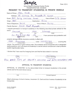
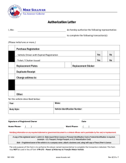


© Copyright 2026