
Maps and their makers … and the pretence of objectivity Related
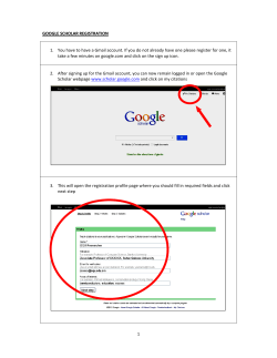
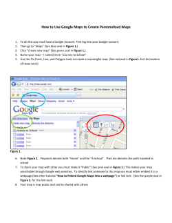
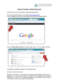
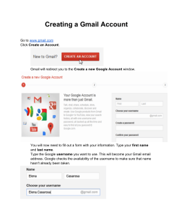
Maps and their makers … and the pretence of objectivity Nick Leech June 19, 2014 Updated: June 22, 2014 13:18:00 One-page article Maryland, USA, May 28, 2014 39º 0’ 9.676” N 76º 56’ 7.792” W (Coordinates refer to locations mentioned in the essay) Related The map may have been a cartographic first, but the detailed image of the vast area of seabed where Malaysian Airlines MH370 is believed to have vanished offered little in the way of consolation. The Wallaby-Zenith fracture zone is a place where plateaus rise vertiginously above the seabed and troughs plunge to a depth of almost five miles. Published in Eos, the weekly journal of the American Geophysical Union, it revealed rather more about our ignorance of the oceans – modern cartography’s greatest terra incognita – and the scale of the task facing the teams searching for MH370 than it did about the missing airliner. “It is a very complex part of the world that is very poorly known,” said Walter H!F Smith, a geophysicist from the laboratory for satellite altimetry at the US National Oceanic and Atmospheric Administration (NOAA) while speaking at a press conference. “For about 90 per cent of the ocean we’ve had a satellite technology which cannot see the ocean floor. I want to be clear about the fact that it does not see the ocean floor, but it uses radar to measure the sea’s surface and curiously, the sea’s surface shape has some indications in it that can reveal the presence of mountains and valleys below.” As Smith was keen to point out, less than 5 per cent of the south-east Indian Ocean is mapped in any detail and maps produced using images from satellites fitted with altimeters have an accuracy measured in kilometres rather than metres. ■ A History of the World in Twelve Maps shows that cartography is a matter of perspective In pictures: Google's Street View maps the Burj Khalifa ■ Google's Mapathon 'threatens security' Topic Arts & Culture Topics, The Review “If you wanted to see something as small as a car, or a small piece of an airplane or a black box, you would need to be very close to that object,” he explained. “That means either a deep-towed or a robotically operated vehicle in the water close to the sea floor – and almost none of the ocean is known by that means.” In order to illustrate the topography of the search area, Smith and his NOAA colleague Karen M Marks used publicly available information retrieved from satellite data, ship tracking systems, underwater topographic records and media reports on the search. “We’ve figured out how to take this satellite radar measurement of the shape of sea level and infer the mountains and valleys below. Putting all this together we get a crude map of the terrain” – but, Smith explained, “we are painting with a very, very broad brush”. Abu Dhabi, March 30, 2014 24º 27’ 28.128” N 54º 18’ 7.792” E “The world has now been aerially mapped and digitally imaged many times over and, as those of us using digital devices know, in our everyday wanderings we have access to a vast, layered array of these digital maps.” So explained the medievalist Carolyn Dinshaw. “These maps are the backbone of location-aware applications that use GPS technology to pinpoint us and to monetise our gender, race, class and economic positions in space and time.” By the time Dinshaw and her collaborator Marget Long had taken to the stage for their public lecture Exploring Nowhere: Mirages, Digital Maps, and the Historical Problem of Location at the InterContinental Hotel in the capital in March, there was really only one problem of location at the forefront of everyone’s minds. MH370 had been missing for three weeks. “That flight is shocking. The idea that a huge jetliner could vanish off the face of the Earth, I think at this point, especially for people who use digital mapping technologies every day and rely on satellite imagery, that seems nearly impossible,” Dinshaw explained before the event. “It goes against our presumption that everything is locatable, but there are places that elude mapping technology and there are ways to still be unmapped in the present time.” As MH370 shows, one way to escape mapping is to mysteriously disappear. Another, as Marget Long explained, is not to be a priority on the list of contemporary cartographers. “Google are mapping every nook and cranny in the US and they’ve even gone off-road and into the landscape and the national parks, and yet they haven’t mapped a major city like Dubai. No place in the UAE is Google Street View mapped, although it is meant to be coming very soon. That’s a choice. These things take time but there is a priority system in place.” Dubai, February 2014 25º 2’ 51.591” N 55º 10’ 54.266” E On February 6, 2014, @MEGadgetGuy, a self-described “proud geek” posted the following tweet: “#map #Google #StreetView car spotted in #dubai”. The tweet was accompanied by a picture of the car in question, complete with its panoptic, 15-eyed camera and was soon picked up by the blogosphere where rumours about Google Street View’s imminent arrival in the UAE started to spread. Six days later, at the UAE Government Summit at the Madinat Jumeirah hotel in Dubai, Peter Barron, Google’s director of communications and public affairs for Europe, the Middle East and Africa, confirmed that Dubai would become the first Arab city to be available on Google Street View. The news was accompanied by the display of one of Google’s Street View cars at the technology and innovation showcase that was held at the summit. “The opportunities for growth in the UAE are extraordinary,” Barron told a reporter from the Dubai-based newspaper Gulf News. “The interest of the consumers is extraordinarily high, in terms of mobile, and in terms of YouTube [the UAE has] one of the highest adoptions anywhere in the world. This is really encouraging.” “This is what I like about Dubai. Always in the lead,” wrote Ali, a Dubai resident, in the online comments that followed the report. French territorial waters, the Coral Sea, November 22, 2012 19º 12’ 44” S 159º 56’ 21” E If MH370 and even Dubai highlight the holes that still exist in our maps, the recent case of Sandy Island points to the holes in the data used to compile them. On November 22, 2012, a group of scientists made an “undiscovery” 1125 kilometres off the north-east coast of Australia. Before then, Sandy Island had existed. Afterwards, it didn’t. As Dr Maria Seton, a geologist at Sydney University and the expedition leader explained to The Sydney Morning Herald at the time, it was actually a discrepancy between maps that led to the island’s “undiscovery”. “We became suspicious when the navigation charts used by the ship showed a depth of 1,400 metres in an area where our scientific maps and Google Earth showed the existence of a large island.” By November 26, Sandy Island had been removed from Google Earth and replaced with a low-resolution patch of open water. Google was not, however, the only cartographer to have taken the existence of Sandy Island for granted. The island was first “sighted” by the crew of a whaling ship in 1876, appeared in Australian naval directories, British Admiralty charts and even in the World Vector Shoreline Database, a data set compiled in 1995 by the United States’ National Imagery and Mapping Agency with the aim of creating “the highest resolution demarcation of coastline globally available”. The Sandy Island incident is just one of the 47 short case studies that feature in Professor Alastair Bonnett’s new book, Off the Map: Lost Spaces, Invisible Cities, Forgotten Islands, Feral Places and What They Tell Us About the World [Amazon.com]. In it, the geographer sets off on a journey “to the ends of the earth and the other side of the street, as far as we need to go to get away from the familiar and the routine”. Bonnett is actually fonder of the book’s American title, Unruly Places: Lost Spaces, Secret Cities, and Other Inscrutable Geographies [Amazon.com] Not only is this more succinct, but it more accurately captures its clarion call for a wider re-engagement and reenchantment with place. “When we find that Sandy Island never existed in the first place, it gives us a sense of cocking a snook to the allseeing-eye, a sense of release,” Bonnett explains. “If you go to Sandy Island now you’ll see that it’s covered in photographs of amazing palaces and dinosaurs clashing. It’s become a fantasy site for Google Earth users where they can upload their fantasies of a nonexistent place.” Oxford, March 1876 51° 44’ 58.9”N 1° 15’ 20.8”W “What’s the good of Mercator’s North Poles and Equators, Tropics, Zones and Meridian Lines?” So the Bellman would cry: and the crew would reply, “They are merely conventional signs!” “Other maps are such shapes, with their islands and capes! But we’ve got our brave captain to thank” (so the crew would protest) “that he’s brought us the best – A perfect and absolute blank!” The Hunting of the Snark (An Agony in Eight Fits) Lewis Carroll London, June 23, 2014 51º 31’ 6.491” N 0º 7’ 27.509” E On Monday evening Tom McCarthy, the award-winning author of Remainder, Men in Space and C, will meet with Hans Ulrich Obrist, the co-director of London’s Serpentine Gallery, to discuss the publication of their recent collaboration, Mapping It Out: An Alternative Atlas of Contemporary Cartographies. As well as McCarthy’s introduction, the book features more than 130 maps produced by luminaries from the worlds of architecture, literature, philosophy, science and art such as Toyo Ito, Tim Berners-Lee, Louise Bourgeois, Damien Hirst and Yoko Ono. “No wonder, then, that artists from Leonardo and Dürer to Boetti and Ruscha have been fascinated by maps,” says McCarthy. “The cartographer’s problem is the draughtsman’s problem, the problem of perspective.” Divided into sections such as Redrawn Territories, Charting Human Life, Scientia Naturalis, Invented Worlds and The Unmappable, Mapping It Out features maps in all of their apparently infinite variety, from Bourgeois’s beguiling personification of France to complex data visualisations such as the geneticist Craig Venter’s map of the human genome. According to Obrist, Mapping It Out has been almost 30 years in gestation, but its immediate inspiration came from Map Marathon, a series of performances, interviews and presentations made by 50 writers, thinkers, scientists and artists that Obrist curated for the Serpentine Gallery in 2010. The marathon’s agenda was as diverse as contemporary cartography itself: the performance artist Marina Abramovic talked about body maps while Hal Bertram, the co-founder of the London-based data visualisation experts ITO, explained the active disaster relief role played by members of OpenStreetMap (OSM), a Wiki-based, open source mapping community. OSM’s aim is to create a map of the world, built using crowd-sourcing and open data, that is both free and freed from the commercial imperatives that dictate the efforts of cartographic giants such as Google and Apple. Following the 2010 earthquake in Haiti, an updated and dynamic OSM map of Port-au-Prince – created online by volunteers in just two days using available satellite imagery – provided NGOs and emergency services with the most comprehensive map of the disaster area available anywhere in the world. As is so often the case in Obrist’s career, Map Marathon seemed to capture the zeitgeist, talking to a moment in which (thanks to satellite technology, powerful geographical information system [GIS] software, big data, social media and mobile technologies) maps and mapping have returned to the centre stage of political, artistic, cultural and scientific inquiry and debate. The marathon also dovetailed neatly with a 2010 British Library exhibition, Magnificent Maps, which identified the introduction of dynamic digital mapping in the early 21st century as one of the most revolutionary chapters in cartography since the 15th century, the moment when manuscripts gave way to print. As Obrist said at the time: “In this new age of GPS, Google Earth and multidimensional digital maps, mapping is suddenly hugely relevant again.” Cartography first became part of Obrist’s intellectual universe when, as an 18-year-old, he met the artist he now describes as both a friend and a mentor while on a school trip to Rome. Alighiero e Boetti’s career became inextricably associated with a series of intricately embroidered large-scale maps. The first of these, Dodici forme dal 10 guigno 1967 (Twelve Shapes Starting from 10 June 1967) was embroidered by Boetti’s wife and was based on engravings that detailed the territories fought over during the Arab-Israeli war of that year. This was eventually followed by a series of almost 150 embroidered maps that Boetti commissioned from artisans working in Afghanistan and Pakistan. Executed between the early 1970s and the early 1990s and known simply as Mappa, these large-scale, conventional projections feature world maps in which the outline of each nation is filled with its flag. Created in countries with little or no history of cartography and finished in colours that were often dictated by the availability of materials, the maps were the product of painstaking processes that meant they were invariably out of date by the time they were completed. They are artistic testament to the relationship between cartography, place and politics in a world embroiled in near-permanent and often violent transformation. “There is an interesting conundrum now between velocity and speed in relation to maps because very often maps are now instantly reconfigured on the net, whereas historically they contain a great slowness,” Obrist explains. “Any attempt at making a synthetic image of something that is so complex that it escapes that synthetic image is an interesting conundrum.” New York, September 2001 40º 46’ 24.351” N 73º 57’ 49.666” W If Boetti’s is the presiding genius behind Mapping It Out, the book is actually dedicated to another, the curator, art historian, and conceptual artist-cum-investigator Mark Lombardi. Lombardi came to the practice that now defines his reputation late in life. The fact that there are doubts about the cause of his early death – Lombardi is thought to have committed suicide in 2000 – seems sadly appropriate for a man who dedicated himself to the cartography of conspiracy. Using nothing more than a sheet of paper and a pen, Lombardi attempted to visualise the relationships between politics, big business and international terrorism in cases such as the collapse of the Vatican Bank, the Iran-Contra scandal and the collapse of the Bank of Credit and Commerce International. The results – bewildering clouds of hand-rendered names, connecting lines and intersecting points – are now admired by conspiracy theorists, specialists in data visualisation and contemporary artists alike, but uncertainty surrounds their status as historical evidence. In the aftermath of 9/11, public and political paranoia was at a sufficient pitch to persuade the FBI to send an agent to the Whitney Museum of American Art to investigate a Lombardi drawing that identified seemingly direct links between George W Bush and Osama bin Laden. New York, April 14, 2014 40º 44’ 56.102” N 74º 0’ 16.458” W “I actually read Mark Lombardi in a very different way. I read him as being like Jackson Pollock,” says the social scientist, artist and writer Trevor Paglen. “Those charts and those maps, for me, they are abstract, formal things. They don’t reveal anything and if they do reveal something it is obscurity.” Although he insists that “mapping isn’t his thing”, Paglen’s and Lombardi’s work share many of the same formal and conceptual concerns and, ever since 9/11, Paglen has dedicated himself to uncovering the global geography of America’s secret state. It’s a process Paglen describes in his 2009 book Blank Spots on the Map – the Dark Geography of the Pentagon’s Secret World and in Invisible: Covert Operations and Classified Landscapes. “Something that has been of great concern to me is the rise of the post-9/11 terror state. The ways in which what we might call the legitimate functions of the state have been completely rewritten over the last 13 or 14 years and how institutions like assassination, torture and indefinite detention – things that were once considered aberrant and criminal – are now seen as legitimate.” Rather than cartography, one of the principal ways Paglen has tried to make these operations visible is through photographs, using photography as an act of what he describes as “truth telling”. “I’m looking at places that are not easily understood, not easily something that you can make sense of, in my case because the things that are going on there are secret and these are often secret places. Places the government calls ‘black sites’, places that don’t exist as far as public information is concerned.” This “truth telling” is most apparent in two of Paglen’s series of pictures. In Limit Telephotography, Paglen uses camera technology designed for astronomers to photograph top-secret governmental sites, while in The Other Night Sky, he uses the data of amateur satellite watchers to track and photograph classified spacecraft and eavesdropping spy satellites as they appear in Earth’s orbit. Heavily distorted by the effects of distance, long lenses and long exposure times, the results are an almost mirage-like series of images whose obscurity reflects the fact that they exist at the limits of what we can and are allowed to see. “For me, these images are questions rather than answers, unlike Google Maps which is an image that purports to be an answer,” Paglen says. “My work is almost the opposite of mapping.” Both Paglen and Lombardi use the world of secrecy as their source material, but Paglen is keen to highlight what he sees as a fundamental difference between their work. “I don’t use the aesthetics of objectivity in the way that Lombardi does. Lombardi’s work has the aesthetics of objectivity, it seems to promise you an answer and a coherent story, but what it delivers is the opposite.” For Paglen, that use of the aesthetics of objectivity – a phrase Paglen admits to stealing from his friend, the author Rebecca Solnit – places Lombardi’s work on a similar plane to contemporary mapping technologies such as GPS, GIS and Google Earth. “The advent of mobile technologies has made maps ubiquitous, interactive, distributed and a part of our everyday lives in a way that has not been true historically,” the artist explains. “And it’s becoming increasingly clear that the GPS constellation is probably as revolutionary a technology as centralised coordinated time was in the 19th century.” “But what are all the things that a map cannot tell you? There is an aesthetic of objectivity and omnipotence to maps and mapping, but this is not real. It’s an aesthetic and despite its God’s-eye view, a map is not omniscient. It’s a point-of-view that seems to give you more information than it actually does.” Nick Leech is a features writer for The National. nleech@thenational


© Copyright 2026