
The mobile opportunity: How to capture upwards of 200% in lost traffic
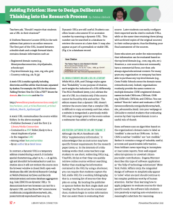
June 2014
BrightEdge Mobile Share Report
The mobile opportunity:
How to capture upwards
of 200% in lost traffic
Mobile Share Report // June 2014
You’ve likely heard that mobile website optimization is the next frontier, and
you’ve probably heard that for quite some time. The truth is, we’re already there.
Mobile usage continues to climb, and BrightEdge data forecasts an estimated
50-percent growth in smartphone traffic in the coming year.
There is a shift happening in the search results as we speak. Sixty-two percent
of the results on Google show different results on mobile devices compared to
desktop. This is a new trend, and historically has not been the case.
With Google favoring sites in the search results that offer an excellent experience
for mobile users, it’s now more important than ever for a site’s rankings that the
mobile solution is implemented well. However, new BrightEdge research has
revealed that nearly a third of websites studied have incorrectly implemented
mobile solutions, leading to a severe loss of traffic opportunity.
That means, many brands are not only losing traffic to their competitors, but also
potential revenue.
In this new research, BrightEdge found that on average, 27 percent of websites
were misconfigured for smartphone searches, which resulted in an average
68-percent loss of smartphone traffic to those websites. If these mobile sites
were to regain the full potential of their traffic, it would equal a 212-percent jump
from what they currently experience.
27% of mobile sites are misconfigured, losing
an average of 68% of smartphone traffic.
This research, derived from analysis of data found in BrightEdge’s Data Cube,
serves as a stark reminder that if website owners aren’t doing mobile – and doing
it well – their traffic suffers. Armed with the right knowledge, website owners can
be better prepared for the opportunities that lie ahead in their mobile journey.
This paper will explore exclusive BrightEdge research on how the various
approaches to mobile perform relative to one another, and common
implementation errors and associated loss of traffic; it will also examine the types
of mobile configurations available, the ways to determine which configuration to
adopt for smartphone users, and the associated benefits and challenges of each
type of configuration.
1
Mobile Share Report // June 2014
Smartphone traffic share expected to grow
by 50% in coming year
iPhone and Android devices, now in their 7th year of existence, have 23 percent
of the organic traffic share, according to information from BrightEdge’s Data Cube
in April 2014. Smartphone growth is not expected to stop. BrightEdge forecasts
total smartphone traffic share will grow at least 50 percent in 2014.
SMARTPHONE SHARE OF ORGANIC SEARCHES
25%
SHARE
20%
15%
10%
5%
APR
MAR
FEB
JAN
DEC
NOV
SEP
OCT
JUL
2014
AUG
MAY
APR
MAR
FEB
JAN
DEC
NOV
SEP
OCT
JUL
2013
AUG
JUN
MAY
APR
MAR
FEB
JAN
2012
JUN
0%
eMarketer data agrees with the growth, showing 48.9 percent of mobile phone
users worldwide, or 2.23 billion people, “will go online via mobile at least
monthly in 2014, and over half of the mobile audience will use the mobile Internet
next year.”
Tablets now make up a 12-percent share of organic traffic. Add smartphones
and tablets together, and mobile devices now command a third of organic search
traffic going to websites.
Smartphones and tablets together
command 1/3 of organic search traffic.
2
Mobile Share Report // June 2014
Type of mobile configuration and
related rankings
On average, 62 percent of organic searches show different results depending on
whether the search was performed on a desktop or smartphone, according to
BrightEdge data.
In its research, BrightEdge wanted to know if the type of mobile configuration
had an impact in mobile rankings, or if it was the implementation of the mobile
configuration that had more of an impact.
Right now, Google supports the following three mobile configurations:
–– Responsive web design. This is when a website serves the same URL and
same HTML to all devices, using CSS to change how the page is rendered on
the device. Google has stated this is its recommended mobile configuration.
–– Dynamic serving. This is when websites serve the same set of URLs to all
devices, but the HTML and CSS changes depending on the device (in other
words, the content is different, URL is the same).
–– Separate mobile sites. This is when a website has a separate mobile
experience from its desktop version, and the URLs are different – be it
an entire site or specific pages within a site.
Data from BrightEdge’s Data Cube shows that for a given keyword, on average,
a website’s rank for smartphone users varies only slightly based on the type of
mobile configuration a website has implemented.
CHANGE IN SEARCH RANK
So, for example, if a site is ranked No. 3 on a desktop, it would rank 3.5 (on
average) on a smartphone device. This data represents the average across billions
of keywords studied.
0.2
0
-0.2
Responsive
Dynamic
Separate
-0.51
-0.57
-0.52
-0.4
-0.6
-0.8
MOBILE CONFIGURATION
3
Mobile Share Report // June 2014
Overall, mobile ranks were half a position lower than desktop ranks across all
three mobile approaches; competition from local results is most likely the cause
for the slightly lower mobile ranks. For example, if you’re on the go and search for
pizza, you might get local results that push the rank down, whereas you might not
see those same results on a desktop.
Responsive design did perform slightly better than the other approaches, with
the lowest drop in rank at .51 positions, although the difference was not
statistically significant.
The relatively similar performance in the search results rankings across all three
mobile configurations makes sense, because search engines have stated they are
not partial to one approach or the other.
Mobile sites are rarely configured perfectly
While the ranking outcome of a correctly implemented mobile configuration is
virtually the same regardless of the type (e.g., responsive, dynamic, separate
URLs), an incorrectly implemented site resulted in a drop in smartphone rank
by almost two positions (1.82 on average).
This drop in the search rankings may not seem like much, but click-through
rates are highly sensitive to rank. Thus, this drop in rank leads to a 68-percent
drop in traffic.
35%
Smartphone
CLICK THROUGH RATE
30%
Tablet
Desktop
25%
20%
15%
10%
5%
0%
1
2
3
4
5
6
7
8
9
10
11
12
13
14
15
16
17
18
19
20
RANK
4
Mobile Share Report // June 2014
This stat is derived from the fact that misconfigured sites receive only 7 percent
on average of smartphone traffic, versus sites that have correctly implemented
a mobile configuration and see 23 percent of traffic coming from smartphones.
Due to the varying technical requirements of each type of configuration, the
configuration a website owner chooses can greatly increase the related risks of
errors and ongoing maintenance costs.
In its research, BrightEdge observed the following error rates for each type of
mobile configuration:
Approach
% with errors
Separate
72%
Dynamic
30%
Responsive
Negligible
Separate mobile URLs experienced the most implementation errors. Those errors
are detailed in the following table:
Error
Dynamic
Separate
No HTTP Vary
82%
41%
Wrong Canonical
35%
No Canonical
35%
Wrong Alternate
2%
No Alternate
61%
Disallow Robots on Mobile subdomain robots.txt
16%
Redirecting all pages to mobile home page
12%
5
Mobile Share Report // June 2014
Common mobile errors explained
For separate mobile URLs, there are a handful of common mistakes made in
implementation. BrightEdge research showed that no HTTP Vary header was
a common mistake amongst two approaches: dynamic serving (82 percent)
and separate mobile URLs (41 percent). And among the separate mobile URL
approaches, not having an alternate URL tag was the most common error 61
percent of the time.
No HTTP vary
No HTTP Vary means that the website did not indicate through the HTTP Vary
header that the content should be different for each “user-agent” (for example, a
smartphone user).
An example of the correct usage is pictured in the following image:
Wrong or no canonical
A wrong or no canonical tag means that the website did not have the correct
canonical URL listed in the HTML of the smartphone-optimized URL. When a
separate mobile experience exists apart from desktop, the separate URLs are the
mobile equivalent of the desktop URLs, and annotations need to be made for the
search engines to understand that through the canonical tag. A correct canonical
has the full subdomain and domain in the URL.
An example of a correct canonical tag is provided in the following screenshot, which shows
http://www.1800flowers.com/valentinesday:
6
Mobile Share Report // June 2014
Wrong or no alternate
Similarly, wrong or no alternate tag means that the website did not have the
correct alternate URL in the HTML of the canonical URL.
An example of a correctly implemented alternate URL is shown in the previous screenshot,
showing http://m.www.1800flowers.com/valentinesday.
Disallow robots
When a webmaster incorrectly uses the “Disallow” directive for robots.txt on a
mobile subdomain, it usually looks something like this:
User-agent: *
Disallow: /
Using the disallow directive prevents search engines from crawling the separate,
mobile-optimized URLs entirely.
Faulty redirects
When a website redirects smartphone users to a mobile home page instead of
the mobile version of the URL the person is trying to access, it creates a bad
user experience. In addition, a single mobile home page cannot rank well for all
the queries related to multiple pages of desktop content – especially if the mobile
home page does not contain any of that content.
Pick your mobile solution well
Now that we’ve gone through the common mistakes associated with the various
types of mobile configurations, it’s time to start deciding which mobile experience
is right for you. Choosing a mobile path starts with the intent of the user and the
goals of the site.
Here are two common scenarios for smartphone users interacting with a site that
can help determine the mobile configuration to choose:
1. Smartphone users have the same intent as desktop users. The
experience should be optimized for the different screen sizes (responsive).
2. Smartphone users have different intentions than desktop users. The
website should be configured for those different use cases (separate mobile
URLs or dynamic serving).
7
Mobile Share Report // June 2014
How do you know which scenario fits your smartphone user? Site owners can
use a variety of methods to uncover intent including keyword data by device
(if available) and the pages smartphone users visit most, as well as surveying
customers to ask them directly what they would want in a mobile experience.
Part of this decision-making process lies within the intel that a marketing team
or site owner already has about what people want in a mobile experience. One
scenario where a person could make assumptions about mobile intent is if, for
example, a nationwide retailer sold clothing online and also in local brick-andmortar stores.
Those coming from a desktop are likely looking to perform research and to buy
clothes online; whereas those coming from smartphones are likely looking for the
location and contact information of a local store.
The following graph represents the types of website configurations based on
varying needs like:
–– Same HTML/Same URL
–– Different HTML/Same URL
–– Different HTML/Different URL
Advanced Mobile
SEO Matrix
Same URL
Same HTML
Responsive
Different HTML
Dynamic Serving
Different URL
Separate
8
Mobile Share Report // June 2014
Responsive
Responsive websites are created with the assumption that content should be the
same across all devices. It is not the content (or HTML) of the Web page that
changes, but the presentation of that content that changes based on the device
and size of the browser.
Here is an example using the Starbucks website demonstrating desktop to mobile experience:
This is implemented through the media attribute of the HTML link element and/or
media queries in CSS. The URL of the content is also the same regardless of the
attributes of the browser or device.
For the last several years, responsive Web design has emerged as a popular
choice. That movement was validated in April 2012 when Google officially
recommended responsive design as the mobile configuration of choice.
Dynamic
Dynamic websites are created with the assumption that the content (HTML)
presented to the user should vary by device. The URL remains the same.
Here is an example using the Zillow website demonstrating the desktop versus
dynamic experience:
9
Mobile Share Report // June 2014
A word of warning: Because the URL of the content is the same regardless of
browser or device, the customization of the HTML could be reminiscent of
Black Hat “cloaking” when not implemented well.
The difference between cloaking and dynamic serving is that dynamic serving
actively signals that the content is customized through the use of the HTTP
Vary header.
Separate
Separate mobile URLs or websites are created as if the desktop and mobile
websites are two completely separate entities and experiences. The URLs are
different and the content and HTML are different.
Here is an example using 1-800-FLOWERS.COM to show the desktop versus separate
mobile experience:
Tips for implementing mobile
Once you’ve chosen your configuration strategy, and you understand the common
errors associated with each type, it’s time to implement. Even if your mobile
solution is correctly configured today, with each website release, the configuration
needs to be verified again.
10
Mobile Share Report // June 2014
Here are some tips on how to get the most from each type of mobile
configuration:
–– Responsive: Make sure to implement conditional loading correctly for fast
page load time. Reduce the number of asset files to download, and reduce
the file size of large images or video asset files.
–– Dynamic: Ensure the site is not perceived to be cloaking; indicate “useragent” in the HTTP Vary header. Also, remember to optimize your mobile
URLs and content for on-page SEO, just as you did
for desktop content.
–– Separate URLs: Ensure the site is compliant with HTTP Vary usage, so that
search engines know why smartphone users are being redirected to a
different URL. Make sure search engines also know how to combine link
equity by using canonical and alternate tags and URLs in the HTML. Also,
make sure search engines are able to crawl the mobile pages by properly
configuring the robots.txt.
What’s next for mobile optimization?
As enterprises cater to the growing mobile market, BrightEdge data shows that
all three approaches to mobile website configuration rank about the same for a
given keyword if implemented correctly. We believe many brands will take on
responsive design as their choice of mobile configuration, but what we’ve found
in talking with customers is that one mobile configuration is not necessarily a
one-size-fits-all solution.
There is an evolution in how brands are
approaching mobile right now. One type
of mobile configuration is not always a
one-size-fits-all solution.
Jim Yu, Founder and CEO, BrightEdge
11
Mobile Share Report // June 2014
Some brands aren’t exclusively choosing responsive or dynamic, for example.
Some brands will experiment with responsive, but implement dynamic serving of
content on the most important pages within the website.
If you’re a CMO or site owner, you have some big choices to make in mobile.
The mobile configuration itself varies in the degree of risk in potential errors.
Layer on top of that multiple mobile approaches, and you have some serious
technical considerations.
Being that incorrect implementation results in an average loss of about two-thirds
of smartphone traffic, according to BrightEdge data, ensuring mobile configuration
is implemented well requires the right tools during the process.
BrightEdge’s SEO platform offers the most comprehensive mobile SEO
technology on the market to help marketing and development teams succeed
before, during and after the mobile implementation.
BrightEdge’s site audit recommendations assist during implementation to make
sure you get it right, and then mobile analytics and rankings reports track the
impact of your mobile investment over time; the mobile “share of voice” takes it
a step further to help you understand and monitor the competition after you’ve
launched your mobile experience, so you can tweak your marketing strategy in
real time.
For Marriott, we definitely need to make
sure that we’re on top of our game from a
mobile perspective — BrightEdge visibility
definitely helps us do that.”
Luisa Escobar, Director of Search Engine Optimization, Marriott International
12
To learn more about tracking mobile search performance, and mobile content
and optimization, join us at Share14, BrightEdge’s premier digital marketing
conference, taking place August 20 to 22, 2014, in San Francisco. More than
1,000 digital marketing leaders are attending to discuss the latest trends in not
only mobile, but also content marketing and organic search.
Methodology and notes
Unless otherwise indicated, all BrightEdge data comes from the analysis of
information found in BrightEdge’s Data Cube -- the industry’s most complete
data set, which process more than 100 terabytes of data per week, and includes
billions of pieces of content and keywords for analysis.
In all instances where applicable, “mobile” rank and traffic refers to both
smartphone and tablet devices combined, whereas references to “smartphone”
rank and traffic refer to that device only.
BrightEdge is the essential SEO and content marketing platform that transforms online content
into tangible business results such as traffic, revenue and engagement. BrightEdge’s S3 platform
is powered by a sophisticated big data analysis engine and is the only company capable of
Web-wide, real-time measurement of content engagement across all digital channels, including
search, social and mobile. BrightEdge 8,500+ customers include global brands such as 3M,
Microsoft, Netflix and Nike.
The company is based in San Mateo, Calif., with offices in New York City, Chicago and London.
Visit our website
Read our blog
Like us on Facebook
Follow us on Twitter


© Copyright 2026