
STATUS BOARD How to graph your own data. !! !
STATUS BOARD
How to graph your own data.
!!
!
Changelog
! Version 1.3 (November 2013): Added how to access data from Dropbox; added new
•
“Debugging” section.
!
!
!
Introduction
!You can specify your data in one of two formats: CSV or JSON. If you're new to this,
CSV format is probably the place to start.
!
!
!
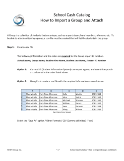
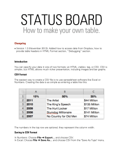
CSV Format
!The easiest way to create a CSV file is to use spreadsheet software like Excel or
Numbers. Creating the data is as simple as entering a table like this:
This creates a graph like this:
!
!In order to see this graph in Status Board, you need to 1) save your table data to CSV
format, and 2) make your CSV file accessible on the network.
Saving to CSV Format
!
In Numbers: Choose File ➜ Export… and choose CSV.
In Excel: Choose File ➜ Save As… and choose CSV from the "Save As Type" menu.
!
Regarding Your CSV Data: Delimiters in CSV files can be either commas or
semicolons. Please DO NOT use grouping separators in any numeric values (for
example, expressing the number one thousand as "1,000" or "1.000".) Grouping
separators will cause your values to be parsed incorrectly.
!!
Adding a graph to your status board
!Go into Edit Mode by tapping the “gear” icon in the upper left of your iPad’s screen.
Drag a graph panel onto your board (pictured below), placing and sizing it however
you’d like.
!
!
Making your data accessible to Status Board
!Now that your graph data is in a file, you need to put that file in a location where Status
Board can access it. There are two ways to do this:
!!
1. Storing your file on Dropbox
!This is the simplest method, especially if you’re already a Dropbox user.
! 1. You’ll need the Dropbox application installed on your iPad.
2. While in Edit Mode, tap on your Graph panel to display the panel’s customizer.
3. Tap Dropbox.
4. The Dropbox app will open; grant Status Board permission to access your
Dropbox. (Status Board will only access the file you specify, and will not access
any other file on your Dropbox.)
5. After you grant access, Status Board will re-open. Browse through your Dropbox
folder hierarchy and find the file that contains your graph data. Tap on that
filename.
!You’re done! Status Board should display your graph. When changes are made to the
file on your Dropbox, those changes should be reflected on your status board within a
few minutes.
!!
2. Storing your file on a web server
!This method requires that you know how to place a file on a web server. (Not to
mention: if your graph data is generated dynamically, this is the way to go.)
! 1. Store your file on a web server of your choosing.
2.
3.
4.
5.
While in Edit Mode, tap on your Graph panel to display the panel’s customizer.
Tap URL.
Enter the URL of your file.
Tap Save.
!You’re done! Status Board should now display your graph. When changes are made to
the file on your web server, those changes should be reflected on your status board
within a few minutes.
CSV Tips & Tricks
!If you want to specify custom colors for your graph, just add a row called "Colors". The
color values can be red, blue, green, yellow, orange, purple, aqua, or pink.
!
If you want to see totaled values on your graph, just add another row called "Totals".
(No need to put any totaled values in your table; Status Board will calculate them for
you.)
!
JSON Format
!If you're creating the graph data yourself, CSV is probably simpler. If you have software
that will be creating the graph data for you—or you need more sophisticated graphing
capabilities—JSON is probably a better choice. The JSON format looks like this:
!
{
"graph" : {
"title" : "Soft Drink Sales",
"datasequences" : [
{
"title" : "X-Cola",
"datapoints" : [
{ "title" : "2008",
{ "title" : "2009",
{ "title" : "2010",
{ "title" : "2011",
{ "title" : "2012",
]
},
{
"title" : "Y-Cola",
"datapoints" : [
{ "title" : "2008",
{ "title" : "2009",
{ "title" : "2010",
{ "title" : "2011",
{ "title" : "2012",
]
}
]
}
}
"value"
"value"
"value"
"value"
"value"
:
:
:
:
:
22 },
24 },
25.5 },
27.9 },
31 },
"value"
"value"
"value"
"value"
"value"
:
:
:
:
:
18.4 },
20.1 },
24.8 },
26.1 },
29 },
! !
JSON Tips & Tricks
!Refresh Interval
!You can specify how often you'd like Status Board to poll your graph data:
!
{
"graph" : {
"title" : "Soft Drink Sales",
"refreshEveryNSeconds" : 120,
"datasequences" : [
{
"title" : "X-Cola",
"datapoints" : [
!!
This parameter is optional. If you leave it out, it will use the default interval of 120
seconds. (This may change in future builds of Status Board.) The minimum value is 15.
!!
!
Color
!Add "color" to a datasequence object:
!
{
}
"title" : "X-Cola",
"color" : "red",
"datapoints" : [
{ "title" : "2008",
{ "title" : "2009",
{ "title" : "2010",
{ "title" : "2011",
{ "title" : "2012",
]
"value"
"value"
"value"
"value"
"value"
:
:
:
:
:
22 },
24 },
25.5 },
27.9 },
31 },
!Color values can be yellow, green, red, purple, blue, mediumGray, pink, aqua, orange,
or lightGray.
!Totals
!Display totals by adding an attribute to the graph object:
!
{
"graph" : {
"title" : "Soft Drink Sales",
"total" : true,
"datasequences" : [
...
!!
Graph Type
!Status Board can draw line or bar graphs, and tries to make the best choice for your
data. If you want to force Status Board to go one way or the other, do:
!
{
"graph" : {
"title" : "Soft Drink Sales",
"total" : true,
"type" : "bar",
"datasequences" : [
...
!Graph type values can be "bar" or "line".
!!
!!
!!
!!
!!
!
Scaling the Y-axis
!If you want the graph's Y-axis to start at a particular value and/or end at a particular
value, do:
!
{
"graph" : {
"title" : "Soft Drink Sales",
"yAxis" : {
"minValue" : 50,
"maxValue" : 150
},
…
!Either minValue, maxValue, or both values can be specified. (Both together are not
required.)
!!
Specifying Units
!If you want the graph to display a units string with your values (say, a "$" in front of a
number, or a "%" behind), do:
!
{
"graph" : {
"title" : "Soft Drink Sales",
"yAxis" : {
"units" : {
"prefix" : "$",
"suffix" : "%"
},
…
!(Though you probably wouldn't want to show these two together at the same time.)
!!
Scaling Values
!If Status Board detects that your numbers are mostly in the thousands, millions, etc., it
will scale the numbers so they fit more concisely on the graph. (For example, 4,600,000
might become 4.6.) In turn, "(Thousands)" or "(Millions)" will be placed in the graph title.
!If you don't want it to do that, do:
!
{
"graph" : {
"title" : "Soft Drink Sales",
"yAxis" : {
"scaleTo" : 1
},
…
!If you want to scale to thousands or millions, specify "1000" or "1000000". ("0" will tell
Status Board that it should make its best guess, just as it would if no parameter were
provided at all.)
!
Hide Axis Labels
!If you don't want to show values labels on the Y-axis, do the following:
!
{
"graph" : {
"title" : "Soft Drink Sales",
"yAxis" : {
"hide" : true
},
…
!The same can be done for the X-axis by using an "xAxis" attribute.
!!
Forcing Every X-Axis Label to Display
!Oftentimes, x-axis labels represent a sequence in time. Because of this, Status Board
will sometimes drop a few of the x-axis labels so as to give more space to a fewer
number of labels. (For instance, say your x-axis labels represent the months in a year. If
your graph gets small, Status Board may skip every other month to give more space to
each label that remains.)
!But sometimes you don't want that to happen. To make sure every x-axis label is
displayed, do the following:
!
{
"graph" : {
"title" : "Soft Drink Sales",
"xAxis" : {
"showEveryLabel" : true
},
…
!!
Error Reporting
!If you want to report an error, include an error object in your graph:
!
{
"graph" : {
"title" : "Soft Drink Sales",
"error" : {
"message" : "Message displayed on panel",
"detail" : "Message displayed after quad-tap on panel"
},
"datasequences" : [
...
!Other attributes can be listed in the "graph" object, but if the "error" object is present
they will be ignored.
!!
!!
!!
Sharing Graphs via URL
!It's possible to have one of your customers install a graph panel onto a Status Board via
a URL on a web page. Use the following format:
!
!The sourceDisplayName argument is optional.
!When the user taps on that link on their iPad, Status Board will launch and ask the user
if they'd like to install the graph on their Status Board.
!!
!
Debugging
!Debug your graph by quad-tapping on it (four taps in a row) with your Status Board in
panicboard://?url=[%-encoded graph data url]&panel=graph
&sourceDisplayName=[your %-encoded company name]
“locked” (non-edit) mode. This will bring up a debug window that will let you see the
graph data your server is sending to Status Board.
!
Force a refresh of your graph by triple-tapping on it in “locked” (non-edit) mode.
(Triple-tapping forces any panel to refresh, not just table panels. Exception: for list
panels, use pull-to-refresh.)
!


© Copyright 2026