
Crayton Heritage Letterpress File Preparation Packet
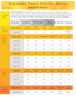
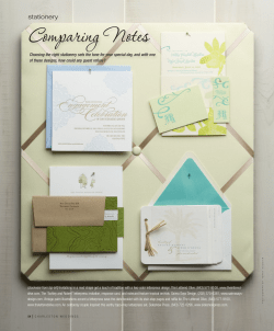
Crayton Heritage Letterpress File Preparation Packet
2321 Distribution St # B
Charlotte, NC 28203-5370
Telephone: (704) 333-5413
Fax: (704) 333-5414
Questions and Quotes: [email protected]
Print Production Email: [email protected]
Designing for Letterpress
Width of lines: Lines should be .25 point (or .003”) or thicker. Anything thinner we cannot guarantee will
make it to the final print.
Typefaces: Letterpress excels at printing type and handles most fonts very well. We recommend using
type no smaller than 6 point.
Envelopes: Artwork needs to be placed at least ½” from the bottom of the envelope. Artwork placed
over the seams of an envelope may have the marks of the seam on them either as a light or a dark line
through the image. The fine envelopes we use are not made uniformly
Paper Size: Maximum size: 18” wide by 24” long for letterpress and 14” wide for 22” long for foil stamping.
Screens: Letterpress excels at printing
colors at 100%. If you’d like to
incorporate a lighter color, we recommend
using a second lighter ink color instead of
a screen. Screens are more suited for
offset printing, not letterpress.
20% screen
of the orange
10% tint
of the orange
Large solids (large solids are areas larger than ½” of ink coverage): Letterpress printed solids look different from offset printed solids. The paper tends to show through large solids, creating a slightly textured
look that’s almost heathered, called “salting.” The amount of ink needed to make a large area solid will
make smaller lines fatten and thin type fill in. Large solids may also cause your paper to buckle and
warp. Additionally, any piece that uses a large amount of ink will have far less consistent color through
the run.
Light ink on colored paper: Letterpress inks, including opaque white, are translucent (think watercolors)
so we tend to print dark ink on light paper or a tone on tone. On colored paper, be prepared for paper
show. For example, on blue paper, a yellow ink will be dark blue and a blue ink on yellow paper is green.
The most opaque inks we use are the metallic inks—these will be tinted by the color of paper they are
printed on but are opaque enough and strong enough colors to be visible on almost any paper. Most
projects we have done using metallic inks on dark paper have come out beautifully while mixing colors
with opaque white tends to be hit or miss. If you must have an opaque, bright color on a dark or colored
paper, we would suggest going with foil rather than ink.
Double-sided prints: Printing on both sides of thin papers will not have the deep relief you’ve come to
expect from letterpress. Also, there may be a shiny spot or bruise from the printing of one side to the
other. We try to minimize the bruising—but some show-through is likely because the paper stretches
when you letterpress on it.
Designing for Foil
In general, larger text sizes work better than smaller. “Fill in” is a term used to describe bridging between
the open areas of a character, or between two characters, which affects the legibility of the text and
overall appearance. However, copy sizes that are too large can present problems—as the foil may not
want to stick properly.
OK- similar
line weight
BAD- different line
weights. The negative
space in the bloom and
the type will fill in with
foil.
When designing, avoid mixing both thin and thick artwork in the same foil color. Putting fine text or details on the same piece as large solid image areas will cause problems in both the image and the text—
the image may have bare spots where the paper shows through and the text may be filled in. Many
foils of the same color come in different releases. Some are meant for big solid artwork, others for thin,
detailed artwork. One single foil is not meant to be used for both.
Toothy paper does not work well for foil. The smoother the paper the better!
Mixing foil and letterpress: We love being able to
In this example, black is
have both processes on one piece but accommofoil and red is letterpress.
dations must be made. Tight traps and registration
The letterpress is knocked
are to be avoided—foil expands somewhat and
out with a halo to prevent
letterpress stretches the paper so they can interact
overlapping the foil.
in some unexpected ways. You cannot letterpress
directly on top of foil and vice versa. Foil will not stick to letterpress and letterpress will crack the foil.
Areas where letterpress and foil are to meet, a halo of blank space must be left between the two. We do
this often and the extra breathing room actually shows the impression better.
Selecting a Foil
Our most popular foils are gold and silver. If you are placing an order for gold or silver foil please specify
matte or shiny.
If you need a more specific selection or would like a pigment foil but do not have any foil sample books,
please contact us in advance of your order. Selecting a foil after you project is in production may delay
your order.
Keep in mind that pigment (color) foils come in gloss and matte. Gloss pigment foils look cleaner than
matte but neither are as crisp as metallics. Small open areas such as the counter space in “a” or “b” will
likely fill in and thin lines will look fat and blurry.
File Preparation Instructions
Best way to send files: Email high quality PDF files to our print production email address with type outlined. (In Adobe InDesign or Illustrator: select all, click on Type menu > Create Outlines)
A note on Photoshop: If possible, use Photoshop only for imagery. Type and vector artwork should be
designed in Illustrator, InDesign, or Quark instead of Photoshop. Bitmap images at 1200 dpi work best
(you can set this in Image>Mode... menu with the 50% Threshold method). Preferred file format: TIFF
(with LZW compression).
Selecting Colors: Please use Pantone spot colors only. The selected colors should correspond with the
color of ink we will be using when printing. If we are printing in two colors, please be sure that there are
only two colors on your files. Check this by selecting all of the artwork and in Illustrator going to Edit>Edit
Colors>Recolor Artwork.
Document size: The document size should be larger than the final trim size. Many of our customers
choose to have every file in an 8.5x11” document. The artwork should completely fit inside the document with a holding line (trim line) showing the size of the final piece.
Trim size: Denote the final trim size with a 1 point 100 % black or 100% magenta line around the artwork.
Bleeds: Please use clipping masks to create a 1/8th inch bleed beyond the trim line when applicable.
Dies and scores: Please indicate a die cut with a 1 point 100% magenta line and scores with a 1 point
100% cyan line. Perferations should be a dotted line.
File naming: Please reference the job name in some sort of manner when naming files. Example : Ashley
Hudson’s wedding invitations: AH_invite or AH_mailer. Or order number: 2549_invite.
Layers: No layers can be locked! If a layer is locked, there is a good chance it will not make it to plate.
If you used a tiled background, turn artwork to vector so that it can be selected. A quick reference:
“Select All” from your design menu (command-A for Mac users). If any part of your artwork is not selected, it will not get printed.
Submitting an Order
Please email orders to our print production email: [email protected]
What to include when submitting an order:
1. A completed Crayton Heritage Order form. (see below) When filling out the plates section, please
note that 2/0 means that there are 2 colors of ink on the front of the piece and 0 on the back. 2/1 would
mean 2 colors on the front and 1 on the back of the piece.
2. Print ready files in PDF or EPS (readable in CS3) form. This file will stand as both our print ready file
and press proofs. If the job requires assembly, a file showing final assembly is required as well.
Please note that orders require a 50% deposit before we begin the printing process.
Company Logo Here
page 1
Red Duck Design
1468 Ivy Trail Lane
Charlotte, NC 49525
Phone 362-865-9825
Email [email protected]
client:
Kym VantLeven
project description: Invitation Suite
rush:
★ Envs only, ship 11/1
date in: 10/25/2010
date out: 11/08/2010
ship to: Red Duck Design
address: 1468 Ivy Trail Lane, Charlotte, NC 49525
other ship to: Pretty Calligraphy
address: 324 Flourish Street, Nashville, TN 62539
notes:
Item
Quantity
Invite
100
rsvp
envelope
mailer
Size
4 7/8"x
6 3/4"
Paper
PMS/
Plates Foil
#1
PW Lettra 300gsm 2/0
2955
100
Crane's PW
corinne
1/0
2955
100
Crane's PW
embassy
1/0
2955
PMS/
Foil
#2
PMS/
Special Press
Foil
Ship Proof
#3
Specialty
Kurz
Luxor
414
✔
Ship to Calligraphy
Please set up your press proof PDFs as follows:
104 VantLeven
Mailer
PMS 4625
Quantitiy: 100
Crane’s Pearl White Embassy Outer


© Copyright 2026